Goatfunded Mobile Trading App design
Raji Adeoye
Goat Funded Trader Mobile App - The Case Study
Role: Product Designer
Platform: iOS & Android
Timeline: 3 Months
Status: Launched
Impact
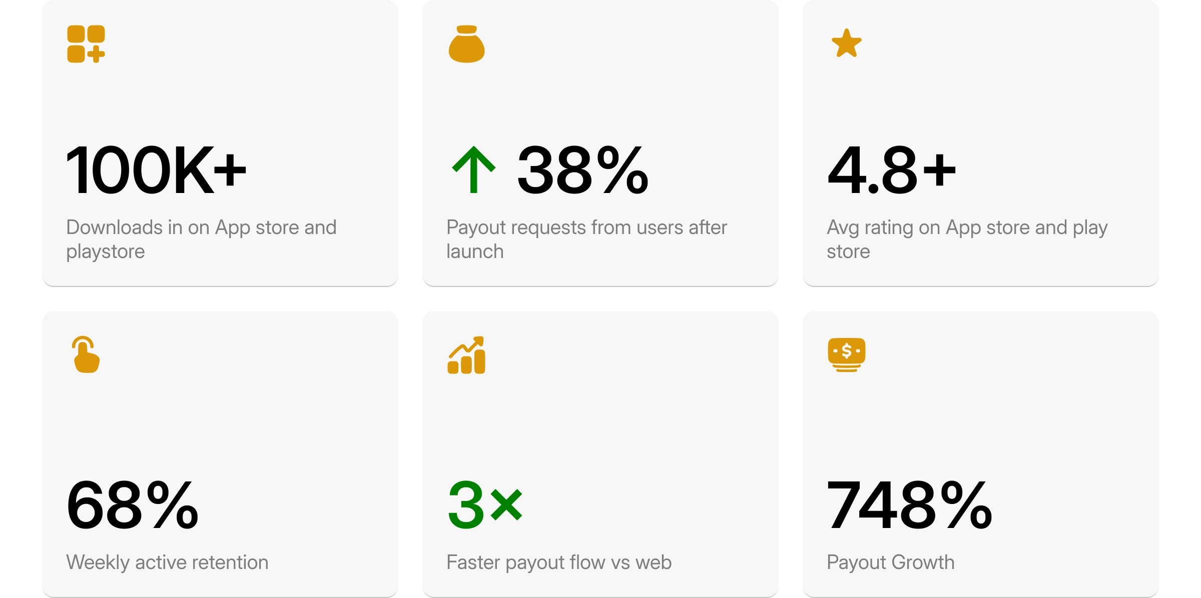
Showcasing the impact of the mobile app
THE PROBLEM — Traders were flying blind
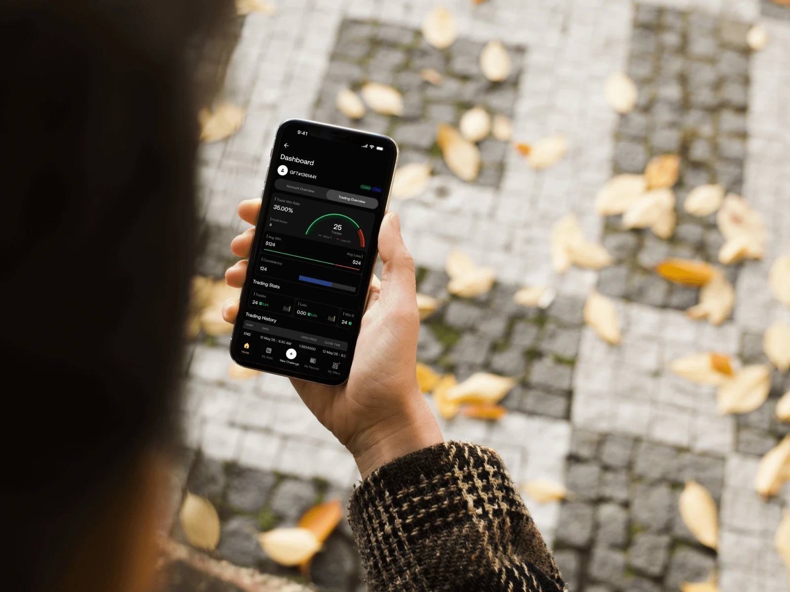
App Mobile in use
Before the app, funded traders on Goat Funded Trader had no mobile presence. They relied entirely on desktop dashboards and email notifications,missing real-time drawdown alerts, unable to check P&L on the go, and disconnected from a community that was already thriving on social. The result: higher anxiety, lower confidence, and a growing churn risk.
No mobile presence — Traders could not access account data or act on positions away from a desktop.
Missed critical alerts — Drawdown breaches went unnoticed until traders returned to a computer — too late.
Friction in payouts — Requesting withdrawals required navigating a complex web flow with multiple logins.
Community disconnect — Competitions and Goat Points felt invisible traders didn't know they were missing rewards.
DESIGN PROCESS
Checking your Dashboard
How I approached it
01 - Discovery & trader interviews
Spoke with 12 active funded traders to understand their daily habits, how they monitored performance, and what caused the most anxiety. Pain points mapped to three themes: visibility, trust, and speed.
02 - Information architecture
Defined a bottom navigation model with five anchors: Home, My Stats, New Challenge, My Payouts, My Offers. Each screen had a clear job, reducing cognitive load for traders in high-stress situations.
03 - Visual language & dark theme
Chosen deliberately. Dark UI reduces eye strain during late-night trading sessions, and the gold accent signals premium status and is consistent with GFT brand equity.
04 - Component design & prototyping
Built a scalable component library covering account cards, stat charts, payout flows, overlays, and gauge visualizations. Every state loaded, empty, and error was designed before handoff.
05 - Usability testing & iteration
Ran two rounds of moderated testing. Main iteration: the trading dashboard initially showed too many numbers at once. I restructured it into Account Overview vs Trading Overview tabs, giving traders a clear mental model.
SCREEN WALKTHROUGHS —
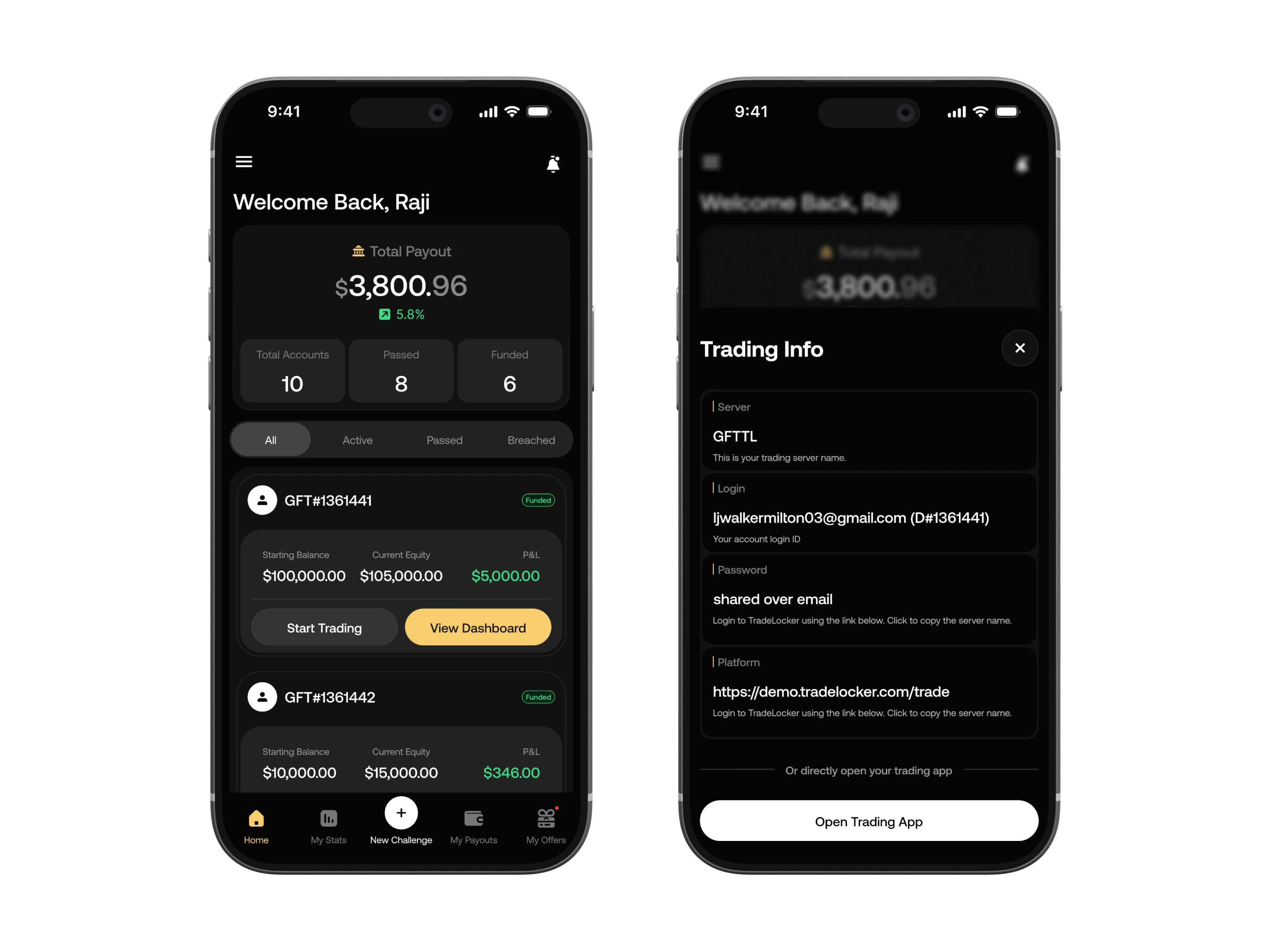
Home
The home screen surfaces the most emotionally significant number, total payout, immediately. Beneath it, account status (Total, Passed, Funded) is displayed as a three-cell grid so traders can assess their portfolio health at a glance. Each account card has two clear actions: Start Trading and View Dashboard, reducing decision fatigue.
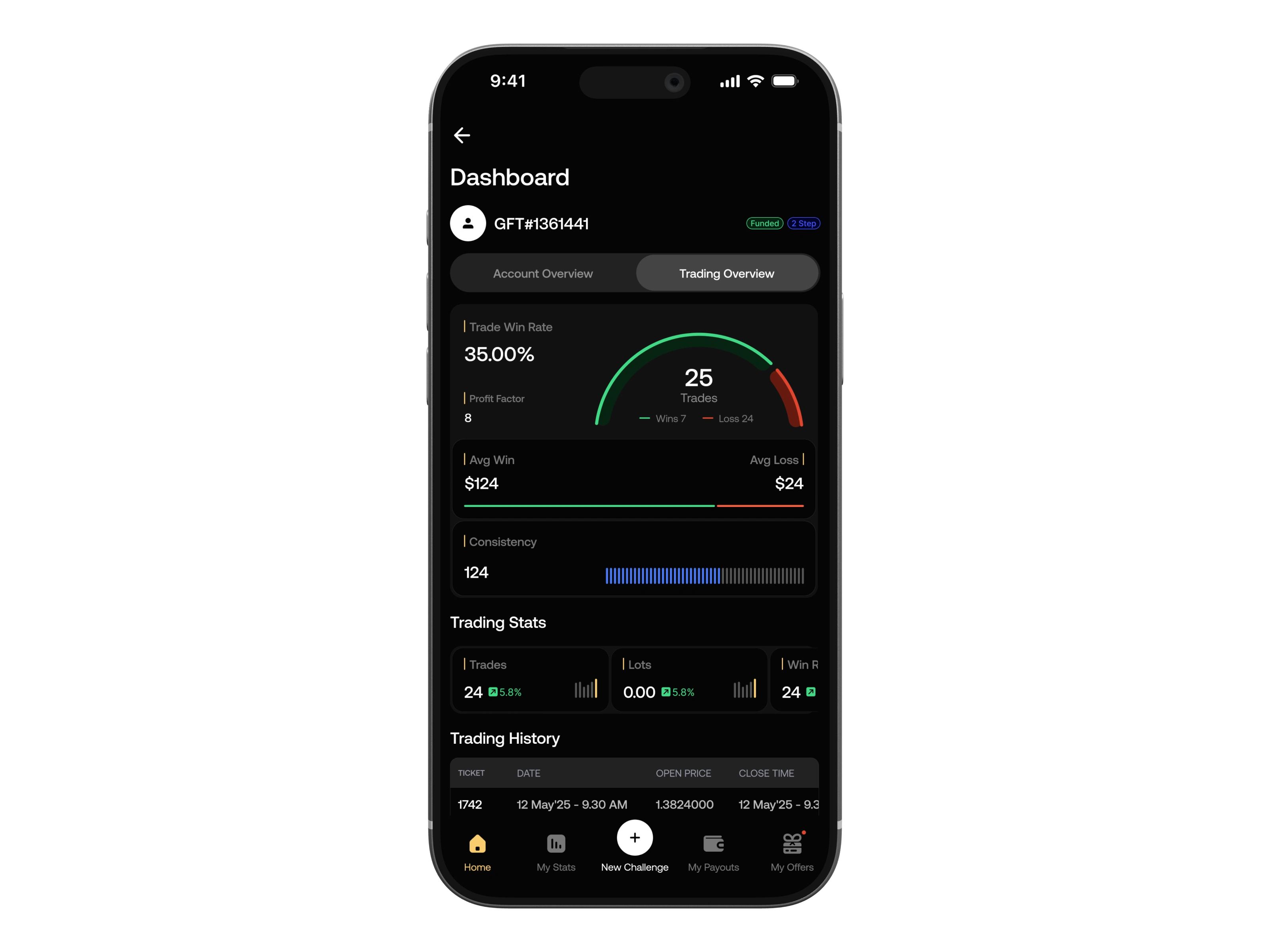
Trading Overview
The trading dashboard is split into two tabs: Account Overview for financial health, and Trading Overview for performance metrics. The gauge visualization for win rate gives traders an immediate emotional read on their performance without needing to parse a table of numbers. Average win vs average loss is displayed side by side with color coding (green/red) to reinforce the narrative.
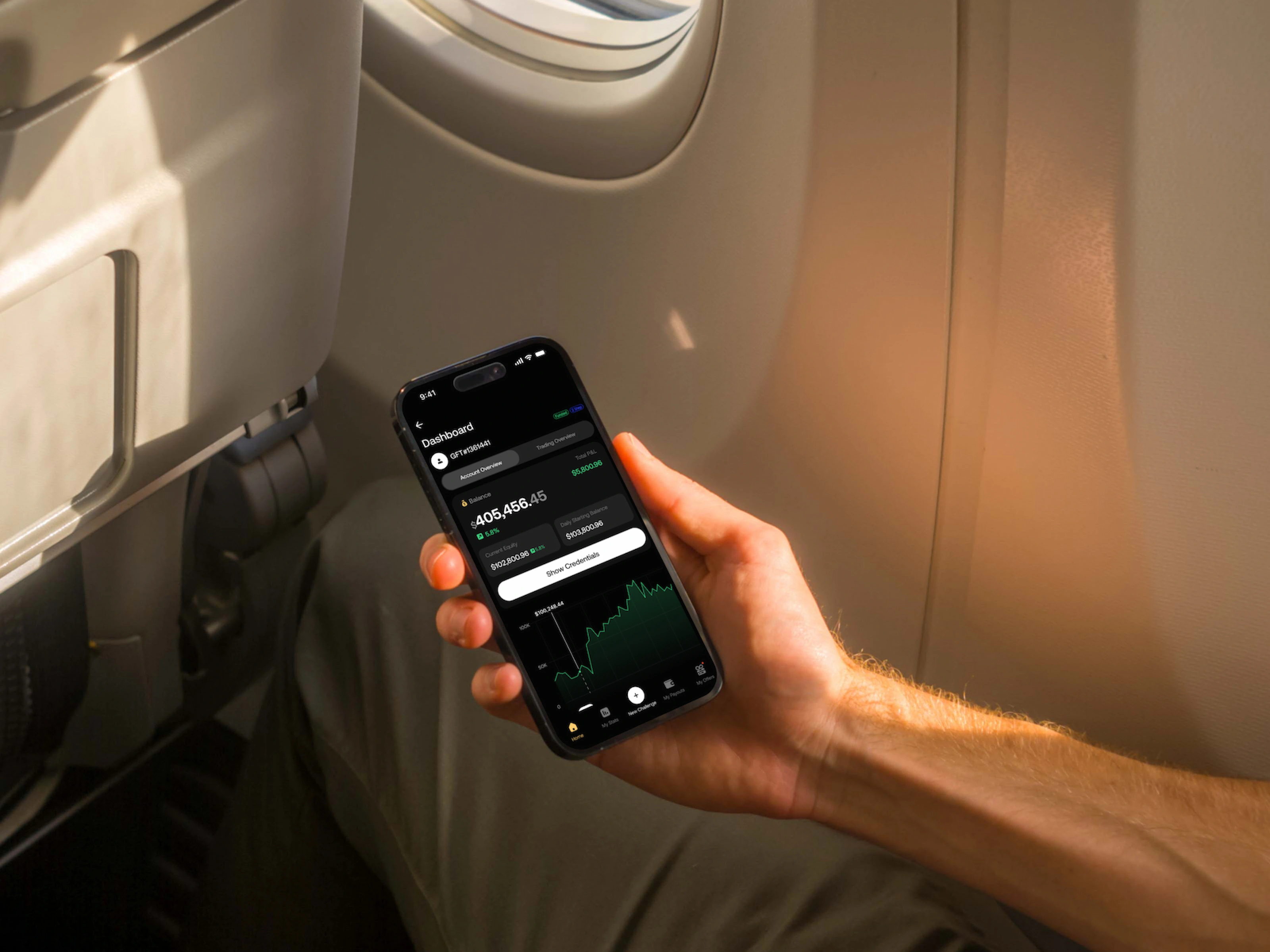
Account Overview
Displays real-time balance, total P&L, current equity, and a live equity curve chart. The Show Credentials button surfaces trading platform credentials in one tap, a significant time saver versus logging into a separate portal.
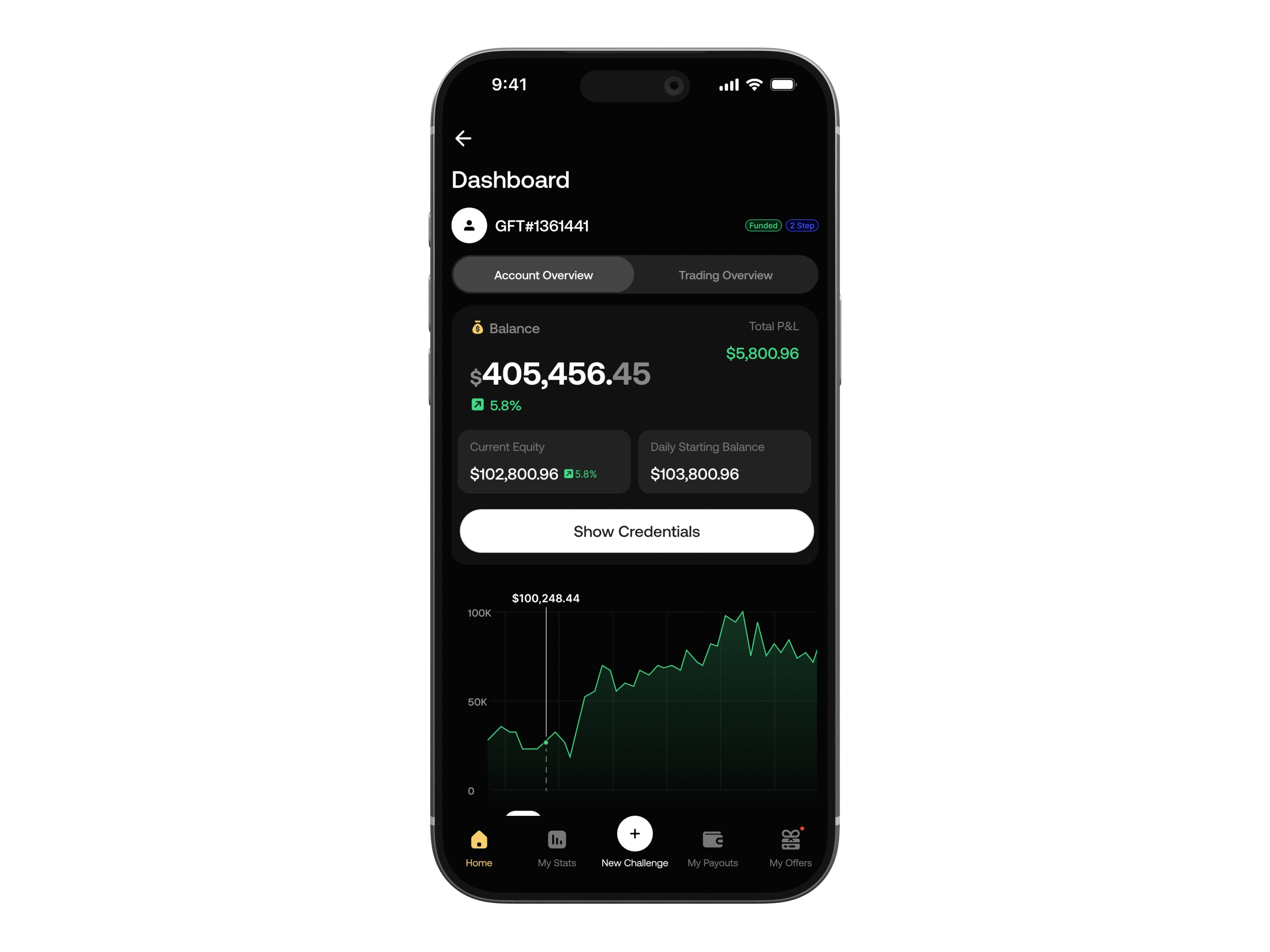
Account Overview
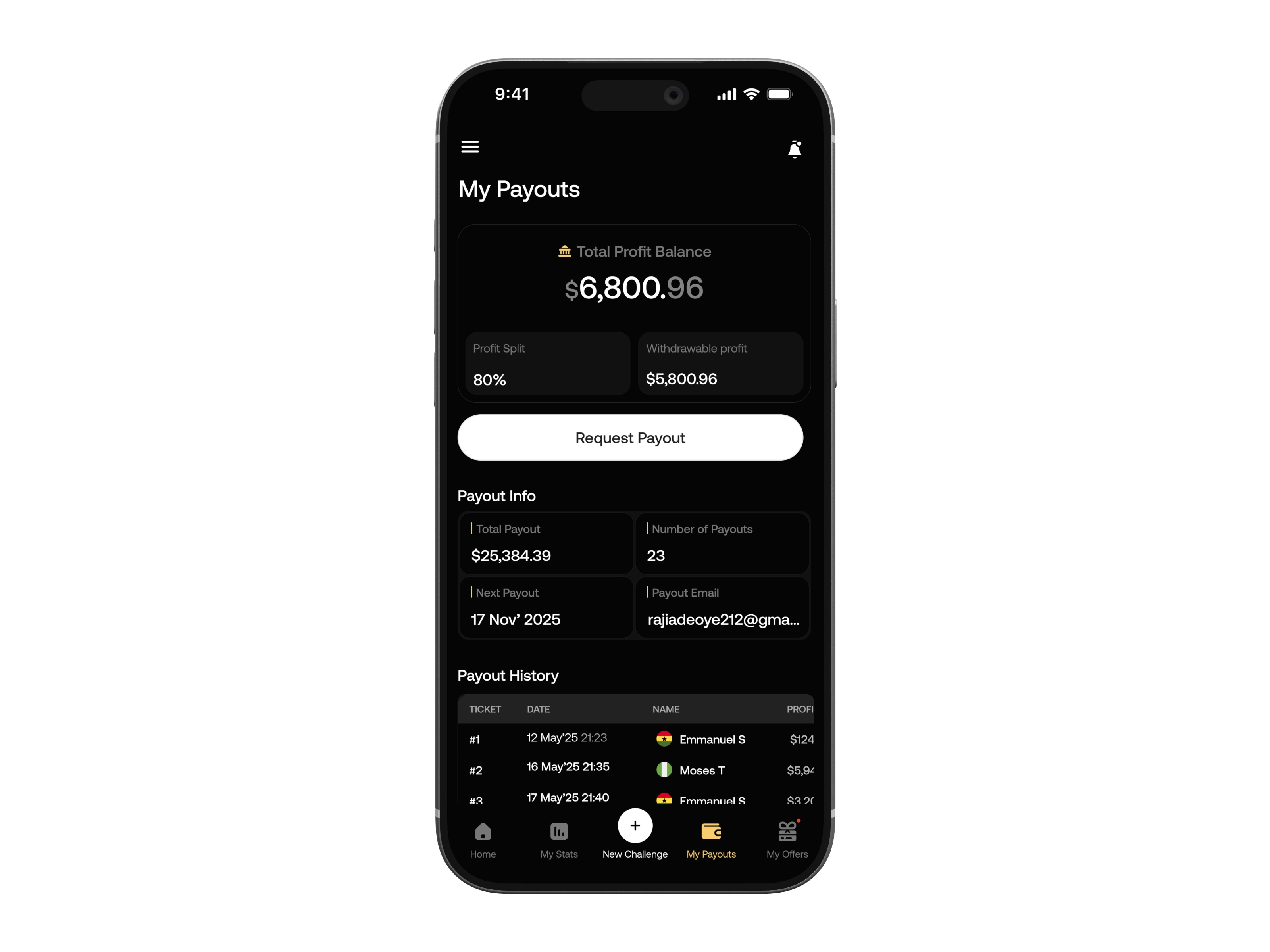
My Payouts
The most business-critical screen. Profit split percentage, withdrawable amount, and payout history are all surface-level. The Request Payout button requires no navigation. It is the primary action on the screen. This frictionless access directly correlates with the 38% uplift in payout requests following launch.
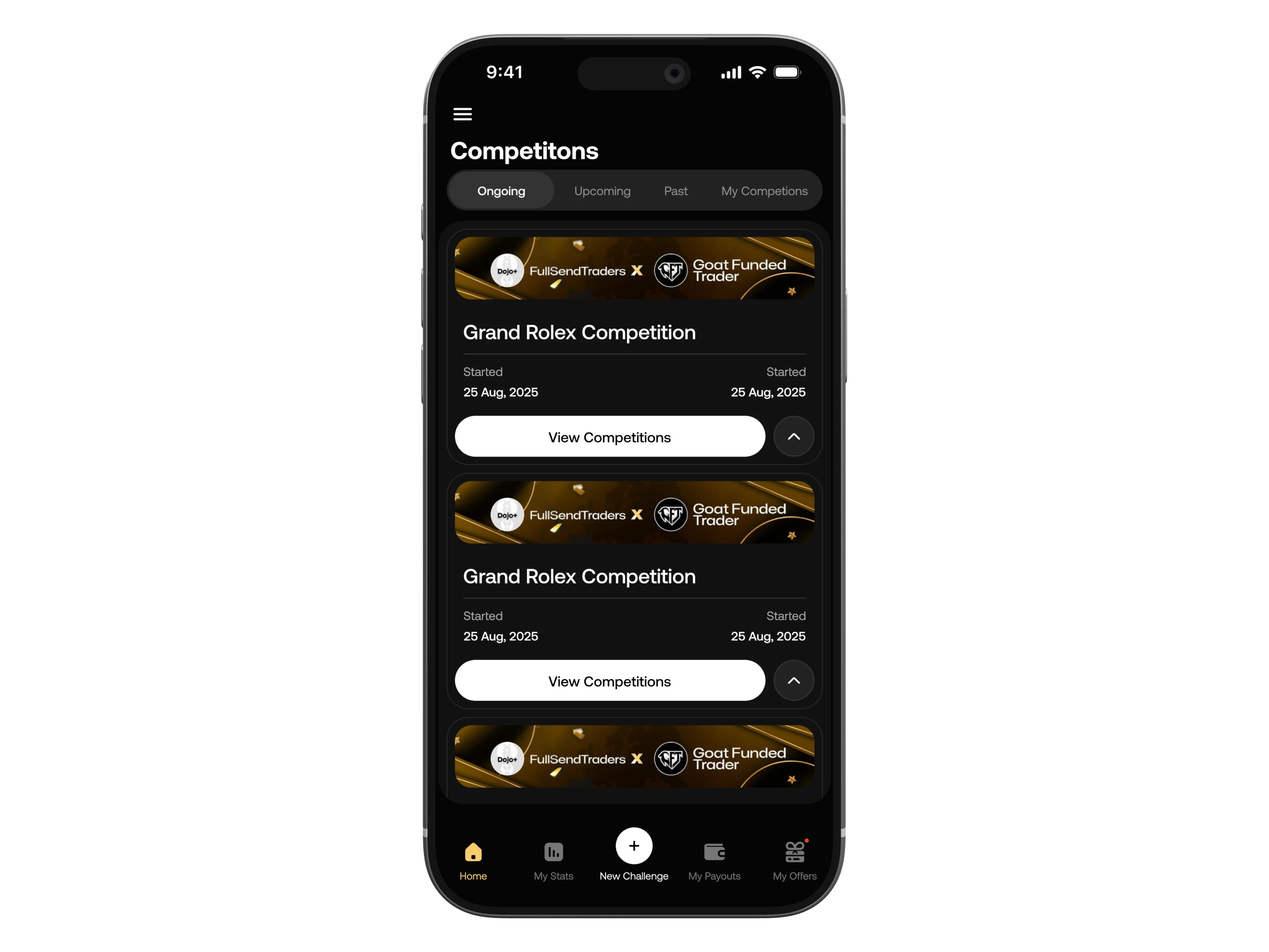
Competitions
Funded traders are competitive by nature. The Competitions screen taps into this by surfacing ongoing and upcoming prize competitions, including brand partnerships like the Grand Rolex Competition. Tabs for Ongoing, Upcoming, Past, and My Competitions give traders a sense of progress and FOMO-driven motivation to stay active.
Offers
A curated space for limited-time promotions and challenge discounts. Each offer card shows a countdown timer, headline, and clear CTA, designed to drive urgency without feeling spammy. The pop-up overlay is triggered contextually, not on every session, to avoid fatigue.
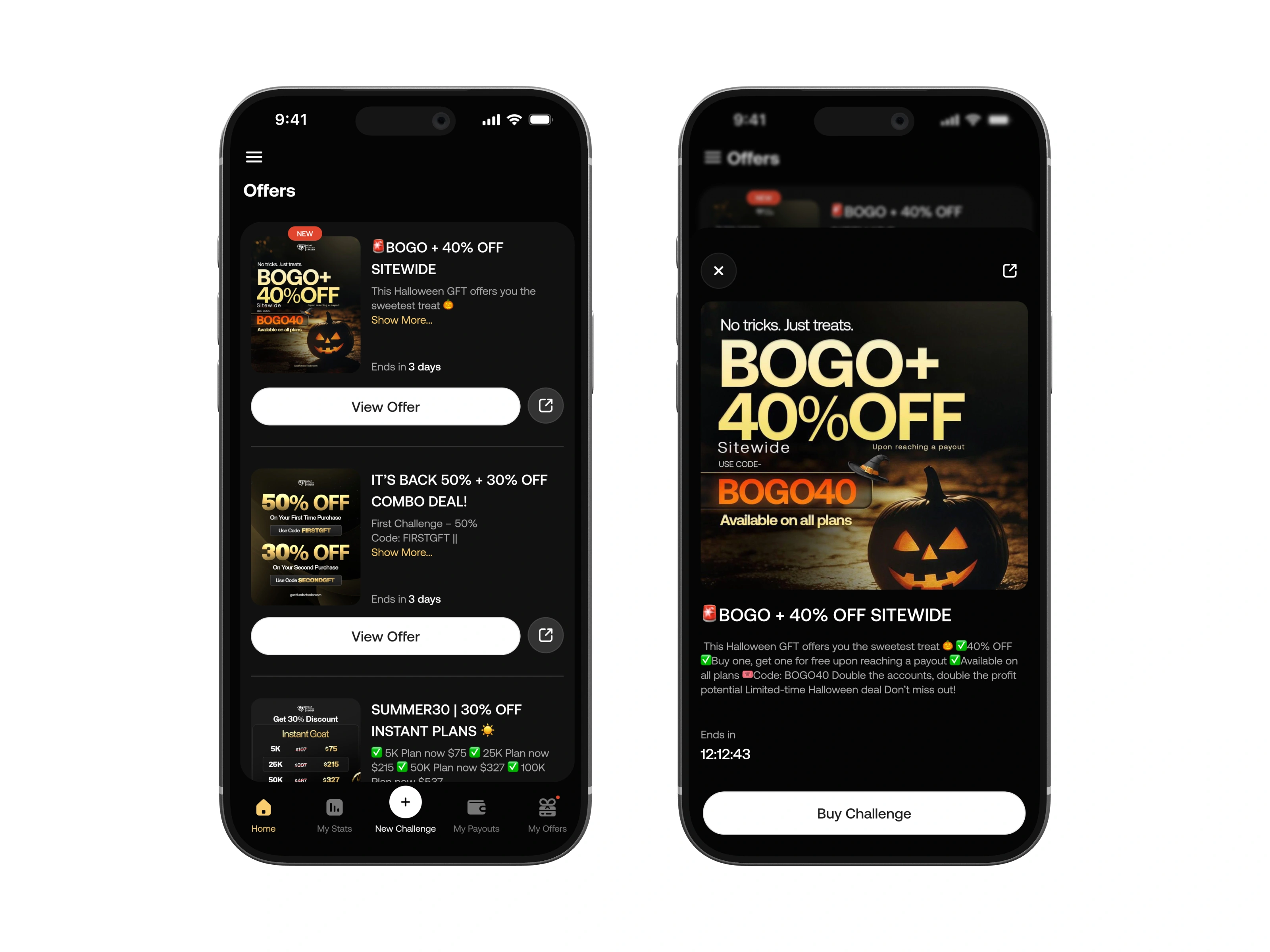
Offers
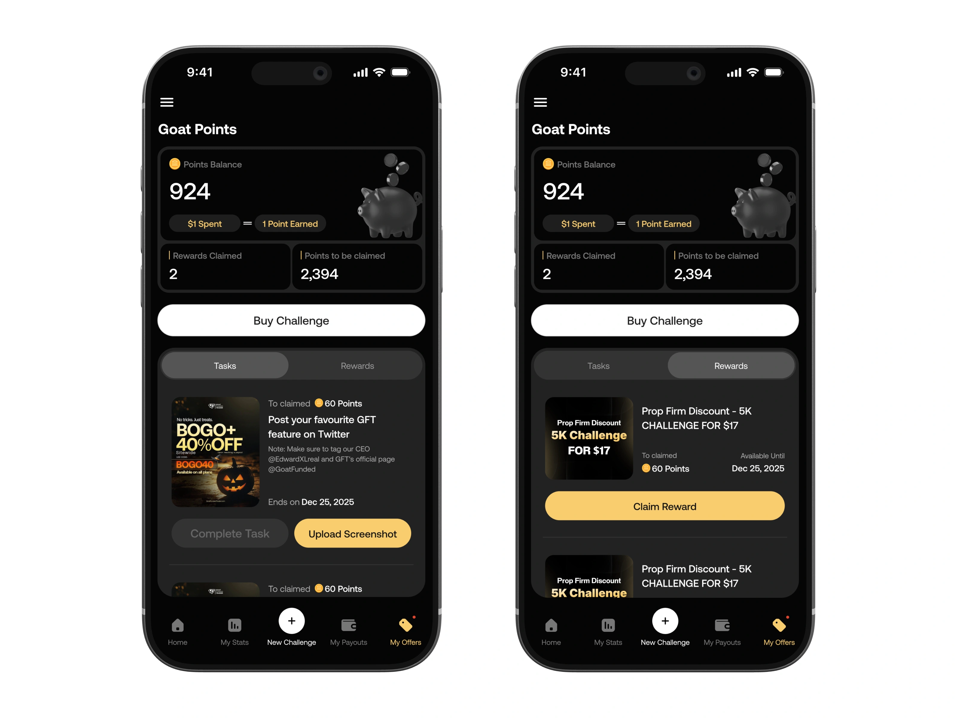
REWARDS
How Goat Points shaped the app
When I first reviewed the Goat Points feature brief, it felt like a loyalty add-on. What I discovered through research was that it was actually one of the most powerful retention levers in the entire product, and it was almost entirely hidden.
Rewards with GoatFunded
The insight
Traders didn't know Goat Points existed until they stumbled onto the screen. There was no onboarding moment, no notification, no visible progress indicator on the home screen. Points were being earned and going unclaimed.
What I designed
Visible point balance. The Points Balance (924 pts in the example) is displayed prominently at the top of the Goat Points screen, not buried in a profile page. The $1 = 1 Point equation is shown directly beneath it, making the value exchange immediately legible.
Tasks and Rewards as separate tabs. Tasks are actionable challenges (post about GFT on Twitter, tag the CEO, share a feature). Rewards are the claims: discount vouchers and free challenges. Separating these into distinct tabs gives each a clear job. One drives behavior, the other closes the loop with value.
Upload Screenshot as a verification mechanic. Rather than relying on honor-system task completion, the Upload Screenshot button turns task completion into a tangible action. This also generates UGC (user-generated content) for the brand, a business win that comes directly from a design decision.
Claim Reward CTA. The gold Claim Reward button appears only when a reward is available to redeem. This deliberate restraint, not showing it until earned, makes the moment feel like a genuine unlock rather than a persistent button.
OUTCOMES
What the app moved 100,000+ downloads in 3 months
Organic growth driven by trader community sharing, competitions, leaderboards, and Goat Points created natural virality.
Payout requests up 38%
Frictionless access to the payout flow meant traders who previously delayed their requests now acted immediately from mobile.
68% weekly active retention
Traders checking their accounts daily, a strong signal of app stickiness driven by real-time performance visibility.
4.8★ app store rating
Top-reviewed feedback highlights ease of payout, dashboard clarity, and Goat Points as the most loved features.
Reflection
This project reinforced that great product design lives in the tension between business goals and genuine user needs. The payout flow wasn't the most complex screen to design, but it was the most important. Identifying that friction point through research, and removing it with a simple layout decision, produced the app's most significant measurable outcome.
The Goat Points system was the unexpected discovery, a feature that looked like a loyalty perk on the brief but turned out to be the app's most powerful acquisition engine. Designing it well required understanding not just the interface, but the psychology of the traders using it: competitive, motivated, and responsive to systems that make their effort feel visible and rewarded.
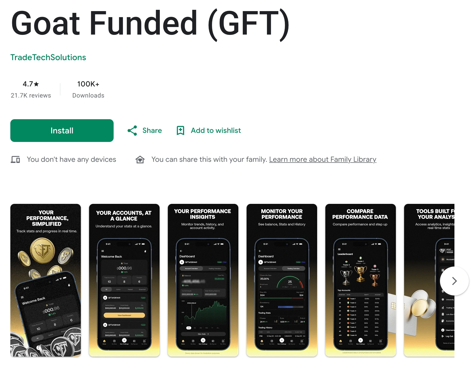
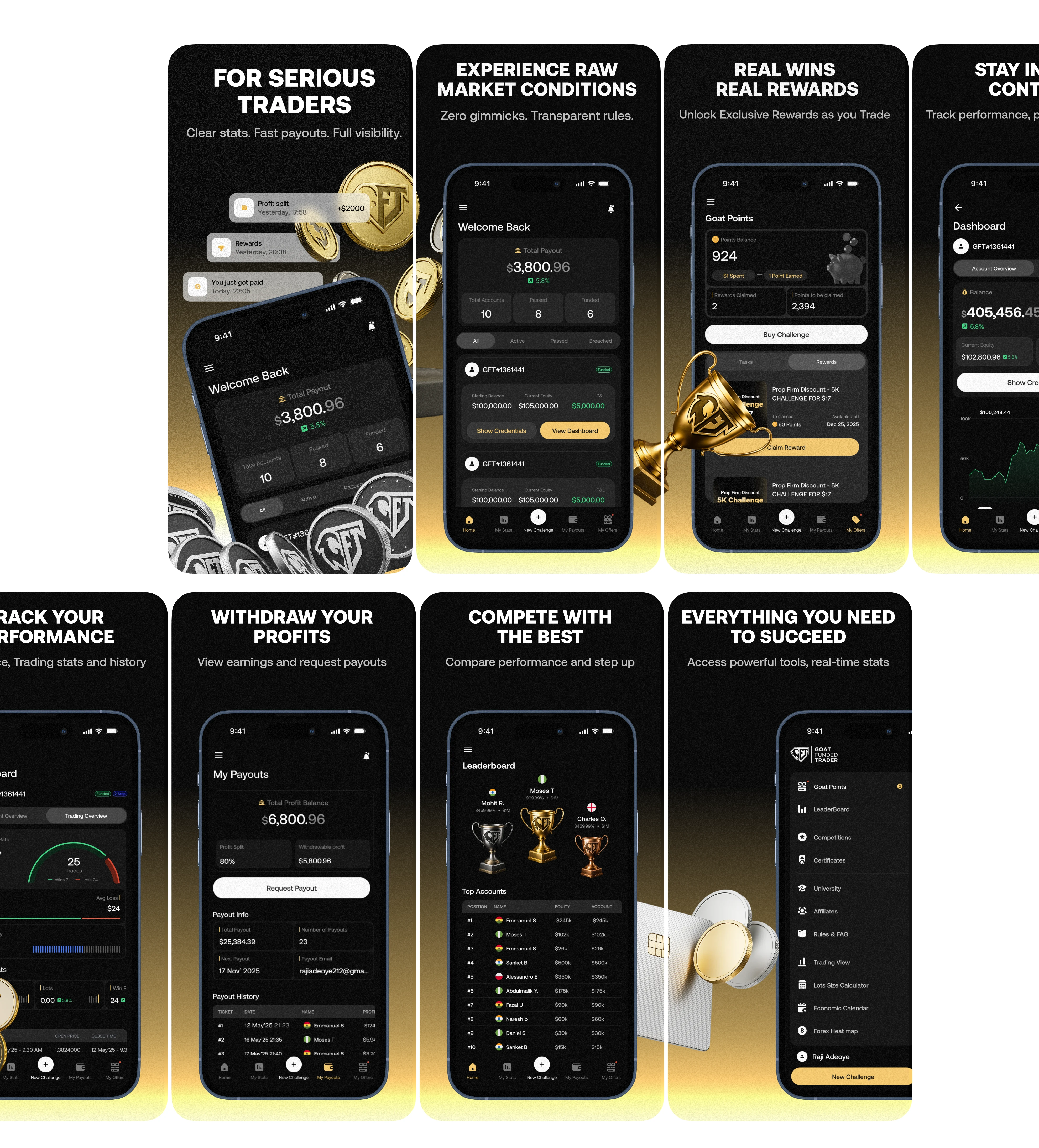
App Store Screenshots
A look at the full product — from daily account monitoring to payouts, competitions, and rewards.
Like this project
Posted May 18, 2026
I designed the GFT mobile app from 0→1. Launched to 100K+ downloads in 3 months, boosted trader payouts by 38%, and earned a 4.8★ app store rating.
Likes
2
Views
11
Timeline
Oct 18, 2025 - Dec 20, 2025