Built with Framer
Funding Traders Website Redesign
Raji Adeoye
Verified
Funding Traders Website Redesign
A visual overhaul of a prop trading firm's marketing site, transforming a functional but dated layout into a high-trust, conversion-focused fintech experience.
Project type
Web Redesign
Industry
Fintech / Prop Trading
Role
Web Designer
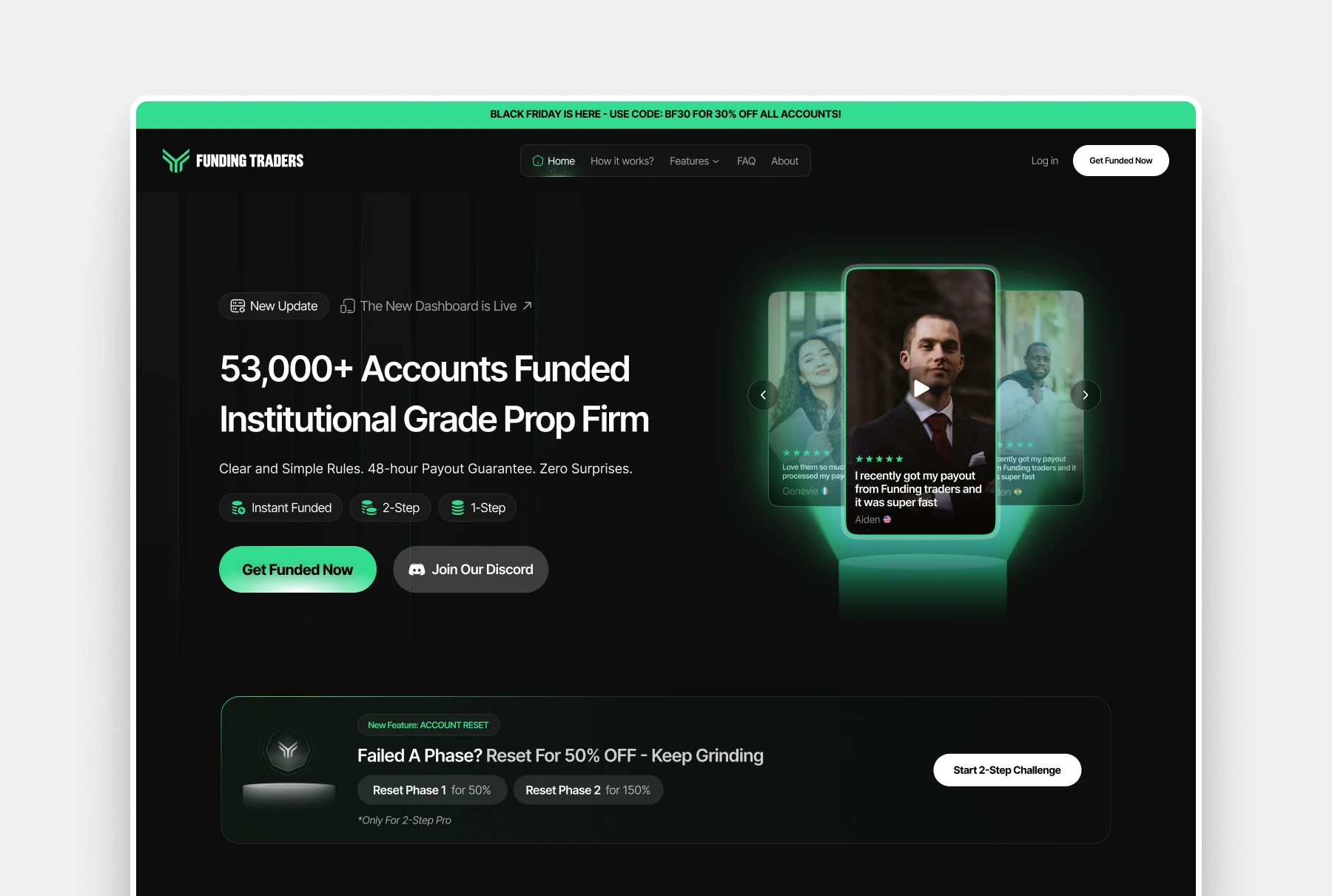
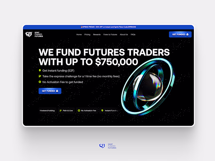
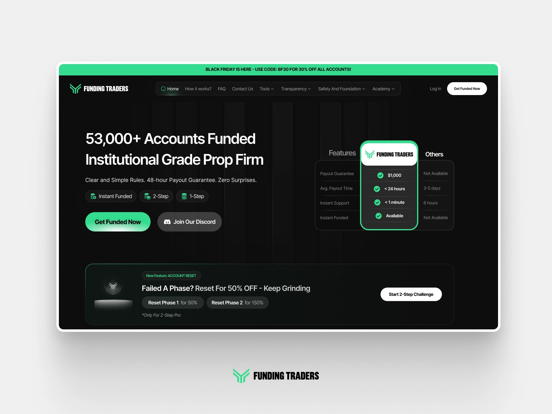
Explored Hero Section for funding Traders (Unused)
01 — The Problem
A platform with strong credibility signals, held back by an outdated visual language
Funding Traders had already built a solid product, real payouts, a large funded account base, and a growing community. But the website's design didn't reflect that maturity. The original site leaned on generic fintech conventions: standard card layouts, predictable green-on-dark color usage, and typographic hierarchy that didn't guide attention toward the key trust signals and CTAs users needed to convert.
/
The visual style felt misaligned with the credibility of the platform users with real money at stake needed an experience that felt modern, trustworthy, and purpose-built for serious traders.
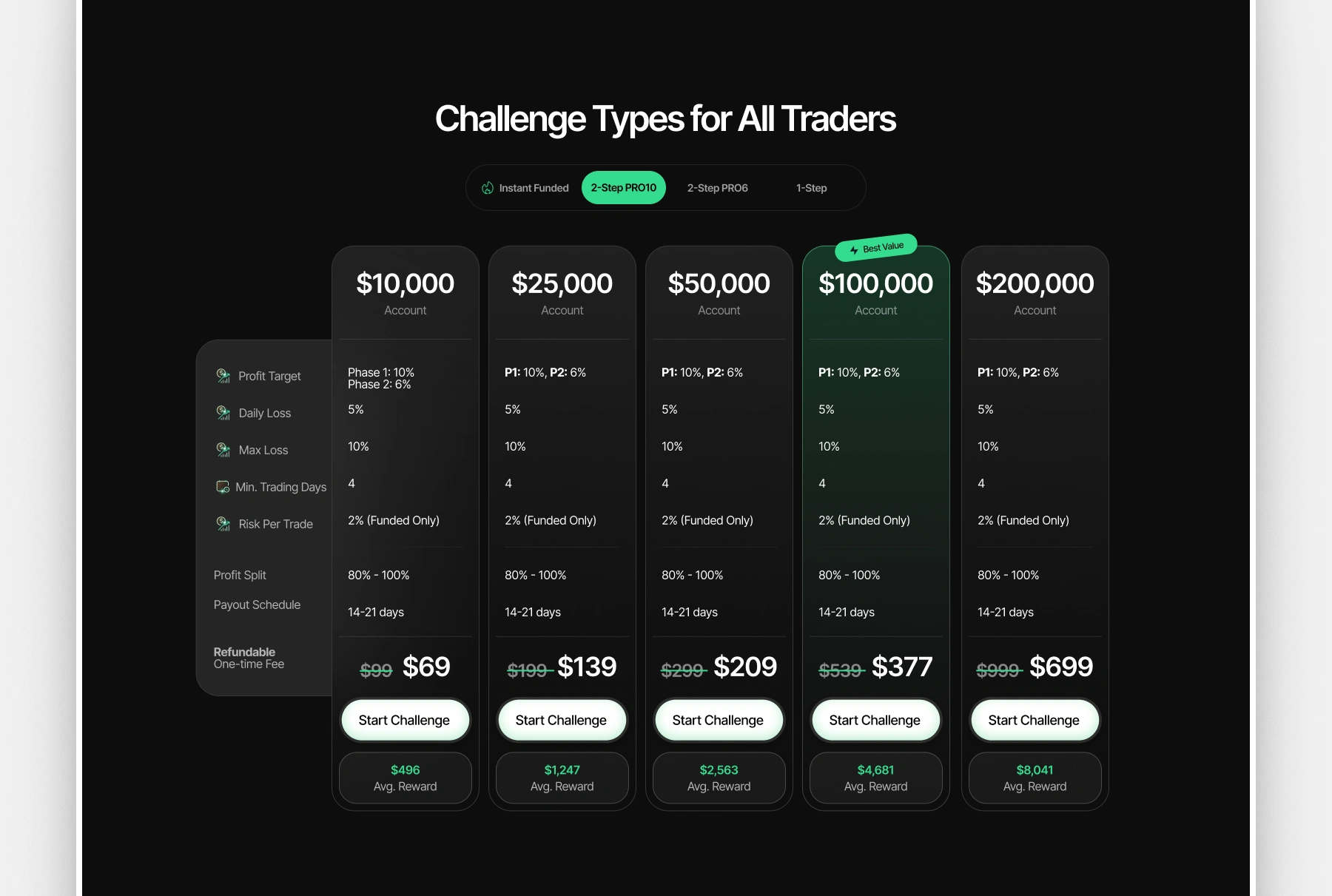
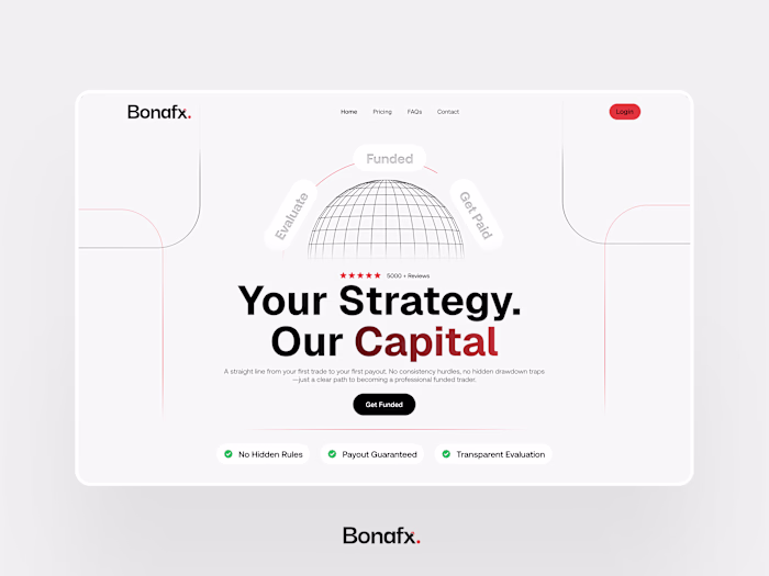
Pricing Section for Funding Trader
02 — Design Process
Four phases from audit to final delivery
1-Visual audit
Reviewed the existing site section by section mapping which elements were doing conversion work and which were creating visual noise. Identified weak typographic hierarchy, low-contrast CTAs, and trust sections that weren't landing.
2-Direction setting
Defined the design direction: a dark base with a refined, intentional use of the brand green. The goal was to feel like a professional trading platform closer to Bloomberg or a premium SaaS tool than a typical prop firm site.
3-Component redesign
Redesigned every major section hero, payout ticker, challenge pricing table, social proof, platform logos, and FAQs with consistent spacing, tighter typographic scale, and improved visual hierarchy throughout.
4- Full-page composition
Assembled all redesigned sections into a cohesive full-page layout in Figma ensuring rhythm between sections, consistent use of the green accent, and a clear conversion path from scroll to CTA click.
03 — Key Decisions
Green was pulled back to accent-only use on buttons, highlights, and key stats to give it more visual weight and make CTAs pop without overwhelming the layout.
A tighter typographic scale was introduced across heading sizes, body text, and labels, with trust signals like payout amounts and account counts given dominant sizing.
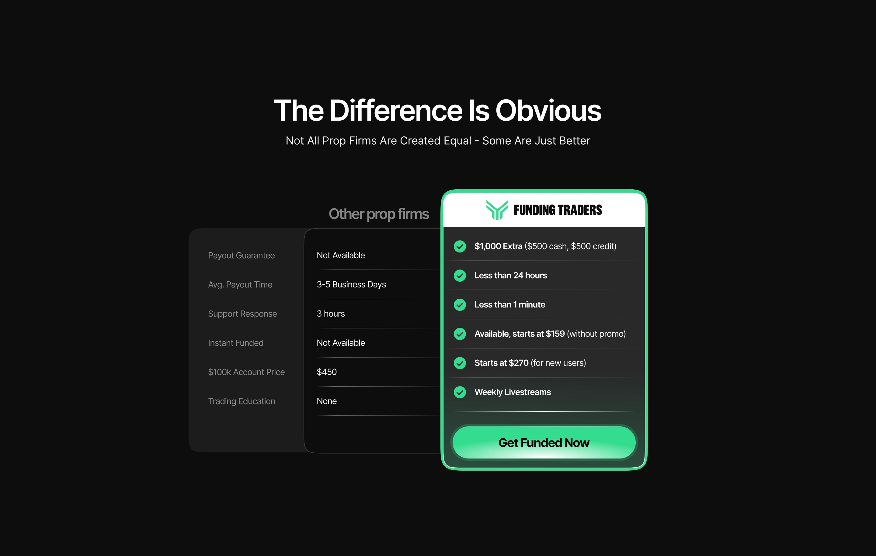
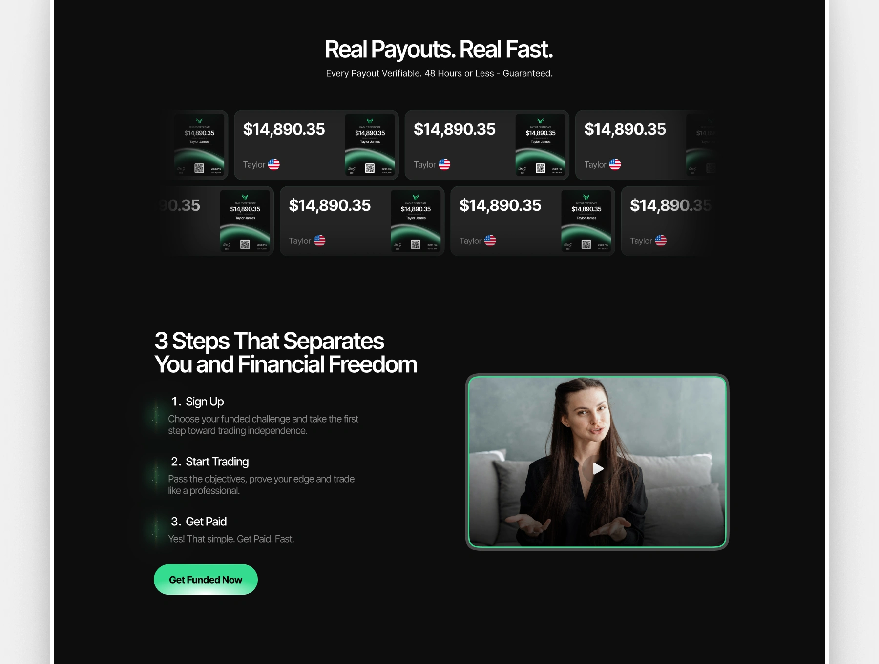
Payout certificates and testimonials were redesigned as scannable, consistent cards, making the volume and legitimacy of payouts immediately legible.
The challenge and pricing table was rebuilt with clear visual grouping, readable rule breakdowns, and a prominent CTA per tier to reduce decision friction
04 — Outcome
What the redesign delivers
A visual identity that matches the platform's credibility — 53,000+ funded accounts deserves a site that looks the part
Clearer conversion path from hero to CTA — users encounter trust signals before they're asked to act
Scalable Figma component structure that makes future updates consistent and fast
A cohesive dark-mode-first design language the brand can carry forward across future pages
You can view the full website LIVE -
Like this project
Posted Mar 30, 2026
I redesigned their full marketing site from the ground up, turning a dated dark-themed layout into a sharp, conversion-focused prop trading experience.
Likes
3
Views
41
Timeline
Feb 11, 2026 - Ongoing
Clients
Funding Traders