1. The Starting Asset Started with

Ismaeel Hamza Syed


1. The Starting Asset
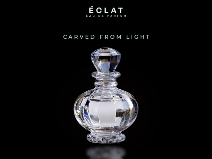
Started with just a raw transparent cutout of the glass bottle.
2. The Problem (Beige Background)
I initially placed it on a warm beige background, but the bottle looked like it was awkwardly floating in mid-air. It lacked depth and grounded realism.
3. Grounding & Reflection
To fix the floating effect, I switched to a jet-black background and added a warm gradient across the bottom to establish a clear surface floor. I also researched and built a crisp glass reflection on the surface to make the bottle feel heavy and physically planted.
4. Lighting & Final Polish
To bring atmosphere into the frame, I added a dramatic orange light beam coming from the top-right corner. Then I adjusted the highlights and cast shadows across the glass to match the new directional light source, along with setting up the custom label layout.
Sometimes making a product look "expensive" comes down to how well you control the lighting and environment around it.
Like this project
Posted Jul 22, 2026
1. The Starting Asset Started with just a raw transparent cutout of the glass bottle. 2. The Problem (Beige Background) I initially placed it on a warm beige...