Luxury Watch Ad Design: From Clutter to Premium Editorial

Ismaeel Hamza Syed


Case Study: Evolving a Luxury Watch Ad Through Real-World Iteration
📋 Project Details:
• Role: Art Director & Visual Designer
• Tools: Adobe Photoshop, Google Gemini (Copywriting)
• Deliverables: Digital Display Ad & High-End Social Assets
• Focus Area: Commercial Lighting & Typography
Project Overview
I wanted to design a premium digital advertisement for a luxury watch, exploring how typography, copy, and product placement interact. Instead of settling for the first clean layout, I pushed the design through four distinct rounds of refinement to find the perfect balance between information and high-end visual impact.
Phase 1: Setting the Niche & Layout
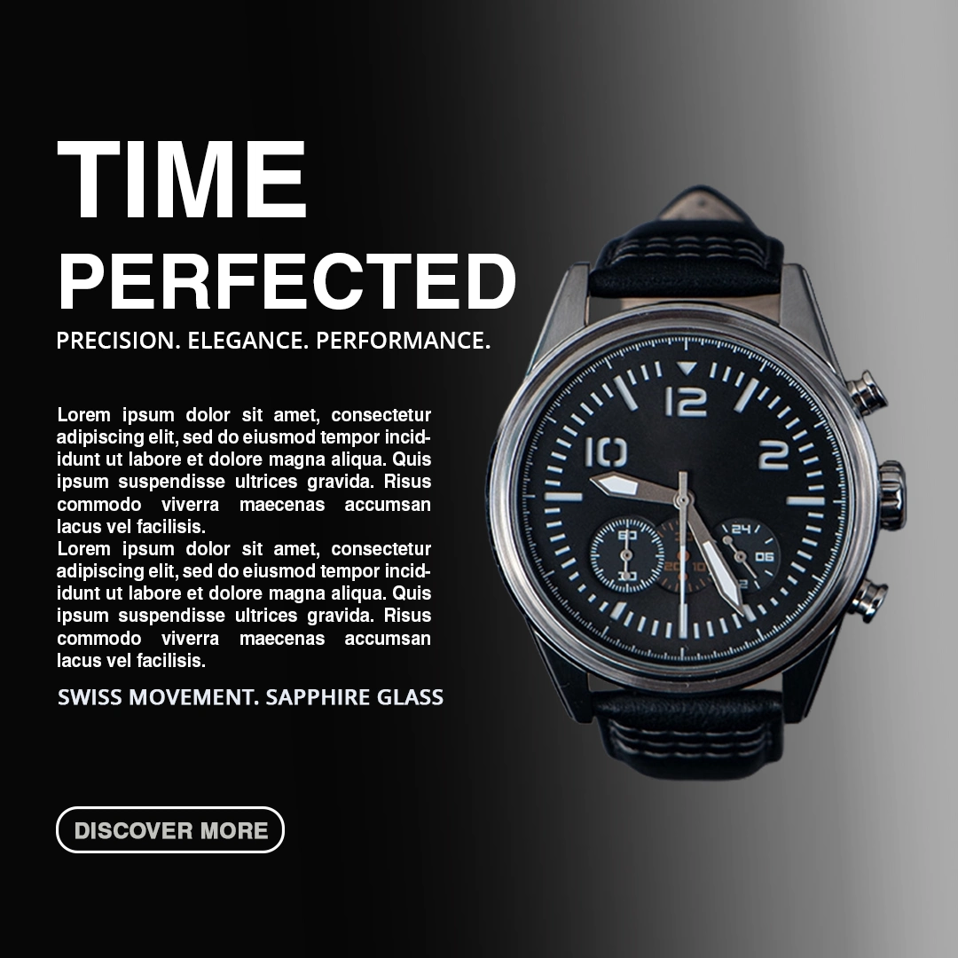
When I started with "Time Perfected," my core goal wasn't necessarily to make it minimalist—I was simply trying to establish a solid design niche for a luxury timepiece. I paired a bold headline with a large block of paragraph text to give it an editorial feel.
The Realization: After stepping back and looking at it, the layout felt too cluttered. The massive block of placeholder text and the standard web-style "Discover More" button were pulling attention away from the watch itself.
Phase 2: Refining the Message & Skimming the Heavy Text
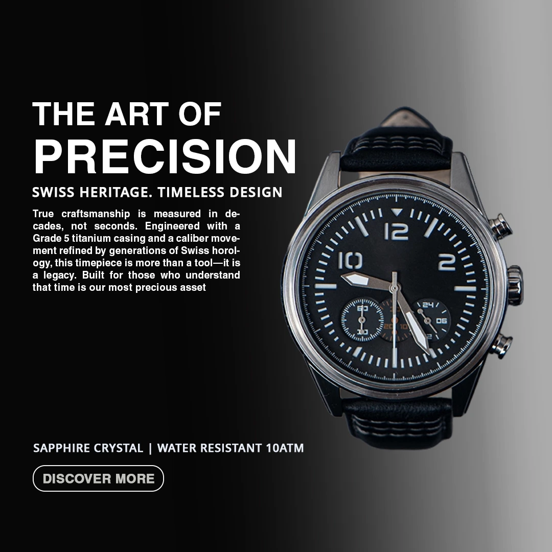
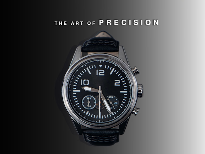
For the next version, I shifted the headline to "The Art of Precision" to elevate the premium feel.
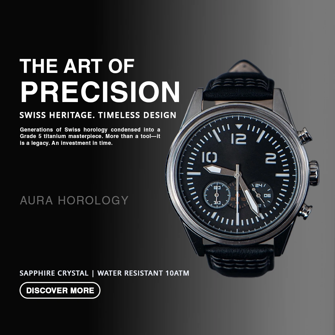
The Realization: Even with better copy, that paragraph text still looked incredibly heavy on the eyes. It split the canvas down the middle and competed with the product. To fix this, I skimmed the copy down drastically, making it much more point-to-point and punchy, while introducing a clean brand name: Aura Horology.
Phase 3: The Radical Reset (Focusing on the Product)
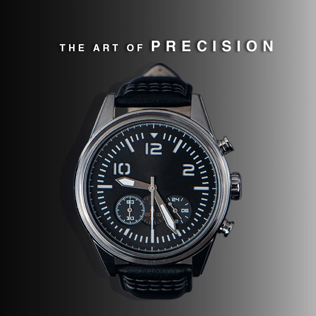
At this stage, I realized that if the watch is truly premium, the design should let the craftsmanship do the talking. I stripped away the body paragraph entirely.
I centered the watch, blew out the tracking (letter-spacing) on "P R E C I S I O N," and placed it cleanly across the top. By removing the dense blocks of text, the composition instantly felt like a high-end, high-value editorial print ad.
Phase 4: Scaling for Platforms (The Thumbnail)
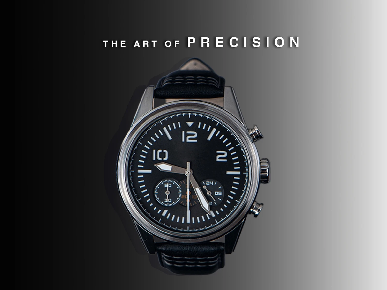
To round out the project, I adapted the final centered concept into a wide aspect ratio thumbnail. This exercise proved that when a layout's core elements are balanced and intentional, the design can scale seamlessly across different digital dimensions without losing its premium identity.
My Key Takeaways
Edit the Copy, Not Just the Shapes: A graphic designer has to edit the text just as much as the visual elements. Skimming the heavy text was the turning point for this layout.
Trust the Product: Luxury isn't about crowding the page with descriptions; it's about giving a beautiful asset the space to breathe.
Like this project
Posted Jul 19, 2026
A step-by-step case study in refining layout hierarchy, skimming heavy copy, and transforming a cluttered ad concept into a premium, high-end visual.