Fleet Management Dashboard UI/UX Design
Sagar Donda
Fleet Management Dashboard UI/UX Design
🧾 Project Overview
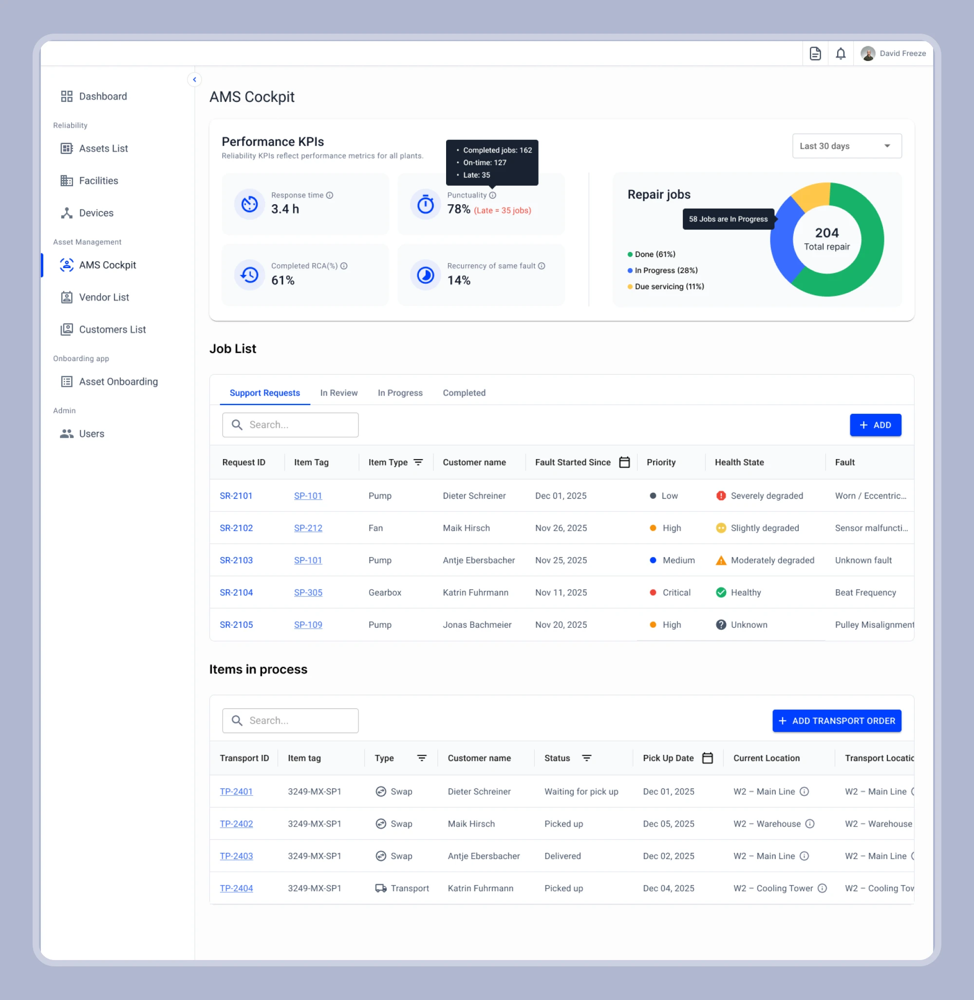
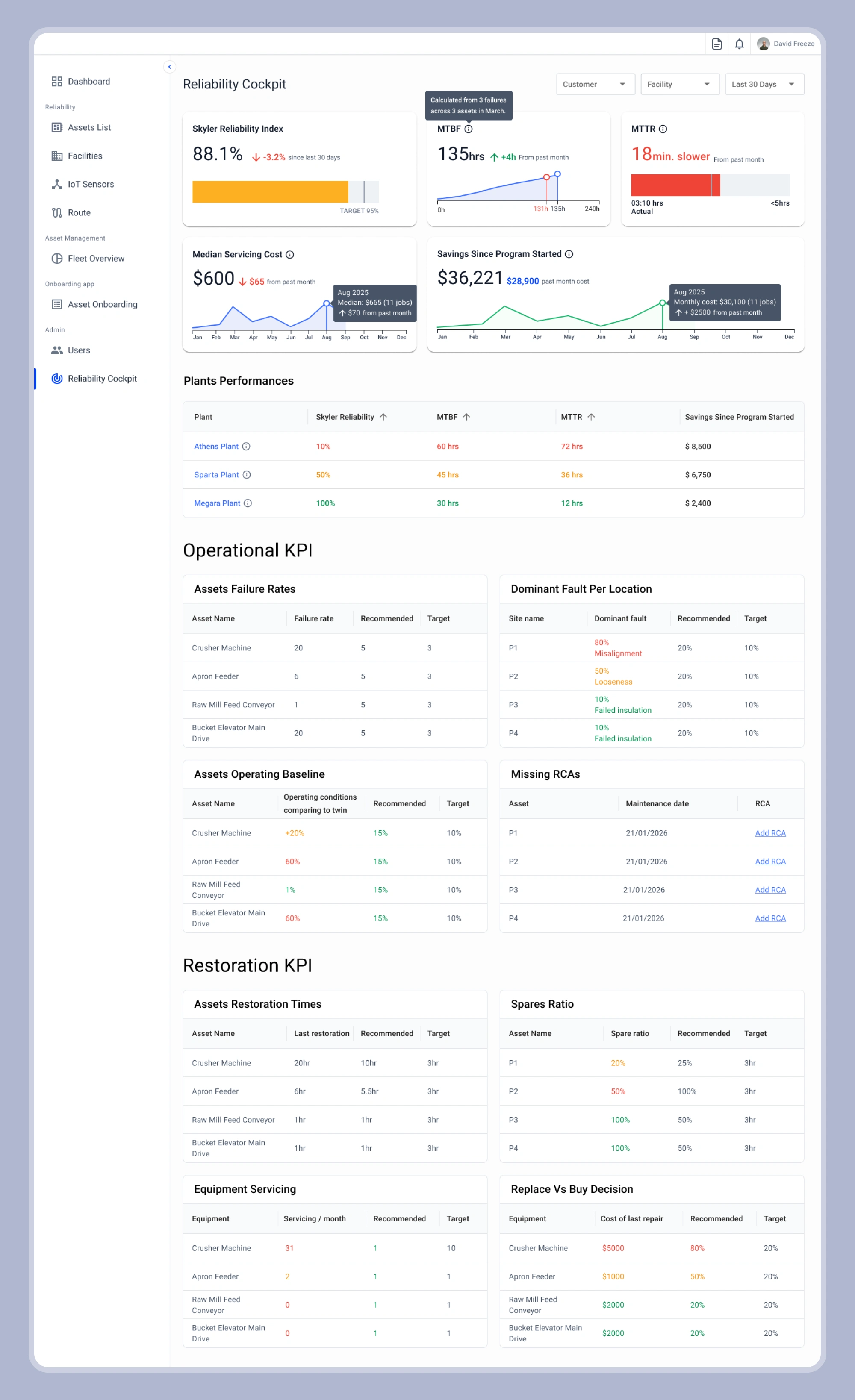
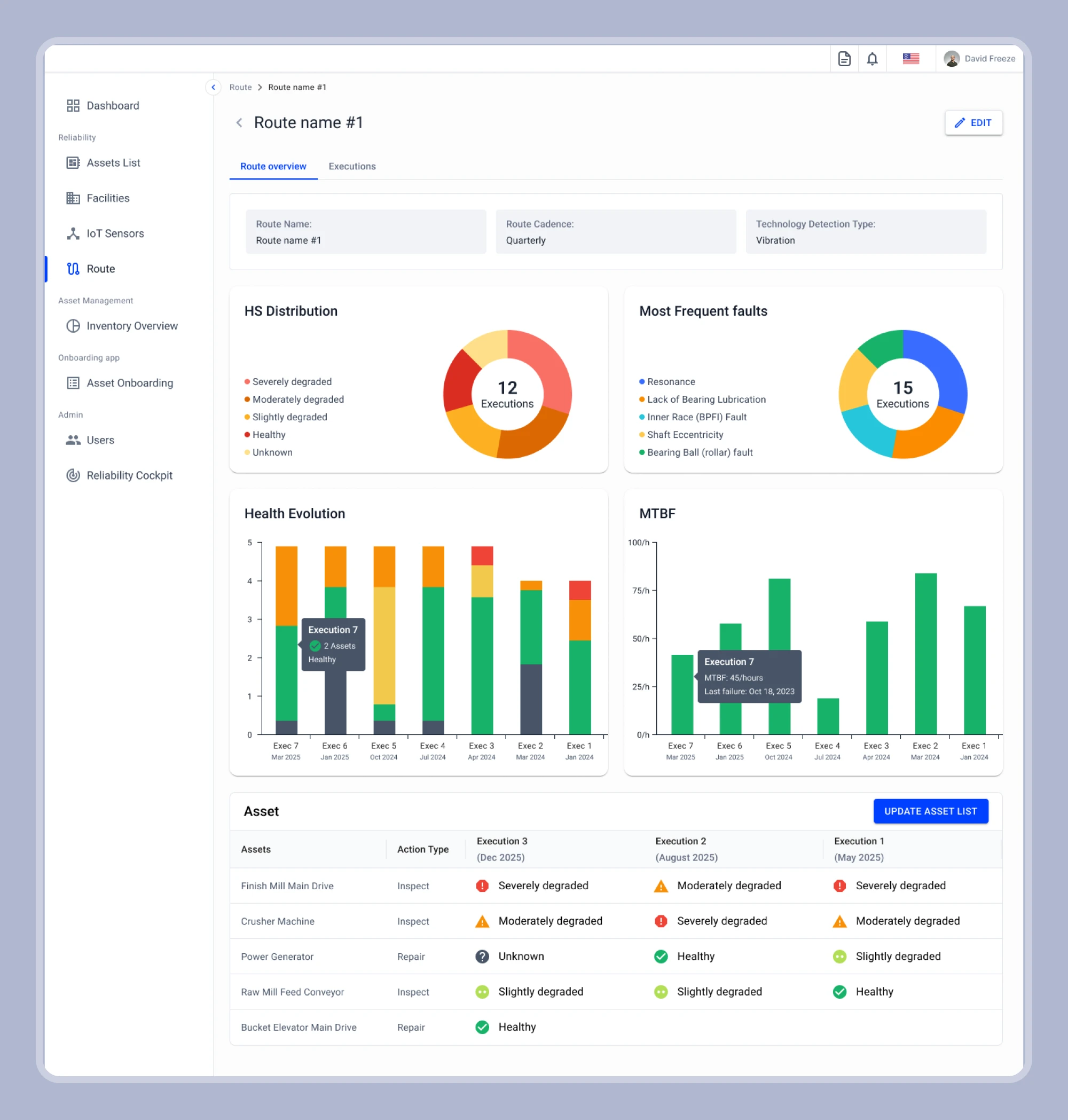
This project focuses on designing a fleet management dashboard that helps users monitor assets, track performance, and manage servicing efficiently.
The goal was to simplify complex operational data and present it in a way that is easy to understand and act on.
🎯 Challenges
• Handling large amounts of operational and asset data
• Making analytics easy to understand at a glance
• Avoiding clutter in a data-heavy dashboard
• Creating a smooth and intuitive user flow
💡 Solution
• Designed a structured layout with clear sections
• Used charts and data visualization for better insights
• Organized asset and servicing data into easy-to-read tables
• Applied strong visual hierarchy for quick scanning
• Kept the interface clean and minimal
⭐ Key Features
• Fleet overview dashboard
• Asset management and onboarding sections
• Data visualization (charts & metrics)
• Servicing and cost tracking
• Clean table-based data layout
• User-friendly navigation
👨💻 My Role
• UI/UX Design
• Dashboard layout and structure
• High-fidelity design in Figma
• Component design
🛠 Tools
Figma
📊 Outcome
The final design provides a clear and efficient way to manage fleet operations, helping users quickly understand data and make informed decisions.
Like this project
Posted Mar 23, 2026
Designed a clean SaaS dashboard for fleet and asset management, focusing on data clarity, usability, and efficient user workflows.