OrangeDS Brand Identity Design and Development
Vijay Prasath
OrangeDS – International Shipping for US Ecommerce Brands.
In 2014, I joined Orange Distribution Solutions as they were starting up—then operating under the domain odsolinc—a name that lacked clarity, memorability, and brand resonance.
Recognizing the need for a stronger identity, I led the initiative to rename the brand's web domain and how the name Orange is used. Since the standalone name Orange was unavailable due to existing brand conflicts, I proposed the name OrangeDS—a simplified and pronounceable alternative that maintained brand relevance while improving recall.
This was just the first step in what became a 10+ year creative and strategic partnership. Over the years, I’ve continued to evolve OrangeDS’ brand—shaping its identity, language, and design systems to meet the expectations of a modern, global shipping company.
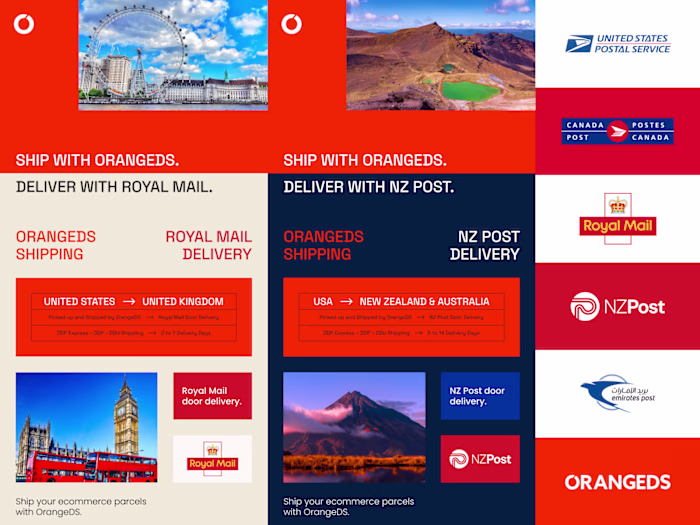
OrangeDS has shipped millions of parcels to 220+ countries—helping countless ecommerce brands grow beyond borders.
Despite strong growth, OrangeDS eventually shut down in Dec 2024 due to internal losses and challenges in scaling customer experience fast enough.

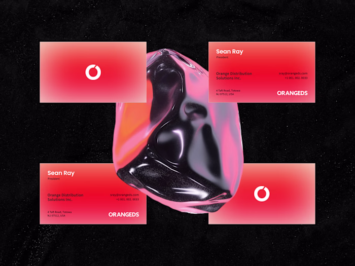
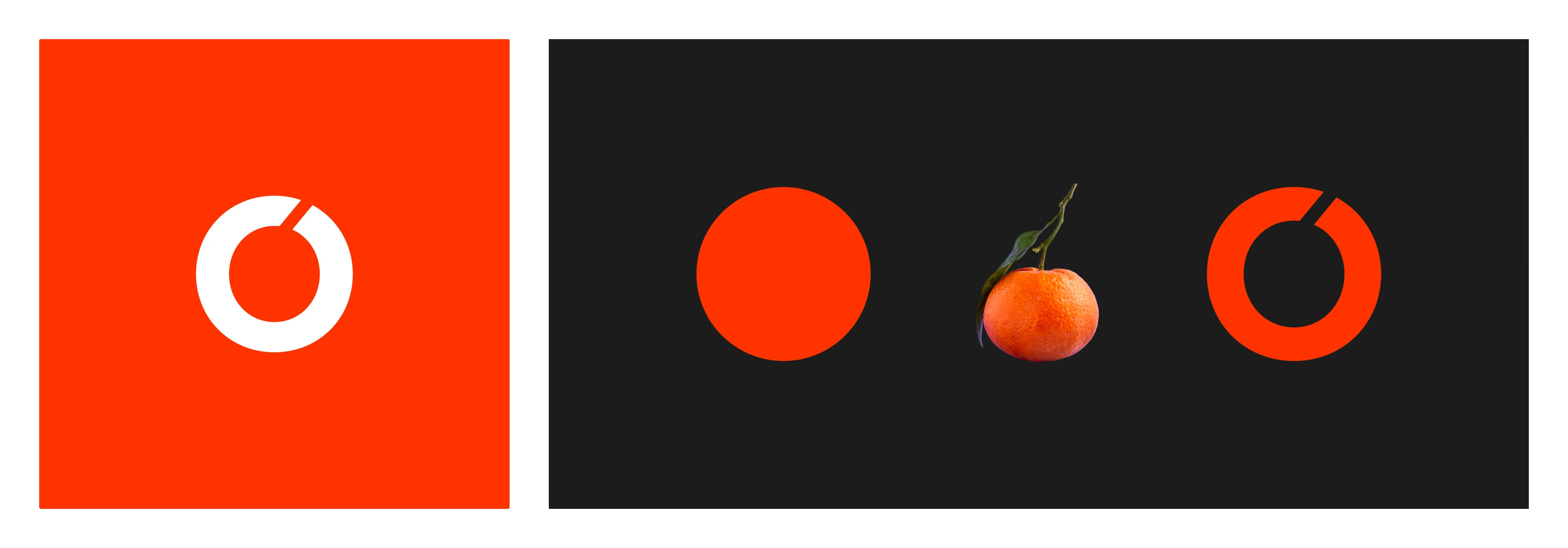
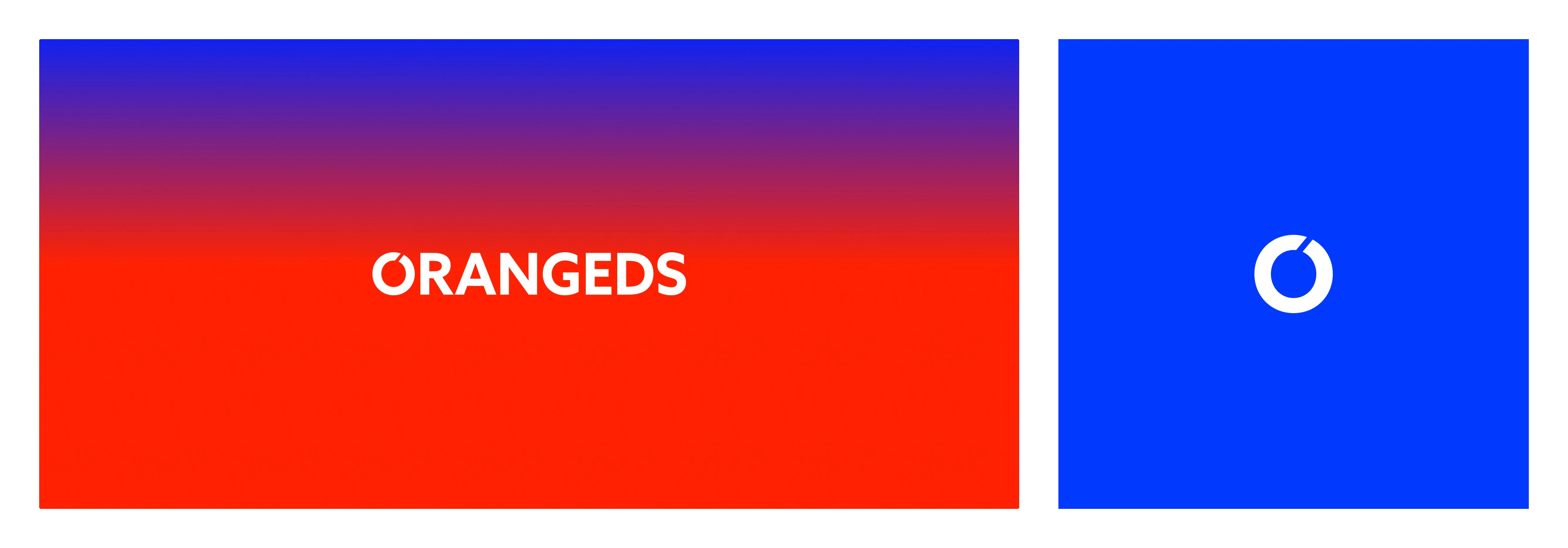
Logo and Logomark on Light and Dark Colors
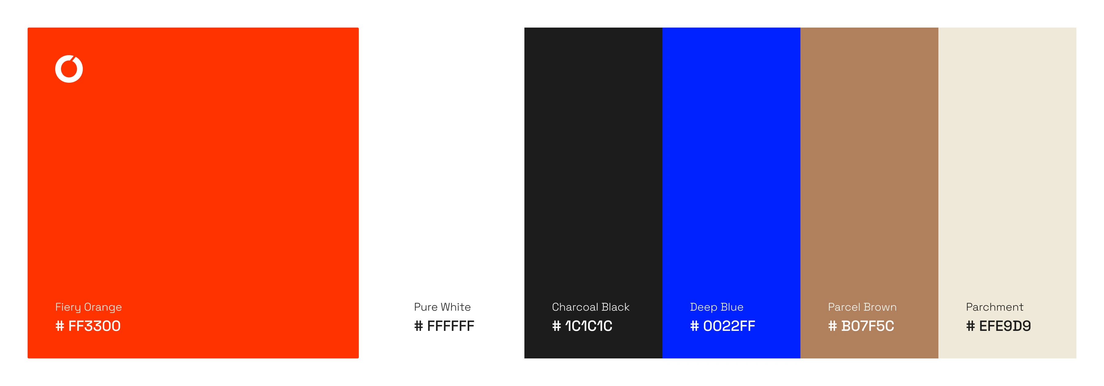
OrangeDS Colors
The OrangeDS color palette combines functionality with brand storytelling. Fiery Orange leads as the signature color—bold, energetic, and built for instant recall. It's balanced by Pure White for clarity and Charcoal Black for structure and contrast. Deep Blue adds a sense of trust and stability, while Parcel Brown grounds the brand in its ecommerce shipping roots. Parchment brings warmth and a tactile, human touch.
OrangeDS Colors
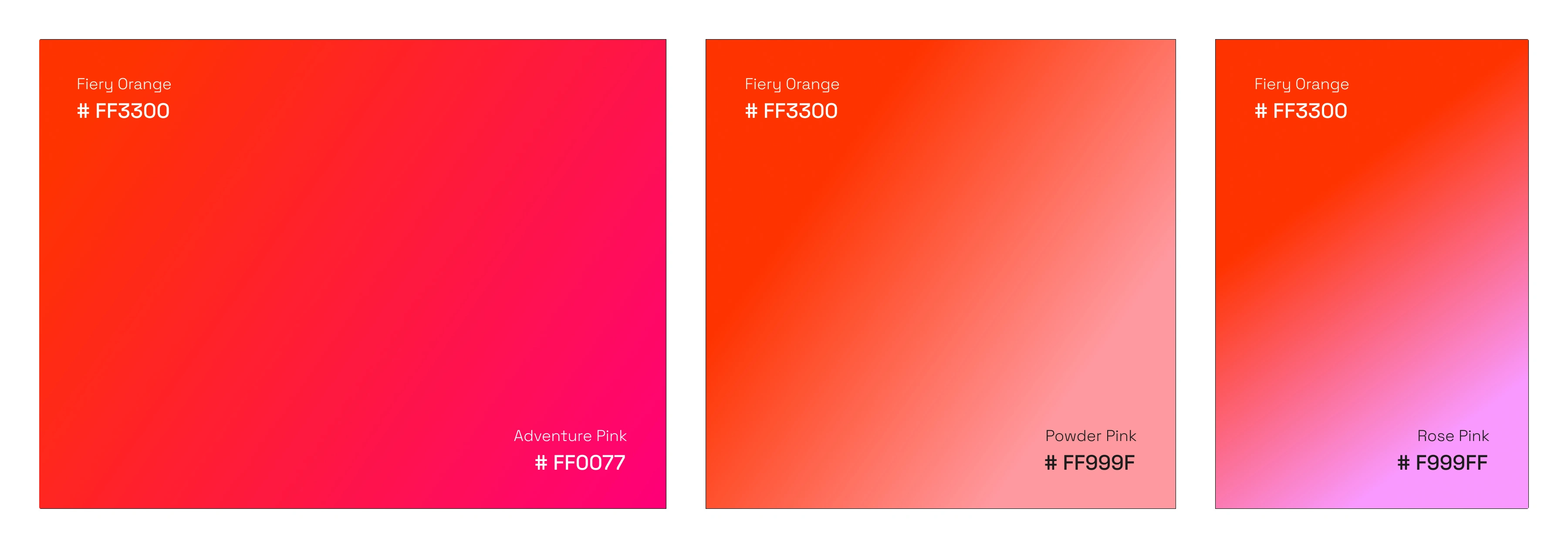
OrangeDS Pinkish Gradients
To complement the bold Fiery Orange, I created a set of pinkish gradients that bring warmth, energy, and emotional depth to the brand. These gradients are built by blending Fiery Orange with three distinct pink tones—Adventure Pink, a vibrant, saturated hue that evokes bold movement; Powder Pink, a soft pastel that adds calmness and approachability; and Rose Pink, a balanced mid-tone that adds warmth and polish. These three pairings form key gradients used across marketing and digital touch-points.
OrangeDS Orange-Pink Gradients
OrangeDS Logo Concept
The OrangeDS logo concept evolved from the brand’s namesake—the color orange and the orange fruit itself. I drew inspiration from the fruit’s organic circular form and signature right-leaning stem, the logo integrates this silhouette as negative space within the letter "O". This subtle detail creates a unique visual anchor while preserving simplicity. The custom “O” is seamlessly integrated into a clean, bold wordmark—striking a balance between friendly and professional, while making the logo instantly recognizable across packaging, digital, and print applications.
OrangeDS Logo Concept

OrangeDS Logo with imagery
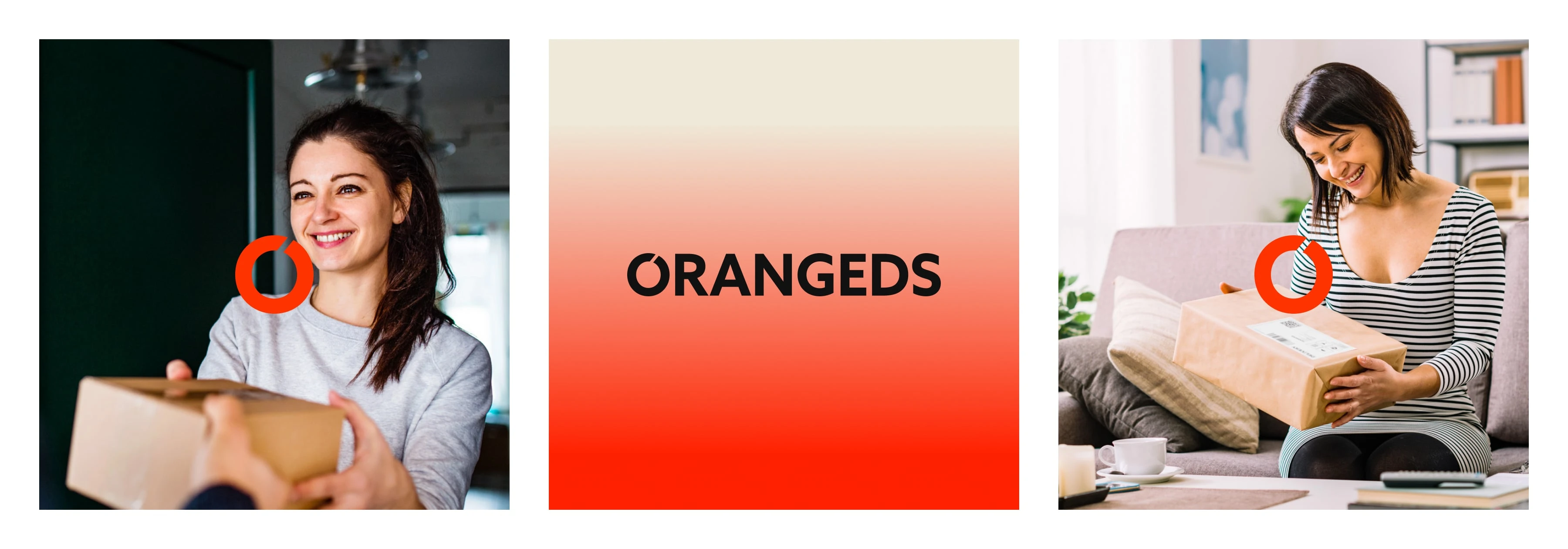
Black OrangeDS Logo on Orange & Parchment gradient with Logo usage images
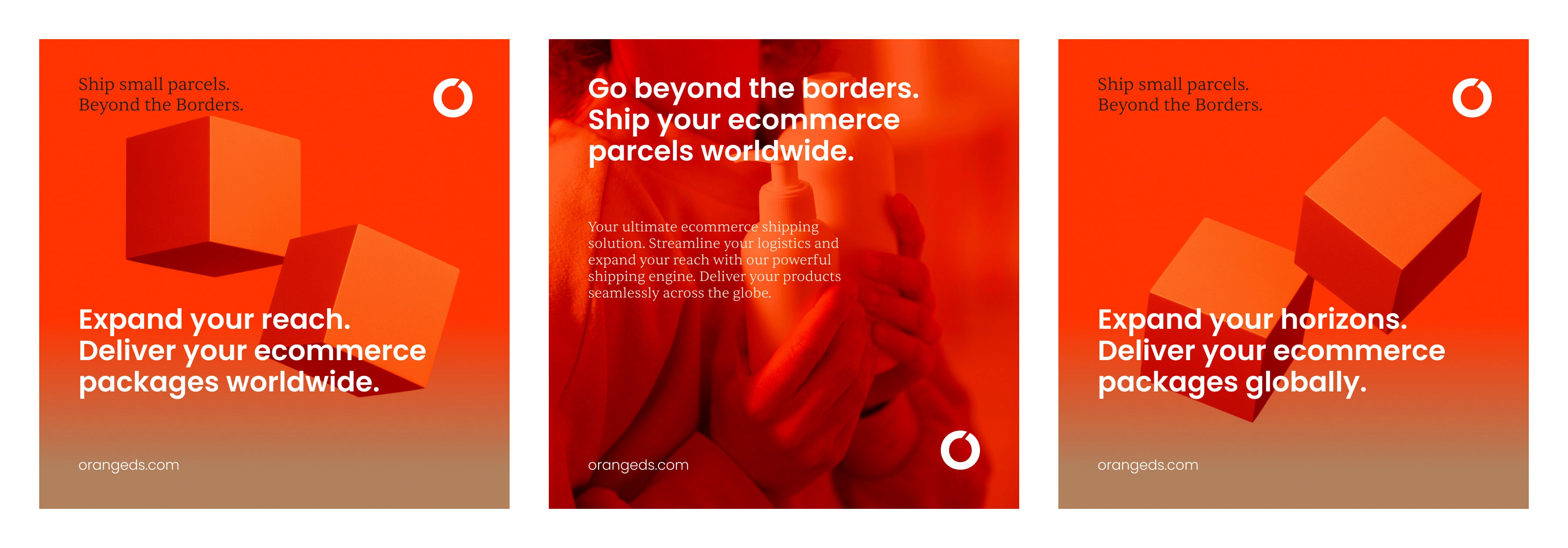
OrangeDS Social Media Collateral
OrangeDS social media collateral was designed to be bold, clean, and instantly impactful. Focus of the key campaigns are “Crossborder Shipping,” and “Small Parcel Shipping”. The campaign featured strong, minimal typography paired with striking visuals—ranging from floating parcel boxes, delivery trucks to planes in motion, and customers unboxing with delight. The campaign also showcased shippable items like skincare, snacks, fashion accessories, tech gadgets, and supplements—reinforcing OrangeDS’s small parcel shipping capabilities for ecommerce brands.

OrangeDS Social Media Ads Design

OrangeDS Social Media Ads Design
OrangeDS Social Media Ads Design

Social Media Design

Social Media Ship Your Product Campaign Design
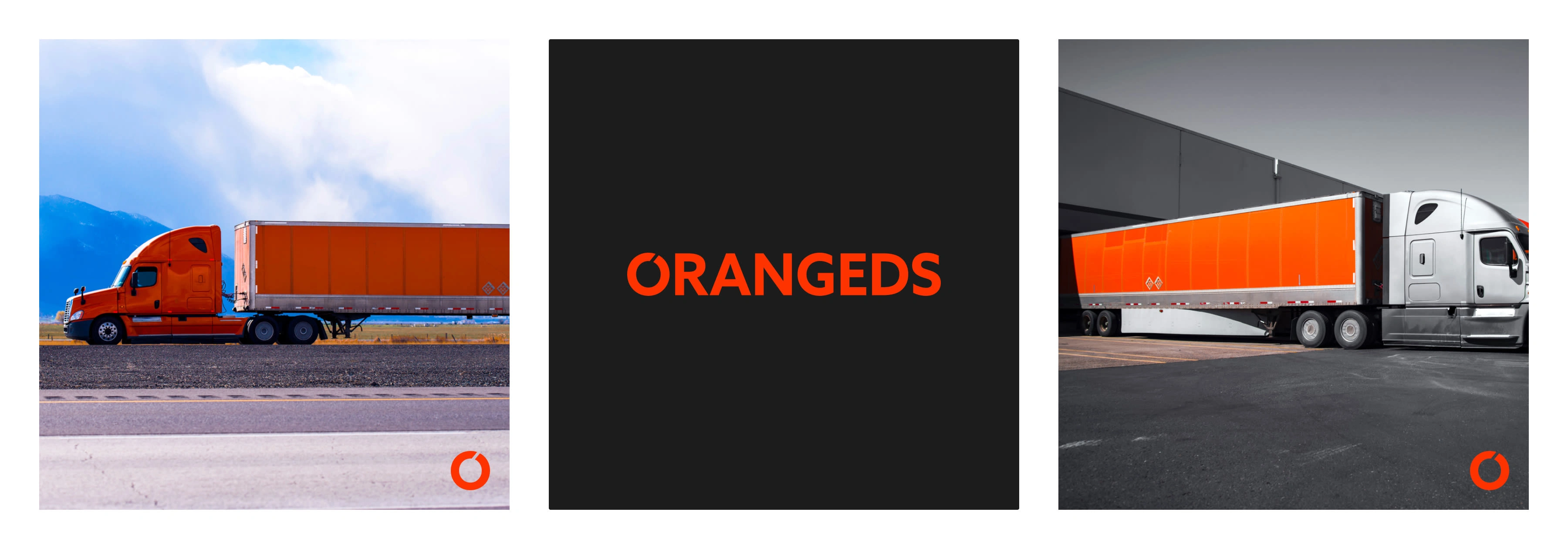
OrangeDS Logo on Black and with Box Trucks
OrangeDS Logo on Gradient and Deep Blue
Like this project
Posted Jun 30, 2025
Led the renaming and brand design of OrangeDS—transforming a complex identity into a clear, memorable brand that supported growth in global ecommerce shipping.
Likes
0
Views
3
Clients
Orange Distribution Solutions