Eloka Logistics - Brand Identity

Ayomide Ogunlade


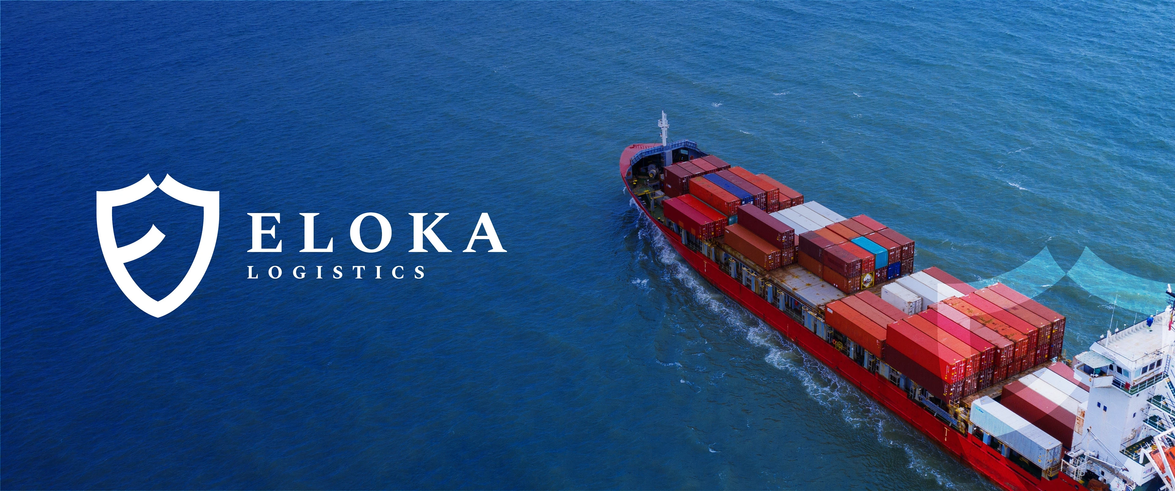
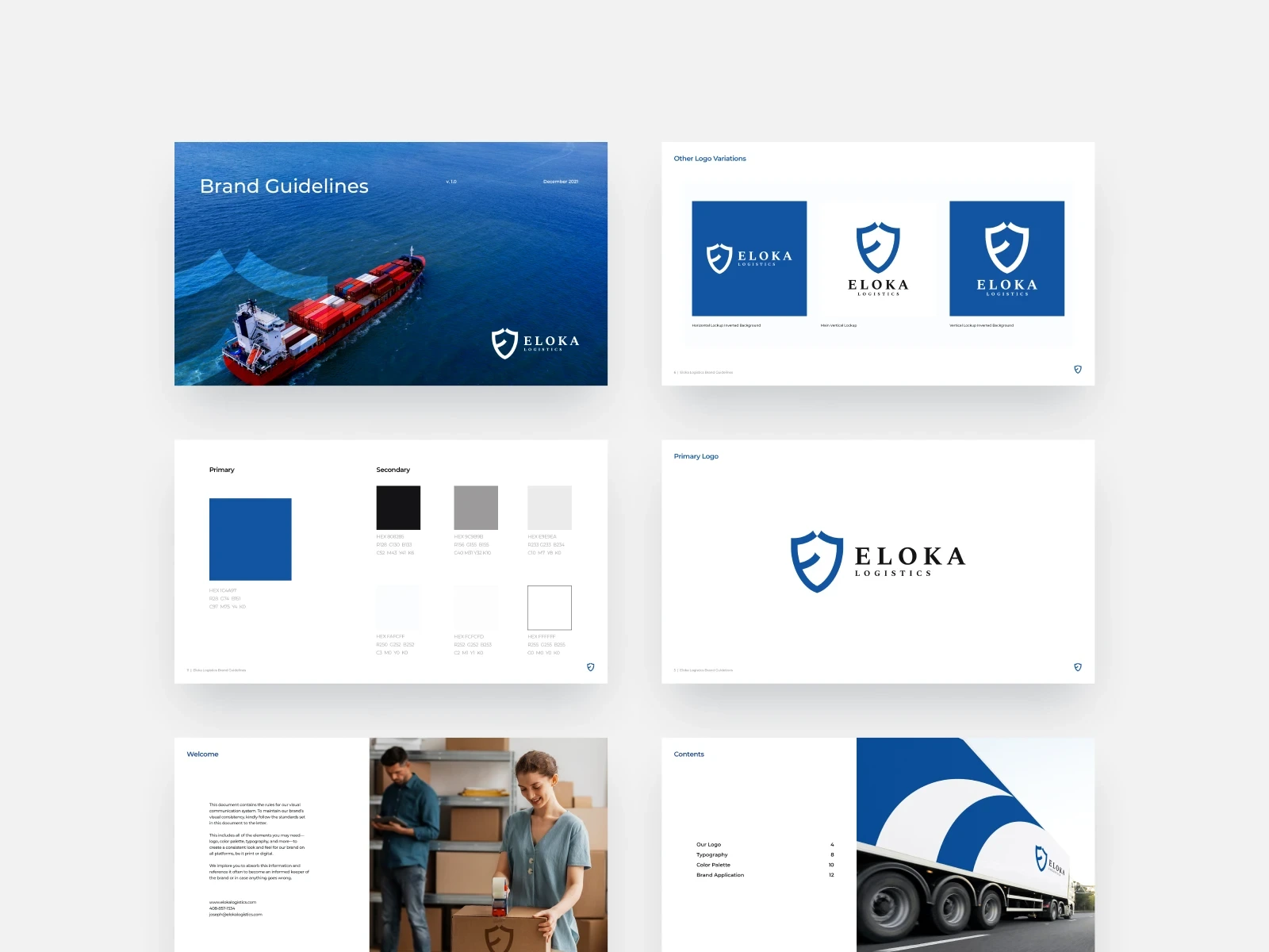
Eloka Logo
Background
Eloka Logistics is a brand that aims to provide jobs and employment opportunities for the community, while serving as a delivery provider for its partners. It's also more of a family business than a logistics company.
They reached out because they saw the need for an upgrade and a brand identity system that better reflects the essence of their brand. Apart from that, they wanted something that could stand the test of time and attract talent.
My Approach
To design the identity system, we leveraged the brand's core values: safety, dependability, and Great Workplace. This influenced the construction of the mark as well as the colour and typography choice.
Crafting Eloka's Logo
Even in the midst of the brand's familial nature reflected both within and without, the logomark demonstrates the brand's values of trust, dependability and safety in keeping its promises till the very end.
In terms of its structure, you can see how the mark forms a shield (a symbol of security and trust), adopting the first two letters of the brand name.
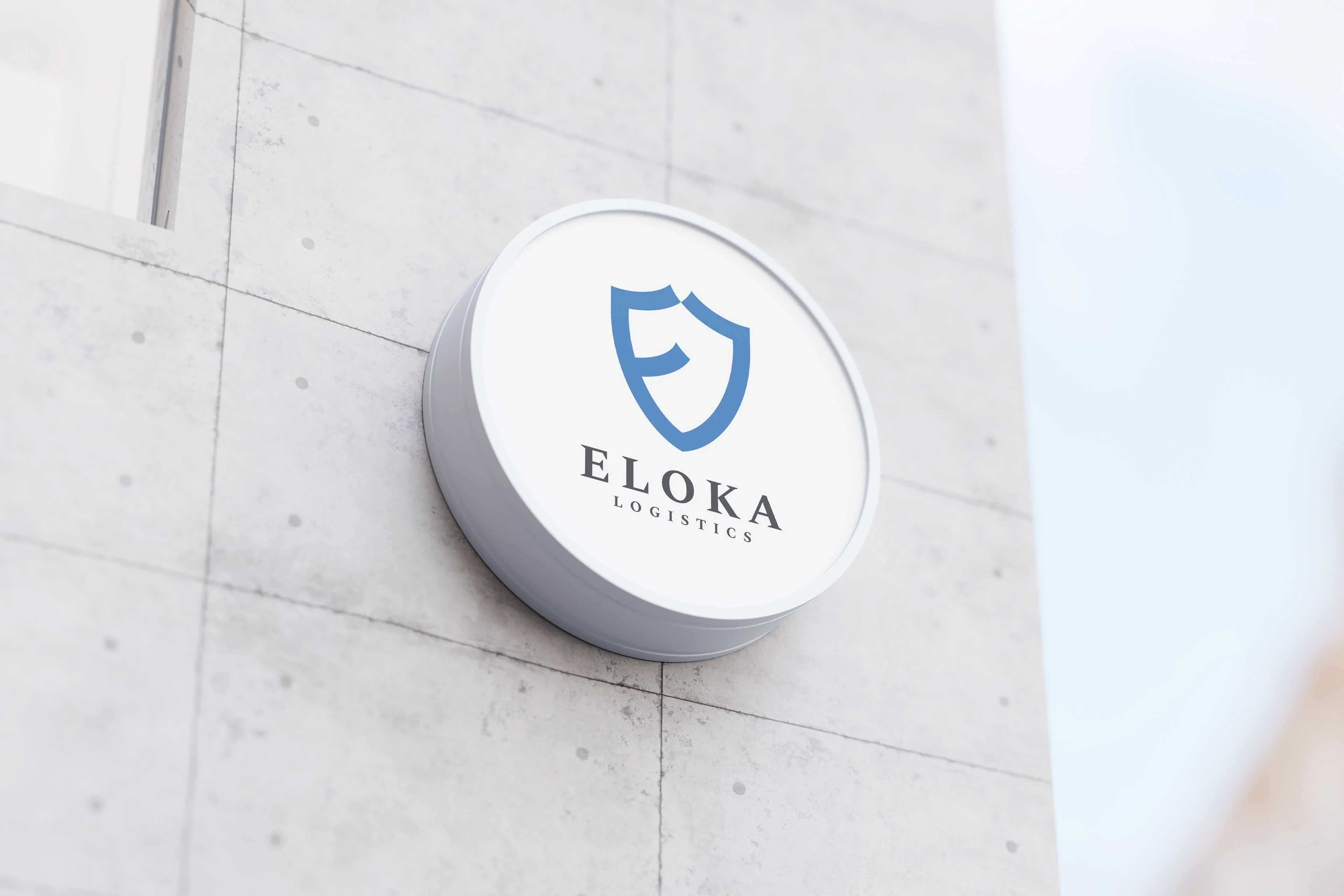
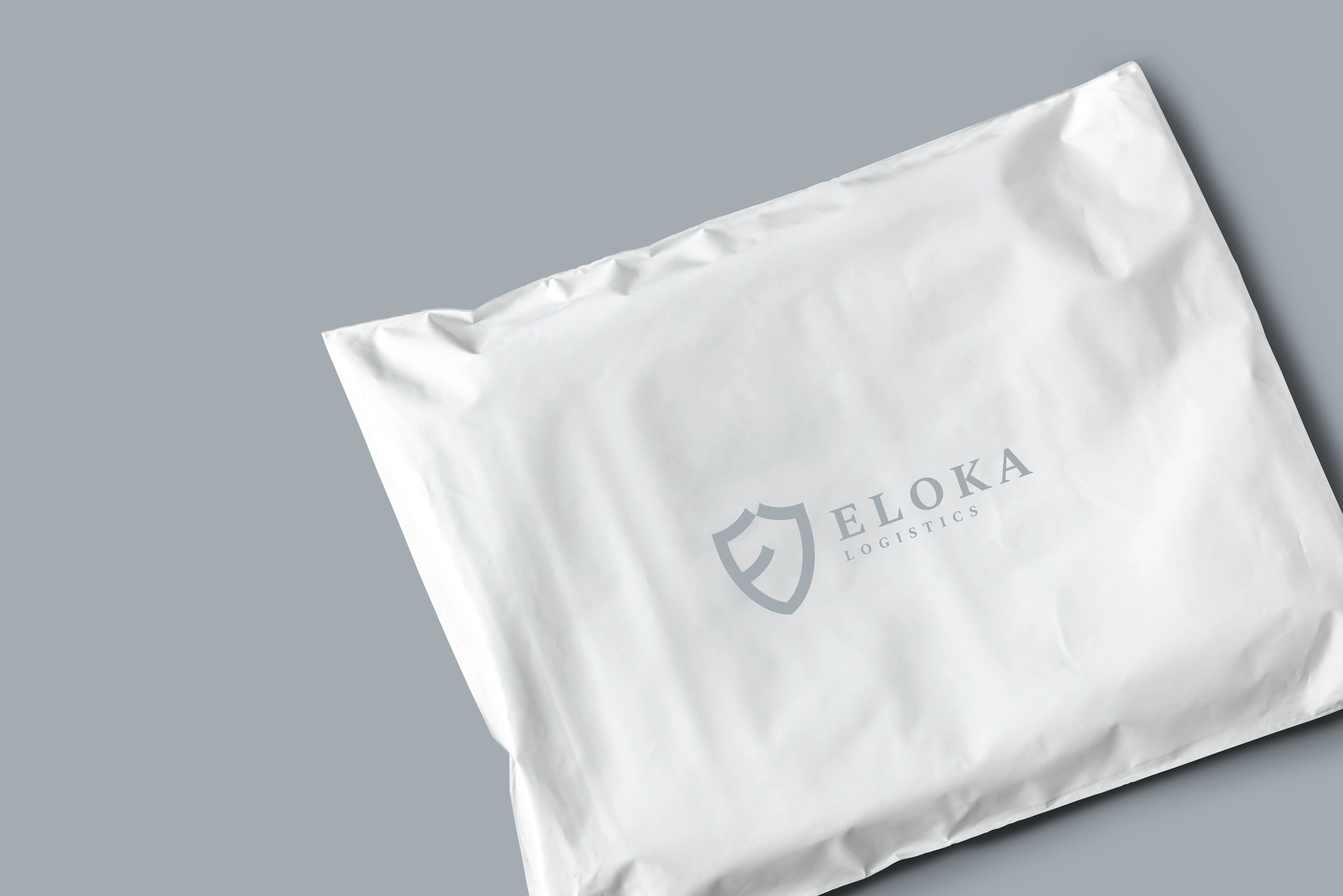
On Different Backgrounds
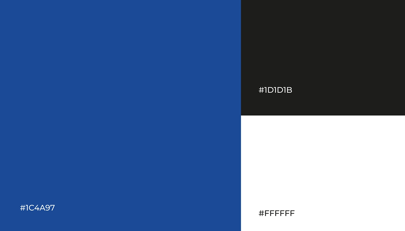
Brand Colours
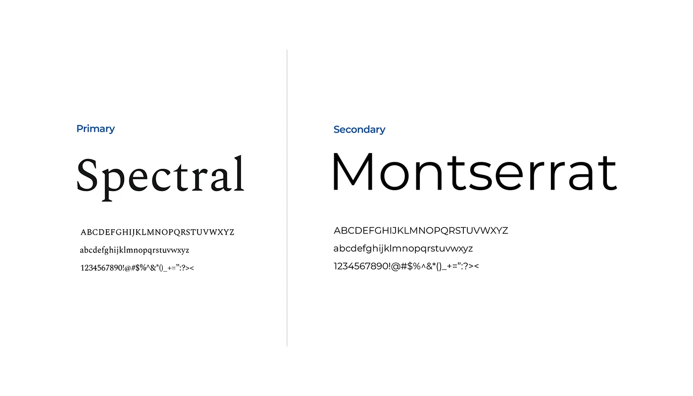
Brand Fonts
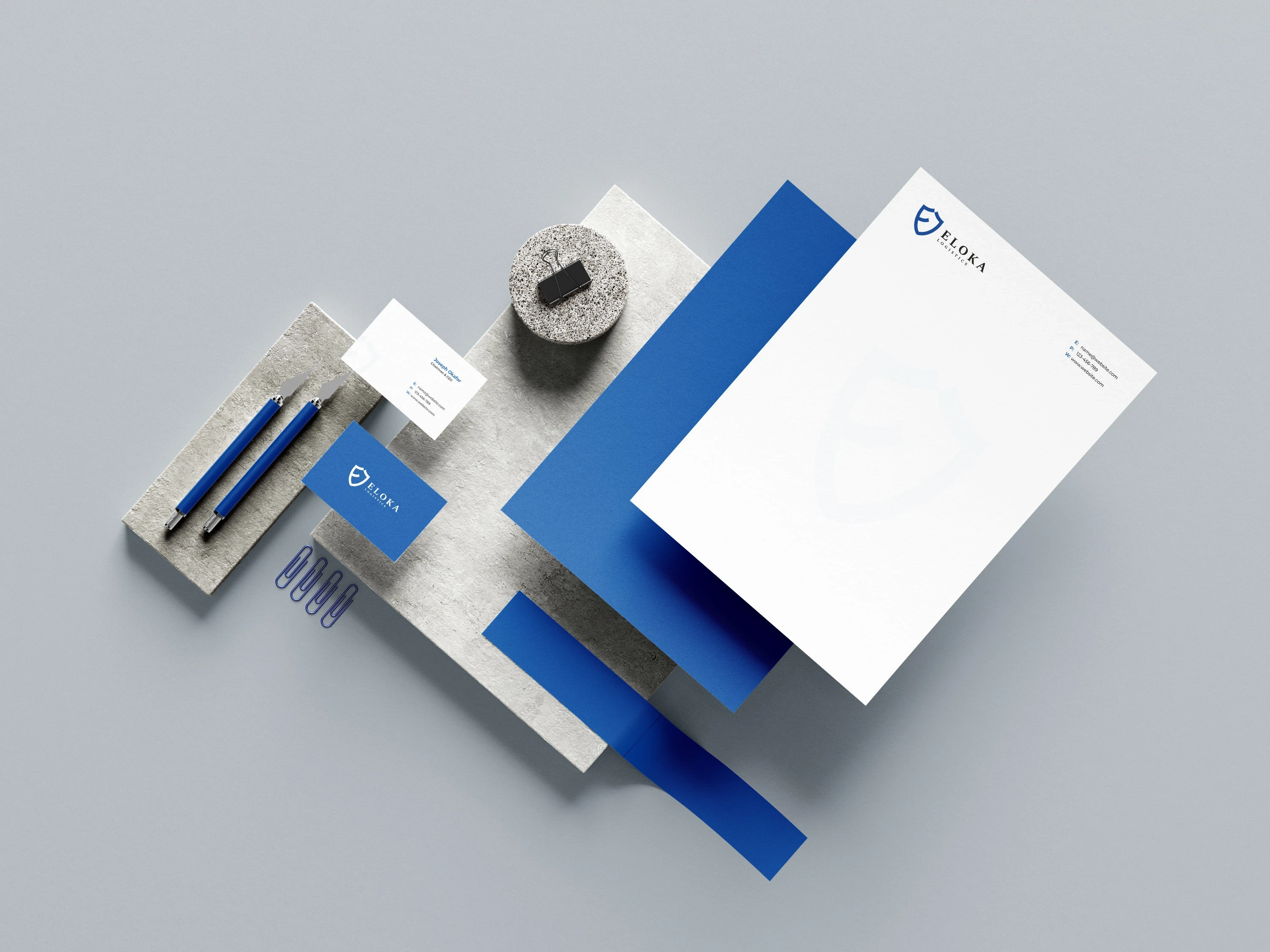
Branding
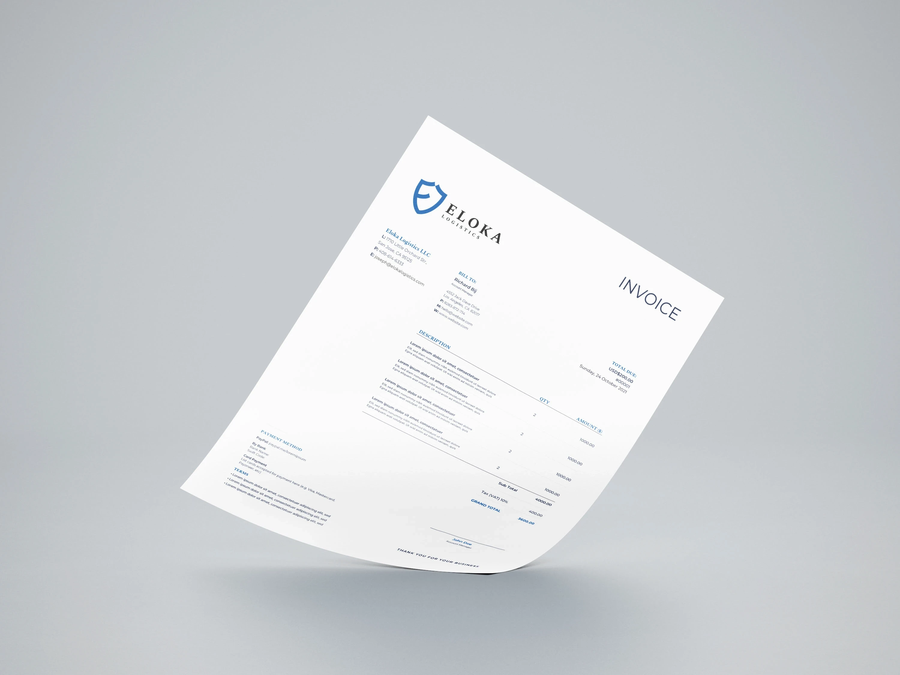
Eloka Invoice
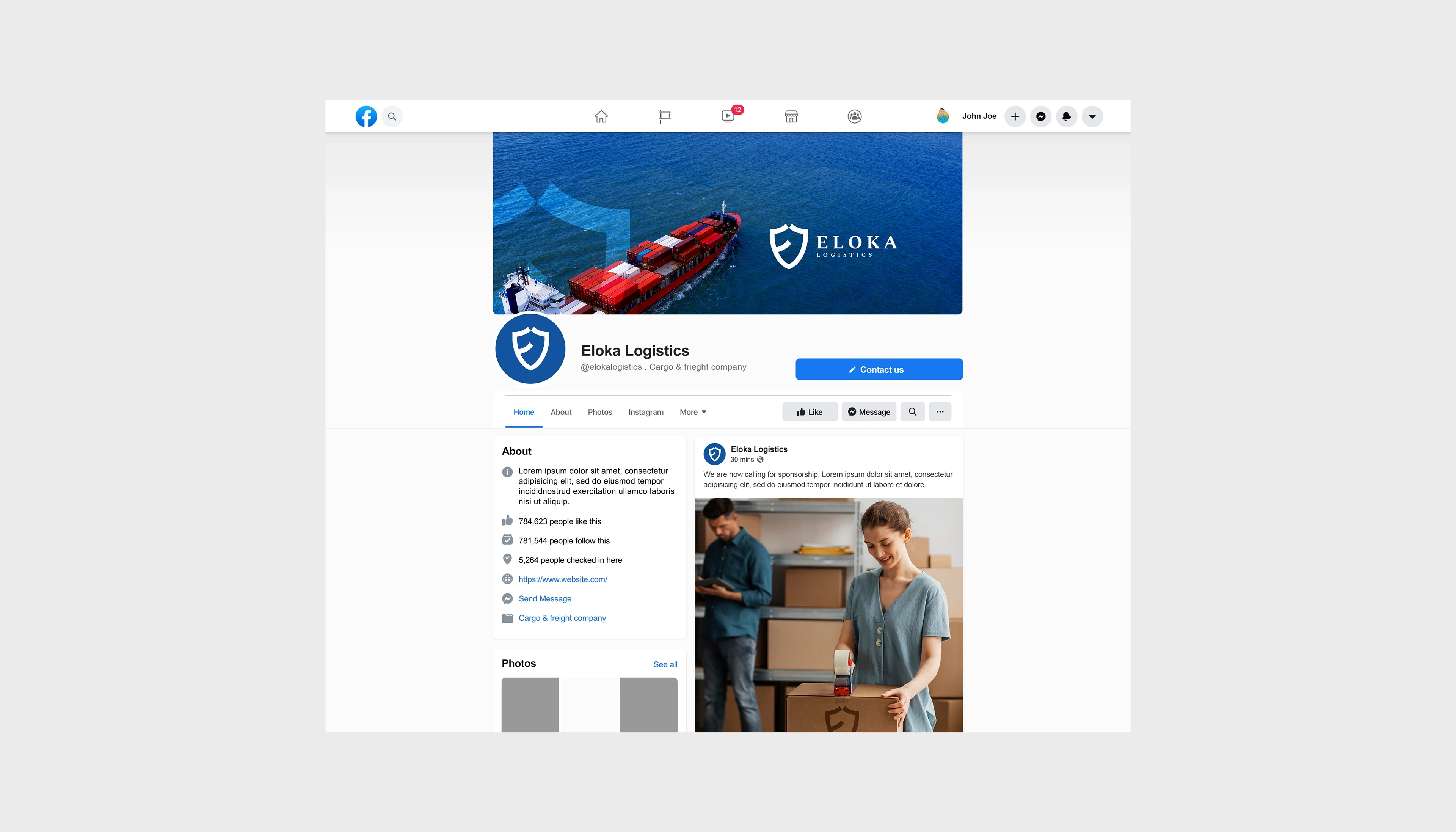
Facebok Branding
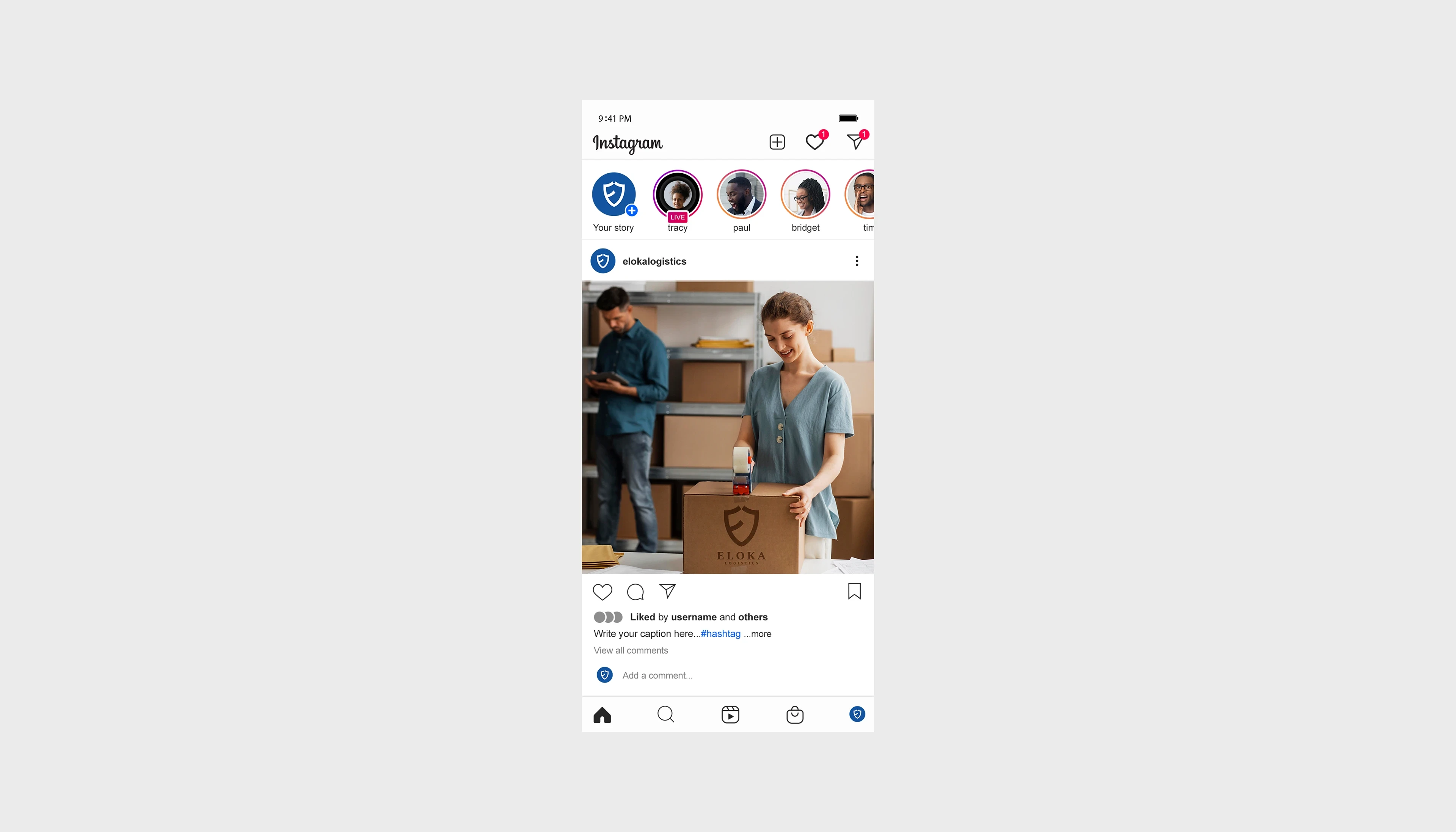
Instagram Branding
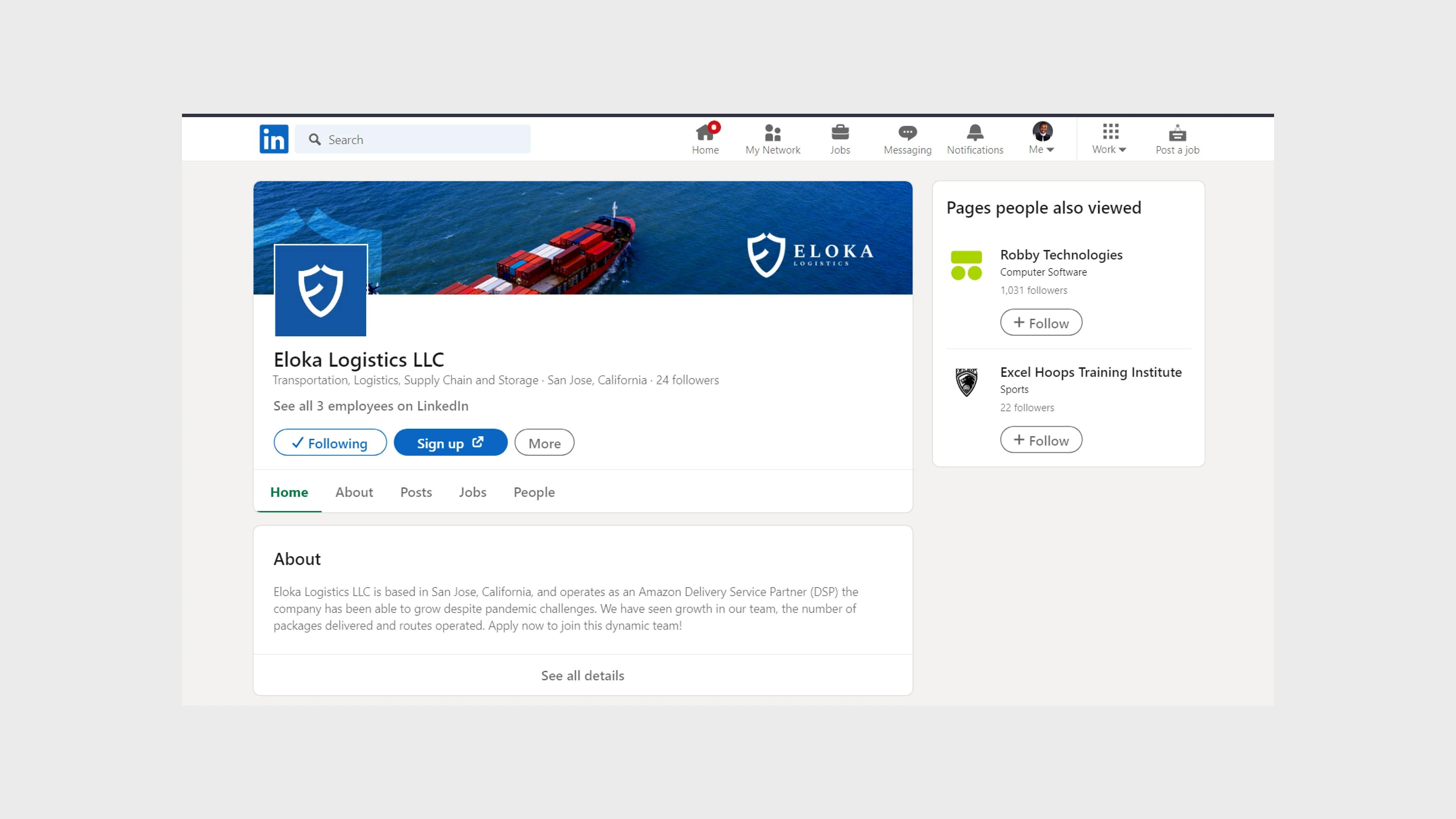
LinkedIn Branding
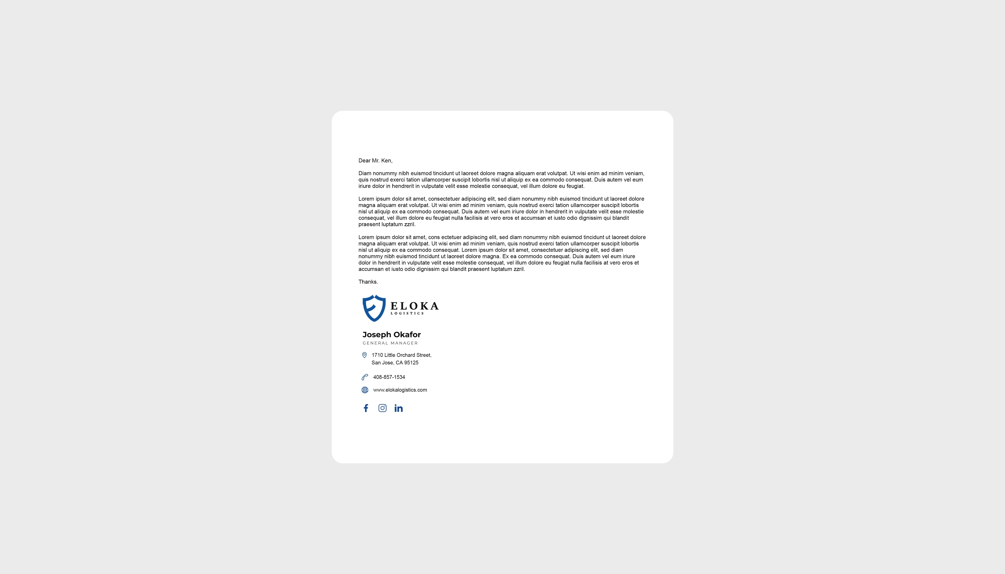
Open Letter Branding
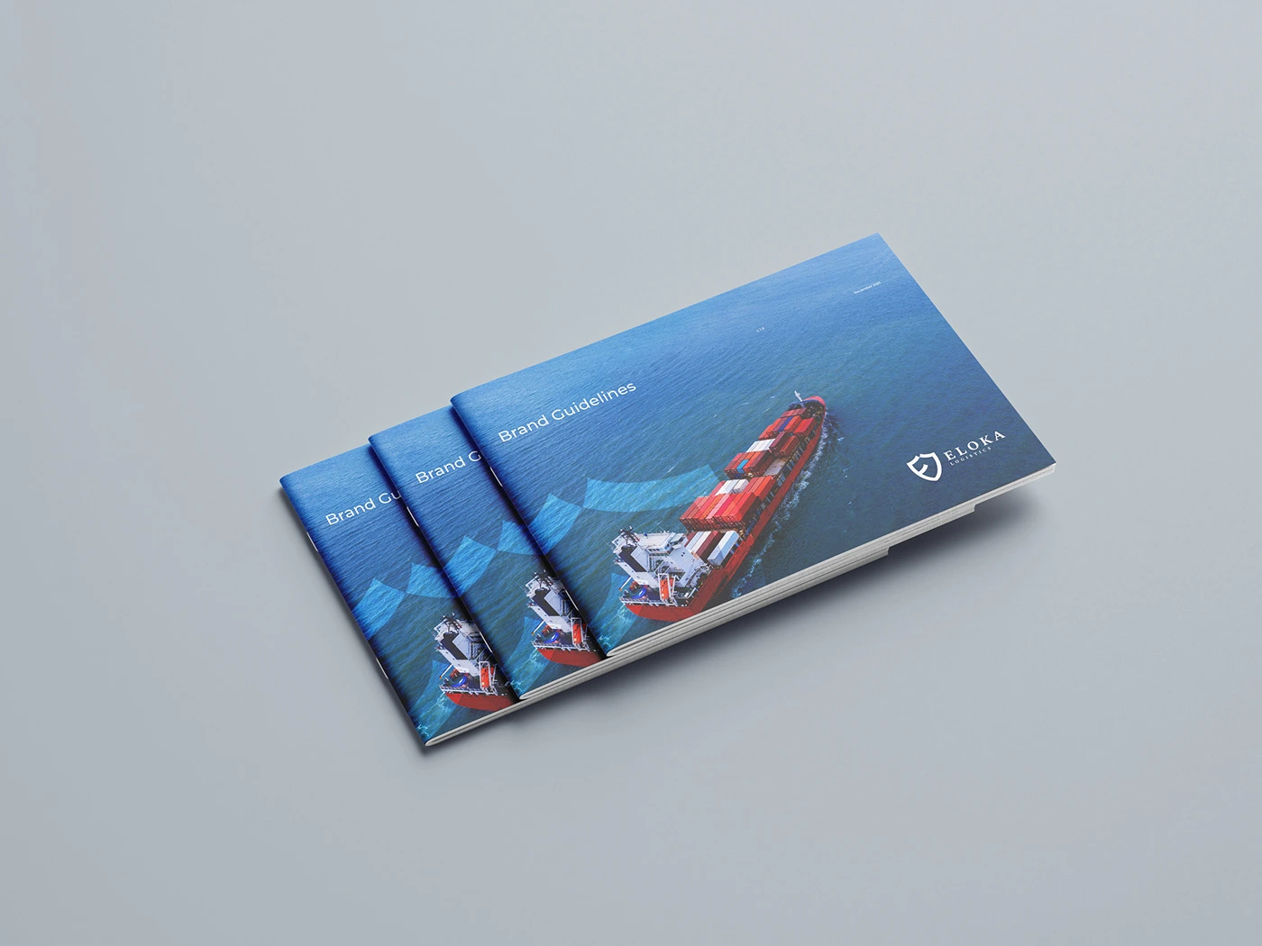
Brand Guidelines (Front Cover)
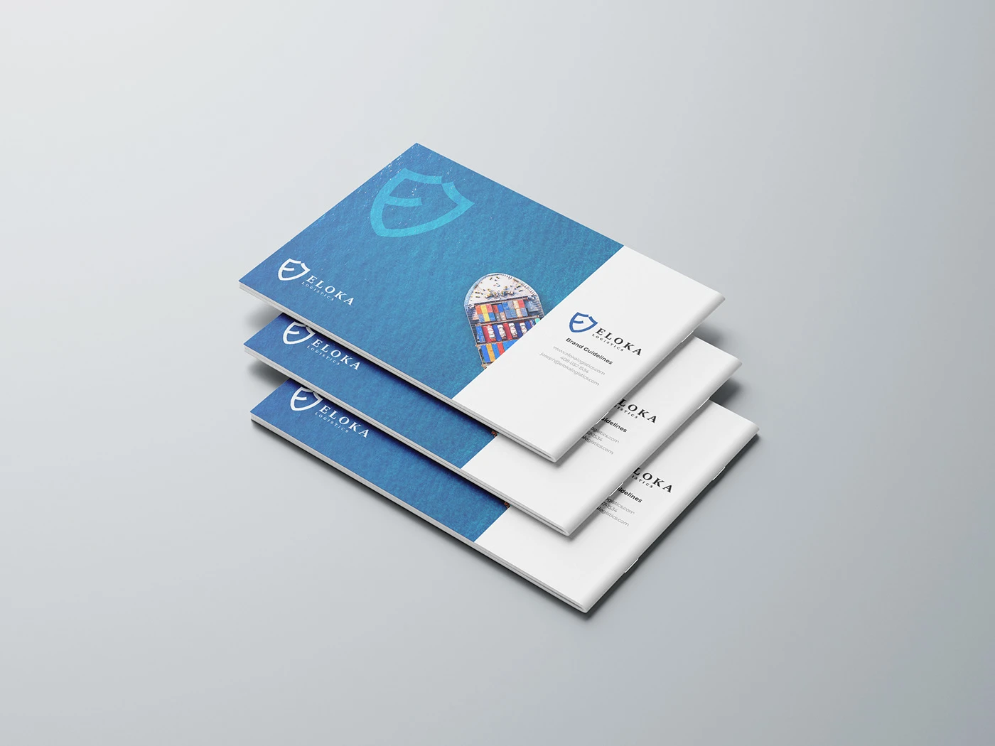
Brand Guidelines (Back Cover)

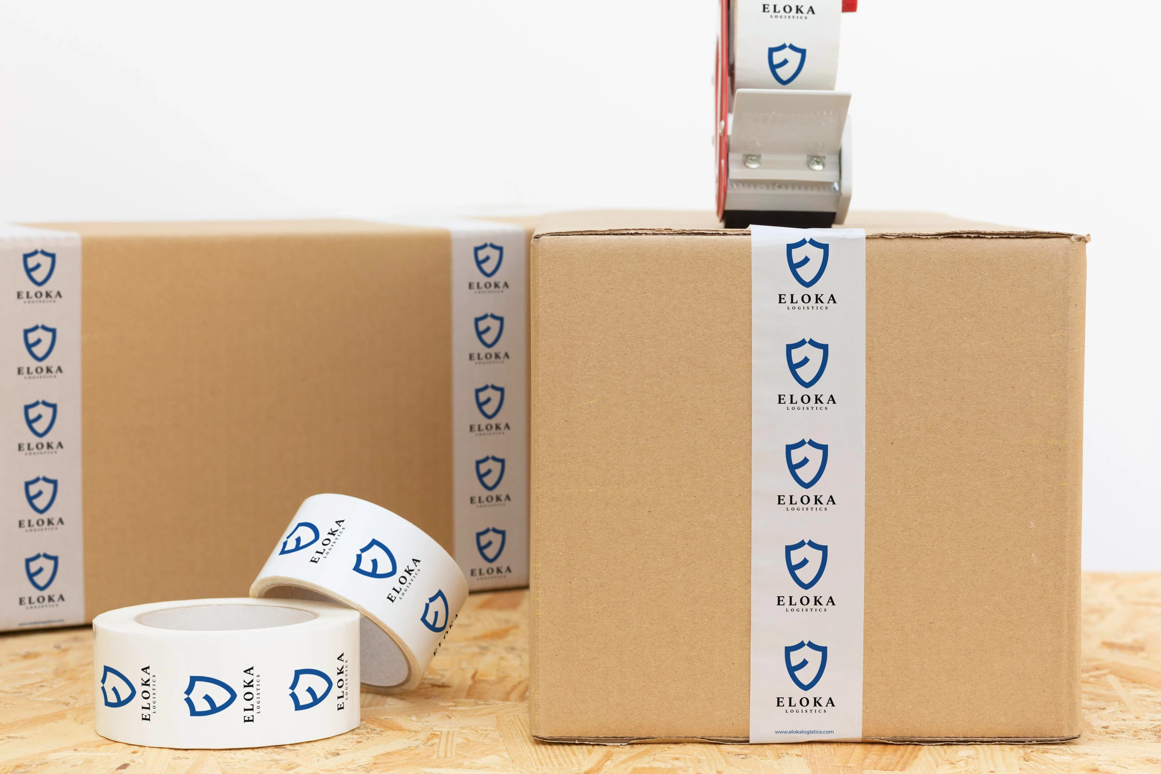
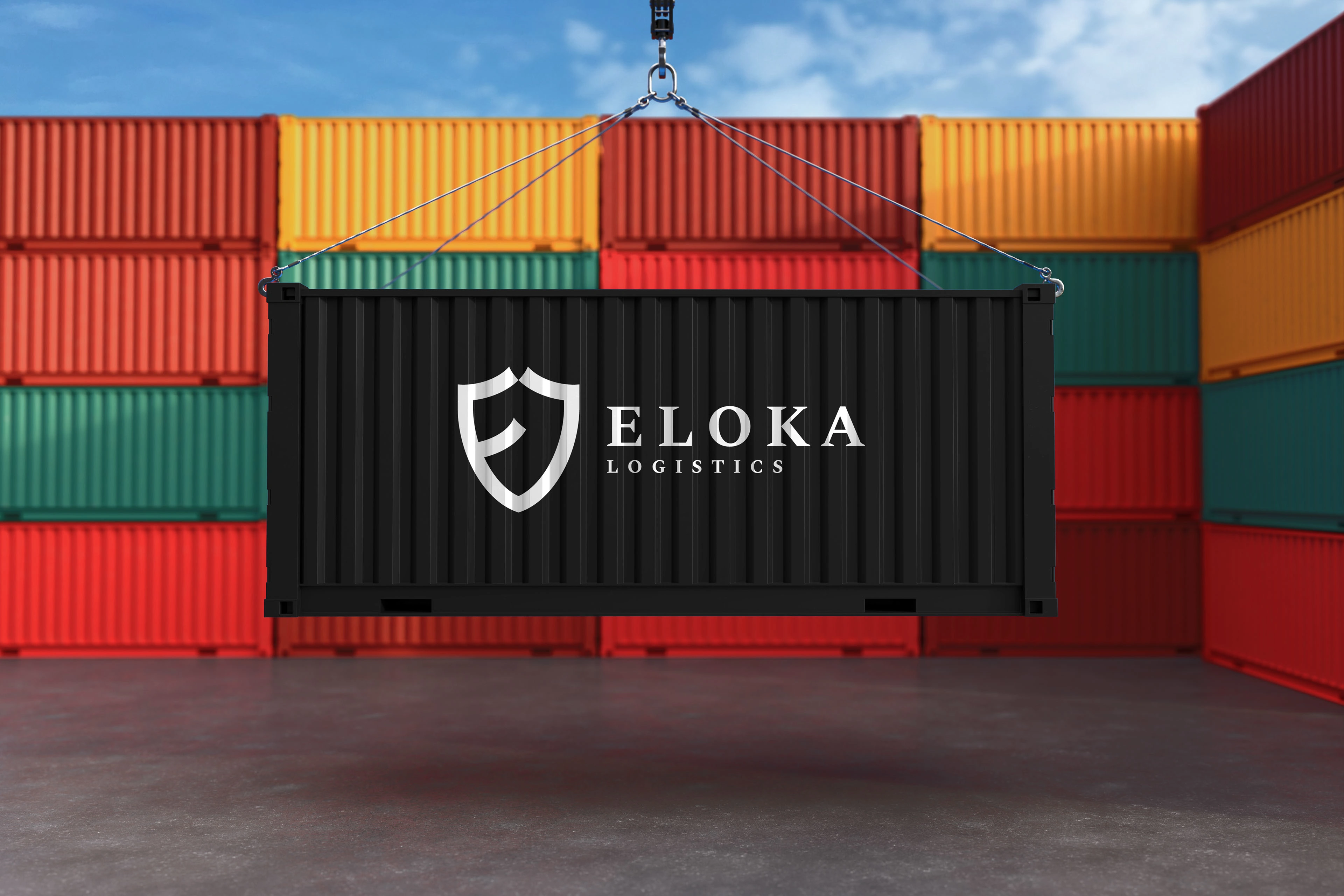
Package Branding
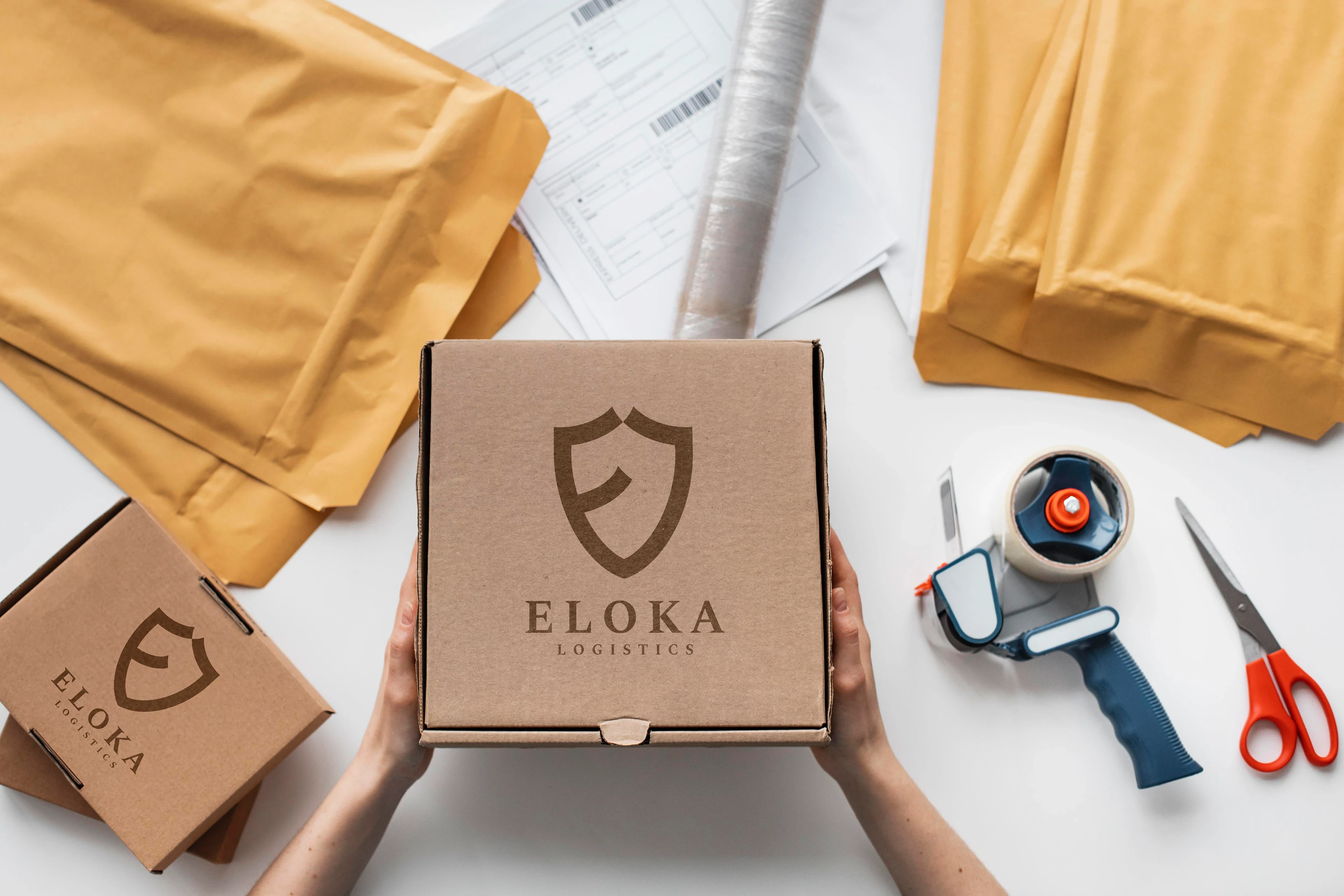
Top Package Branding
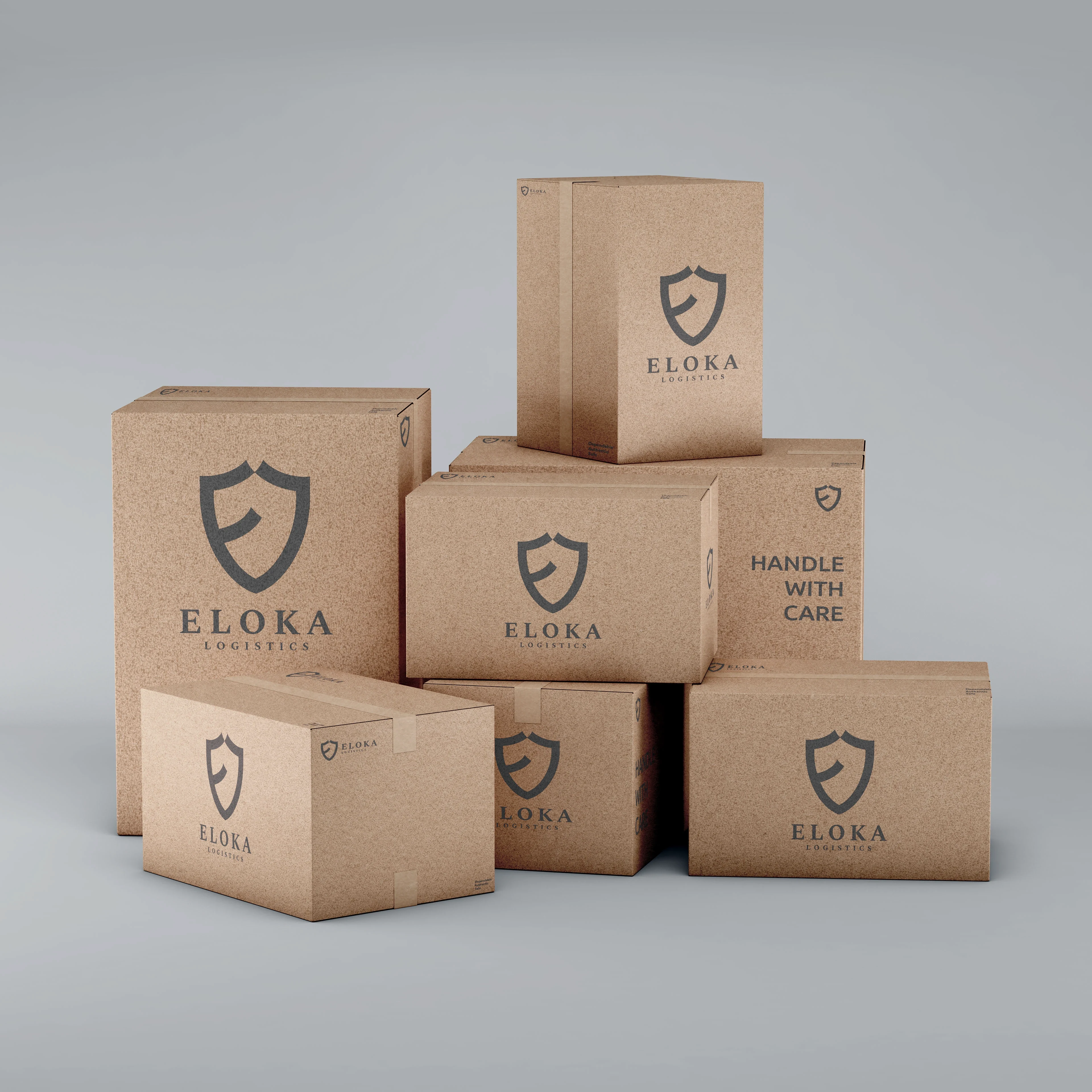
More Package Branding
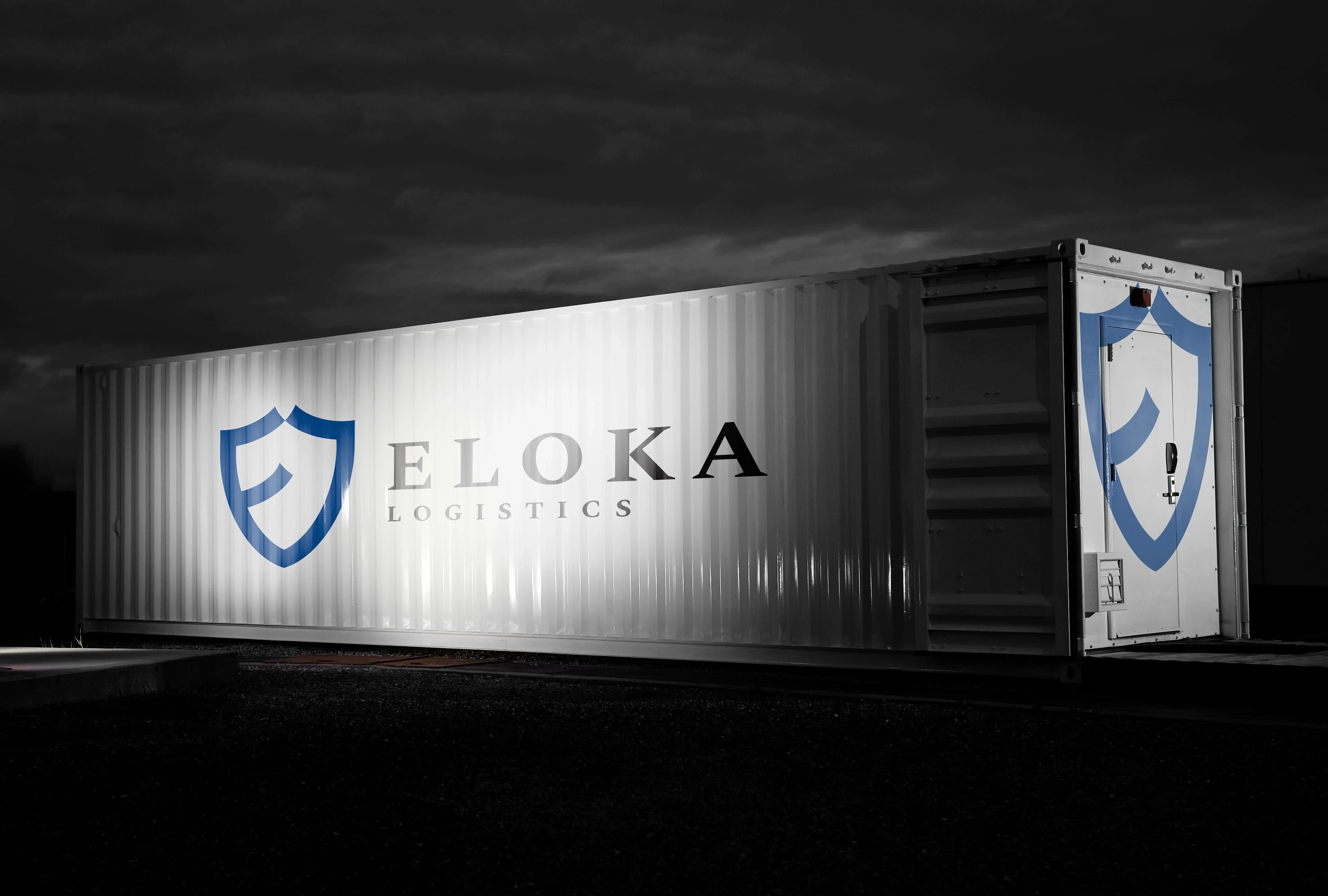
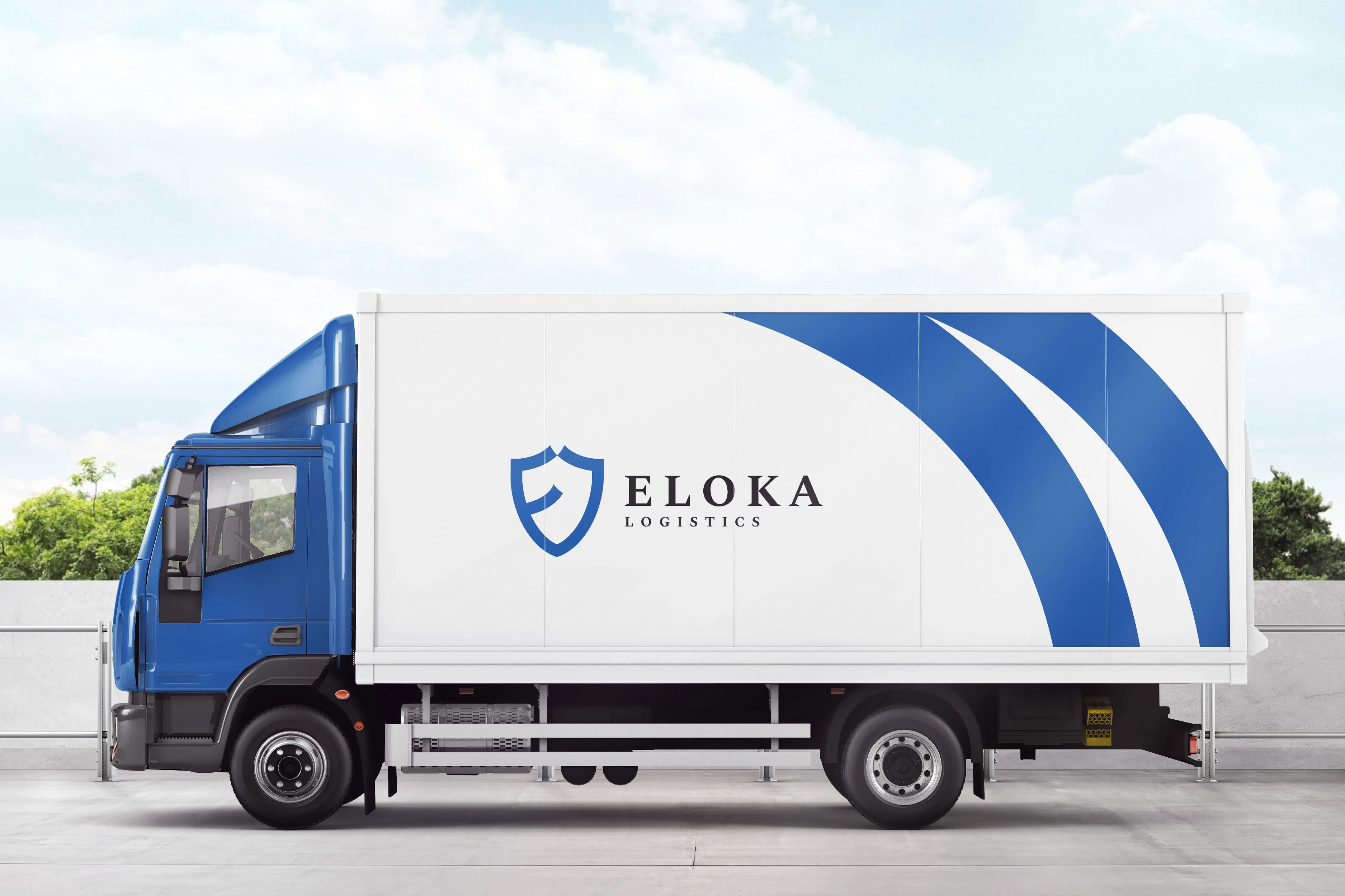
Truck Branding
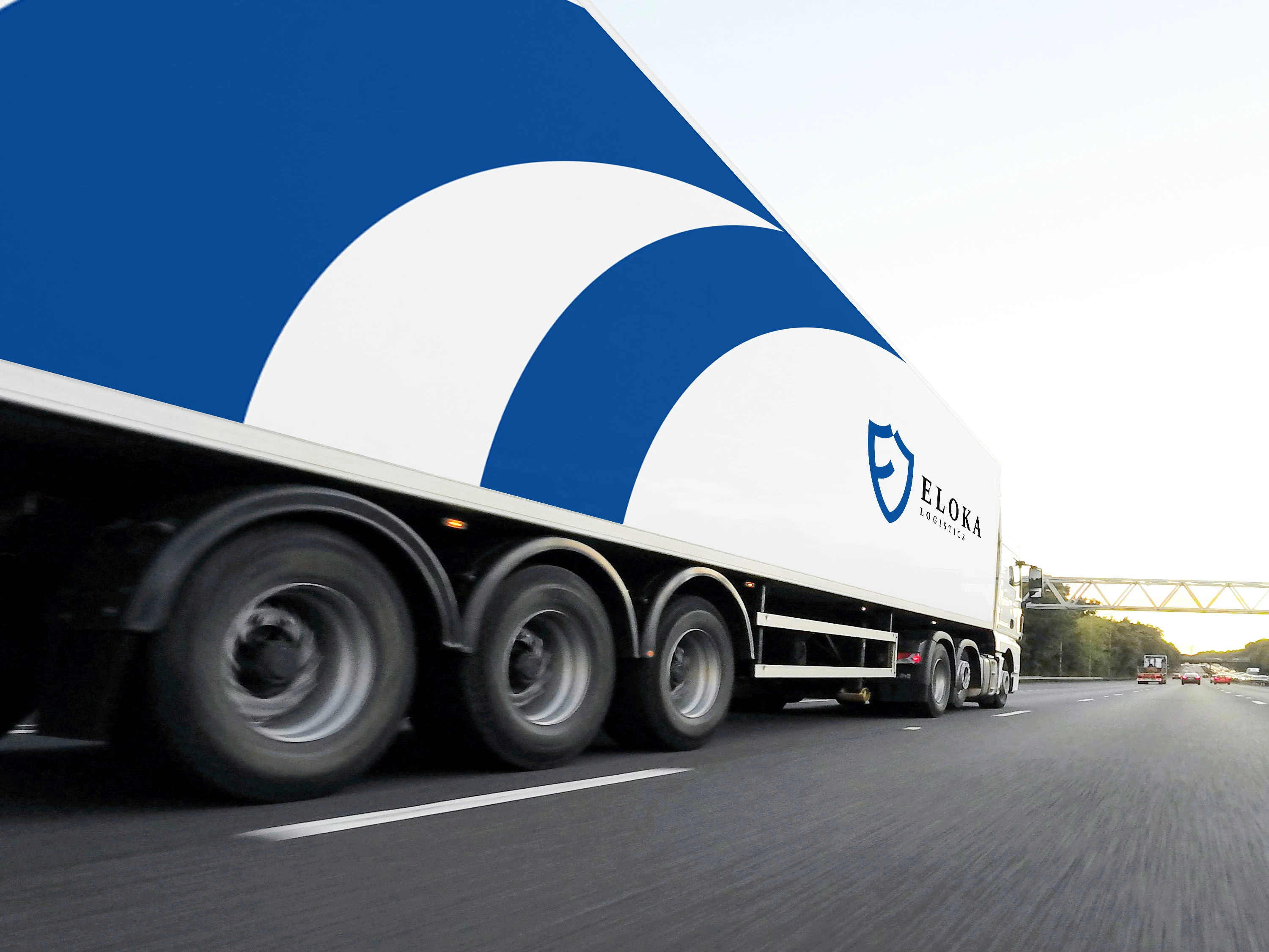
Long Vehicle Branding
Like this project
Posted Nov 5, 2025
We designed a lasting brand identity that reflects the brand's values of trust, dependability and safety. We worked extensively with the Eloka team.