Built with Webflow
Anchoa Magazine branding, design and Webflow
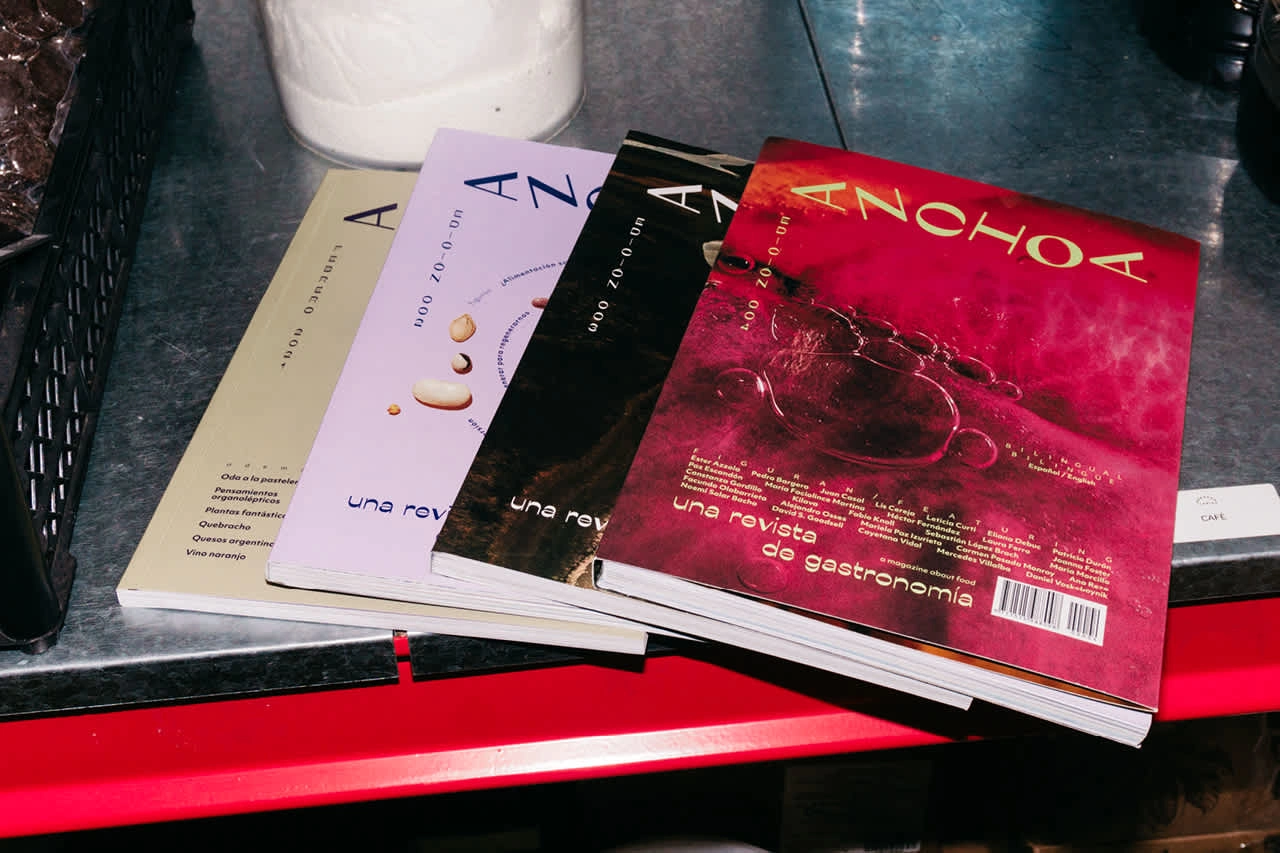
Anchoa
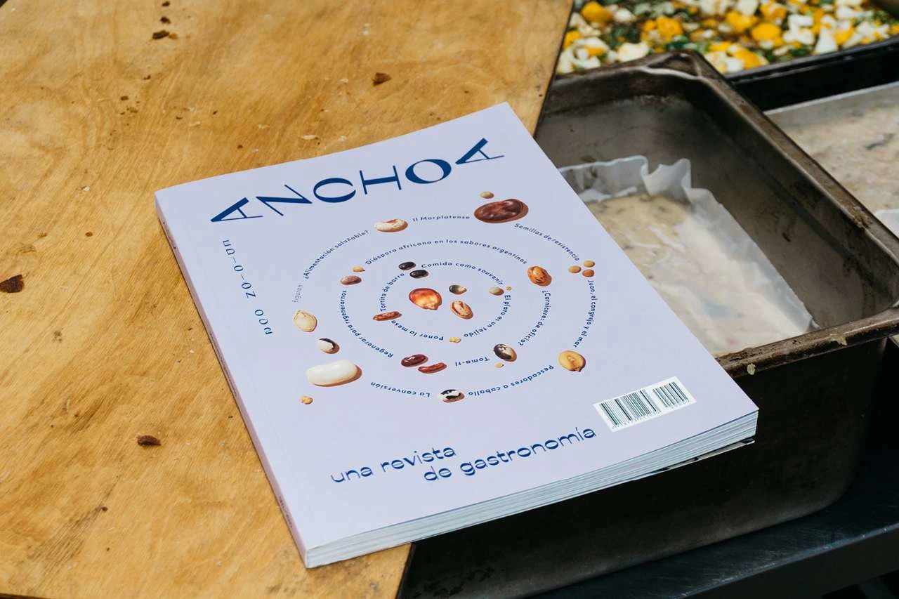
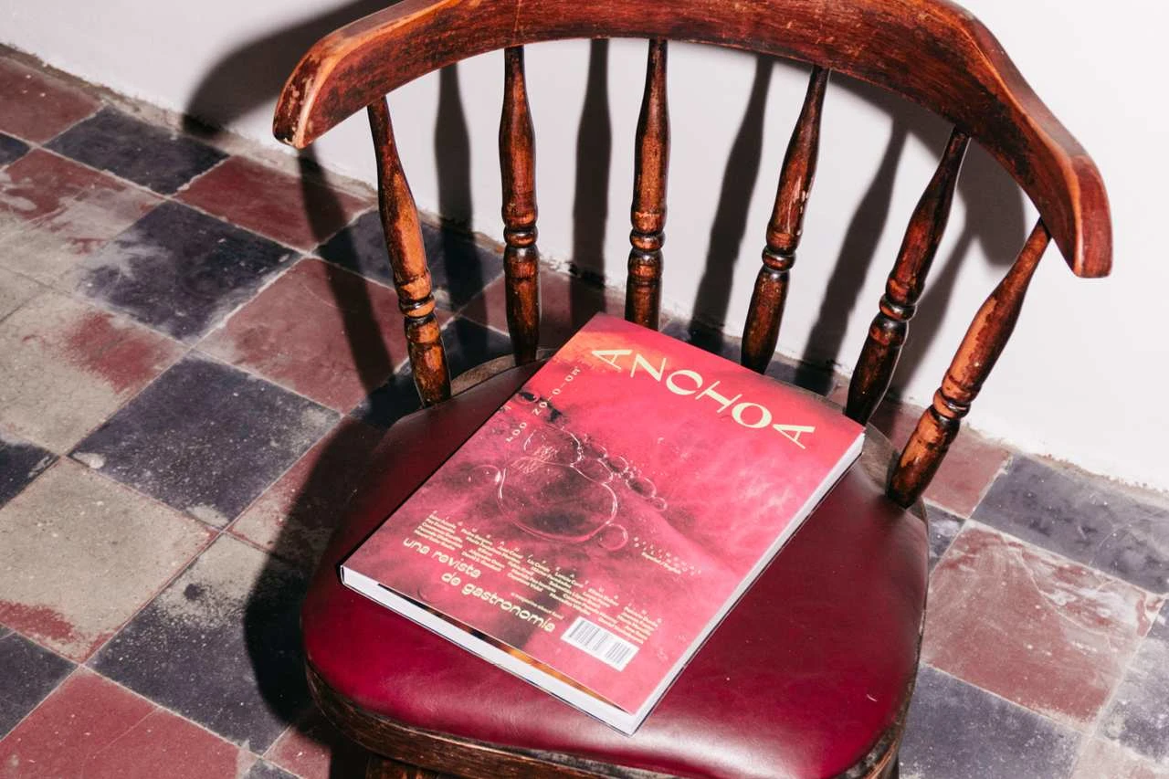
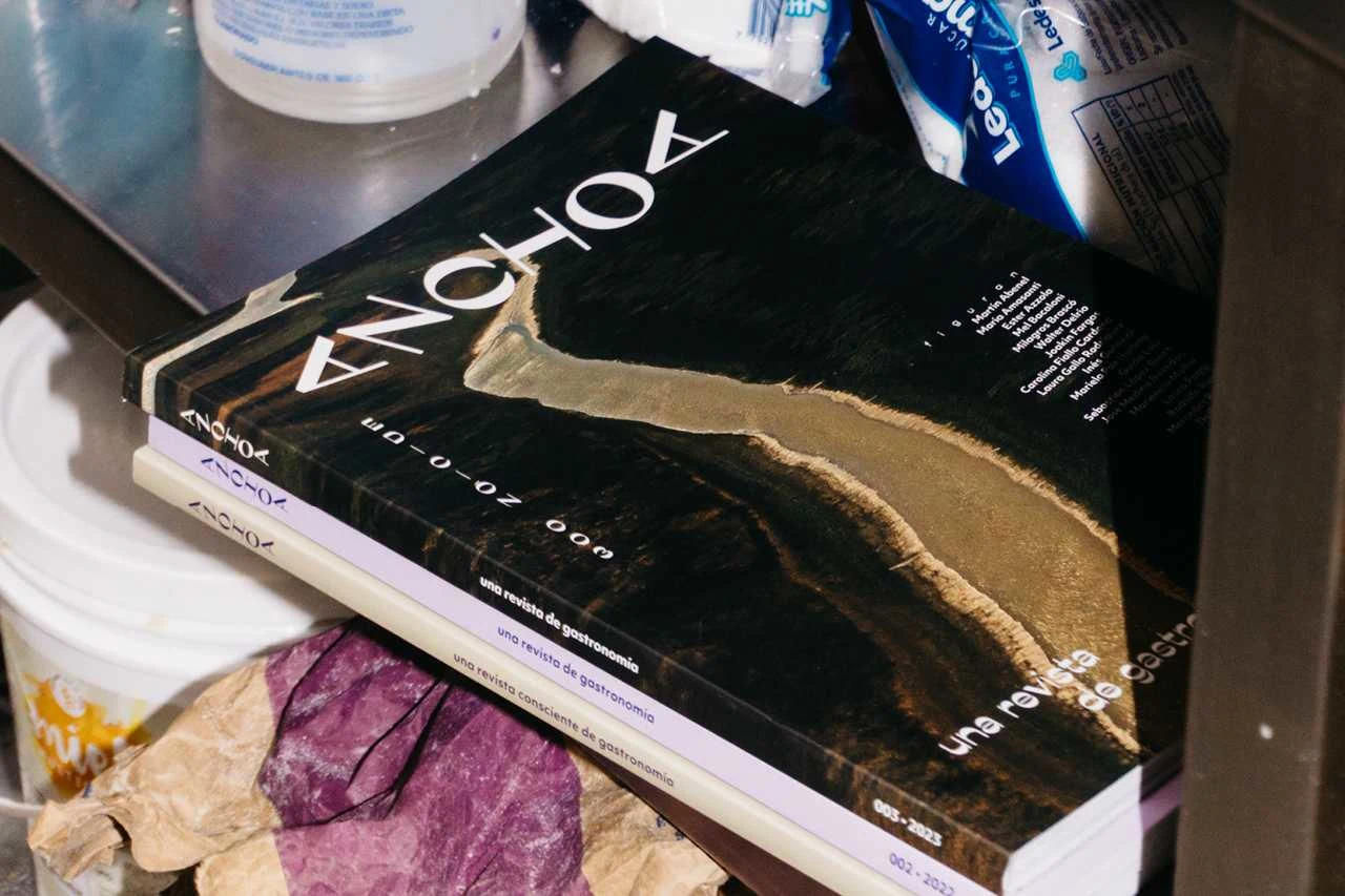
Anchoa started first as an annual print magazine, of which there have been four issues so far, and now includes a digital platform for exclusive members’ content as well as a podcast. Anchoa explores gastronomy through ecology, food production systems, history and culture.
Logo
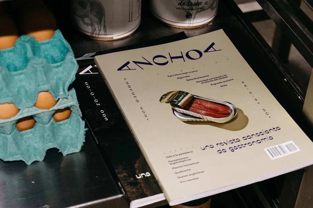
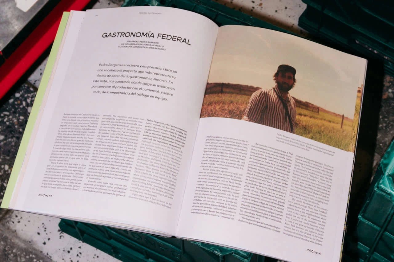
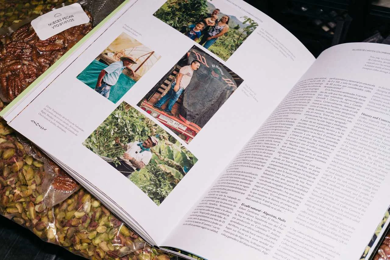
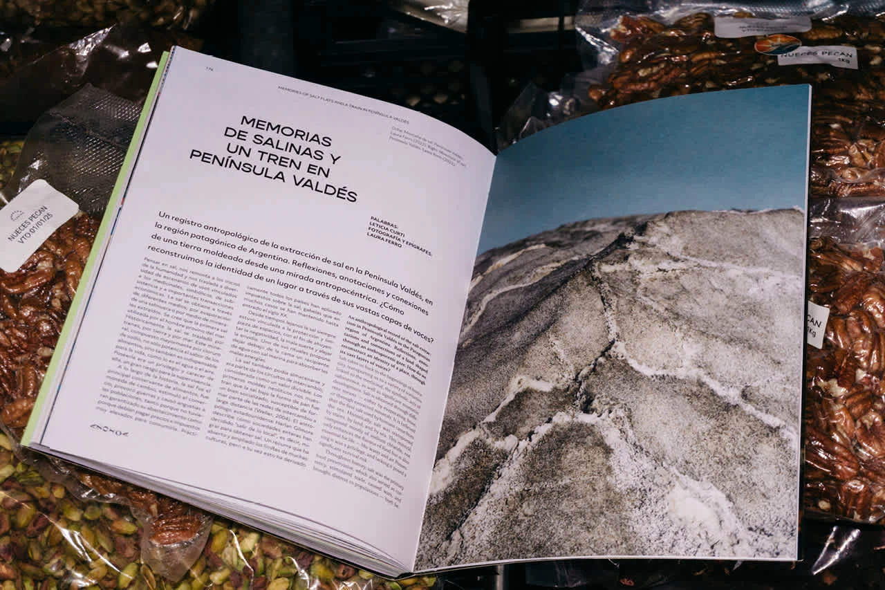
Magazine design
Website in Webflow with paid content gated with user accounts
This was first published as an article on Fonts In Use which you can read on the website here.
The mainstays of the project are Ribes Black and Objektiv. Issue one used Acme Gothic, but that was dropped for issue two in favour of more Objektiv. Since launching the podcast and membership platform Gopher was added to support and complement Ribes. The variety of weights available with Gopher makes it more flexible across the brand. The logo uses Ribes Black, which is from Collletttivo and designed by Luigi Gorlero.
The idea with Anchoa was to have something that looks familiar in the market of independent magazines but not too samey, not too trendy. We wanted the magazine to stand out in the international market, where there are a hundred other independent food magazines, but also not look too out of place in Argentina, where there are relatively very few independent magazines.
We didn’t want to do that thing where it looks like you took something from one market and cloned it for another – but at the same time, we didn’t want to go off and accidentally make something too difficult to decode for the Argentine and wider Latin American market.
It’s common to see reverse contrast lettering on storefronts for small businesses around Buenos Aires, anything from a classic neighbourhood lavandería to a new coffee shop opening – likely the Italian influence on the city. Ribes Black feels at home in Argentina. Gopher is a nice reserve-stress companion to Ribes, it carries a similar style but is a little easier on the eye for some of the small text settings and it’s nice to have the option of different weights to use around the brand. Objektiv is the workhorse of the brand. We liked the 1930s feel to Objektiv, reminiscent of a golden era in Argentina, a really exciting time in the life of the city. Objektiv was created by Brazilian type designer Bruno Mello, a final South American detail behind the choices.
Another big consideration was the economy. The specifics of the market, the situation with the Argentine currency and inflation. Buying a typeface from, say, a Canadian company, would incur an extra tax of around 50%. These problems are everywhere when you start working with software and services all charging in dollars or euros. A web platform like Squarespace plus a couple of premium fonts can total more than a decent month’s salary. Thankfully, Adobe has found a way to charge a fairer local rate than a straight conversion of their US price.
With the membership platform continuing to grow and the podcast continuing to develop, we’ll see, but hopefully the latest round of changes to the brand typography will be the last for a while. Did we hit the brief? Let’s admit for a second there wasn’t really a brief, just a few guiding thoughts. There isn’t a huge market for indie mags in Argentina, compared to, say, the US, where there are hundreds of examples. There was some tension between wanting the magazine to look new and exciting, cool, or even edgy in its presentation and design, but also for it to present as a serious, quality product to a broad audience. We found a balance, eventually.
“He may not look like he knows what he’s doing but this layout system was put together by somebody who does” – this was feedback received on the design of issue one, from a legend of the print industry in Argentina, a man with a great sense of humour, some seventy-plus years experience in the publishing industry and numerous magazines to his name. Issue three is dedicated to Alberto Fontevecchia.
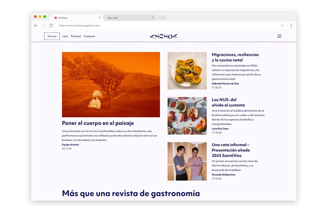
Anchoa Website, build with Webflow
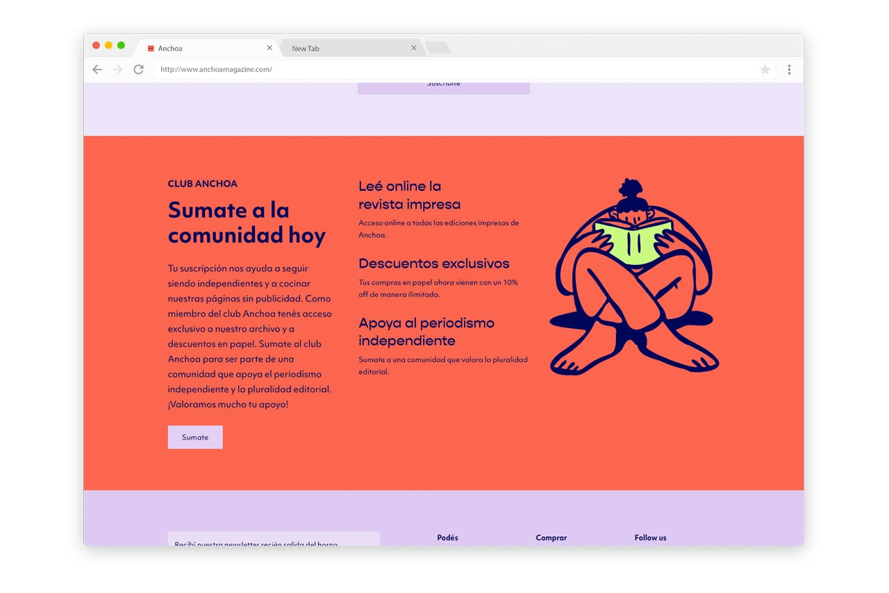
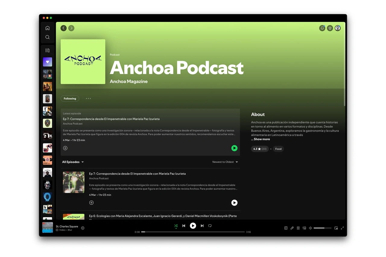
Anchoa Podcast on Spotify
Like this project
Posted Jun 26, 2025
Anchoa started first as an annual print magazine and now includes a digital platform for exclusive members’ content as well as a podcast.
Likes
2
Views
17
