NAMP UX Redesign for U.S. Forest Service
Kevin Ray
01. The Problem
Leadership at the U.S. Forest Service brought us in to address critical issues with their National Asset Management Platform (NAMP).
The platform tracks $1 billion in infrastructure funding across 150+ national forests, but leadership was frustrated by persistent reporting inaccuracies and inefficient tracking processes that hampered their ability to manage this massive portfolio effectively.
The Stakes
Supports over $1 billion in deferred maintenance projects.
Used by thousands of employees across 150+ national forests.
Tied to workflows that reach 30,000 Forest Service and USDA staff.
The Core Issue
NAMP had become increasingly difficult to use as it evolved without fundamental redesign. Users navigated through disconnected screens and complex workflows to complete basic tasks, leading to errors, workarounds, and inefficiencies.
The platform's complexity meant that even experienced users struggled to find information and complete their work efficiently, while newer users felt overwhelmed and required constant assistance from colleagues.
02. Research and Discovery
To understand the reporting and tracking issues, we conducted 5 in-depth stakeholder interviews with users representing diverse roles and experience levels across the Forest Service. Our sampling strategy was intentional: we needed perspectives from both power users who had developed workarounds and newer users who struggled with the platform daily; from field rangers with limited NAMP experience to data specialists and regional coordinators who used it constantly.
Strategic Interview Design
Each semi-structured interview lasted 40-50 minutes and followed a carefully designed five-part structure:
Background (4-5 min):
Understanding each participant's role, daily tasks, and relationship with NAMP
Training (7 min):
Exploring what resources existed, how they learned the system, and their confidence levels
Walkthrough (10-15 min):
Participants demonstrated their typical workflows, revealing actual usage patterns
Pain Points (20-25 min):
Deep dive into specific frustrations, bottlenecks, and workarounds
Wrap Up (5 min):
Open floor for broader concerns and lingering thoughts
The structure was strategic: we didn't just ask "what's frustrating?" We had participants walk through specific scenarios (like correcting a mistake on the platform) to understand why issues led to the data errors leadership was experiencing.
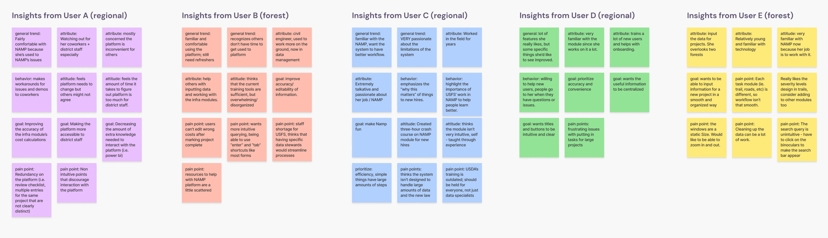
Synthesizing Patterns
After completing all interviews, we used affinity mapping to collaboratively organize 100+ insights. Working in pairs, we grouped findings by user motivations, behaviors, and pain points, then identified patterns that appeared across multiple interviews.
Three critical themes emerged:
Theme 1: The "Expert Blind Spot"
The most striking pattern: experienced users were comfortable with NAMP but deeply concerned about everyone else. Multiple participants said variations of "the platform is okay for me but too much for other people."
This created a vicious cycle: power users developed workarounds and informally trained others, but this knowledge never made it back into the platform. One coordinator created her own 3-hour crash course for new hires.
The insight: The platform worked for power users who mastered its complexity. For everyone else, it was a significant barrier.
Theme 2: Workflow Chaos from Inconsistent Design
Users consistently highlighted that each module (trails, roads, buildings) worked differently, creating a disjointed experience that required re-learning the interface for each task type. Simple tasks required "large amounts of steps."
The search function was unintuitive. Users had to "click on the binoculars" instead of just pressing Enter. Disconnected modules confused users about what they could and couldn't edit.
The real impact: This wasn't just annoying. It directly caused the errors leadership wanted to fix. When users struggled to navigate the platform, they rushed through data entry to minimize time spent in the system, made mistakes they couldn't easily correct, and developed workarounds that bypassed intended workflows.
Theme 3: System Limitations That Cascaded
Once a project was marked "100% complete," it became locked forever. Costs couldn't be corrected, information couldn't be updated. This single limitation had cascading effects: users were afraid to mark things complete (delaying reporting), and when they did, cost data became permanently inaccurate. This directly caused the "reporting inaccuracies" leadership wanted us to fix.
Additionally, auto-calculated costs were frequently inaccurate because users with vastly different skill levels were responsible for estimates, and training materials were scattered and outdated across multiple SharePoint versions.
The Discovery
As we synthesized these themes, a clear picture emerged: the reporting inaccuracies and tracking inefficiencies weren't technical problems. They were symptoms of fundamental UX failures.
Unintuitive workflows forced users to rush through data entry. Module inconsistencies created steep learning curves. Lack of editability meant mistakes became permanent. The platform actively discouraged proper use, creating the exact problems leadership was experiencing.
"They don't have a lot of time to do the data entry stuff, but they're kind of required to, so they just make their best effort to do it and try to as quick as they can to keep moving."
— Program Manager describing why rushed data entry led to errors
"It was a bit of a steep learning curve to begin, especially because to add different tasks to the project, you have to go into other modules."
— Regional Coordinator on workflow complexity
"Each task module is different, so the inconsistencies make the workflow not that smooth. It would be difficult for a user who is not very familiar with NAMP to navigate it."
— Data Specialist on design inconsistency
Advocating for a UX-First Approach
With the research showing that user experience was the root cause, we advocated for a fundamental shift in approach. Rather than applying technical fixes to symptoms, we proposed redesigning core workflows to be intuitive and efficient.We presented findings in terms leadership cared about, connecting UX improvements directly to organizational goals:
Their Goal: Improve data accuracy
→ Errors weren't from user incompetence. They were from rushed data entry caused by complex workflows. Streamlined workflows would reduce cognitive load.
Their Goal: Increase tracking efficiency
→ Users had developed time-consuming workarounds. Consistent, intuitive workflows would eliminate the need for workarounds.
Their Goal: Better compliance and reporting
→ Users avoided features that were too complex or risky. Design for confidence. Make it easy to do the right thing.
We showed that better UX = fewer errors = accurate reporting. Leadership agreed to move forward with a comprehensive UX-centered redesign focused on workflow optimization.The research had reframed the entire project from a technical fix to a fundamental UX transformation.
03. User Personas
Our research revealed a critical insight: NAMP's problems weren't affecting all users equally. From our affinity mapping, two distinct user archetypes emerged representing opposite ends of the experience spectrum. The "Expert Blind Spot" theme showed experienced users were comfortable but worried about others, while "Workflow Chaos" and "System Limitations" disproportionately affected less experienced users.
We created John Doe (overwhelmed basic user) and Dylan Doe (proficient but frustrated super user) to represent these patterns. These personas synthesized real insights from our interviews and became our north star for design decisions.
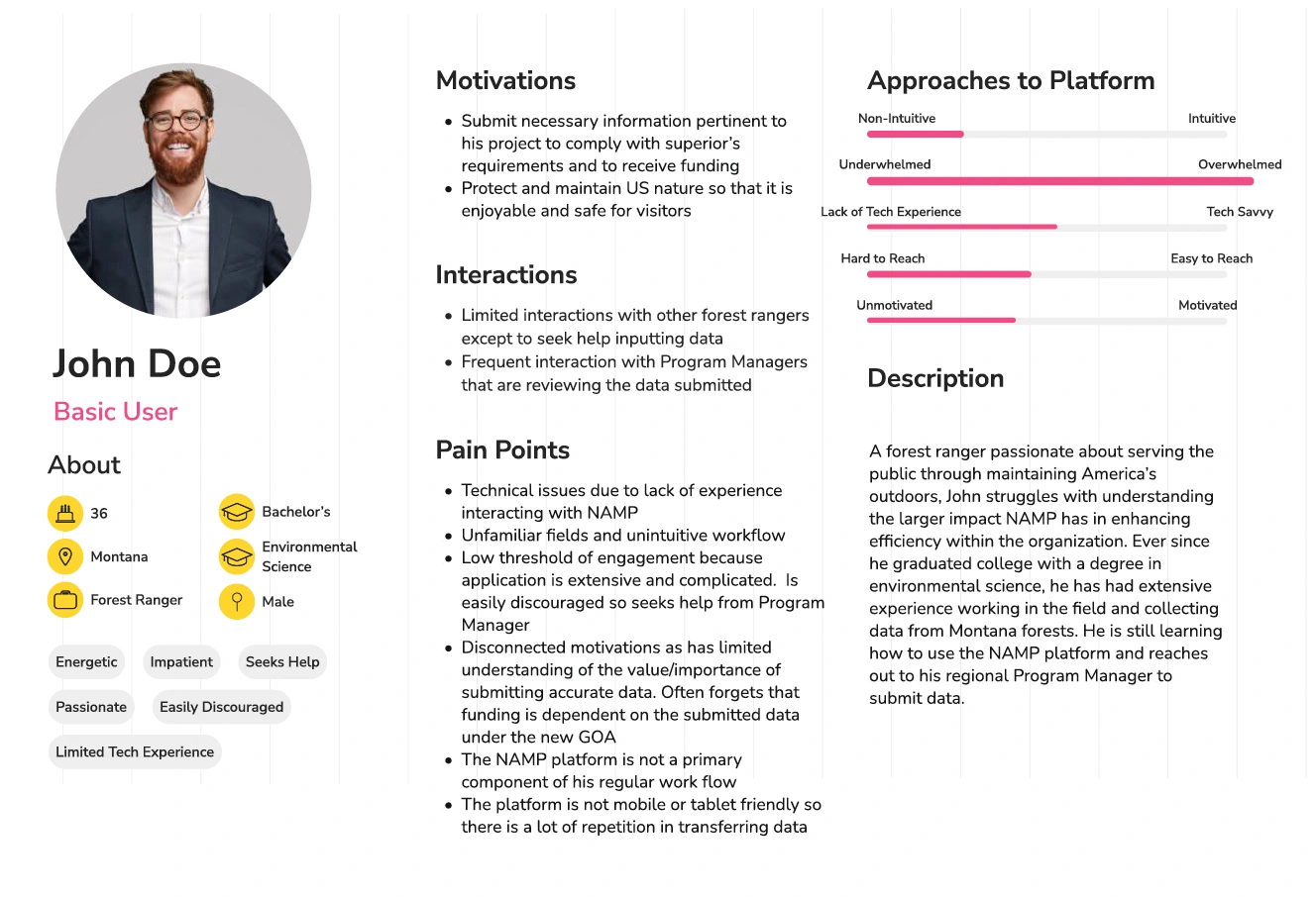
Meet John: The Overwhelmed Basic User
Who John Represents: Field rangers and seasonal staff for whom NAMP is a secondary tool. They're passionate about field work but view data entry as an obligation.
John's Core Challenge: Low threshold of engagement. The platform is extensive and complicated, so he's easily discouraged and seeks help rather than learning the system. NAMP isn't a primary part of his workflow, and it's not mobile-friendly, creating extra work transferring field data.
Why John Struggles:
Doesn't fully understand how NAMP data connects to funding requirements
Infrequent use means he never builds muscle memory
Unfamiliar fields and workflows are barriers with his limited tech experience
Design Implications: Workflows must be intuitive without extensive training. Context and help built into the interface. Minimize cognitive load and steps.
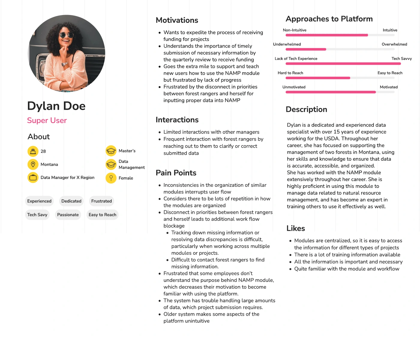
Meet Dylan: The Proficient but Frustrated Super User
Who Dylan Represents: Data managers and regional coordinators responsible for overseeing data quality across multiple projects. They use NAMP daily and have mastered its quirks.
Dylan's Core Frustration: She's proficient with NAMP but spends excessive time helping others navigate its inconsistencies. The disconnect between her priorities (accurate, timely data) and field rangers' understanding creates constant workflow bottlenecks.
Why Dylan Struggles:
Constantly training users like John because the platform isn't self-explanatory
Module inconsistencies make it hard to teach patterns instead of memorizing variations
Difficult to track down errors and contact field rangers for missing information
Design Implications: Workflows must be consistent across modules. Error prevention and correction must be easier. Better visibility into project status and data quality.
The Design Challenge: Bridging the Gap
The tension between John and Dylan defined our design challenge. We needed workflows simple enough for John to navigate independently, yet efficient enough for Dylan to manage data at scale.
Our research showed that John's struggles CREATED Dylan's frustrations. By making the platform more intuitive for basic users, we could reduce the support burden on super users.
The solution had to:
Reduce the learning curve for infrequent users
Create consistency across modules
Build in guardrails and error prevention
Make the value proposition clear
These personas became our north star for every design decision.
04. Current Workflow
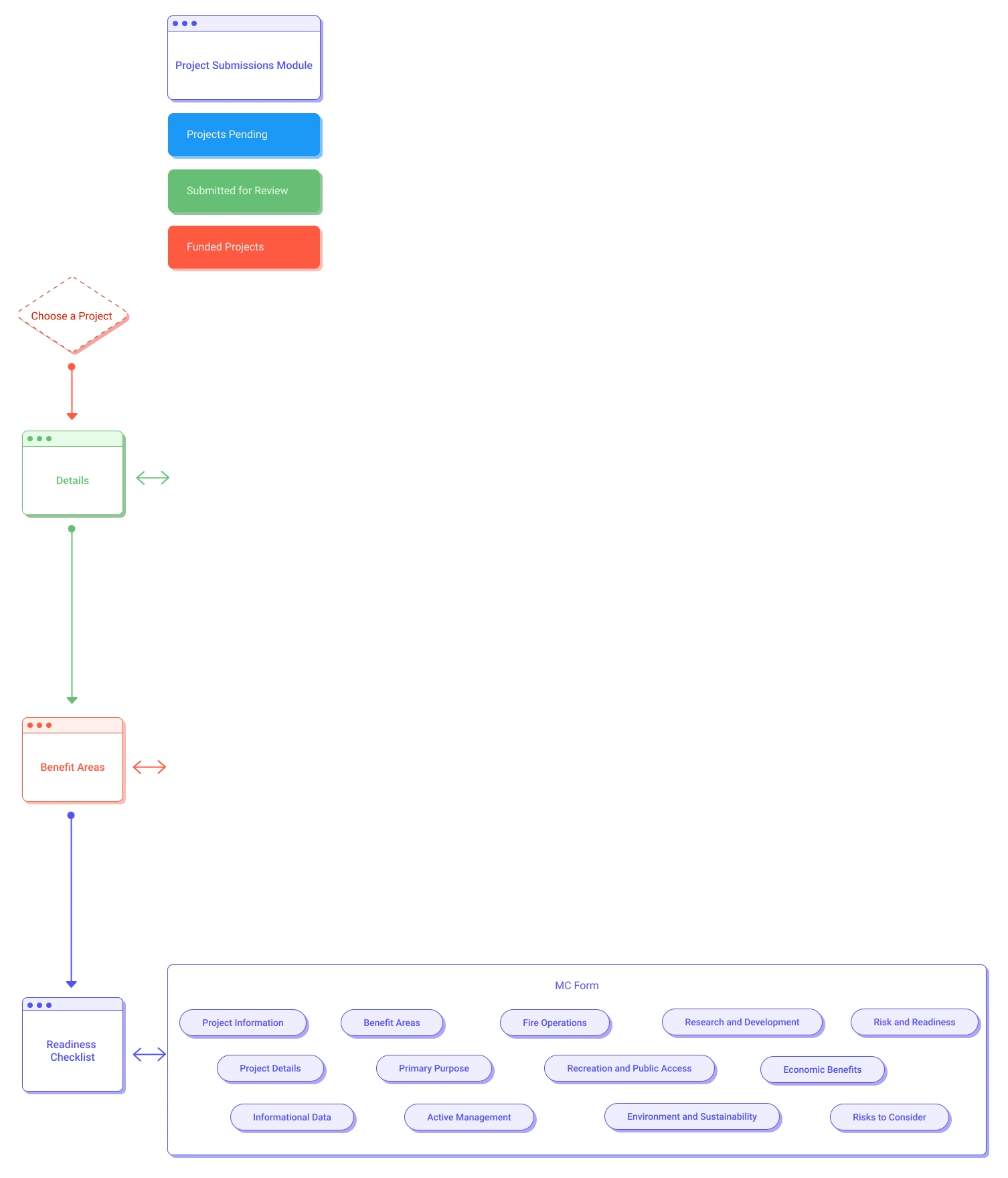
Before redesigning, we needed to understand exactly where the current workflows were breaking down. We mapped both the Infra Projects Module (where users manage infrastructure tasks like trails, roads, and buildings) and the Project Submissions Module (where projects are submitted for funding review).
These flow diagrams revealed the complexity that was overwhelming users like John and creating bottlenecks for users like Dylan.
Infra Projects Module: The Current State
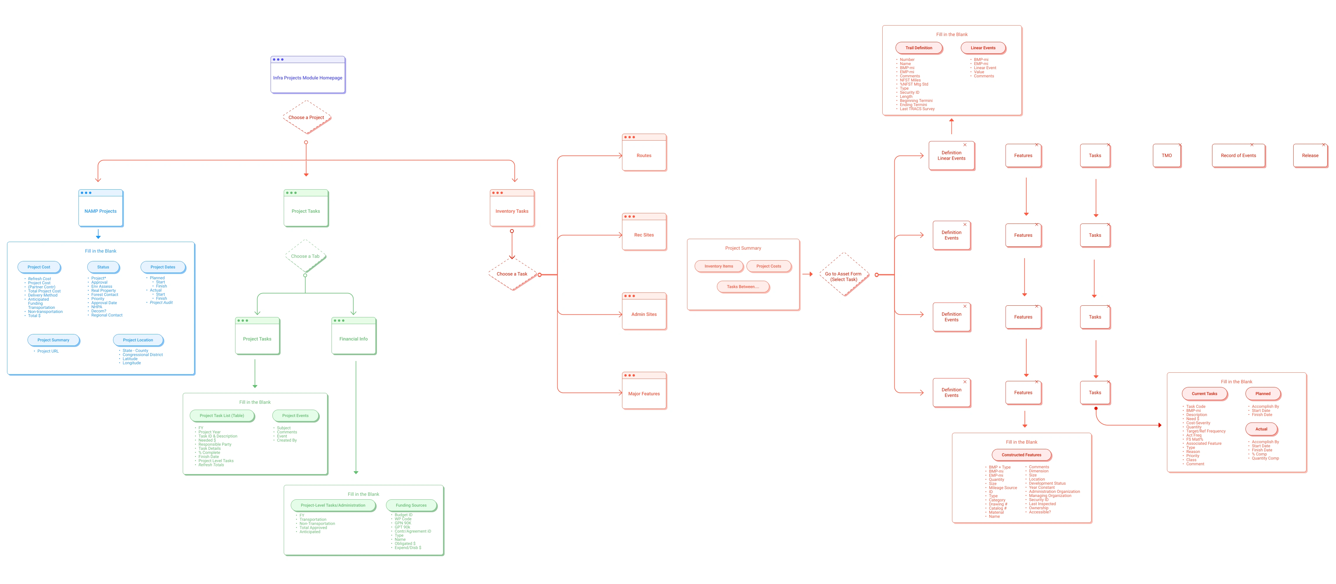
Key Pain Points in Infra Projects Workflow
1. Disconnected Module Navigation
Users had to navigate through separate screens for Routes, Rec Sites, Admin Sites, and Major Features. Each module had different layouts and workflows, requiring users to re-learn the interface for each task type.
2. Hidden Critical Information
Project details, financial information, and task lists lived on separate tabs. Users constantly switched between views to find information, breaking their mental model and creating opportunities for errors.
3. Unclear Entry Points
Multiple ways to access the same information created confusion. Users weren't sure whether to start from "Choose a Project," "Choose a Task," or navigate through the inventory items first.
4. Repetitive Data Entry
Similar information had to be entered in multiple places across different modules, creating frustration and inconsistency.
Project Submissions Module: The Current State
Key Pain Points in Project Submissions Workflow
1. Linear But Rigid
The workflow moved linearly from Details → Benefit Areas → Readiness Checklist. While simpler than Infra Projects, users couldn't easily jump between sections or get an overview of what was complete.
2. MC Form Complexity
The Master Calendar (MC) Form contained numerous fields across multiple categories (Project Information, Benefit Areas, Risk and Readiness) without clear grouping or progressive disclosure.
3. No Progress Visibility
Users couldn't easily see what sections were complete or what still needed attention. This was especially problematic for users like Dylan who managed multiple project submissions.
4. Disconnect from Infra Projects
The Project Submissions Module pulled data from the Infra Projects Module, but users often didn't understand the relationship. When fields auto-populated, users thought they couldn't edit them, creating confusion about where to make changes.
How Workflows Created the Problems Leadership Saw
These workflow issues directly caused the reporting inaccuracies and tracking inefficiencies that brought us into the project:
Reporting Inaccuracies:
Disconnected modules meant users entered data in wrong places
No validation or error prevention led to incorrect cost estimates
Once projects marked "100% complete," locked data couldn't be corrected
Tracking Inefficiencies:
Users developed workarounds to avoid complex workflows
Dylan spent time helping users navigate rather than managing data
Inconsistent workflows slowed down data entry and review
The root cause: Workflows weren't designed for how users actually work. They reflected system architecture, not user needs.
05. Reimagined Workflows
After mapping the problems, we redesigned both workflows around three core optimization principles. These principles directly addressed the pain points while serving both John's need for simplicity and Dylan's need for efficiency.
Three Optimization Principles
1. Consolidate Related Information
Instead of scattering data across multiple screens and tabs, group related information together. Users shouldn't have to navigate between disconnected views to complete a single task.
2. Create Consistent Patterns
Every module (trails, roads, buildings) should follow the same structure and interaction patterns. Learn once, apply everywhere.
3. Provide Clear Navigation and Progress
Users should always know where they are, what's complete, and how to get to other sections. No hidden paths or unclear entry points.
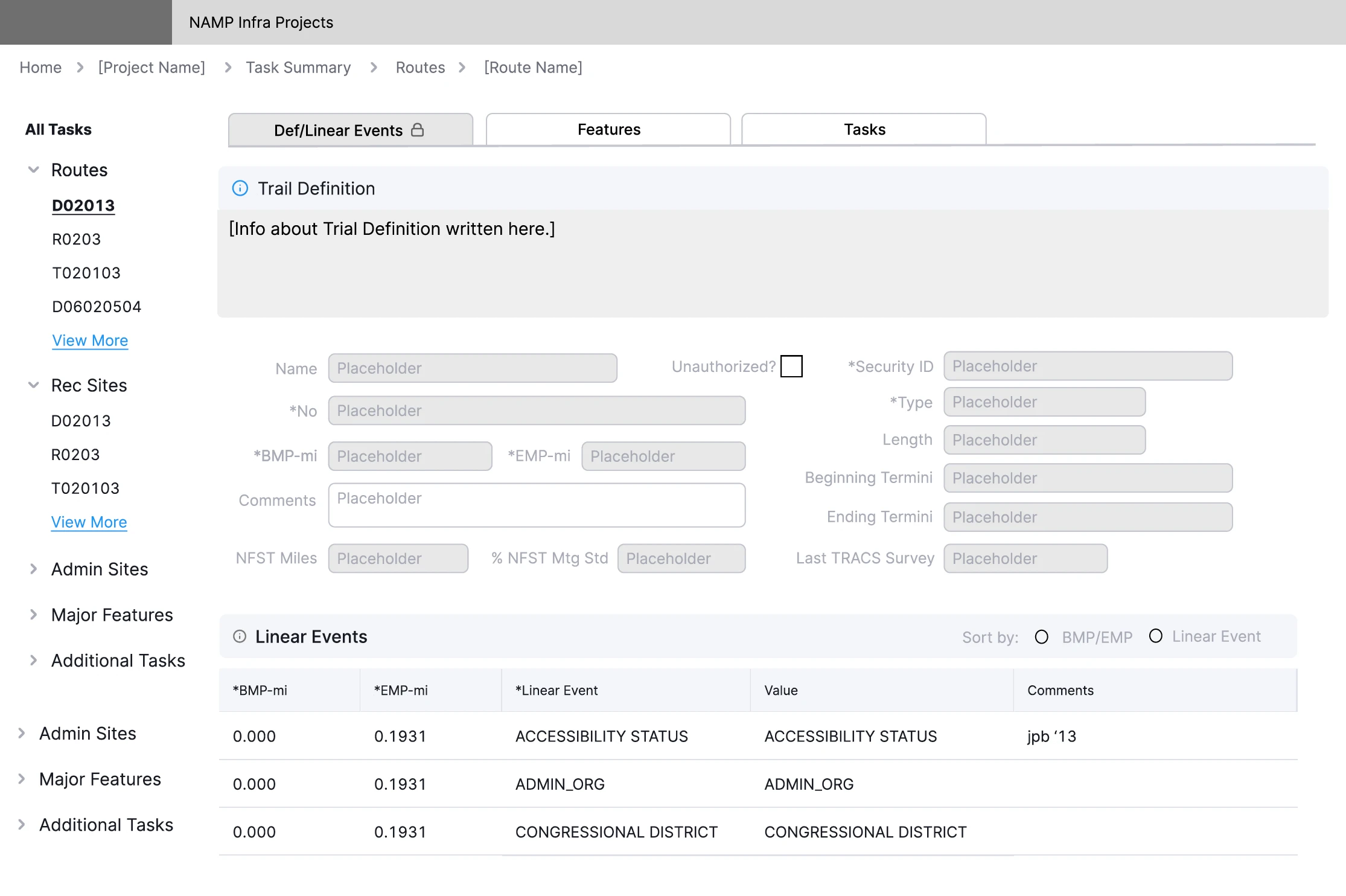
Optimized Infra Projects Module
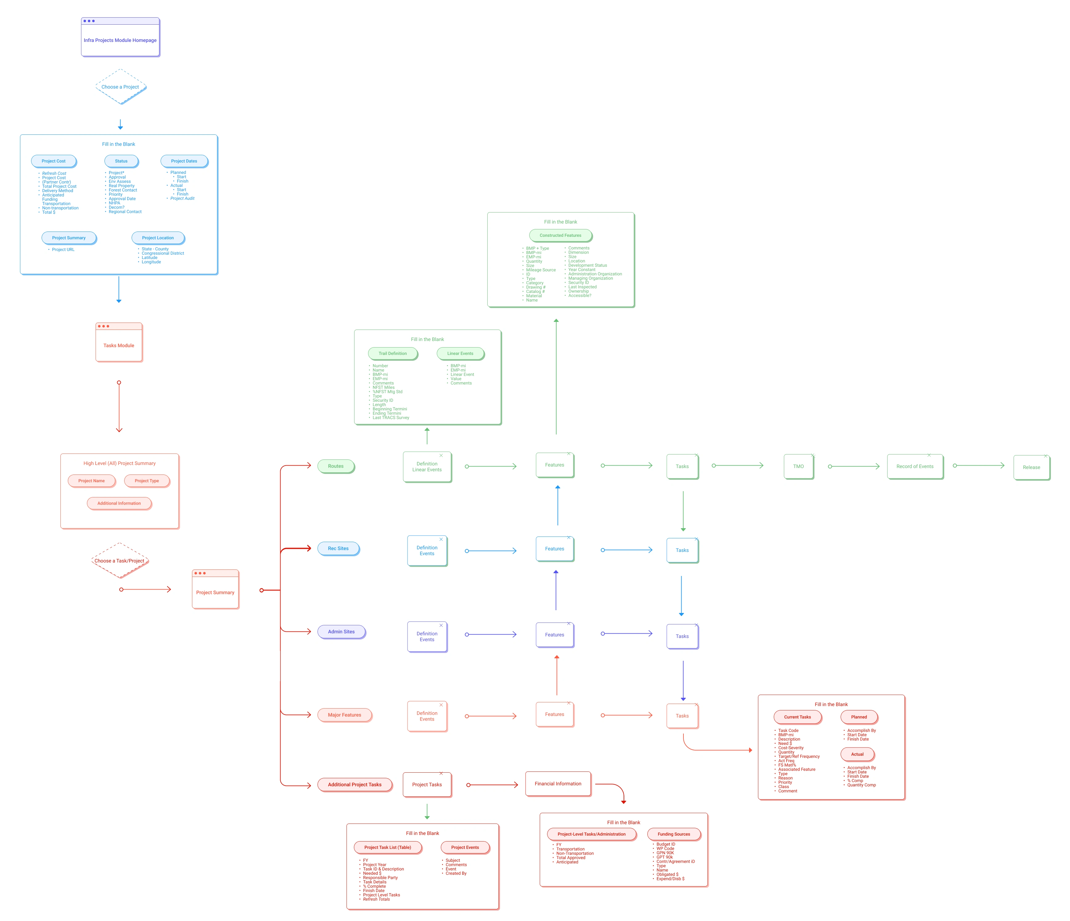
Key Improvements in Infra Projects
Consolidated Project View
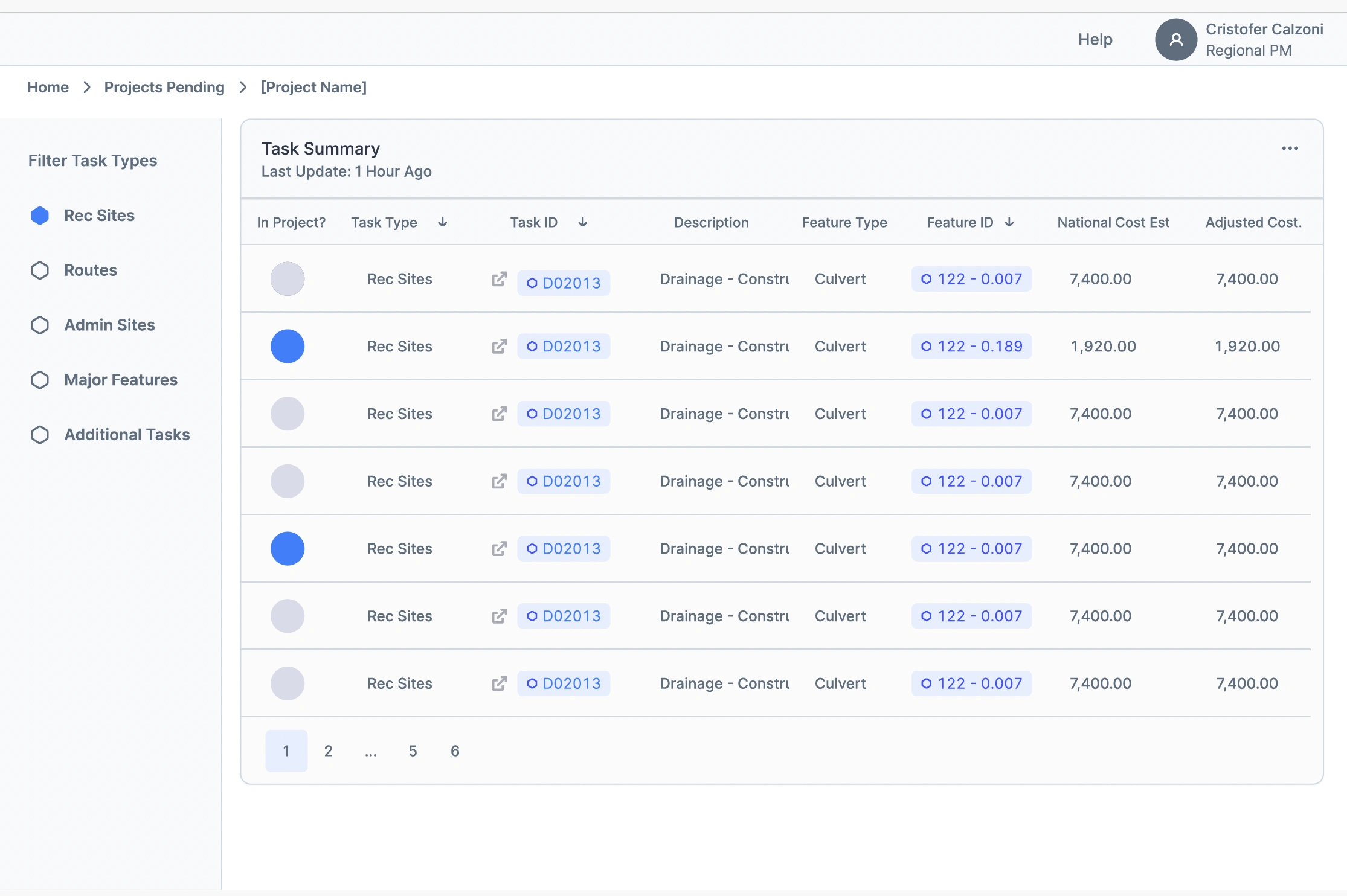
All critical project information (Project Summary, Project Tasks, Financial Information) now lives on a single high-level view. Users can see everything without switching tabs or navigating to separate screens.
Unified Module Structure
Routes, Rec Sites, Admin Sites, and Major Features now share a consistent structure: Definition → Linear Events → Features → Tasks. Users learn the pattern once and apply it to all task types.
Clearer Task Hierarchy
Tasks are now visually organized under their parent projects, making the relationship obvious. Users can expand/collapse sections to focus on what they need.
Simplified Navigation
Reduced entry points from multiple confusing paths to a clear "Choose a Project" → "Choose a Task/Project" flow. Users know exactly where to start.
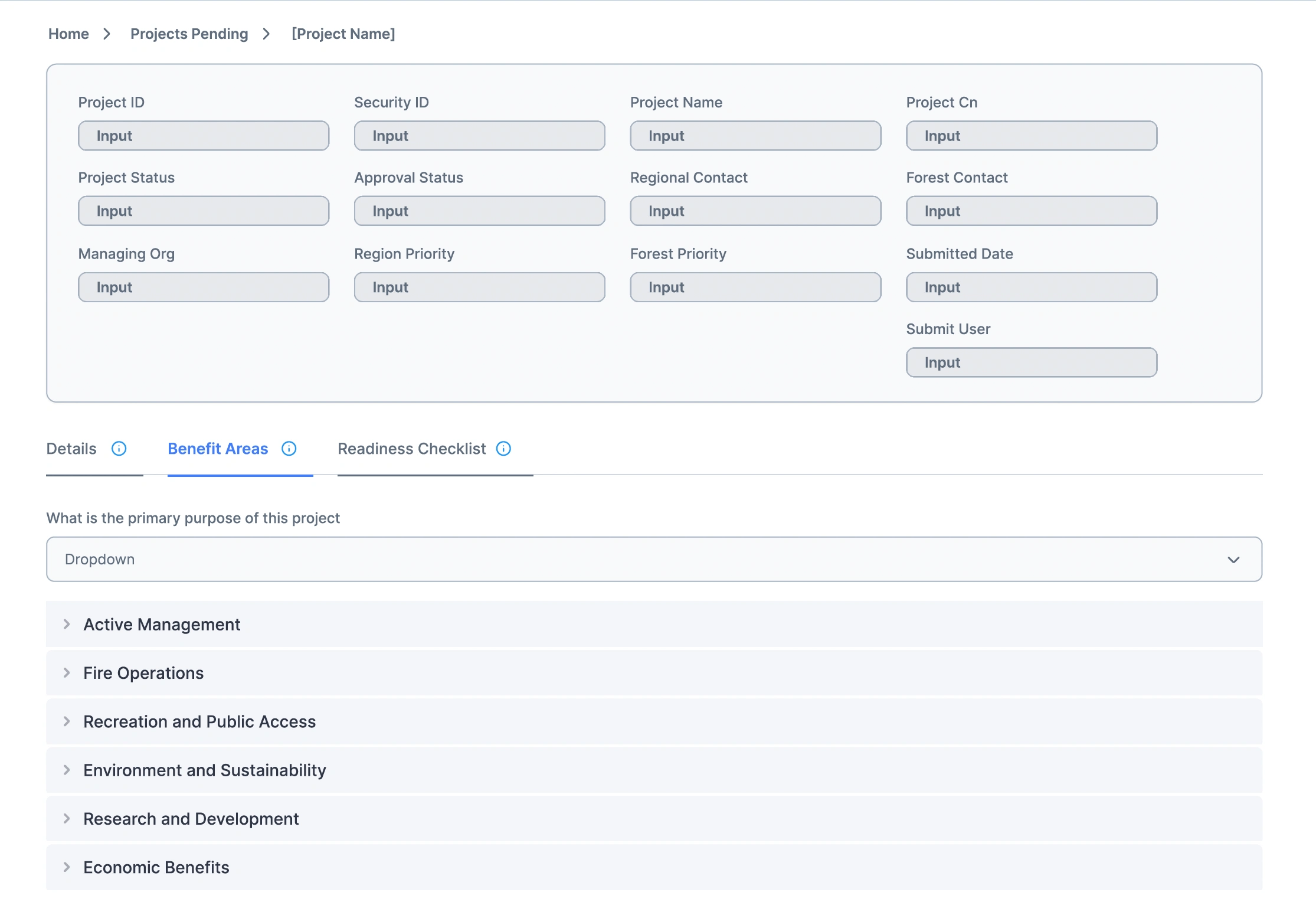
Optimized Project Submissions Module
The Project Submissions Module was already more streamlined than Infra Projects, but we made targeted improvements to address specific pain points.
Progress Visibility
Added clear indicators showing which sections (Details, Benefit Areas, Readiness Checklist) are complete and which need attention. Users like Dylan can quickly assess project status.
Flexible Navigation
While maintaining the logical flow, users can now jump between sections without being forced into a rigid sequence. This helps users who need to review or update specific parts.
Clearer Data Relationships
Made the connection between Project Submissions and Infra Projects more explicit. Users now understand what data comes from where and what they can edit.
How Optimized Workflows Solve the Original Problems
These workflow improvements directly address the goals leadership brought us in to solve:
Improving Data Accuracy:
Consolidated information reduces errors from entering data in wrong places. Consistent patterns across modules prevent confusion. Clear validation and error prevention catch mistakes before they become permanent.
Increasing Tracking Efficiency:
Unified structures mean Dylan can teach patterns instead of memorizing module variations. Clear progress visibility lets her quickly assess status across multiple projects. Simplified navigation reduces time spent clicking through screens.
Better Compliance and Reporting:
Clearer workflows reduce the learning curve for users like John. Explicit data relationships help users understand what information feeds into reports. Flexible navigation means users can fix issues quickly rather than getting stuck.
The optimized workflows bridge the gap between John and Dylan. John gets intuitive patterns he can follow without extensive training. Dylan gets consistent structures she can manage at scale and teach to others efficiently.
06. Design & Iteration
Before touching visual design, we established design principles that would guide every decision, from information architecture to interaction patterns. These principles became our framework for evaluating ideas, prioritizing feedback, and making strategic trade-offs.
Design Principles: Our Decision-Making Framework
1. Progressive Complexity:
Start simple, reveal complexity only when needed. John should complete basic tasks without encountering advanced features, while Dylan can access powerful functionality when necessary.
2. Maintain Mental Models:
Changes should feel like improvements to familiar patterns, not radical departures. This reduces the training burden Dylan faces when onboarding others.
3. Make Relationships Visible:
Connections between data, modules, and workflows were hidden. Make hierarchies, dependencies, and relationships explicit in the interface.
4. Support Multiple Workflows:
The interface should support both linear, guided workflows (for John) and non-linear, expert shortcuts (for Dylan).
Lo-Fi Phase: Strategic Structural Decisions
Decision 1: Left Navigation for Task Hierarchy
Persistent left sidebar shows all task types (Routes, Rec Sites, Admin Sites, Major Features) in an expandable tree. Users see the full project structure and jump directly to any task.
Trade-off: Screen real estate vs. constant context. We chose constant context because research showed users got lost navigating between task types.
Decision 2: Consistent Tab Structure Across All Modules
Every task type (Routes, Rec Sites, etc.) uses the same three tabs: Def/Linear Events, Features, and Tasks. This creates a predictable pattern users learn once and apply everywhere.
Trade-off: Perfect customization vs. consistency. We chose consistency because Dylan struggled teaching users when each module had different structures.
Decision 3: Accordion Sections with Progress Indicators
In Project Submissions, we used collapsible accordion sections (Project Information, Project Details, Benefit Areas, etc.) with visible progress bars showing completion percentage and fraction (e.g., 50%, 3/6).
Trade-off: Screen real estate vs. constant context. We chose constant context because research showed users got lost navigating between task types.
Usability Testing: Validation
Left Sidebar Navigation
"I really like the sidebar and the ability to easily go between things within a project. Organization and layout and content makes sense."
Why this mattered: Validated "Make Relationships Visible." Users immediately understood project structure because it was spatially represented in the hierarchy.
Accordion Layouts with Progress
"Likes the progress bar for each collapsable. Some people will want to see the actual number completed."
Why this mattered: Validated "Progressive Complexity." Dylan could scan completion status (50%, 3/6) without expanding sections, while still diving deep when needed.
Hi-Fi: Strategic Visual Design
Visual Hierarchy Supports Task Navigation
The left sidebar uses visual hierarchy to show task relationships. Parent categories (Routes, Rec Sites) are bold with chevrons. Child items (D02013, R0203) are indented and lighter weight. This visual structure mirrors the data hierarchy.
Progress Indicators Show Completion at a Glance
Progress bars use dual indicators: percentage (50%) and fraction (3/6). Dylan can quickly scan multiple projects and see which need attention. The fraction satisfies users who wanted to know exactly how many items remained.
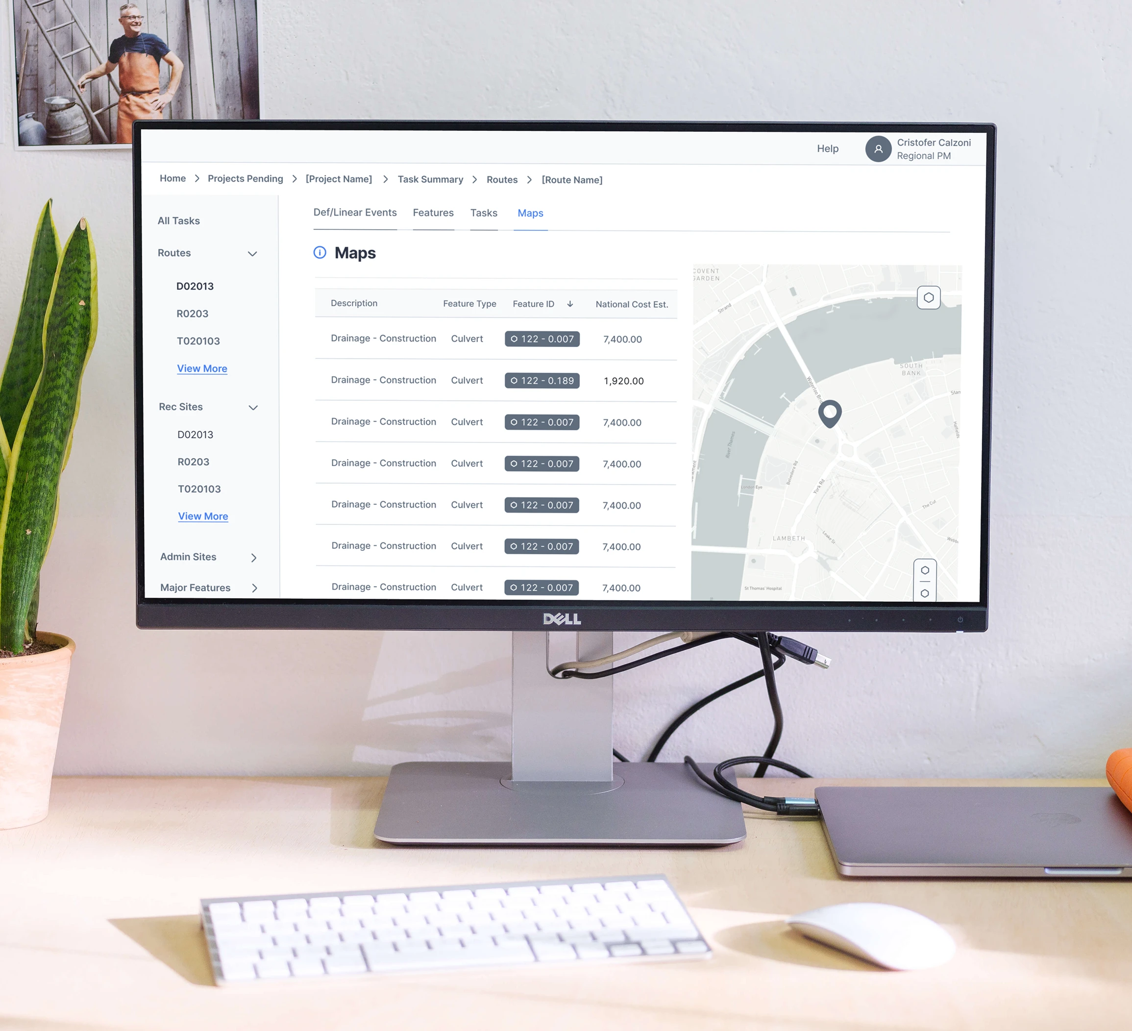
Breadcrumb Navigation Provides Spatial Context
Home > Projects Pending > [Project Name] > Task Summary > Routes > [Route Name] shows exactly where users are in the deep hierarchy. This prevents the "getting lost" problem from research.
These design decisions directly address the goals leadership brought us in to solve:
Data Accuracy:
Visible relationships (sidebar hierarchy) and clear progress indicators reduce errors from users not understanding what they're completing. Maps help users verify they're working on the correct physical locations.
Tracking Efficiency:
Left sidebar lets Dylan jump directly to any task type without clicking through menus. Progress bars let her scan multiple projects quickly. Consistent tab structure (Def/Linear Events, Features, Tasks, Maps) means she teaches one pattern that applies everywhere.
User Adoption:
Familiar patterns (file/folder sidebar, breadcrumbs, tabs) reduce the learning curve for John. Regional/Forest toggle shows only relevant questions. Progressive disclosure (accordions) prevents overwhelm while keeping power features accessible to Dylan.
07. Reflection
Key Learnings
Complexity Isn't the Enemy. Users didn't need less complexity, they needed visible relationships and predictable patterns that made complexity navigable.
Consistency Beats Customization. Users valued predictability over perfection because consistent patterns reduce training time, prevent errors, and build confidence.
Design Principles Are Decision Tools. Principles gave us a framework to evaluate conflicting feedback and find solutions that served both user types.
Testing Validates Strategy, Not Just Screens. When users loved the sidebar, they were confirming that "Make Relationships Visible" addressed a pain point.
What I'd Do Differently
Question the Accordion Pattern More Critically. While accordions solved the overwhelming information problem, they also hid context that expert users like Dylan needed visible. I might explore a middle ground where power users could set their preferred default view.
Challenge My Assumption About Module Separation. I assumed users would stay within one module at a time, but testing revealed they frequently jumped between Infra Projects and Project Submissions. Better integration between these modules might have reduced friction.
Reconsider the Consistency Over Customization Trade-off. While consistent tab structure helped with training, forcing every task type into the same four-tab pattern might have been too rigid. Routes and Recreation Sites have genuinely different workflows that the structure didn't fully accommodate.
Document "Why" During Design. Keeping a decision log would have made iterations faster and handoff clearer.
Impact
This project taught me that organizational goals and user needs are not competing priorities. Leadership brought us in to solve data accuracy, tracking efficiency, and onboarding issues. By focusing on what users actually needed (visible relationships, consistent patterns, location visualization), we addressed those business goals through user-centered solutions. The best way to achieve strategic outcomes is to solve real user problems.
Like this project
Posted Nov 14, 2025
Redesigned infrastructure project management system for USFS (90K employees, $1B in projects). 2 modules, 20 screens, 5 user interviews, 2 usability tests.
Likes
0
Views
4
Timeline
Jan 15, 2023 - Ongoing
Clients
U.S. Forest Service