Visual Identity : Caught Your Eye Thrift Store
Aparajita Bhattacharya
Overview 🔎
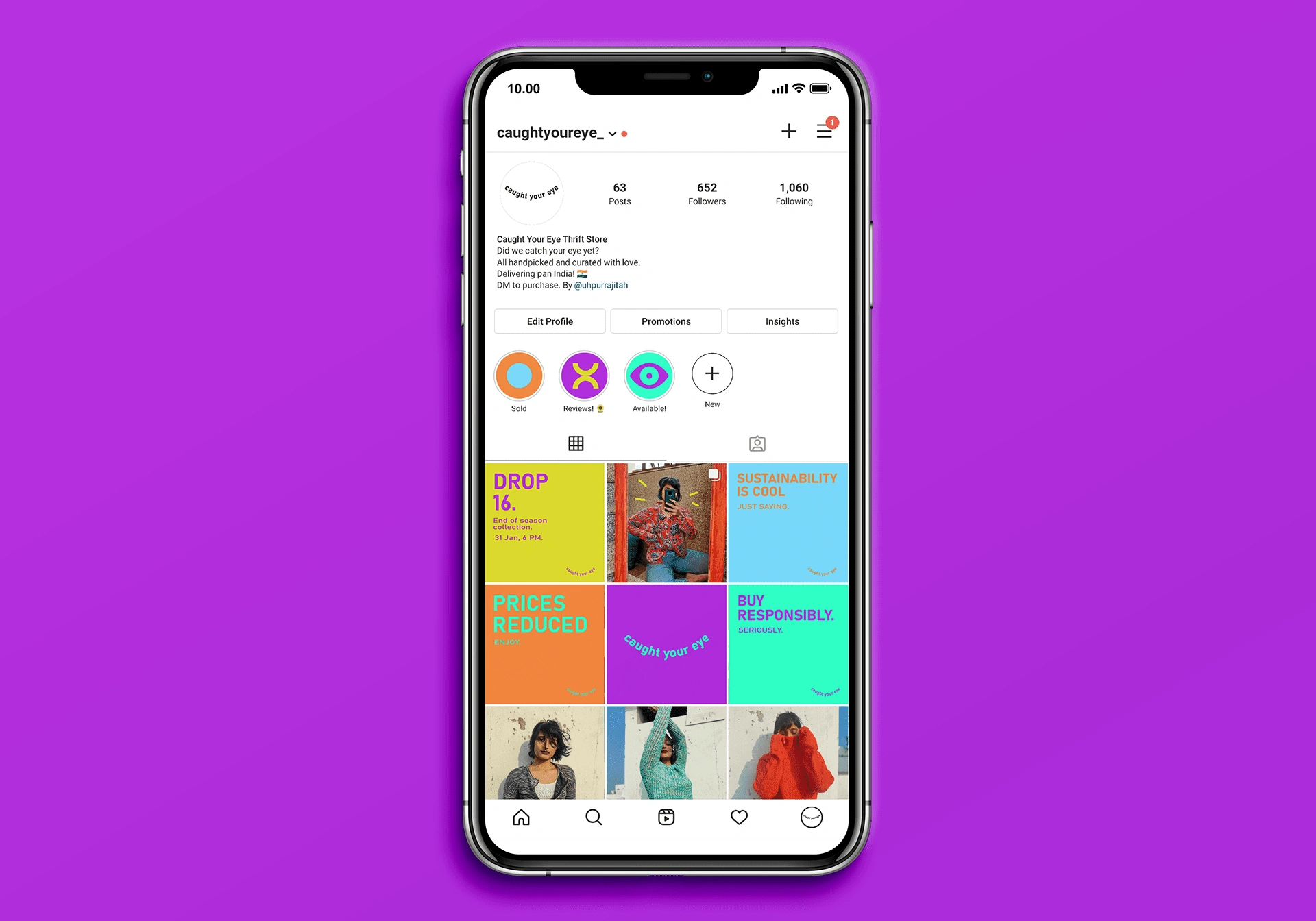
Caught Your Eye is a thrift store based in Kolkata which I started during covid years. It specialised in reselling thrift finds and factory seconds.
Brief ✍️
To create an identity that is bright, colourful, and bold - and one that reflects the brand's philosophy of being fun and fashionable, yet sustainable.
Problem & Solution 🤝
The Problem: This was during peak Covid in 2021 when thrift stores were in vogue and thousands were popping up around the world. The problem here was - how to make this particular one stand out where in an already saturated market.
The Solution: It was clear that there in order to stand out from the crowd, something needed to catch the consumer's eye. From there, the name 'Caught Your Eye' originated. Usage of bright colours and bold branding was employed to make it striking to one's eye - essentially catching someone's eye!
Process 🛣
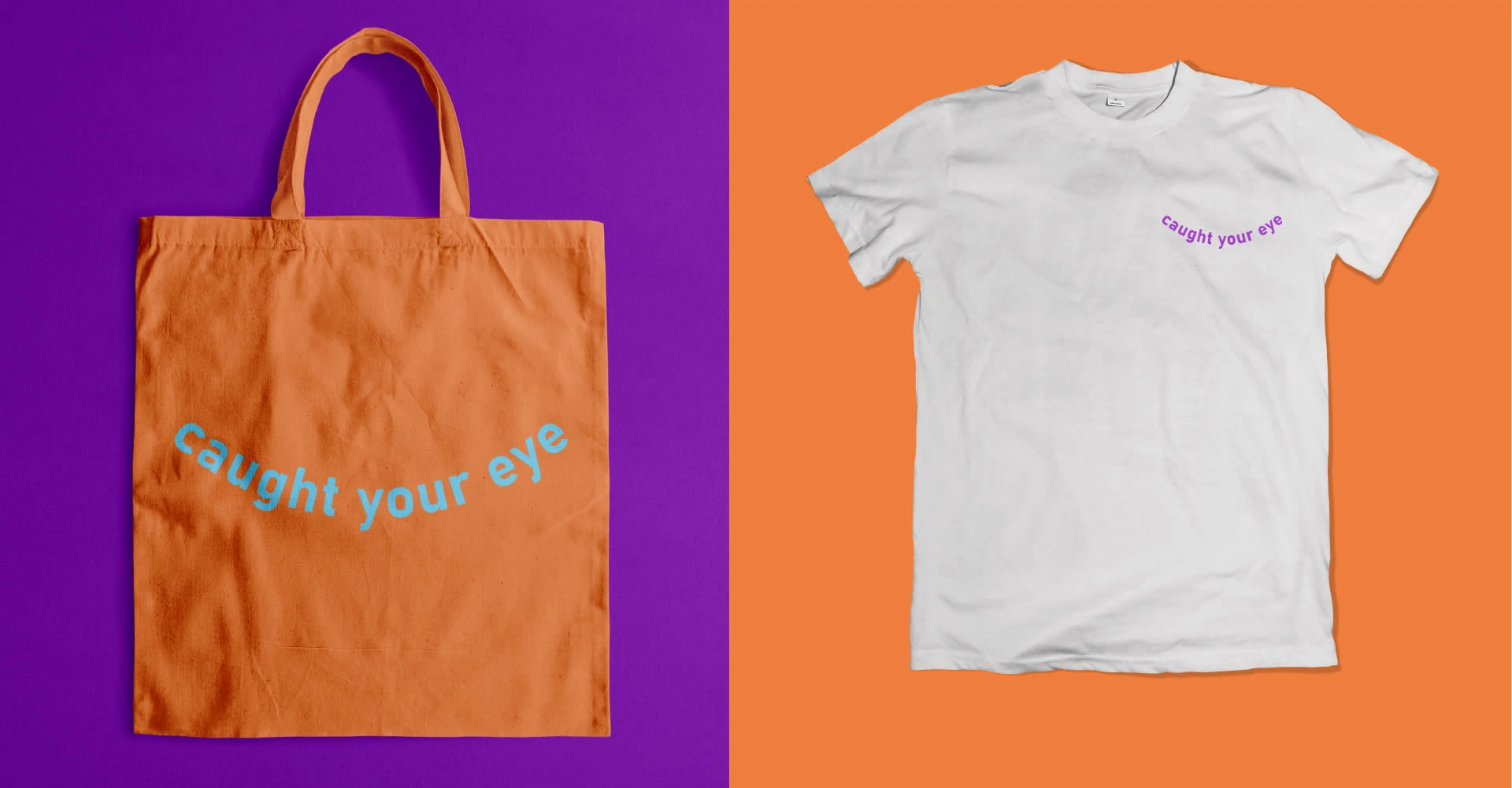
Several options were created, including the usage of an 'eye' as a logo element. However, it felt too overused. By the final iterations, the logo was kept simple, which made sense given the colourful nature of the identity. A simple curved line became the basis of the logo, and the wordmark was created thus. The reasoning behind the logo is listed below:
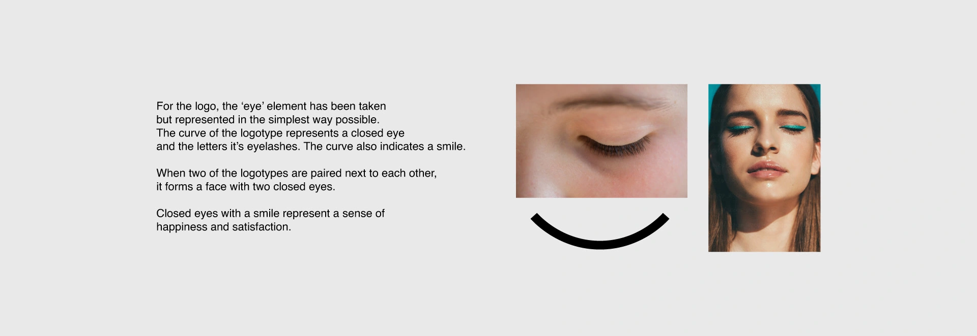
Here, one can see that two logos together seem to form two closed eyes and also two smiles, as explained in the above graphic.
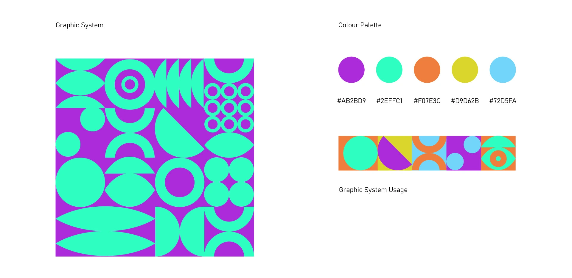
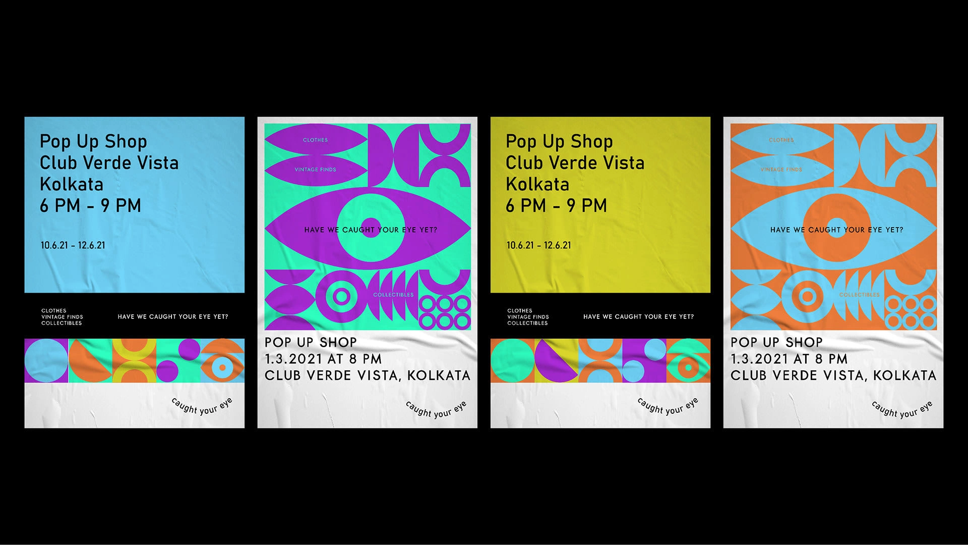
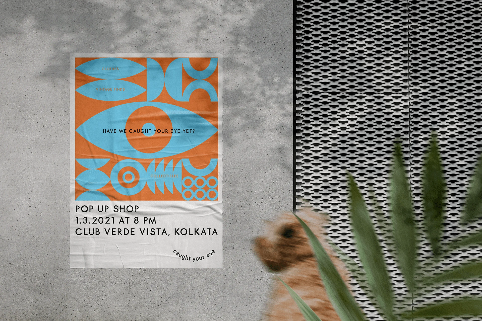
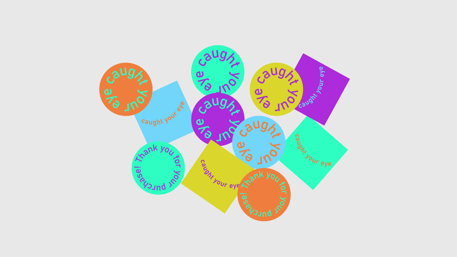
An extensive graphic system was created for the identity using geometric shapes which were then experimented with to create patterns and elements.
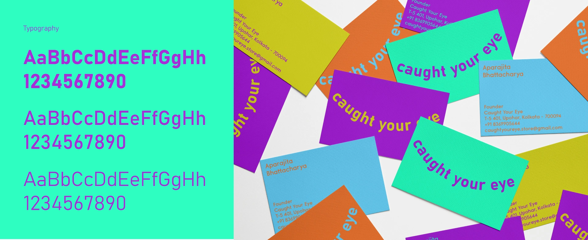
The colour palette was also carefully chosen with a lot of trial and error to find the best possible combination.
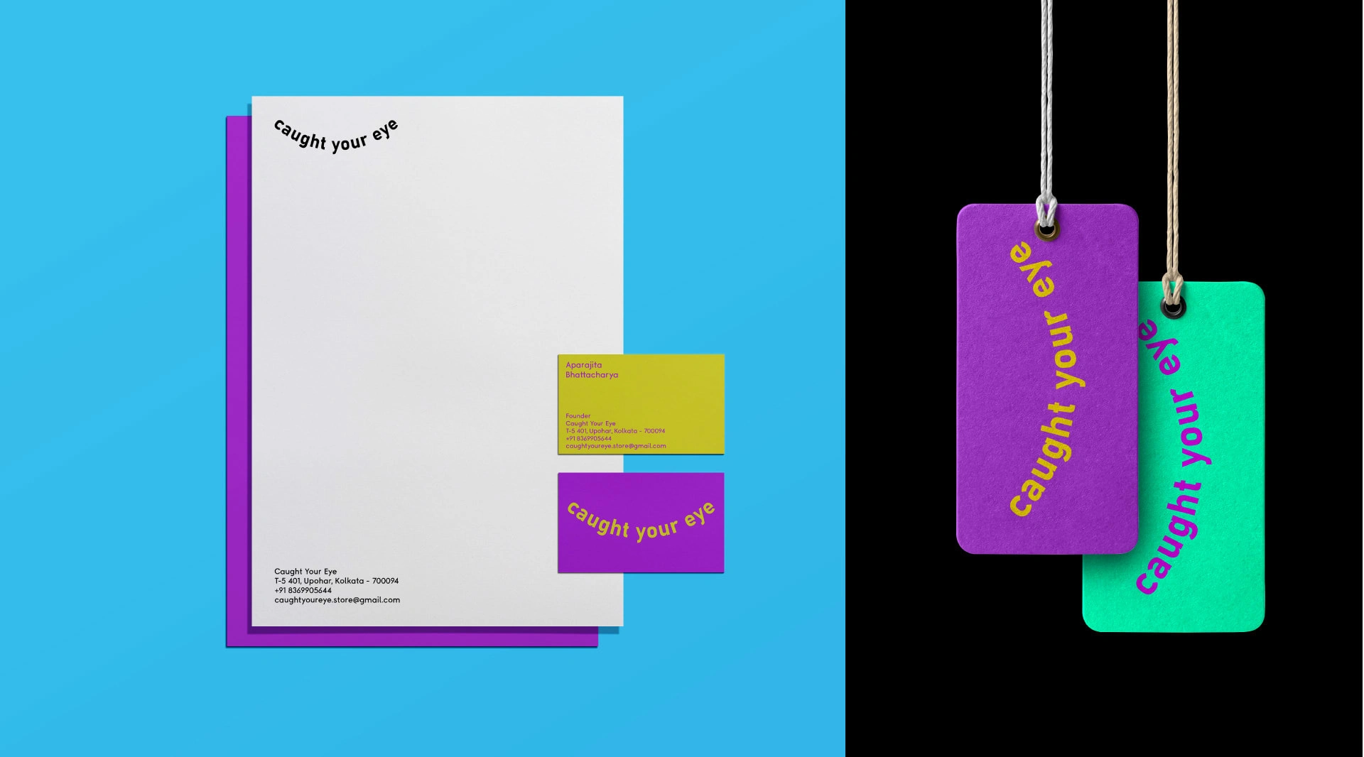
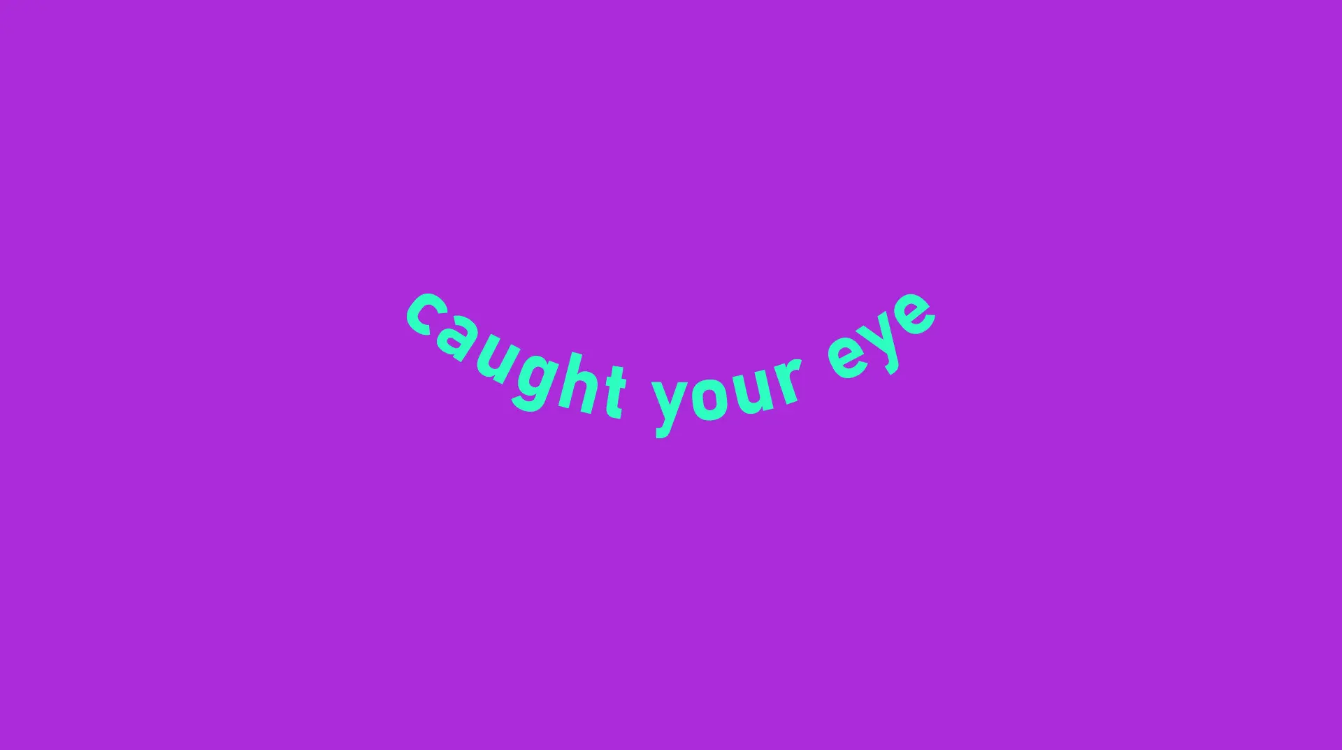
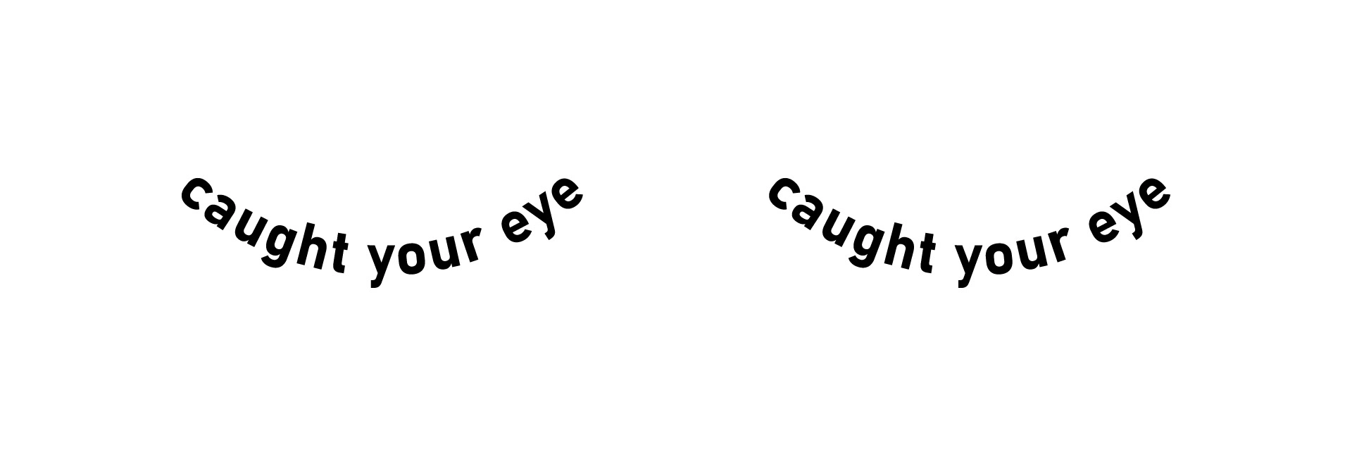
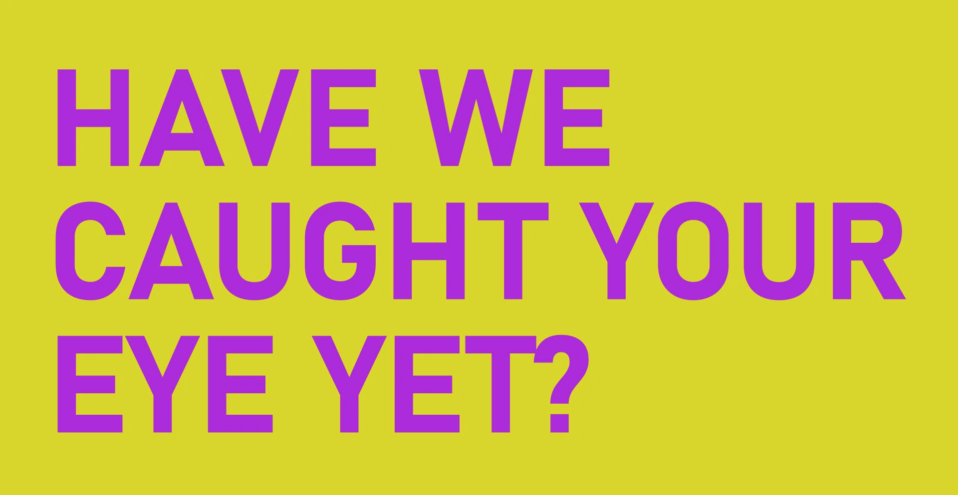
And to end it, the catchphrase:
Like this project
Posted Jul 21, 2023
It's 2020 and it's Covid-19 era. Thrift stores are the rage now, so how do you make a visual identity for one that actually stands out? That's what I did here.