Designing for real usage means
ajao jelil
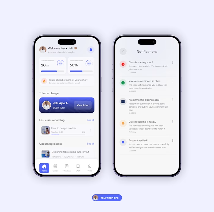
Designing for real usage means thinking beyond a single state.
For this learning app dashboard, I explored both light and dark modes with a focus on how students actually interact with products throughout the day.
The goal wasn’t just visual variation, it was consistency, clarity, and usability across contexts.
In this design:
• Key learning metrics (attendance, performance) remain easy to scan
• Important actions stay visible in both modes
• Visual hierarchy is preserved without relying on brightness
This is part of an ongoing learning platform I’m designing to improve how students track progress, stay accountable, and engage consistently.
Open to product design opportunities, especially in fintech, edtech, and data-heavy platforms.
Like this project
Posted Mar 20, 2026
Designing for real usage means thinking beyond a single state. For this learning app dashboard, I explored both light and dark modes with a focus on how stud...
Likes
0
Views
1