Base Café Logo Design
Rachna Ravi
Base Café Logo Design
Base Café is an IP under Base India, the Indian chapter of Base. Its goal is to spotlight builders, shippers, creators, and designers doing exciting things within the Base ecosystem. It began as a weekly livestream on X every Friday, but soon evolved into a more flexible schedule, going live whenever there’s exciting news to share or someone in the community to highlight.
Here’s how I approached designing the logo and building the visual identity for this IP.
I knew I wanted the café aspect represented in the logo, so I started by exploring visuals in Midjourney. It quickly became clear that the café element needed to be subtle (hinting at streaming without feeling too literal) while also allowing the identity to easily expand into templates for future guest announcements and social posts.
Initial exploration in Midjourney that was edited in Photoshop to adjust for brand colors.
I chose a classic coffee mug as the base, but wanted it to be more expressive than just a cup. My mind immediately went to cats: curious, inquisitive, always exploring. A perfect fit for the spirit of the IP. I quickly sketched a few cat poses to see what worked best.
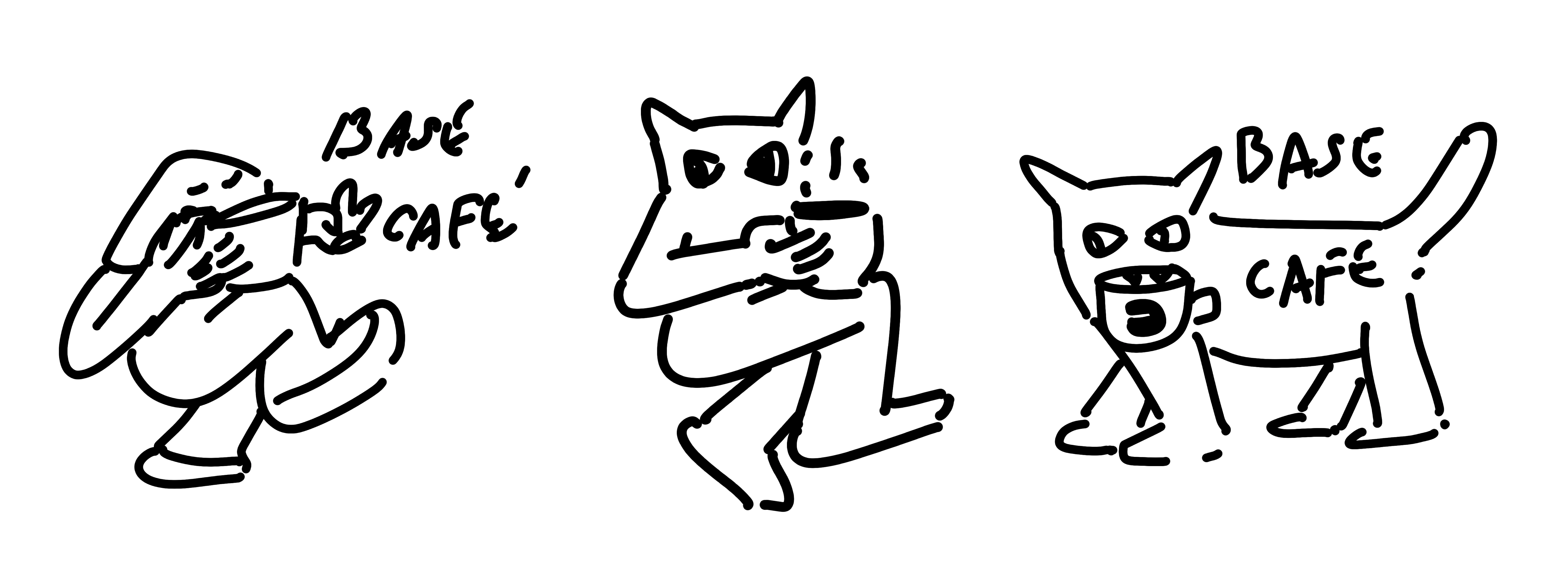
Initial sketches for the cat poses.
I decided the best direction was a minimal cat design holding a coffee mug, as if intrigued by the wordmark - like, “Hey, what’s that?”
Iterated the pose a bunch of times till I was happy with the tweaks.

Finally brought it into Illustrator to vectorize, clean up and figure out the final font.
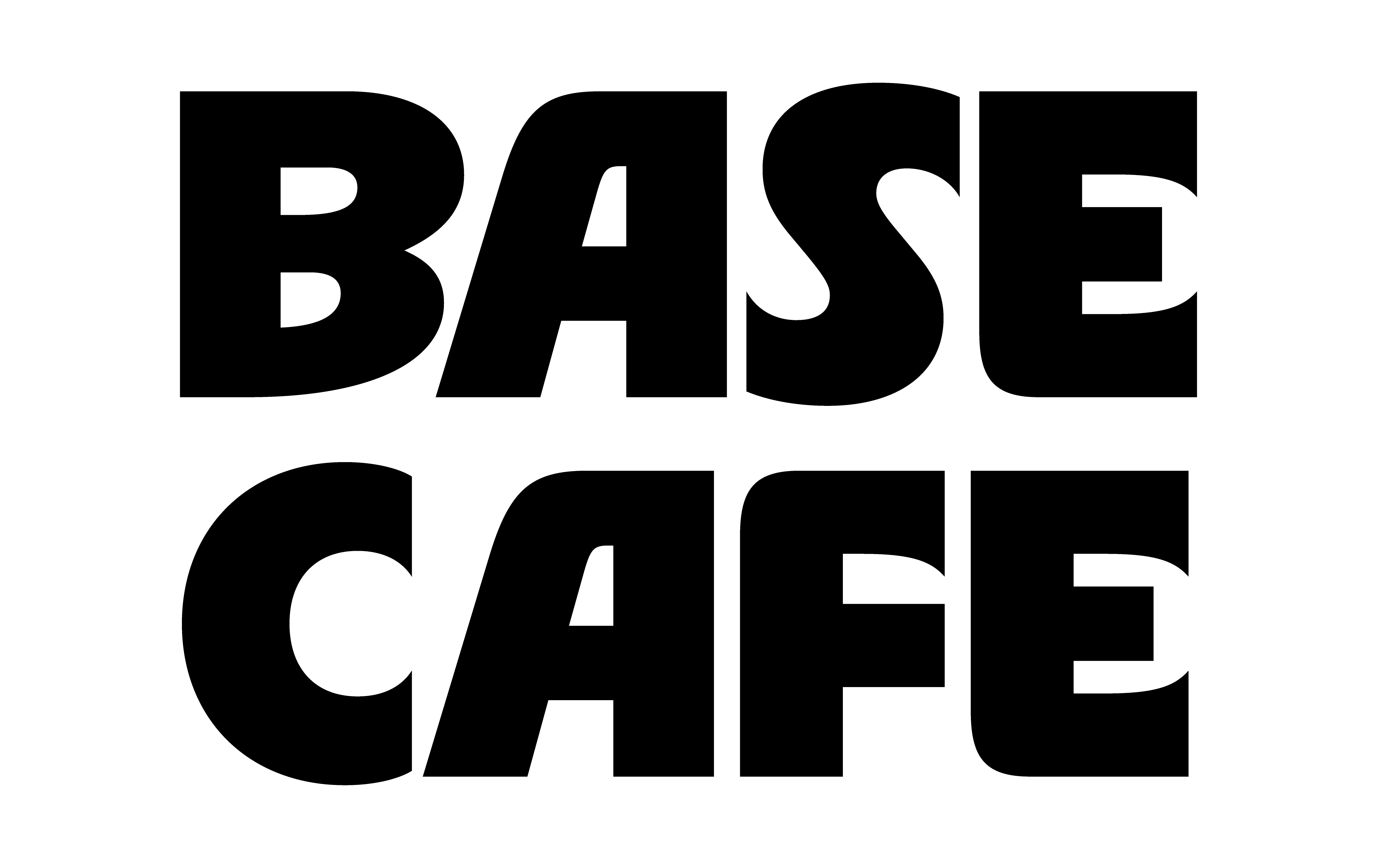
I chose RL Aqva (Black) as the final font. It had just the right amount of playfulness yet bold enough to demand attention.
Finally, I added a small TV-box frame to bring everything together - a fun suggestion from Ahaan (from my team at the time). It was the missing piece that ensured the logo clearly conveyed a streaming IP. For the subtext, I chose BC Alphapipe as the font since its angles complemented the box’s extrusion perfectly.
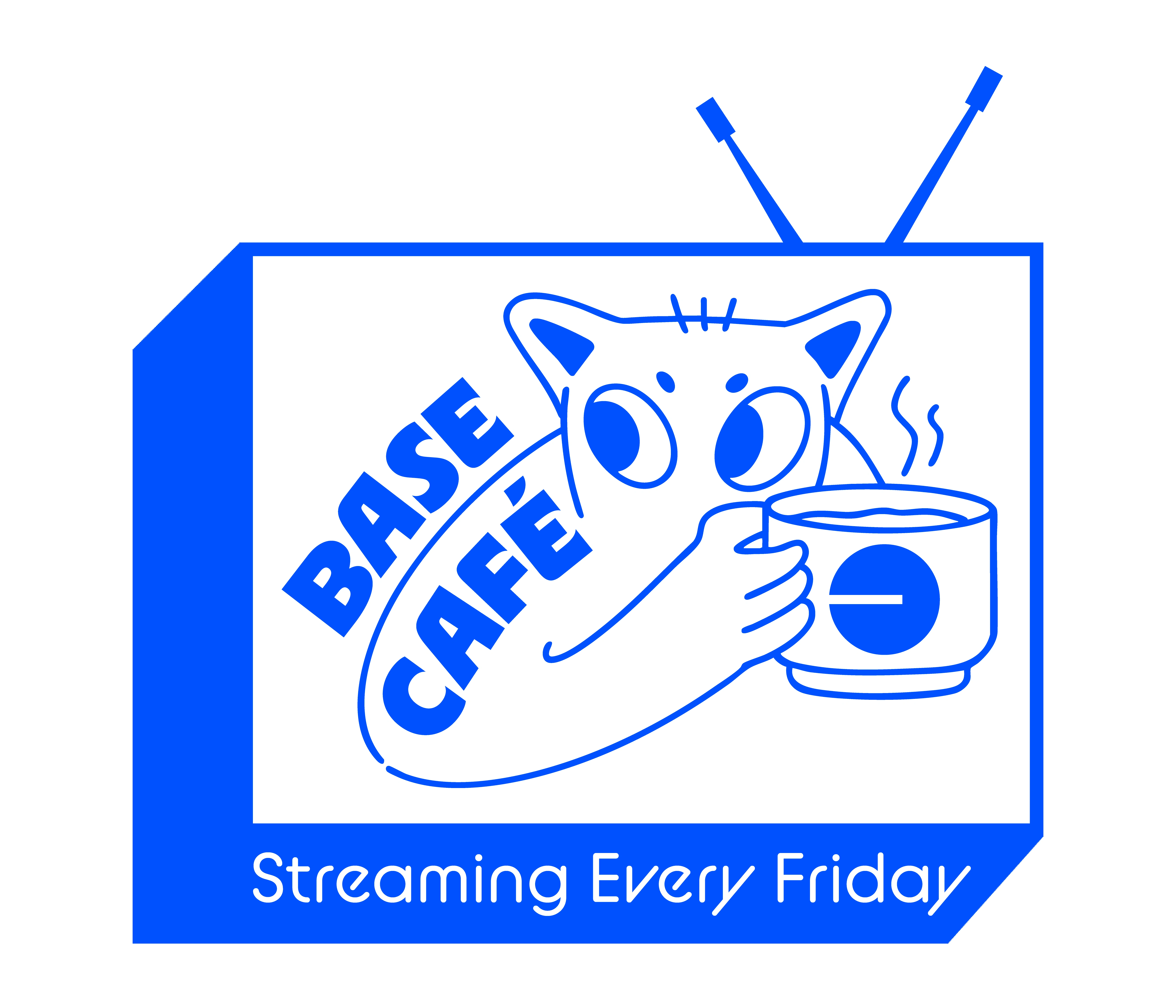
Final logo in the brand color.
Like this project
Posted Dec 3, 2025
Developed a iconic logo and identity for Base Café that strengthened recognition, clarified the streaming focus, and scaled across social templates.