Built with Spline

A fresh website & full brand identity for a fresh executive consultant
Michal is a coach working with professionals and leaders in tech, helping them navigate career growth, leadership, and personal development. As she launched her new business, she needed a website that felt modern, confident, and premium.
Inspiration
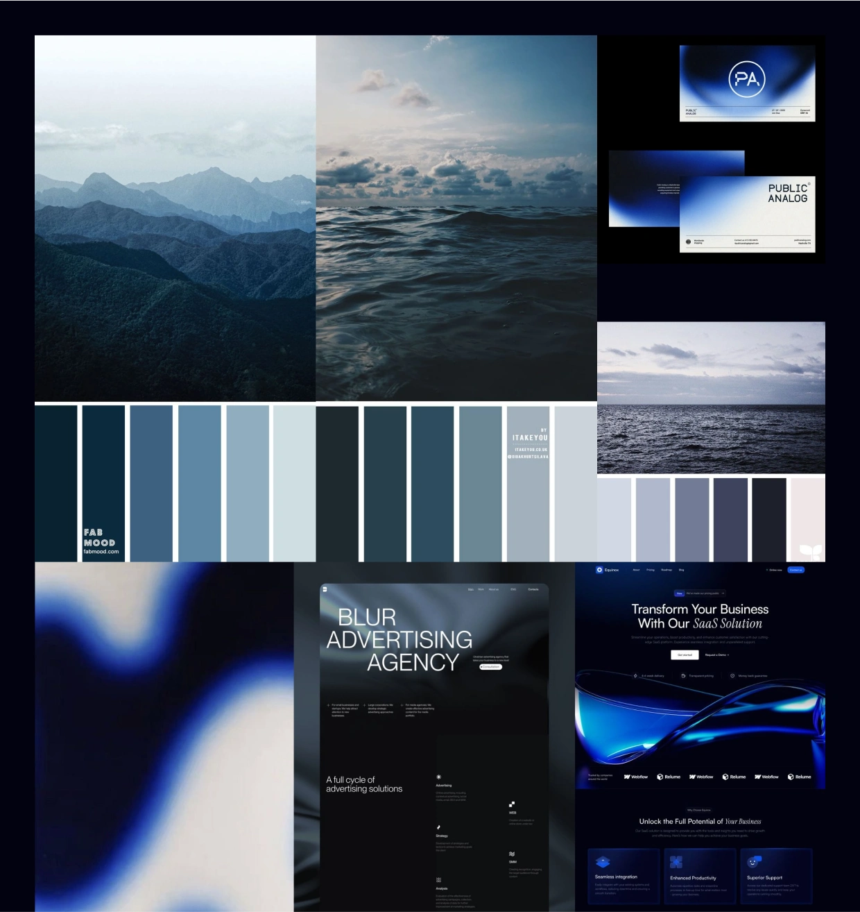
Michal was launching her coaching business and wanted a modern, tech-inspired website to connect with people working in technology. We aimed for a clean, premium design that stood out from the competition and reflected her professionalism with a sleek, futuristic feel.
For inspiration, we drew from the ocean and its waves, symbols of change and growth that align closely with the brand’s message. We also embraced the ocean’s deep blue, a color that evokes curiosity and depth.
Exploration & Drafts
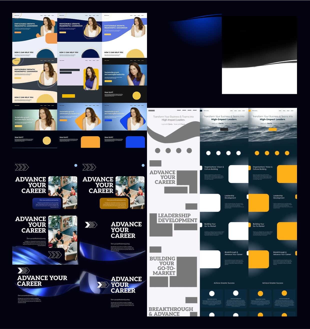
Quick drafts help establish concepts and put both myself and the client in the right direction. Then, I move to draft some layouts and create some designs based on what works best for the client and the brand.
Key Message
To break up the flow of information a bit, we added a short, uplifting message that captures the brand’s core purpose. It offers a moment of pause and clarity, reminding the viewer what the brand truly stands for.
Animation
Webflow and GSAP were used to craft smooth animations that bring the website to life.
Transitions are designed to guide the viewer’s eye, highlighting key content without overwhelming the experience. The motion adds depth and clarity, supporting both usability and visual interest.
3D Touch
To add a distinct edge and a futuristic feel to the website, we integrated 3D elements using Spline. These interactive visuals enhance the overall experience, adding depth and movement that align with the brand’s forward-thinking identity. The 3D touches make the site feel dynamic, modern, and visually engaging.
Iconography
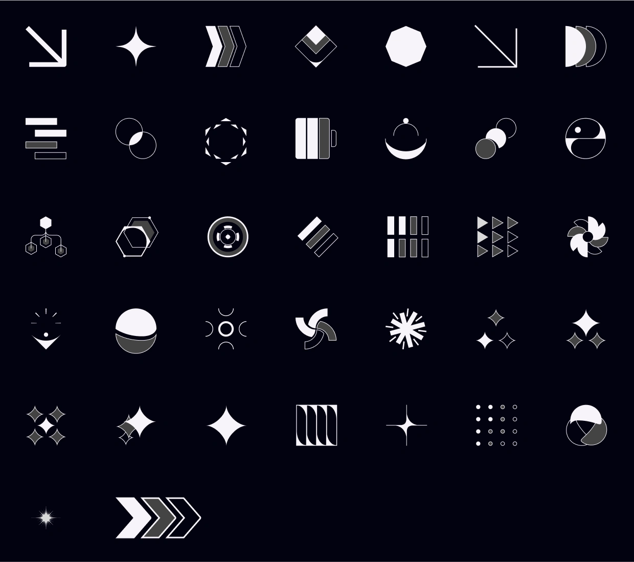
We chose a brutalist iconography style that is raw, direct, and unapologetically structured. Each icon is deliberately minimal yet symbolic, designed to communicate a clear concept without distraction. This approach reinforces the brand’s confident tone and gives each visual element intentional weight and meaning.
Typography
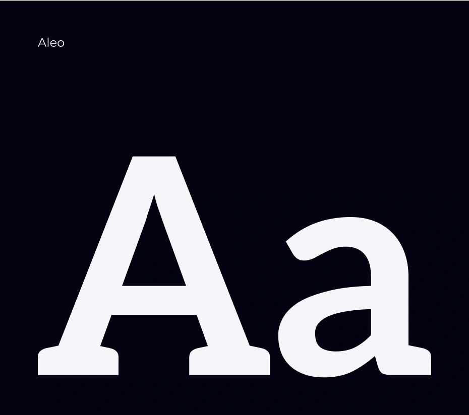
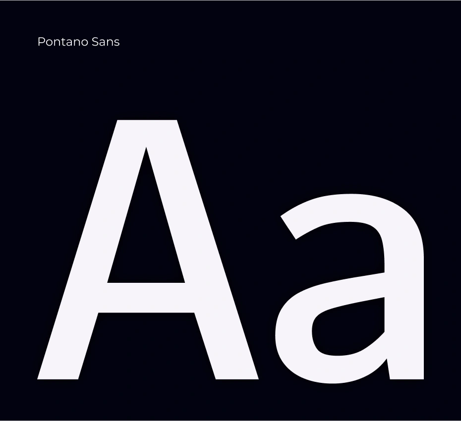
We paired Aleo for titles with Pontano Sans for text to reflect the brand’s strength and its brutalist, futuristic aesthetic. Aleo adds structure and personality to headlines, while Pontano Sans delivers clean, modern readability that supports clear, forward-looking communication.
Thanks for reading!
26 likes · 272 views · Jun 12, 2025
I designed a sleek, modern site with smooth animations and 3D visuals to bring an executive coach’s message to life with engaging movement and colors.
Timeline
Jun 1, 2025 - Jun 12, 2025


