The Witch's Rede website build
Need a low/no-code website built? I decided to design and build a digital home for graphic novel The Witch's Rede. I gathered a list of core features, prioritized them, mocked up designs, and built the pages in Webflow. What I learned in the process was how to make web designs easier to build without sacrificing aesthetics.

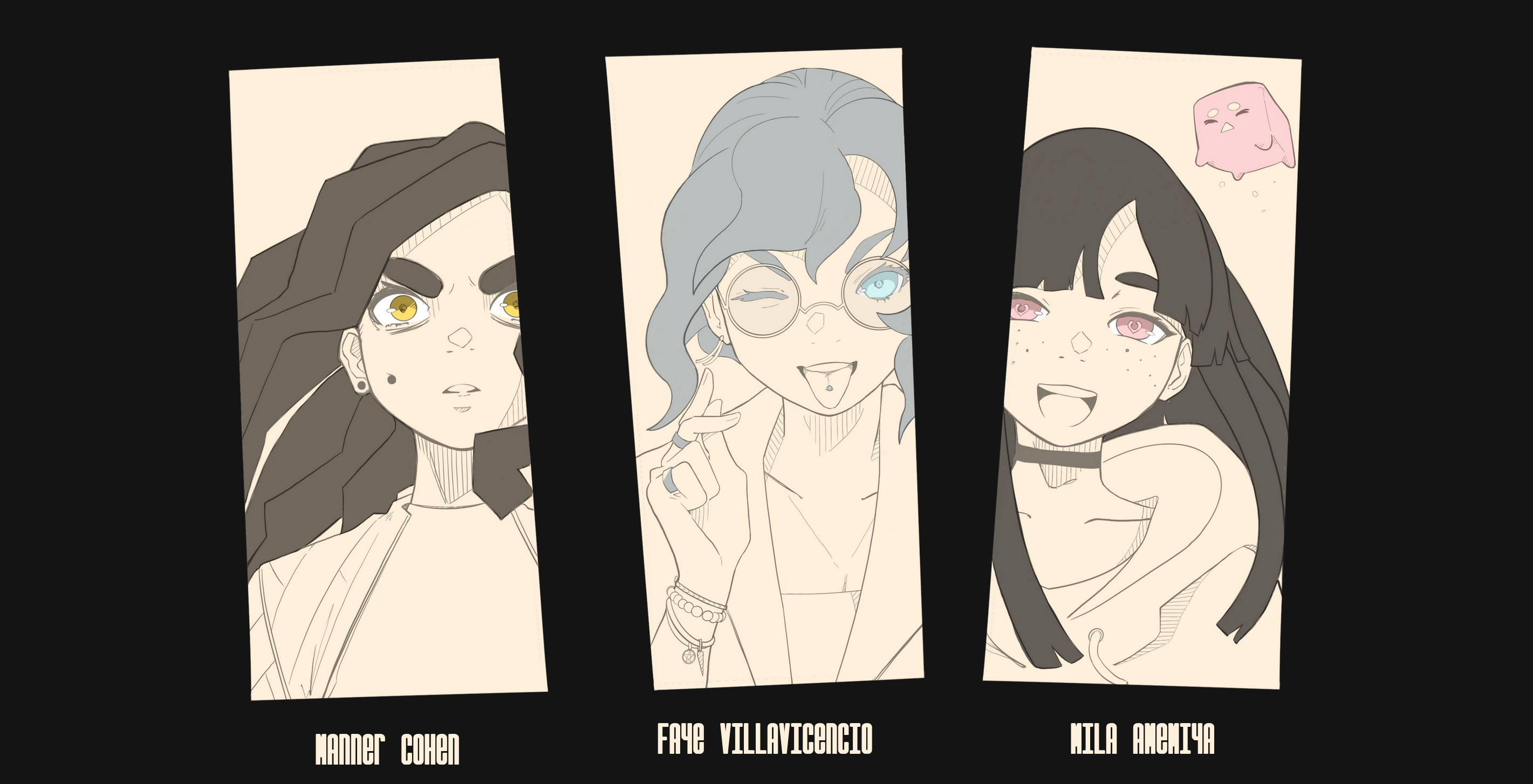
A hero image from The Witch's Rede website, showcasing several character illustrations.
The Challenge
Some flows, like checkouts in e-commerce, are pretty well established. Reading comics is not one of those flows. There are a lot of different ways to create your pictures, and a lot of ways to display them. Without a clear path to follow, I set out to find a realistic one for my project.
Research
Good (comic) UX focuses on simplicity

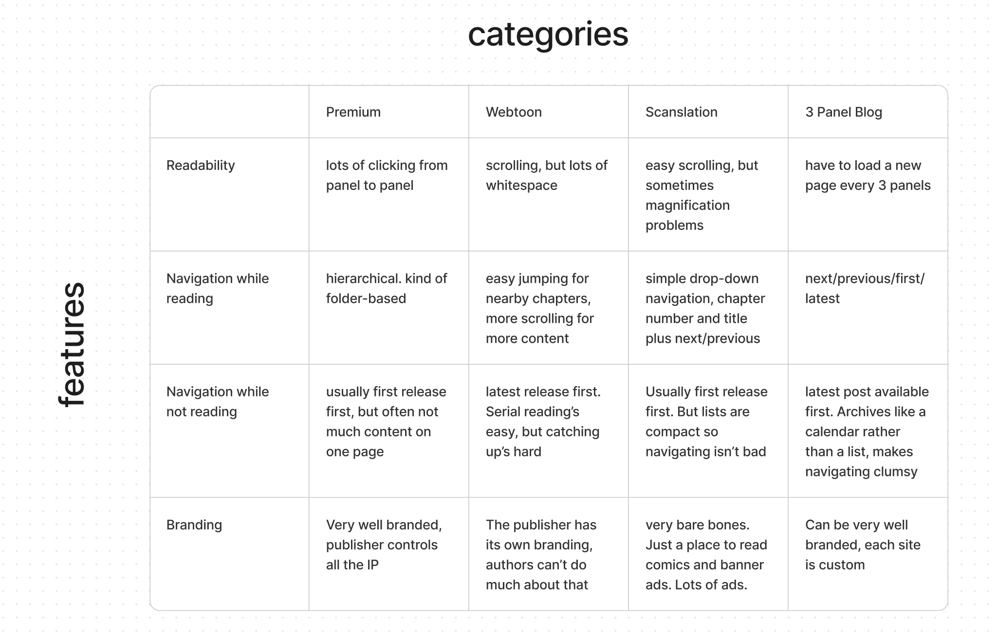
A chart comparing the different styles of digital comic along several axes, including ease of navigation and legibility.
I did a broad survey of digital comics to determine what features are important for a comic reader, and what UX patterns exist.
The easiest comics to read require minimal clicking. I don't want to reload the entire site every time I need a new page. Nor do I want to click constantly to pause or unpause a slideshow.
The easiest comics to navigate have chapter lists. Most comics have first/back/next/latest navigation, but that can make it hard to come back to reading after a break, or to find a specific moment to re-read.
Design
Leave options open for iteration
Over-designing would be wasteful. The Witch's Rede only has one chapter, and updates one page at a time. Trying to design now for the comic five years in the future would make the site feel clunky. I decided to load all the images onto a single page.
The site should cater both to new and returning readers. The page should load the oldest image first for first-time visitors, and the latest image at the bottom, with an anchor link down to it at the top of the page for readers returning every update.
Branding
Balancing originality with readability
I wanted branding that would communicate the concept of a 'witch' without evoking the kind of stereotypes you might see on Halloween. So I opted for a dark theme and a moon motif, but stayed away from gothic or pagan imagery. While I originally used mystical symbols as site iconography, I eventually replaced them with my own creations. I used with tall typography with a thin stroke weight to reinforce a dark, creepy feel.
Build
Simple can still be striking
After a few mock ups, I started to build Webflow. But I quickly ran into a problem. The wide, horizontal layouts and organic shapes I chose to make room for the comic overlapped in unexpected ways on smaller screens.
I started building and designing in quick loops, iterating to make each section of the site perform well on mobile. As a result of this work, the section above became the section below:
Not only does it work better on a variety of screens, it has a more dynamic look. Building the site myself gave me a better sense of what was possible in my designs.
Result
Bewitching Branding
The website is live, and, tied into social media, I think it's a pretty good first step for launching this project. The home page will start pretty simply, just containing a few images, but as it gets longer I'll add navigation to match.
Like this project
Posted Apr 16, 2024
A full website design and build in Webflow promoting an upcoming graphic novel.
Likes
0
Views
0


