Cadence
Jeremiah Ragsdale

Visual identity for a mindfulness audio app.
This concept brand's target demographics are those who utilize soundscapes and binaural beats for focus, meditation, and sleep.
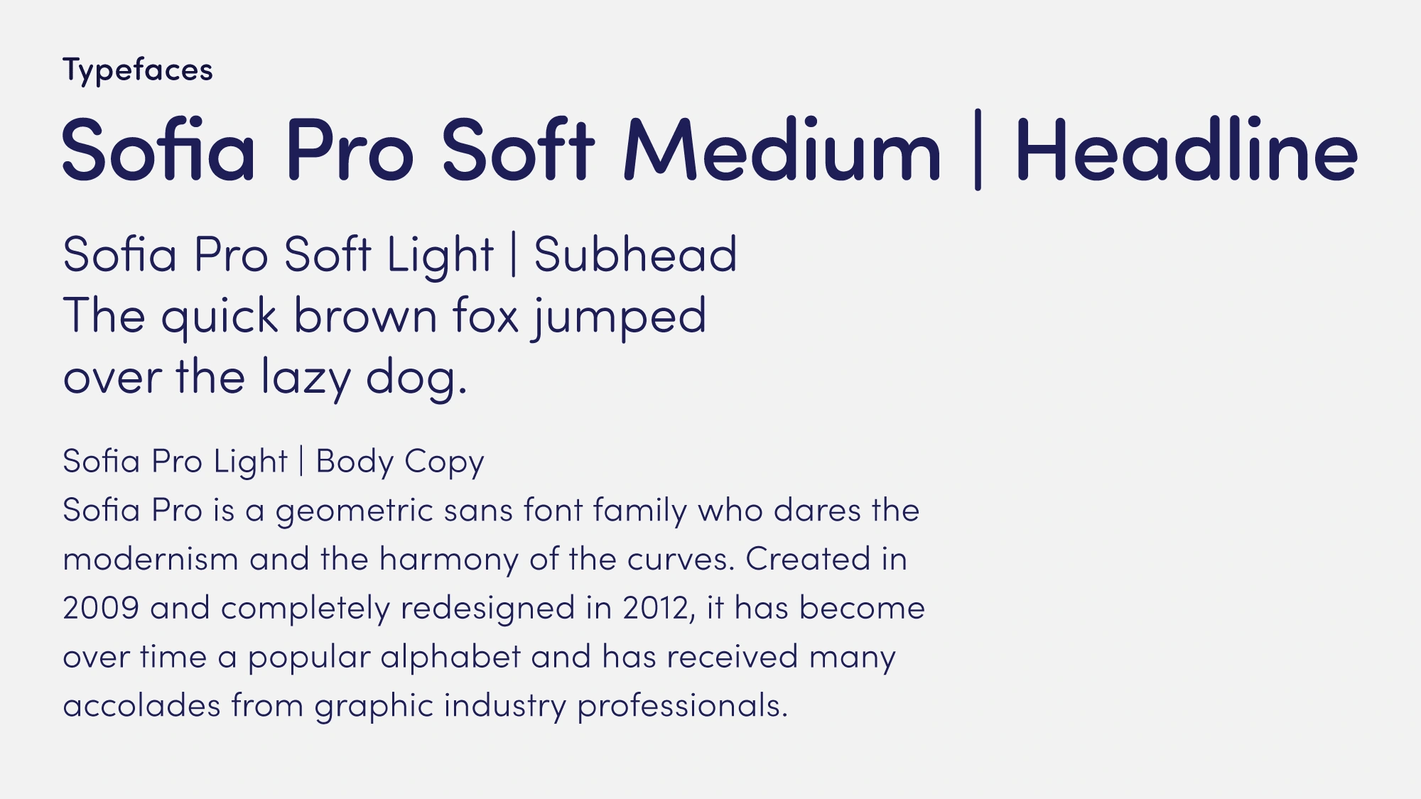
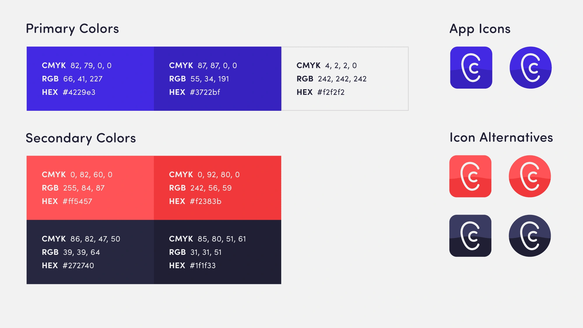
The simple approach of the visual identity would be carried over in the use of the app to minimize distraction. The brand's primary colors are complimented and contrasted by its secondary colors. The use of secondary colors is intended for communications and in the app for customization, encouraging the user to choose their cadence.
The wordmark's baseline is a nod towards an audio wave and mimicks the inflections when saying "Cadence."The ear in the wordmark is intended for use on its own in places where the wordmark would not fit.


Like this project
Posted Jul 16, 2021
Likes
0
Views
55