Eko
Visual identity for a company that creates digital health solutions.
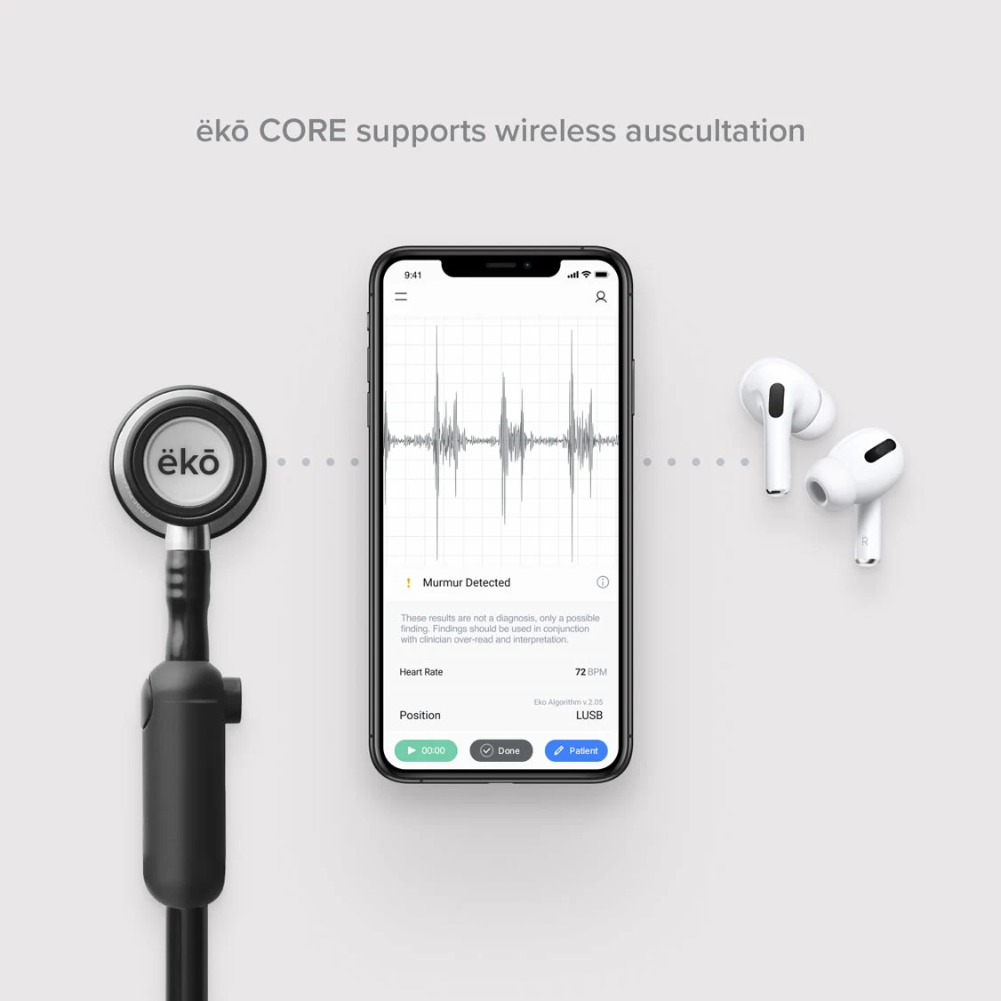
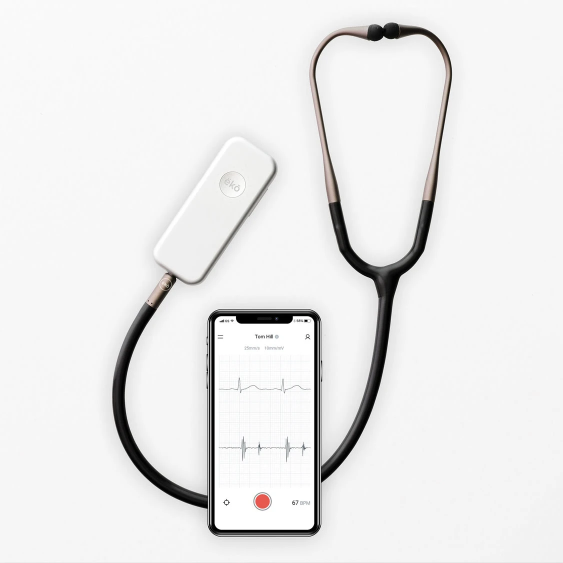
Eko produces digital medical devices and offers a platform that helps doctors, nurses, researchers, and health systems to better care for the heart.
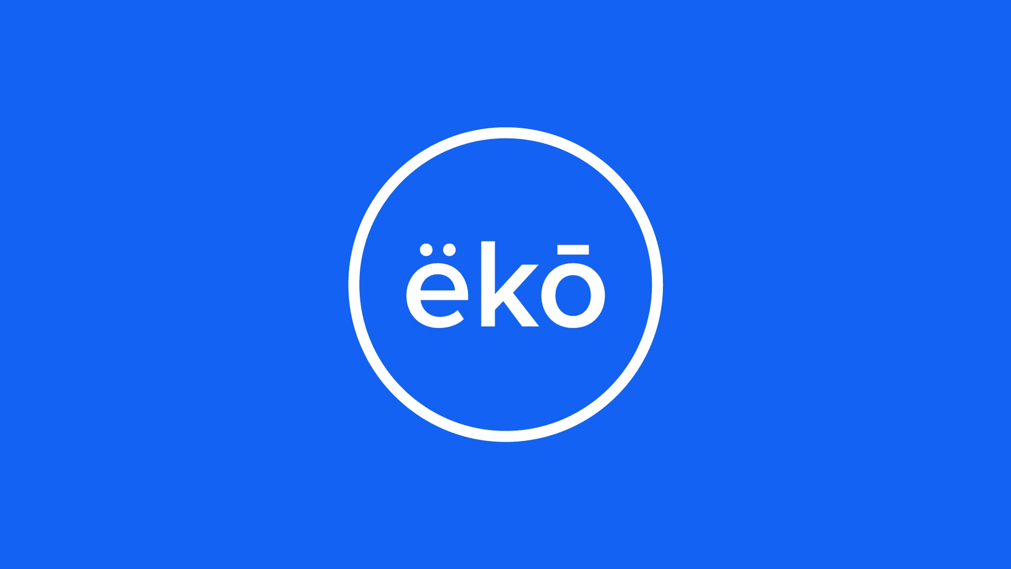
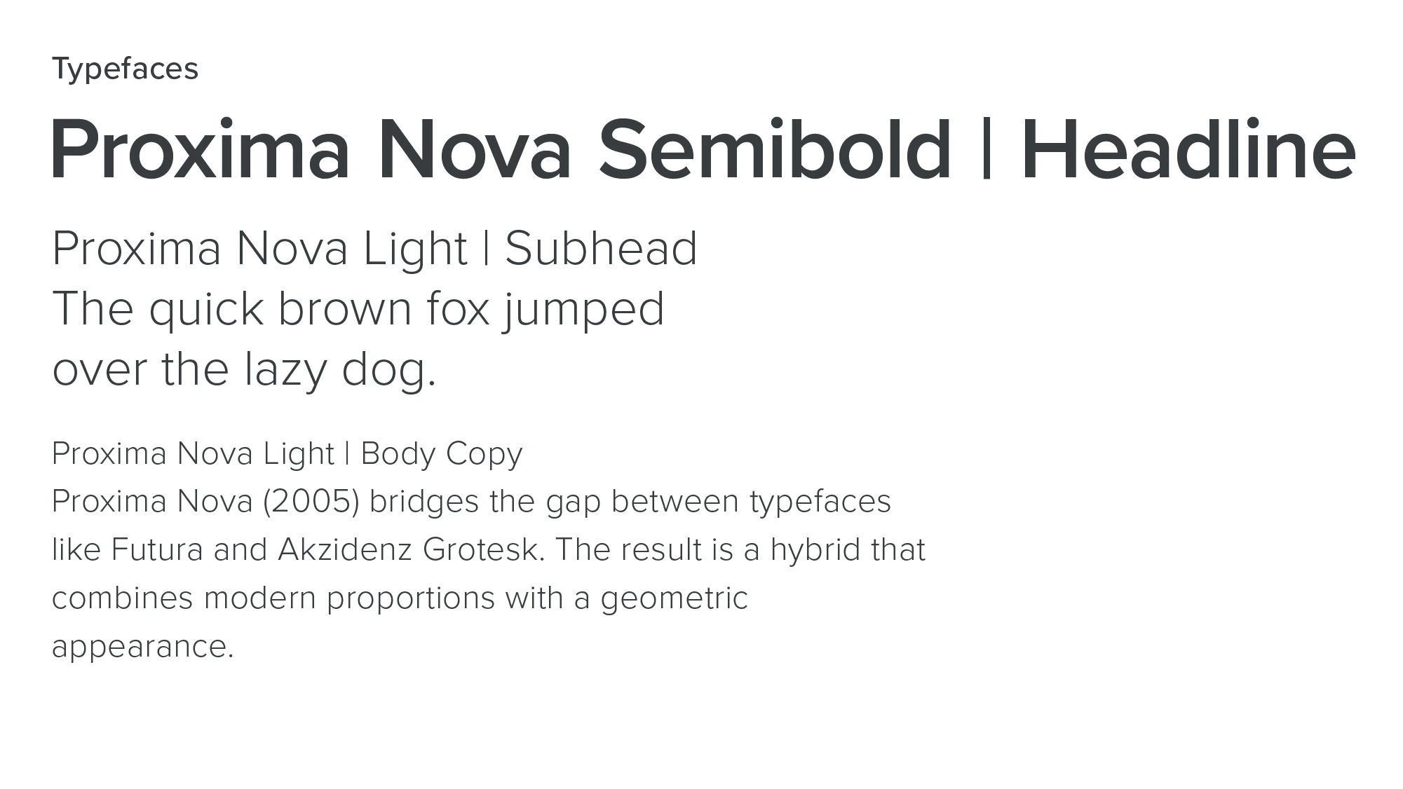
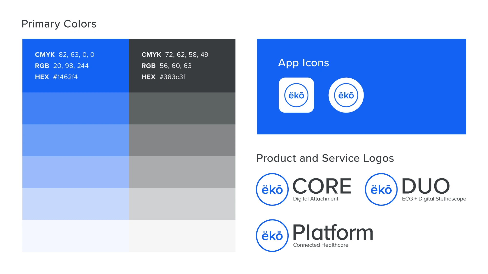
For this self-initiated proposed rebrand, I created a simple, recognizable logomark and established a visual consistency across their products, website, and social media.
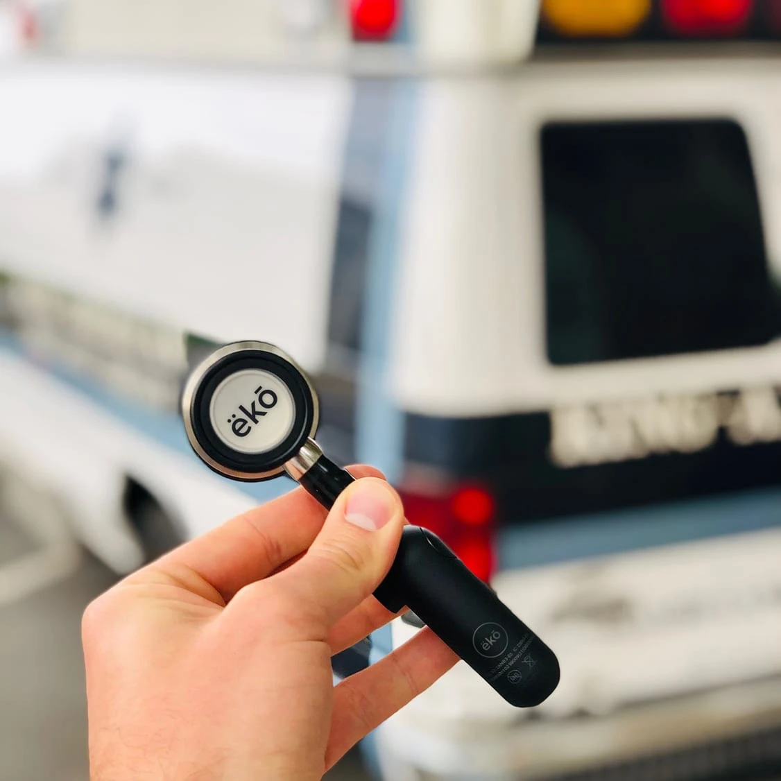
The name is reformatted and kerned to create a strong balance, left to right, using diacritics to both clarify pronunciation and reinforce a visual rhythm. The ring echos the mark's placement on the surface of a stethoscope's bell.



Like this project
Posted Jul 16, 2021
Likes
0
Views
83


