AI Diagnostic Startup Communication Pitch Deck

Scott DS Young
Verified


Brand Identity Translated into Investor Communication
Brand Idea — Anti-Fragility Health Clinic (AFHC)
To support AFHC’s investor outreach, I developed a brand identity system designed to communicate resilience, innovation, and trust within the healthcare space.
AFHC is built around the concept of anti-fragility — systems that become stronger through stress and adaptation. The identity expresses this philosophy through an interconnected logo form representing a holistic and strengthening approach to wellness.
The color system reinforces the message:
• Blue signals medical trust and credibility,
• Green represents renewal and healing
• Red introduces vitality and human energy
Together they form a visual language designed to communicate clarity, resilience, and modern healthcare innovation.
AFHC focuses on personalized and preventative medicine for individuals seeking proactive approaches to chronic health challenges. Clear visual communication was essential for presenting this complex model to potential investors.
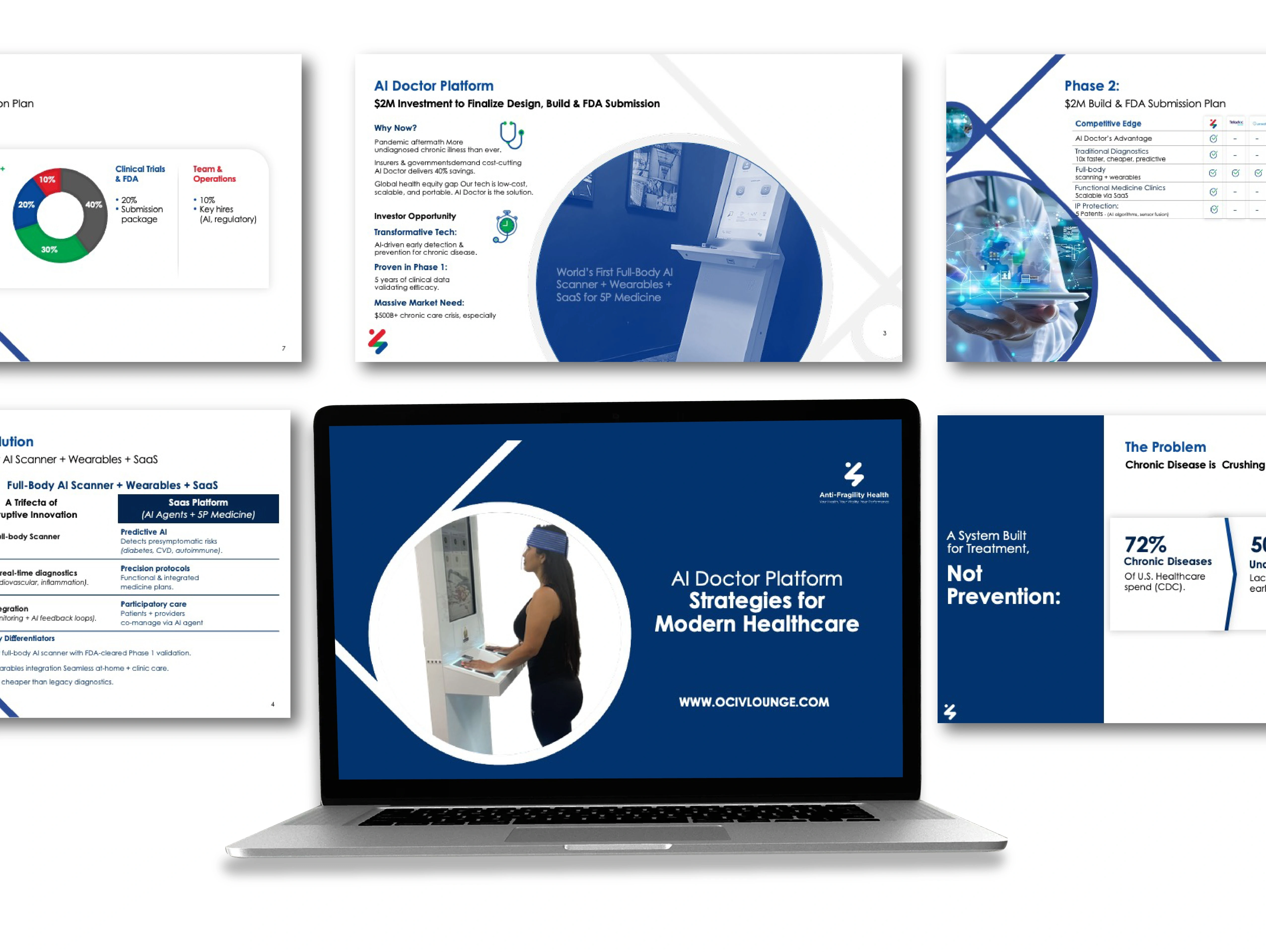
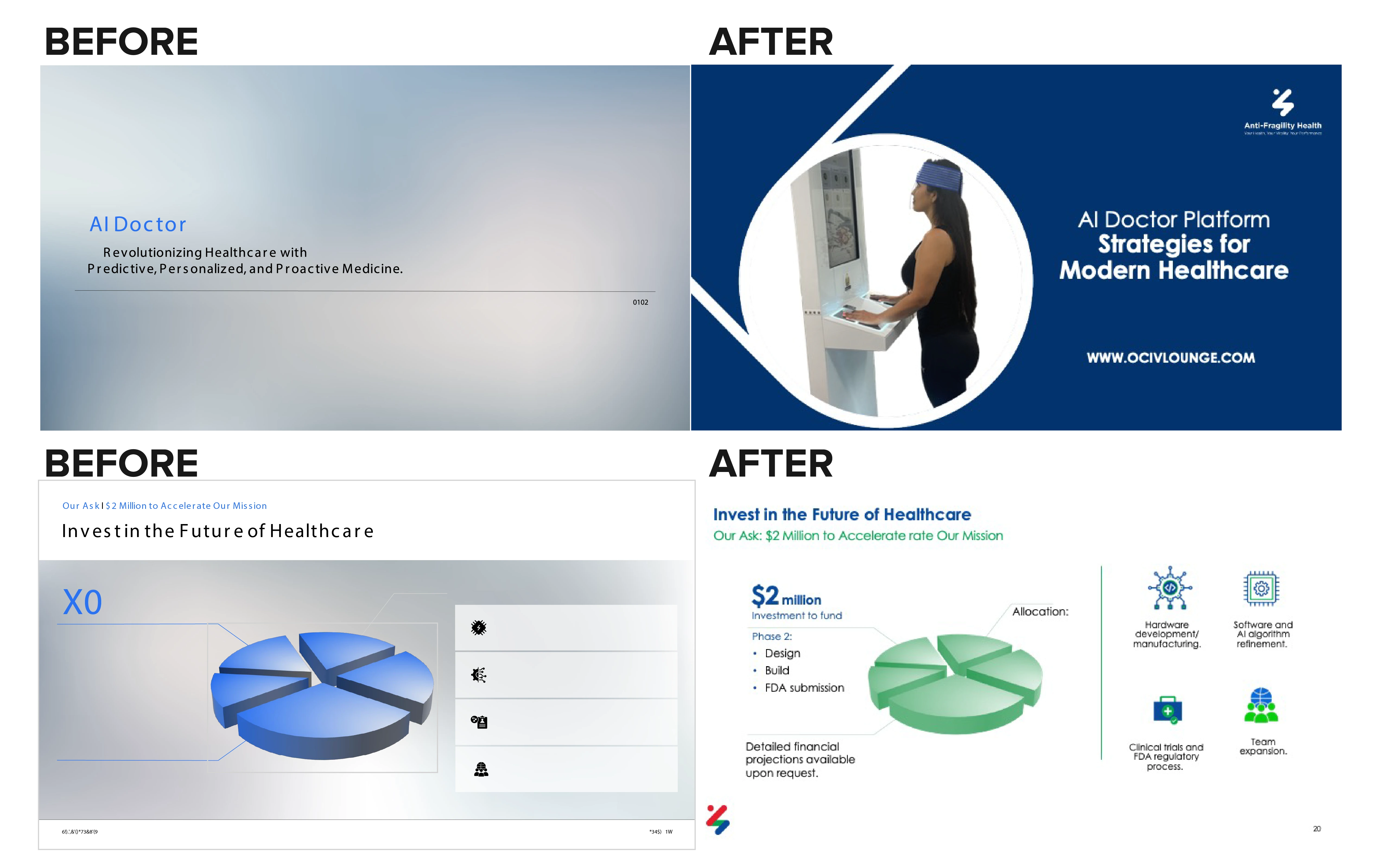
Challenge
The original investor deck lacked a cohesive visual structure. Inconsistent layouts, dense content, and conflicting colors made it difficult to communicate the company’s value clearly and confidently to investors.
The goal was to establish a clear visual identity and structured presentation system that could translate complex healthcare innovation into a focused, investor-ready narrative.


Typography System
A geometric sans-serif type system establishes clear hierarchy across headlines, supporting insights, and technical data. Defined type scales and spacing rules guide readers through complex information while maintaining clarity across presentation and marketing materials.
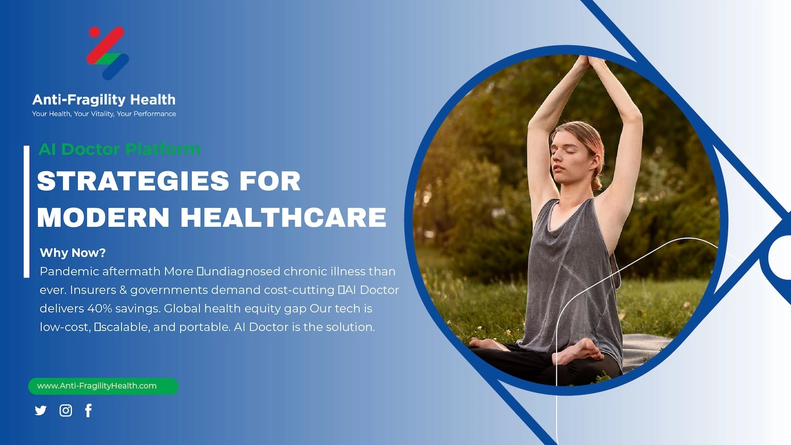
Logo & Brand Identity
The identity centers around an abstract mark inspired by anti-fragility — systems that grow stronger through adaptation and connection. Interconnected forms symbolize a holistic approach to strengthening health outcomes while suggesting forward momentum and technological innovation.
The color palette reinforces the concept:
• Blue for trust and clinical credibility,
• Green for renewal and healing,
• Red for vitality and human energy.
Role & Approach
I developed the visual identity and presentation system, structuring the narrative and establishing consistent design rules across the deck.
Slides were simplified to focus on a single idea at a time, using typography, color, and layout hierarchy to guide attention. The resulting system created a clean, cohesive framework that supports both investor communication and future brand applications.
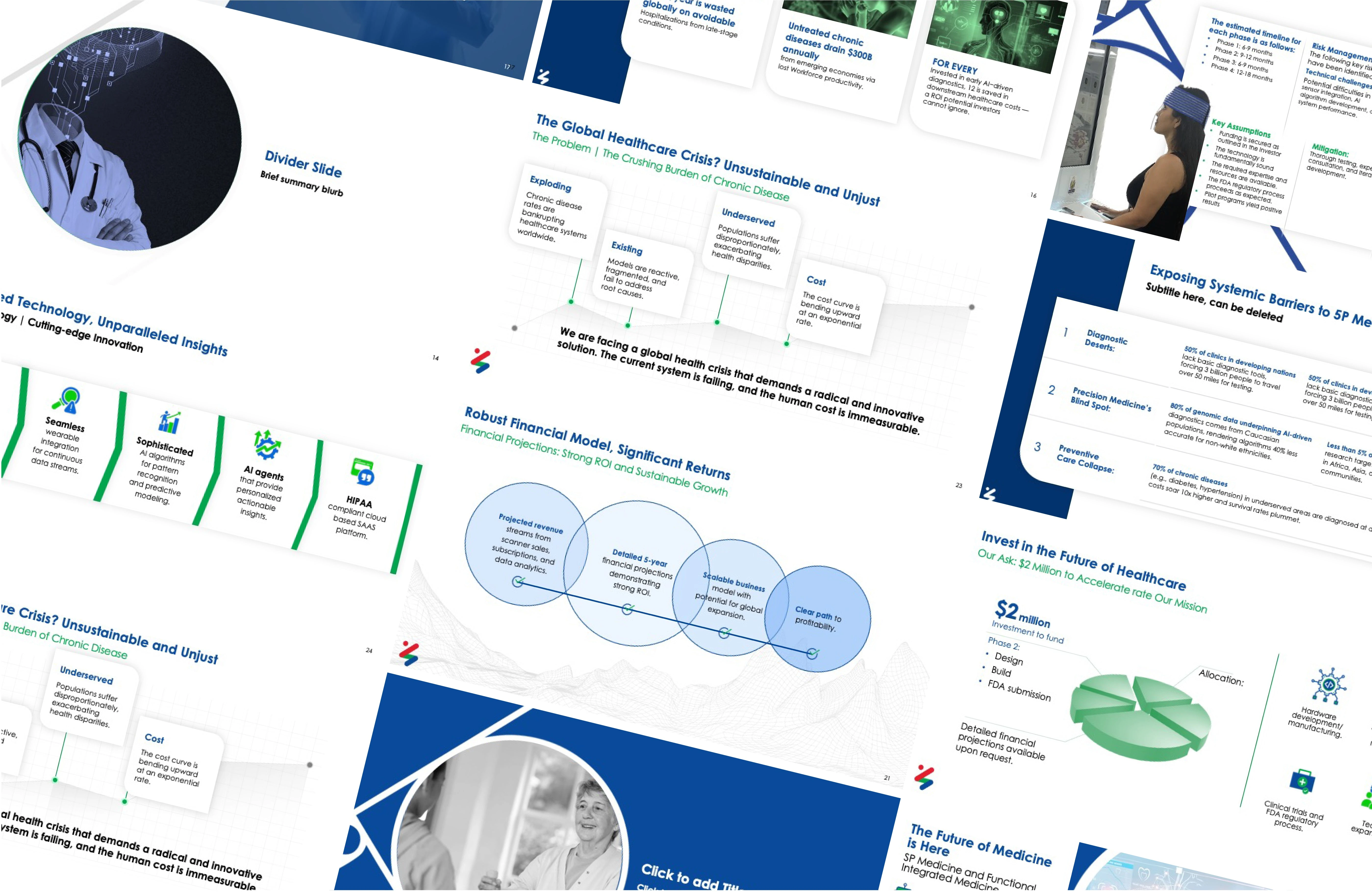
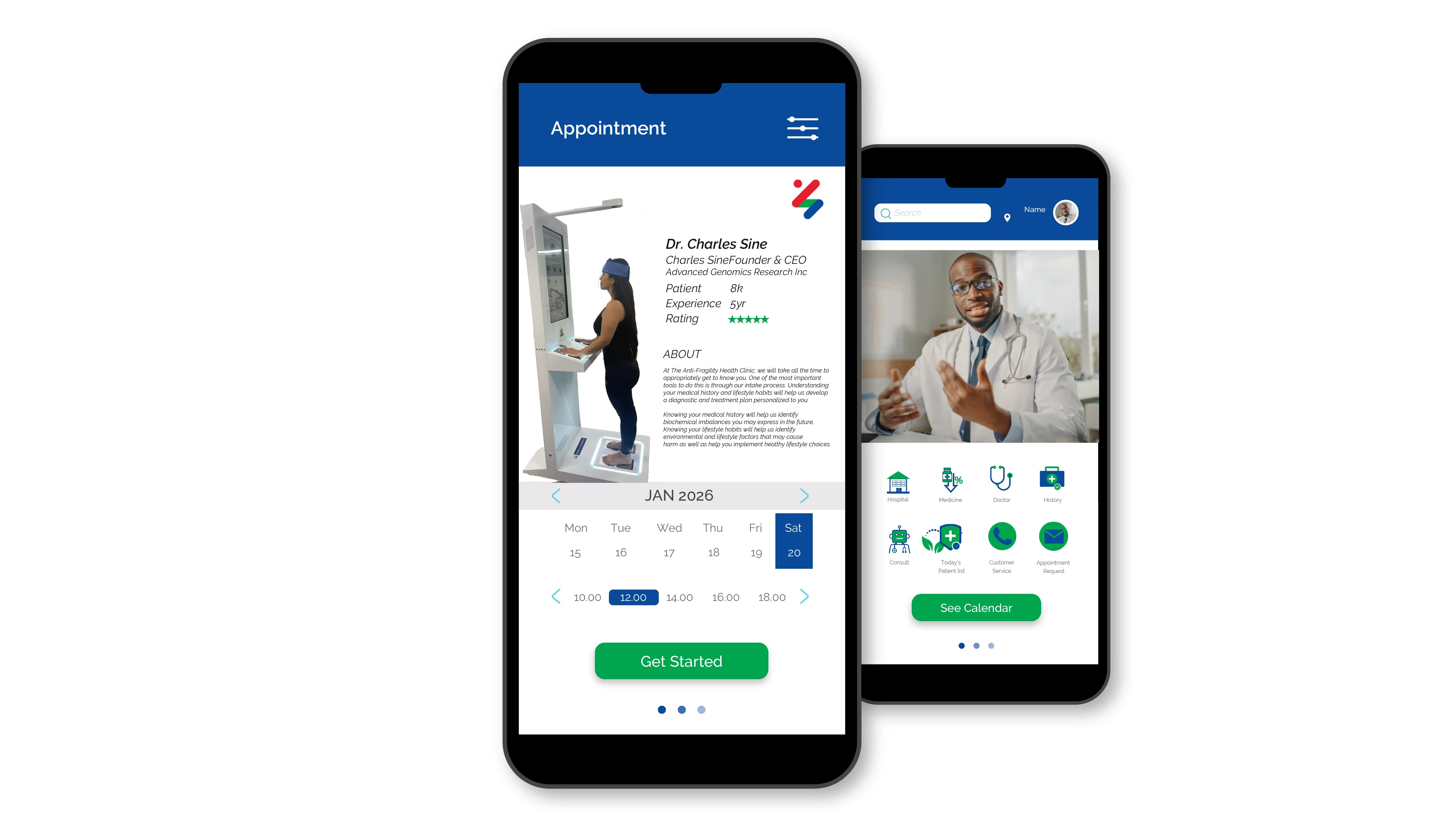
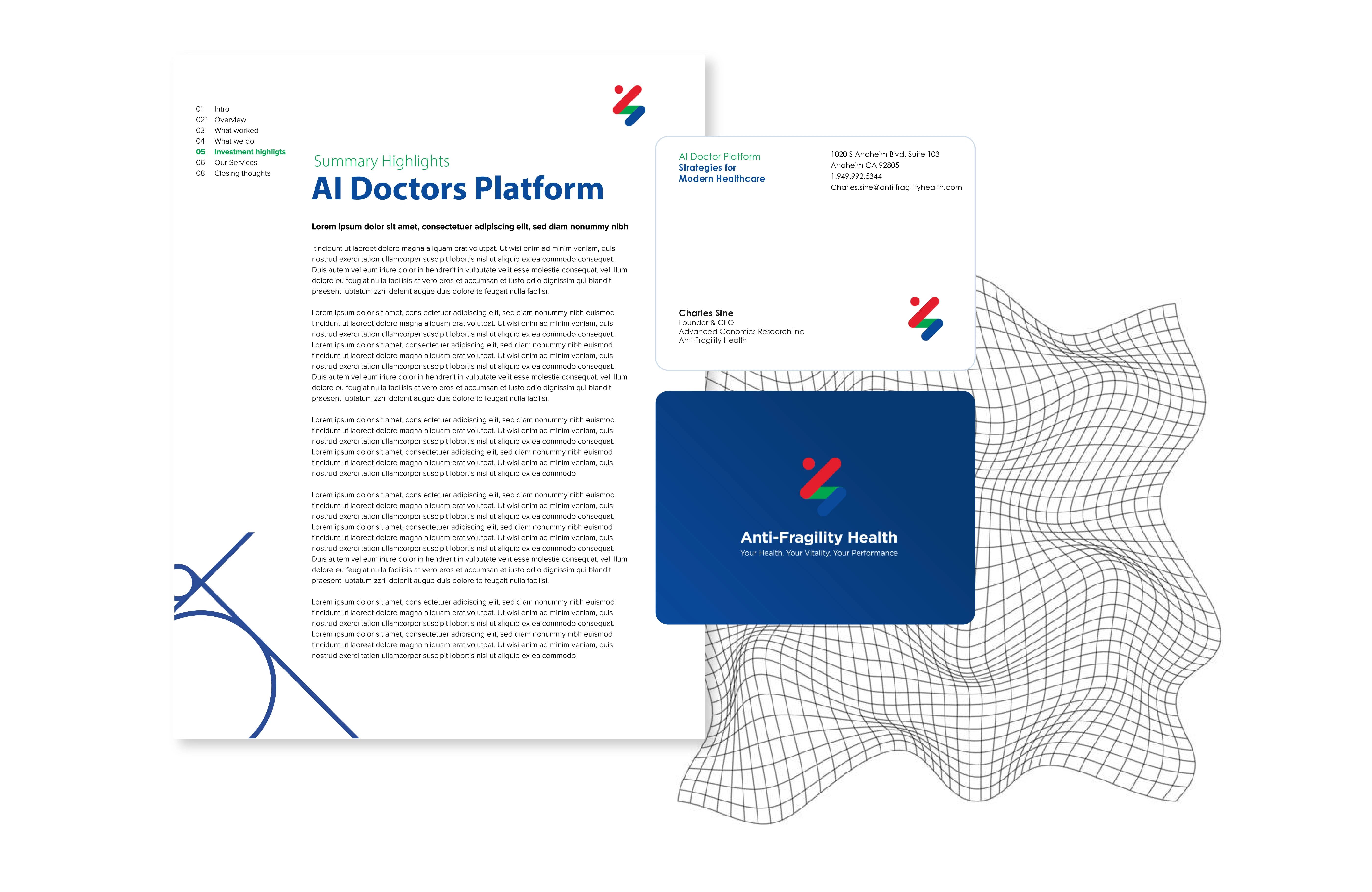
Visual language applied across investor and marketing assets
Visual language applied across investor and marketing assets

Like this project
What the client had to say
Kind and patient. Very through and fast
Charles Sine, Anti-Fragility Health
May 20, 2025, Client
Posted May 23, 2025
Brand identity system translating complex healthcare technology into a clear visual language for investor communication, presentations, and digital brand assets
Likes
0
Views
109
Timeline
May 5, 2025 - May 20, 2025
Clients
Anti-Fragility Health