Yummy Pot Visual Identity Design | Case Study
Archivo Studios
Yummy Pot’s idea centers around a modern, playful take on asian inspired comfort food, where bold flavours are served with a sense of warmth and nostalgia.
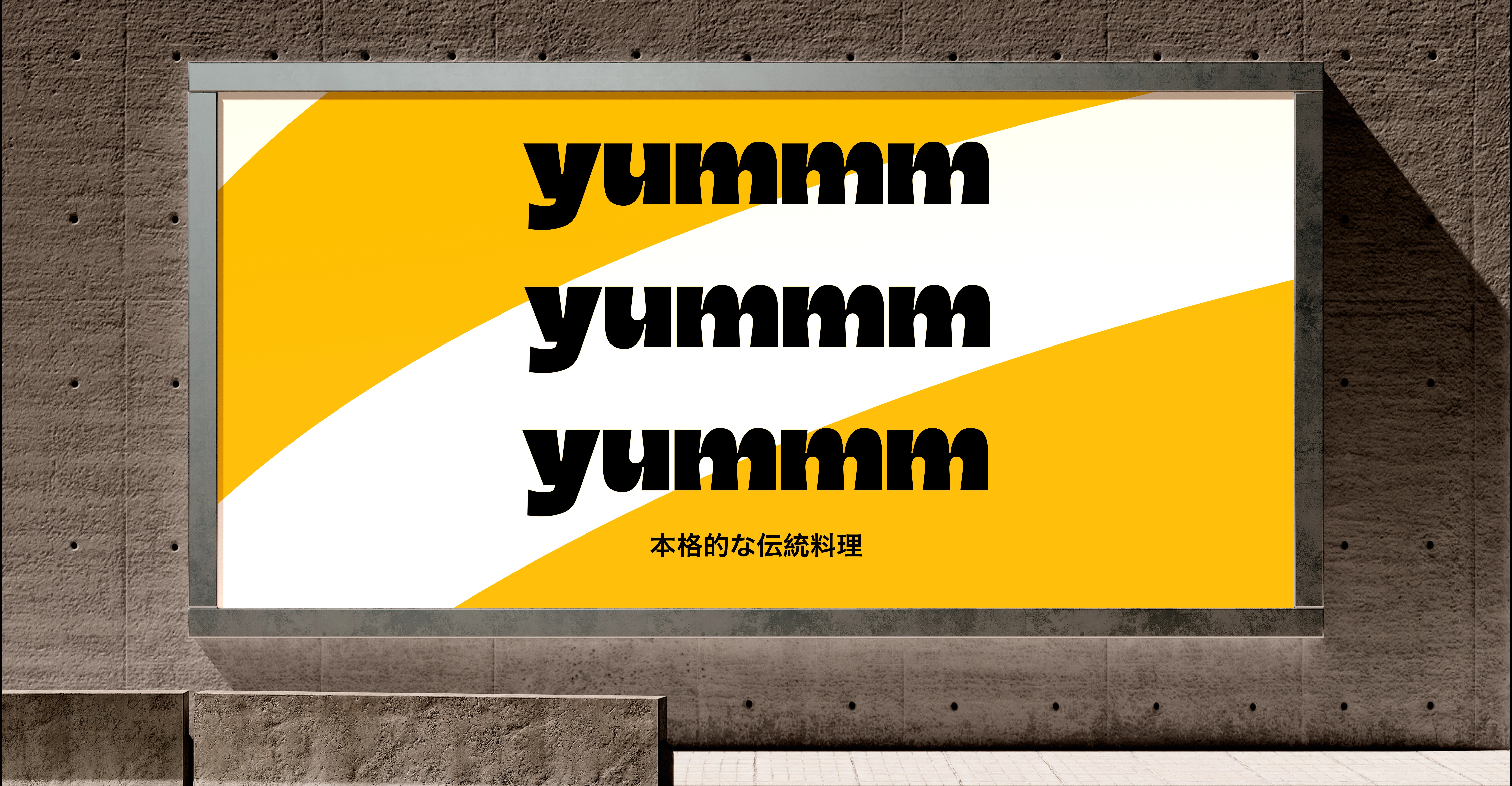
The visual identity blends clean minimalism with a pop of character, combining vibrant color palettes and quirky sans-serif typography. It combines a warm, approachable tone with subtle cultural references. The goal was to explore how type, colour, and form can work together to evoke both authenticity and modern street-food energy.
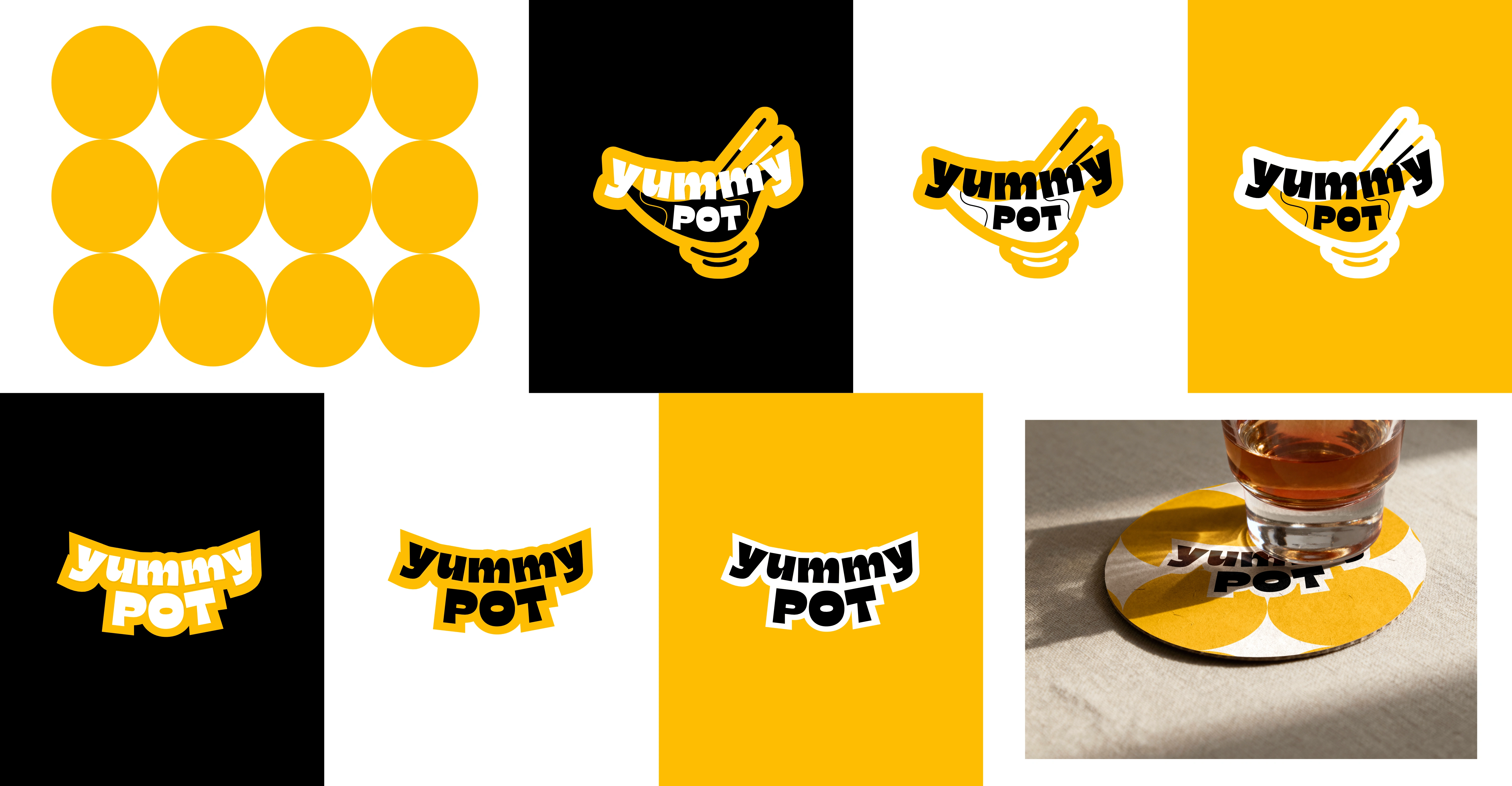
The image above highlights how the logo adapts across the brand’s colour palette consisting of black, yellow, and white & demonstrates the consistent use of patterns and visual elements throughout the identity system.
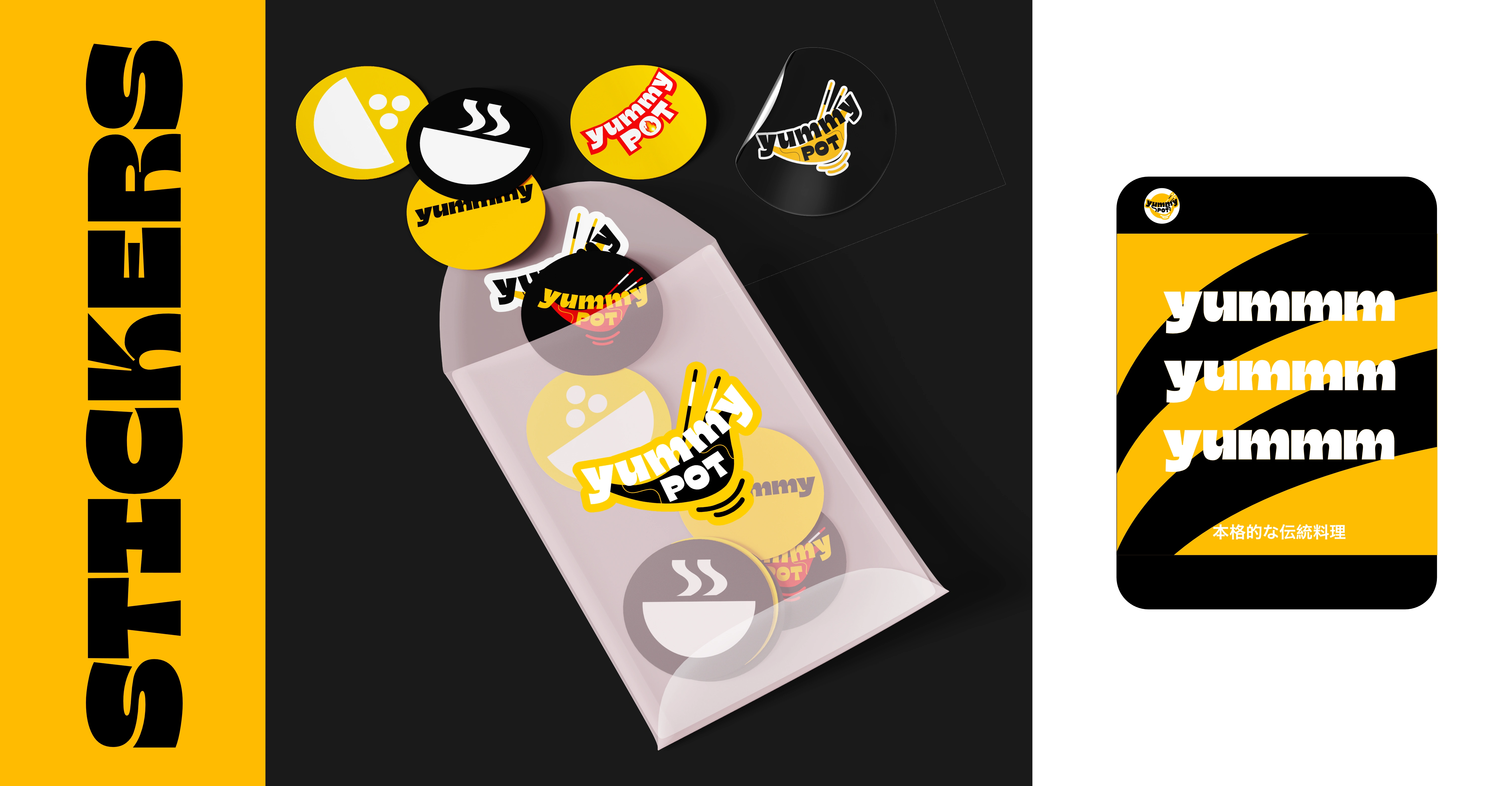
The sticker collection brings the Yummy Pot identity to life in a more casual, expressive way. Each design reflects the brand’s warm and playful character, using the black, yellow, and white palette to maintain consistency while adding energy and movement.

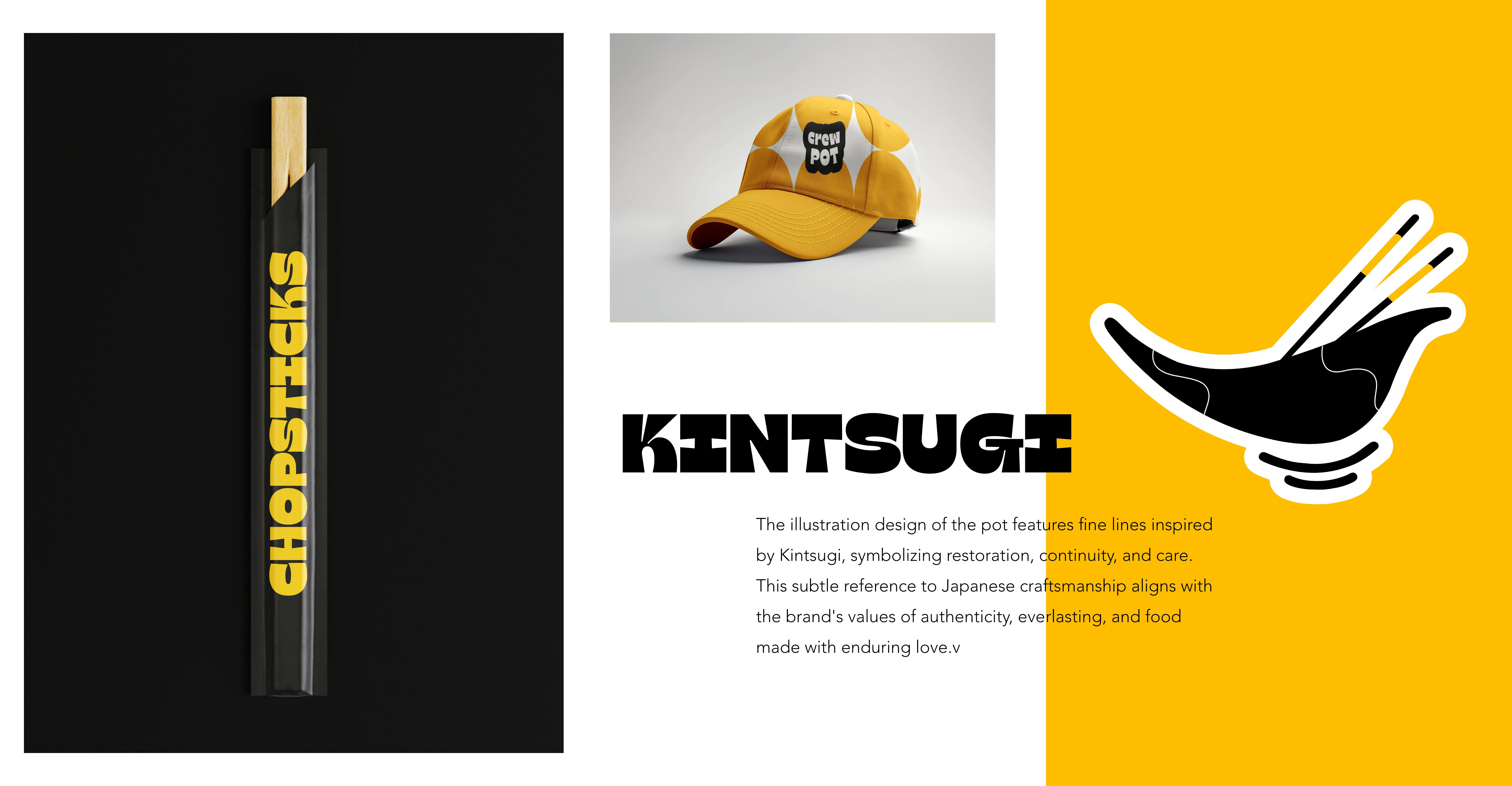
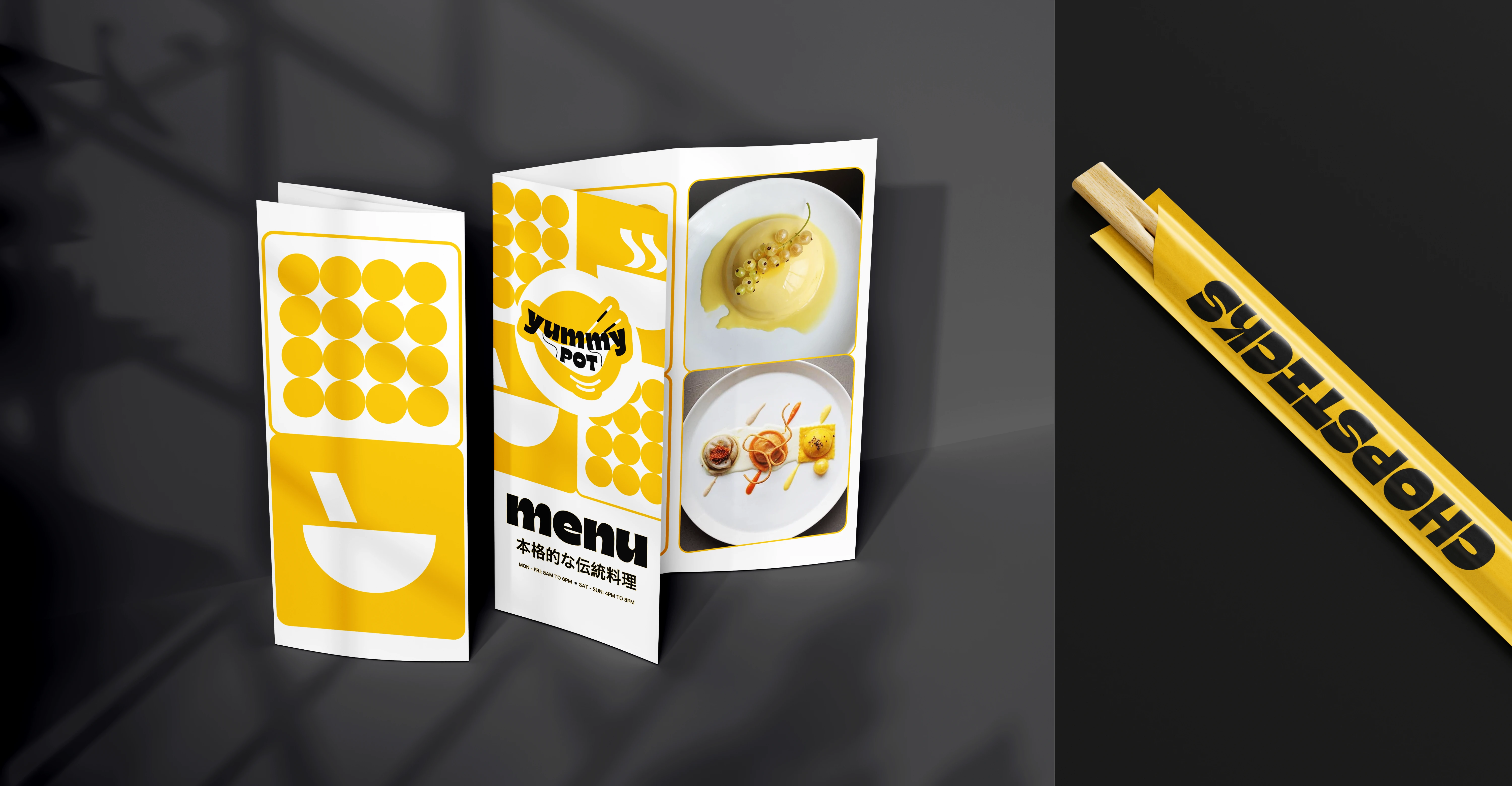
A demonstration of how the Yummy Pot branding translates into a real-world environment. The cohesive use of the logo, colour palette, and typography helps create an inviting and recognisable visual presence for the brand.
Like this project
Posted Nov 7, 2025
Developed a modern visual identity for Yummy Pot with vibrant colors and playful typography. A modern food brand exploring playful and cohesive visual identity.
Likes
2
Views
7
Timeline
Oct 7, 2025 - Nov 5, 2025