Built with Framer
Ocella: AI Eye Exam Results Portal

Artis Lutkovskis


Ocella – Eye Exam Results Portal
Client Pain
After an eye exam, patients got a printout full of numbers and terms like "central subfield thickness 268 µm" with no explanation. To understand it, they called the clinic, searched online or simply worried until the next visit. AI made it possible to spot changes in the retina earlier than before, but patients didn't know whether to trust what a machine had found. Reception spent hours every week answering the same question: "Is this dangerous?"
About Project
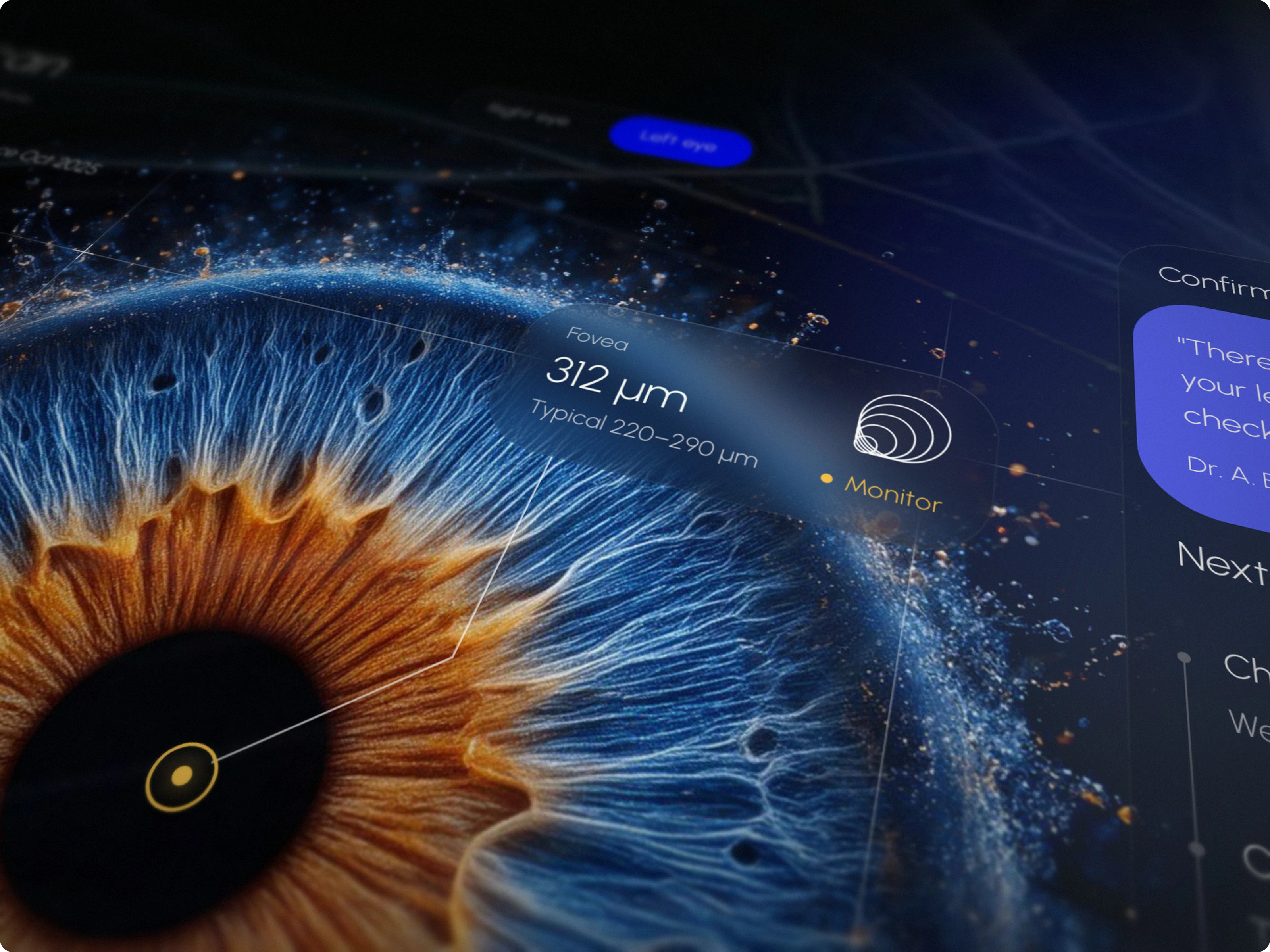
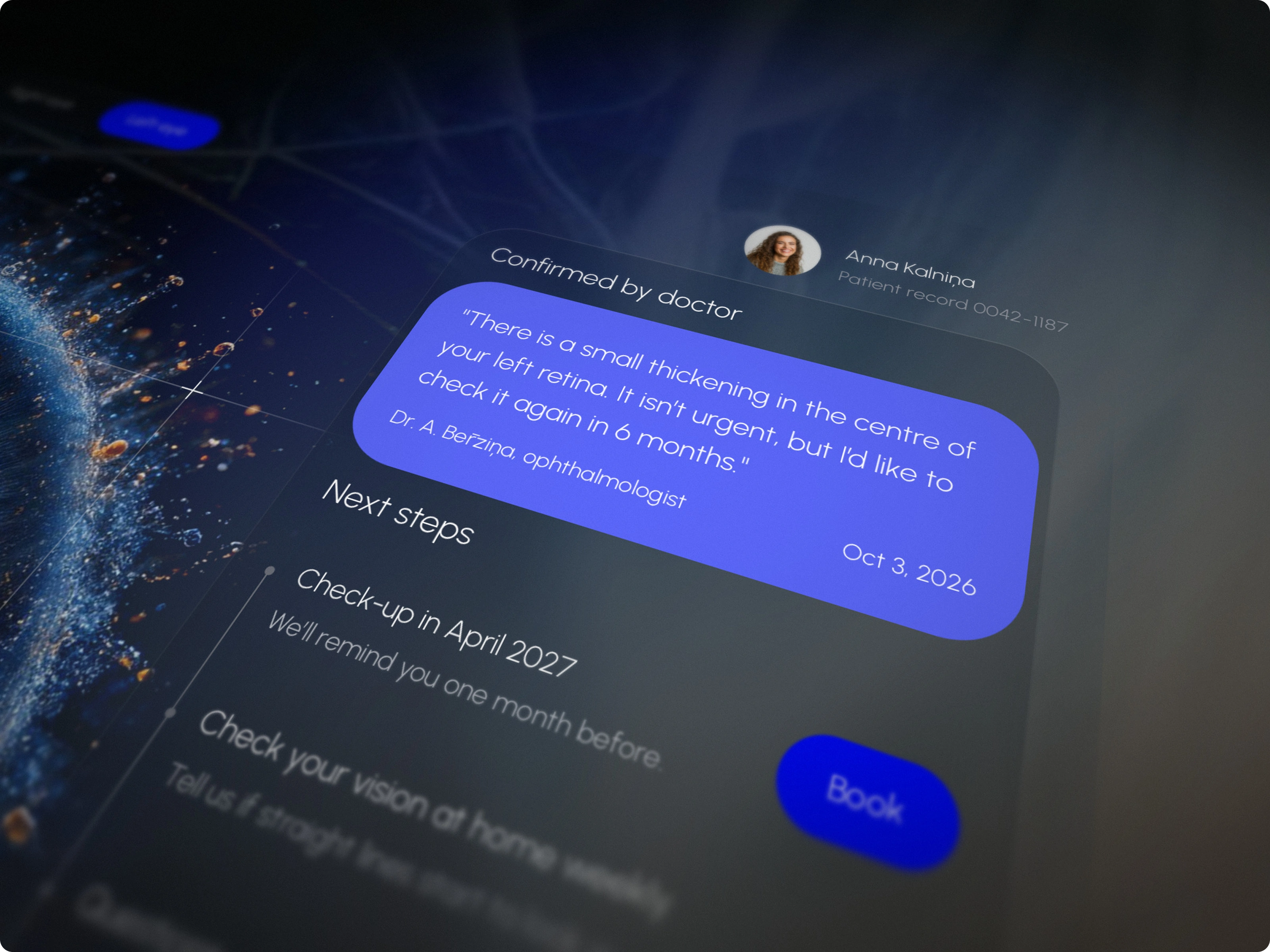
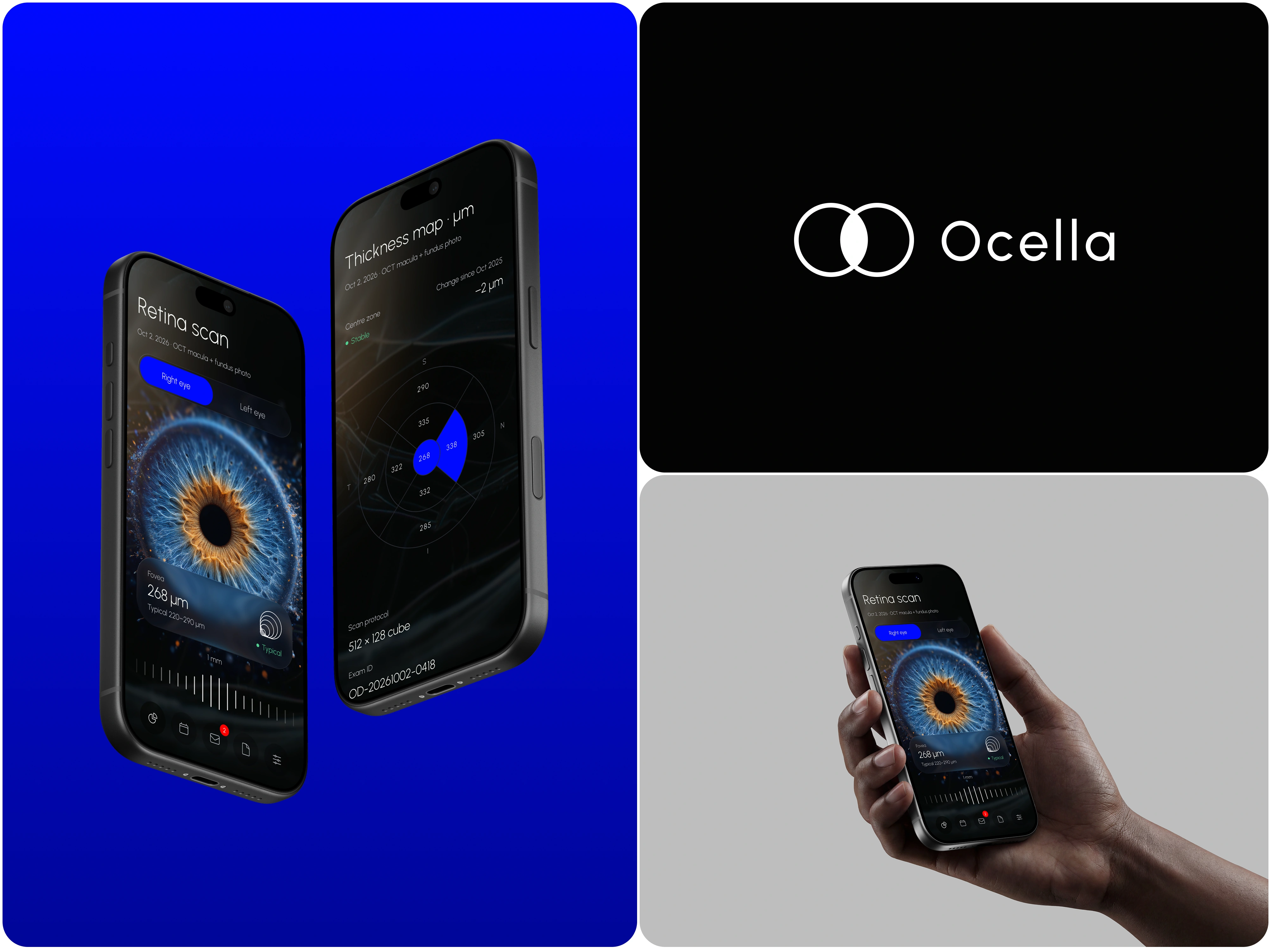
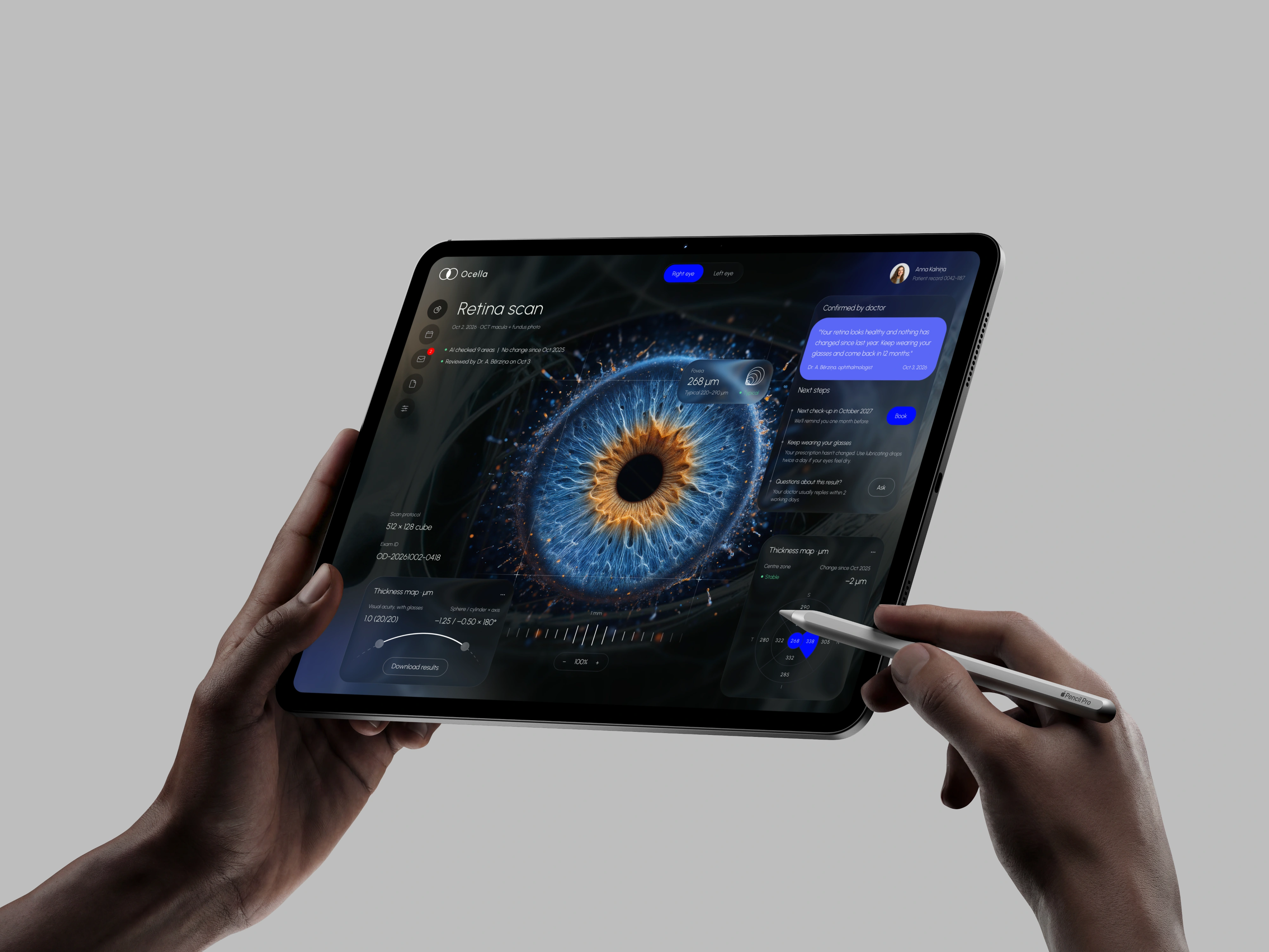
Ocella is a patient portal for an ophthalmology clinic that uses AI diagnostics. Every result is shown in two voices: what the AI measured, and what it means in the doctor's own words. The patient sees an image of their eye in the centre, the technical data beside it, and the doctor's recommendations with clear next steps. Nothing new is needed on the clinic side: the data comes from the existing OCT scanner and the AI model's output.
Business Task to Solve
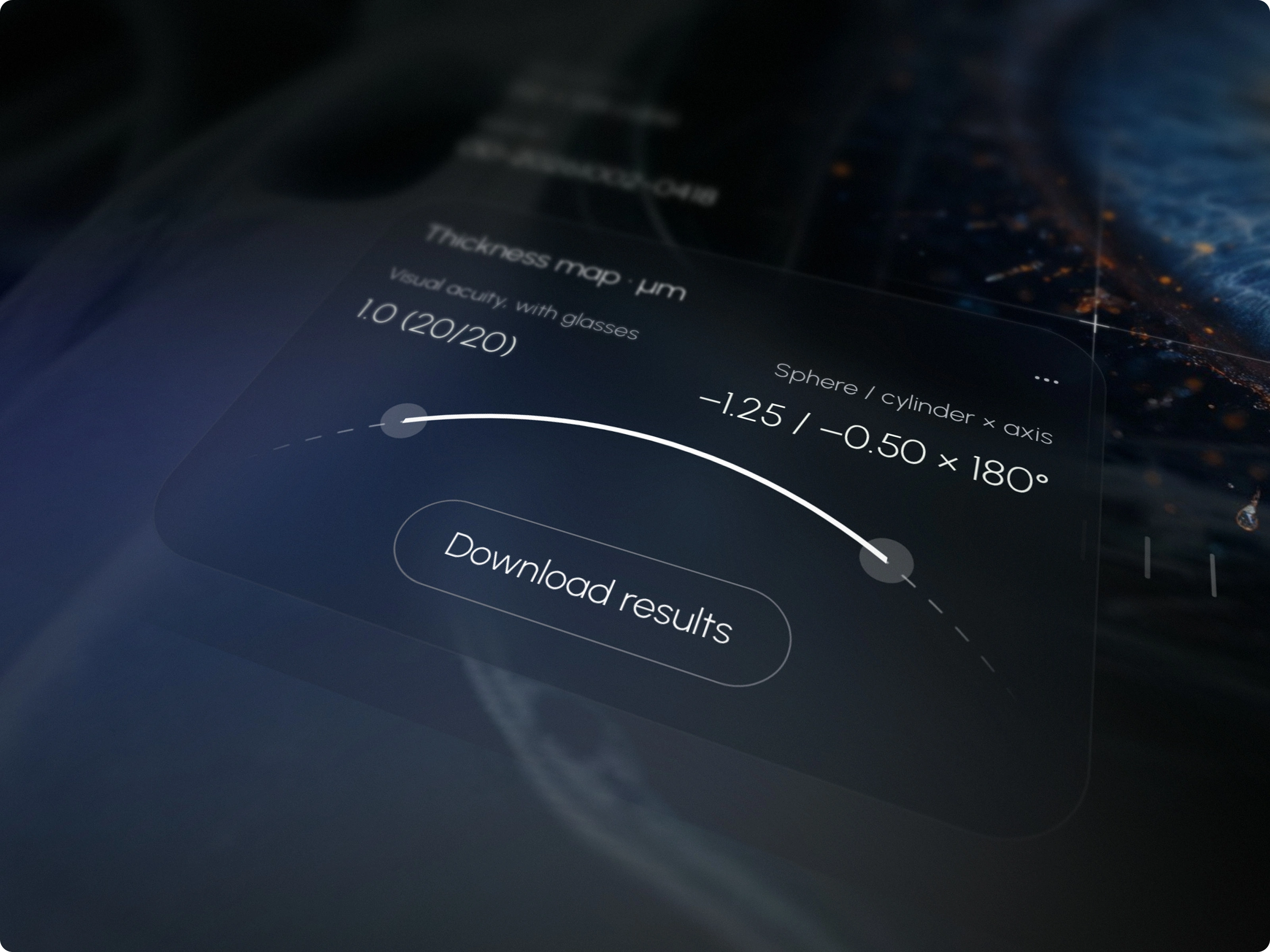
The task was to turn a clinical OCT report into something a patient can understand without calling the clinic, while keeping every number accurate. Patients needed to answer three questions at a glance: is my eye OK, what changed since last time, and what should I do next. A key rule from the start: no AI finding is shown to a patient before a doctor has reviewed it.
Project Timeline & Process
We started by mapping the patient journey from the exam to the next visit, and every moment where anxiety appears: getting the notification, opening the result, and the days after. From there we built the strategy, the information architecture and a content guide with voice, tone and microcopy for each state, from "Normal" to "Urgent". The design system came next, with dark and light modes and contrast checked against WCAG AA, because many of these patients have reduced vision. The visual language uses a deep black background, frosted glass cards and thin HUD lines, with electric blue for the AI voice and warm orange for the human one. The last step was a live prototype to test the interaction itself.
Key Decisions
We put the eye at the centre of the screen, because patients think about their eyes, not about tables. Switching between the right and left eye works like a camera: it zooms out to an X-ray of the skull, travels to the other eye and zooms back in, so the patient always knows which eye they are looking at. A pulsing point marks the fovea, the centre of sharp vision; tap it to see the measurement, its typical range and its status. The ETDRS thickness map keeps the clinical standard but explains the nine zones in plain language. Each status is always a word plus a colour, never colour alone, and urgent results are never delivered by the app — the clinic calls the patient.
Business Growth Effect
With a clear explanation next to every number, patients can understand their results without calling the clinic, and reception gets fewer "is this dangerous?" calls. The doctor's confirmation on every AI finding builds trust in the technology instead of fear of it. Clear next steps with booking built in turn single exams into regular check-ups. Because it relies only on existing scanner and AI data, the portal can grow to new exam types without new hardware.
Like this project
Posted Oct 8, 2026
A patient portal that turns complex AI-assisted eye exam results into clear, doctor-reviewed guidance and next steps.