Terapung Float — An Altered State of Wellness
Elva Yaputra
What happens to the body when it enters unfamiliar sensory conditions?
For Terapung Float, the challenge wasn’t just showcasing its services.
It was creating a visual language for a different kind of wellness, one that feels dark, introspective, and future-facing.
Angle
How do you visualise what the body feels, but cannot show?
Rather than presenting wellness as relaxation,
the direction explores how the body response.
Placed in conditions that alter its senses,
Sensory deprivation, red light therapy, and confined environments are treated as conditions that alter perception.
Each condition does not define the space,
but reveals how the body reacts within it.
The focus shifts from how wellness looks to what it does to the body.
Narrative
The work unfolds through a series of controlled states, each expressing a distinct physical sensation. The body is placed in conditions where familiar reference points are removed, and sensory input is altered.
In exposure, the body encounters an unfamiliar state.
Light intensifies, depth flattens, and perception is overridden.
In containment, the body begins to adjust.
Space tightens, awareness sharpens, and boundaries become more defined.
In suspension, the body releases.
Weight softens, orientation fades, and presence becomes less anchored.
Each image does not describe the environment, but captures how the body registers it.
Visual Logic
The visual language operates as a system for reading internal states.
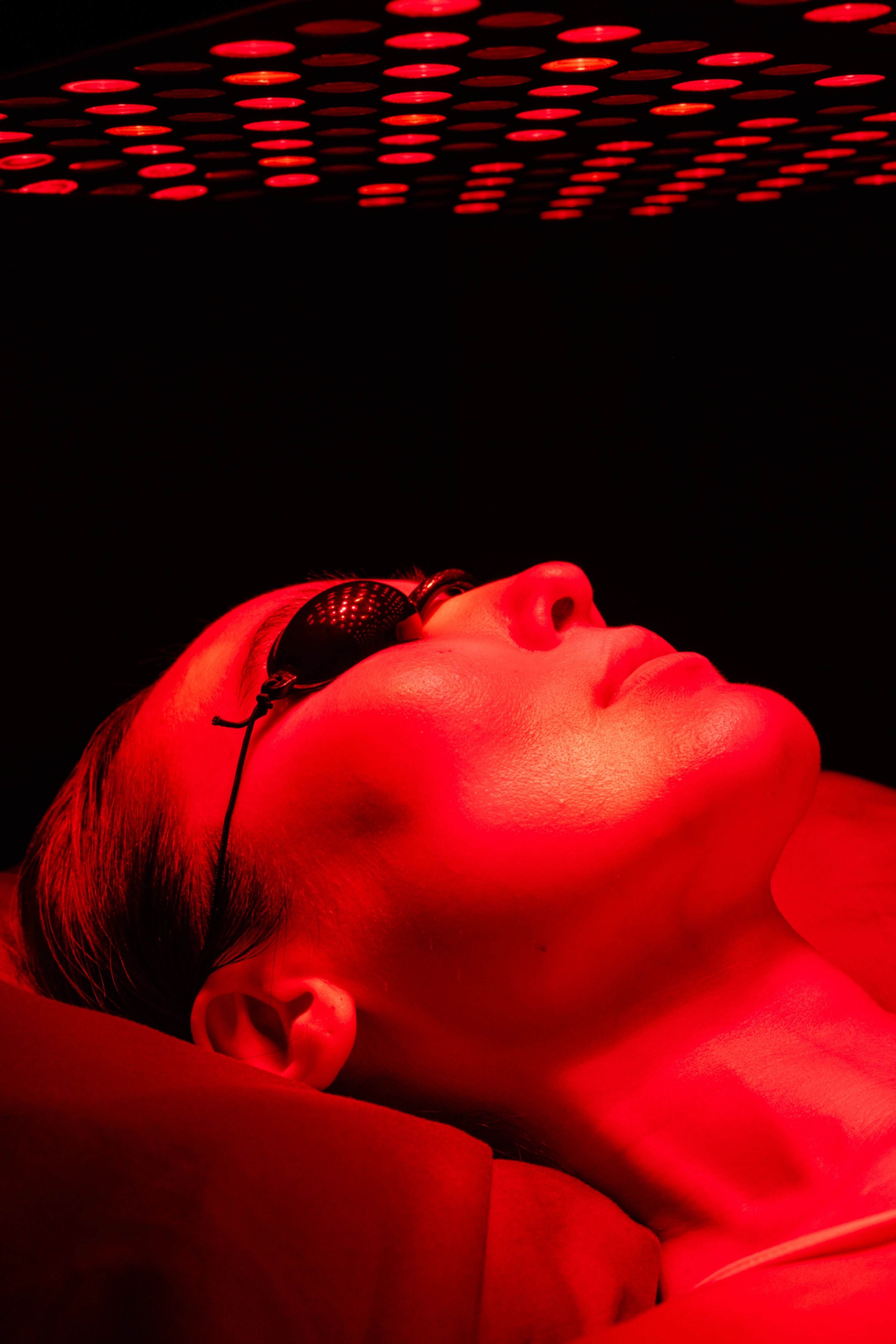
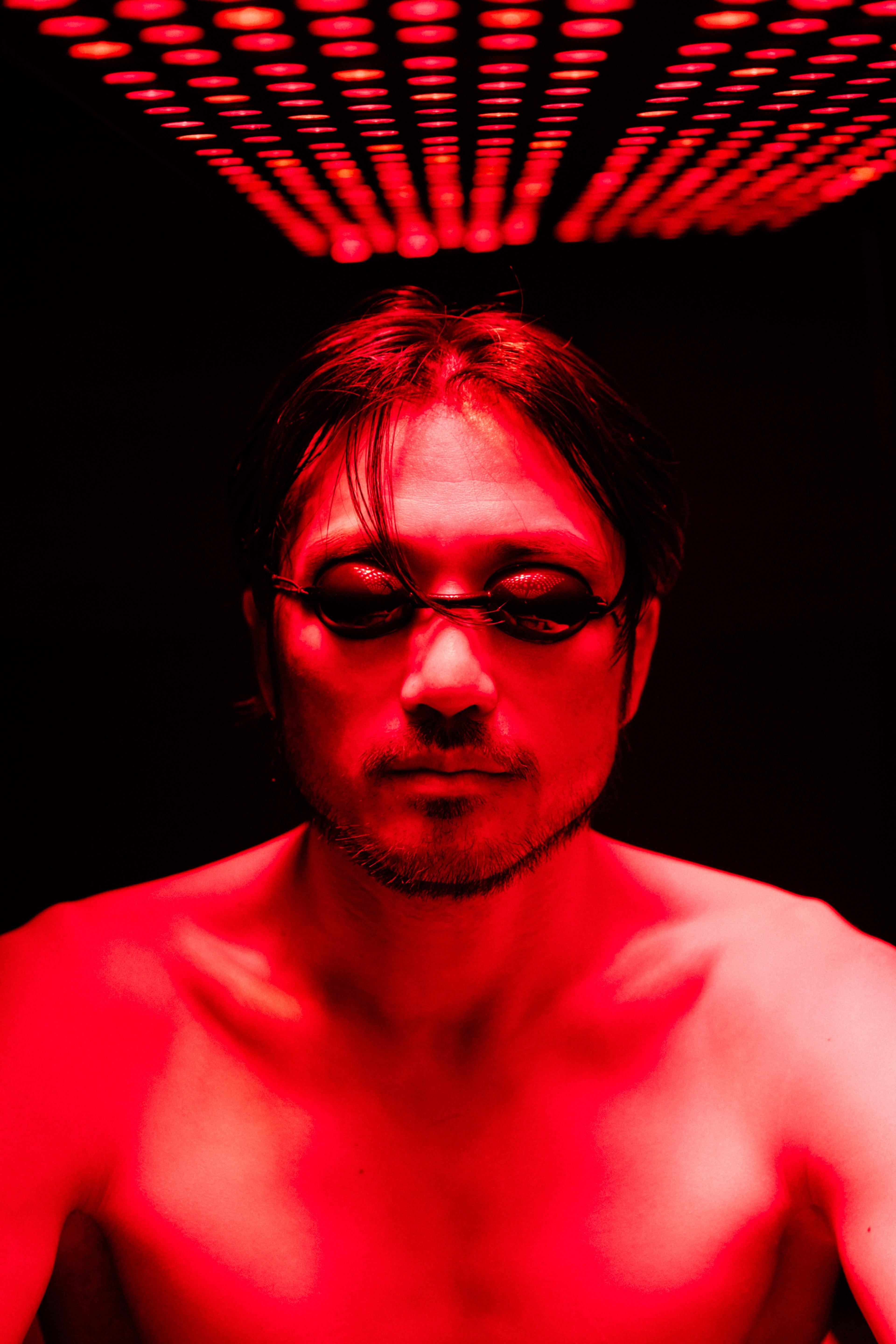
Colour is used to indicate how the body responds under specific conditions:
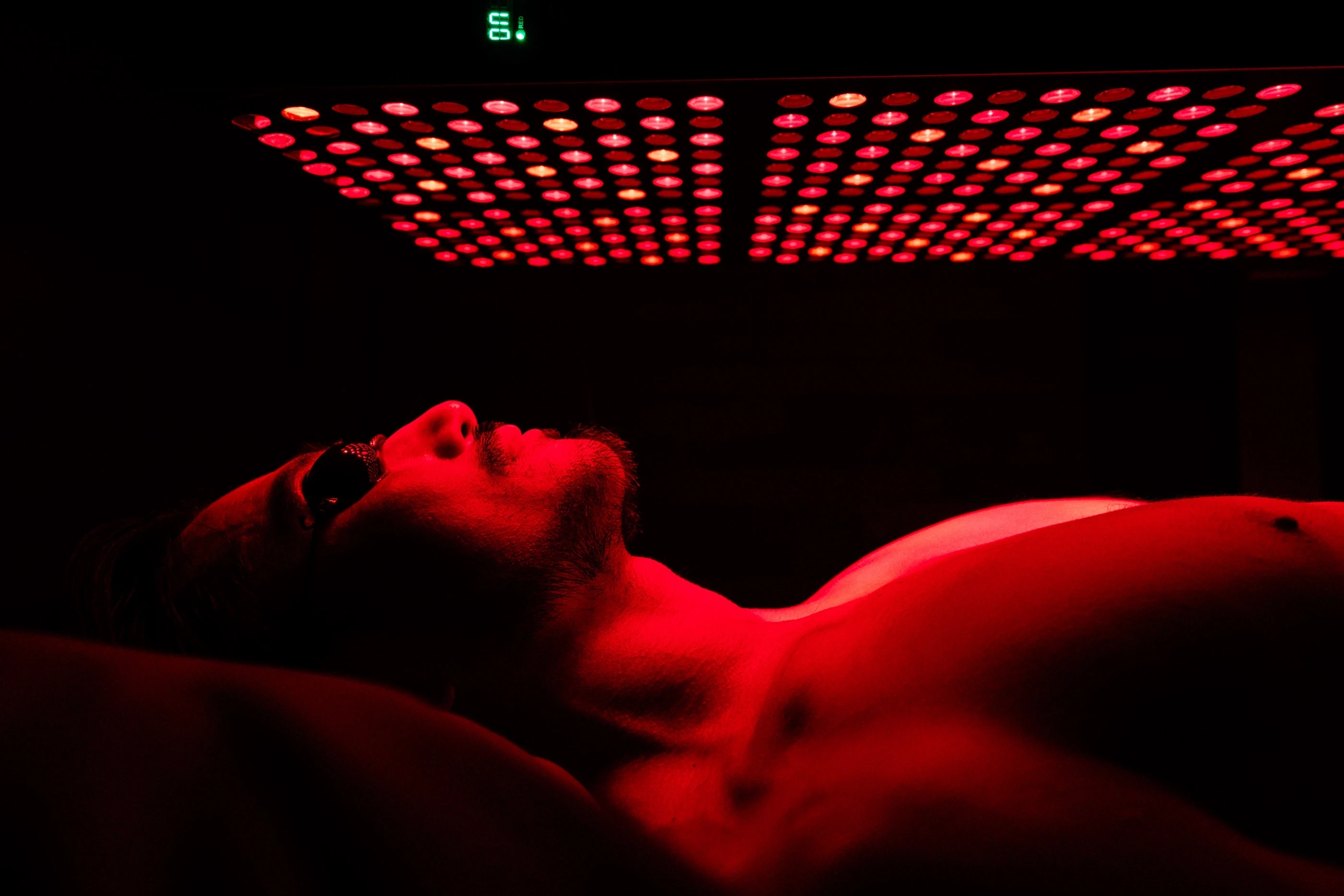
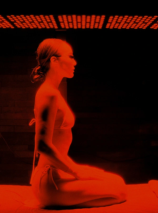
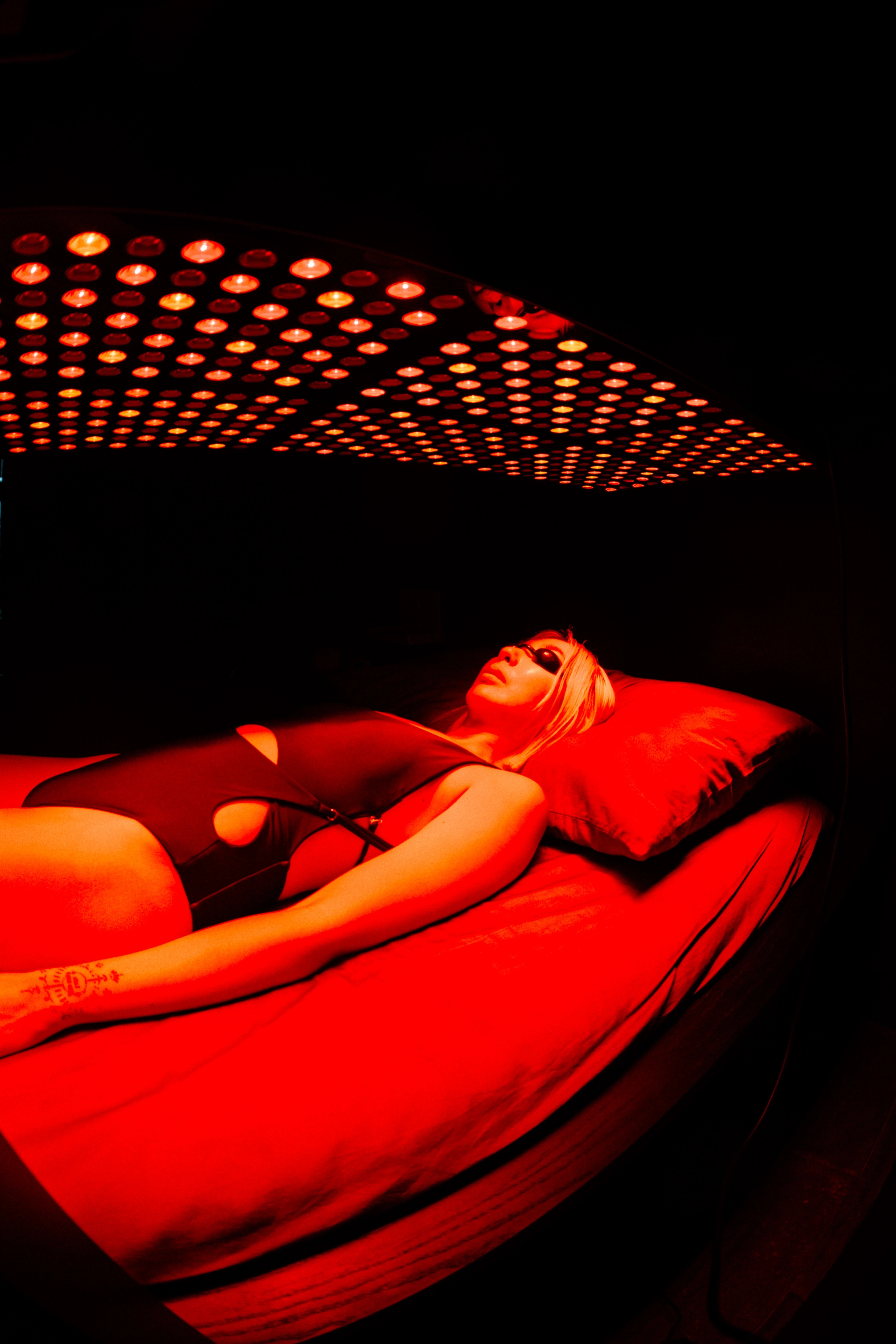
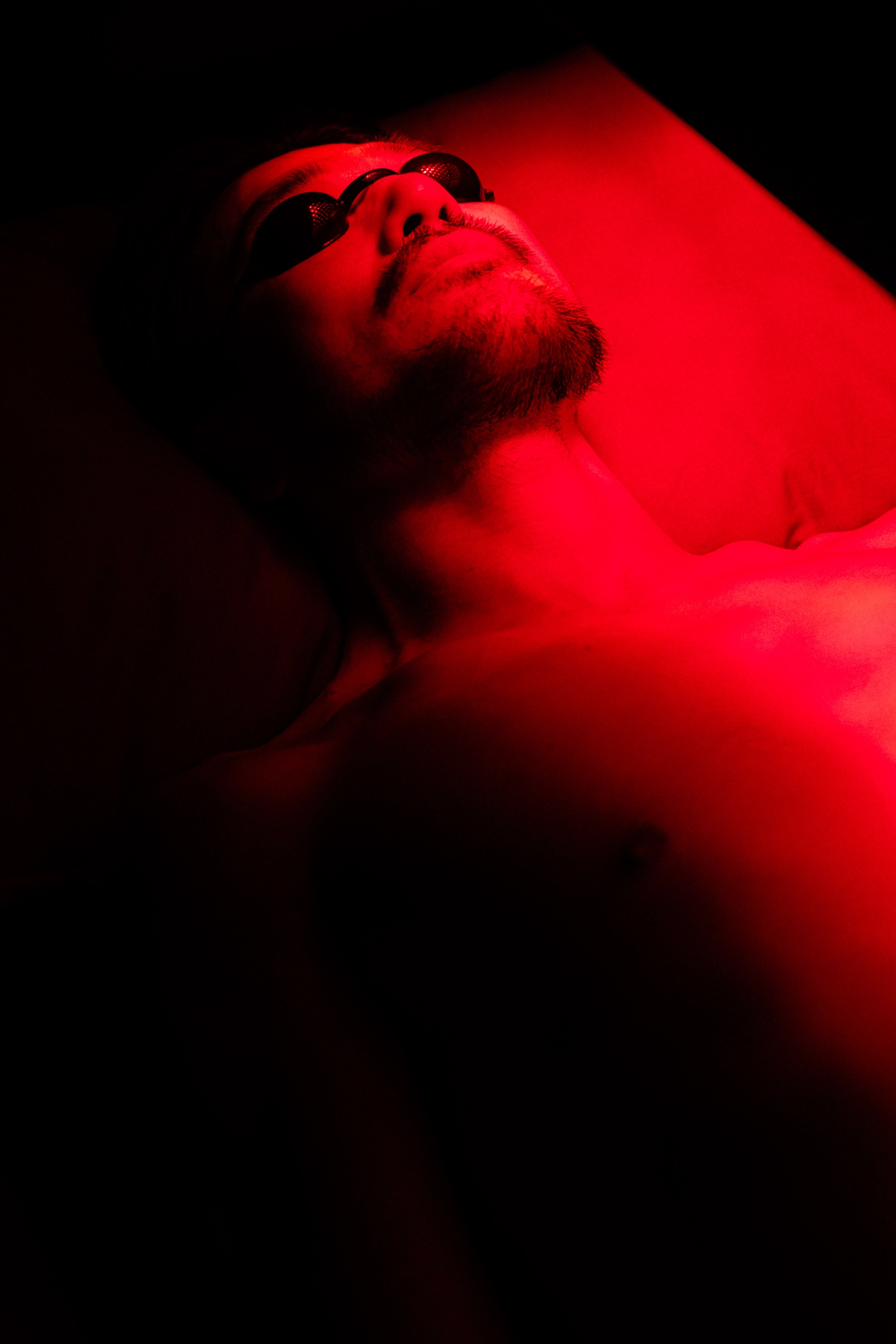
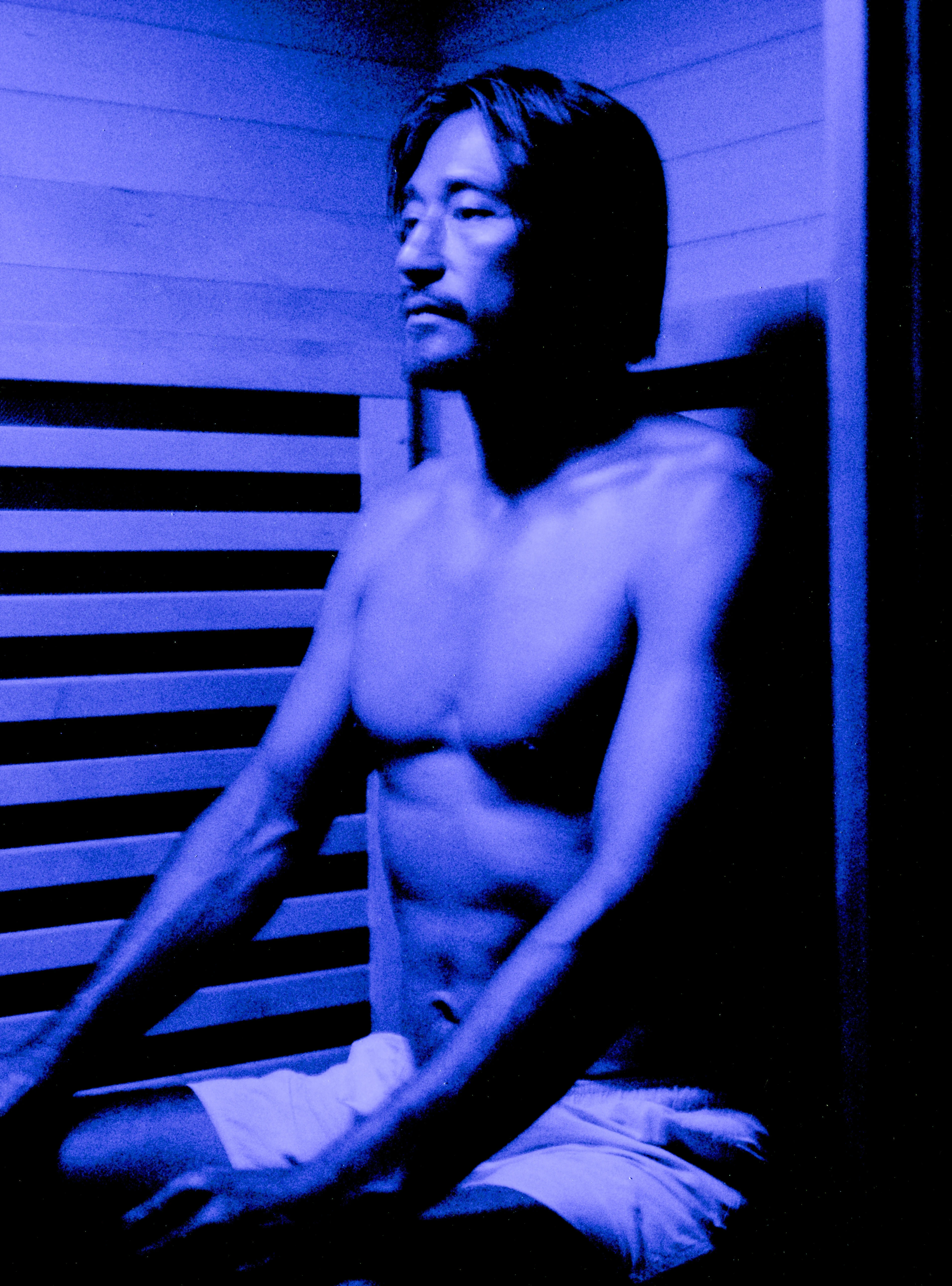
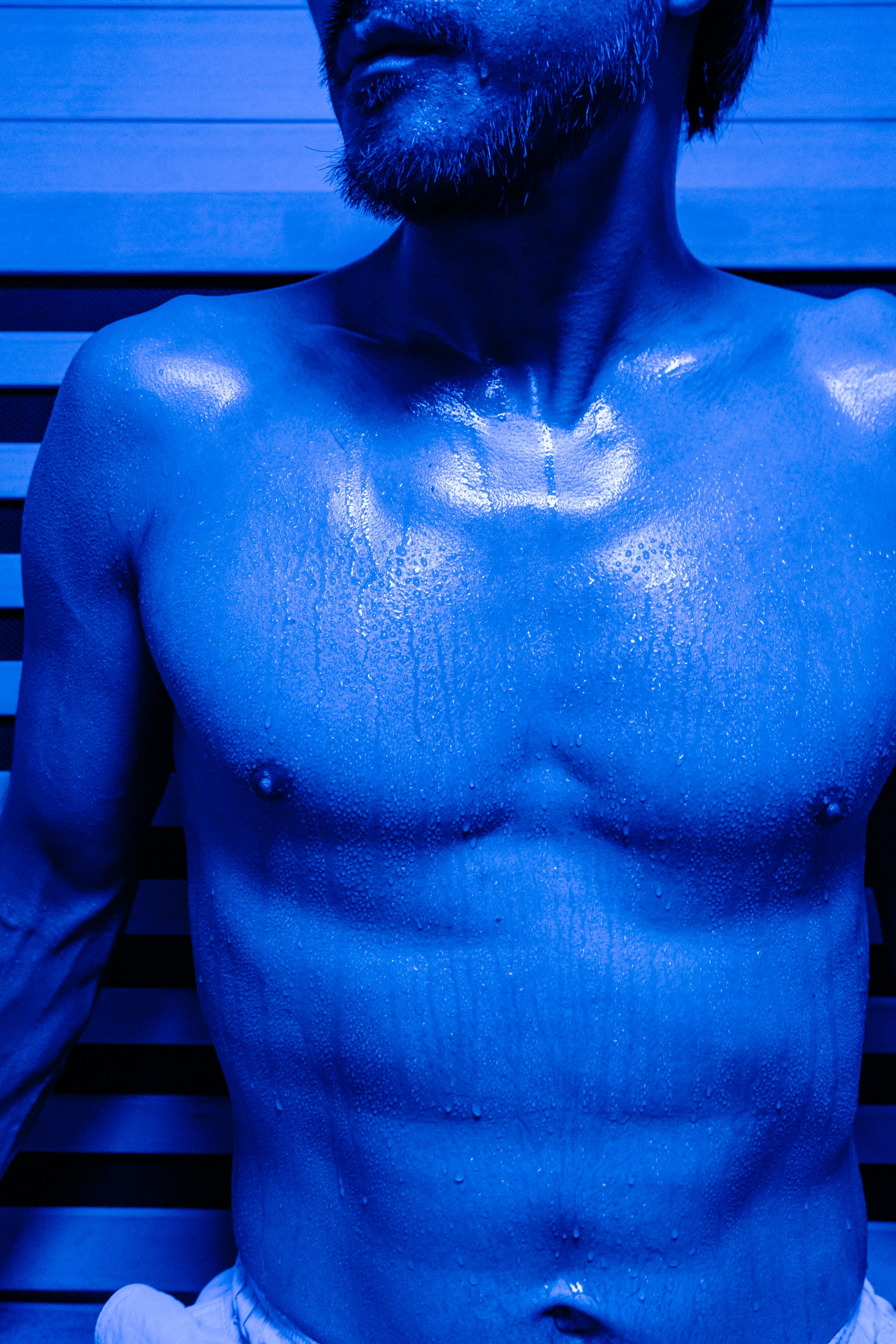
Red — exposure
Represents first contact with unfamiliar conditions.
Perception is intensified, depth is flattened, and the body is placed in a heightened state.
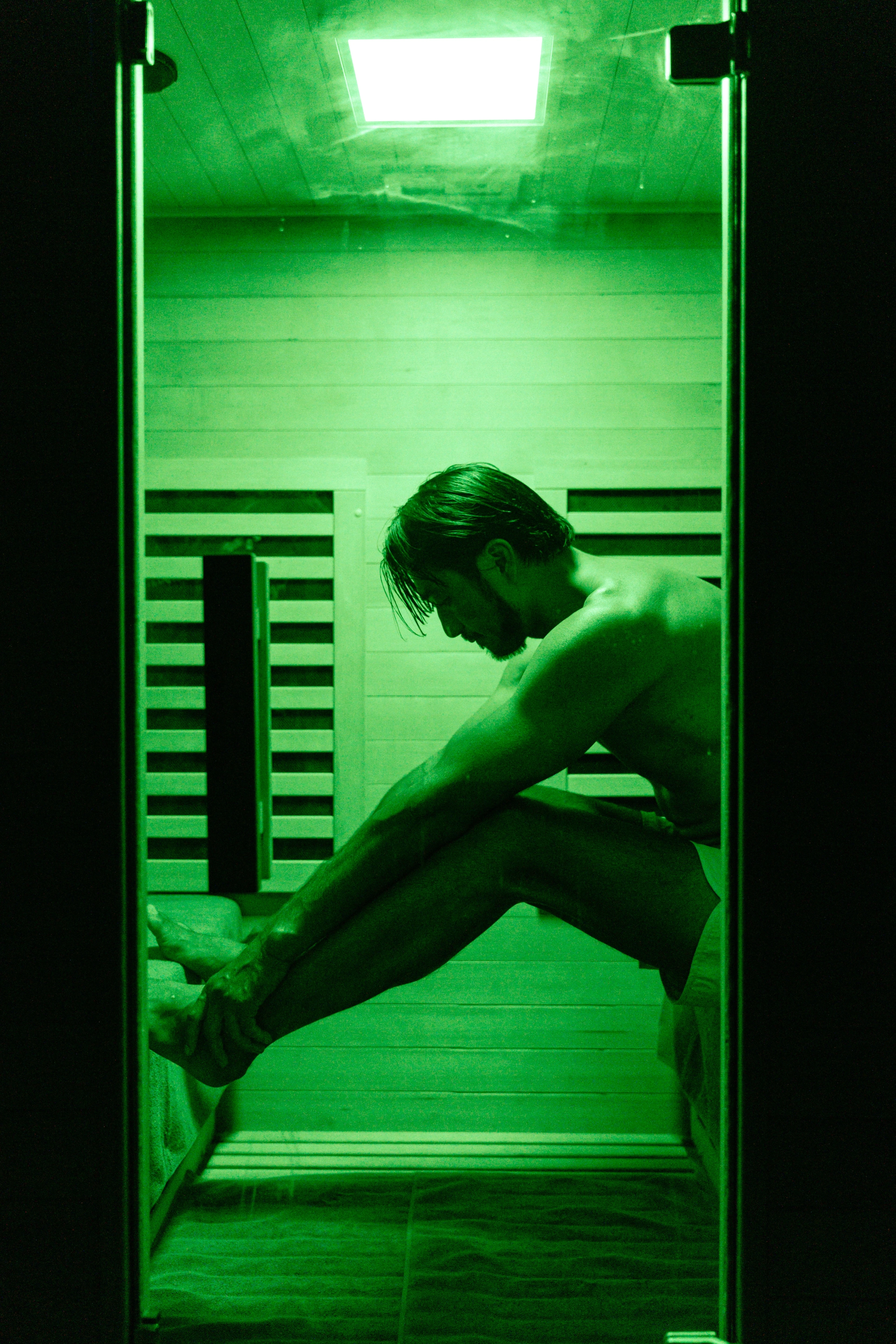
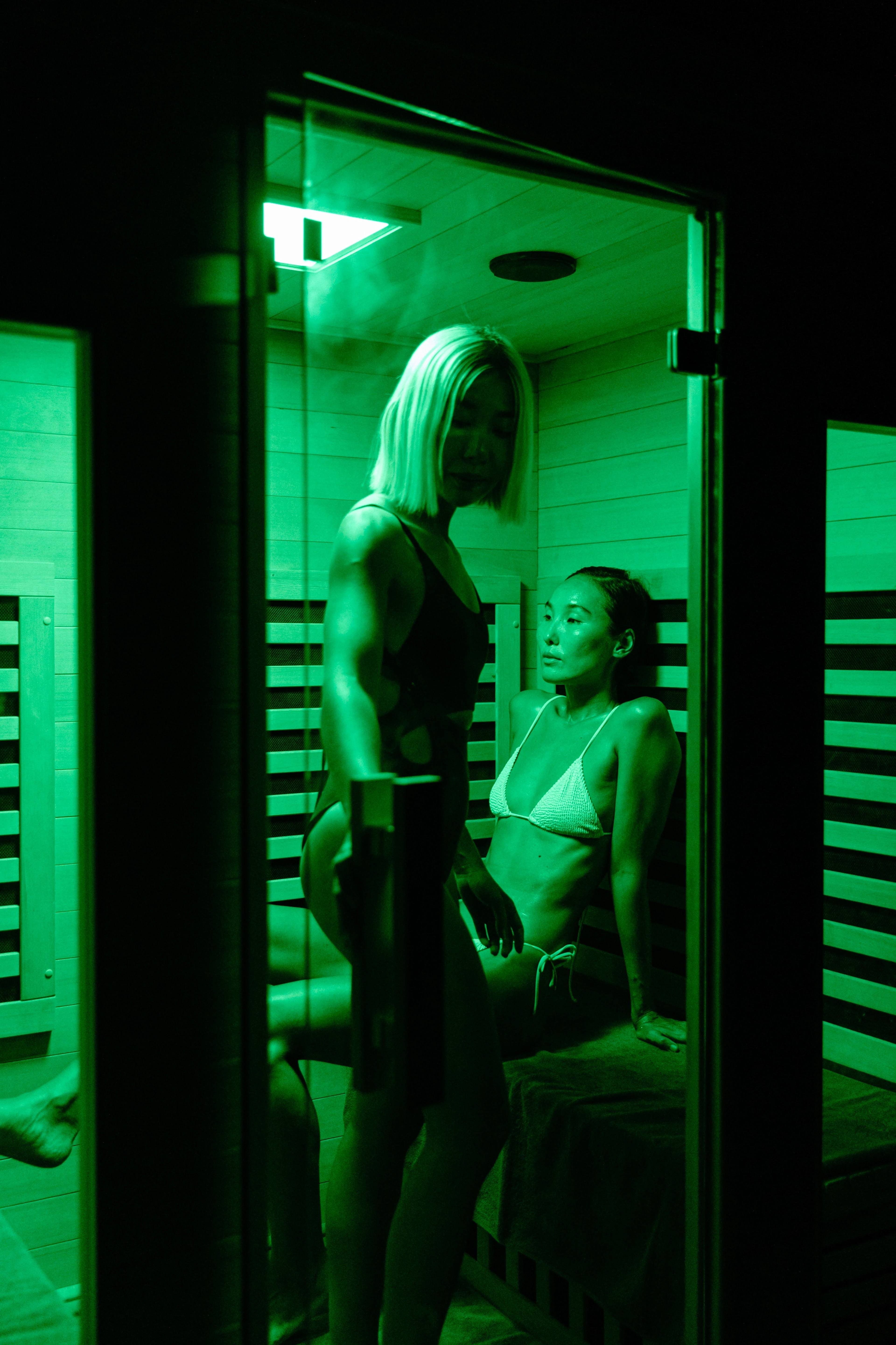
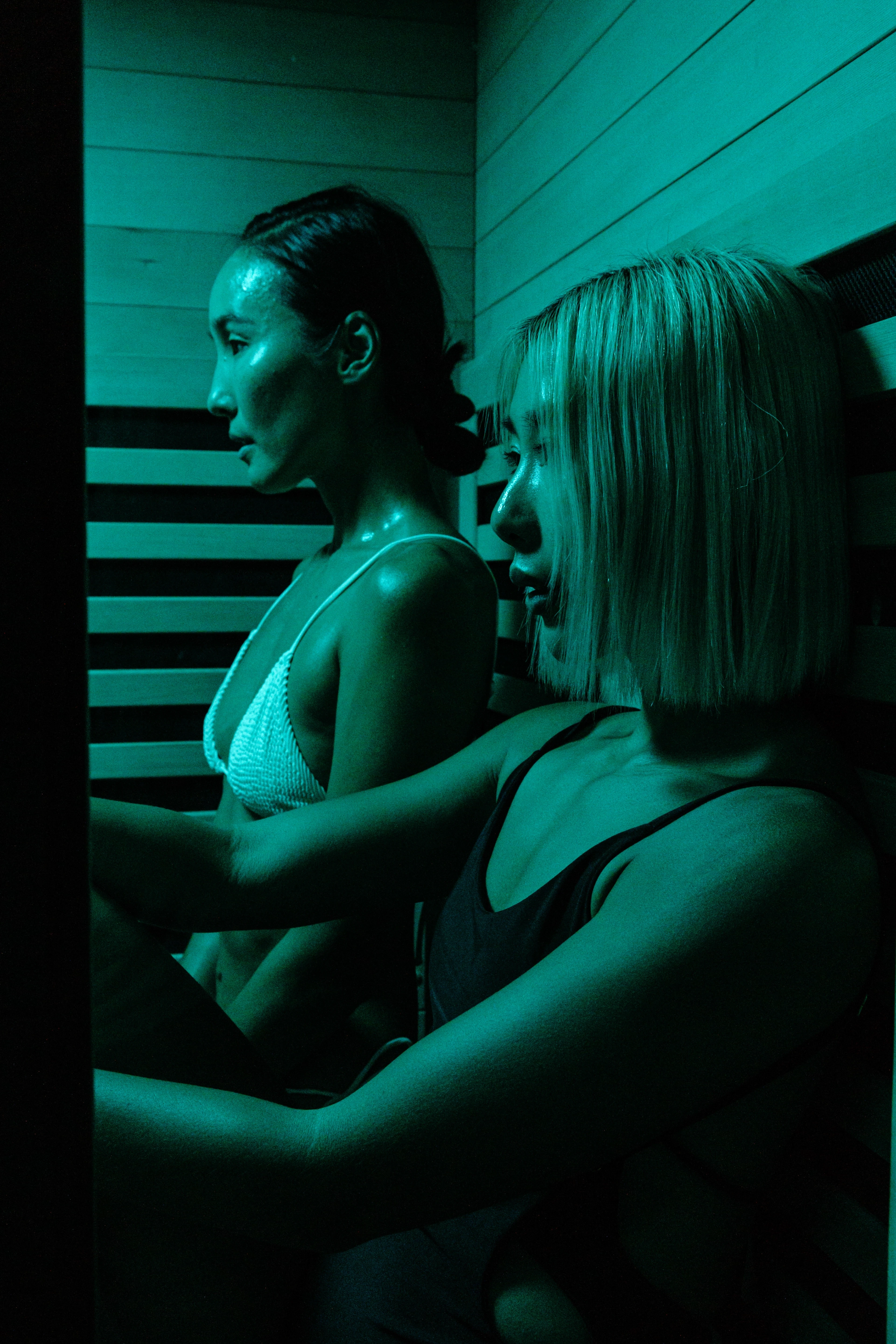
Green — containment
Represents adjustment and control.
The body becomes more aware of its boundaries, and tension begins to stabilise.
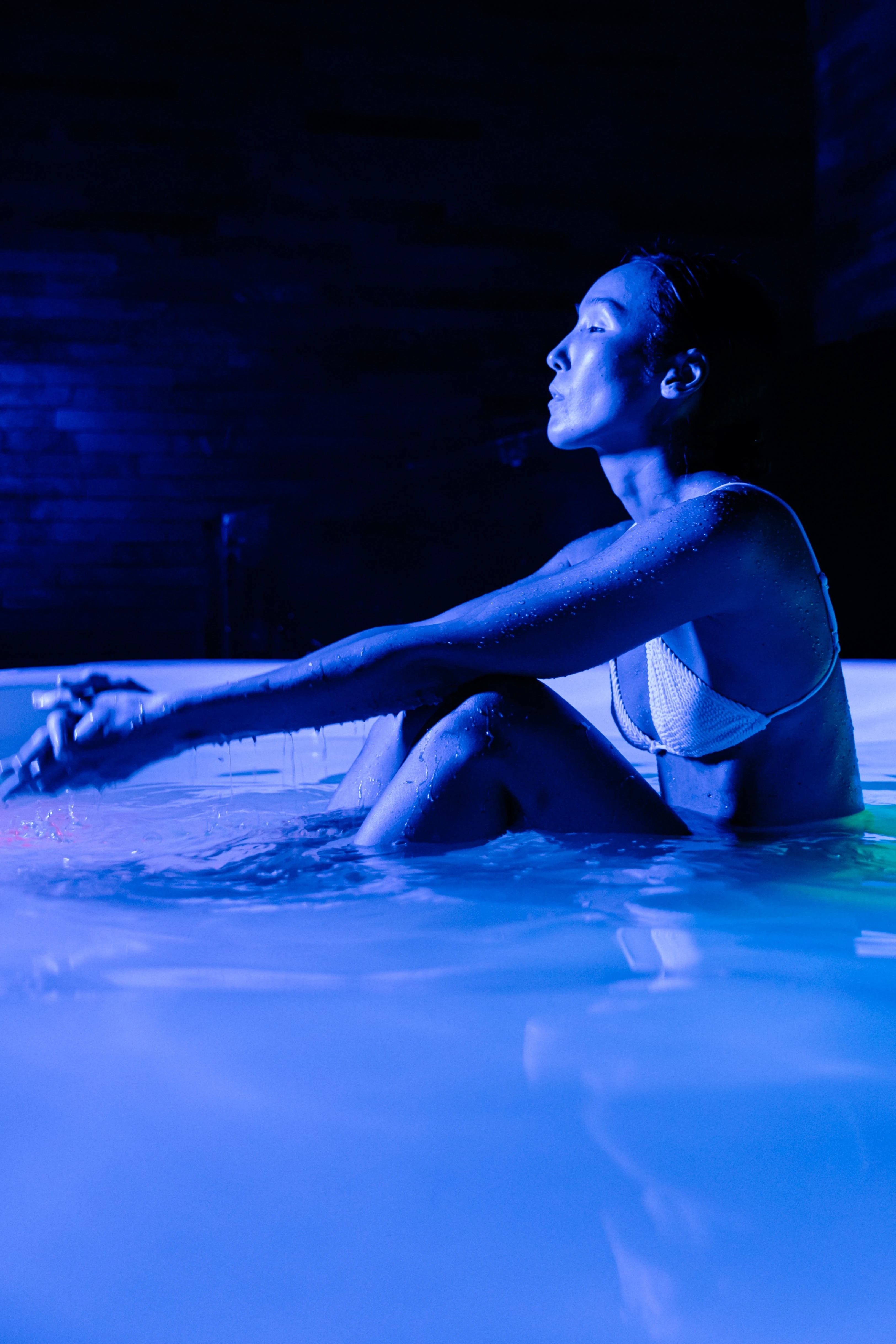
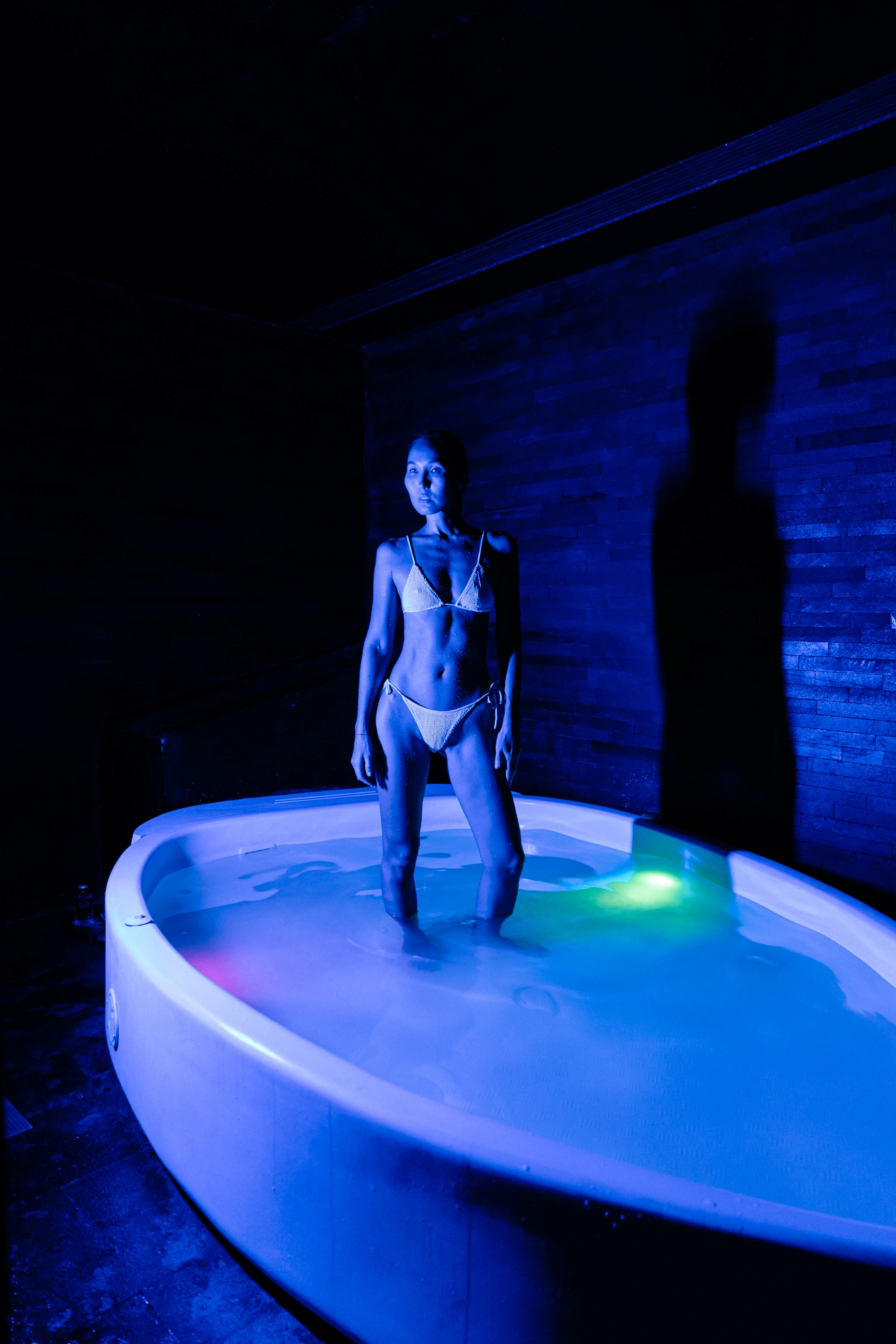
Blue — suspension
Represents release and detachment.
Weight and spatial awareness soften, and the body appears less anchored.
Light functions as a controlling element.
It does not illuminate the body, but defines its condition.
Colour makes internal change visible.

Role
I led the creative direction and production, from interpreting the brief and developing the treatment to defining the visual language and executing it across casting, styling, and production.
Outcome
The project repositions the brand away from Bali’s familiar language of calm and nature, toward a more detached and otherworldly state.
Wellness becomes less about grounding,
and more about entering an altered, almost unfamiliar state of awareness,
placing Terapung within a more alternative, future-facing space.
Like this project
Posted Apr 26, 2026
A visual system that repositions wellness as an altered, introspective state, translating sensory experiences into a distinct and future-facing identity.