Synapse AI Pitch Deck | Case Study
Mansi Chauhan
Designing an investor pitch deck is not about making slides look modern. It’s about reducing risk in an investor’s mind, slide by slide.
For Synapse AI, the objective was not to simply explain the product. The objective was to frame the company in a way that makes funding feel logical and inevitable.
This case study breaks down the thinking behind the deck and the decisions that shaped it.
Founders are usually clear on their story.
Investors, however, are encountering it for the first time.
In the first few seconds, investors are subconsciously asking where this company fits, what problem it truly solves, and whether it has the potential to scale.
That is why the deck opens with a clear positioning statement.
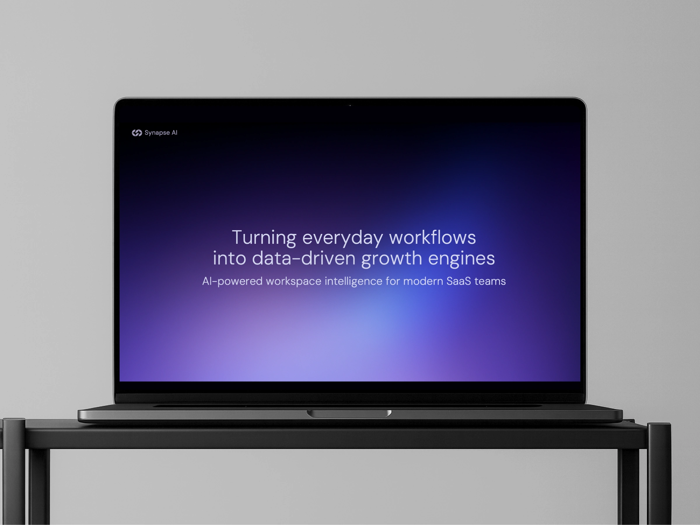
"Turning everyday workflows into data-driven growth engines."
This line creates instant orientation. It frames the category, sets expectations, and signals that the product delivers leverage at a system level.
With that context in place, the rest of the narrative flows naturally.
The problem is not presented as a generic pain point.
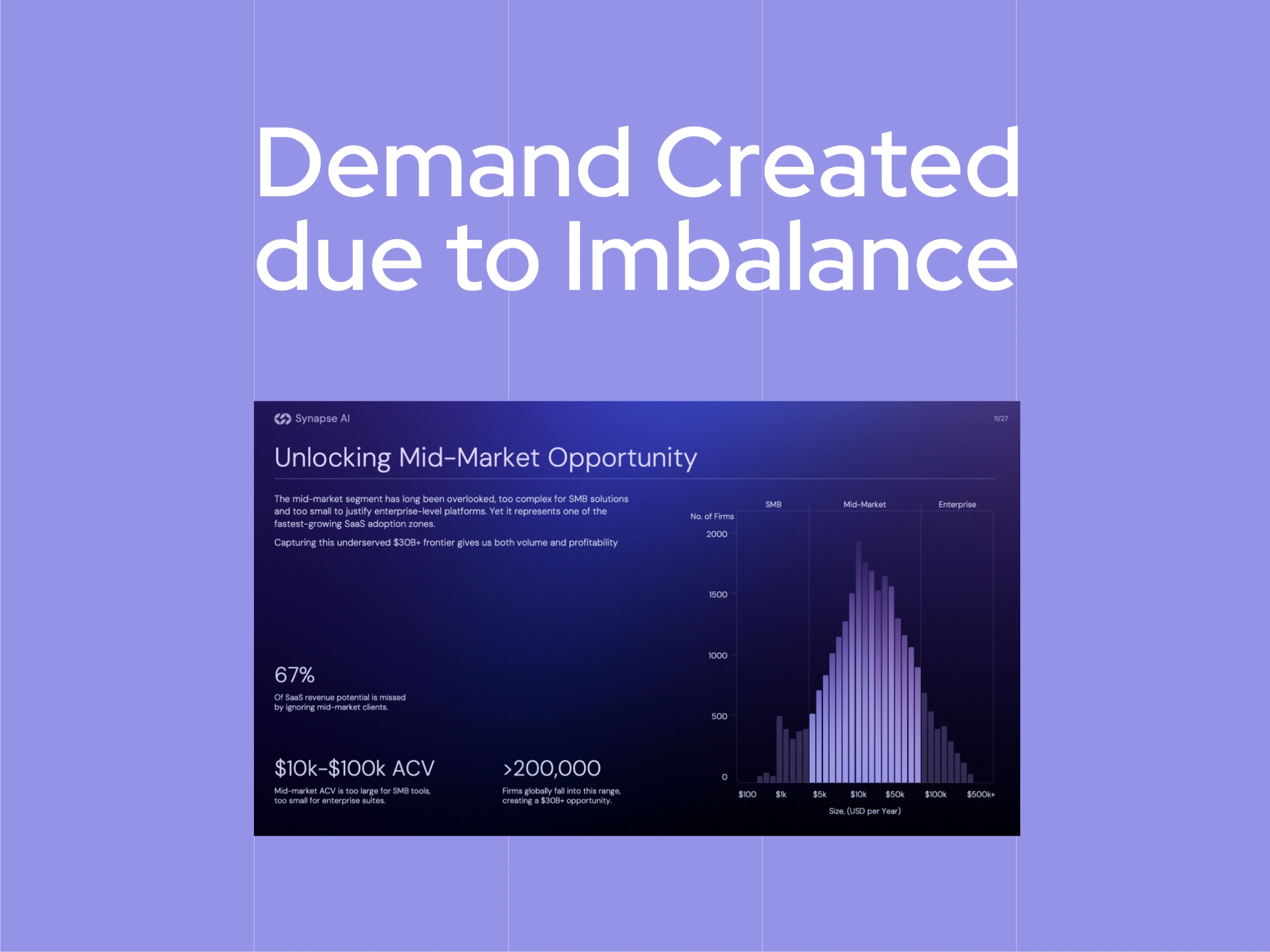
It is defined through the structure of the market itself.
By focusing on mid-market teams, the slide reframes the problem as a gap rather than a complaint. These teams face operational complexity similar to enterprise organizations, yet lack access to tools designed for their scale and constraints.
This positioning does two things simultaneously.
It explains why existing solutions fall short, and it makes the opportunity feel structural rather than temporary.
Instead of relying on abstract market size numbers, the slide uses distribution, ACV ranges, and segmentation to show how value is actually captured. This helps investors visualize demand in practical terms, not theoretical ones.
At this point, the product no longer feels like a nice-to-have.
It feels like a response to an imbalance the market has failed to correct.
Traction in this deck is not treated as proof of success.
It is treated as proof of behavior.
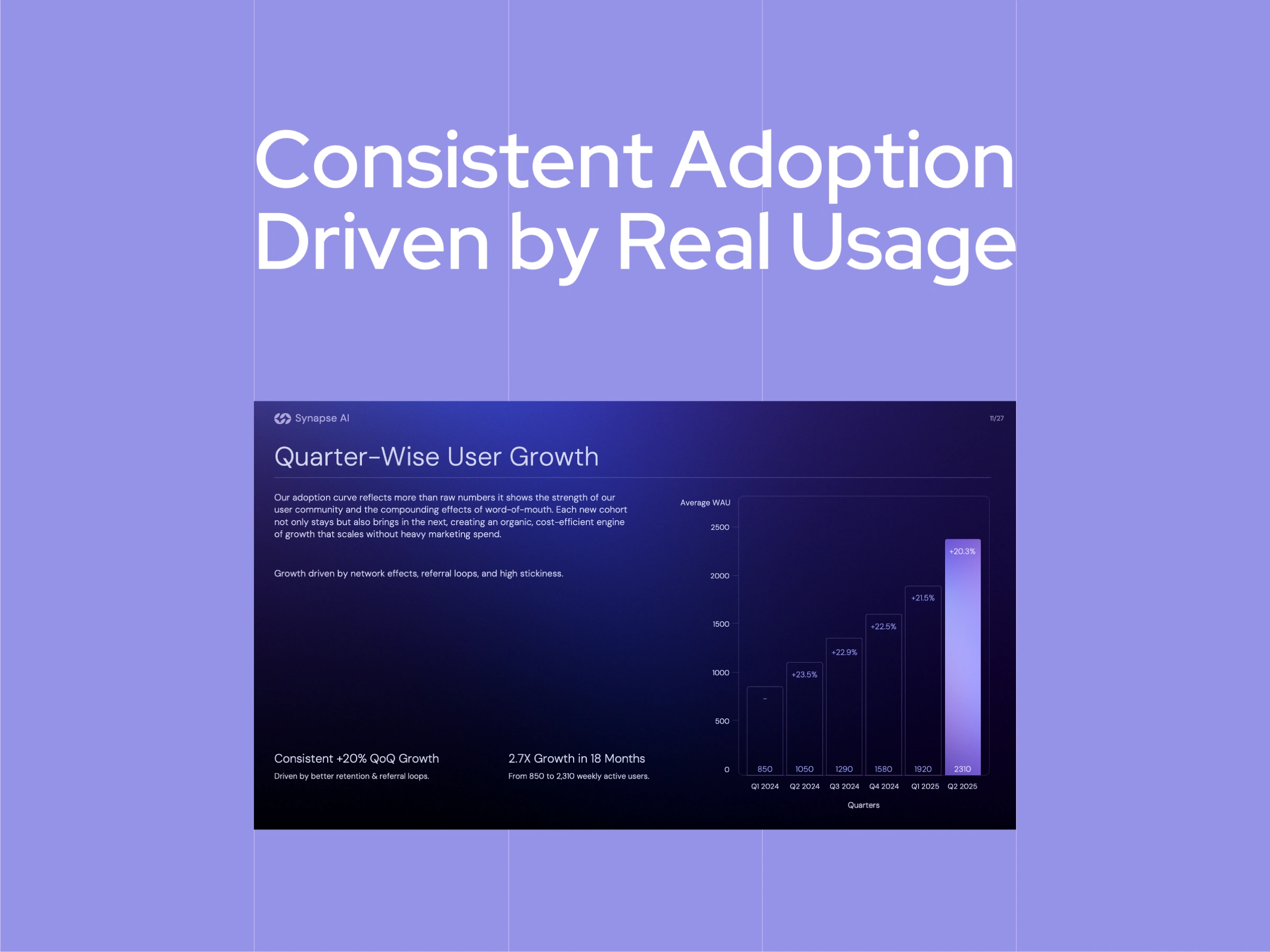
Rather than highlighting absolute numbers or celebratory milestones, the slide focuses on consistency and direction. Quarter-wise user growth shows a pattern that investors recognize immediately: repeated adoption driven by real usage, not short-term spikes.
This framing shifts the conversation from “How big is this today?” to “Is this becoming embedded in how teams work?”
That distinction matters. Investors know early numbers can be small. What they look for instead is evidence that the product earns its place inside a workflow and expands naturally as usage compounds.
The design supports this intent. Visual emphasis is placed on trend and acceleration, not on isolated data points, allowing the signal to stand out without explanation.
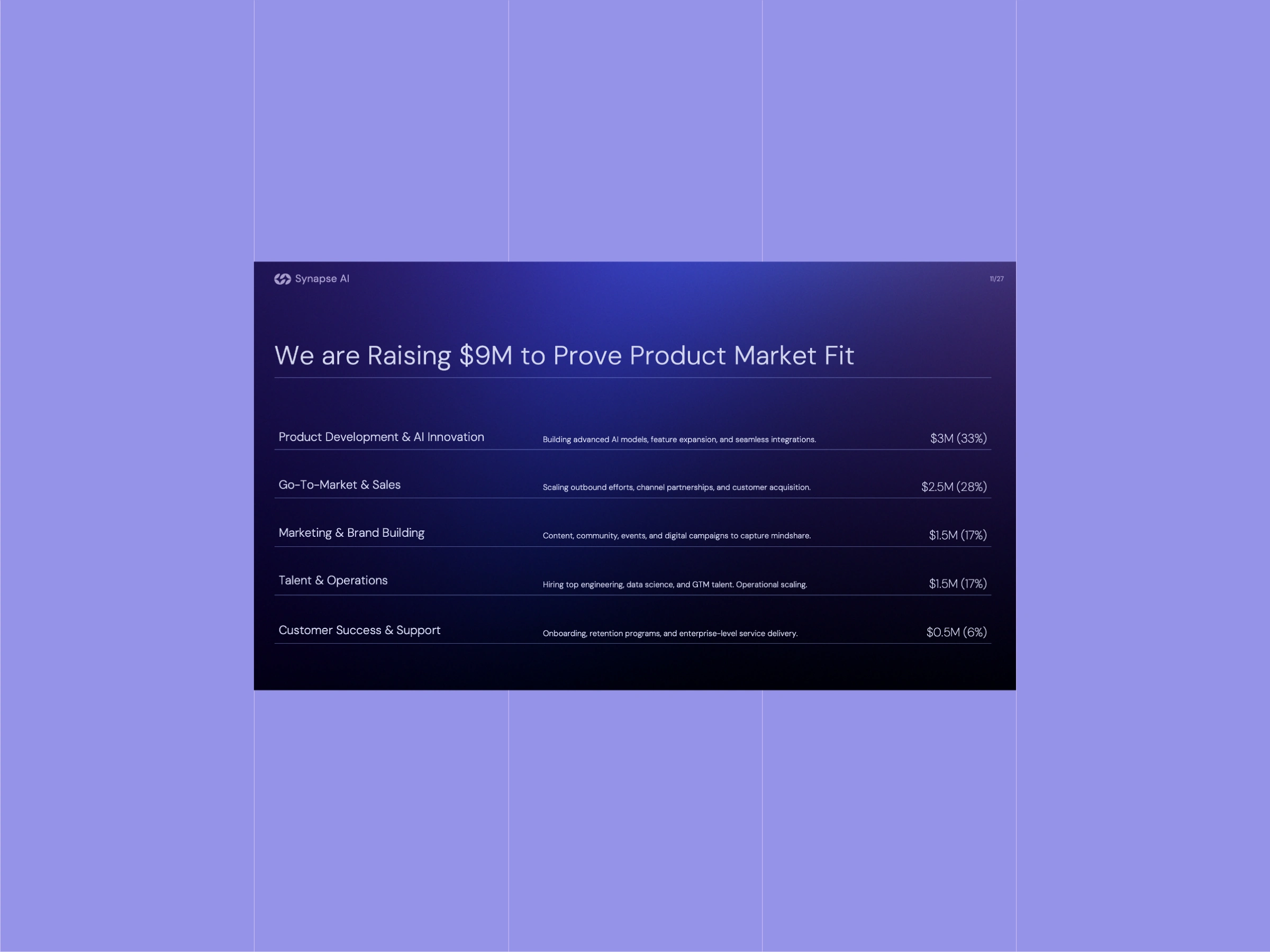
We framed the fundraising ask as a strategic decision rather than a simple request for capital.
Instead of leading with the number alone, we focused on how the capital would be deployed and what it was expected to unlock. Each allocation was tied to a clear operational outcome, such as product maturity, go-to-market efficiency, or scale readiness, allowing investors to evaluate the round through execution logic rather than ambition.
Our intent was to remove ambiguity. Investors care less about how much is being raised and more about whether the amount feels justified for the company’s stage. By grounding the ask in milestones and priorities, we reduced concerns around burn and signaled disciplined decision-making.
The result is an ask that feels deliberate and considered, positioning capital as a tool to accelerate what is already working, not to search for direction.
The deck is held together by restraint and consistency.
Decisions around structure, pacing, and visual hierarchy were made to keep attention focused without forcing it. Nothing is designed to compete for emphasis or demand explanation. Instead, clarity is allowed to build naturally as the deck is skimmed, revisited, and absorbed over time.
The intent throughout was to reduce friction, maintain trust, and let conviction form without being pushed.
As the slides move, the emphasis stays on how information is revealed rather than how much is shown.
Each section introduces just enough context to orient the viewer before moving on, allowing the story to be understood without interruption. The pacing is deliberate, giving space for ideas to land while maintaining forward momentum.
Together, the slides form a complete picture without requiring narration, reflecting a deck built to be absorbed quietly rather than explained out loud.
This case study is shared for illustrative purposes only. The original project is subject to a non-disclosure agreement. Certain details, including the company name and specific information, have been modified to respect confidentiality while preserving the integrity of the work.
Collaborators
Want your deck to communicate with this level of precision & elegance?
Get in touch!!
Like this project
Posted Dec 22, 2025
Fundraising pitch deck for an AI SaaS startup, designed to support investor decision-making through clear positioning, market context, and narrative discipline.
Likes
1
Views
24
Timeline
Aug 1, 2025 - Aug 30, 2025