SKIN Brand Identity Design

Divya Venkatesh


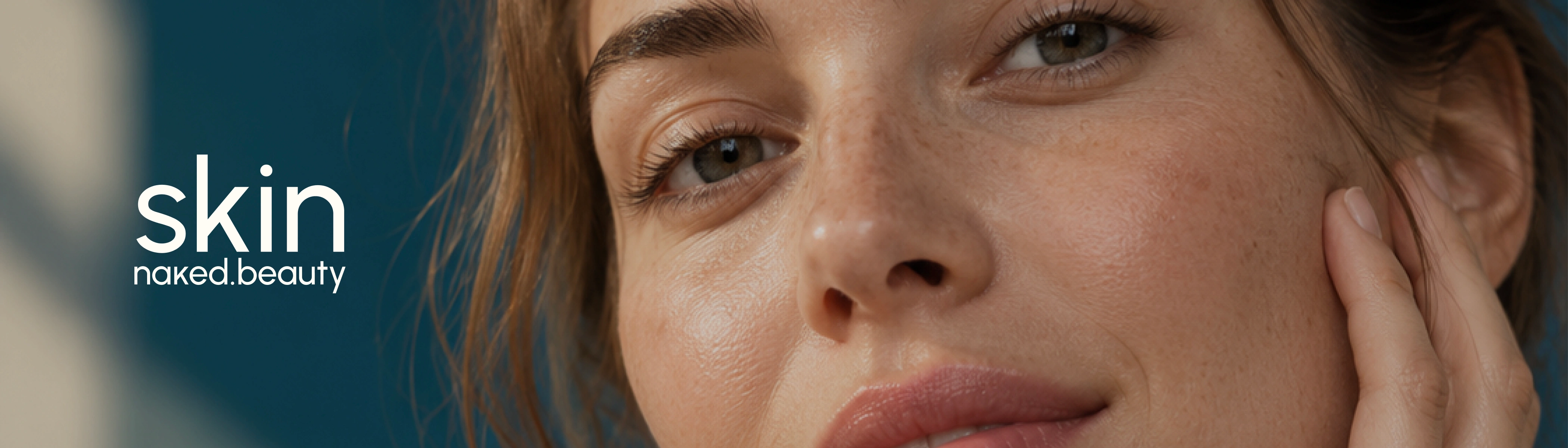
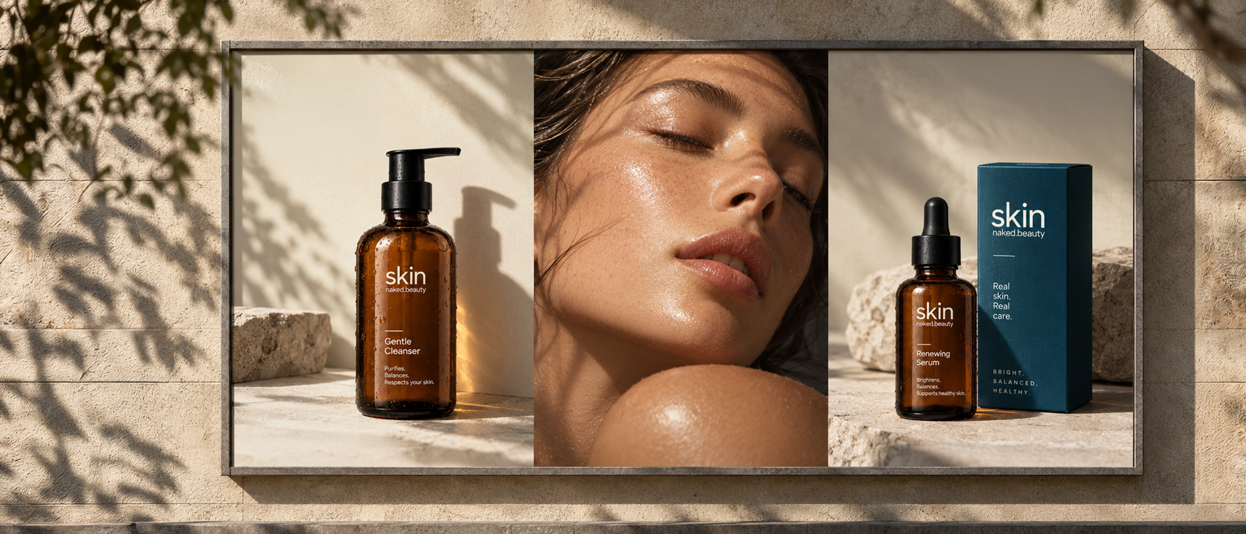
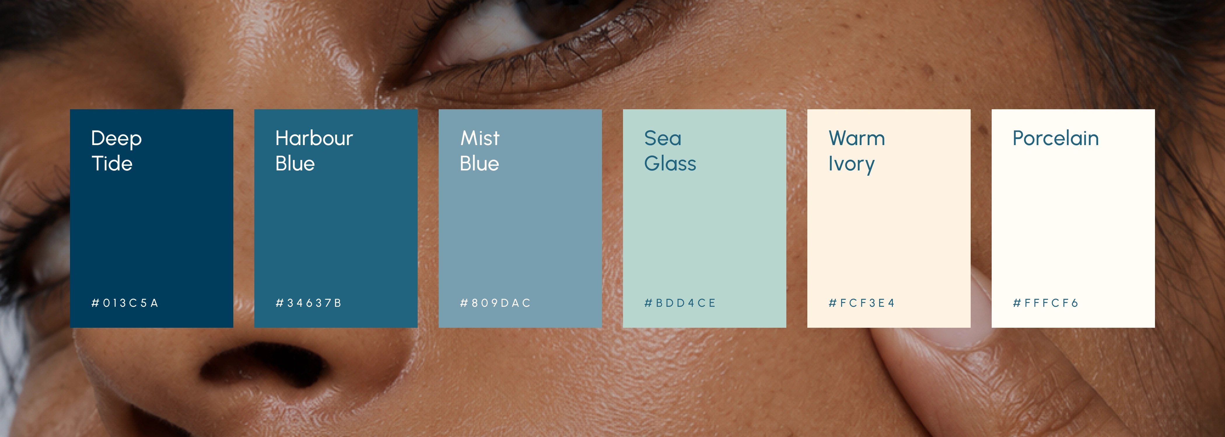
SKIN is built around the idea of honest, uncomplicated skincare. The identity avoids overly clinical or overly luxurious cues, instead creating a space that feels confident, warm, and accessible. The deep blue establishes trust and consistency, while off-white tones soften the overall experience. Amber bottles, clean typography, restrained layouts, and tactile packaging bring together a visual language that feels contemporary yet grounded.






Like this project
Posted Sep 8, 2026
SKIN naked.beauty is a D2C skincare brand and digital experience project that explores identity, packaging, product presentation, and interface design.