Oak & Stone Coffee Shop - Logo Design
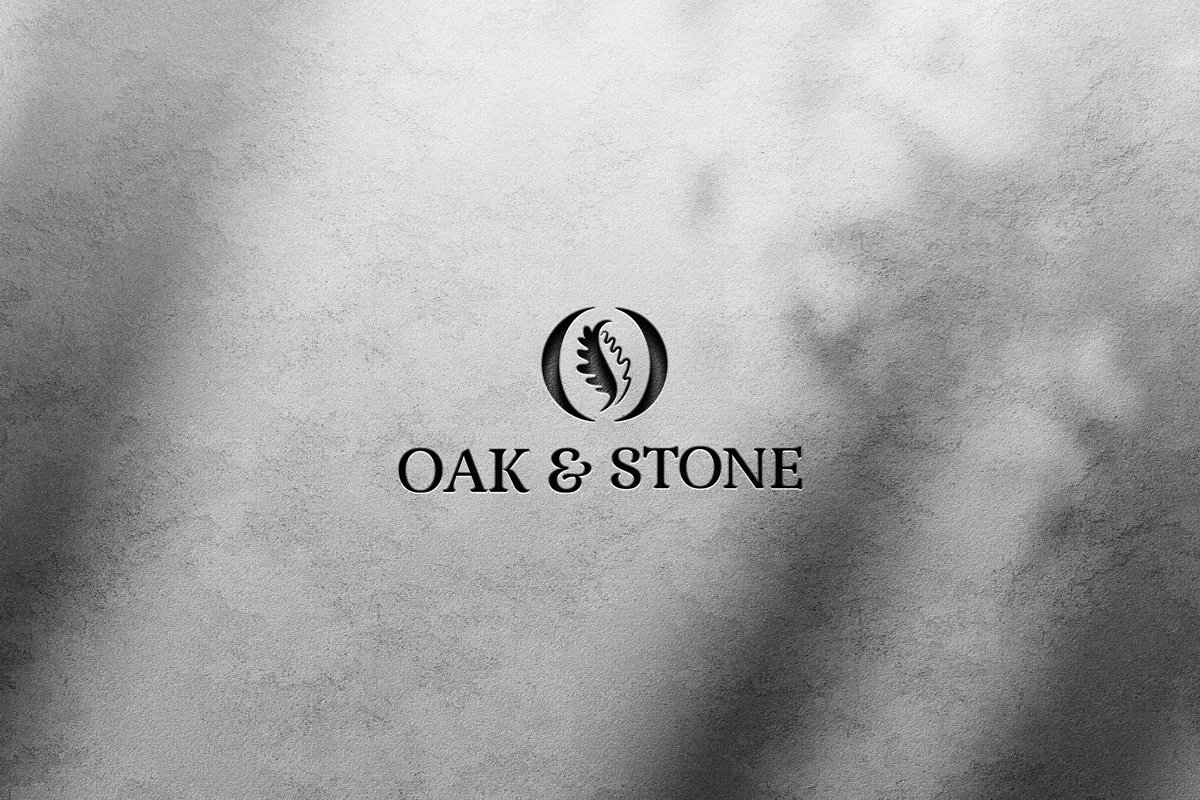
The main logo combines a refined wordmark with an emblem featuring an oak leaf and coffee bean. The oak leaf represents strength, tradition, and authenticity, while the coffee bean anchors the brand in its true essence: quality coffee. The earthy color palette reinforces warmth and natural simplicity.

Color Palette & Typography
The chosen earthy tones complement the organic theme, while the typefaces balance rustic sophistication with modern legibility. This pairing creates a timeless look that feels both inviting and premium.

Monochrome Version
This black-and-white version highlights the clarity of the design. Even without color, the oak leaf and coffee bean remain distinct, making the logo suitable for embossing, stamps, or minimal print applications.
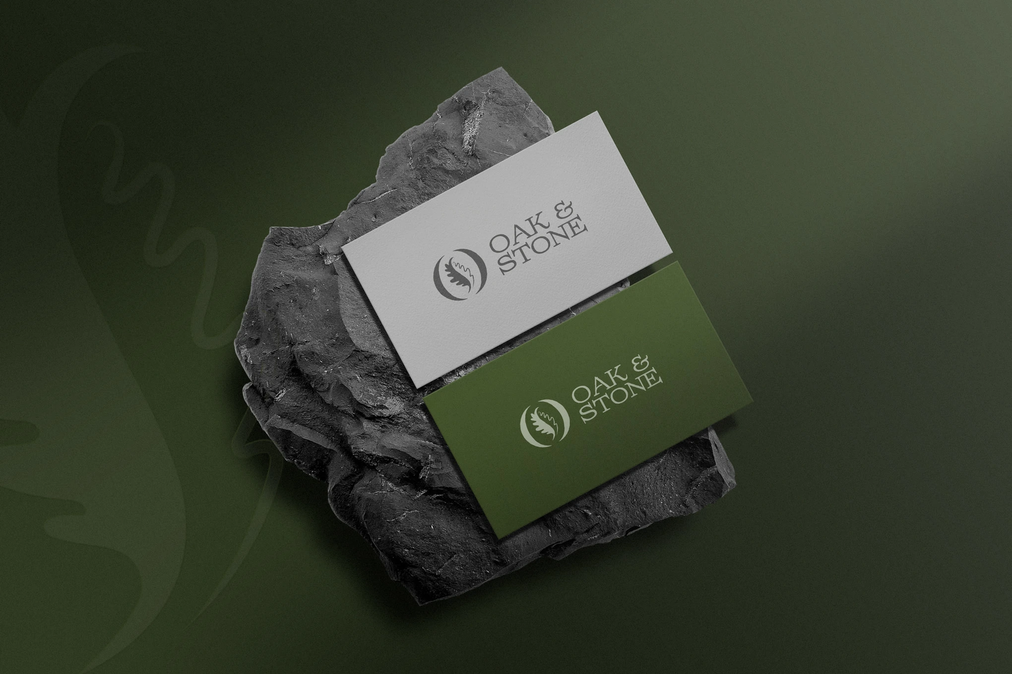

Mockups in Context
Applied to signage, packaging, and coffee cups, the logo comes to life in real-world settings. The oak leaf and coffee bean emblem reinforces the brand’s identity, ensuring Oak & Stone feels authentic, grounded, and memorable.
Like this project
Posted Oct 1, 2025
Elegant logo blending an oak leaf with a coffee bean to symbolize strength, tradition, and quality. Versatile across print, digital, and packaging.

