Web Design & Development for Lumeva Studio

Nathanael Mbale


Web Design & Development Process for Lumeva Studio
Objective
Every project starts with a simple idea.
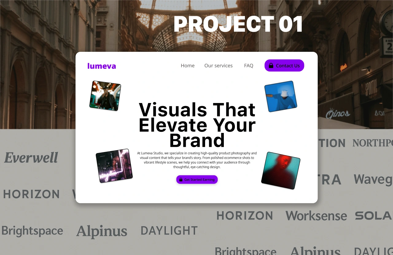
For Lumeva Studio — a New York-based creative branding and product photography agency — that idea was to build a website that reflects the premium quality, creativity, and trustworthiness of their services. The goal wasn’t to create anything flashy or overcomplicated, but rather a clean, elegant site that positions them as a modern partner for ambitious brands while making it easy for potential clients to connect and explore their work.
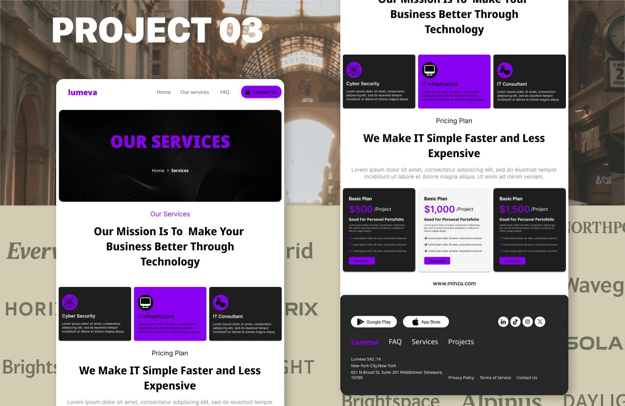
Website Snapshots
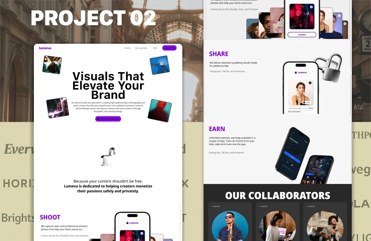
Landing page Snapshots
PHASE 01: Planning & Strategy
1️⃣ Understand Business & Goals
We began by understanding Lumeva Studio’s business and goals. They are a New York-based creative branding and product photography agency serving over 70 clients in fashion, wellness, and food. The website needed to build trust, showcase services, generate leads, and allow for future expansion.
The target audience included small-to-medium businesses, fashion and wellness brands, marketing managers, startup founders, and influencers. These visitors value credibility, strong visuals, and proven work.
For the design, we aimed for a minimalist, bold, and elegant style. The typography combined clean serif and sans-serif fonts like Playfair Display and Inter.
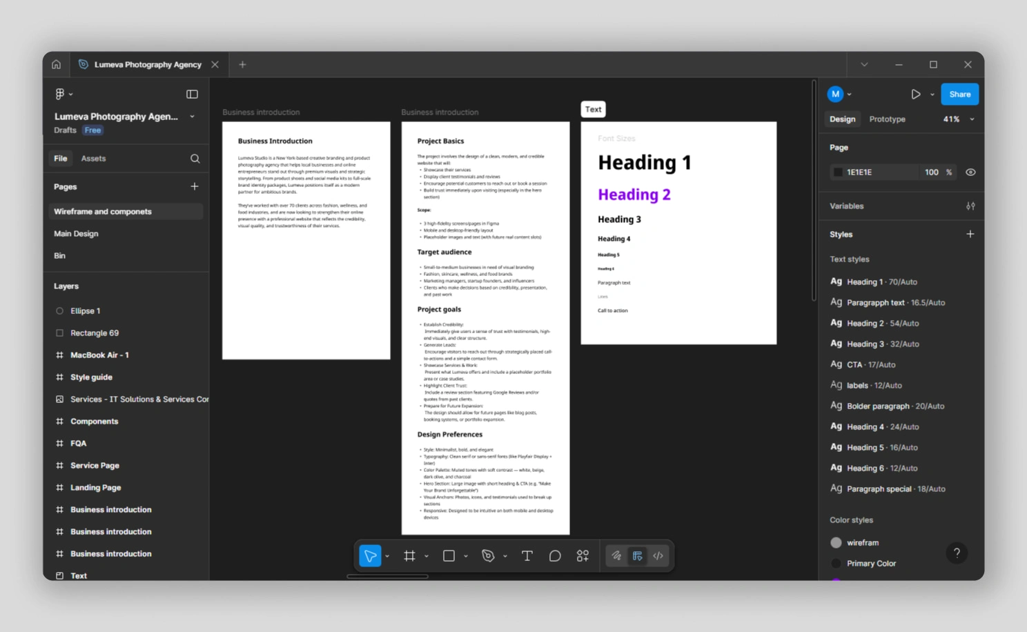
Three documents where plans of the website are written
PHASE 02: Design (Figma)
We started with wireframes to map the site’s structure. This included a hero section, service highlights, testimonials, and a contact prompt. The focus was on simple navigation and clear content flow.
Next, we created three high-fidelity pages for desktop and mobile. We applied the chosen fonts, colors, and a responsive grid. Placeholder images and text marked where future content would go.
Finally, we reviewed and refined the designs. We made sure CTAs were well-placed and the layout could support future additions like a blog or booking system.
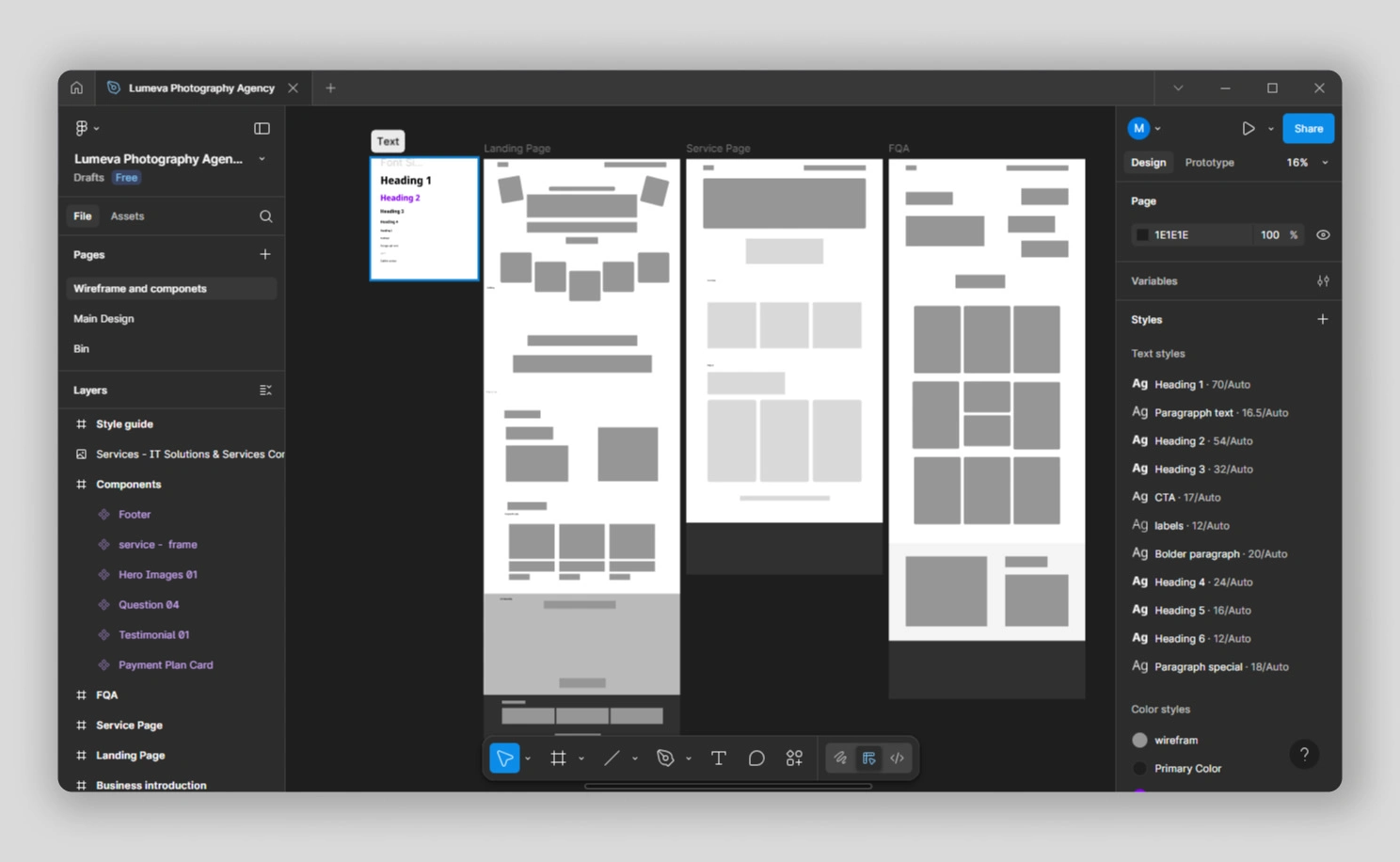
Wireframe of the landing page, service page, and Contact page
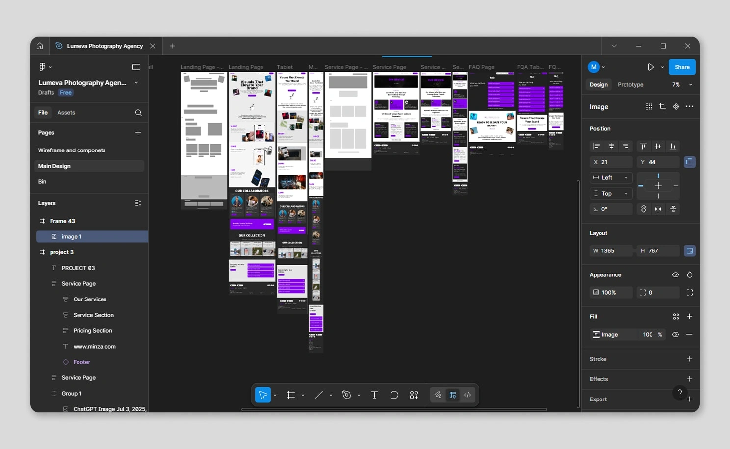
Design of all pages for laptops, tablets, and mobile
PHASE 03: Development (Framer)
We brought the design to life in Framer. The site was built with responsive layouts for desktop and mobile. We created components for the hero section, services, testimonials, and contact form.
To enhance the experience, we added subtle hover effects, transitions, and scroll animations. These kept the site fast and smooth.
Before launch, we tested across devices and browsers. We confirmed that forms, links, and CTAs worked and that the design was ready for future content updates.
Project Link
Like this project
Posted Jul 4, 2025
Designed and developed a minimalist, elegant website for Lumeva Studio using Figma and Framer.
Likes
0
Views
1
Timeline
Jun 8, 2025 - Jul 2, 2025


Crypto Social Media | Mobile UI UX Design

Strathmore Connect | Digital Marketing + System Design

Strathmore Application | Frontend + Backend