4° Deli
Wedian Qzamil
ABOUT
4 Degrees Deli is an expertly curated boutique deli specializing in cannabis-infused creations. A collection of handcrafted products, ranging from edibles to oils, showcasing the perfect fusion of culinary mastery and cannabis expertise. A way to enjoy cannabis beyond smoking.
LOGO
The initial step in the logo design process was research and conceptualization. This involved gaining a thorough understanding of the deli's brand identity, target audience, and core values. incorporating a cannabis leaf body and the degrees symbol, involved a careful blend of symbolism and visual aesthetics. The goal was to create a distinctive and representative mark that would embody the essence of the deli's focus on cannabis use and the deli’s name.

PACKAGING
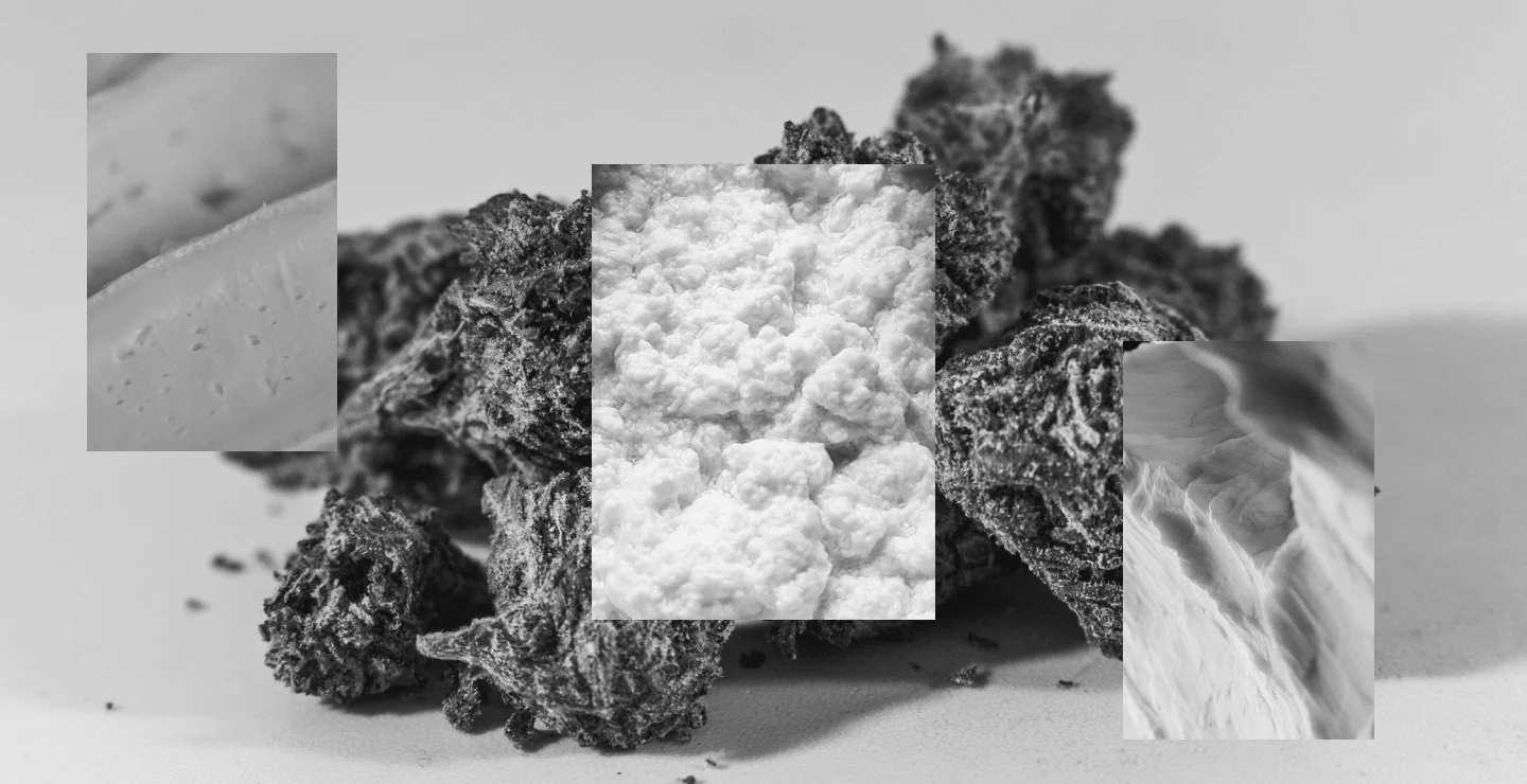
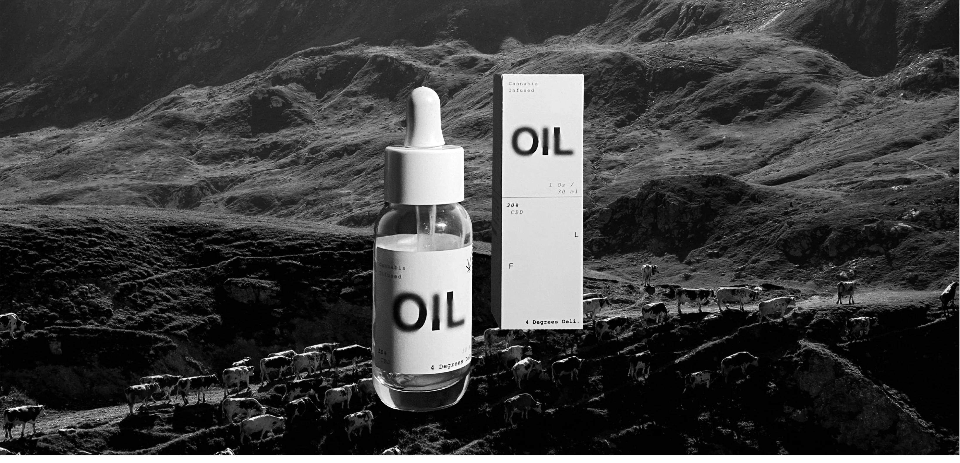
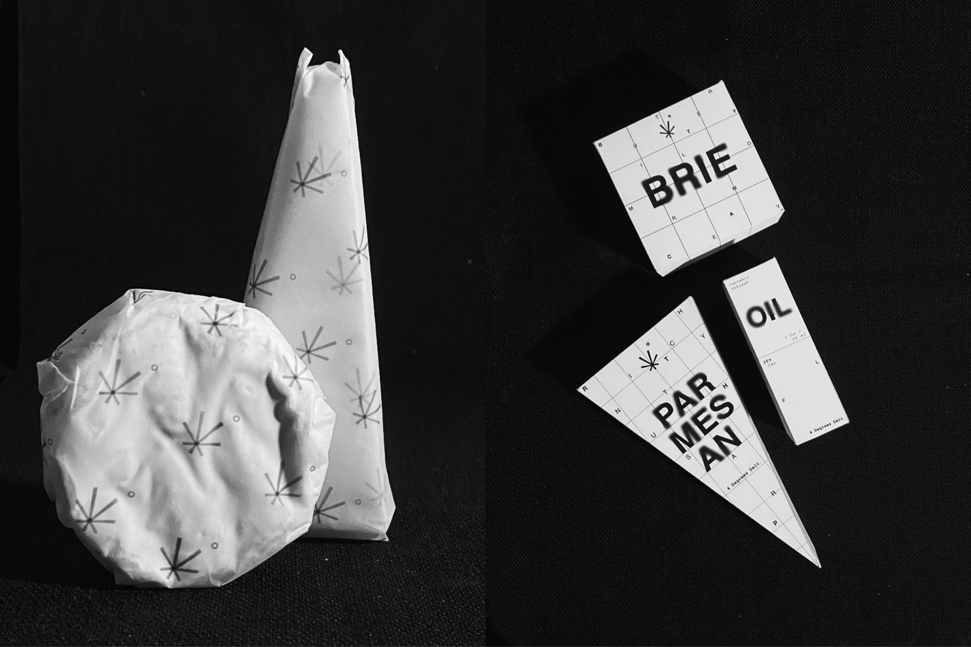
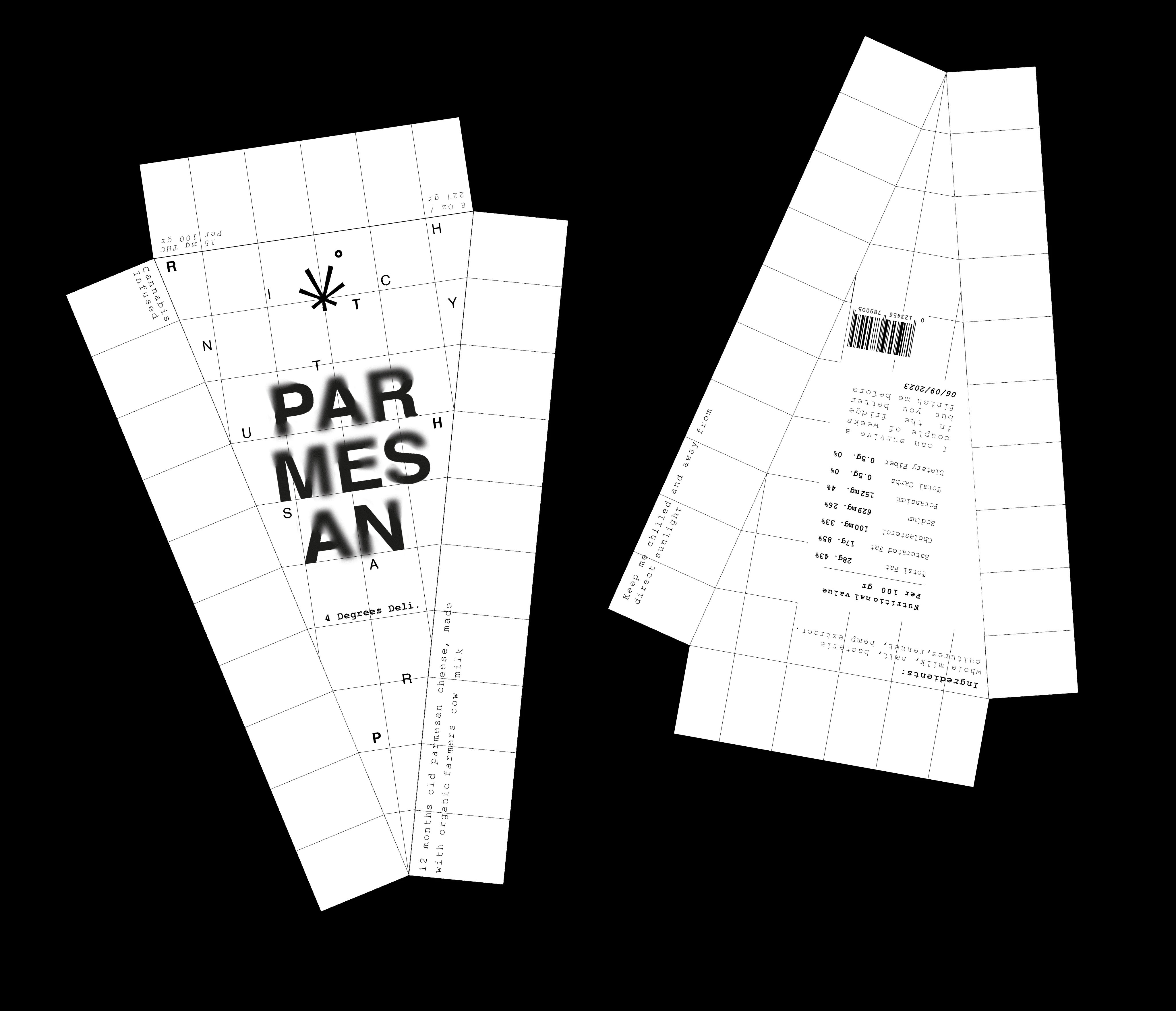
Each product package prominently features the product name and its content, including the percentage of active ingredients. Notably, the bluriness of the product name is intentionally varied to reflect the potency of the contents, with greater blurriness indicating higher potency. Additionally, a grid motif in the background offers a tactile representation of the product's texture; denser grids correspond to firmer cheeses, while softer cheeses feature more spaced-out grids.
Moreover, strategically scattered letters within the grid form descriptive words that evoke the nuanced flavor profile of the cheese. This interactive element encourages consumers to engage with the packaging, creating an immersive experience akin to the perceptual distortions induced by marijuana consumption.
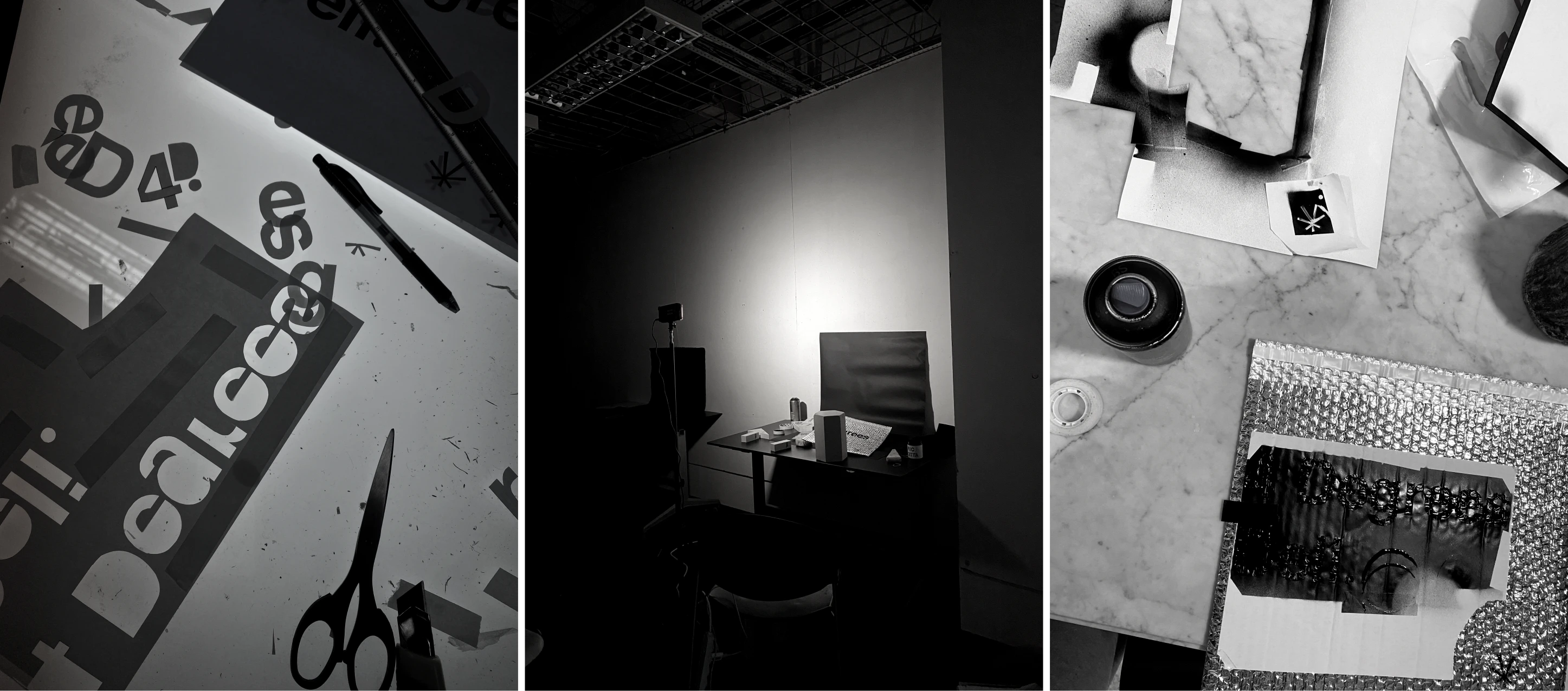
*behing the creation :))*
Like this project
Posted Oct 22, 2024
brand identity projects for an unconventional deli
Likes
0
Views
8