SyncWorks Dashboard — SaaS Analytics UI by Gülçin GümüşSyncWorks Dashboard — SaaS Analytics UI by Gülçin Gümüş

SyncWorks Dashboard — SaaS Analytics UI

Gülçin Gümüş

Gülçin Gümüş

🔍 Project Overview
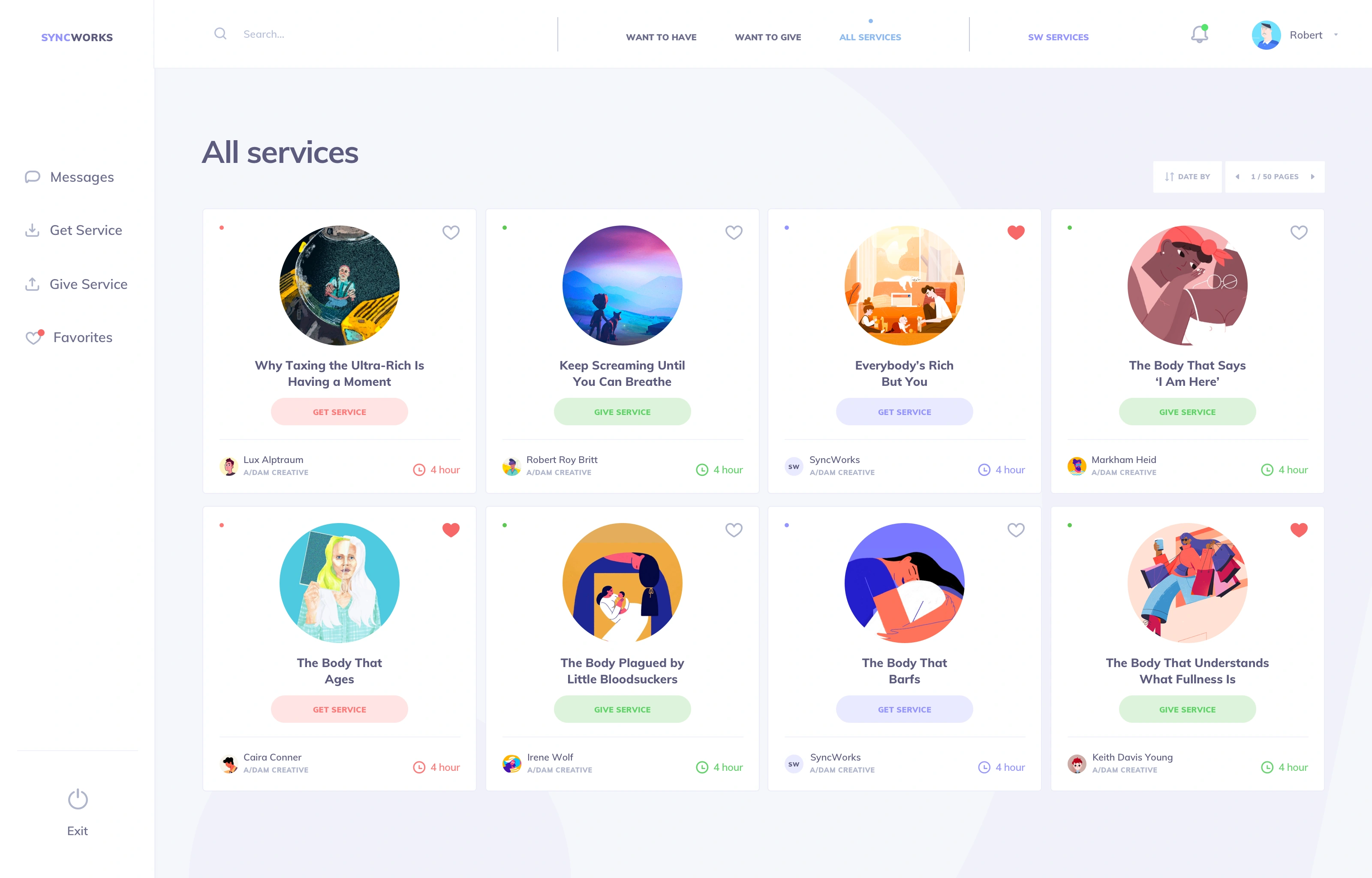
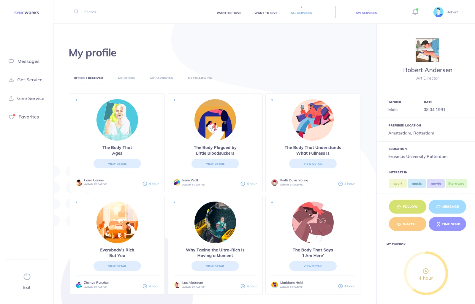
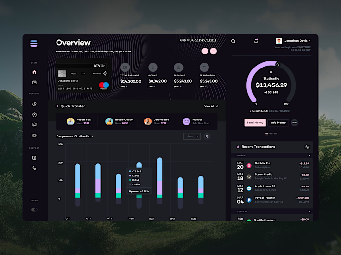
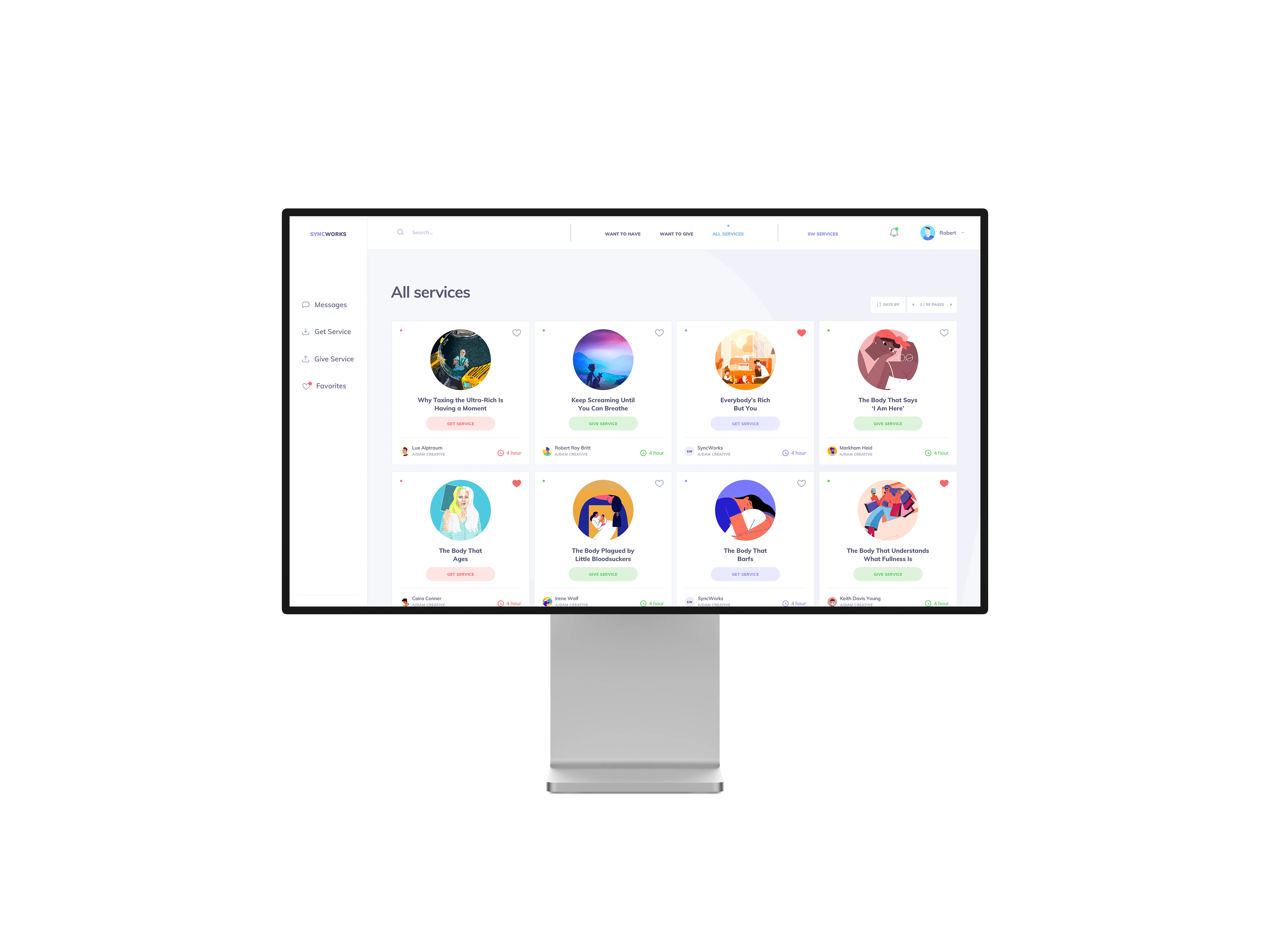
SyncWorks Dashboard is a data-driven productivity interface designed for users who work with complex metrics, multiple widgets, and real-time insights throughout the day. The project focused on balancing information density with visual clarity.
⚡ The Challenge
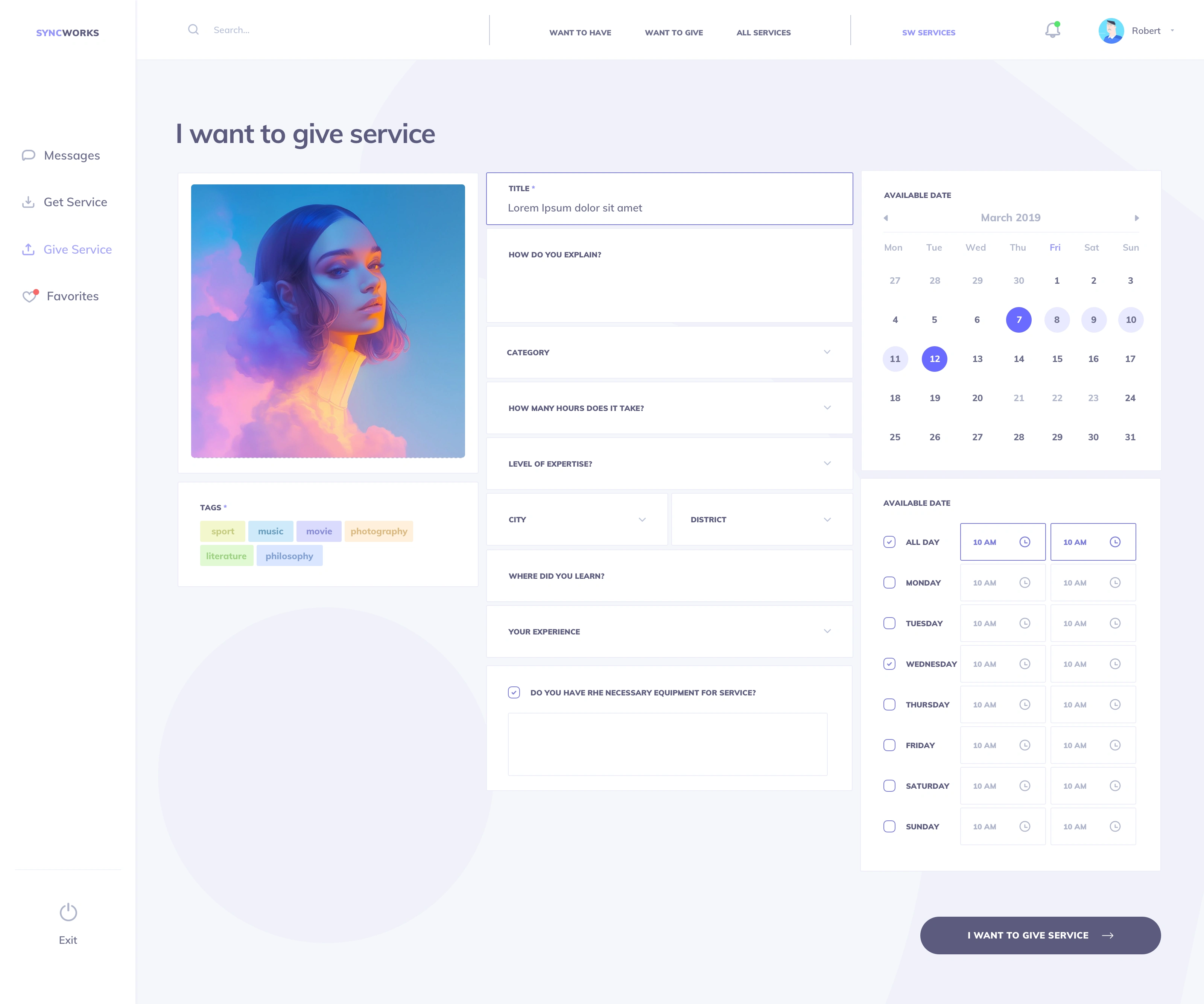
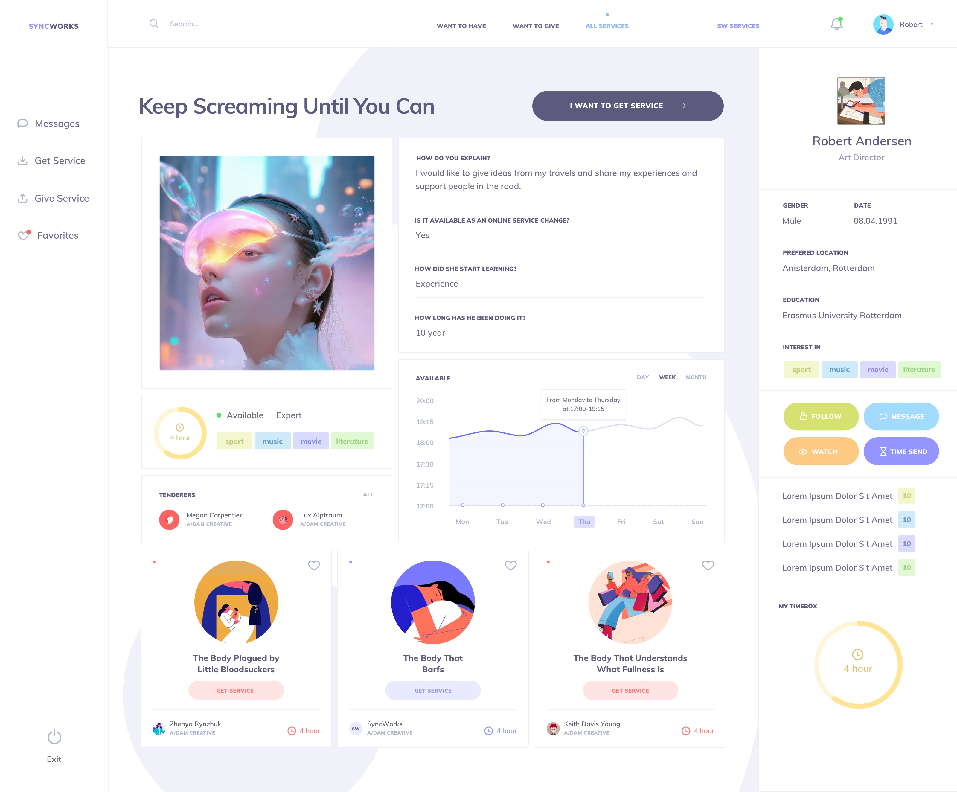
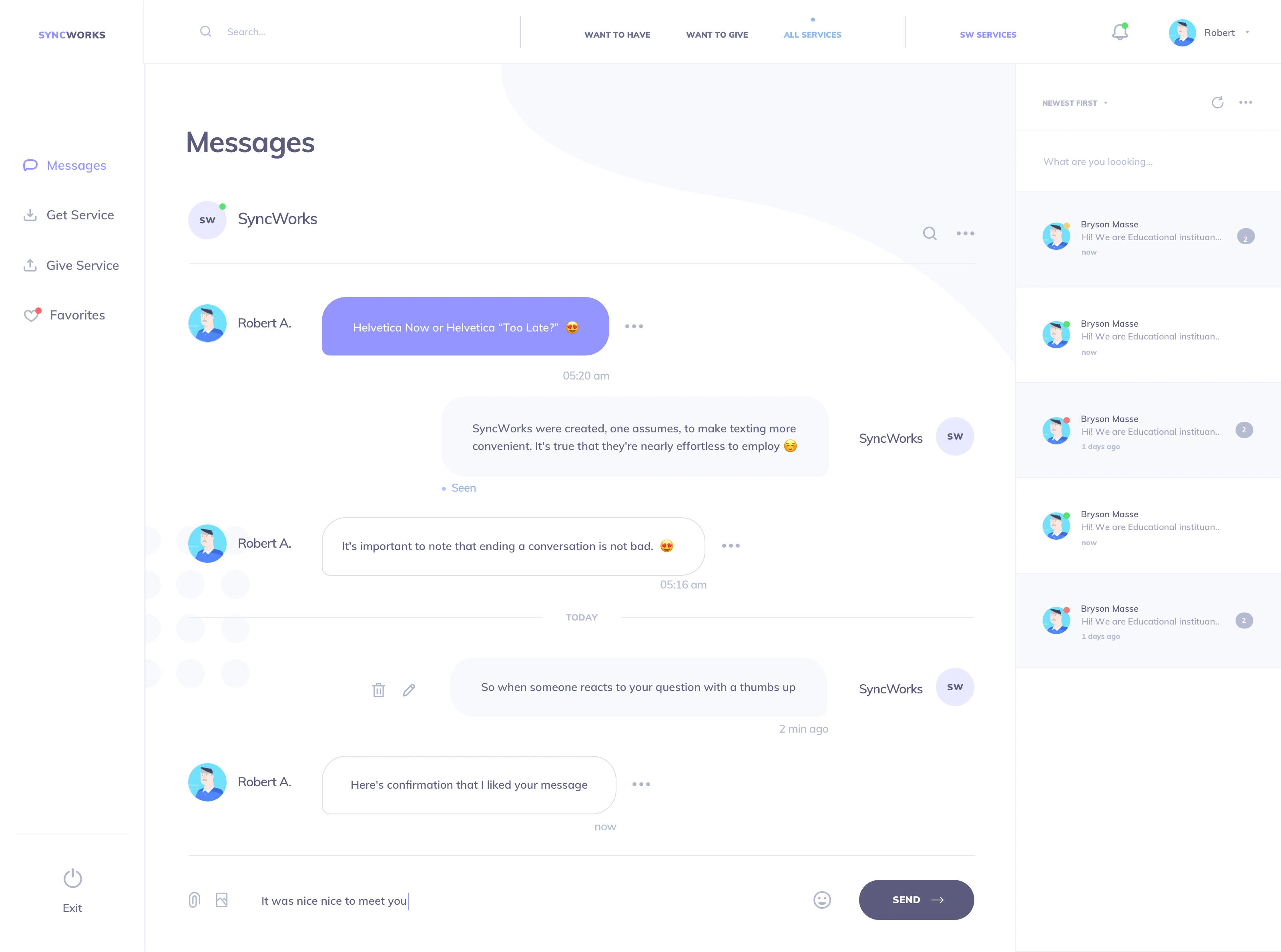
The primary goal was simplifying complex, data-heavy interfaces while preserving the reliability, structure, and scalability expected from an enterprise product. The redesign needed to improve information hierarchy, reduce cognitive load, and create a more intuitive experience across dashboards, user profiles, messaging, and system flows.
🎯 Design Approach
Scan efficiency and task prioritization. Frequent actions are positioned within predictable zones, reducing navigation friction and shortening decision time.
Purposeful spacing rules. White space is used functionally to group content and strengthen hierarchy, not for decorative breathing room.
Consistent component behavior. Reusable cards, tables, and widgets maintain interaction predictability across screens.
Typography calibrated for dense data. Optimized for long usage sessions without visual fatigue.
✅ Outcome
A dashboard experience that supports faster comprehension, clearer insights, and confident decision-making. The interface feels compact yet readable, structured yet flexible, built for real-world productivity environments where clarity directly impacts performance.
Like this project

Posted Apr 2, 2026

This project explores a comprehensive UI/UX redesign for a SaaS-based enterprise workflow platform. The primary goal was to simplify complex, data-heavy interfaces while preserving the reliability, structure, and scalability expected from an enterprise product. The redesign focuses on improving information hierarchy, reducing cognitive load, and creating a more intuitive experience across key areas such as dashboards, user profiles, messaging, services, and system flows. Special attention was given to consistency, modular components, and reusable patterns to support long-term product growth. Accessibility and usability were considered throughout the process, ensuring the interface remains clear and inclusive for a wide range of users. The visual language was refined to feel modern and human-centered, without compromising the professional tone required in enterprise environments. The result is a cleaner, more navigable SaaS experience that helps users understand, manage, and act on c

Likes

1

Views

11

Timeline

Mar 1, 2026 - Apr 1, 2026