Universal Job | Brand Identity Design by Karmuch StudioUniversal Job | Brand Identity Design by Karmuch Studio

Universal Job | Brand Identity Design

Karmuch Studio

Karmuch Studio

Universal Job
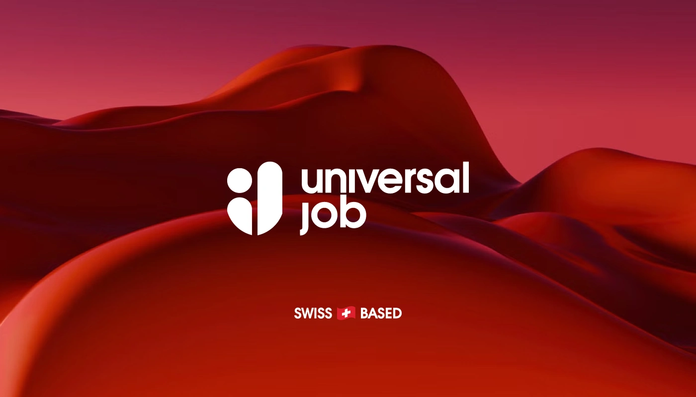
When tasked with developing the brand identity for a Swiss-based online job portal, we set out to create a visual language that balances 
national pride with digital clarity and modern appeal. The logo design is rooted in simplicity and meaning — built directly from the initials 
of the portal’s name. Its geometric structure not only ensures memorability and scalability across digital platforms, but also subtly conveys 
connection, direction, and opportunity — core themes in the job search experience.
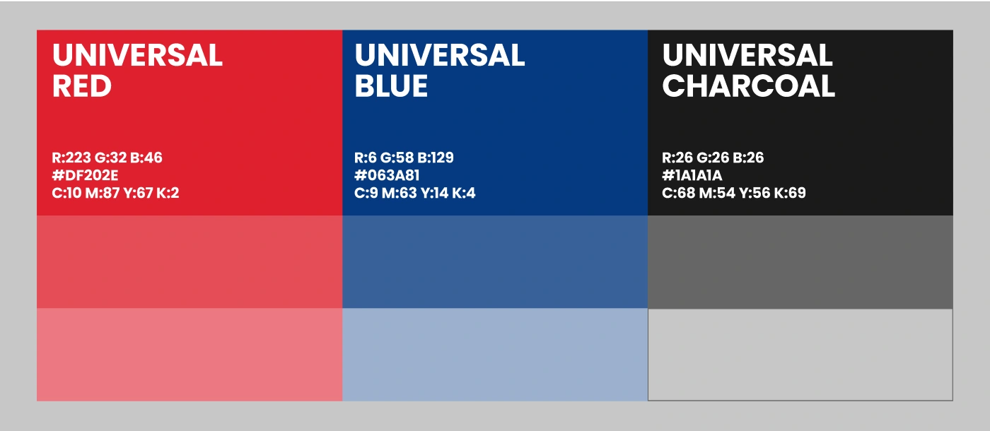
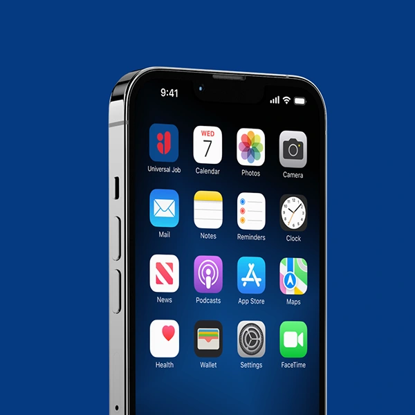
Our color palette draws directly from the Swiss heritage: red and white reflect the national flag and evoke a sense of trust, neutrality, 
and precision — qualities synonymous with Switzerland itself. To bring contrast and depth, we introduced navy blue, a color that
reinforces professionalism, stability, and a modern digital presence. This triad of colors offers versatility while maintaining strong brand recognition.

​​​​​​​
Typography and layout follow a clean, structured design system — easy to navigate, minimalistic, and accessible — mirroring 
the portal’s mission to simplify job discovery in an increasingly complex employment landscape.
This identity is more than just a visual system; it's a strategic foundation. It reflects not only where the portal comes from, but 
where it’s headed — bridging tradition and innovation, and speaking directly to job seekers and employers in a confident, contemporary voice.
Whether it's on-screen, in print, or across social media, the brand’s presence remains consistent, clear, and credible — just 
like the opportunities it helps users discover.
Thanks For Watching.
Follow Us More.
Like this project

Posted Oct 20, 2026

When tasked with developing the brand identity for a Swiss-based online job portal, we set out to create a visual language that balances national pride with digital clarity and modern appeal. The logo design is rooted in simplicity and meaning — built directly from the initials of the portal’s name. Its geometric structure not only ensures memorability and scalability across digital platforms, but also subtly conveys connection, direction, and opportunity — core themes in the job search experience. Our color palette draws directly from the Swiss heritage: red and white reflect the national flag and evoke a sense of trust, neutrality, and precision — qualities synonymous with Switzerland itself. To bring contrast and depth, we introduced navy blue, a color that reinforces professionalism, stability, and a modern digital presence. This triad of colors offers versatility while maintaining strong brand recognition.