Lavishline — Interior Design Studio Website
Denisha Savaliya
Lavishline — Interior Design Studio Website
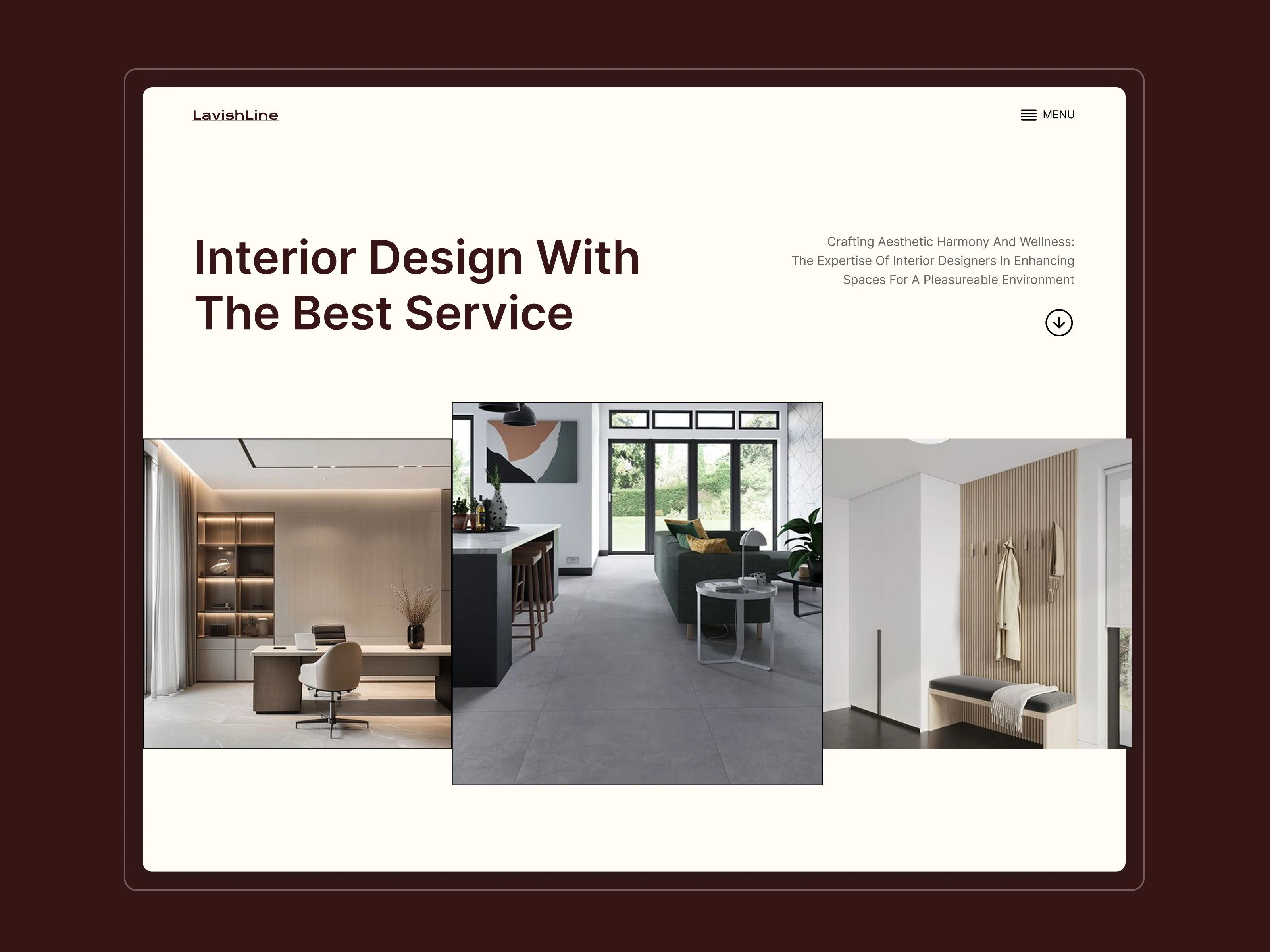
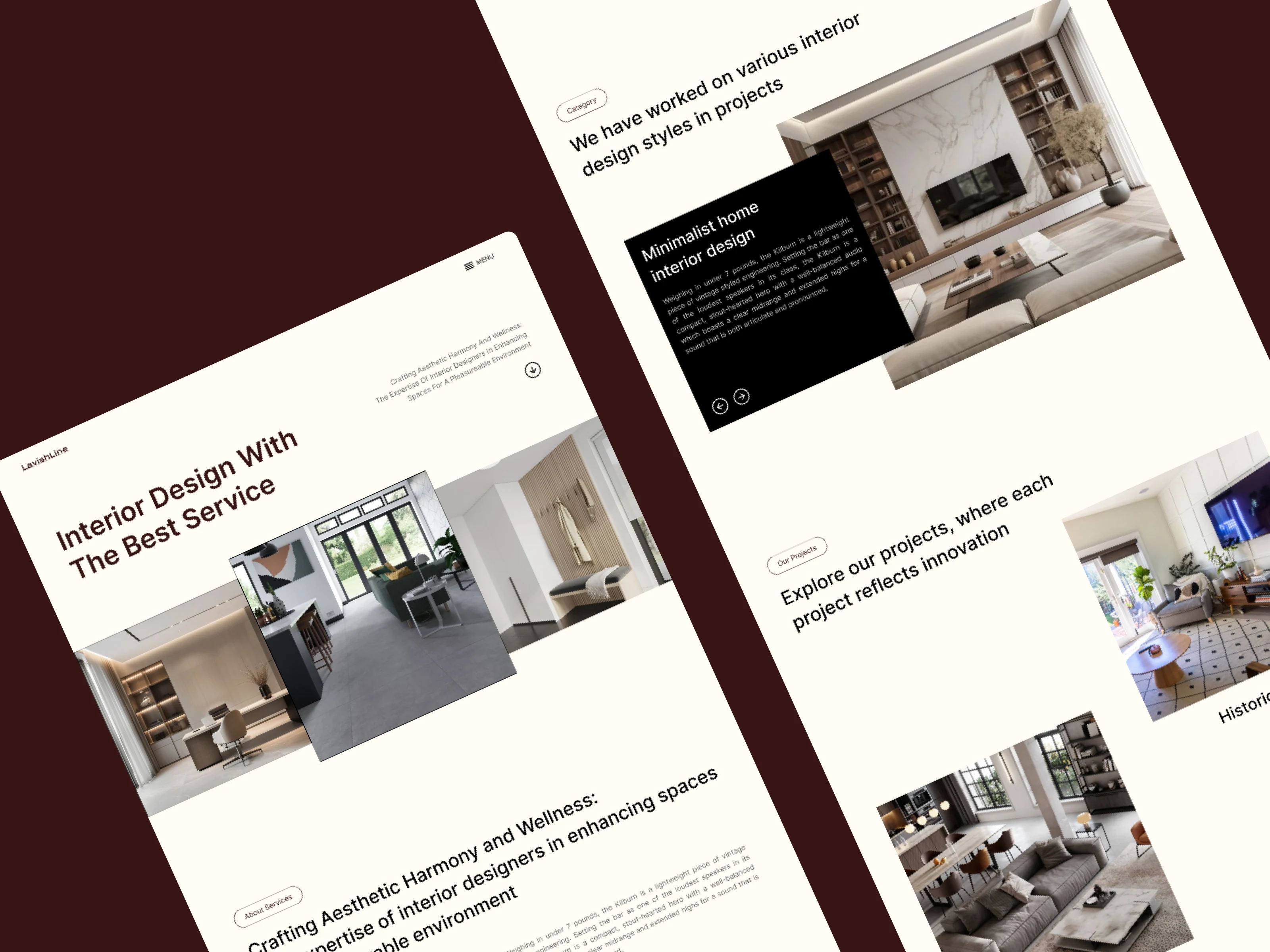
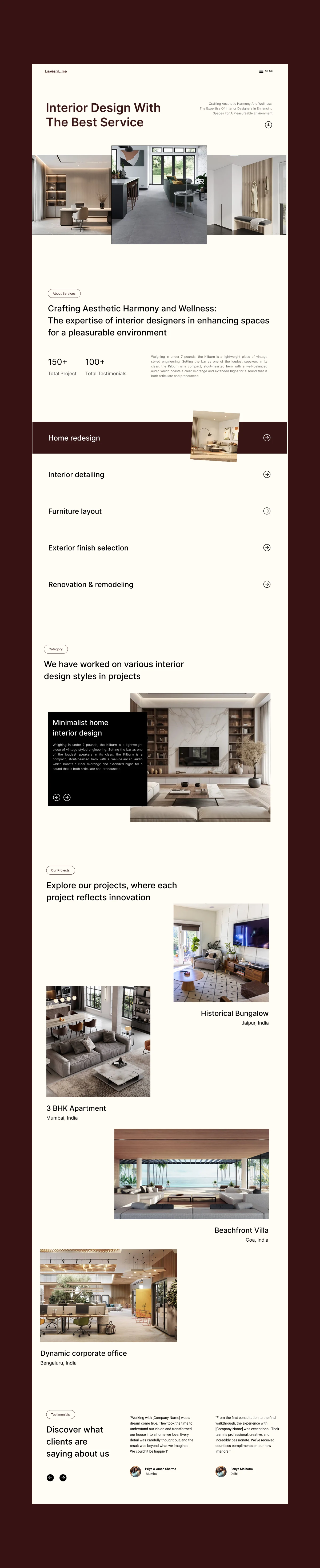
Lavishline is a modern interior design studio focused on curated, aesthetic-driven spaces. The goal was to design a landing experience that feels as intentional and refined as the spaces they create — moving away from generic agency layouts toward a more editorial, immersive structure.
The Challenge
Most interior studio websites rely on predictable sections and overly templated layouts.
The challenge was to:
Communicate premium positioning
Highlight visual storytelling
Maintain strong readability despite heavy imagery
Create hierarchy without overwhelming the user
The website needed to feel sophisticated, calm, and spatial — just like interior design itself.
Strategy & Approach
1. Visual-First Layout System
Large, asymmetrical image compositions were used to reflect architectural balance and spatial harmony. Images lead the narrative instead of text blocks.
2. Editorial Typography Hierarchy
Bold, minimal headings combined with refined body text create a premium, design-magazine feel.
3. Warm Neutral Palette
The color system was inspired by interior materials — beige, cream, and deep wine tones — to evoke warmth and luxury.
4. Structured Yet Non-Traditional Sections
Instead of standard “About → Services → Testimonials” stacking, the layout flows like a portfolio narrative:
Hero with spatial imagery
Studio philosophy
Service focus
Design categories
Project highlights
Testimonials
This creates rhythm and visual breathing space.
Outcome
The final result is a refined, modern landing page that positions Lavishline as a premium interior design brand while maintaining usability and visual clarity.
Like this project
Posted Jan 16, 2026
Lavishline is a modern interior design studio focused on curated, aesthetic-driven spaces. The goal was to design a intentional and refined landing experience.
Likes
1
Views
5