Made for the Making Campaign for Allbirds

Amanda Hewett


Made for the making
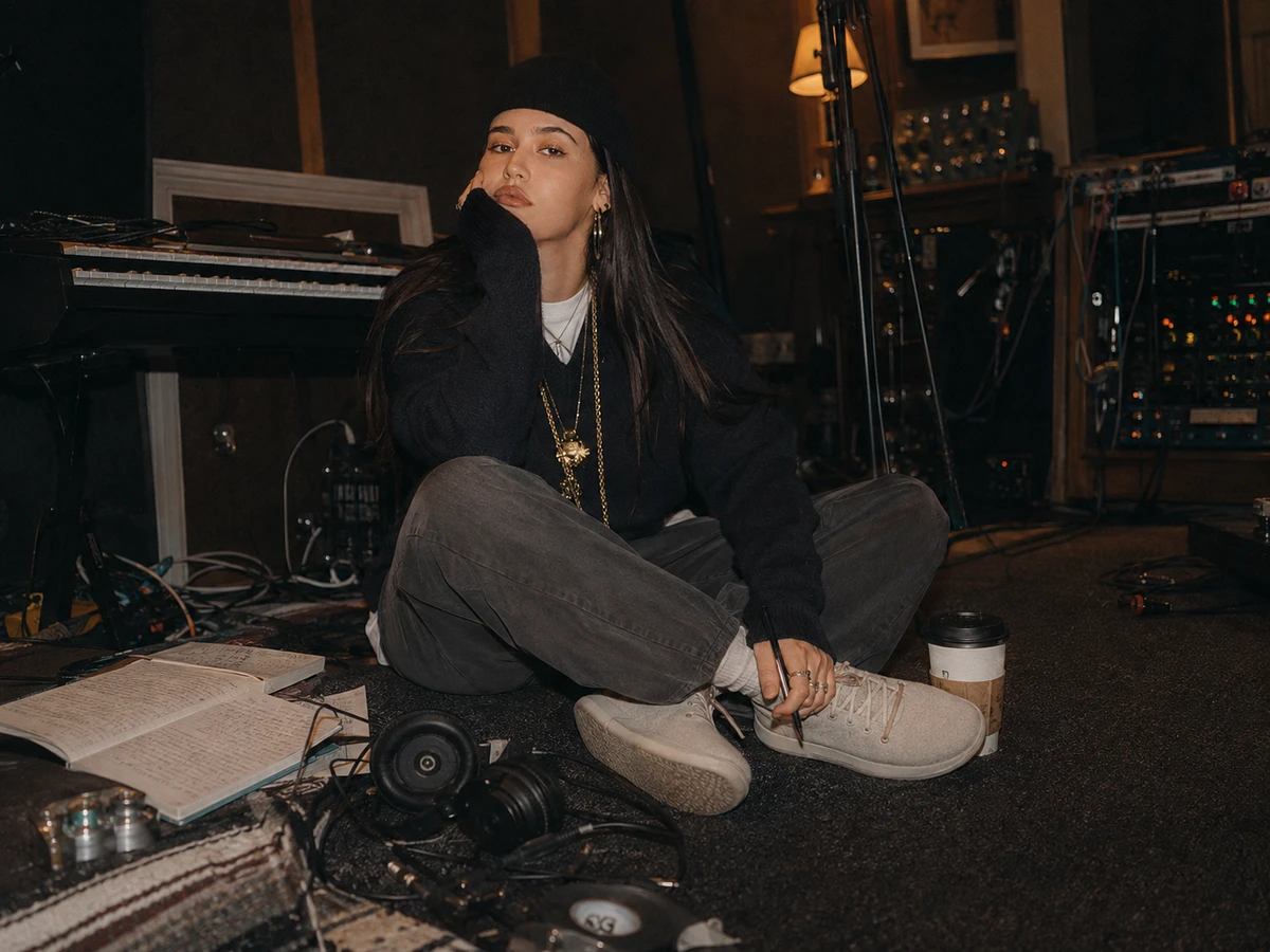
Her days rarely happen in one place.
A session in the morning. A meeting across town. Editing somewhere in between. A show at night. Plans changing as the day goes on.
For creatives like her, the right shoe is not the one that gets the most attention.
It is the one that can keep up without asking for any.
Allbirds was already known for comfort and practicality.
The opportunity was to make that practicality feel aspirational.
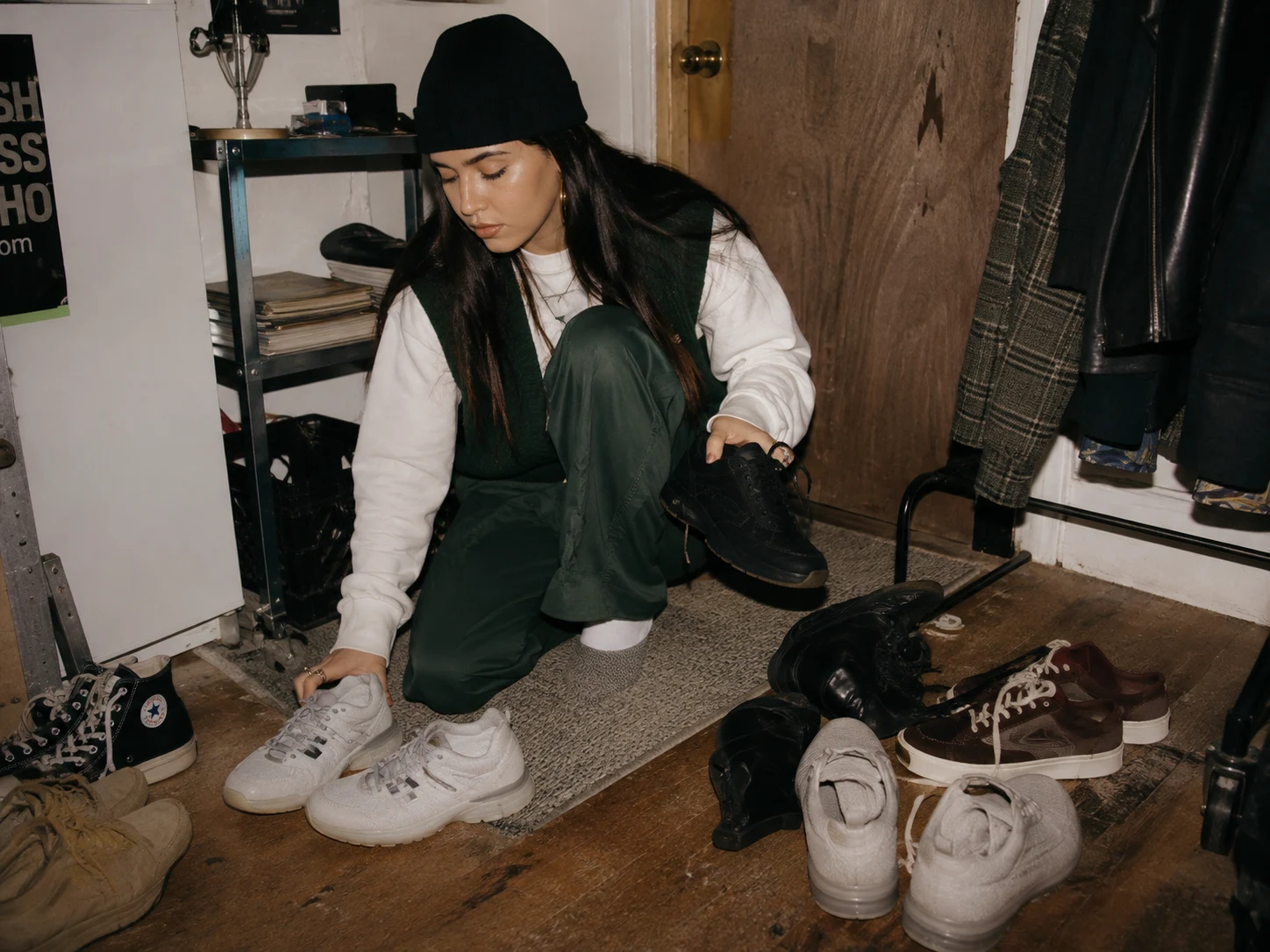
The decision before every day
For creatives, getting dressed is part function and part self-expression.
The shoes that feel most like them are not always the shoes they want to spend twelve hours in.
And the shoes that promise all-day comfort can feel too practical, too safe, or too disconnected from the rest of their style.
That tension became the first problem to solve:
How do we make Allbirds feel like a choice you want to make, not one you settle for?
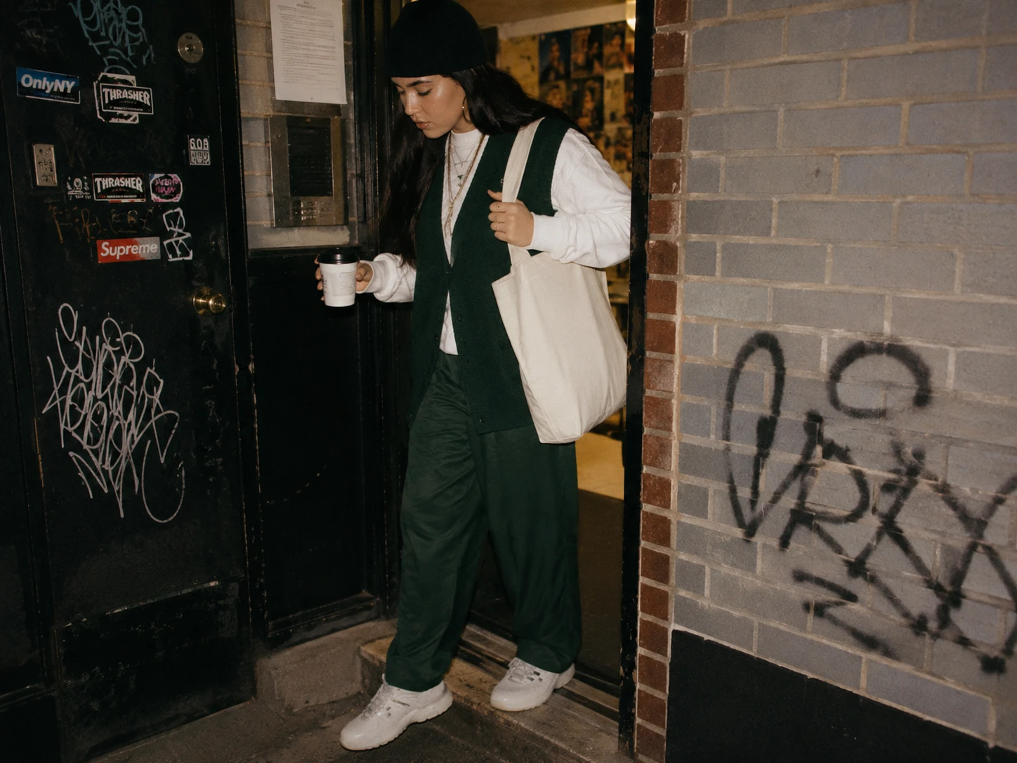
Research started with movement
Instead of asking creatives what they wanted from a shoe, I looked at how their shoes already had to perform.
I followed the moments between destinations — leaving home, commuting, standing through long sessions, carrying gear, changing plans, and moving from work into whatever came next.
What mattered wasn’t one activity.
It was whether a single pair could survive the whole day without forcing a tradeoff between comfort and identity.
That became the question behind the campaign:
What would make Allbirds feel like the practical choice creatives actually want to wear?
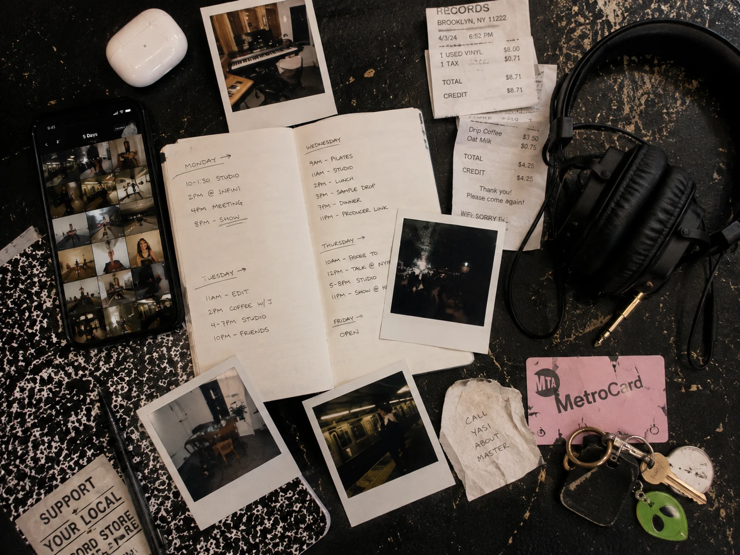
What the week revealed
The problem was not that creatives lacked options.
It was that almost every option asked them to compromise somewhere — comfort, style, versatility, or endurance.
Across the diary study, the same pattern kept showing up: the shoes people loved aesthetically were often the first thing they wanted to take off.
And the pairs that could handle the whole day rarely felt like part of their identity.
That gave us the real opportunity:
Make the comfortable choice feel like the creative choice.
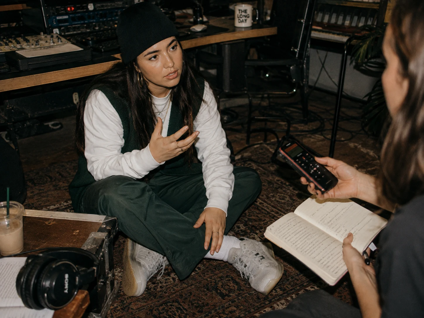
What they told us
Across interviews, the tension was less about comfort itself and more about what comfort seemed to represent.
The creatives we spoke with did not want to look like they had dressed for practicality.
They wanted to feel like themselves — just without paying for it twelve hours later.
One comment captured the problem perfectly:
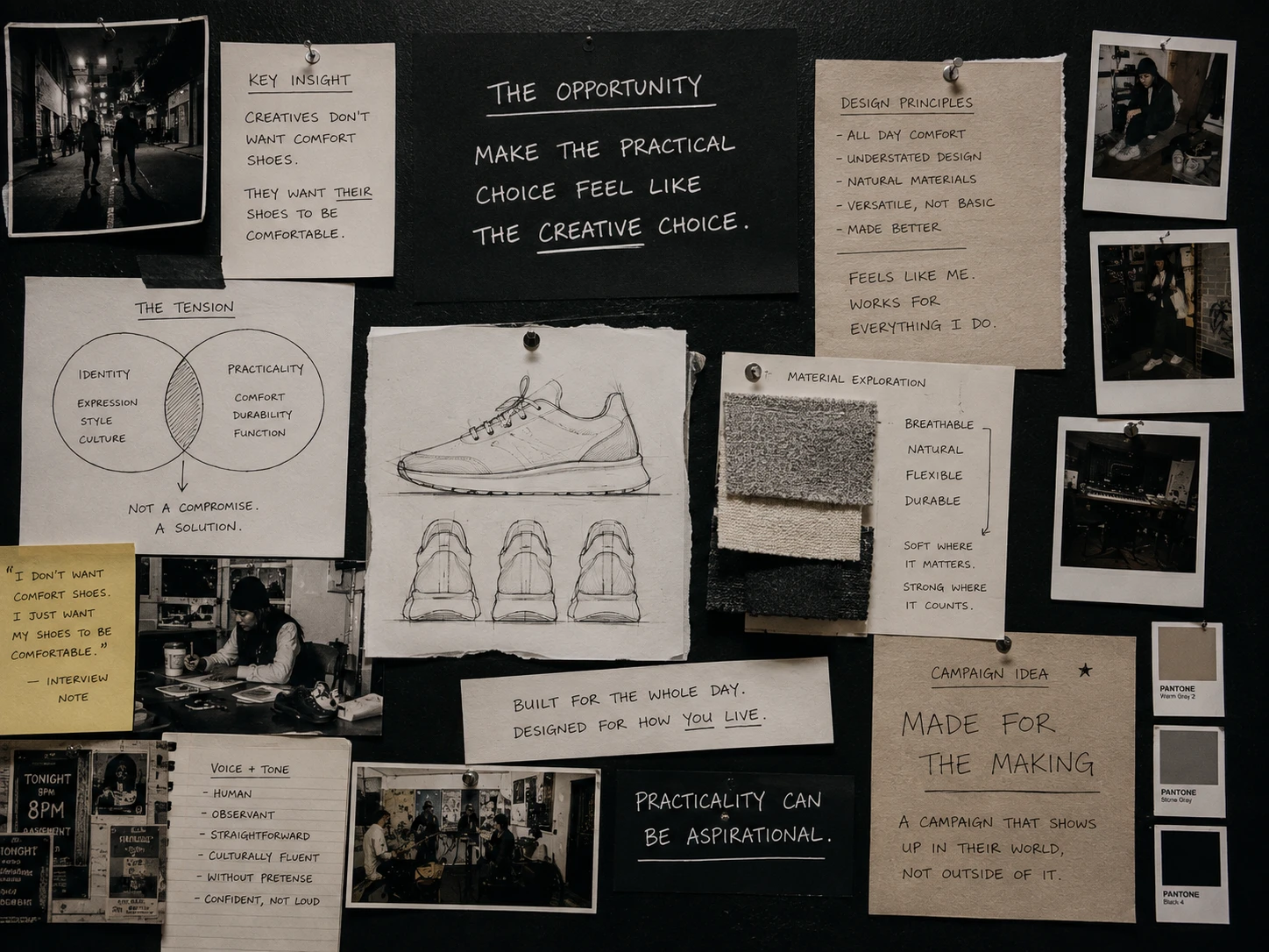
“I don’t want comfort shoes. I just want my shoes to be comfortable.”
That distinction changed the brief.
The opportunity was not to make Allbirds look more fashionable.
It was to make practicality feel culturally credible for people whose style is already their own.
From insight to strategy
The research pointed to a simple shift:
Allbirds did not need to become louder, trendier, or more fashion-led.
It needed to show up inside the lives of people whose taste already made practicality feel aspirational.
That changed the role of the brand from:
comfortable shoes for everyday life
to:
the reliable pair creative people choose because they have more important things to think about.
The campaign idea followed naturally:
Made for the making
A platform built around people who spend their days creating — and a product designed to quietly keep up with them.
The campaign had to earn its place in their world
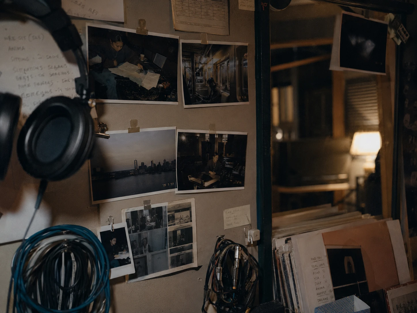
If the goal was to make Allbirds aspirational for creatives, the work could not feel like traditional footwear advertising.
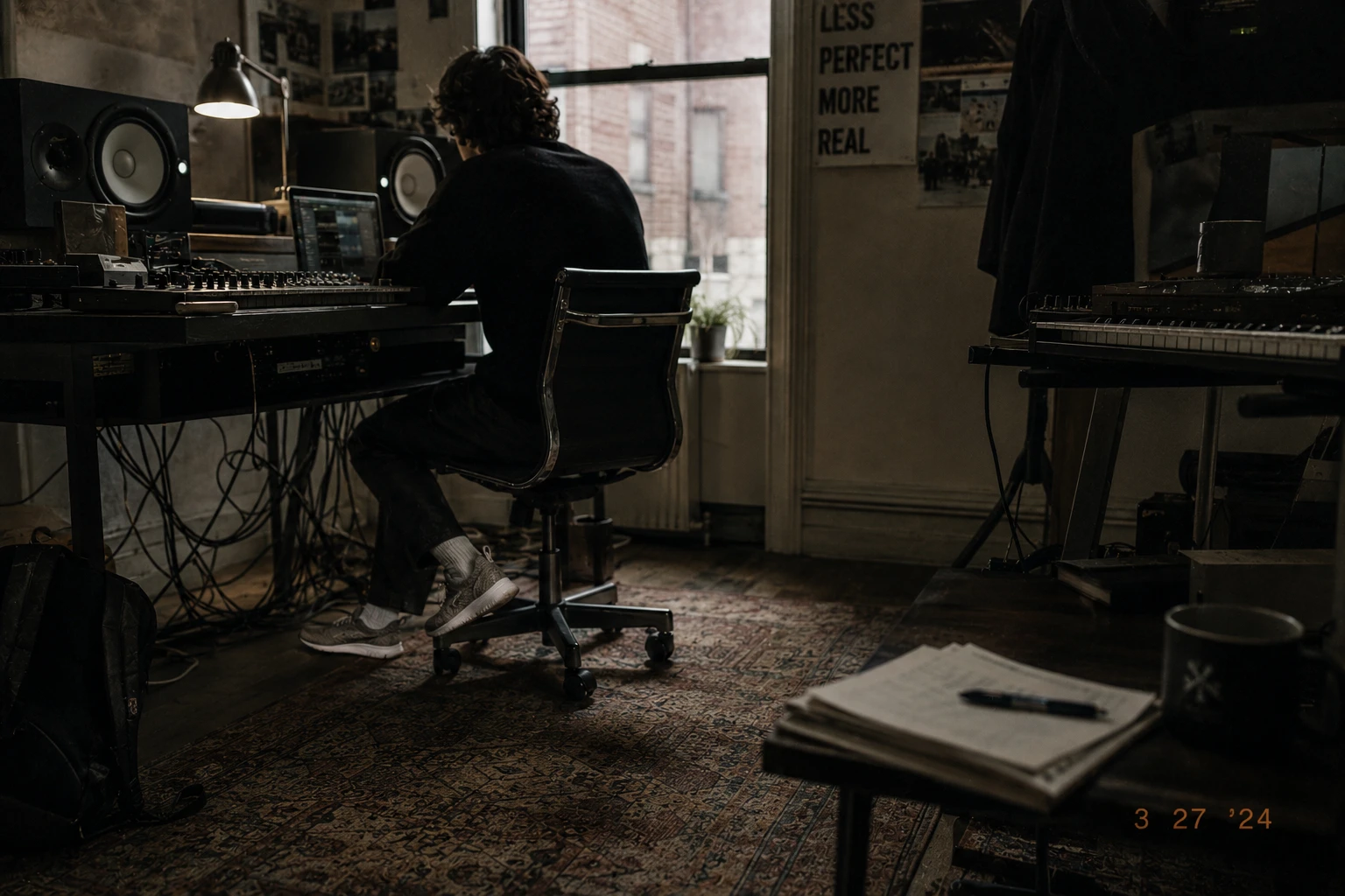
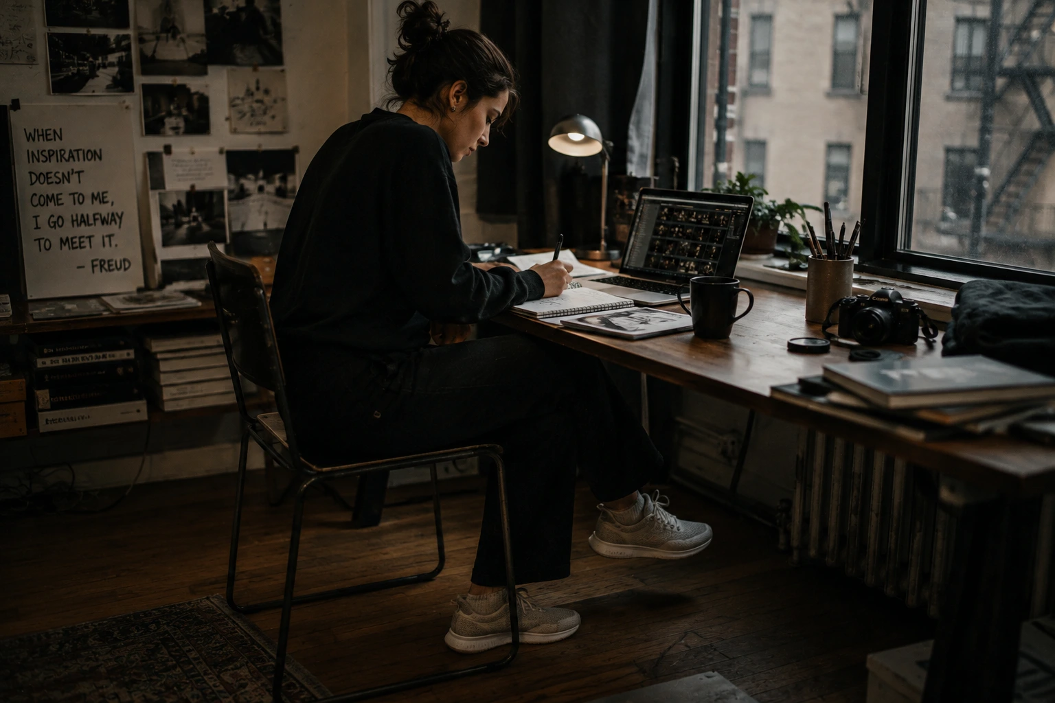
So the campaign was built to look like the environments this audience already trusted: studios, worktables, rehearsal rooms, city streets, late-night edits, and the in-between moments that make up a creative life.
The shoe stayed visible, but never became the loudest thing in the frame.
That became the rule for every execution:
Show the life first. Let the product prove it belongs there.
Designing for credibility
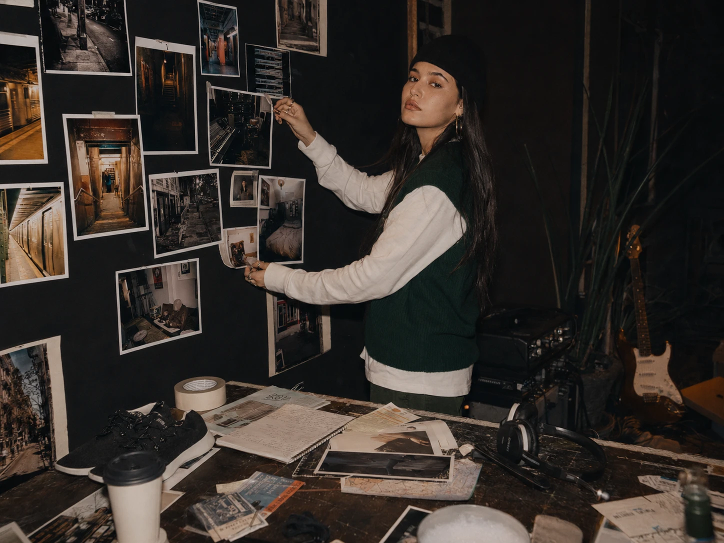
The visual system only worked if it felt native to the people we were trying to reach.
That meant resisting the urge to over-style the product or turn every frame into a traditional campaign image.
Instead, we designed around the environments creatives already move through — studios, sidewalks, coffee shops, rehearsal spaces, late-night work sessions, and the moments in between.
The rule was simple:
Life first. Product second.
By keeping the shoe present but understated, the campaign could borrow credibility from the world around it rather than trying to manufacture it.
The next step was finding the right people and places to make that world feel real.
Choosing environments with credibility
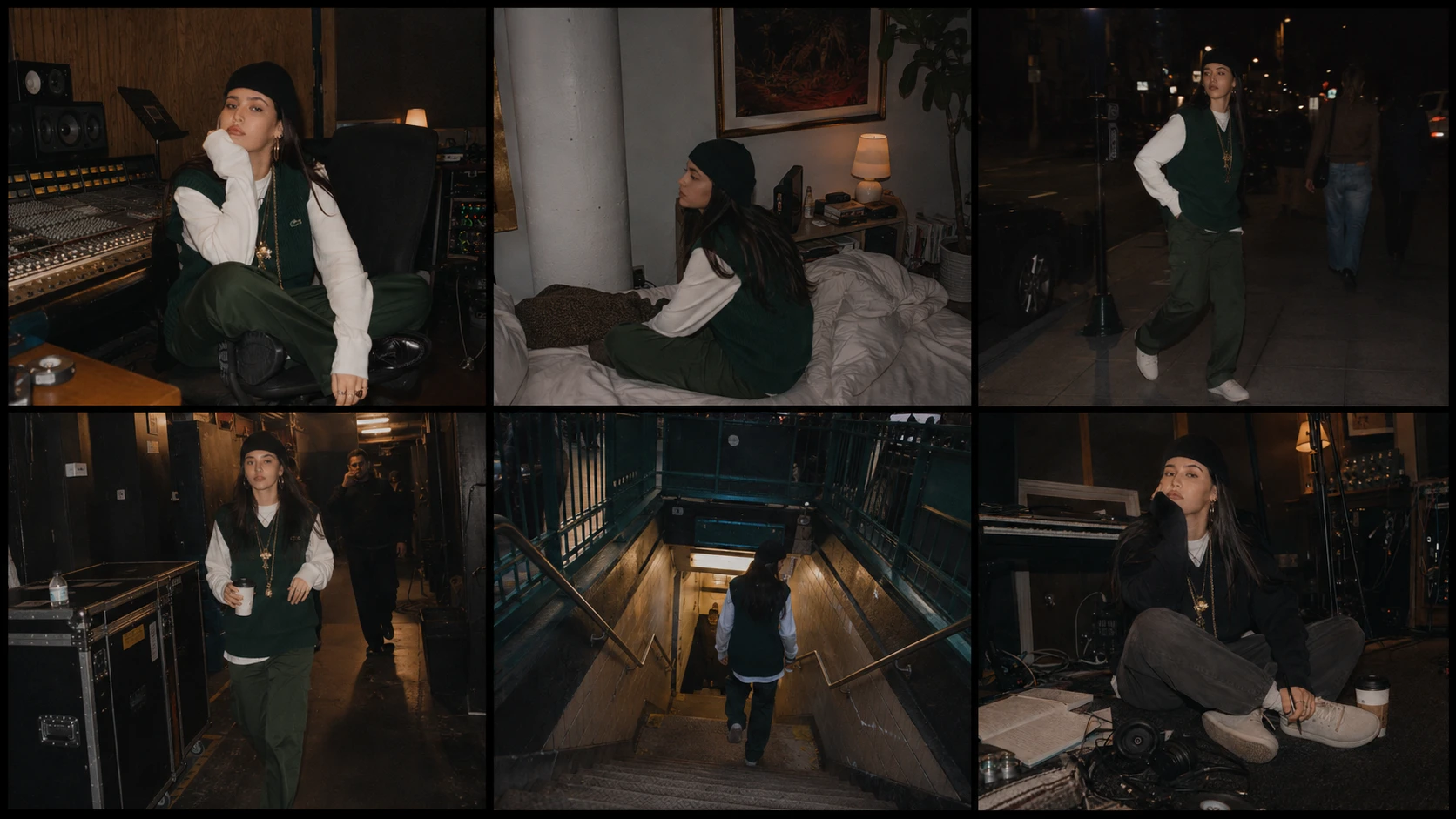
The campaign could not ask creatives to believe Allbirds belonged in their world without first understanding what that world actually looked like.
So the locations were chosen around behavior, not aesthetics.
Studios, rehearsal rooms, apartments, coffee shops, sidewalks, transit, and late-night workspaces all represented different parts of the same day — places where comfort matters, but where personal style still carries weight.
The goal was never to make those spaces feel branded.
It was to make the product feel naturally present inside them.
That became the visual test for every shoot location:
Would this moment still feel real if the shoes were not the reason the camera was there?
Art direction built around observation
Once the environments were chosen, the next challenge was making the photography feel like it genuinely belonged there.
That meant avoiding polished poses, perfect lighting, and product-first compositions.
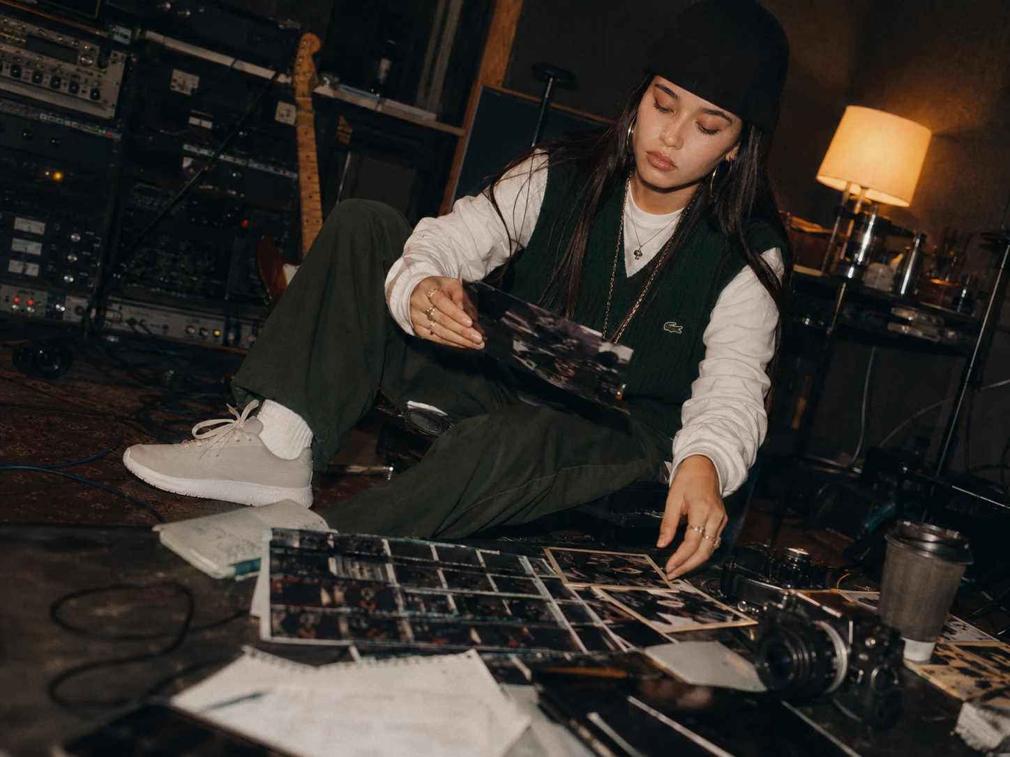
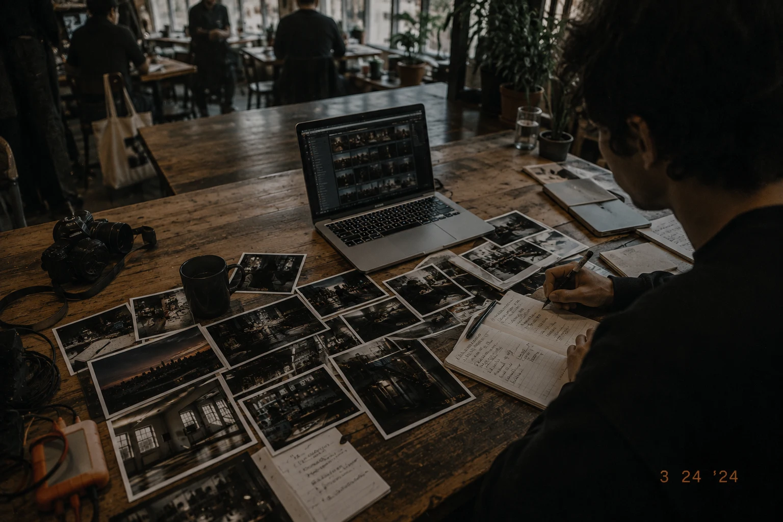
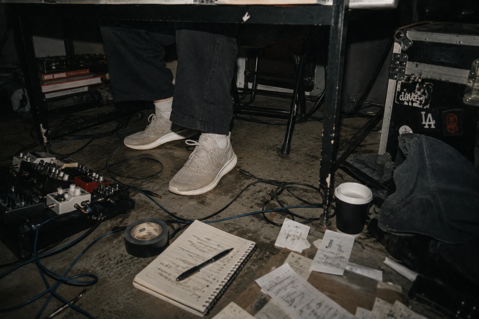
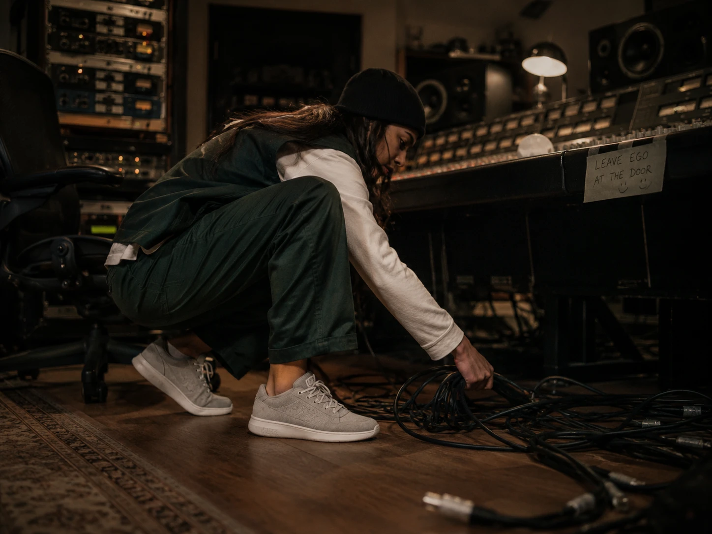
Instead, the shoot was directed around real behavior — reviewing contact sheets, waiting between takes, making notes, moving gear, sitting on the floor, working through an idea.
The camera stayed close enough to feel intimate, but loose enough to leave room for imperfection.
The shoe remained present throughout, but never became the reason the moment existed.
That restraint helped the campaign feel less like advertising and more like evidence of a life already in progress.
The product never had to perform for the camera
By this point, the campaign had a clear visual rule:
The creative comes first. The work comes second. The shoe simply belongs.
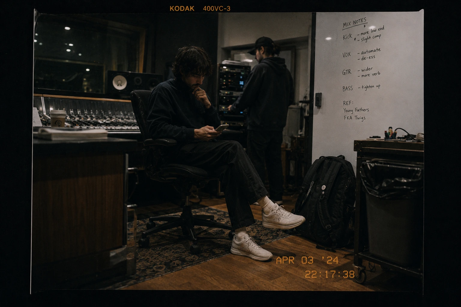
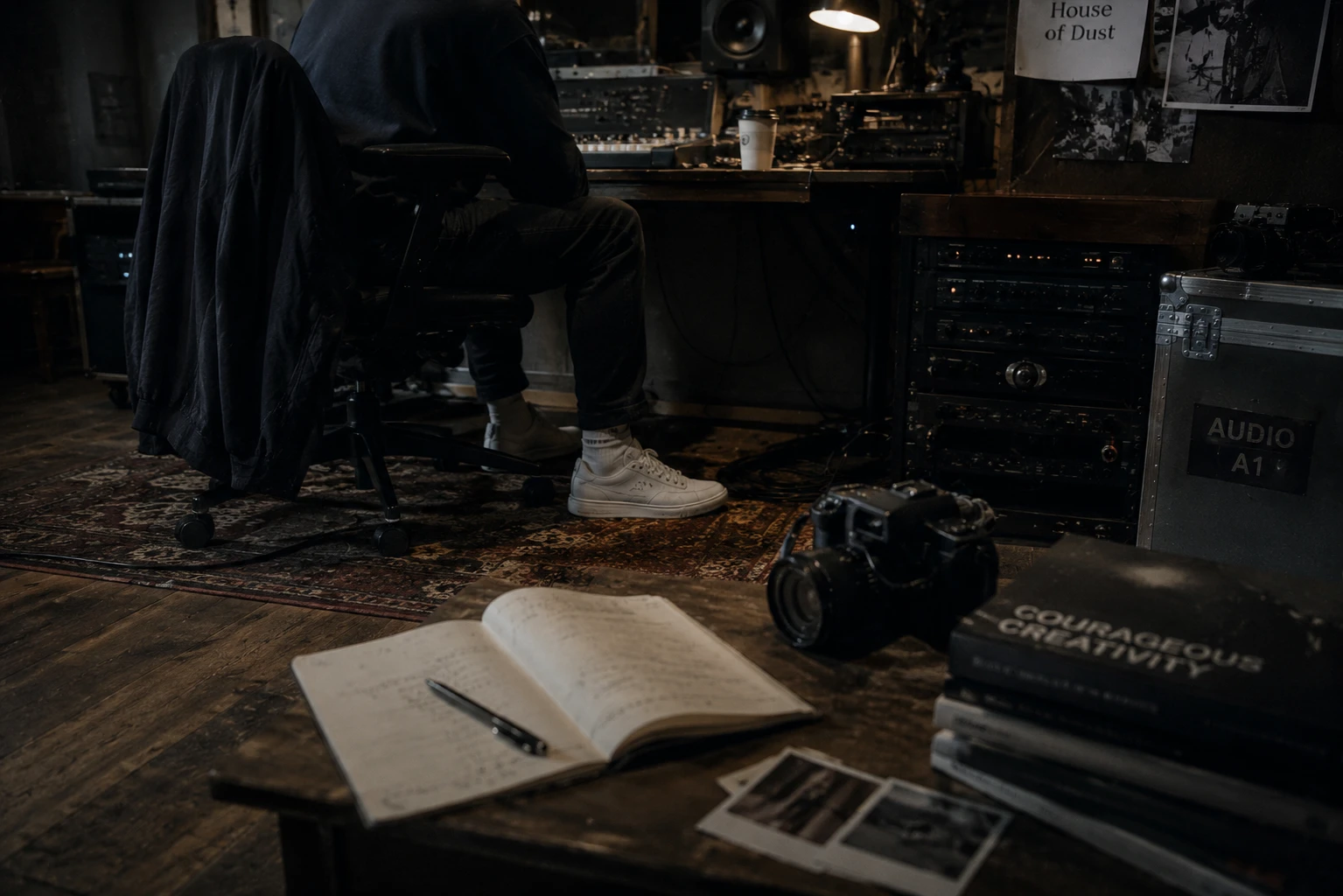
We avoided forcing the product into unnatural hero moments. Instead, it appeared where it would in real life — under the console, beside a road case, on the floor between sessions, or worn through a long day without becoming the center of attention.
That subtlety was important to the repositioning.
If Allbirds was going to become aspirational for this audience, it could not look like it was trying too hard to be cool.
It had to feel like the quietly smart choice already embedded in the life they wanted to live.
Built for the hours nobody photographs
The research kept pointing us toward the same truth: the hardest parts of a creative day are rarely the most visible ones.
It is the standing around between takes. The walk to the next meeting. The hour on concrete studio floors. The subway transfer with a laptop and gear. The late session that runs longer than planned.
Those moments do not look dramatic, but they are where comfort becomes essential.
That changed how we framed the product story.
Instead of building the campaign around technical claims alone, we focused on the accumulated reality of a long day — the small physical demands that add up over time.
The shoe had to work quietly through all of it.
No outfit change. No second pair in the bag. No decision about whether comfort was worth giving up personal style.
That is where Allbirds became relevant to this audience.
Not as the shoe creatives were supposed to notice.
As the shoe that let them keep thinking about everything else.
One pair. The whole day. No compromise required.
Turning the campaign into a shopping experience
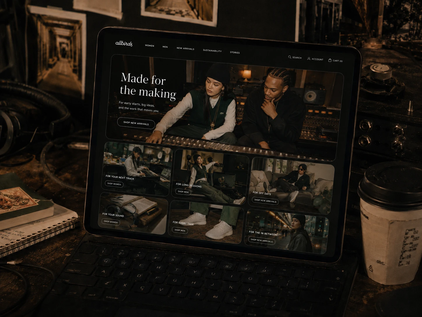
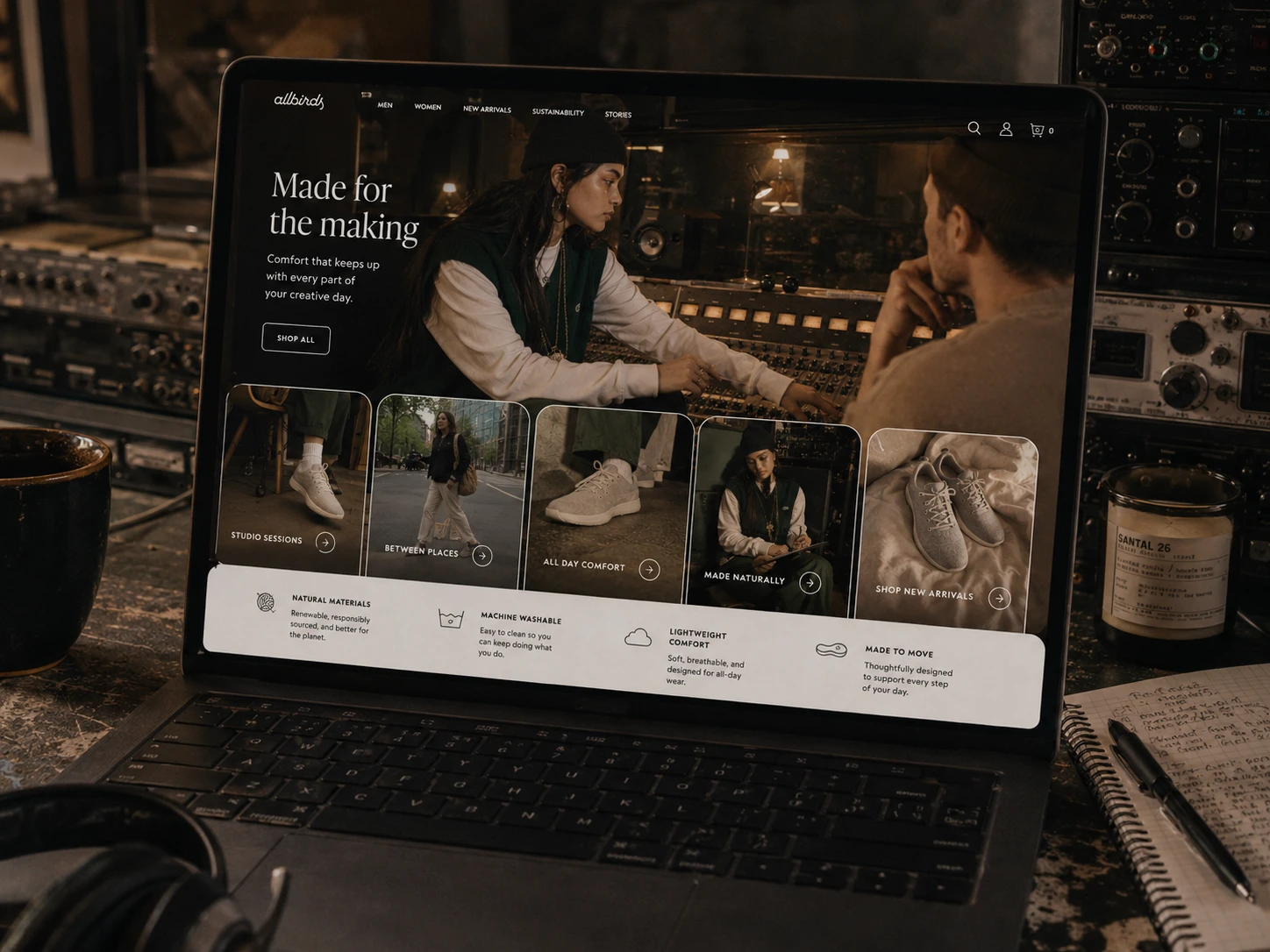
Once the visual language was established, the landing page had to translate that same credibility into commerce.
The goal was not to suddenly switch from storytelling into product marketing.
It was to keep the audience inside the world they had already connected with — then introduce the reasons the product belonged there.
The page opened with our lead creative working alongside a studio client, grounding the campaign in collaboration rather than posing.
From there, the experience moved through different creative contexts: long sessions, transit, downtime, rehearsals, and the in-between moments that shaped the original research.
Each module connected a real-life situation to a product benefit without interrupting the story.
Comfort became endurance.
Versatility became fewer decisions.
Natural materials became something tactile and believable rather than a sustainability claim sitting on its own.
And the calls to action stayed visually restrained so the page still felt editorial, not transactional.
The idea was simple:
Let people recognize themselves in the life first. Then give them enough proof to believe the shoe can keep up with it.
This became the bridge between Made for the making as a campaign idea and an experience designed to drive actual purchase.
Shop by the life you live
The landing page was designed to move from recognition into proof.
Instead of organizing the experience around product specifications alone, we framed the shoe around the situations our research showed mattered most:
Studio sessions. Between places. All-day comfort. Made naturally. One pair that keeps up.
That made the product story easier to understand because every benefit was tied back to a real part of the audience’s day.
The design also kept the visual language of the campaign intact — rounded modules, restrained typography, muted green and taupe tones, candid photography, and lightweight outlined calls to action — so the transition from brand story to shopping experience never felt abrupt.
The result was a landing page that still felt editorial, but answered the practical questions that actually move someone toward purchase.
The campaign created the desire. The experience gave people a reason to believe it.
Advertising that looked like the culture around it
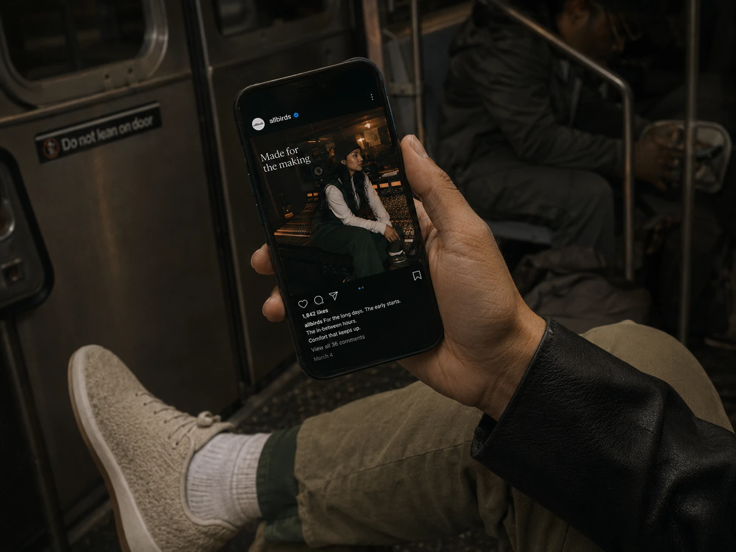
Paid social needed to feel like something our audience would naturally stop on, not something obviously built to interrupt them.
So instead of polishing the campaign into traditional footwear ads, we carried the same documentary language into the feed: real environments, imperfect framing, muted color, familiar creative spaces, and moments that felt observed rather than staged.
The product was still there, but the life around it did the convincing first.
That changed the role of paid media from simply showing the shoe to showing the kind of world the shoe belonged in.
The goal was simple:
Make someone pause because the person, place, and energy felt relevant — then let them realize the product was Allbirds.
By keeping the social work visually consistent with the campaign experience, the brand started to feel less like an outsider trying to reach creatives and more like something already moving through the same culture.
The next step was to make that sense of movement literal.
Motion made the promise tangible
Static photography established the world.
Video showed what it actually felt like to move through it.
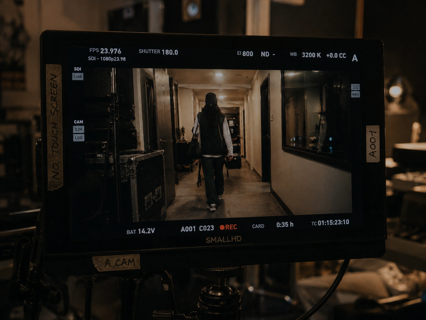
The short-form films followed the rhythm of a real creative day rather than a traditional product narrative — early starts, long sessions, subway transfers, loading gear, waiting around, walking between places, and getting home later than expected.
Apartment. Train. Studio. Street. Show. Home.
There was no dramatic product reveal and no moment where the shoe suddenly became the hero.
It simply stayed with her through every transition.
That was the point.
The campaign was no longer just saying that Allbirds could keep up with creative life.
It was showing the product quietly doing it.
And that created the opening for the next step: turning the campaign idea into something tangible enough to launch.
A campaign needed something worth launching
At this point, the idea had moved beyond a visual campaign.
It needed a product that could make the promise feel real.
So Made for the making introduced the fictional Allbirds Studio Runner — a new everyday silhouette built around the way creatives actually move through a day.
Long sessions. Hard floors. Unexpected errands. Transit. Load-ins. Late nights.
The design stayed intentionally understated, using the natural-material comfort Allbirds already owned, but reframing it around a more culturally expressive audience.
The goal was not to make Allbirds feel like a different brand.
It was to show that the qualities the brand was already known for — comfort, ease, versatility, natural materials — could become aspirational when placed in the right context.
The Studio Runner made that repositioning tangible.
A practical shoe for people whose days are anything but predictable.
Early access for people already making things
The launch was designed to feel like an invitation into the campaign, not a promotion layered on top of it.
Before the Studio Runner opened to everyone, we gave early access to the people whose routines had inspired the idea in the first place: existing Allbirds customers, working creatives, collaborators, and members of the local creative community.
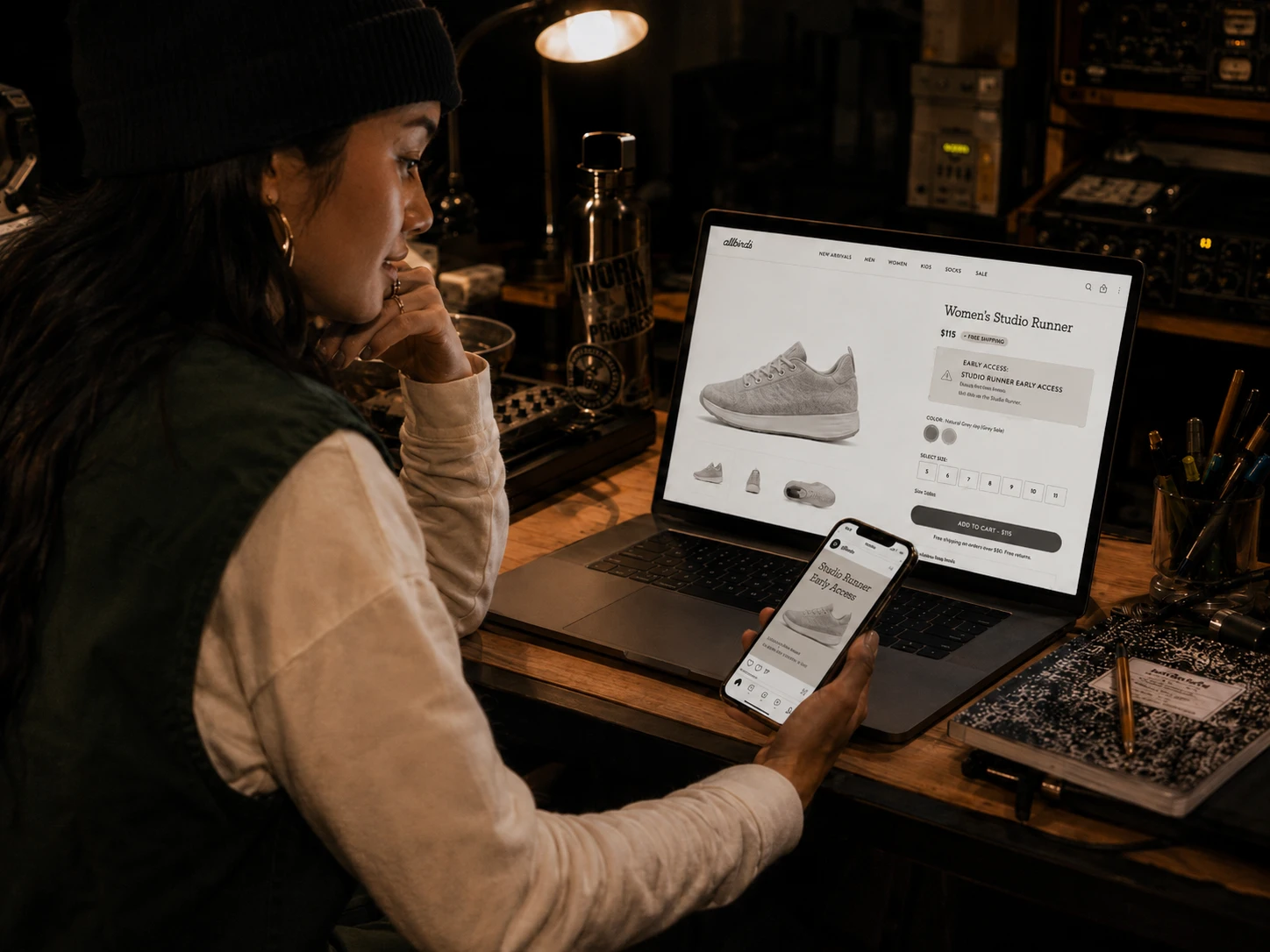
The product page became the center of that experience.
It carried the same visual language as the campaign, but shifted the conversation toward the details that mattered at the moment of purchase: fit, materials, comfort, versatility, and how the shoe would hold up across a long day.
Rather than lead with a discount, the launch offered something more meaningful:
first access to the Studio Runner, a limited opening colorway, and an invitation to experience the campaign in person.
That helped the product feel discovered rather than pushed.
The next step was to turn that access into a physical experience people could actually move through.
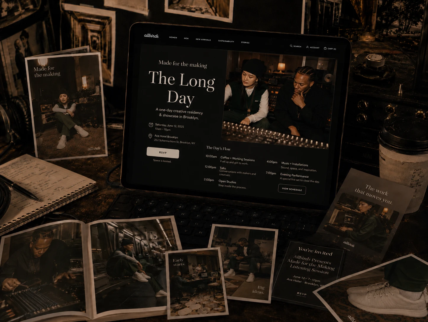
The Long Day
The launch needed to prove the campaign in the same way the photography had: through behavior, not presentation.
So instead of building a traditional product event, we created The Long Day — a one-day creative residency and launch experience in Brooklyn designed around the routines that inspired the Studio Runner in the first place.
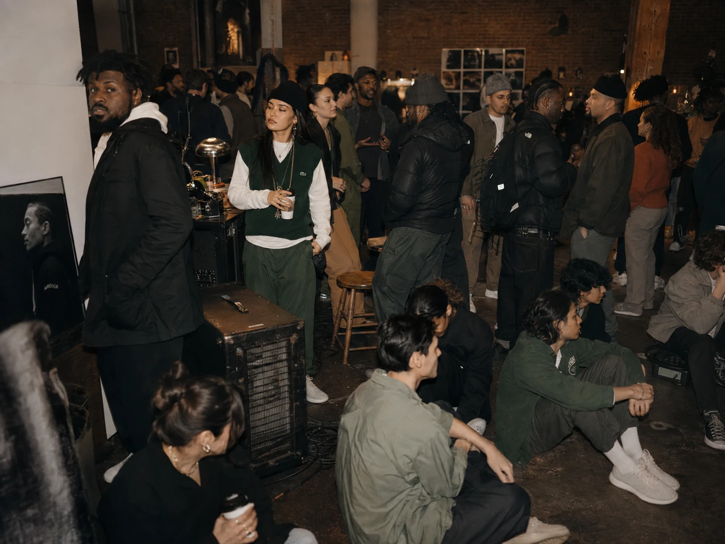
The space changed as the day moved. Morning started with coffee, working sessions, and open tables. By afternoon, the room shifted into talks, collaborative work, installations, and open studios. By evening, it became music, performance, and a crowded social space.
There was no polished step-and-repeat and no product sitting behind glass. The shoe showed up the same way it had throughout the campaign: on people who were busy doing something else. Some attendees were working. Some were moving gear. Some were sitting on the floor talking. Some were staying much longer than they planned. That was the product demonstration.
People experienced the Studio Runner by living through the kind of day it had been designed for.
The event turned the campaign from something the audience could see into something they could participate in — and created the moment where culture, product, and commerce finally met.
The campaign became somewhere you could go
The final expression of Made for the Making was not another ad.
It was The Long Day — a one-day creative residency built around the behavior that inspired the campaign in the first place.
From morning coffee and working sessions to open studios, conversations, installations, music, and a late-night performance, the space changed as the people inside it did.
There was no traditional product showcase.
No step-and-repeat.
No moment where everyone was asked to stop what they were doing and look at a shoe.
Instead, the Studio Runner became part of the day.
People worked in it. Moved equipment in it. Sat on floors in it. Left for coffee and came back. Stayed later than they expected.
The experience turned a product promise into something people could test for themselves.
If the Studio Runner was designed for long creative days, the launch became one.
And once people had experienced the product inside a world that already felt like theirs, the next challenge was making purchase feel just as natural.
Inspiration became action in the same moment
The event was designed so discovery and purchase never felt like separate experiences.
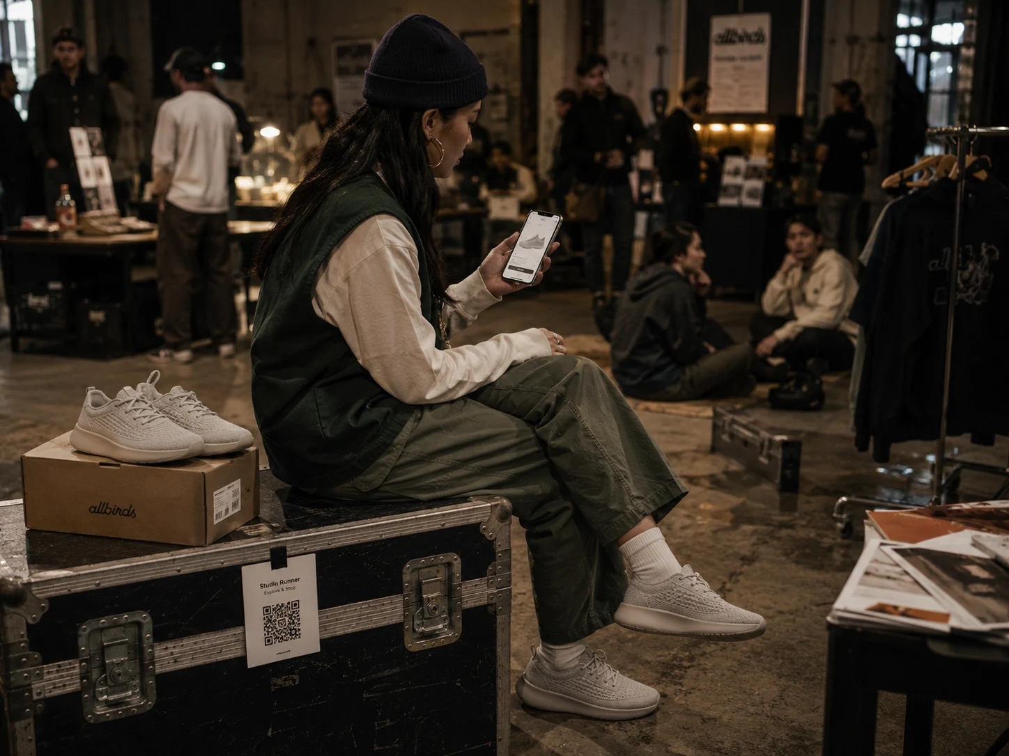
QR touchpoints throughout the space connected directly to the Studio Runner product page — allowing someone to see the shoe, try it, understand the material story, and purchase it without leaving the event.
That continuity mattered.
The campaign had spent every previous touchpoint reducing a different kind of friction:
Research made the audience relevant. Creative made the product desirable. The landing page made the value understandable. The event made the promise tangible. Commerce made the next step effortless.
Rather than forcing someone out of the experience and into a sales funnel, we brought the funnel into the experience.
The purchase became part of the story instead of the end of it.
We measured more than clicks
Before the campaign launched, we defined success around the business problem we were actually trying to solve.
The goal was not simply to make more people aware of Allbirds.
People already knew the brand.
The opportunity was to expand what they believed the brand could mean.
So reporting was organized around four questions:
Brand perception Did creatives see Allbirds as more stylish, culturally relevant, and personally expressive than they had before?
Engagement Did the new positioning make people spend more time with the brand — watching, exploring, saving, sharing, and returning?
Commerce Did that increased relevance translate into product interest, add-to-cart behavior, and purchase?
Loyalty Did people who entered through the campaign leave with a stronger likelihood of choosing Allbirds again?
That gave us a much more meaningful definition of performance.
Not: Did people see the campaign?
Did seeing it change what they thought — and what they did next?
Practical became desirable
The strongest movement was not simply in traffic.
It was in perception.
Simulated campaign outcomes
+16 pts “Allbirds fits my personal style”
+12 pts “Allbirds feels relevant to people like me”
+21% Product-page engagement
+13% Add-to-cart rate vs. benchmark
+9% Conversion lift following landing-page optimization
42% Video completion vs. 34% target
+18% Repeat-purchase intent among campaign-exposed customers
The campaign increased consideration without asking Allbirds to abandon the equity it already owned.
Comfort remained a strength.
Natural materials remained a strength.
What changed was the meaning surrounding them.
The same qualities that once made the brand feel primarily sensible began to make it feel effortless, intentional, and culturally relevant.
That was the real outcome of the work:
we did not replace the existing perception of Allbirds. We expanded it.
Made for the making
We started with a perception problem.
Allbirds already stood for comfort, simplicity, and thoughtful materials.
But for a new generation of working creatives, practicality alone was not enough to create desire.
So instead of beginning with a campaign idea, we began with people.
We studied how they moved.
Where they worked.
What they wore.
What they carried.
How long their days actually lasted.
And what made a practical object earn a permanent place in their lives.
That research changed the brief.
The opportunity was not to make Allbirds less practical.
It was to change what practical looked like.
From that insight came a new audience, a new creative platform, a new product concept, a full-funnel digital experience, and a launch built around the lives that inspired all of it.
Made for the Making turned comfort from a functional benefit into an aspirational advantage.
Because for people whose attention belongs to the thing they are creating, the best product is not the one asking to be noticed.
It is the one that quietly lets them keep going.
Allbirds Studio Runner. Made for the making.
Like this project
Posted Sep 27, 2026
Created a campaign to make Allbirds aspirational for creative professionals.
Likes
0
Views
0
Clients
Allbirds