Tavour E-Commerce Experience Redesign

Amanda Hewett


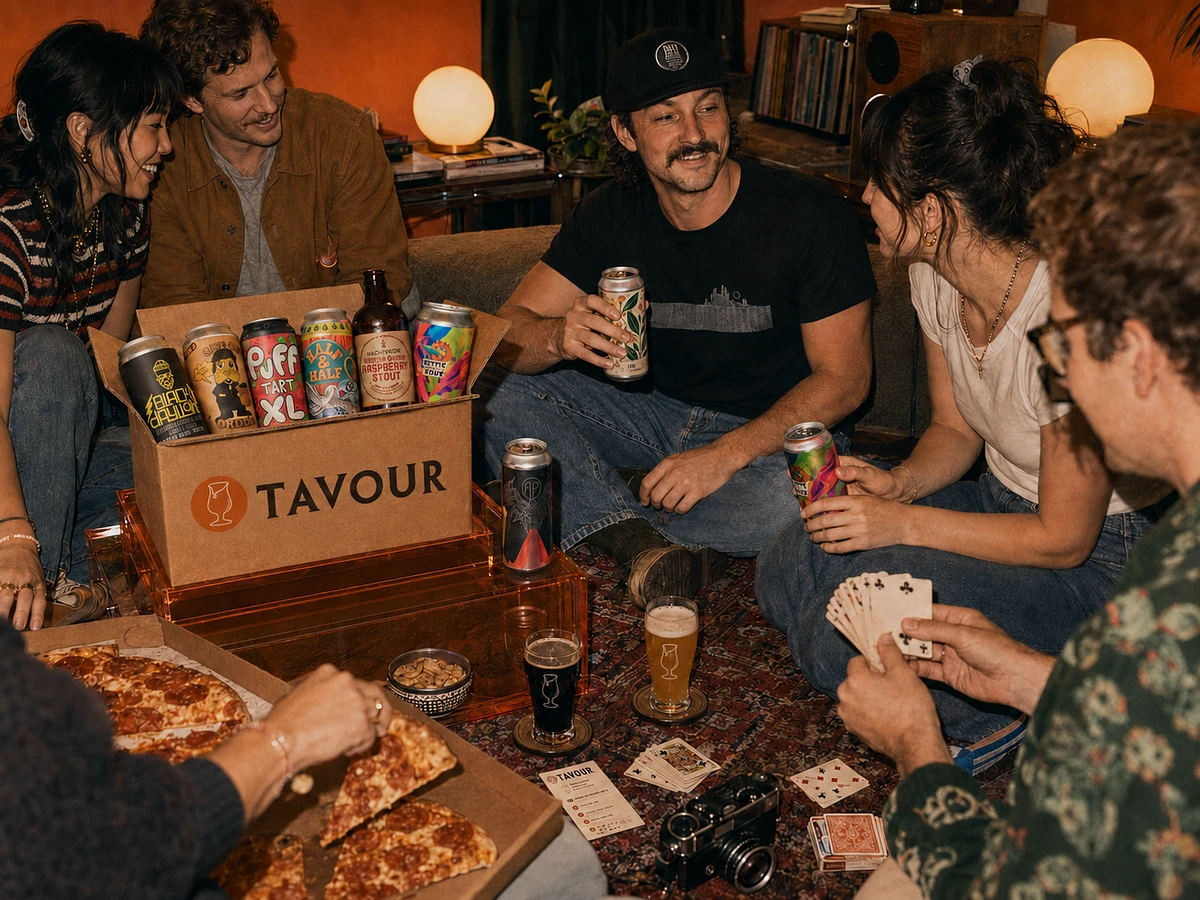
A More Considered Kind of Discovery
Taste is something we become.
The things we seek out eventually become part of who we are—the records we play, the places we remember, the meals we share and the beer we choose to open.
Tavour already gave curious drinkers access to extraordinary independent breweries. Our opportunity was to make that discovery feel more personal, more meaningful and more reflective of the people developing their own point of view.
The refreshed experience transforms a transaction into a ritual: discover something unfamiliar, understand what makes it remarkable and bring it into your world.
Because finding your next favorite beer isn’t only about what you drink.
It’s about remaining curious enough to become someone new.
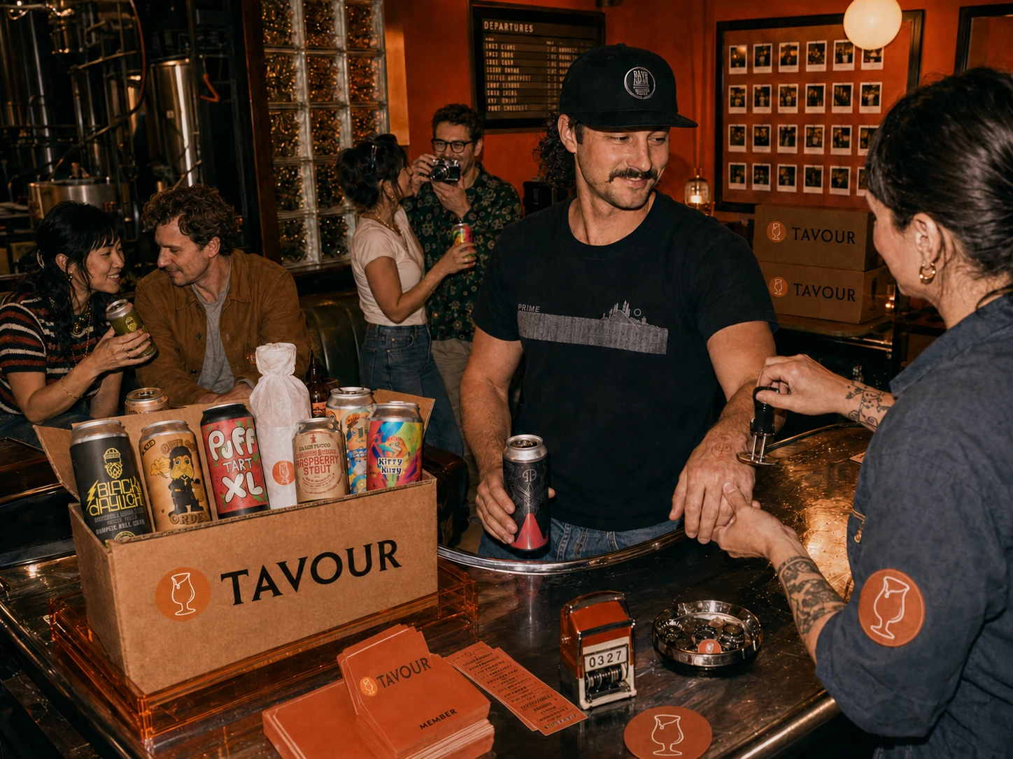
The World Beyond the Shelf.
Good Taste isn't About Knowing Everything.
It's About Wanting to Know More.
Independent beer rewards curiosity. Every release carries the point of view of the people who made it—a place, a process, an ingredient or an idea waiting to be understood.
Yet discovery can feel intimidating when every label speaks a different language. Tavour’s role is not simply to provide access. It is to give people the context and confidence to explore beyond what they already know.
The refreshed experience turns choosing beer into an act of discovery. Flavor becomes more understandable. Brewery stories become more memorable. Recommendations feel considered rather than calculated.
And what begins as personal curiosity becomes something worth sharing: a new favorite poured for a friend, a brewery story brought to the table and a growing appreciation for the craft behind every can.
Refined taste isn’t a destination.
It’s curiosity, practiced.
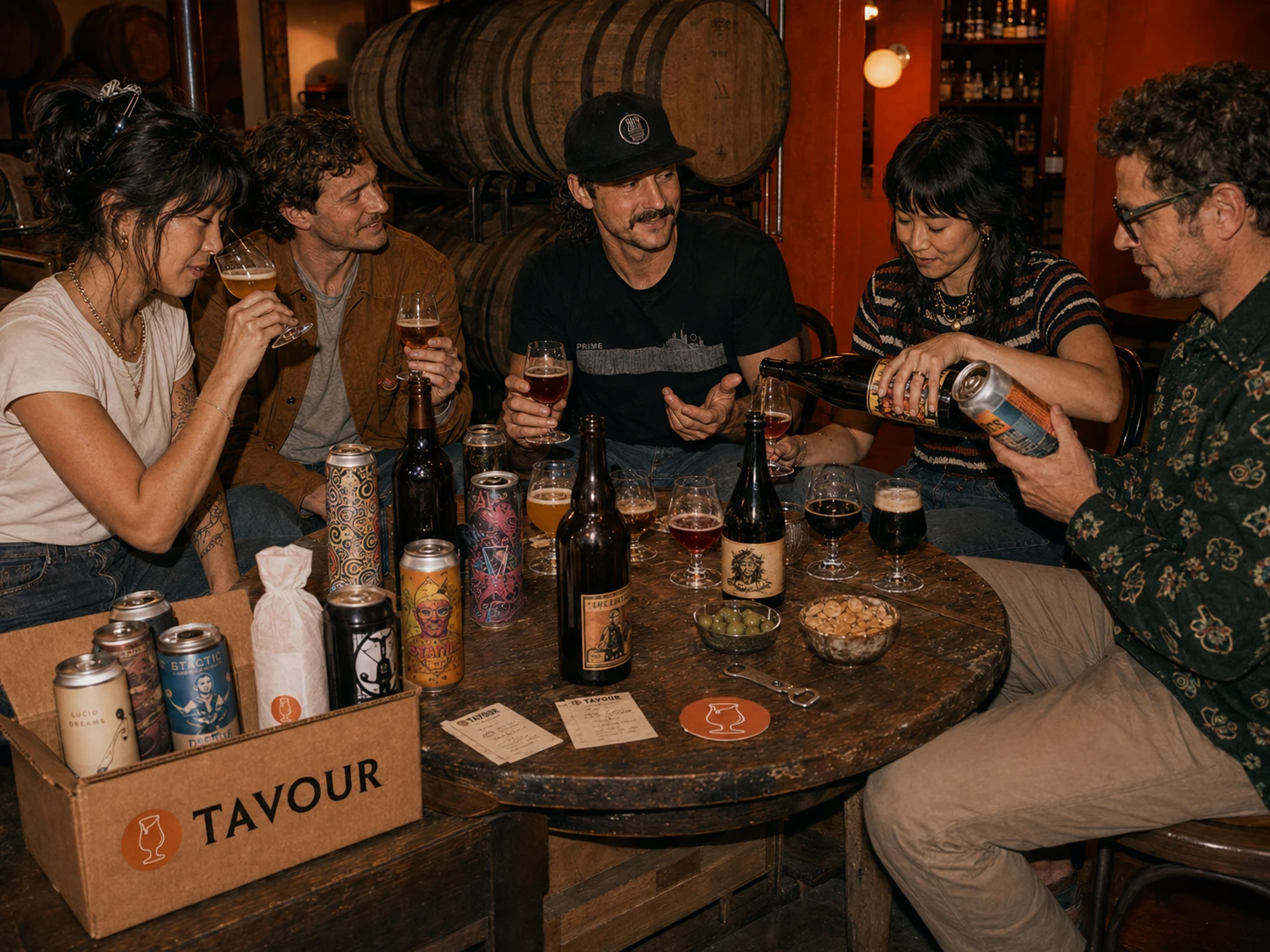
Designed for the Endlessly Curious
They aren't chasing status. They're developing a point of view.
They read the story behind the menu. They remember the record someone played at dinner. They bring home objects made by people whose work they believe in.
Their taste is personal, evolving and never entirely finished.
For them, craft beer offers another way to experience the world. A particular hop can recall a place. An unexpected ingredient can challenge an assumption. A small brewery thousands of miles away can make an evening feel entirely new.
But curiosity needs more than an endless catalog. It needs context, guidance and enough room for personal judgment.
We designed Tavour for people who want to understand what they choose—not because they need to become experts, but because paying attention makes the experience richer.
People who believe the best things are rarely the most obvious.
And that there is always something remarkable left to find.
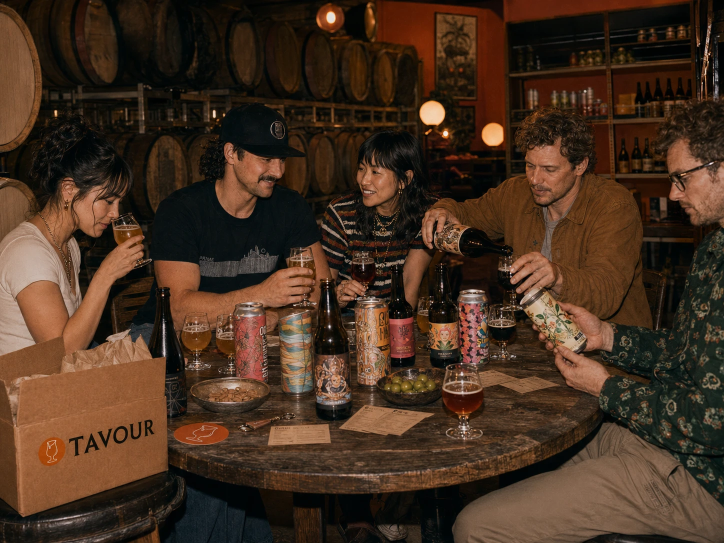
More Choice isn't the Same as Discovery
Craft beer has never offered more possibility. Shelves are filled with expressive labels, unfamiliar breweries and styles that promise an entirely new experience.
But possibility without context quickly becomes noise.
The curious drinker is left decoding unfamiliar terminology, comparing artwork and making decisions with little understanding of what a beer will taste like—or why it might matter to them.
What should feel exciting begins to feel uncertain.
The opportunity for Tavour wasn’t to offer people more beer. It was to create a more meaningful path through it: connecting every release to flavor, place, people and occasion while helping each customer recognize the tastes they were developing along the way.
Discovery needed to become more than access.
It needed to become understanding.
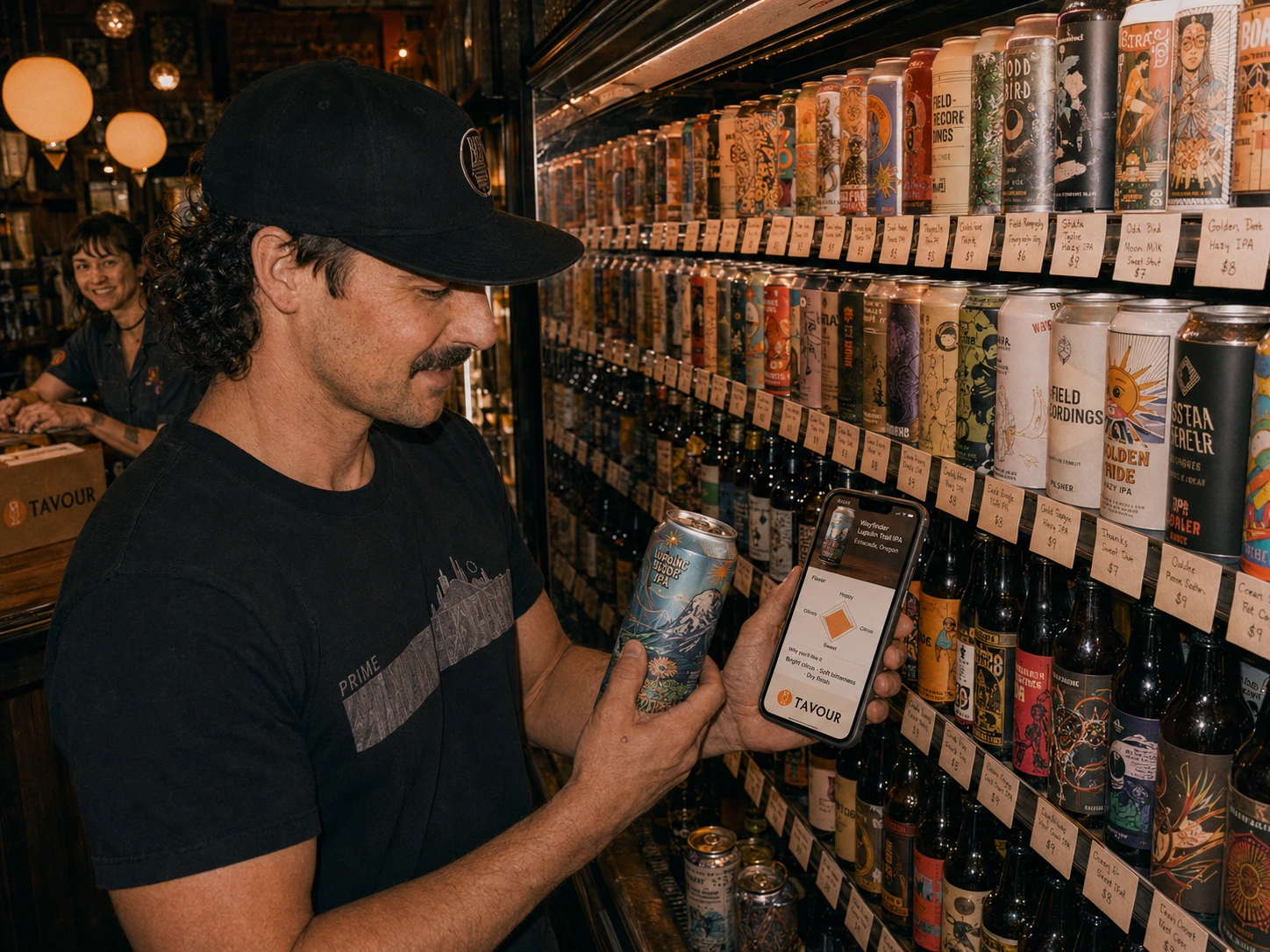
From Browsing to Belonging
The redesign reframed Tavour as more than a marketplace. It became a knowledgeable guide—helping each person move through an unfamiliar world with growing confidence.
Every release gained a clearer story: what it tastes like, where it comes from, how it was made and why it may belong in your crate. Recommendations were shaped around evolving preferences rather than popularity alone.
The experience no longer asked customers to arrive with expertise. It helped them build it.
The more they discovered, the better Tavour understood their taste—and the better they understood themselves.
Discovery became a relationship: one that grows more personal, valuable and rewarding with every pour.
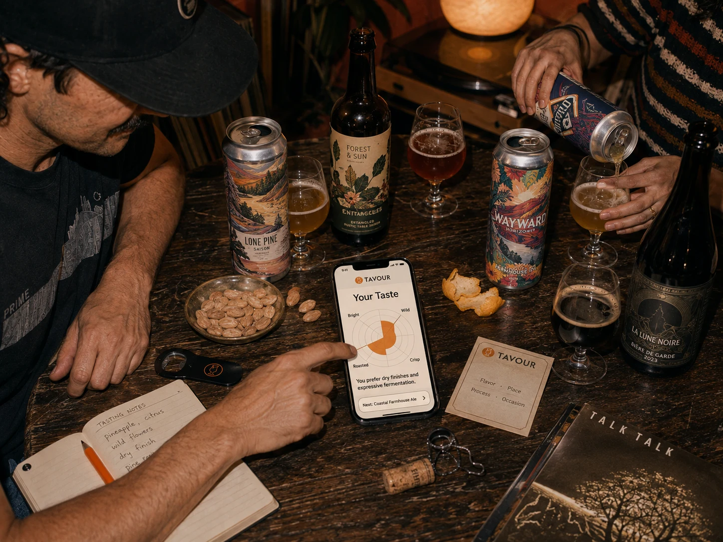
A Taste Profile That Learns With You
Most recommendation systems reduce preference to a category: IPA drinker, sour fan, stout person. But taste is more nuanced than a favorite style.
Tavour’s new Taste Profile learns from the qualities behind every selection—brightness, bitterness, fermentation, body, finish and the occasions that make a beer feel right.
Each rating adds another signal. Each order sharpens the picture. Over time, scattered reactions become a language customers can use to understand and articulate what they love.
Recommendations feel less like products being promoted and more like discoveries waiting to be made.
The result is a system that becomes more valuable with every interaction—giving customers the confidence to move beyond what they already know without losing sight of what makes their taste distinctly their own.
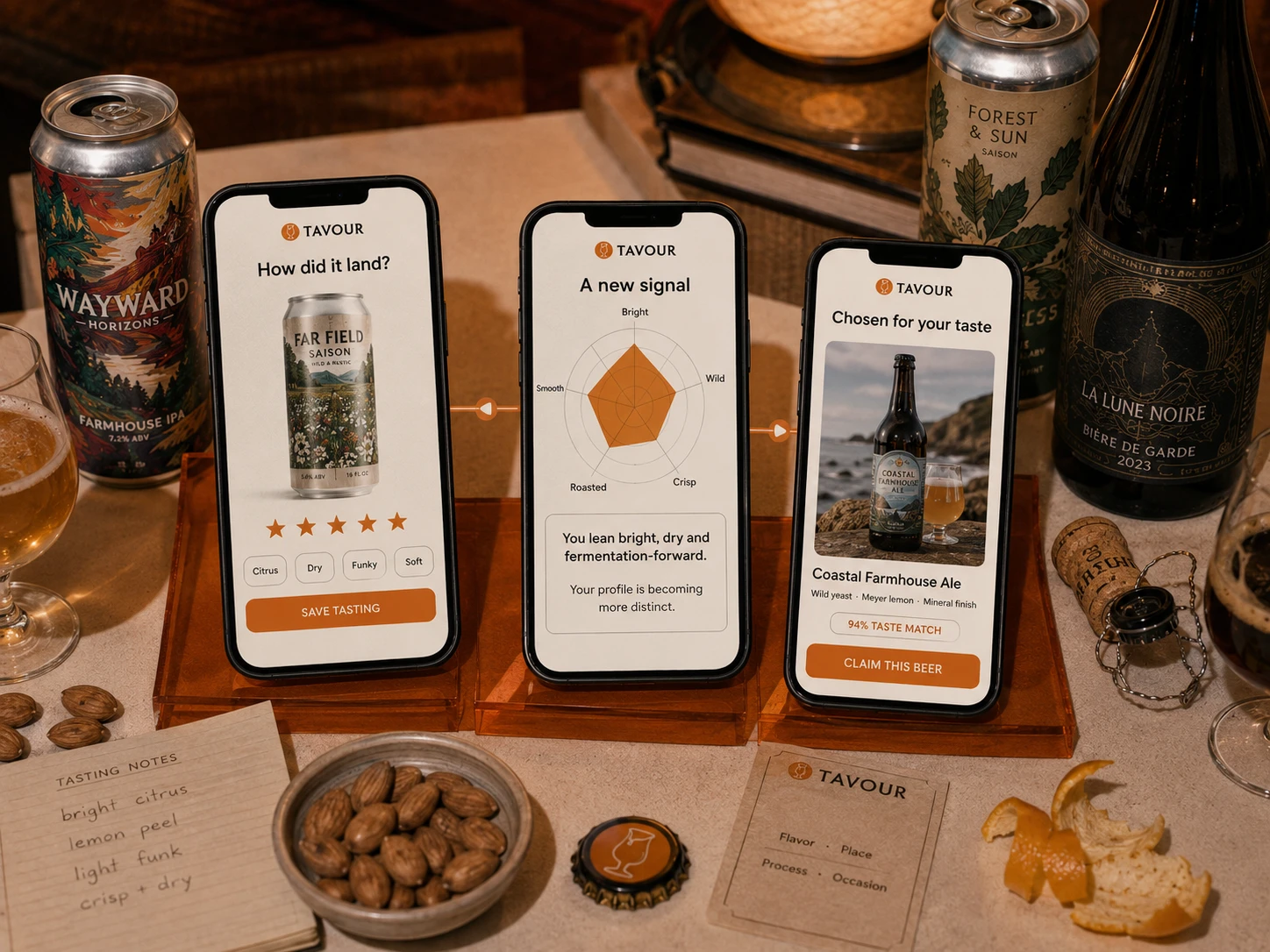
Every Tasting Moves the Journey Forward
The experience was designed as a continuous learning loop:
Rate the experience. Customers respond in familiar sensory language—bright, dry, funky, soft—without needing to understand technical brewing terminology.
Understand the signal. Tavour translates each reaction into a clearer picture of the flavors, processes and characteristics shaping their preferences.
Discover what comes next. Recommendations use that growing understanding to introduce something new without feeling arbitrary or overwhelming.
This creates value on both sides of the experience. Customers become more confident and adventurous, while Tavour gains the context needed to make every drop, recommendation and crate more relevant.
The system doesn’t simply remember what someone ordered.
It understands why they enjoyed it.
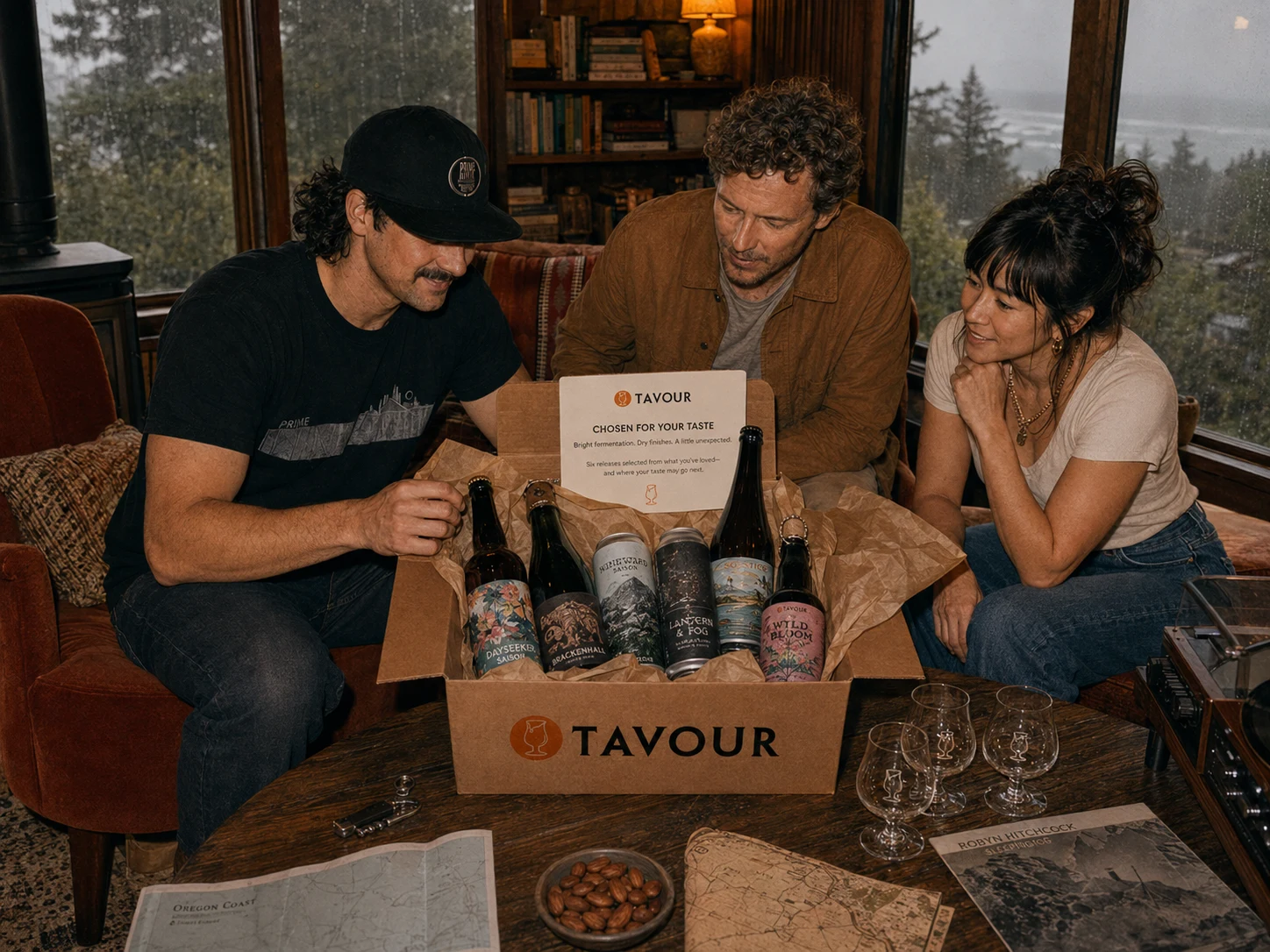
When Personalization Feels Like Care
The best recommendation doesn’t feel predicted. It feels considered.
Every Tavour crate balances recognition with surprise: enough familiarity to build trust and enough possibility to keep discovery moving forward.
Selections are connected through the qualities each customer values—not simply the styles they have purchased before. A preference for bright fermentation might lead from a familiar saison to a coastal wild ale. A love of roasted depth could open the door to a smoked lager or barrel-aged porter.
Each delivery arrives with context: why these beers were selected, what connects them and where they might take the customer next.
The algorithm becomes invisible. What remains is the feeling that someone understood.
This transforms the crate from a shipment of beer into a personal invitation—to taste more attentively, explore more confidently and share something genuinely worth opening.
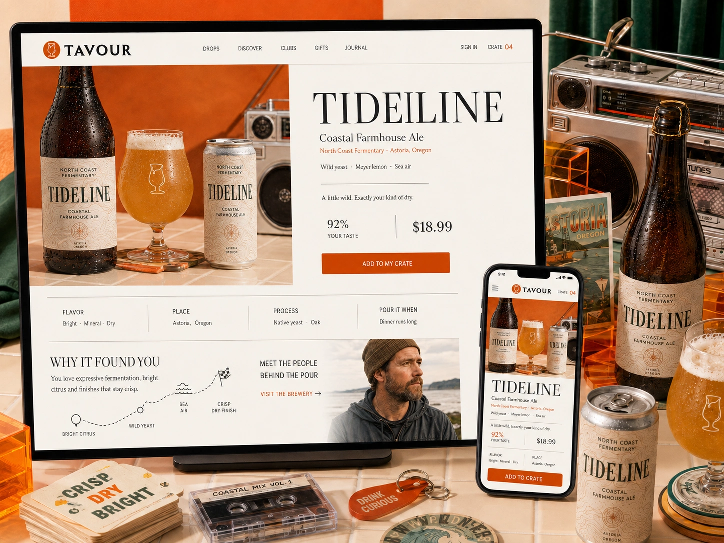
Every Beer Deserves More Than a Product Page
A rare release cannot be understood through a label, style and price alone.
The redesigned product experience gives each beer room to express what makes it worth discovering—its flavor, origin, process, maker and the moment it was made for.
Personalized context answers the question behind every recommendation:
Why did this find me?
Instead of overwhelming customers with tasting terminology, the experience translates complexity into a clear, compelling story. Bright citrus becomes a familiar point of entry. Native yeast becomes a reason to explore. A distant brewery becomes a place the customer can understand and remember.
The result is an experience that feels editorial rather than transactional—pairing playful product photography with the restraint and confidence of a premium publication.
Because when the story is clear, unfamiliarity becomes intrigue.
And intrigue becomes action.
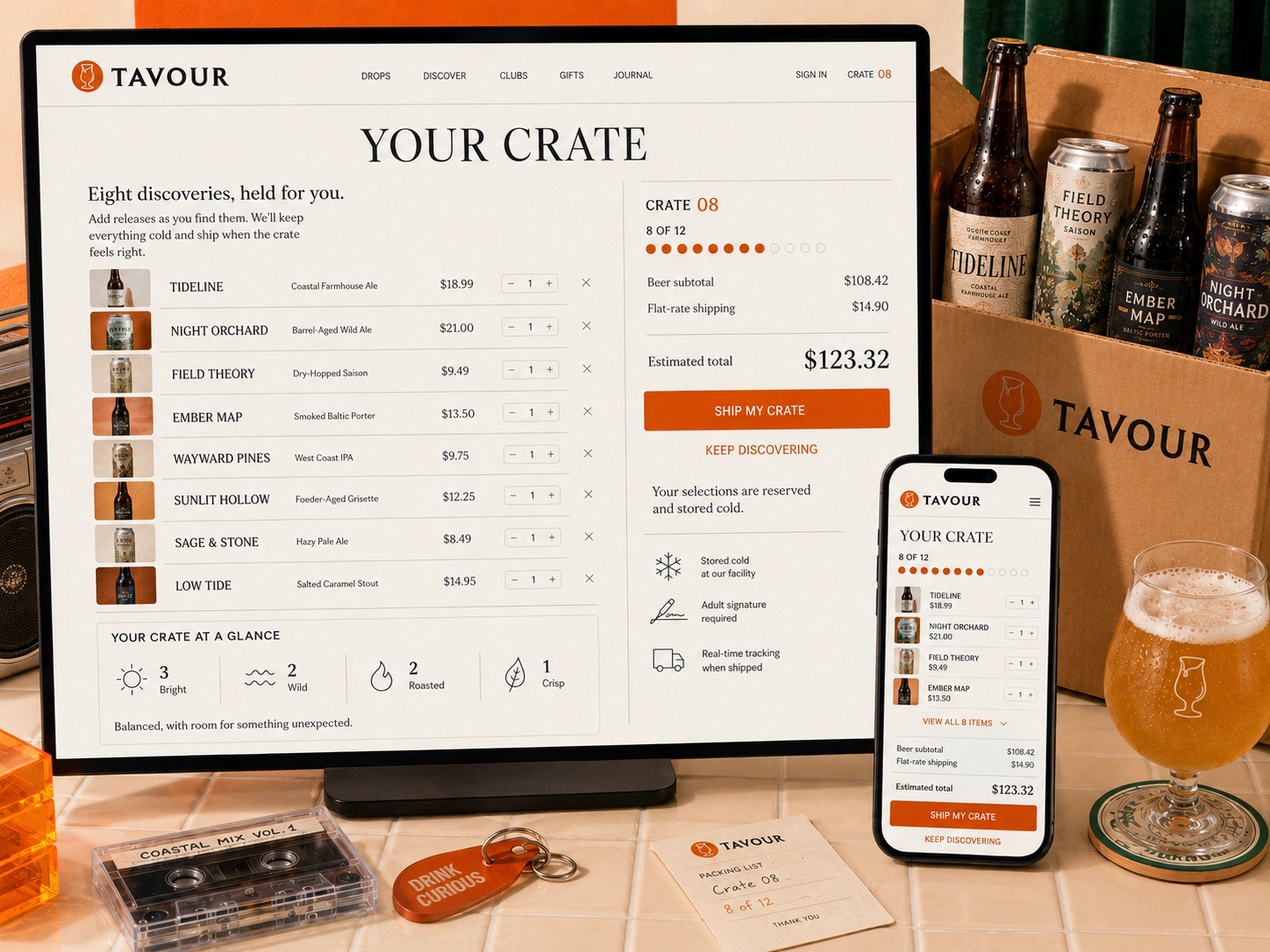
A Cart Designed for Curiosity
Rare beer doesn’t arrive according to a shopping list.
A release may appear unexpectedly, sell quickly and become unavailable long before a customer is ready to place a traditional order. The redesigned crate removes that pressure.
Customers can claim a beer the moment it catches their attention, continue discovering over time and ship only when the collection feels complete.
The experience makes every part of that process visible: what has been reserved, how much space remains, what the crate contains and what it will cost to send.
A living taste summary adds another layer of value—helping customers see the character of their collection and recognize what may be missing.
The crate becomes more than a cart. It becomes a collection in progress.
By replacing urgency with flexibility, Tavour creates a purchasing experience that respects both the scarcity of independent releases and the considered way enthusiasts want to explore them.
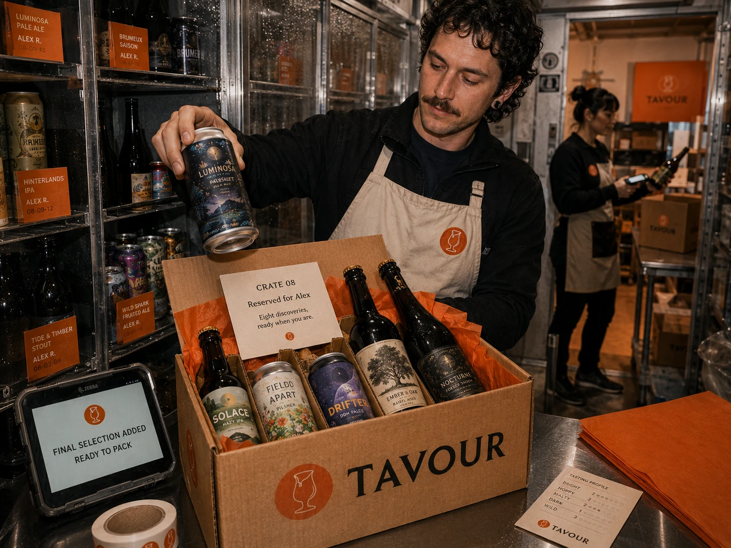
Care Continues After the Click
The promise of flexibility only works when the experience behind it is dependable.
Every claimed release is assigned to the customer, stored cold and protected until the crate is ready to ship. The redesigned system makes that invisible service feel visible—confirming when a beer has been reserved, where it is in the process and what happens next.
Inside the fulfillment experience, customer preferences travel with the order. Packing teams see the collection as a whole, verify every release and prepare each crate as something personal rather than interchangeable inventory.
What begins as a digital interaction becomes a physical act of care.
From cold storage to final packing, every touchpoint reinforces the same promise: the beers a customer worked to discover will arrive exactly as anticipated—and ready for whatever moment they were chosen to become part of.
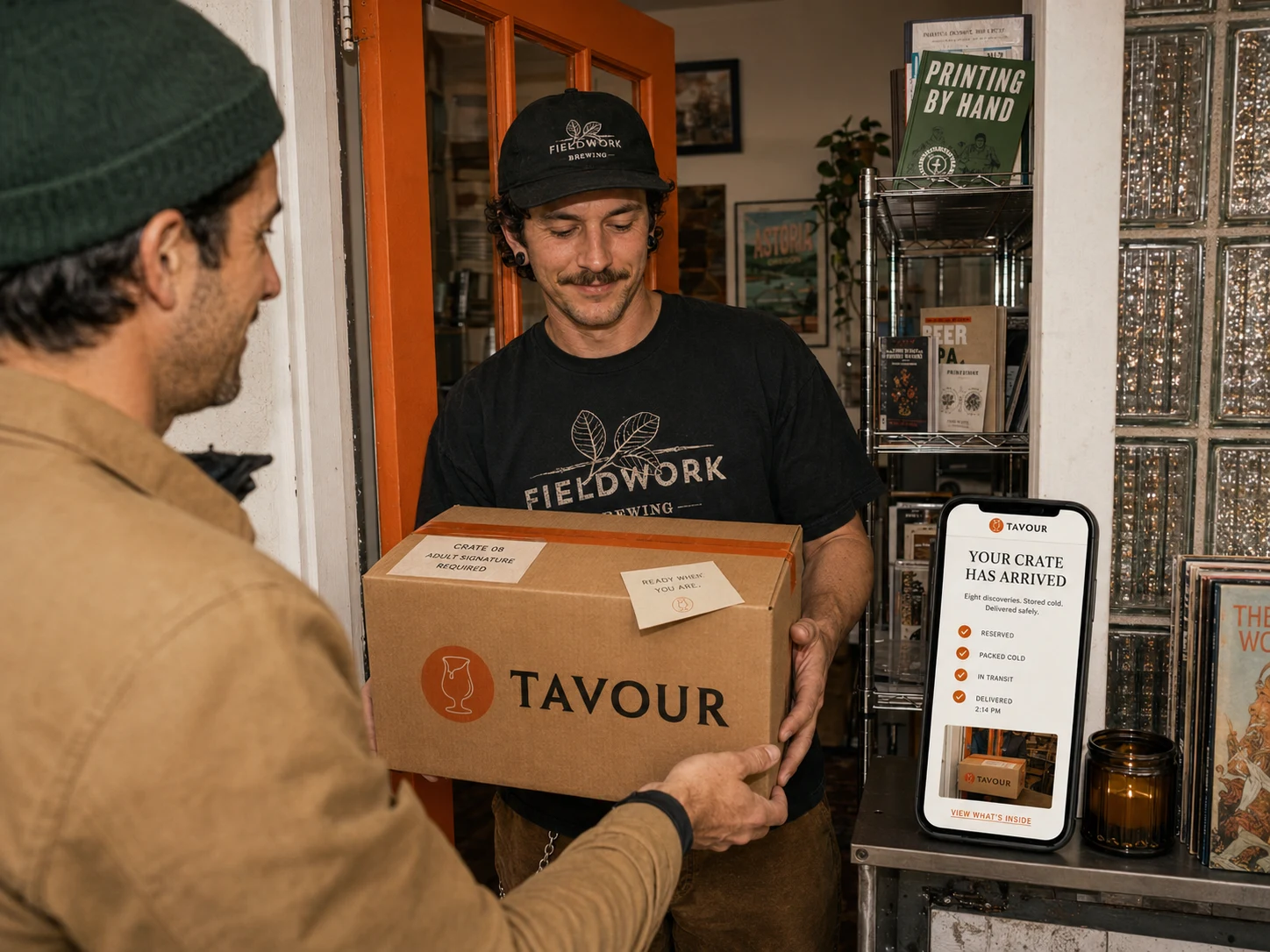
Anticipation Without Uncertainty
Once a crate leaves cold storage, the experience should remain just as considered.
The redesigned delivery journey replaces vague shipping updates with a clear view of every stage—from reservation and cold packing to transit and arrival.
Customers know when their collection is moving, when an adult signature will be required and when it has been delivered safely. Every notification carries the same calm, premium voice as the rest of the experience.
Because anticipation should add to the pleasure—not create anxiety around it.
By connecting the digital journey to the physical handoff, Tavour maintains trust through the final mile and turns a routine delivery into the beginning of something worth opening.
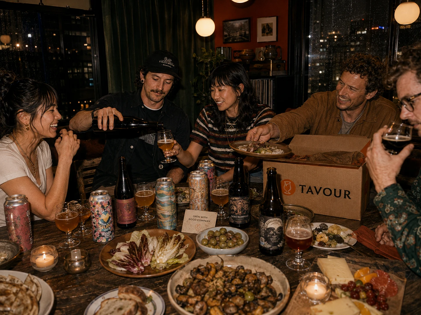
Discovery Becomes Part of the Story
The journey does not end when the crate arrives.
It continues around the table—when an unfamiliar bottle is opened, a flavor becomes a conversation and a brewery thousands of miles away suddenly feels close enough to understand.
The redesigned experience gives customers more than something new to drink. It gives them context worth sharing: where the beer came from, who made it, what makes it distinctive and why it belonged in their crate.
Knowledge deepens the experience without making it feel exclusive.
As customers become more confident in their taste, they become more curious, more generous with what they know and more willing to bring others into the discovery.
Because the real value of finding something remarkable is not simply having it.
It is having someone worth opening it with.
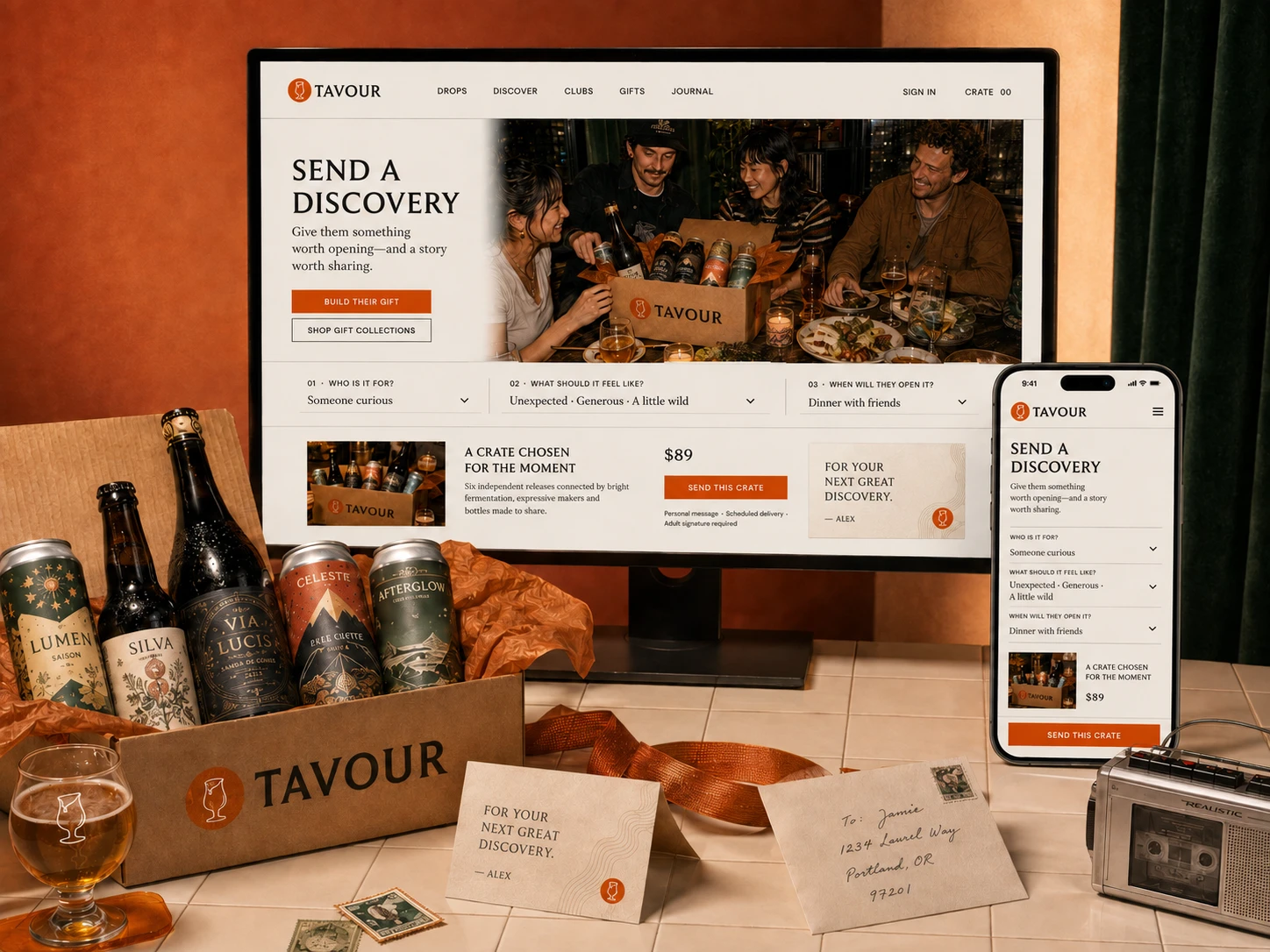
Give Them a Way In
The best gifts reveal how well someone is known.
Tavour’s redesigned gifting experience moves beyond preselected beer boxes and generic occasions. Instead, it helps the giver shape a discovery around the recipient—their curiosity, the feeling they want to create and the moment they hope the crate becomes part of.
Every gift arrives with context: why the releases belong together, what makes each one distinctive and where the recipient might begin.
The gift becomes both an experience and an invitation.
For the recipient, it is a thoughtful introduction to independent beer. For Tavour, it creates a natural path into the broader discovery ecosystem—one built on generosity and shared taste rather than discounts or acquisition tactics.
Because when someone opens a remarkable beer with people they care about, discovery does more than convert.
It travels.
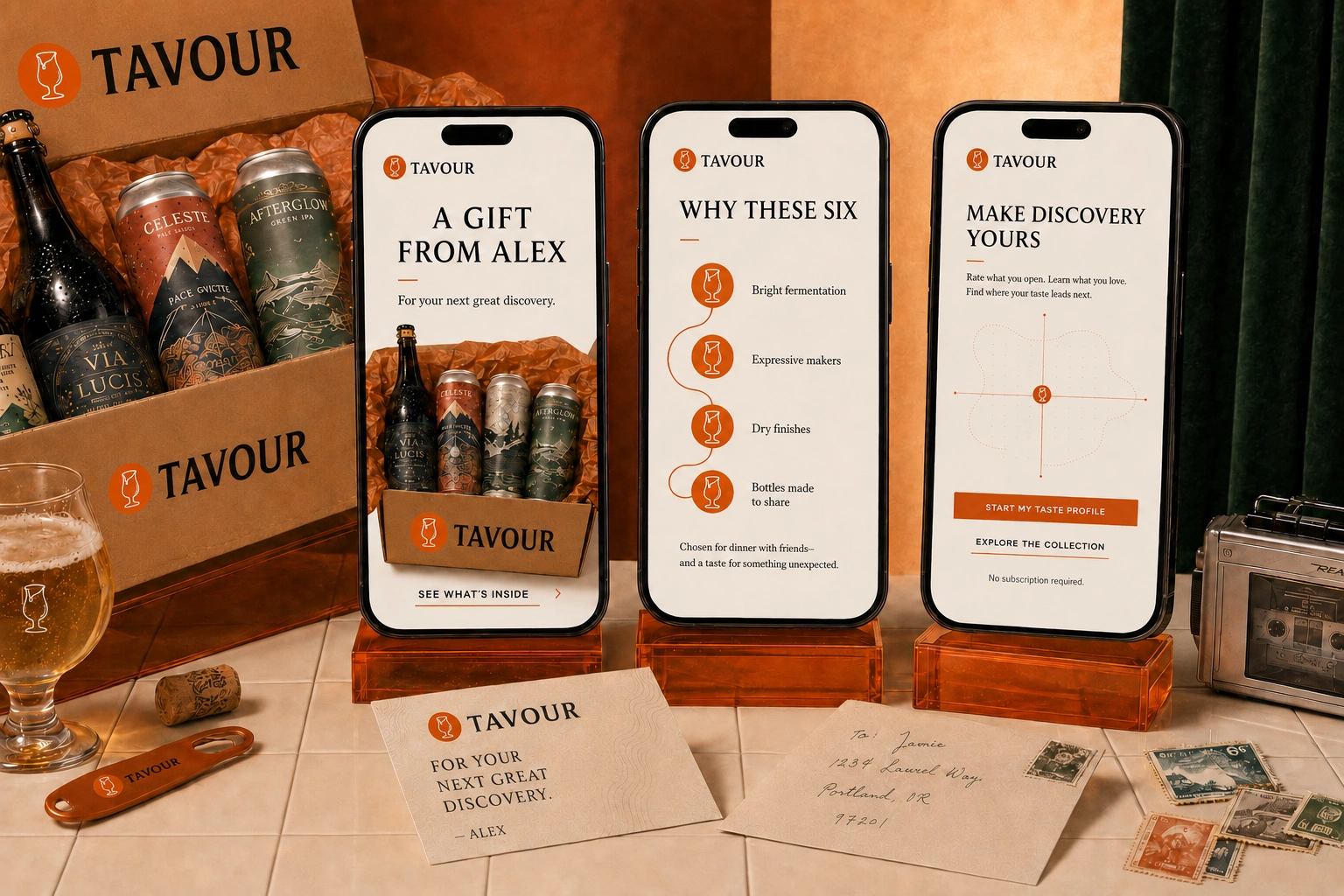
A Gift Becomes a Beginning
Most gifting experiences end when the box is opened.
Tavour’s begins there.
Each recipient can see why the beers were selected, learn about the makers and flavors behind them, and understand what connects the collection. As each bottle or can is opened, simple ratings begin shaping a personal taste profile—turning one thoughtful gift into an ongoing journey of discovery.
The experience never pressures the recipient to become a customer. It gives them a reason to want to.
With every reaction, Tavour becomes more relevant: recommending unfamiliar styles with greater confidence, introducing breweries worth following and giving the recipient language for the taste they were already developing.
The gift creates the first moment of relevance.
The experience gives that moment somewhere to go.
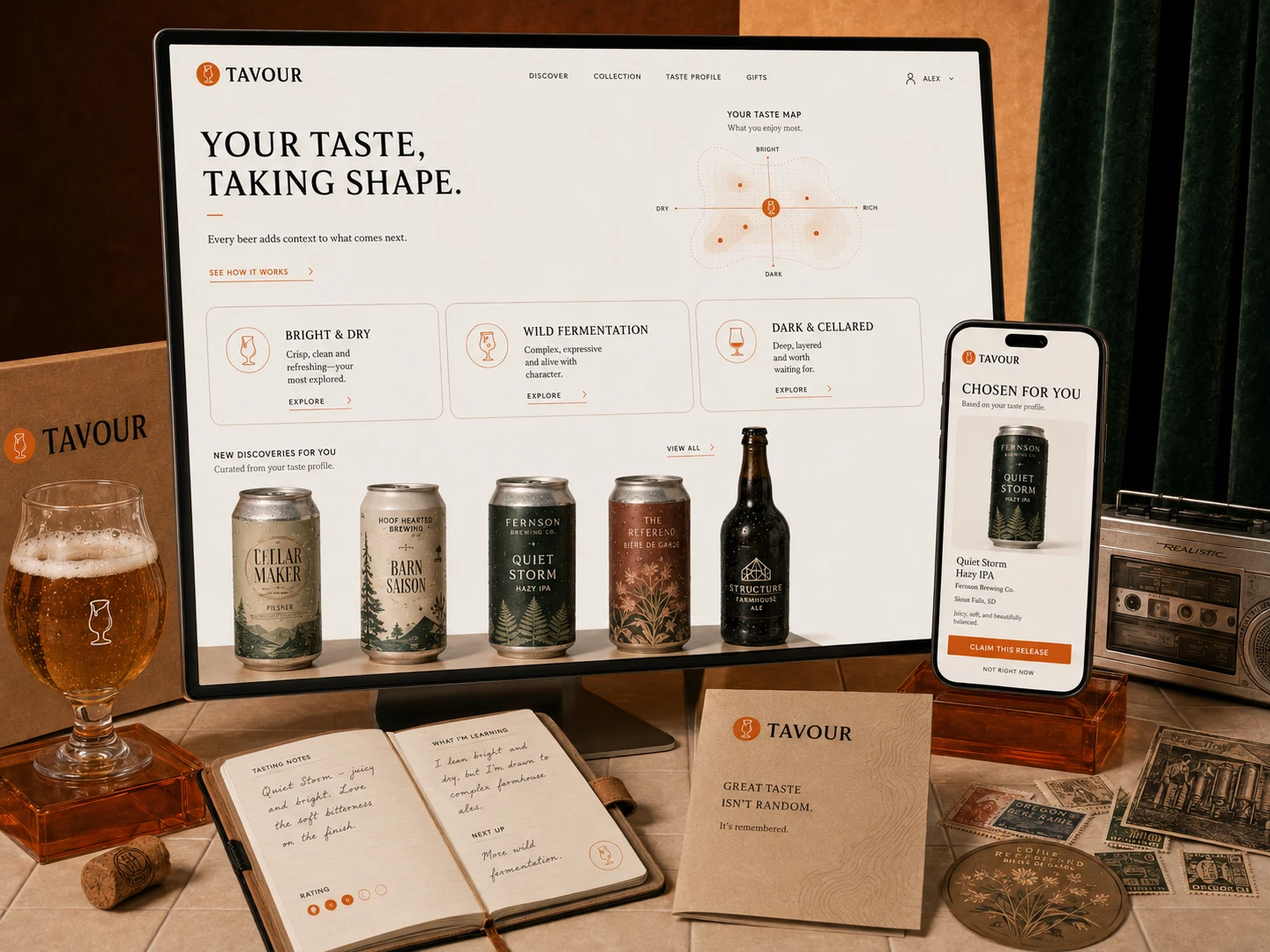
Great Taste Isn’t Random
Taste is developed through attention—remembering what surprised you, recognizing the qualities you return to and becoming more confident in what you want to explore next.
The redesigned Tavour experience turns every beer into useful context. Ratings, flavor notes, brewing methods and moments of enjoyment gradually form a living taste profile unique to each customer.
Instead of reducing preference to a score, the system reveals the patterns behind it.
A love of bright saisons might lead toward spontaneous fermentation. A preference for layered stouts could open the door to barrel-aged releases. Each recommendation remains familiar enough to feel relevant and unexpected enough to remain exciting.
The more someone discovers, the more precisely Tavour can introduce what deserves their attention.
Personalization should not narrow the world.
It should give people the confidence to explore more of it.
Taste Deepens When Context Does
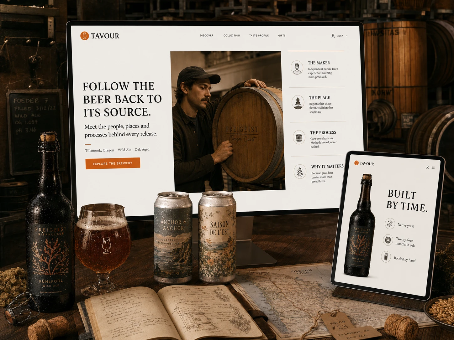
A remarkable beer is never only a collection of flavor notes.
It carries the decisions of its maker, the character of its landscape and the evidence of time. Native yeast, local water, patient fermentation and years spent in oak can shape an experience long before the bottle reaches the customer.
The redesigned Tavour experience brings those stories forward—connecting every release to the people, places and processes responsible for it.
Because understanding where a beer comes from changes how someone experiences what is inside.
Brewery profiles, field notes and release stories transform products into cultural discoveries. Customers can follow the makers they admire, recognize the methods they value and understand why a rare release deserves their attention.
This richer context also gives independent breweries more than shelf space. It gives their work a voice.
Tavour was no longer simply delivering beer.
It was bringing people closer to the craft.
Reach Without Losing What Made It Rare
For an independent brewery, growth can create a difficult tension.
Greater reach means more people can experience the work—but scale can also strip away the context, intimacy and sense of occasion that made a release meaningful in the first place.
Tavour creates a different kind of stage.
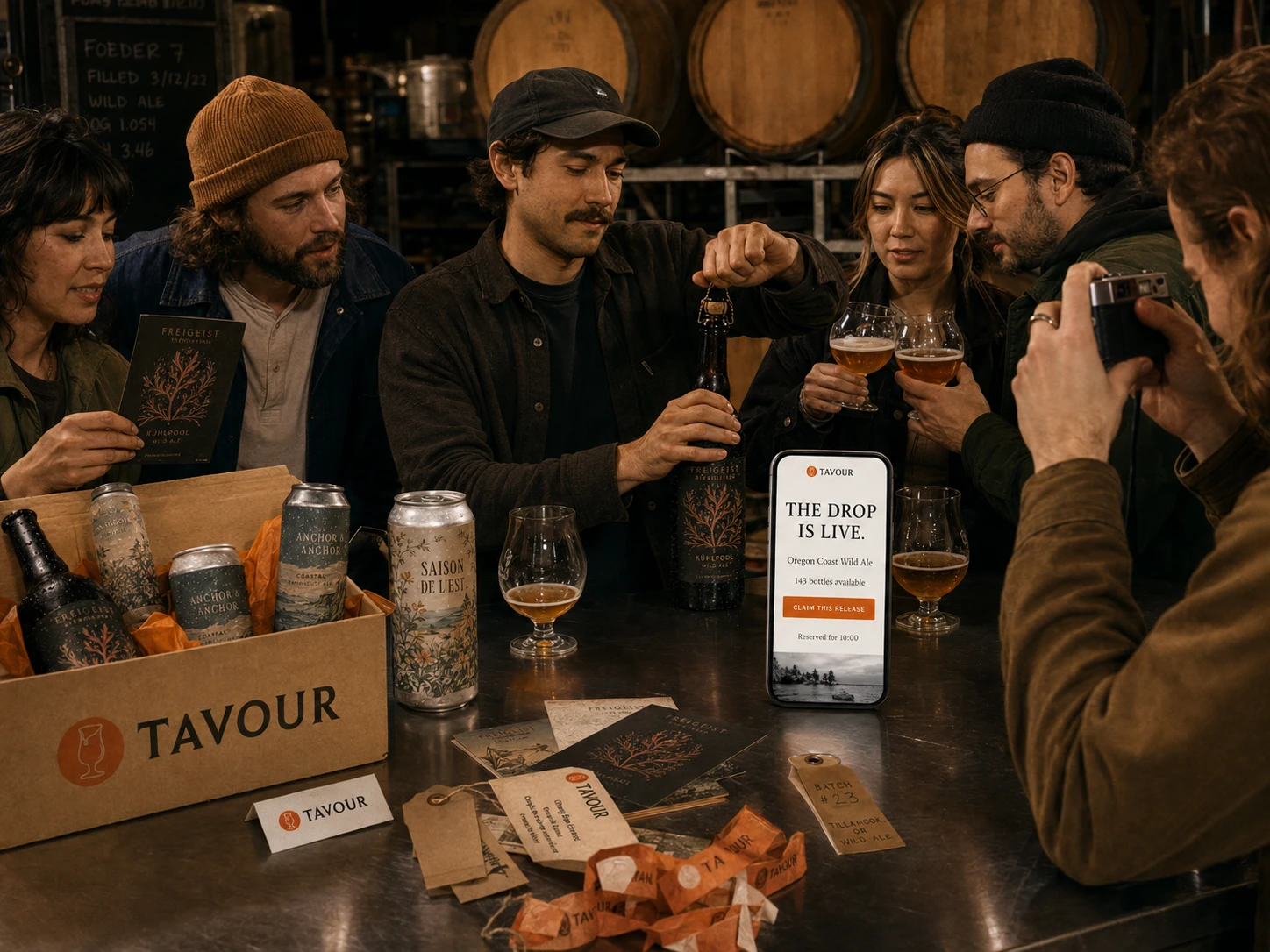
Each drop is introduced through the maker’s story, the intention behind the beer and the reason it deserves attention. Limited availability becomes transparent rather than manipulative, while real-time reservation gives curious customers a fair opportunity to claim something extraordinary.
The technology creates access. The storytelling preserves the meaning.
For the brewery, a single release can reach enthusiasts across the country without becoming another anonymous product on a crowded shelf. For the customer, opening the app feels less like shopping and more like being invited into a moment they would otherwise have missed.
Scale did not need to make craft feel smaller.
It could make the community around it larger.
Discovery Becomes Culture When It Is Shared
The pleasure of finding something remarkable rarely ends with the first sip.
It continues in the conversation that follows: comparing impressions, exchanging context and hearing someone else describe a flavor you almost—but not quite—had the words to name.
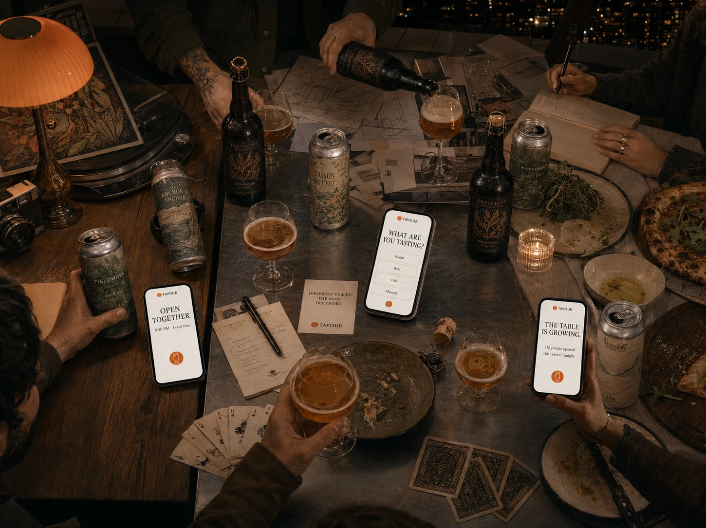
The redesigned Tavour experience creates space for that exchange without becoming another social network. Shared release moments connect people through the beer itself, allowing enthusiasts in different cities to open the same bottle, record what they notice and see how other curious drinkers experienced it.
The goal was not to turn drinking into content. It was to make discovery feel communal.
Each tasting becomes part of a larger cultural record—connecting customers to one another, giving breweries a clearer view of how their work resonates and helping the next person approach an unfamiliar release with greater confidence.
A rare beer may begin with one maker and one place.
Through Tavour, its story can continue across hundreds of tables.
Different cities. Different palates.
The same discovery, opened together.
What You Taste Becomes Part of Your Story
Over time, individual discoveries begin to form something larger.
A bottle that challenged an assumption. A brewery that became worth following. A style that once felt unfamiliar and eventually became a favorite. Each release leaves behind more than a rating—it marks a moment in the customer’s evolving relationship with taste.
The redesigned Tavour experience preserves those moments in a personal archive.
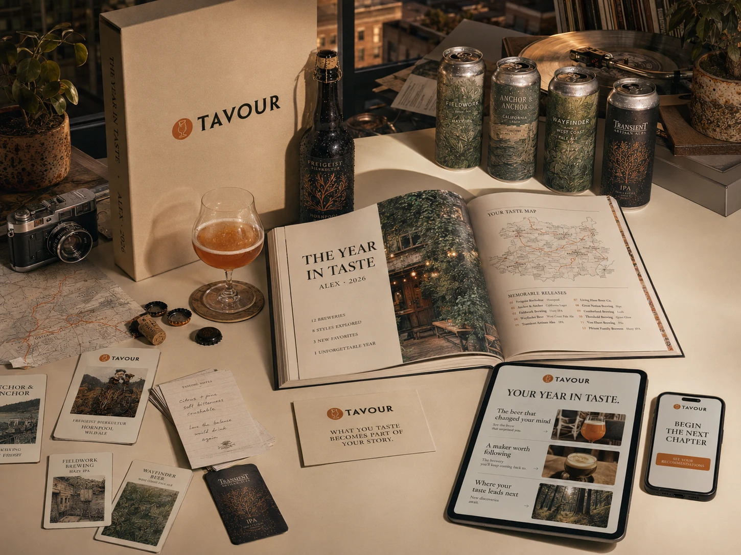
The Year in Taste transforms activity into memory, giving customers a beautifully considered record of where their curiosity took them.
Breweries explored, styles discovered and releases remembered come together in an annual editorial experience designed to be revisited—not another disposable recap optimized for sharing.
Digital recommendations carry the story forward, while a collectible printed edition gives the experience weight, permanence and a place in the customer’s life beyond the screen.
This creates a more meaningful form of retention. People return not because a program demands consistency, but because the next discovery has become part of a story they want to continue.
Loyalty is not a habit a brand extracts.
It is a relationship the experience earns.
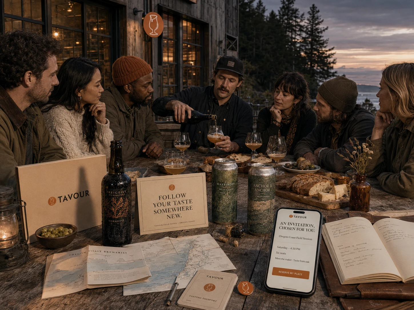
Follow Your Taste Somewhere New
A digital relationship becomes more valuable when it creates opportunities that could not exist on a screen.
As Tavour learns what a customer values, it can do more than recommend another release. It can introduce the place that shaped it, the maker who imagined it and the community that understands why it matters.
The redesigned experience extends discovery into intimate field sessions, brewery visits and guided tastings selected around each customer’s evolving interests.
Access feels meaningful because it is relevant—not because it is exclusive for its own sake.
A fascination with wild fermentation might lead to an afternoon tasting directly from oak. An appreciation for a particular brewer could become an invitation to experience their process firsthand.
The taste profile becomes a passport, translating curiosity into encounters worth remembering.
For breweries, these experiences create deeper relationships with the people most likely to value their work. For customers, Tavour becomes more than the place where the beer was found.
It becomes the reason an unfamiliar interest became part of their life.
The best recommendation is not always another product.
Sometimes, it is somewhere new to go.
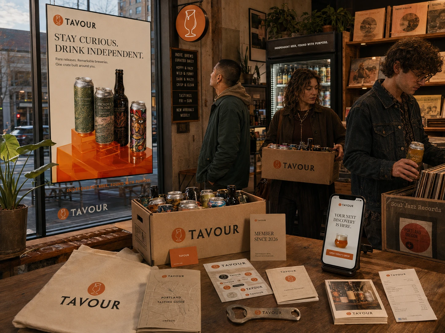
A Brand People Recognize Themselves In
The experience could not end at the edge of the website.
If Tavour was going to become part of how people explored, discussed and understood independent beer, the brand needed to remain recognizable wherever discovery happened—from a delivery crate to a neighborhood bottle shop.
The refreshed identity creates that continuity.
A more refined wordmark, the original tasting-glass insignia and a disciplined orange palette establish familiarity without competing with the expressive artwork of the breweries Tavour represents. Editorial typography brings intelligence, while tactile materials and retro-inspired photography keep the experience warm, human and culturally alive.
The system gives Tavour a distinct point of view while leaving room for every beer to retain its own.
Packaging feels worth receiving. Membership feels worth carrying. Campaigns create curiosity rather than simply announcing inventory. Every touchpoint reinforces the same promise: this is where independent beer is found with purpose.
The result is more than visual consistency.
It is a signal of belonging—one curious person can recognize in another.
Tavour does not define good taste for its customers.
It gives people a place to keep developing their own.
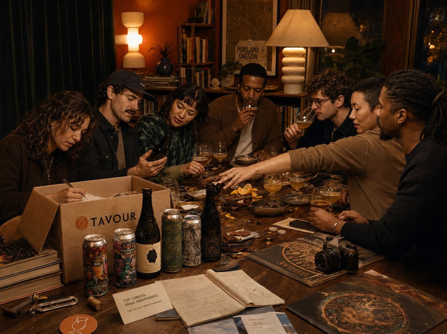
The Next Great Discovery Starts at the Table
The strongest experiences do more than help people complete a transaction.
They give people something to anticipate, something to understand and—eventually—something worth sharing.
The Tavour redesign began with a conversion challenge: make an extraordinary catalog of independent beer easier to explore, trust and purchase. But solving that challenge revealed a larger opportunity.
Tavour could help people become more curious, more confident and more connected through the taste they developed over time.
Every part of the experience supports that journey. Better context turns uncertainty into interest. Personalization turns preference into self-knowledge. Brewery stories turn products into culture. Shared releases turn access into community. Real-world experiences give discovery somewhere new to lead.
The result is not simply a more effective ecommerce platform.
It is a brand people can grow with—and a table they want to return to.
Stay curious. Drink independent.
There is always something remarkable left to discover.
Tavour — E-Commerce Website Growth Redesign Brand Strategy · Customer Experience · UX/UI · Art Direction · Ecommerce · Content Strategy
Like this project
Posted Aug 16, 2026
Redesigned Tavour to enhance personalized discovery in craft beer selection.
Likes
0
Views
0
Clients
Tavour