Orbit — Minimal Fintech Landing Page for Framer

Thisara Prabhath


Overview
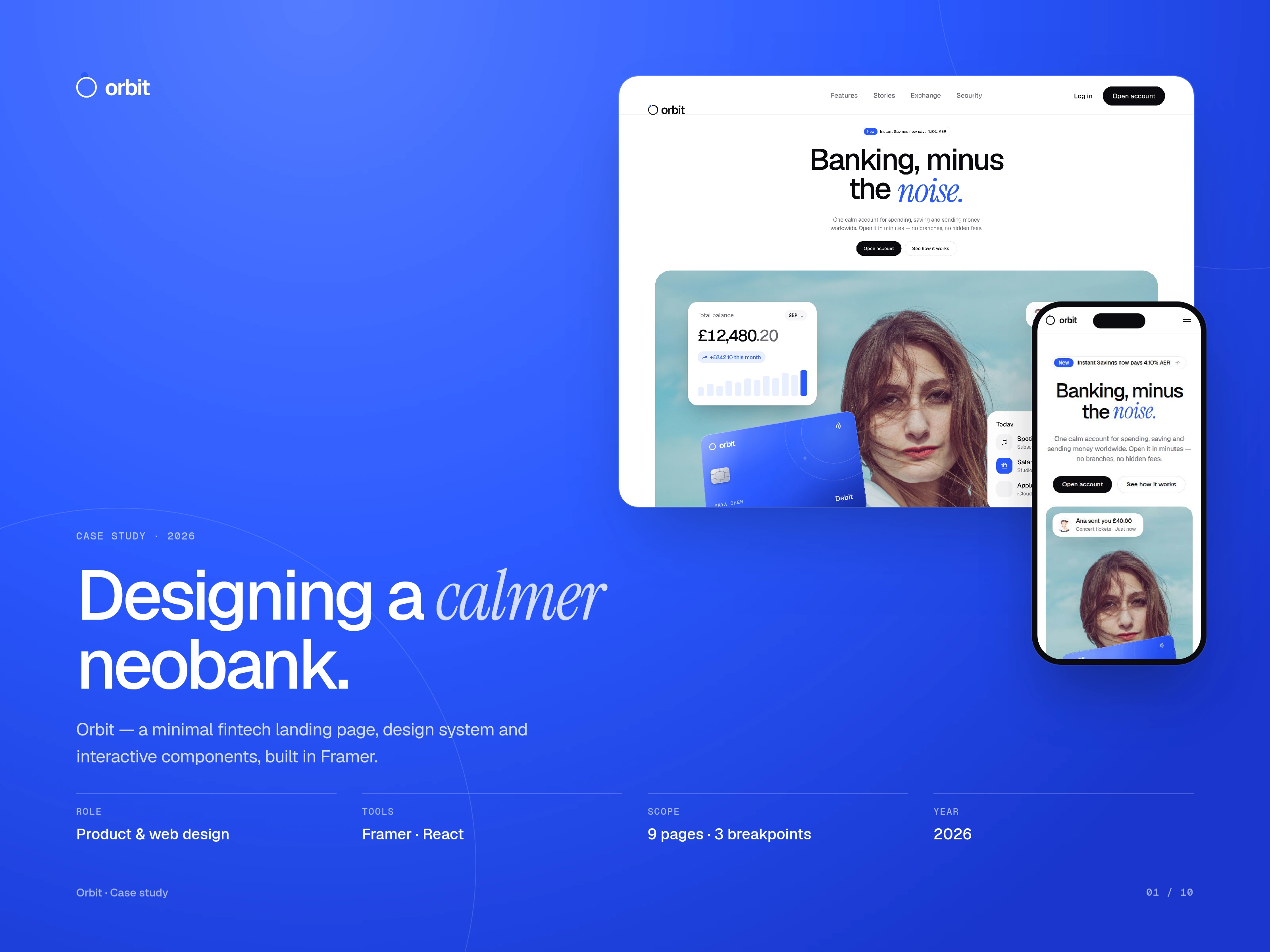
Orbit is a minimal fintech landing page template for Framer: a calm, Revolut-inspired neobank site with 9 responsive pages, a live FX converter, an interactive 3D card and a full design system.
Role: Product & web design · Tools: Framer, React · Scope: 9 pages, 3 breakpoints · Year: 2026
Live site: orbitfintech.framer.website
The challenge
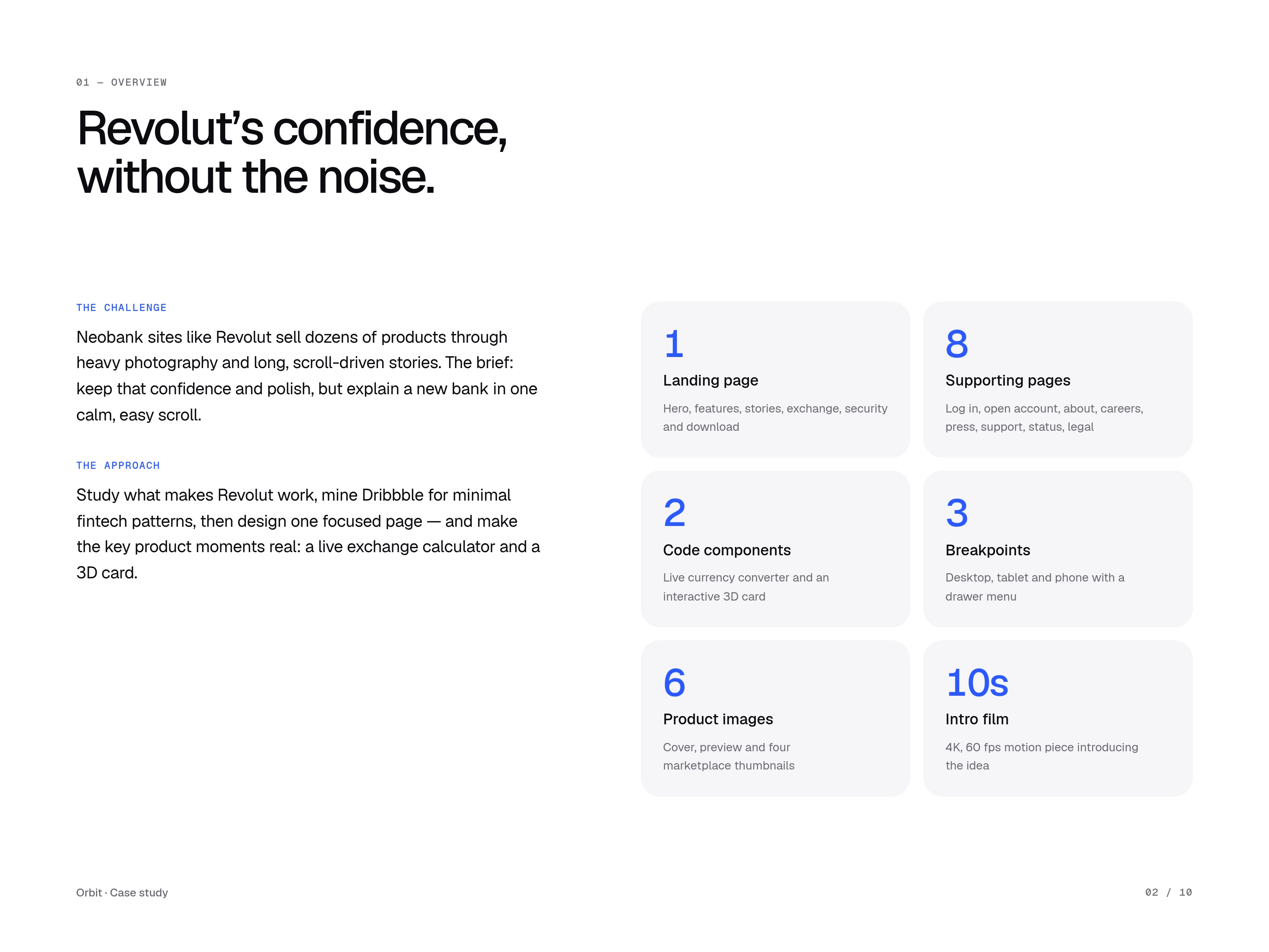
Neobank sites like Revolut sell dozens of products through heavy photography and long, scroll-driven stories. The brief: keep that confidence and polish, but explain a new bank in one calm, easy scroll.
The approach
Study what makes Revolut work, mine Dribbble for minimal fintech patterns, then design one focused page and make the key product moments real: a live exchange calculator and a 3D card.
Final scope: 1 landing page, 8 supporting pages, 2 code components, 3 breakpoints, 6 product images and a 10-second intro film.
Research: what we kept and what we dropped
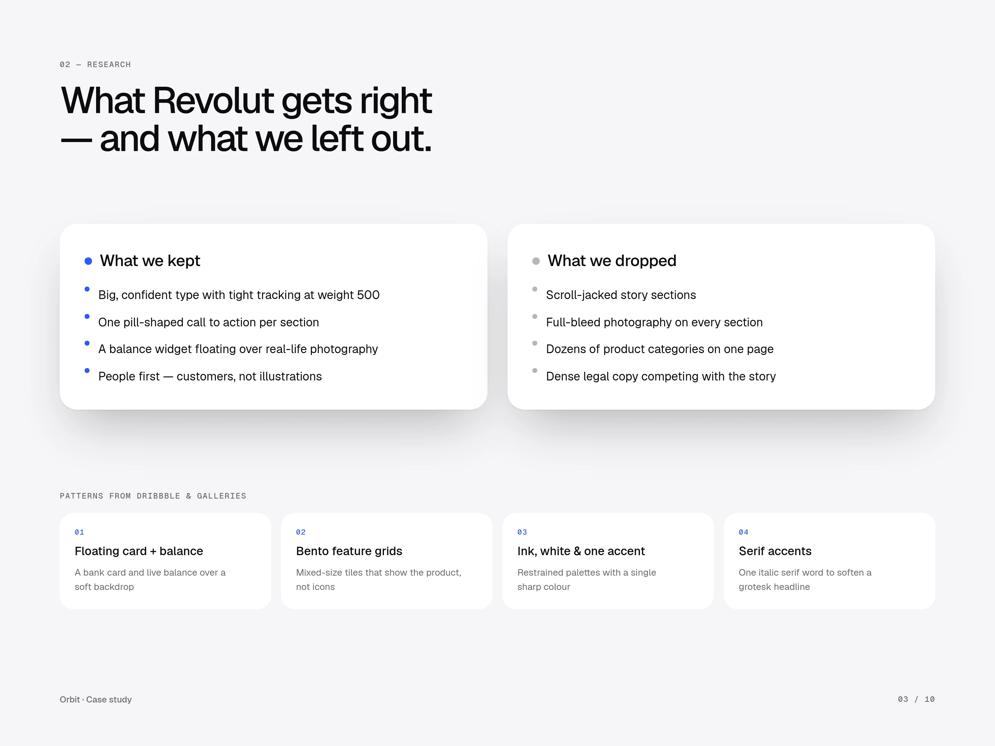
I broke down what makes Revolut's site feel confident, then removed everything that made it noisy.
Kept – Big, confident type with tight tracking; one pill-shaped call to action per section; a balance widget floating over real-life photography; people first, with customers instead of illustrations.
Dropped – Scroll-jacked story sections; full-bleed photography on every section; dozens of product categories on one page; dense legal copy competing with the story.
Patterns from Dribbble and galleries: a floating card with a live balance, bento feature grids, ink and white with one sharp accent, and a single italic serif word to soften the grotesk headline.
Direction: calm, real and product-led
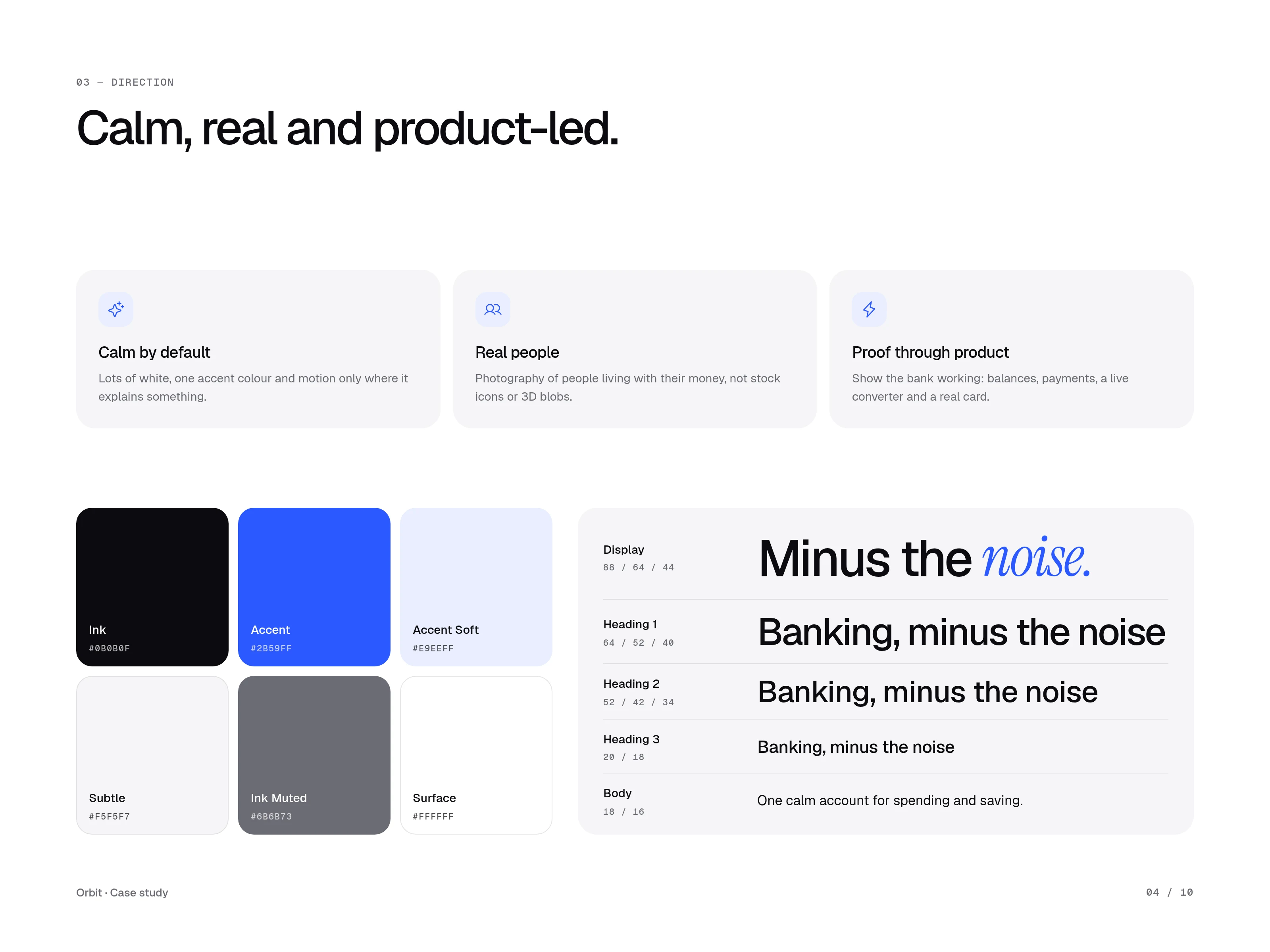
Calm by default – Lots of white, one accent colour and motion only where it explains something.
Real people – Photography of people living with their money, not stock icons or 3D blobs.
Proof through product – Show the bank working: balances, payments, a live converter and a real card.
The design system pairs ink and white with a single bright blue accent and soft greys, plus a type scale from display to body. One italic serif word, "noise", is the signature detail.
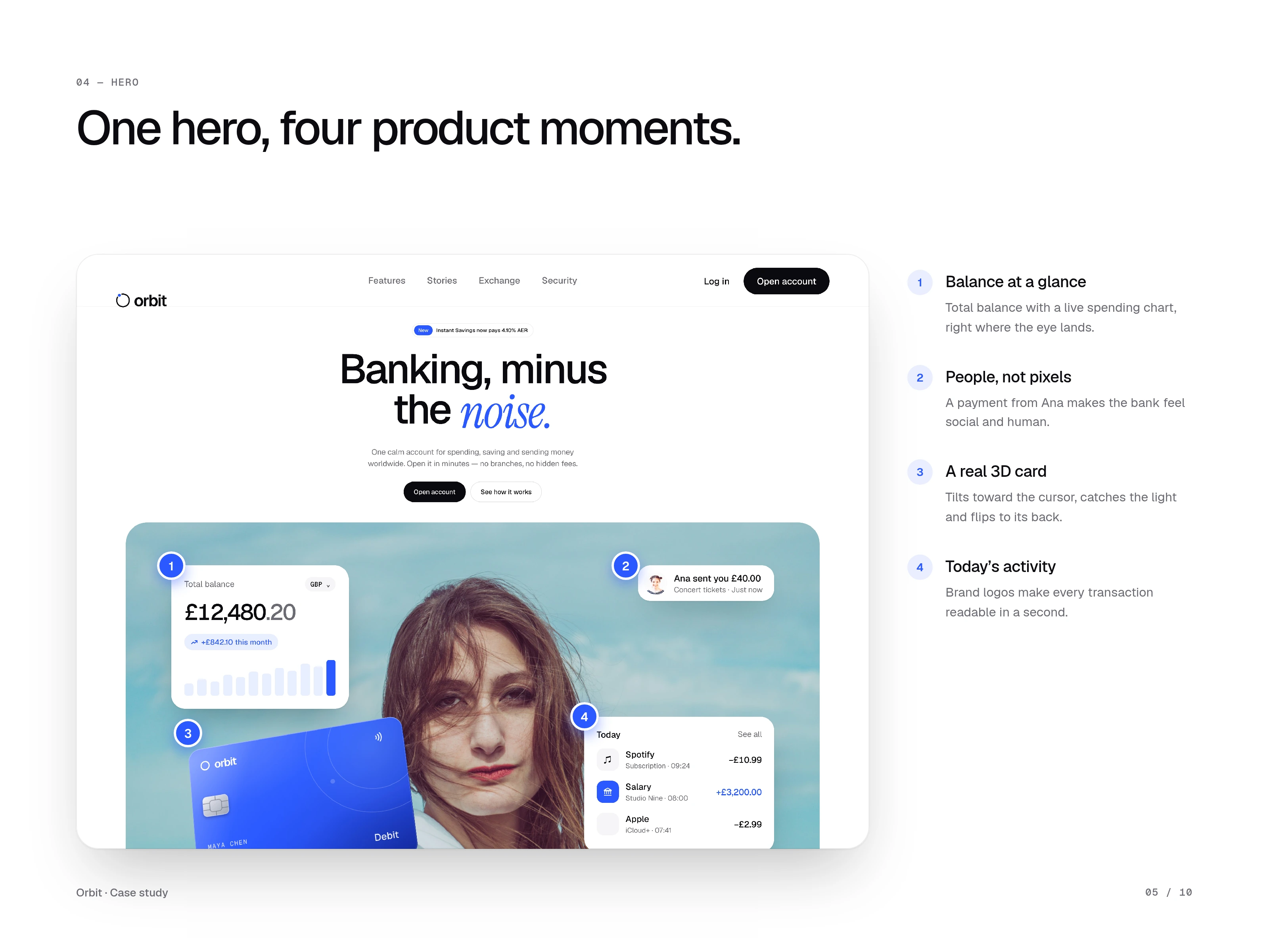
One hero, four product moments
Balance at a glance – Total balance with a live spending chart, right where the eye lands.
People, not pixels – A payment from Ana makes the bank feel social and human.
A real 3D card – Tilts toward the cursor, catches the light and flips to its back.
Today's activity – Brand logos make every transaction readable in a second.
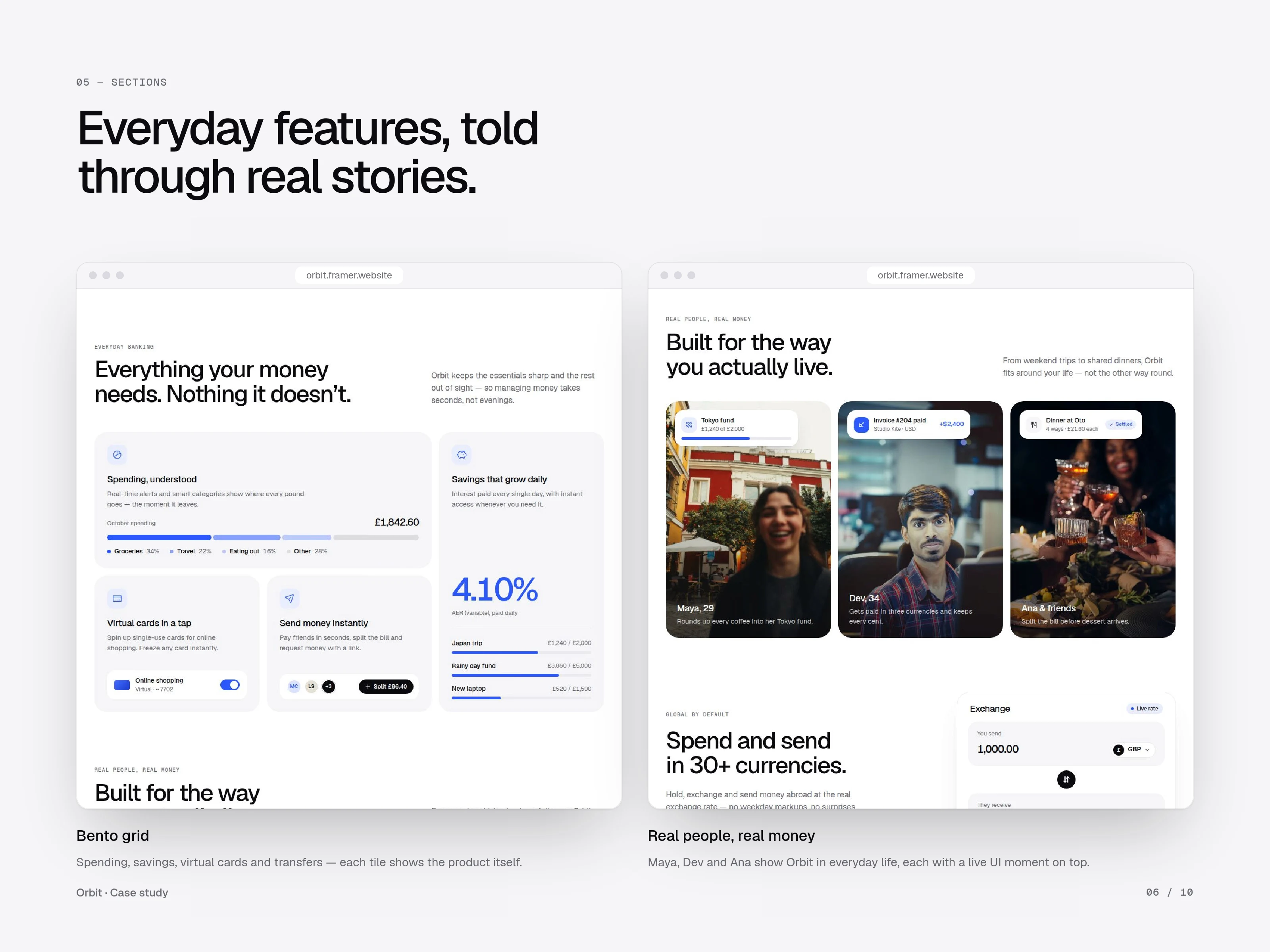
Everyday features, told through real stories
Bento grid – Spending, savings, virtual cards and transfers, where each tile shows the product itself.
Real people, real money – Maya, Dev and Ana show Orbit in everyday life, each with a live UI moment on top.
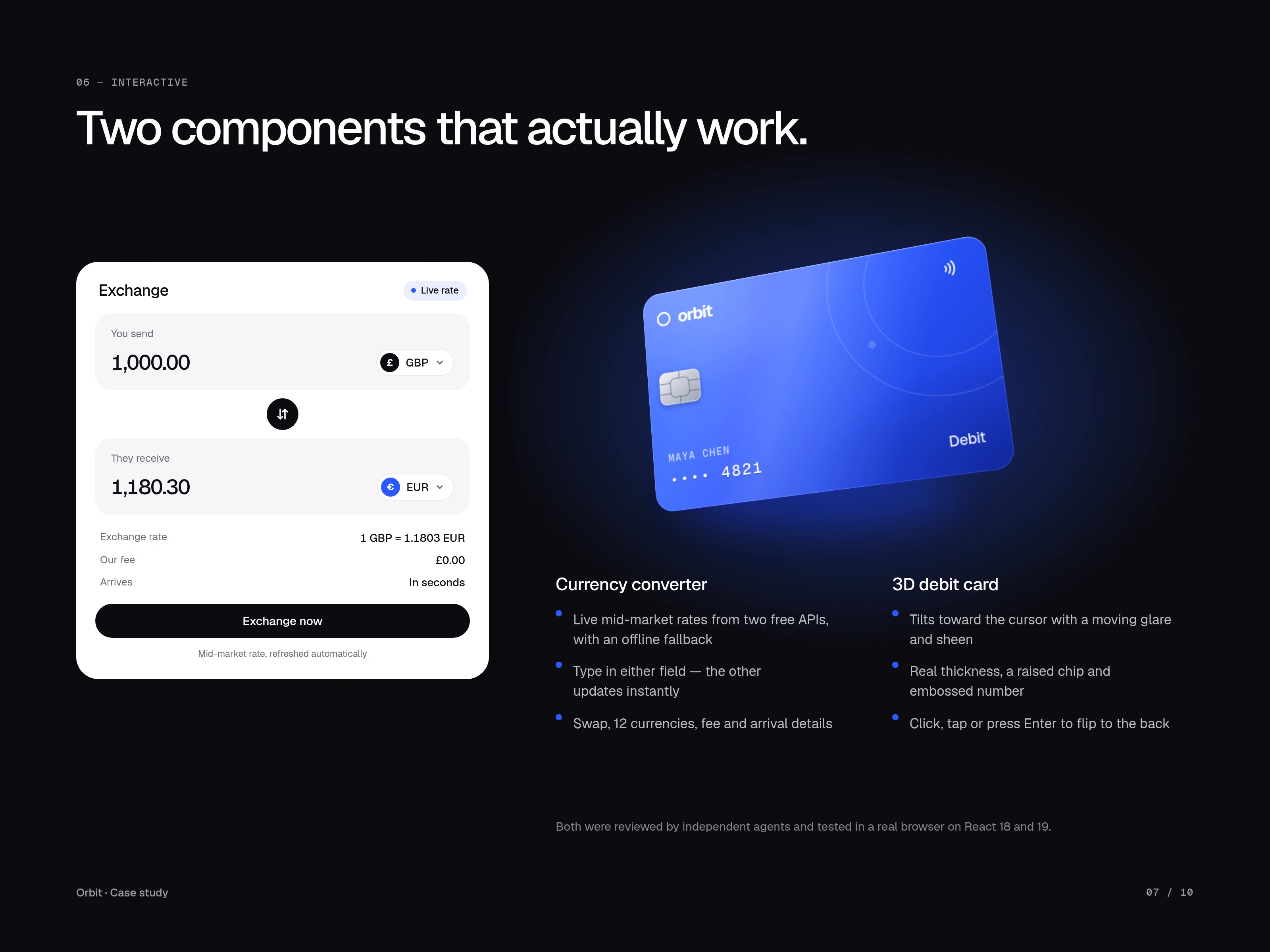
Two components that actually work
Currency converter – Live mid-market rates from two free APIs with an offline fallback. Type in either field and the other updates instantly, with swap, 12 currencies, and fee and arrival details.
3D debit card – Tilts toward the cursor with a moving glare and sheen, with real thickness, a raised chip and an embossed number. Click, tap or press Enter to flip it to the back.
Both components were tested in a real browser on React 18 and 19.
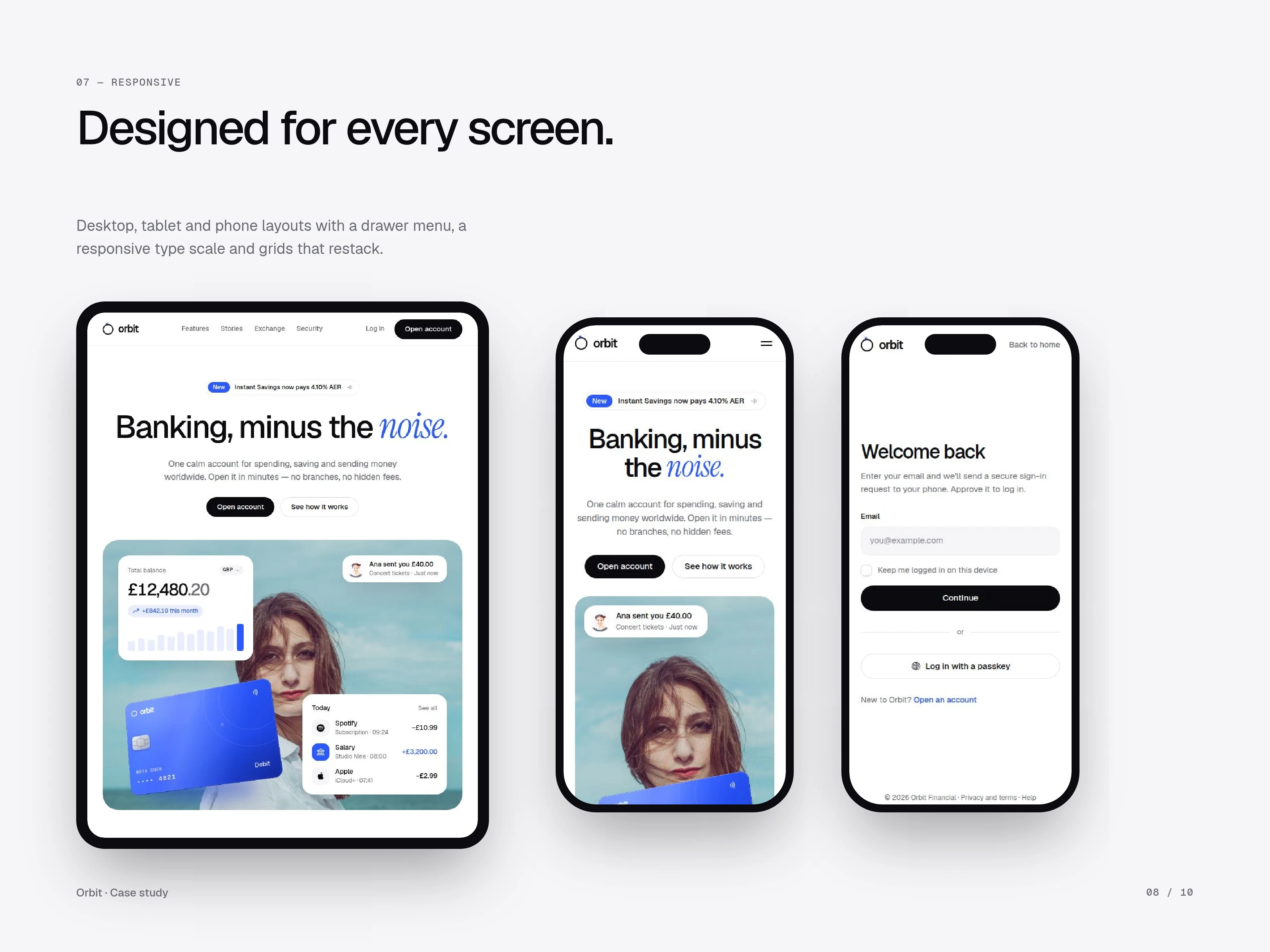
Designed for every screen
Desktop, tablet and phone layouts with a drawer menu, a responsive type scale and grids that restack.
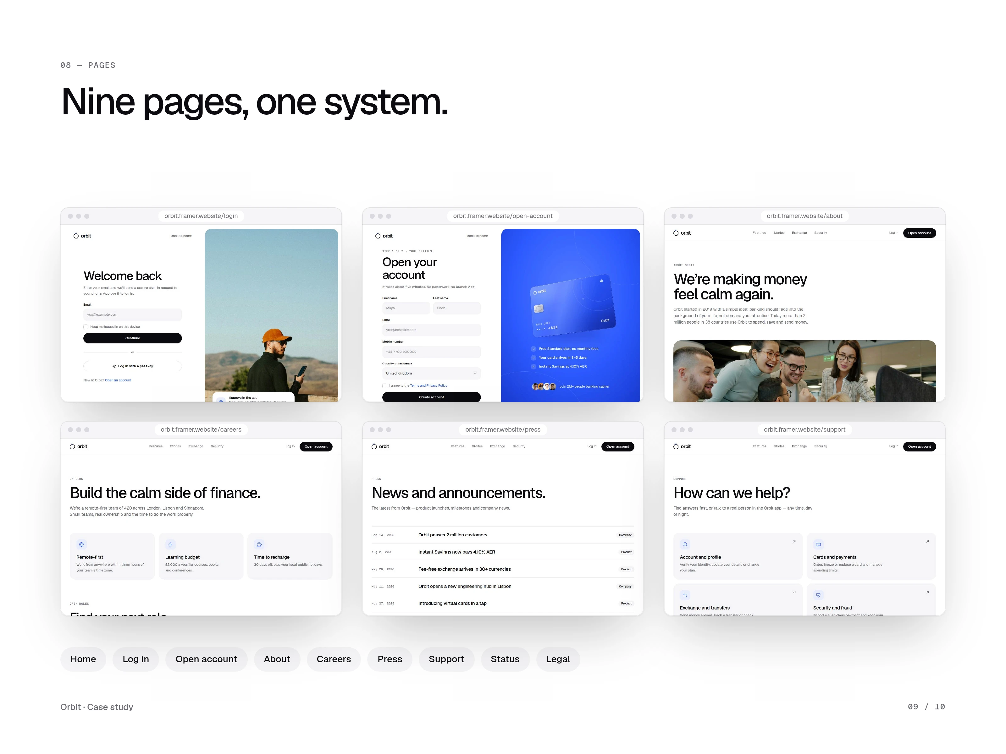
Nine pages, one system
Every page shares one layout and design system: Home, Log in, Open account, About, Careers, Press, Support, Status and Legal.
Outcome
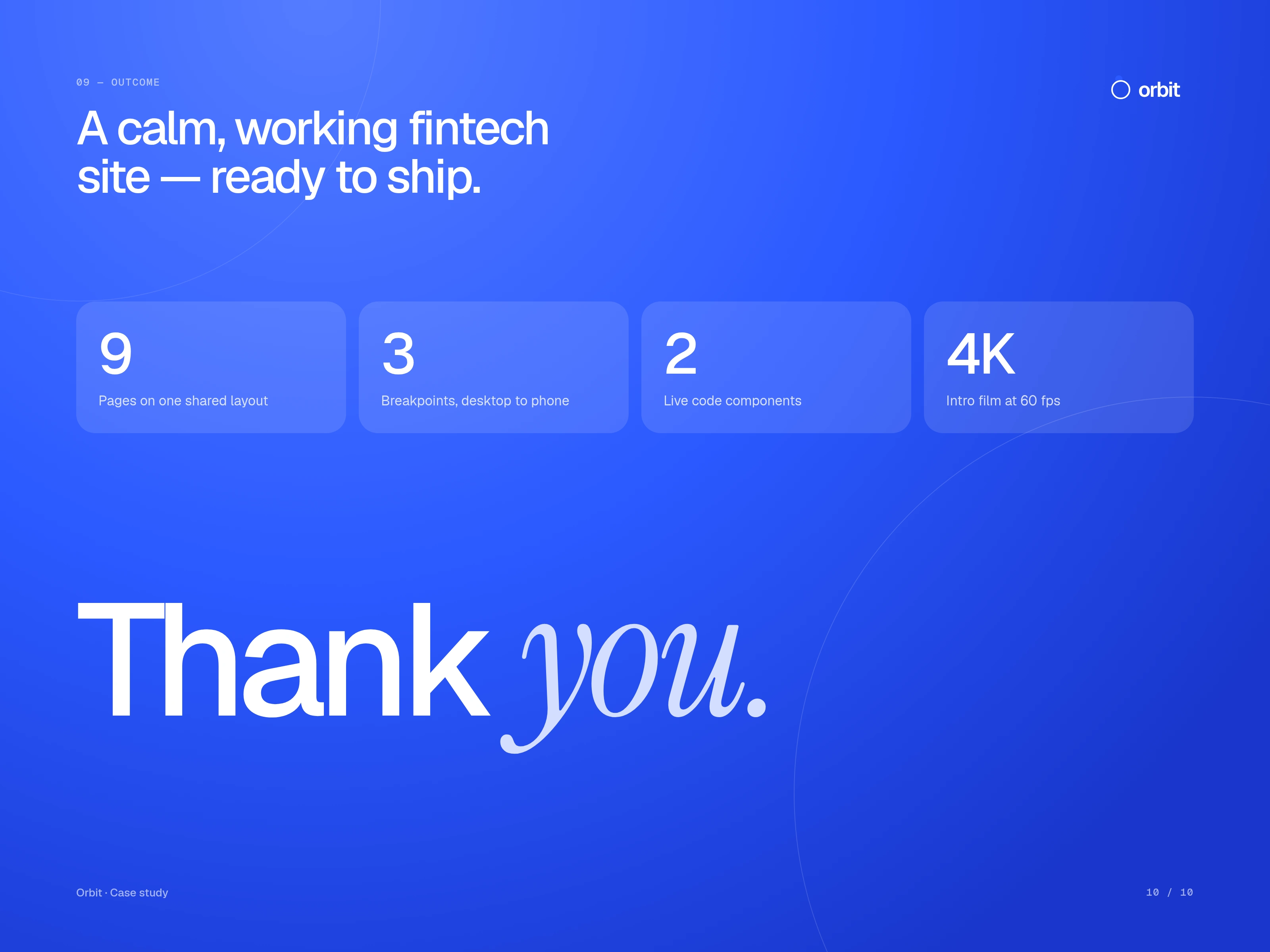
A calm, working fintech site, ready to ship:
9 pages on one shared layout
3 breakpoints, from desktop to phone
2 live code components
A 4K intro film at 60fps (see the Orbit motion design case study)
See it live: orbitfintech.framer.website
Like this project
Posted Oct 9, 2026
Shipped a calm, Revolut inspired fintech site in Framer: 9 responsive pages, a live FX converter, a 3D card and a full design system.