Daniel Website Redesign
Introduction
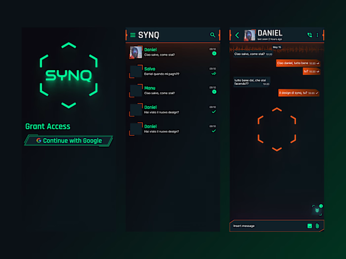
Daniel, an expert web developer and software engineer, required a revamp of his personal portfolio website. I redesigned Daniel's website in order to make it more visual appealing and more user-friendly. The changes I made helped Daniel attract more visitors and increase conversions.
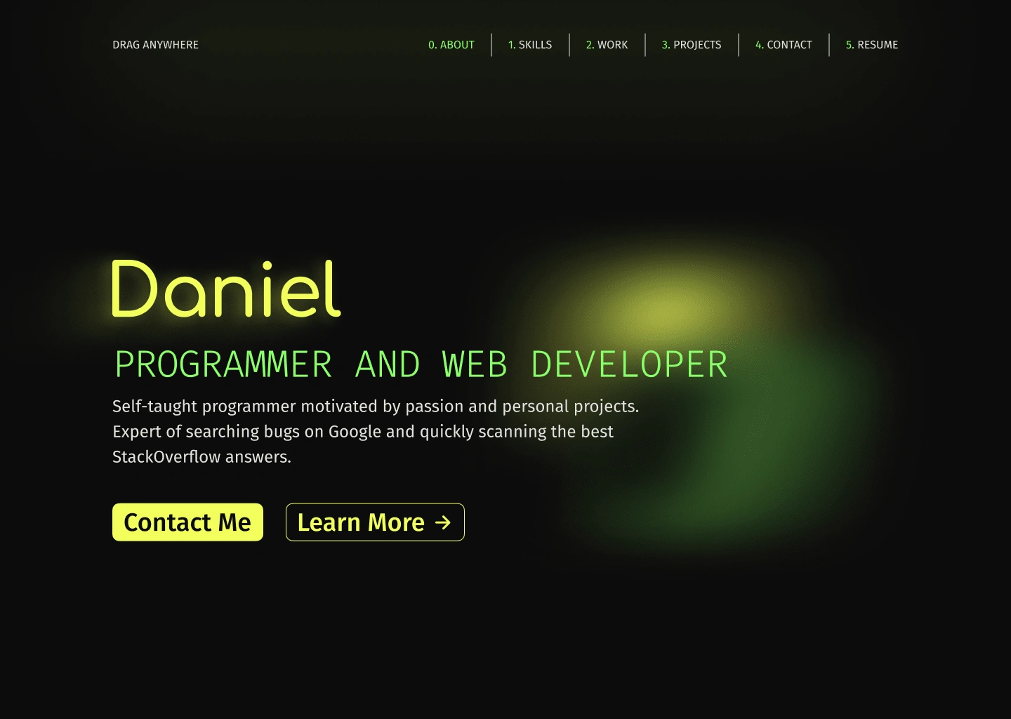
New Landing Page
My Role
I was tasked with redesigning the website while keeping its original style intact, aiming to enhance its appeal and competitiveness. I began the project on October 31, 2023, and completed it a month later. This span encompassed multiple meetings with the client to grasp their requirements, various rounds of feedback, and design revisions, ensuring the client's complete satisfaction by the project's conclusion.
Main Old Design Problems
Navbar misaligned with site padding.
The chosen layout has a narrower navbar width compared to the overall content padding, resulting in visual asymmetry and an inconsistent user experience. It appears disjointed from the rest of the content and lacks seamless integration with the overall design."
Missing secondary CTA (call to action) on the landing page
The absence of a secondary CTA near the primary could limit user options and compromise conversion effectiveness. This may result in missed opportunities for user engagement and conversion.
Confusing overall layout
The site layout could benefit from a more modern and user-friendly design overall, particularly in the 'Skills' section where the text width, matching that of the entire site, makes reading quite challenging.
Slow animations
The initial site animations are very slow, taking up to 7 seconds to load the landing page content. A site with such a lengthy loading time can result in significant conversion loss.
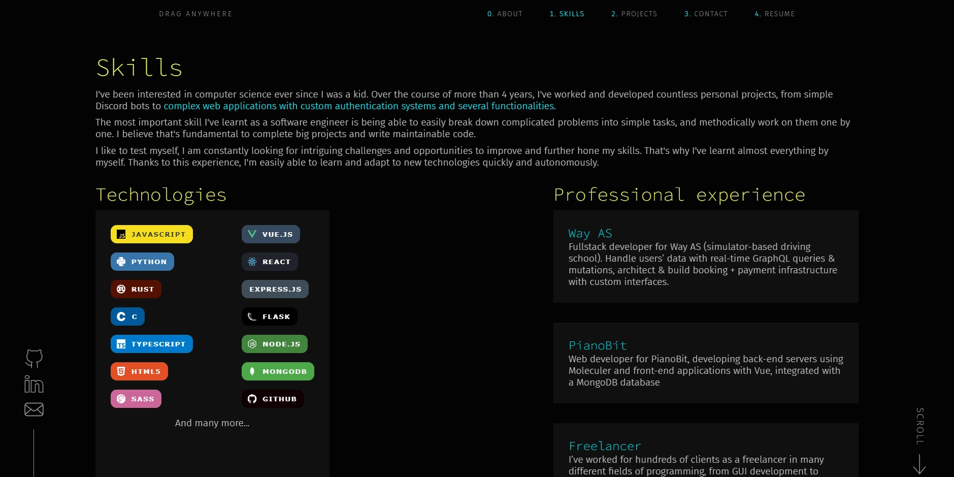
Old Layout
Design Process
Design System
First, I began creating the new design system by selecting colors, fonts, and the main layout for the site.
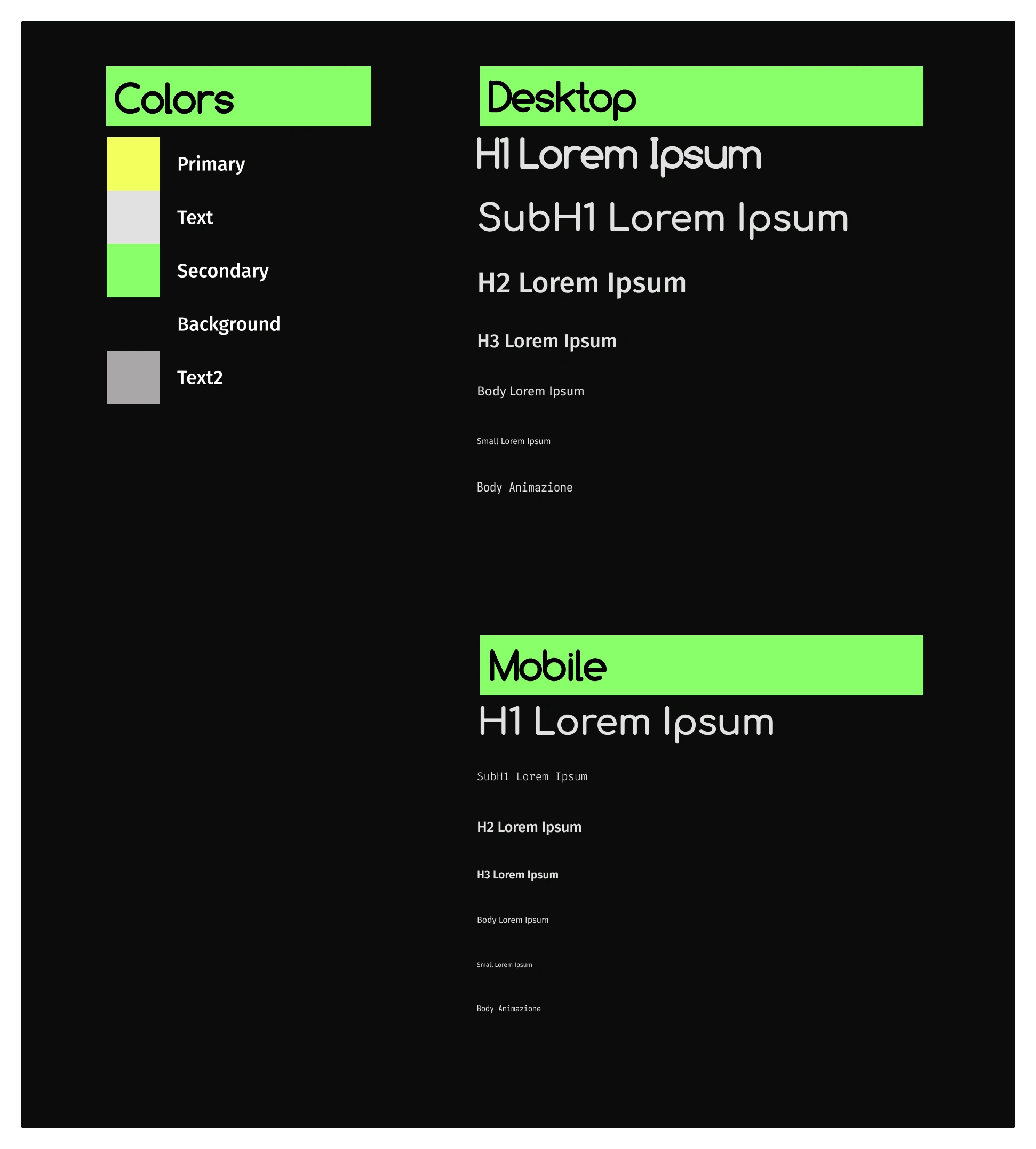
New Design System
Landing Page
Afterward, I focused on the landing page, altering color usage and text presentation for a better hierarchy. I also introduced a secondary CTA and included an abstract animation.

New Landing Page
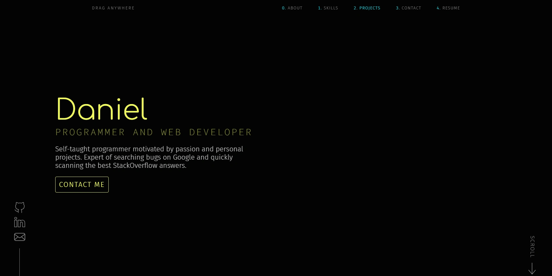
Old Landing Page
Main Sections
The previous website lacked distinct separation between sections like "About Me," "Skills," or "Personal Experience," resulting in a single, big, confusing section.
I also considered implementing a UX concept called Tribalism, which revolves around the idea that people enjoy feeling connected with someone that make them understood. To symbolize this, I used the '{' at the beginning and '}' at the end of each section, resembling the popular way of opening and closing a block of code.
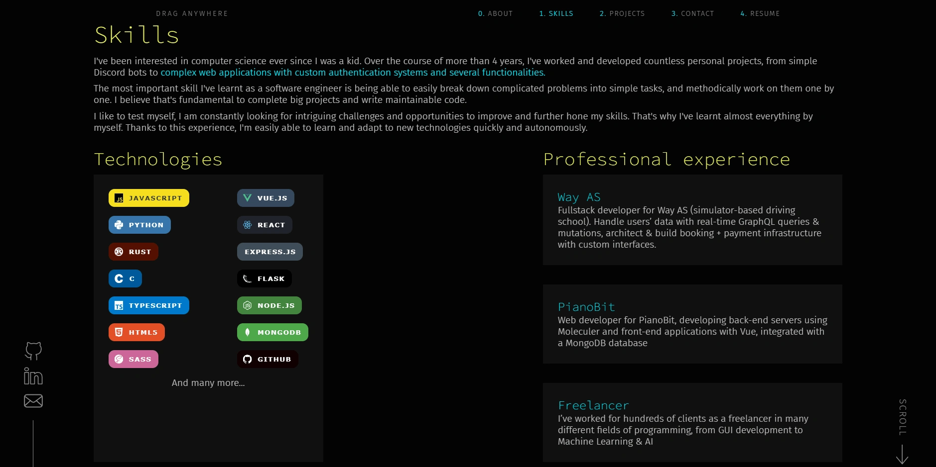
Old sections
About Me Section
The absence of an "About Me" section, that was included in the "Skills" one, wasn't ideal for a portfolio website. To enhance the client's connection with the potential web developer, I designed a modern two-column layout for this crucial section.
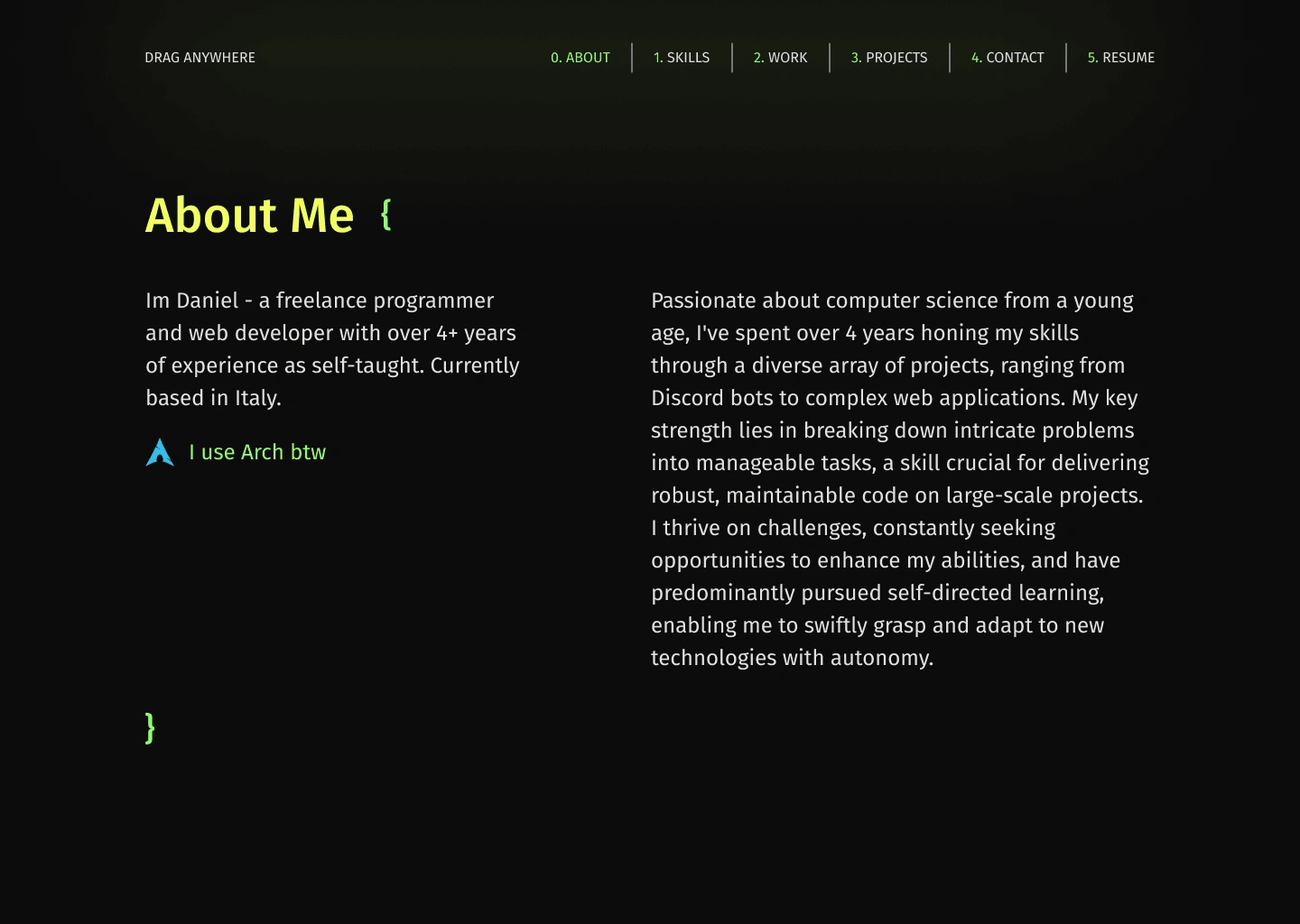
New About Me Section
Skills Section
I revamped the "Skills" section by merging it with the technologies one. I created a section similar to the previous one and included special animations for the showcased technologies visible on the live website.
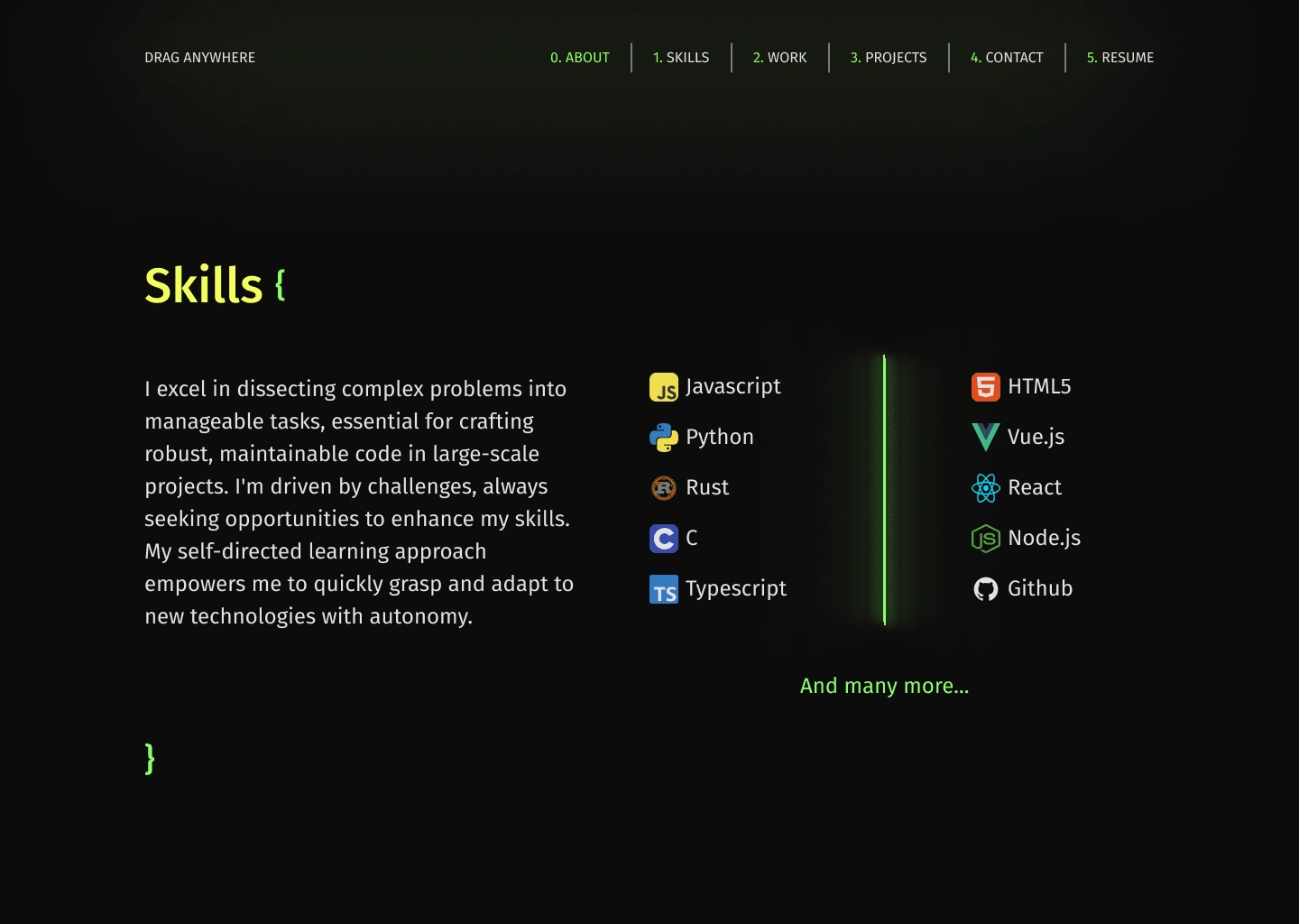
New Skills Section
Experience Section
I completely revamped the professional experience section by crafting a more engaging and visually appealing design. It features a dynamic timeline showcasing all the developer experiences, allowing users to interact by hovering over each entry to reveal animated details of the selected work experience.
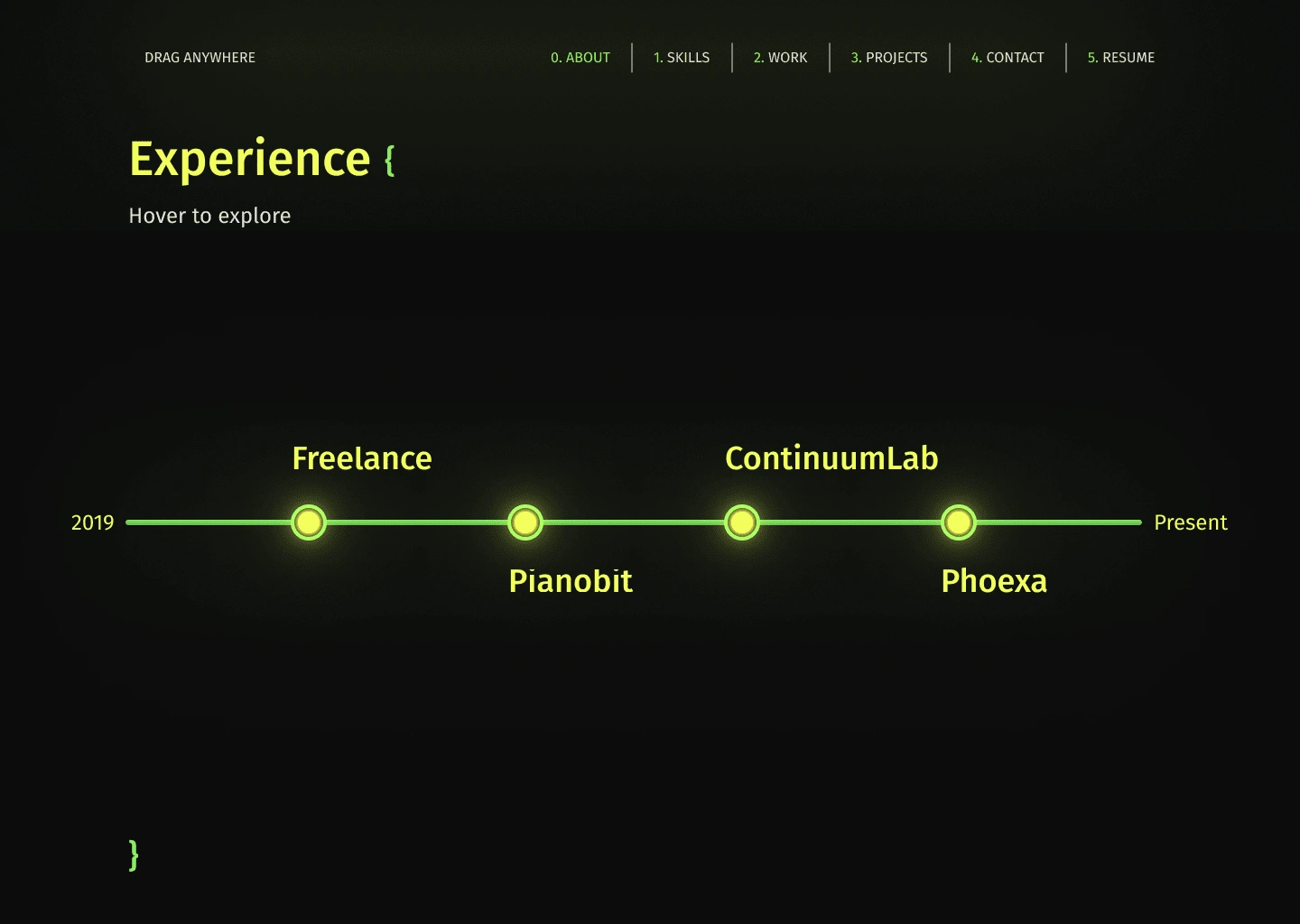
New Experience Section
Quote Section
The previous placement of the Quote was in the middle of the website, which disrupted the overall flow. To enhance its integration and harmonization with the updated color scheme, I redesigned its positioning, ensuring it aligned seamlessly with the website's flow and adapted well to the new color palette.
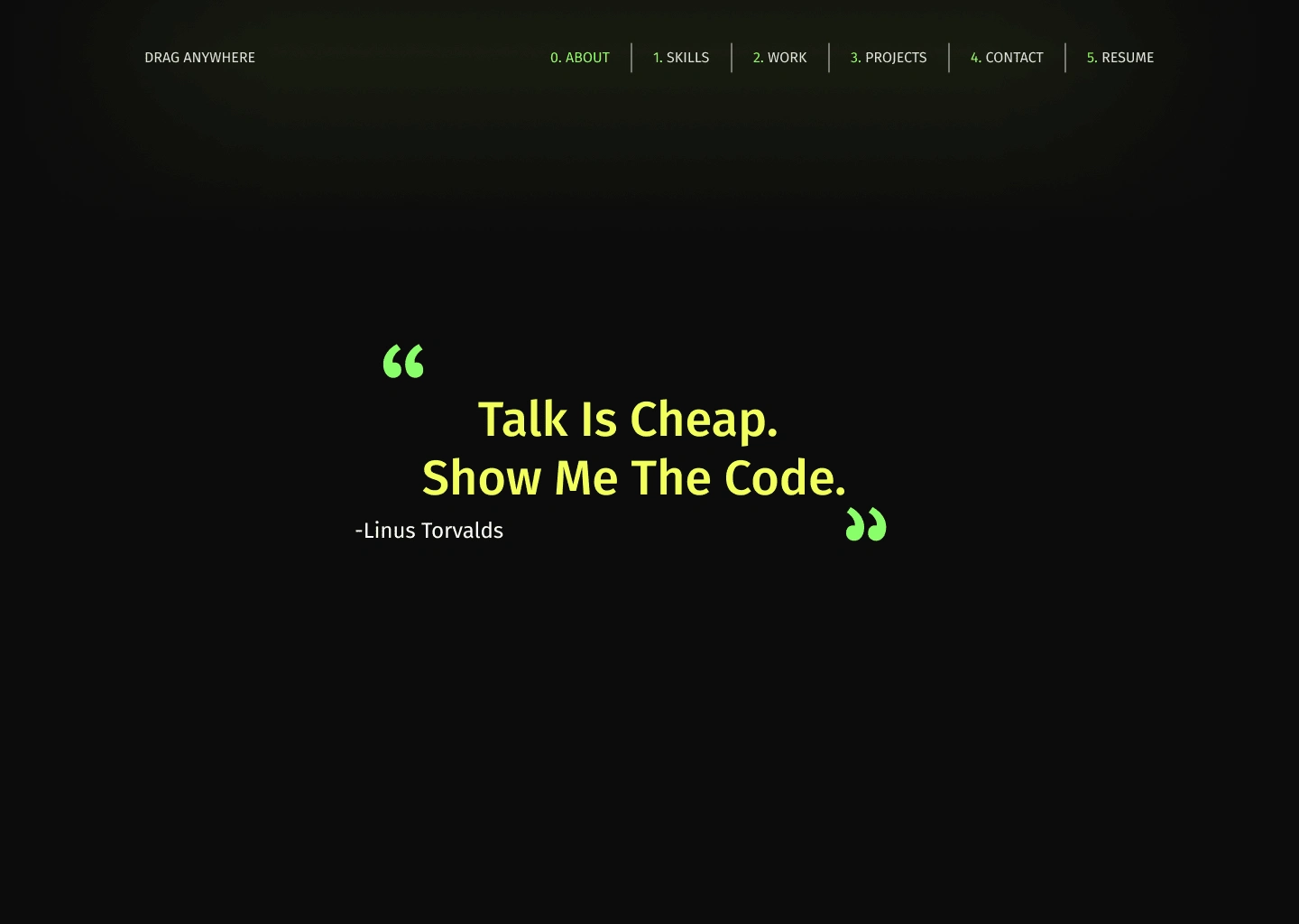
The New Quote

The Old Quote
Projects Section
The previous projects section was relatively small for a portfolio where showcasing projects is crucial. To better highlight these projects and accommodate the new flow, I expanded the section and incorporated an on-hover effect that displays detailed information for each project.
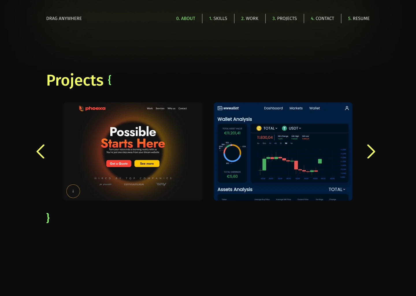
New Project Section
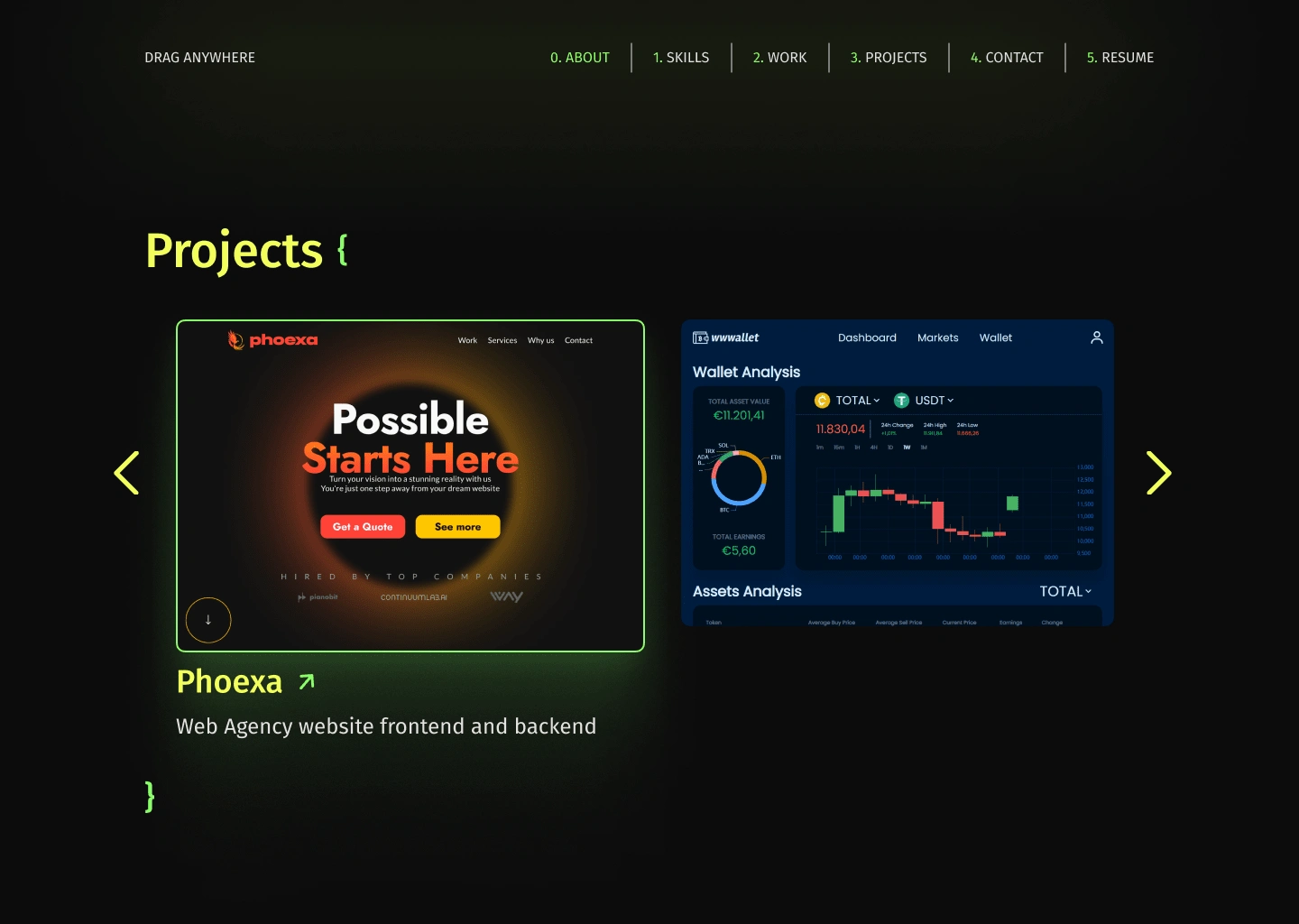
On-Hover Effect
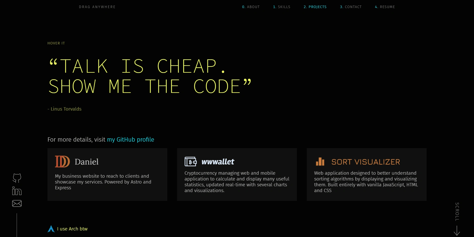
The Old Projects
Contact Section + Footer
I redesign the "Contact" section, aligning it closely with the refreshed website style. This involved relocating the various contact options that were initially positioned on the left side of the screen throughout the entire website. Additionally, I crafted a footer from scratch, which was absent in the old website, ensuring a cohesive and complete visual and functional experience across the entire site.
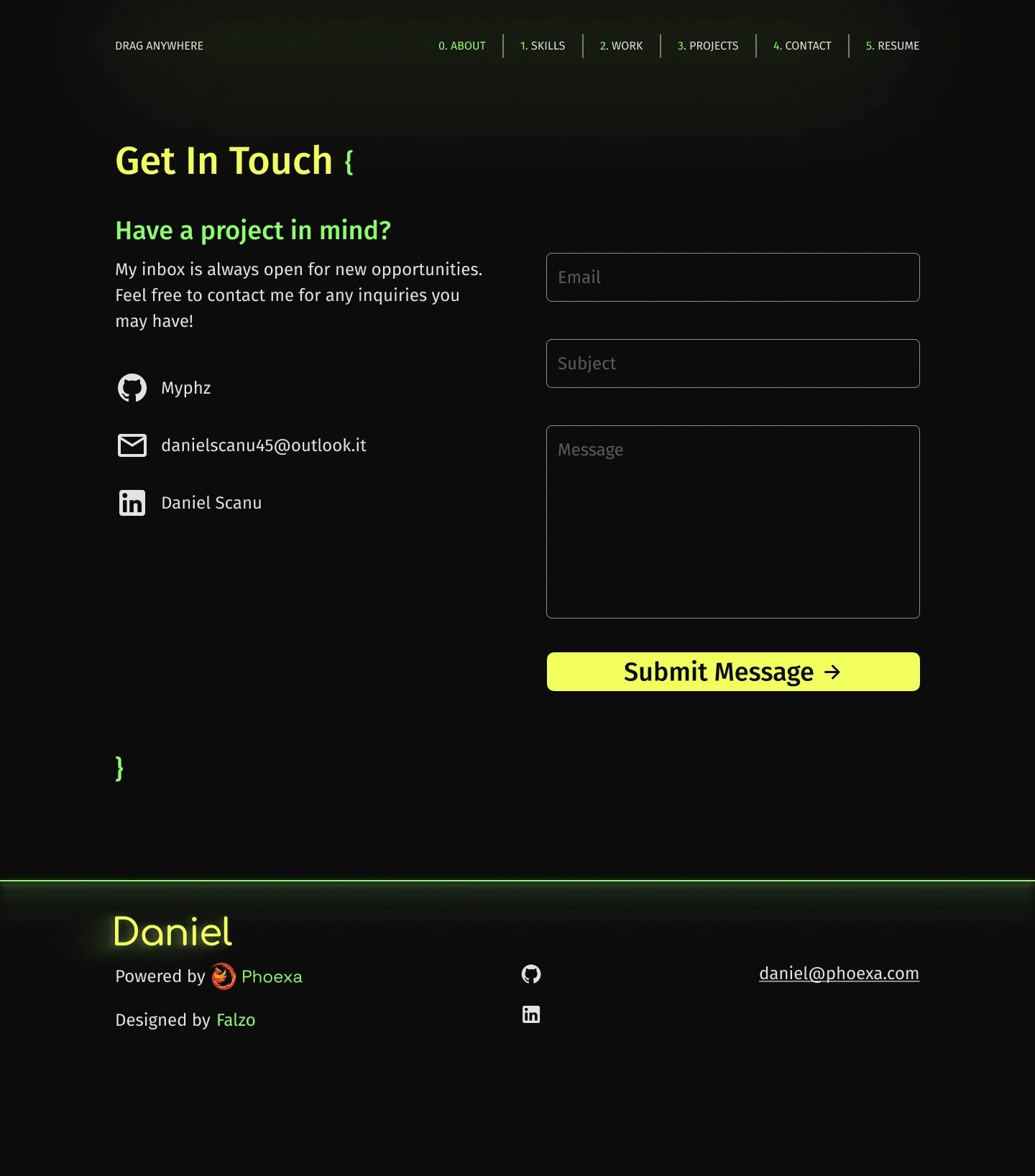
The New Contact + Footer
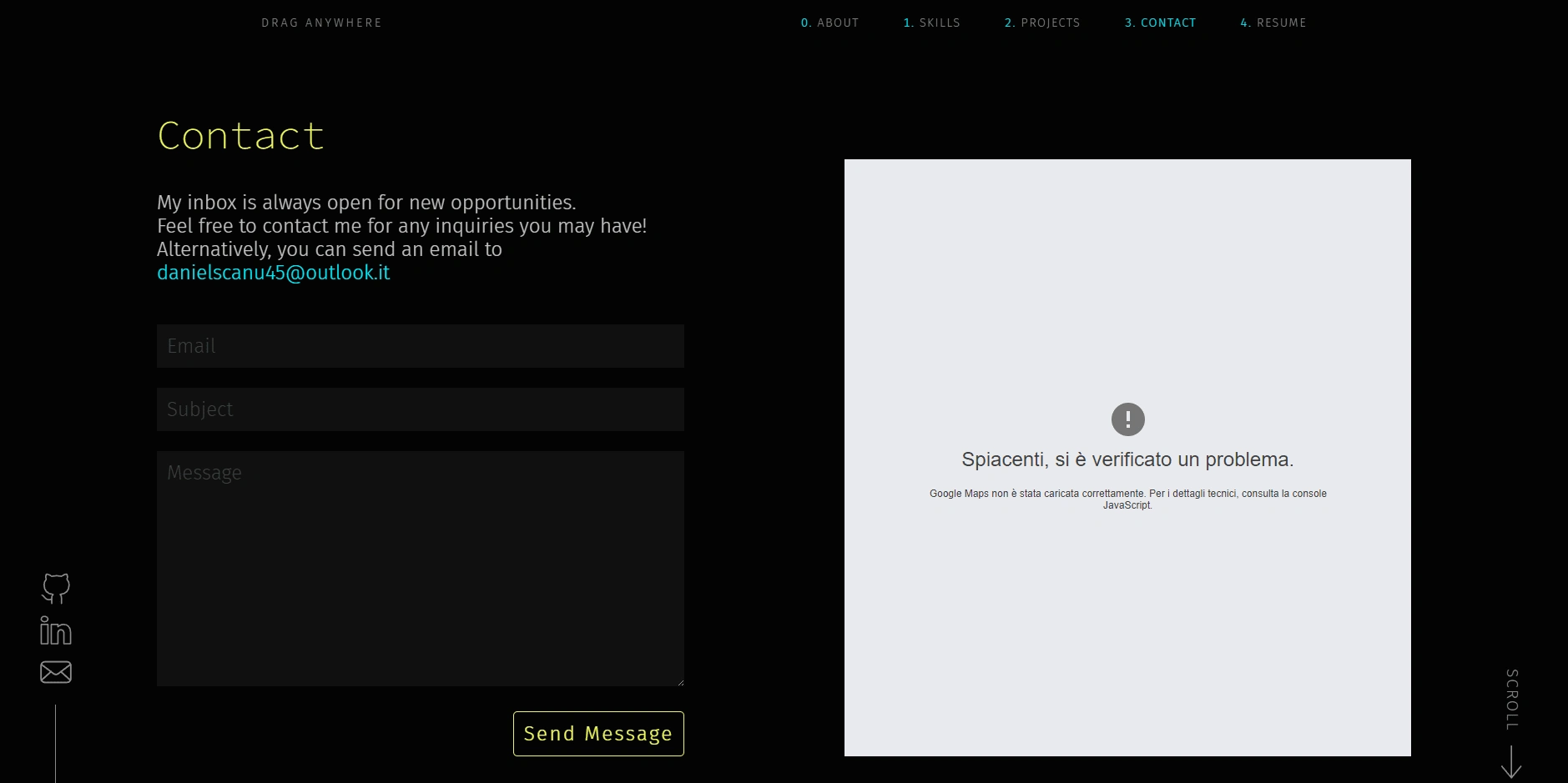
The Old Contact
Final Results
The newly implemented design perfectly aligned with the client's expectations and aspirations. It not only met their envisioned aesthetic and functional requirements but also facilitated an immediate increase in user traffic and conversions. This enhancement in design played a pivotal role in bolstering user engagement and fostering improved conversion rates, fulfilling the client's objectives and ambitions for the website.
You can see the live website here:
Like this project
Posted Nov 23, 2023
I assisted Daniel in realizing his ideal portfolio
Likes
1
Views
70
