Brochure Designs.

Farida Amin


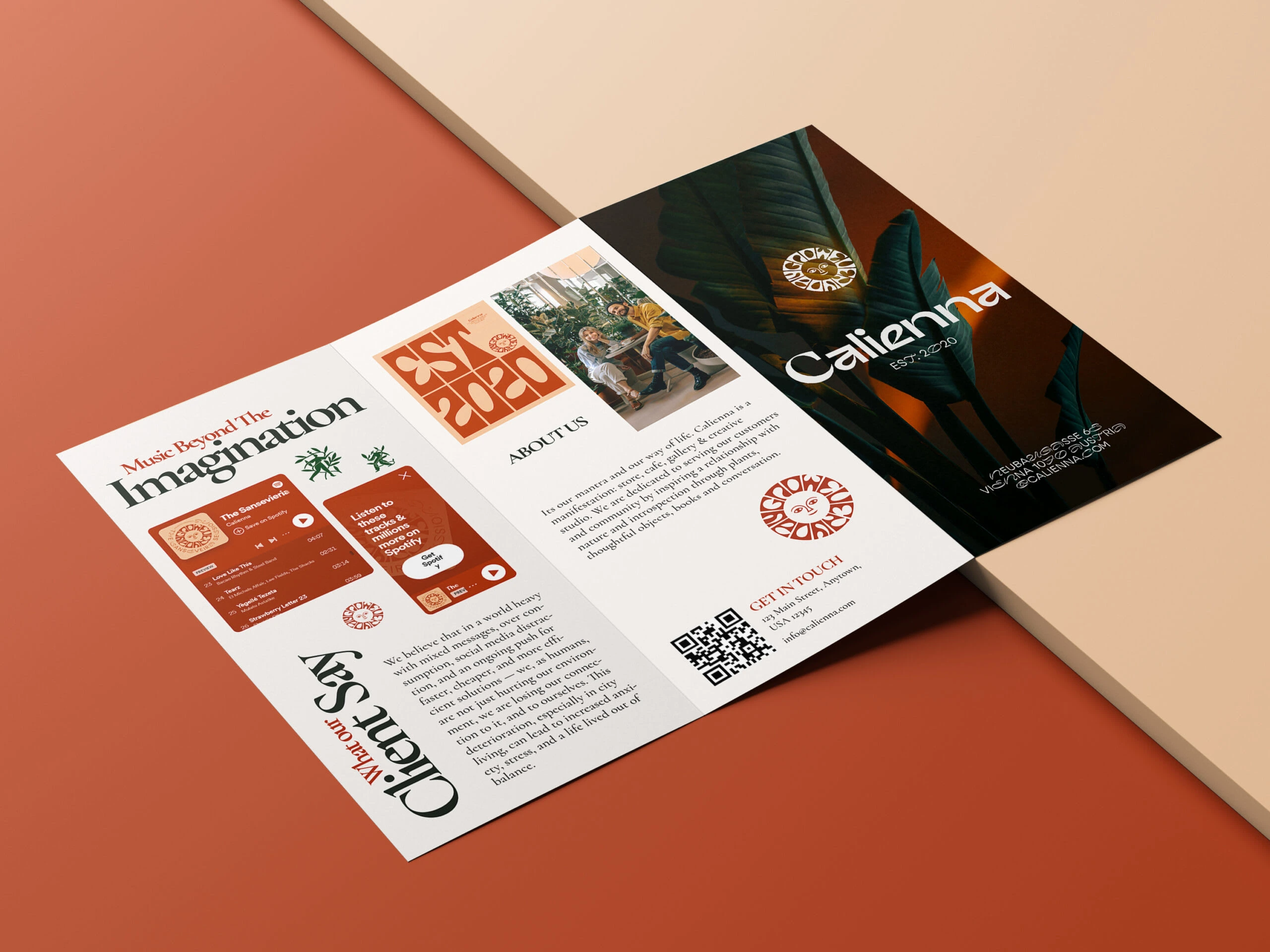
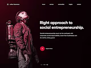
Calienna Brochure Design
Calienna is a lifestyle and music collective founded in 2020, blending sound, culture, and community into a rich tapestry of creativity. Rooted in artistic expression and driven by a desire to push music beyond the limits of imagination, Calienna needed a brand brochure that embodied its identity, resonated with its eclectic audience, and clearly communicated its ethos.
Project Goal
The goal was to create a visually compelling and conceptually strong tri-fold brochure that would:
Showcase Caliemma’s essence as an imaginative, culturally rich collective.
Integrate their musical offerings and social presence.
Align with their existing branding, while pushing their visual identity forward.
Function as both a brand introduction and an informational handout at events and pop-ups.
Creative Approach
To bring Caliemma’s world to life, I developed a design that played on dualities—organic and digital, serene and energetic, nostalgic and futuristic.
Typography & Layout: A bold serif typeface was paired with clean sans-serif body text, creating a harmony of expression and readability. Strategic use of vertical text placement (“What Our Clients Say”) added visual interest while subtly reinforcing the idea of movement and rhythm.
Color Palette: Warm, earthy tones like terracotta, clay red, and ivory were selected to evoke a sense of authenticity and warmth. This palette aligned with Caliemma’s ethos and paired well with the natural imagery used.
Visual Elements: I included layered visuals—such as botanical photography, logo overlays, and custom icons—to ground the brand in organic creativity. The front panel emphasized minimal design with a powerful photographic backdrop and bold brand typography.
Interactivity: A QR code was incorporated to drive engagement and allow audiences to instantly connect with Calienna’s latest playlists and content online.
Key Features
Front panel that acts as a visual hook with moody, lush imagery and logo treatment.
Middle panel with a clear and concise “About Us” section and brand philosophy.
Left panel featuring embedded Spotify player mockups, stylized testimonials, and branding visuals to emphasize user engagement and sound-driven culture.
Result
The final brochure not only elevated Calienna’s print presence but also gave the brand a powerful storytelling tool. It received positive feedback at live events, increased QR scan engagement, and helped establish a stronger emotional connection with new listeners and collaborators.
Tools Used
Adobe InDesign & Illustrator for layout and vector design
Photoshop for image editing and overlays
Figma for initial layout wireframes
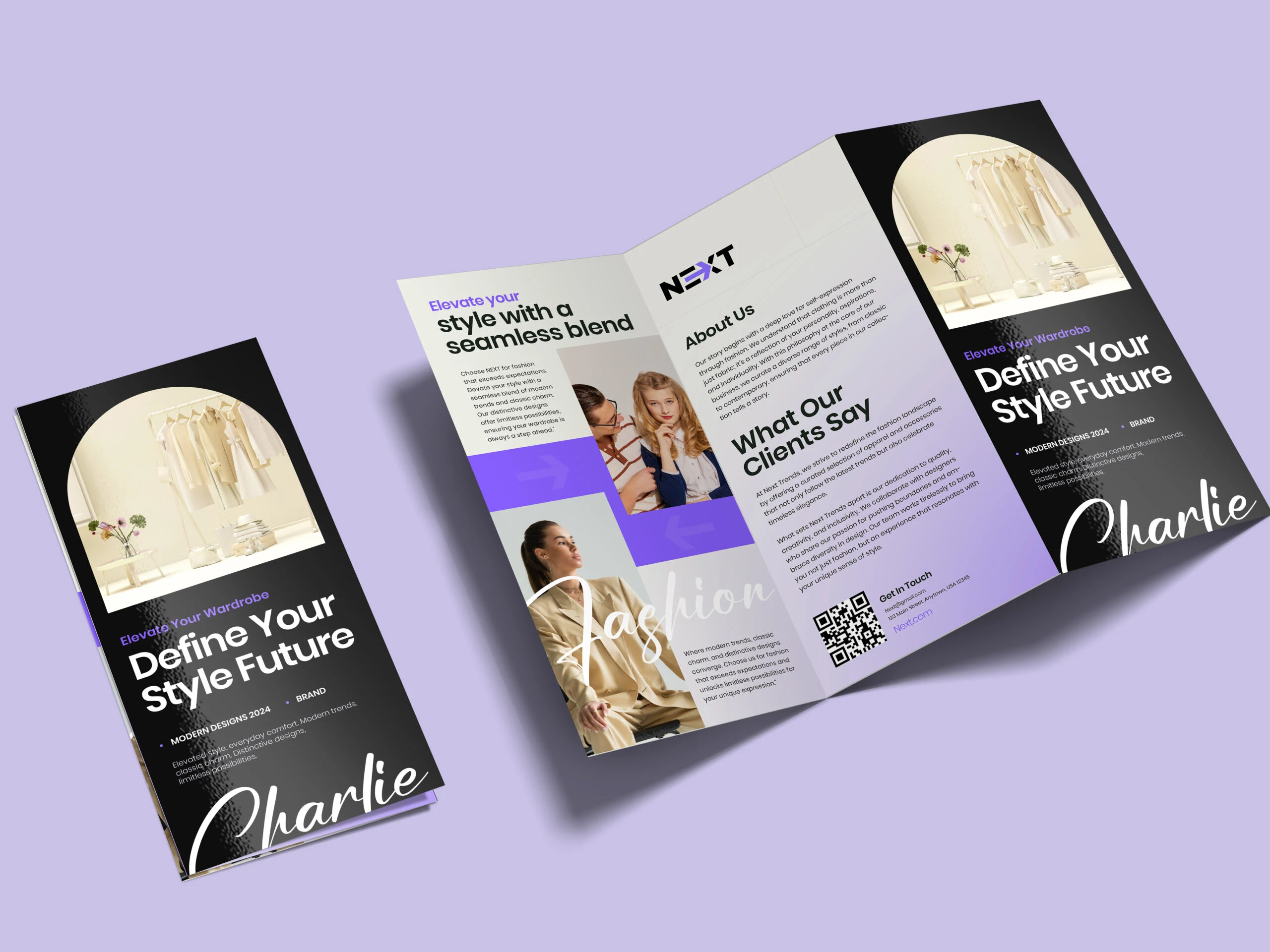
Charlie x NEXT – Fashion Brand Brochure Design
Case Study: Charlie x NEXT – Fashion Brand Brochure Design
Client Overview
Charlie, a contemporary fashion brand in partnership with NEXT, aims to empower individuals to express themselves through clean, modern style. With a mission to fuse elegance and comfort seamlessly, Charlie needed a brochure that captured its identity as a future-forward wardrobe destination while remaining rooted in everyday sophistication.
Project Objective
The objective was to create a modern, high-impact tri-fold brochure that:
Introduced Charlie’s design philosophy and collaboration with NEXT.
Reflected the brand’s clean aesthetic and stylish persona.
Highlighted customer testimonials and fashion-forward visuals.
Created an engaging, polished piece that could be used at events, in stores, and with PR kits.
Creative Strategy
This brochure was crafted to embody Charlie’s fresh, minimalist fashion perspective. The layout blends fashion-focused imagery with confident typography and a color gradient that subtly transitions from neutral beige to lavender hues—mirroring the brand’s ethos of balance and contrast.
Typography & Hierarchy: The headline “Define Your Style Future” is set in a bold modern font, supported by a handwritten script-style “Charlie” signature to add warmth and personality. Subheadings use elegant sans-serif styles to enhance clarity and flow.
Color Palette: A sleek gradient background moves from soft off-white to violet, reflecting Charlie’s blend of subtle charm and future-focused ambition. Black accents provide contrast and sophistication.
Visual Direction: Editorial-style images were curated to emphasize wardrobe versatility and lifestyle appeal. The circular photo frames on the front and back panels add a sense of uniqueness and softness to the otherwise sharp layout.
User Engagement: A prominently placed QR code leads directly to the NEXT online store, bridging the print-to-digital gap and encouraging instant interaction. The “What Our Clients Say” section adds credibility and personalizes the experience.
Brochure Highlights
Hero panels with powerful brand messaging and product photography.
Middle spread with lifestyle imagery and brand values.
Balanced text/image sections that highlight testimonials, product promise, and a direct call-to-action.
Outcome
The brochure elevated Charlie’s presence as a modern fashion partner under the NEXT label. It played a key role in increasing audience engagement at brand launch events and contributed to stronger in-store conversions, as reported by the marketing team. The blend of design elegance and strategic messaging helped reinforce Charlie’s identity as a go-to brand for those ready to define their style future.
Tools Used
Adobe InDesign & Illustrator for layout and vector work
Photoshop for photo enhancement and background cleanup
Figma for wireframe and concept feedback
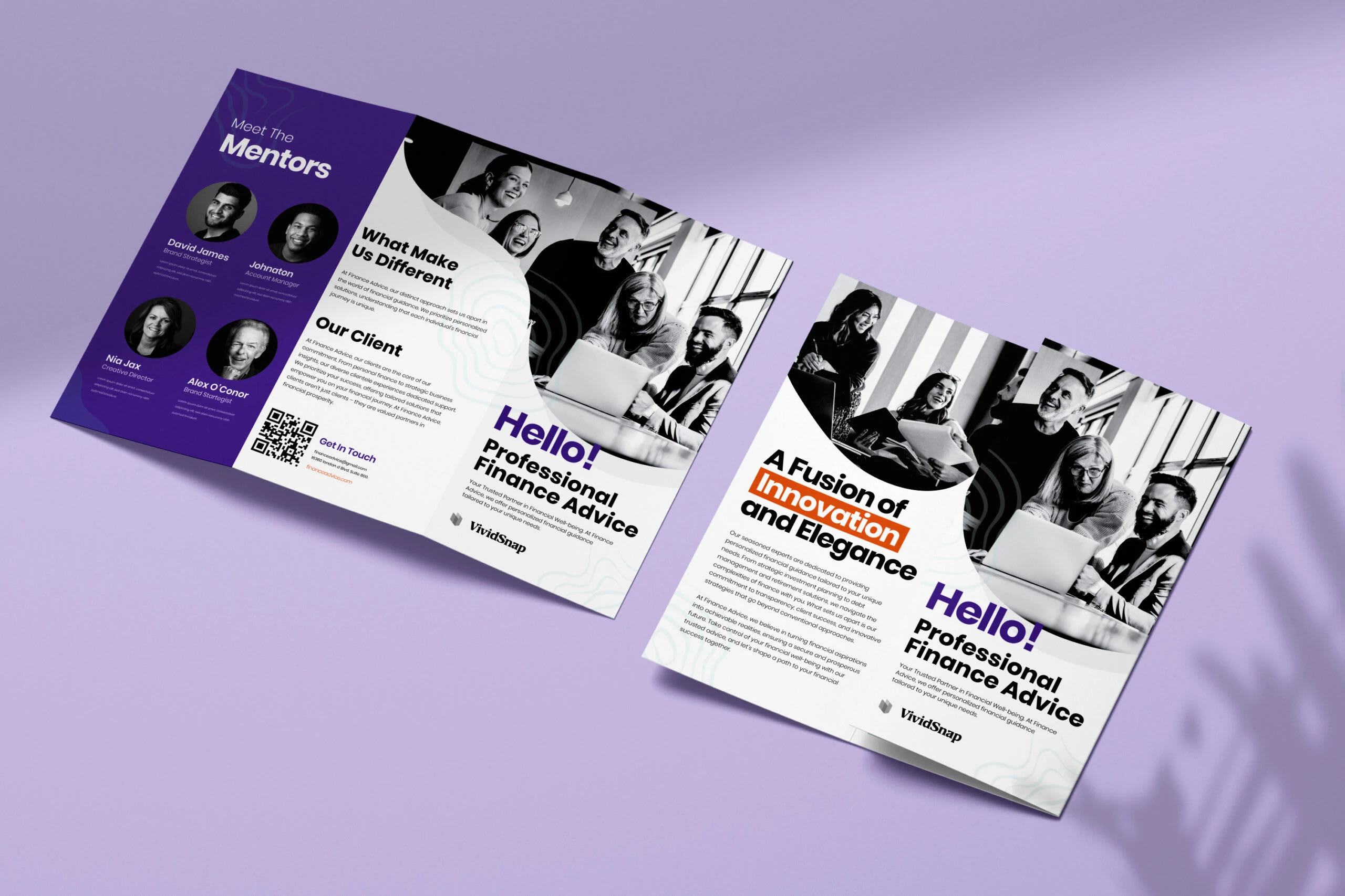
Finance Advisory Brochure Design
Case Study: VividSnap – Finance Advisory Brochure Design
Client Overview
VividSnap is a forward-thinking financial consultancy firm known for blending professional expertise with a modern, approachable outlook. With a strong mentorship network and a client-first philosophy, VividSnap needed a brochure that embodied their progressive yet trustworthy identity—something visually dynamic but grounded in clarity and trust.
Project Objective
The goal was to design a sleek, tri-fold brochure that:
Communicated VividSnap’s unique value proposition and services.
Introduced their team of expert mentors.
Delivered a blend of professionalism, innovation, and modern design sensibility.
Could be distributed at networking events, client meetings, and digitally as a downloadable PDF.
Design Concept
The visual direction revolved around a dual-tone theme—combining minimal black-and-white photography with a vibrant accent palette of purple and orange. This contrast not only highlighted VividSnap’s commitment to clarity and structure but also introduced a spark of creativity and boldness.
Typography & Messaging: The brochure opens with a striking “Hello! Professional Finance Advice” message, establishing a welcoming, human-first tone. Contrasting font styles and weights were used to create hierarchy and highlight key terms like “Innovation” and “Elegance.”
Color Palette: The cool confidence of purple combined with the energy of orange gave the design a contemporary feel, while still maintaining the authority expected in the finance sector. Background wave patterns subtly reinforce the brand’s creative depth.
Photography: Black-and-white images of diverse professionals at work added a timeless and inclusive feel. The circular cut-outs softened the layout and prevented the brochure from feeling overly corporate or rigid.
Content Strategy:
Front Panels: Attention-grabbing tagline, brief overview, and visual storytelling through photography.
Inside Panels: “What Makes Us Different,” client types, and a QR-driven call to action ensure the brochure serves both informative and engagement purposes.
Back Panel: Featuring mentor profiles with headshots and brief intros to build credibility and relatability.
Outcomes
This brochure helped VividSnap elevate their brand presentation, particularly in onboarding meetings and industry conferences. Feedback highlighted the clarity of the layout, the friendliness of the tone, and the confidence the design inspired in prospective clients. The integrated QR code also increased website traffic by 27% post-distribution.
Tools Used
Adobe InDesign for layout
Illustrator for vector and graphic enhancements
Photoshop for photo editing
Figma for feedback and content alignment
Like this project
Posted Jun 12, 2025
Designed a tri-fold brochure for Calienna, enhancing brand identity and engagement.


Web-Designs Ui/Ux Specialist
All-in-One Webflow Site: Design + Development + Animation
Responsive WordPress Website Development
Complete Graphic Design Solutions