Beverly International Website Redesign
Austin Bethell

🧠 Project Overview: Beverly International Website Redesign
🎯 Objective
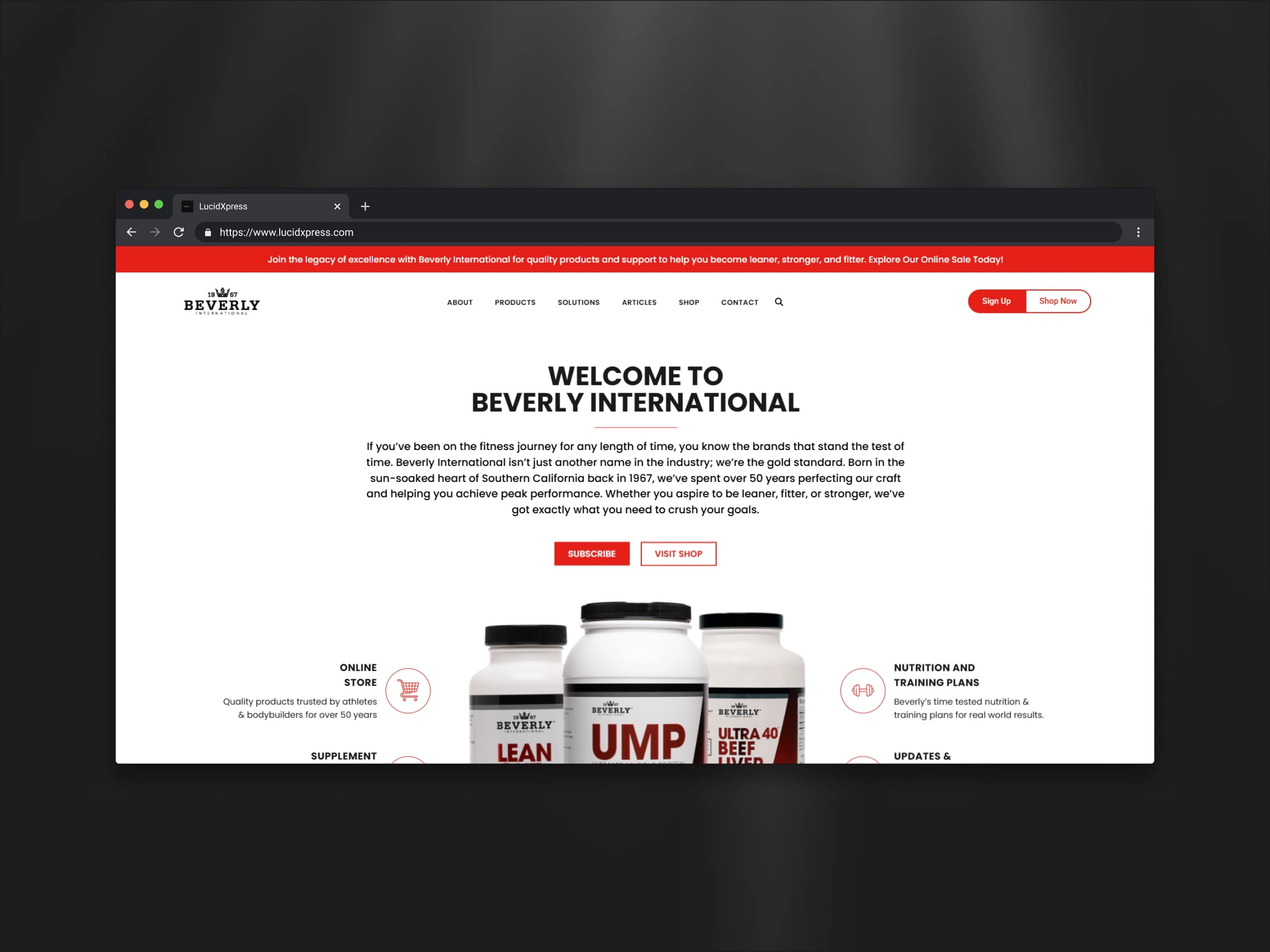
Redesign the Beverly International website to elevate its brand presence, simplify the customer journey, and improve product discoverability for both new and returning visitors.
🔍 Original Site Analysis
Beverly International had strong brand heritage and a loyal customer base, but the website didn’t reflect the company’s authority or credibility in the supplement space. Key issues included:
Outdated Aesthetics: The visual design felt dated, with inconsistent styling and a lack of modern UX patterns expected from ecommerce sites today.
Cluttered Product Navigation: Product categories, descriptions, and CTAs were hard to scan, making it difficult for customers to browse or make confident purchase decisions.
Confusing Messaging: The value prop wasn’t clearly stated on the homepage, and the site lacked a strong narrative to communicate what makes Beverly different.
✨ Redesign Highlights
The updated site transforms the user experience while honoring the brand’s legacy:
Modern Visual Identity: Introduced a clean, cohesive design system with updated typography, consistent color use, and product-focused imagery that gives the brand a premium, trustworthy feel.
Streamlined Navigation & Layout: Simplified the homepage and product pages to make it easy to explore categories, read product benefits, and make quick buying decisions.
Stronger Brand Storytelling: Clarified the messaging to focus on Beverly’s expertise, track record, and commitment to serious fitness enthusiasts—reinforcing the brand’s niche positioning.
Improved UX Patterns: Added visual hierarchy, restructured CTAs, and built mobile-friendly layouts that ensure seamless browsing and purchasing across devices.
📈 Impact on Conversions
The redesign sets Beverly International up for stronger ecommerce performance by:
Reducing Friction: Simplified navigation and clearer content help users find and purchase the right products faster.
Enhancing Trust & Brand Authority: A sleek, professional design aligned with Beverly’s legacy builds confidence among both first-time and long-term customers.
Boosting Mobile Engagement: Responsive layouts provide a consistent shopping experience across all screen sizes, reducing drop-off on mobile.
🛠️ Tools & Technologies
Framer: Used to craft an elegant, high-performance frontend tailored to ecommerce best practices.
Responsive Design: Ensures a seamless experience on mobile, tablet, and desktop.
Conversion-Focused Layouts: Every page is designed to guide the user toward informed buying decisions, with clear benefits and optimized call-to-actions.
Like this project
Posted Apr 14, 2025
Redesigned Beverly International's website to enhance brand presence and improve user experience.