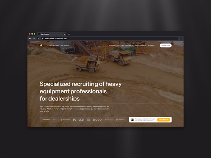
33Across Website Redesign for Enhanced User Experience
Austin Bethell
🎯 Objective
Redesign the 33Across website to deliver a more modern, conversion-optimized experience that clearly communicates the product’s value while reinforcing trust with publishers and advertisers.
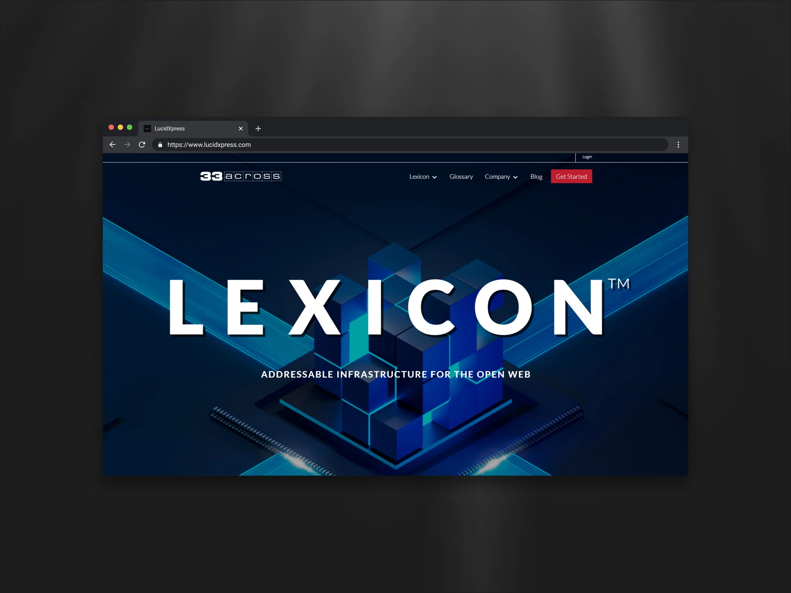
🔍 Original Site Analysis
The previous 33Across website had a strong brand identity but struggled with clarity, layout structure, and conversion flow. Key issues included:
Unclear Messaging: The hero section and above-the-fold content didn’t immediately communicate what 33Across does or why it matters.
Visual Clutter: Competing CTAs, dense blocks of text, and inconsistent spacing made it hard to navigate and digest content.
Disconnected Flow: The user journey lacked cohesion, and important trust signals were buried beneath fold or spread out across disconnected pages.
✨ Redesign Highlights
The new design prioritizes clarity, scannability, and trust-building with a sleek, tech-forward aesthetic:
Clear Value Prop: The new hero section delivers an immediate, plainspoken summary of what 33Across offers—without buzzwords or distractions.
Stronger Visual Hierarchy: Typography, spacing, and layout were reworked to guide users naturally down the page, making each section distinct and purposeful.
Modern, Trustworthy Feel: Clean design with purposeful white space, subtle motion, and well-placed logos/testimonials signals credibility and modernity.
Focused Conversion Paths: CTAs are better placed and more relevant, leading users toward demo requests, product exploration, and contact forms with less friction.
📈 Impact on Conversions
This redesign is set up to drive higher engagement and lead generation by:
Increasing Message Clarity: Users now understand what 33Across offers within seconds, reducing bounce and confusion.
Improving Perceived Credibility: A polished, enterprise-grade aesthetic builds trust with partners, buyers, and stakeholders.
Streamlining Navigation: Logical content flow and intuitive layout reduce user frustration and improve time on site.
🛠️ Tools & Technologies
Elementor/WordPress: Used to design and develop a fast, responsive, and interactive experience.
Responsive Design: Ensures pixel-perfect usability across desktop, tablet, and mobile devices.
CMS-Ready Architecture: Built to scale with future content updates and new product rollouts.

Like this project
Posted Apr 14, 2025
Redesigned 33Across website for clarity, trust, and conversion optimization.