Instagram, UGC, Website : Arlo Hotel's MaryGold's Restaurant
REBRAND
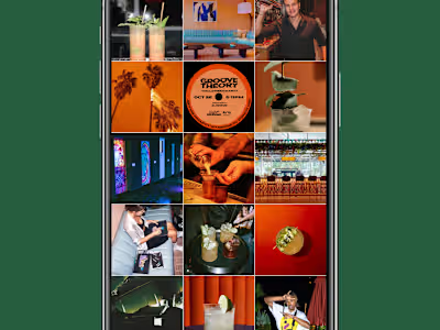
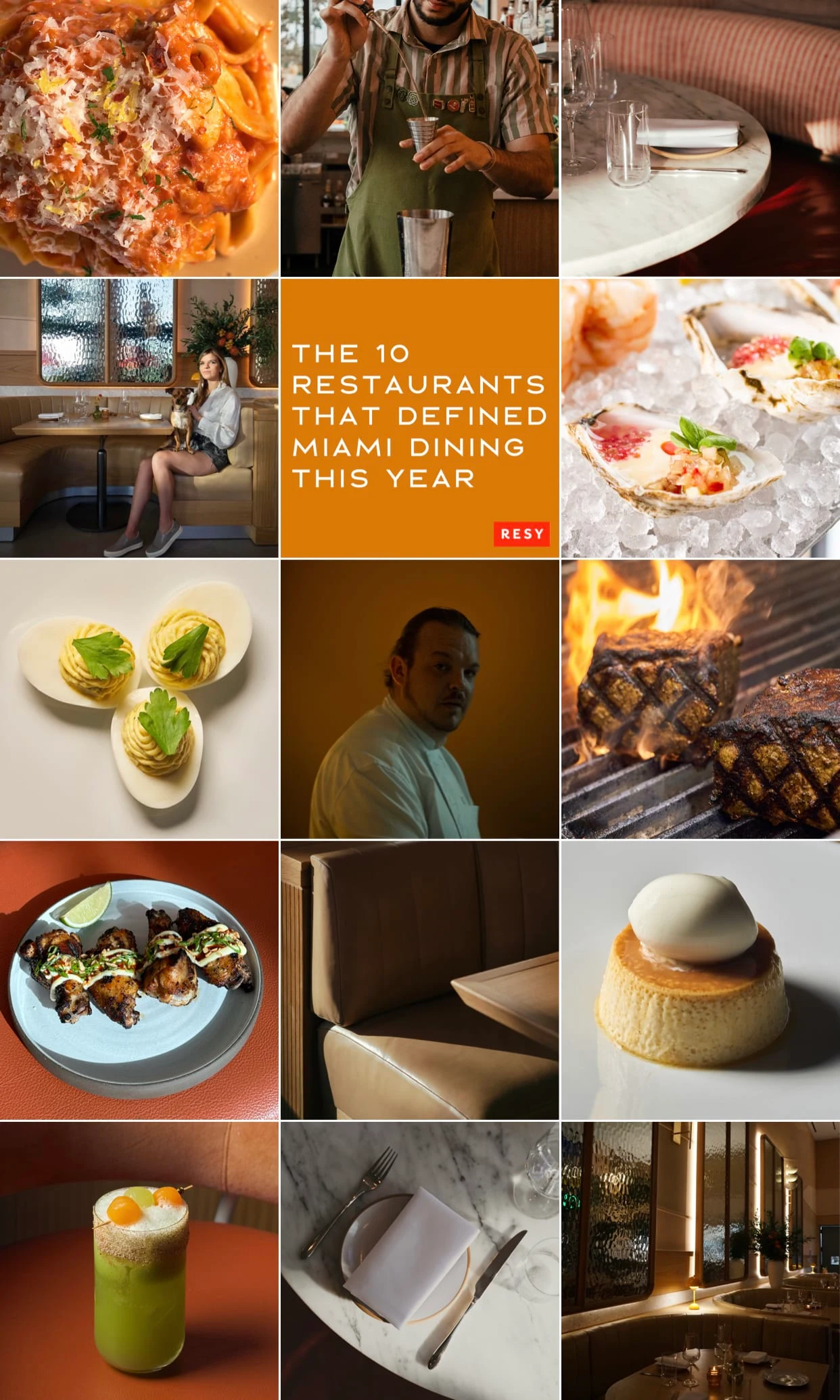
The objective was to elevate MaryGold's Restaurant to the standard worthy of being located inside the Arlo Hotel in Wynwood. We starting off by reimagining a cohesive and memorable grid that ties the ambiance, food, decor, and story together. I picked new brand colors (orange, white, and a shade of brown) since these colors were the common denominator amongst the majority of their existing content. The combination between the bright and dark photos give the feed a sense of elegance and refinement. In addition, this layout makes it easier to digest all the different elements individually at once.
Overall, this grid includes a diversity of highlights: cocktails, desserts, happy hour specials, appetizers, mains, the chef, bartenders, the food-making process, guests, the venue, and our interior design.
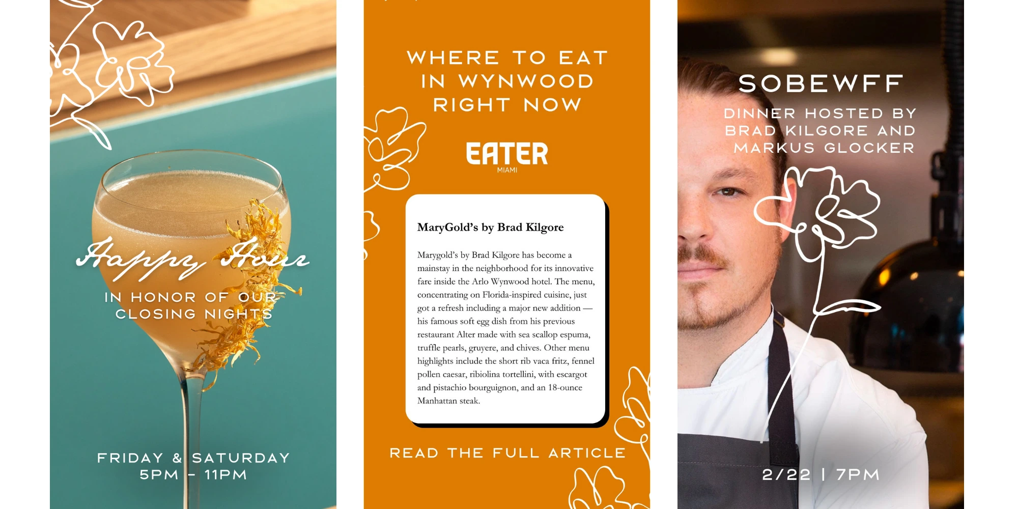
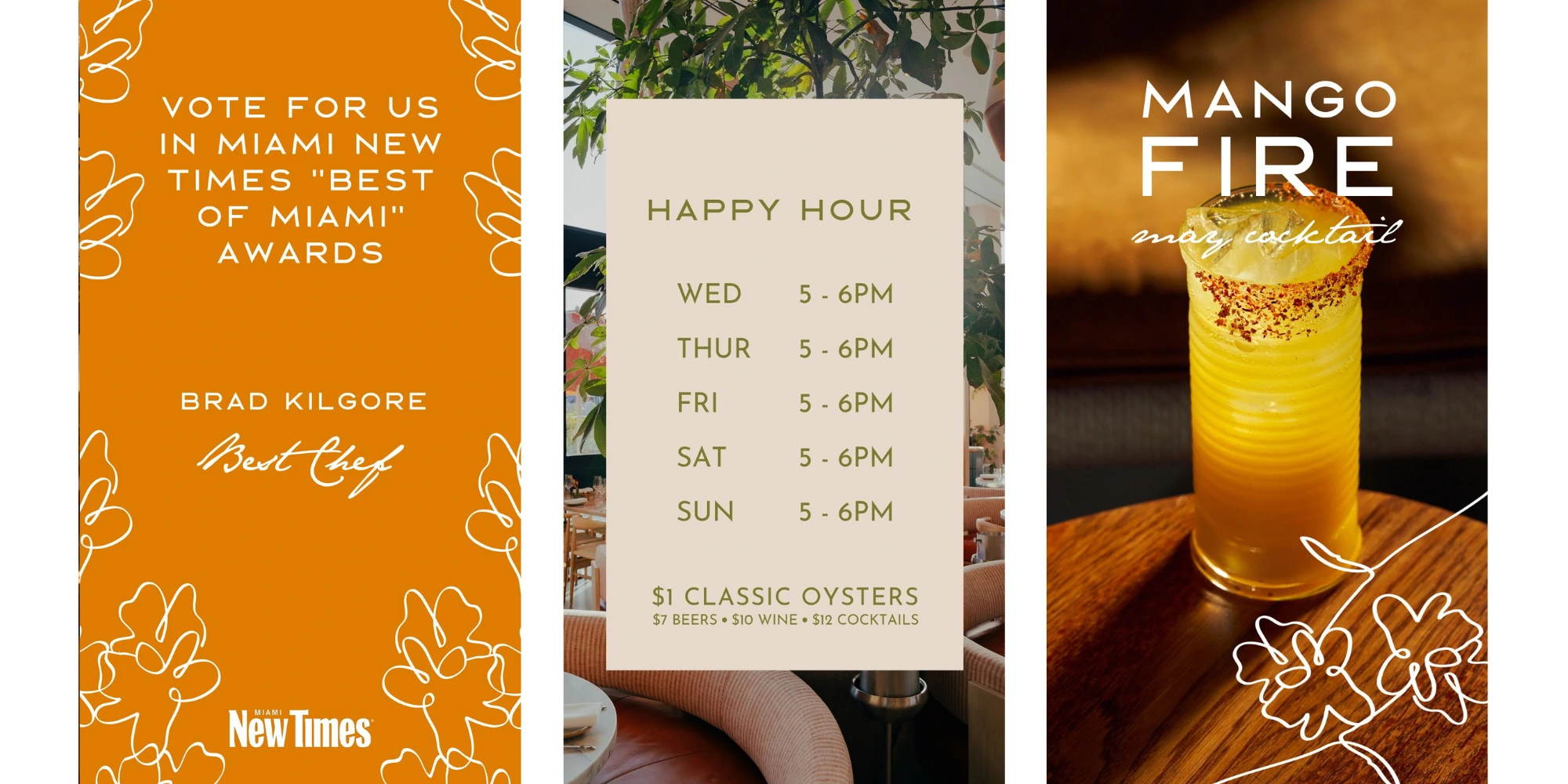
CUSTOM GRAPHIC STORIES:
UGC:

VIDEOGRAPHY:
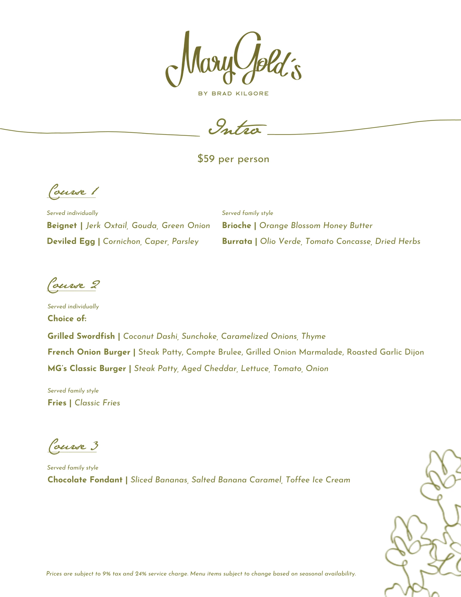
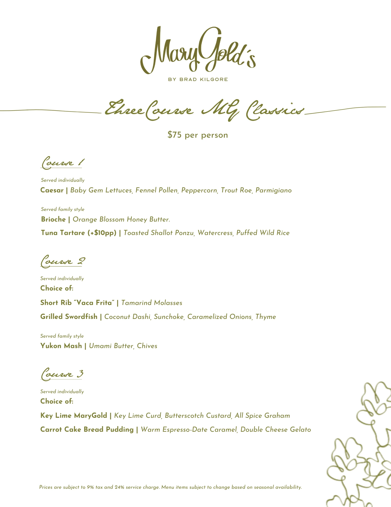
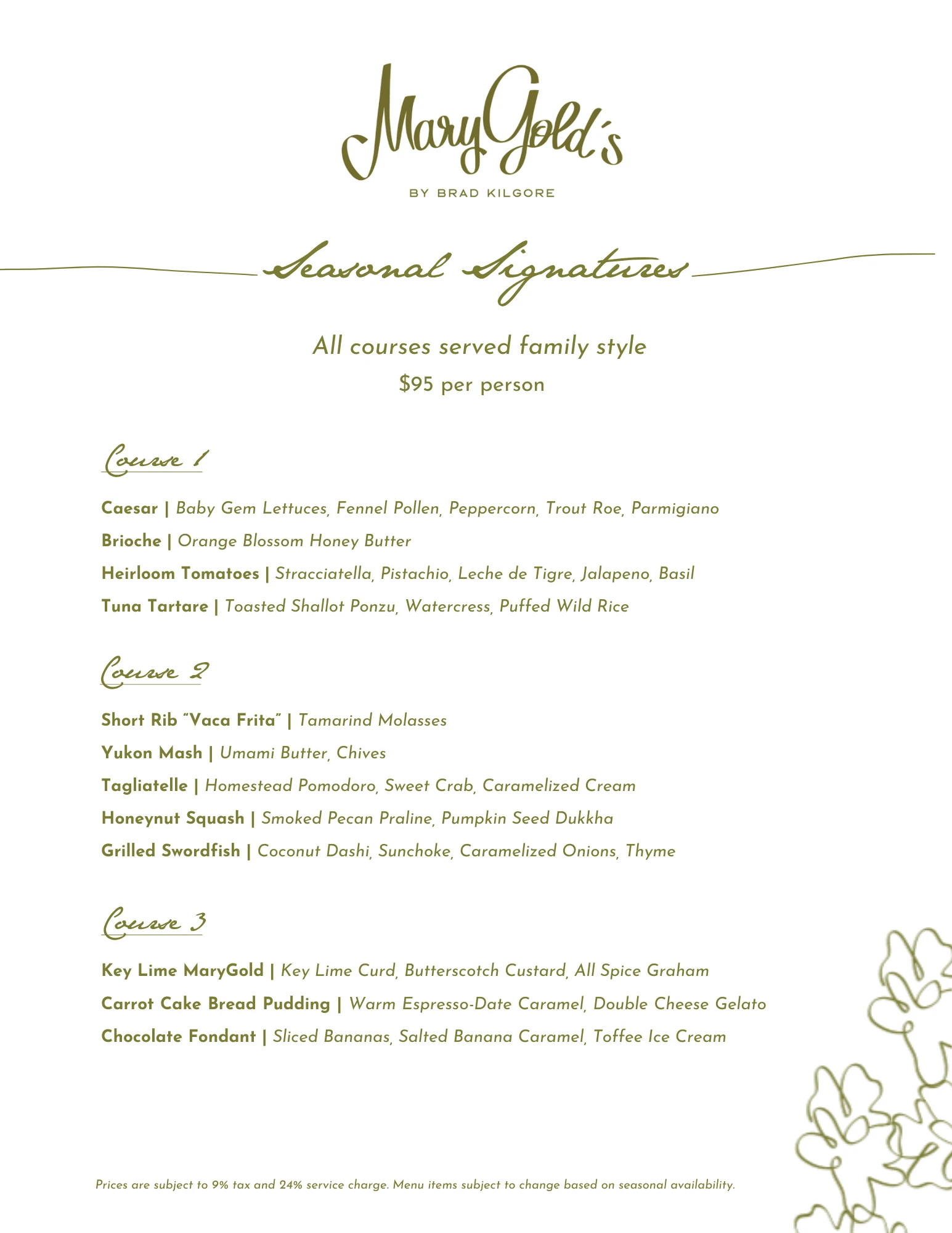
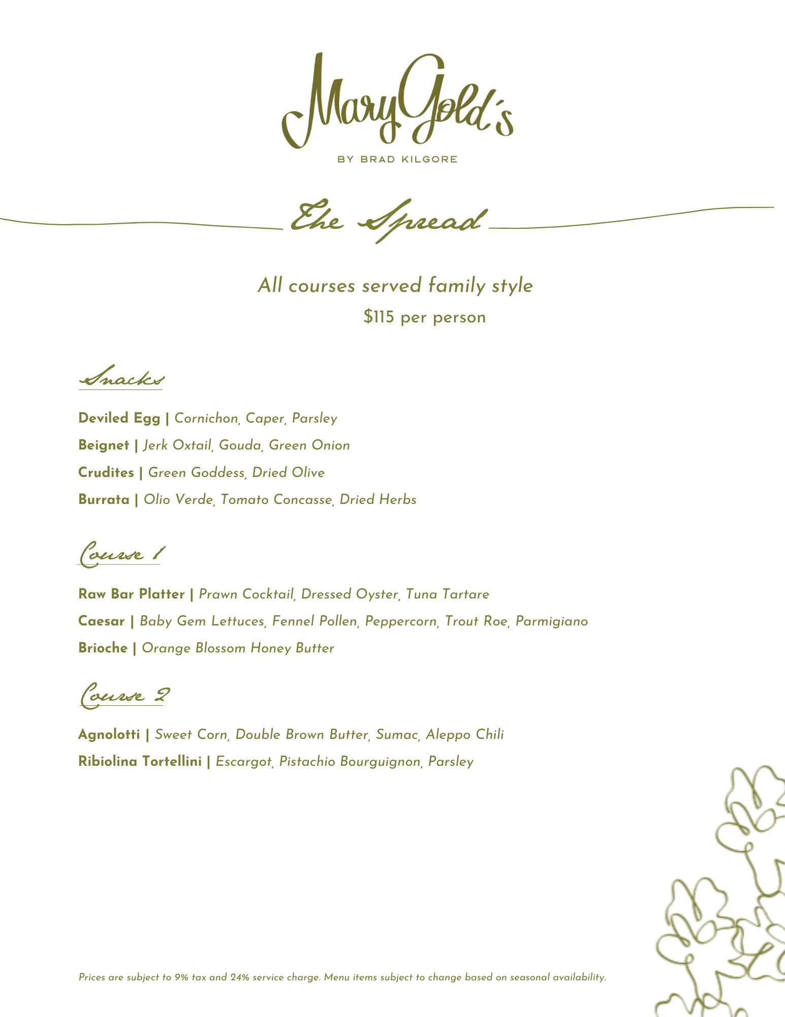
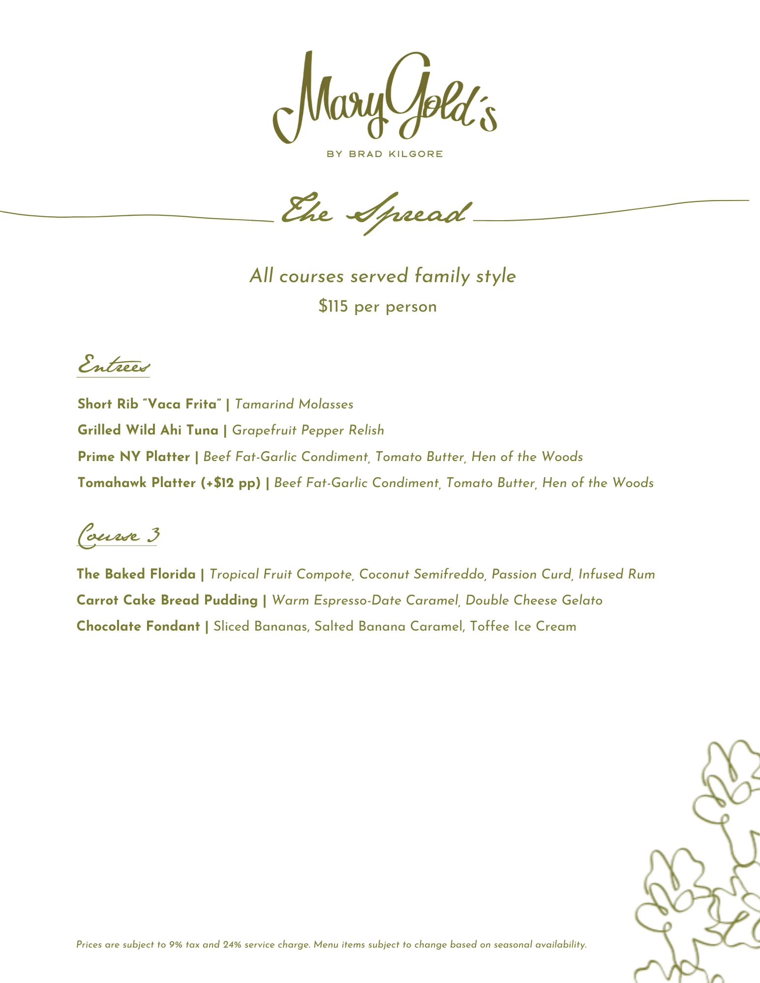
GROUP PRIX-FIXE MENU DESIGN:
Like this project
Posted Jan 9, 2024
MaryGold’s is a modern restaurant located inside Arlo Hotel in Miami from renowned chef Brad Kilgore named Best New Chef in America by Food and Wine Magazine.
Likes
0
Views
60
Clients

Arlo Hotels


