Built with Framer
Waylight — Web redesign for a Creator Platform with 50K+ Users

Samuel Nathaniel

Waylight — Website Redesign for a Creator Platform with 50,000+ Users
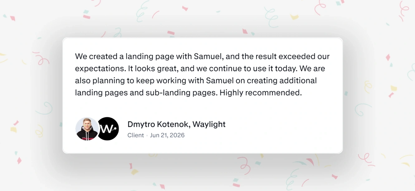
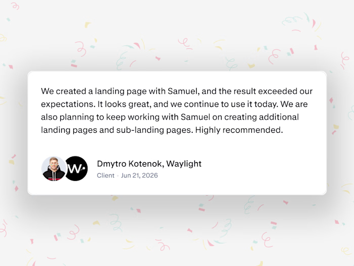
Contra review - Dmytro (Founder @Waylight)
A fast-growing creator-commerce platform needed a landing page that matched its scale.
Waylight today (company reported)
50,000+ users served
$2M+ annual creator earnings
20+ countries
📍THE CHALLENGE
Waylight helps creators sell memberships, products and tickets straight from social media. The product had grown fast, but the landing page still looked like an earlier version of the company: flat, dark and generic.
For a platform that handles payments and weekly payouts for tens of thousands of creators, that undersold it.
Credibility matters when you ask people to trust you with their income, and Waylight brought me in to fix that.
BEFORE: Old website 👇

BEFORE: Waylight's old website design
📍WHAT I DID
I redesigned the full landing page in Figma and rebuilt the visual identity to match where Waylight is now, not where it started. A few of the calls I made:
Replaced the dark, heavy background with a lighter, more premium palette that feels current.
Rebuilt the hierarchy so the product's value is clear in the first five seconds, not after scrolling.
Designed the hero to read as a serious SaaS product, not a generic template.
📍SCOPE
Figma design only. The Waylight team handled implementation and development.
AFTER: New website 👇

AFTER: New design for Waylight
Live website: 👉 https://waylight.me/
📍THE OUTCOME
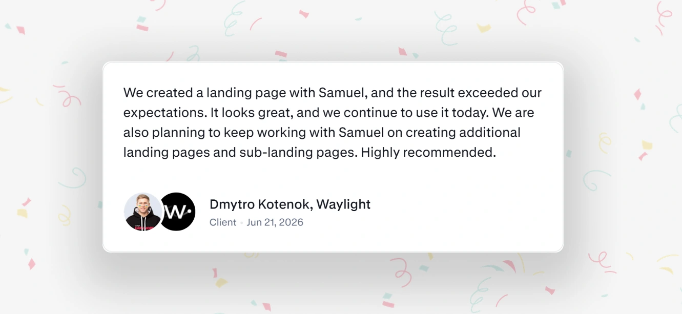
Contra review - Dmytro (Founder @Waylight)
Before launch, Waylight also shared the design with close clients, and the feedback was unanimous: it felt "more credible," more "like them," and more likely to convert.
...Waylight has since come back for more design work.
Deliverable: High-fidelity Figma landing page design
Industry: Creator Economy
Service: Figma Design Only
If your product has outgrown its landing page, I'd love to help fix that.
📩Send me a message!
Like this project
Posted Jun 14, 2026
Redesigned the landing page for Waylight, a creator-commerce platform with 50,000+ users. Figma design built to look as credible as the product.
Likes
0
Views
16
Timeline
Jan 22, 2026 - Jun 6, 2026
Clients
Waylight