SisterWorks | Website & Mobile Redesign
Overview
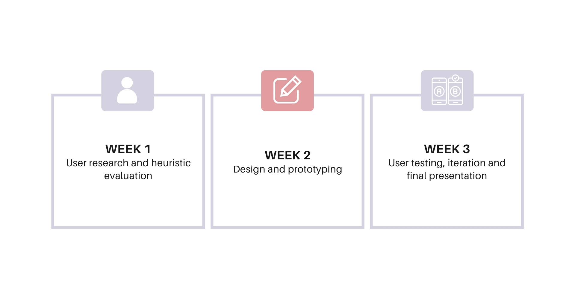
Working in a team of three, we collaborated for three weeks to redesign SisterWorks' website as part of our group project. We identified that the existing website layout and content did not address the needs of their target users (immigrant and refugee women).
Based on our ideation, we identified three (3) key features to improve - homepage, program page and registration.
SisterWorks was my suggestion when asked to find a NGO to redesign. As a team composed entirely of women from different backgrounds, we resonated deeply with SisterWorks' goal to empower refugee and immigrant women"
My role
In this project I was able to showcase my skills in UX research and UI design. I did the Program and course page user flow down to its hi-fidelity prototype design.
Timeline
Why was there a need for a redesign?
The website neglects its mission and vision by prioritising donations and volunteers over its main target user - immigrant and refugee women.
Limited accessibility of information for target users in understanding the support and programs offered by SisterWorks.
The website has poor hierarchy and content redundancy which causes confusing user experience.
Problem statement
How might we leverage the SisterWorks website to help empower women who are refugees, asylum seekers, or immigrants to acquire skills and find employment opportunities?
Design Process
User research
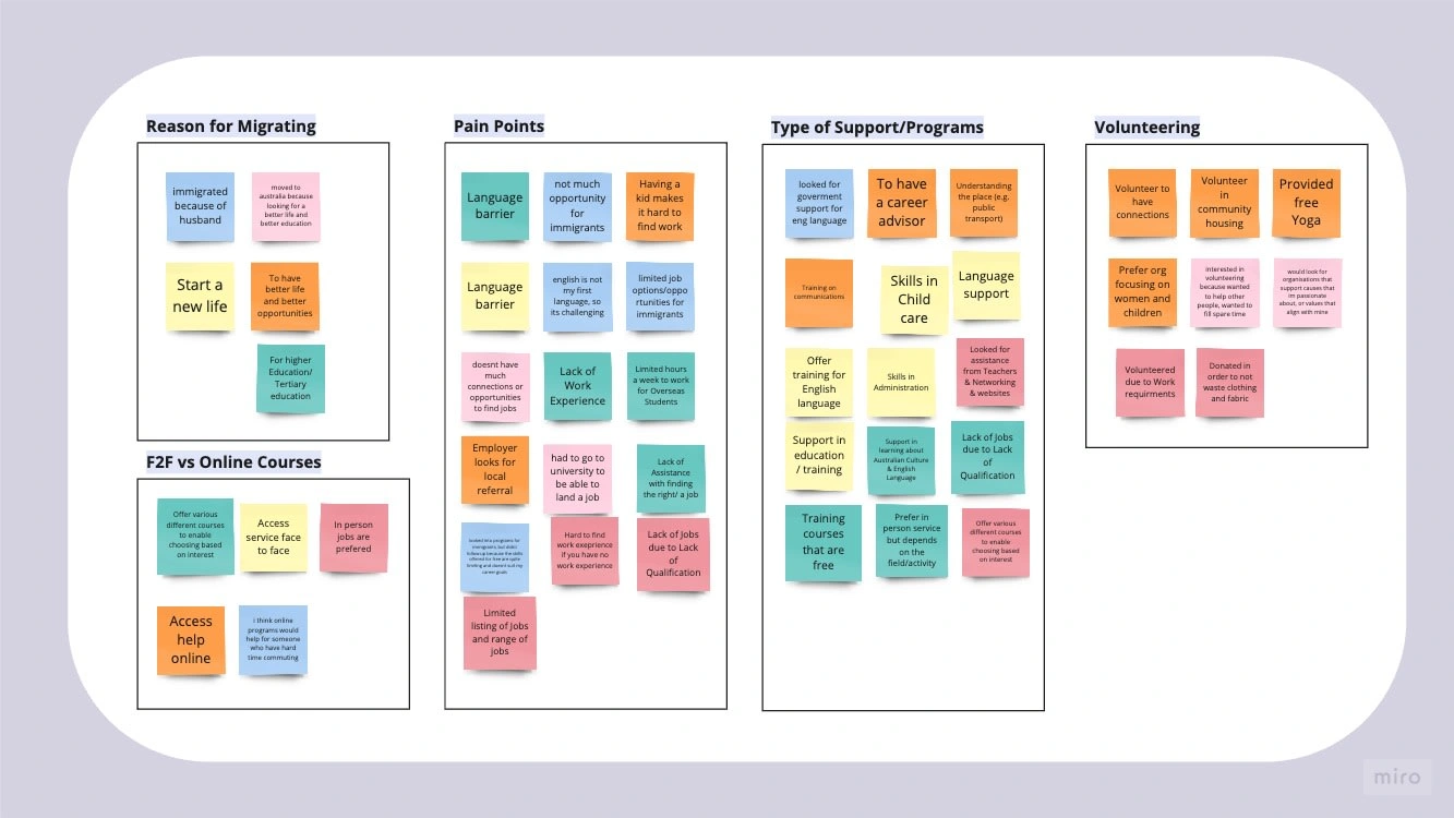
We conducted interviews among five individuals, presenting them with a set of 10-15 carefully curated questions.
Five (5) key themes emerged from our interviews:
We also prepared a short-survey and tried contacting SisterWorks to fully understand their website and their user, however they never responded back to us.
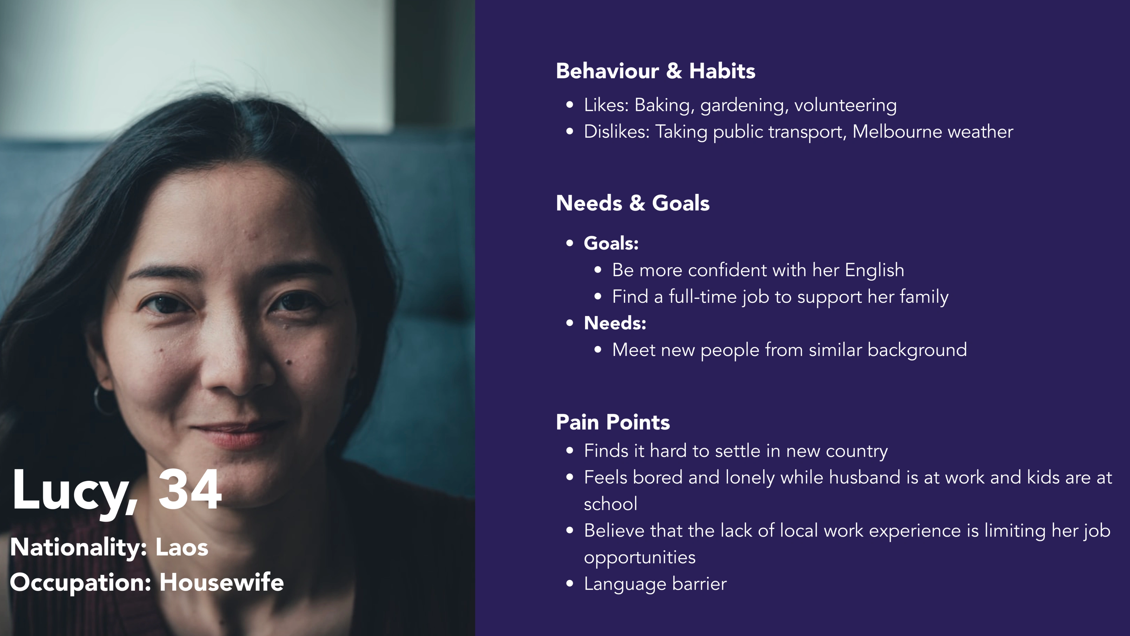
User Persona
Competitor Analysis
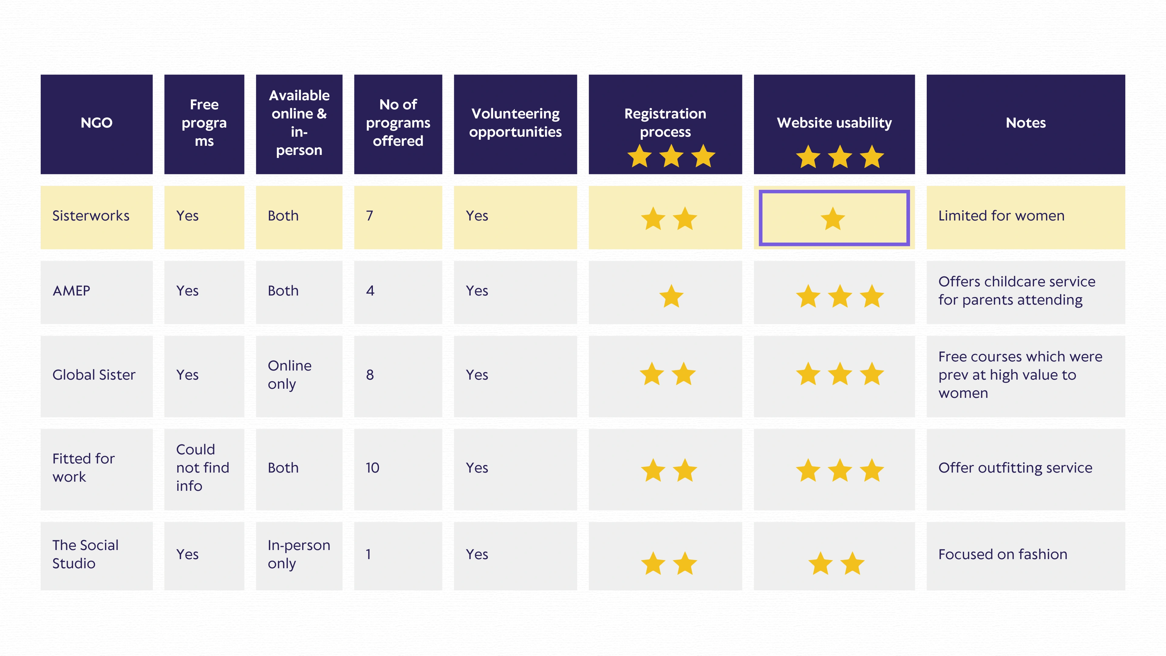
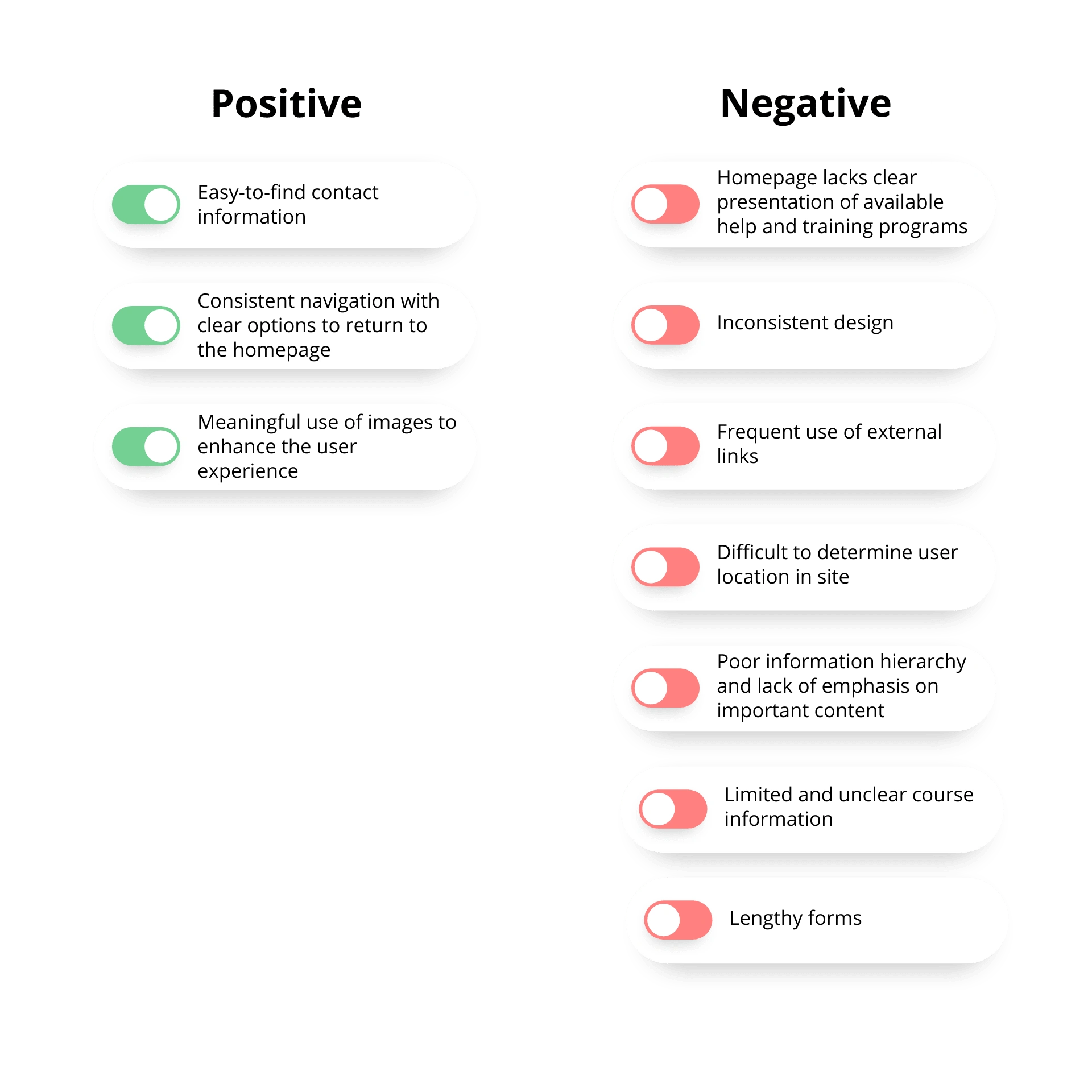
Due to low score on its Website Usability, we conducted a heuristic evaluation.
Identifying Key Focus Areas
We also invited a few of our classmates to do a five second testing on the SisterWorks website. From here, using the prioritisation matrix we were able to identify the key features that we will focus on in our redesign process.
Improve homepage and display program courses.
Clear program information without external links.
Simplify registration form.
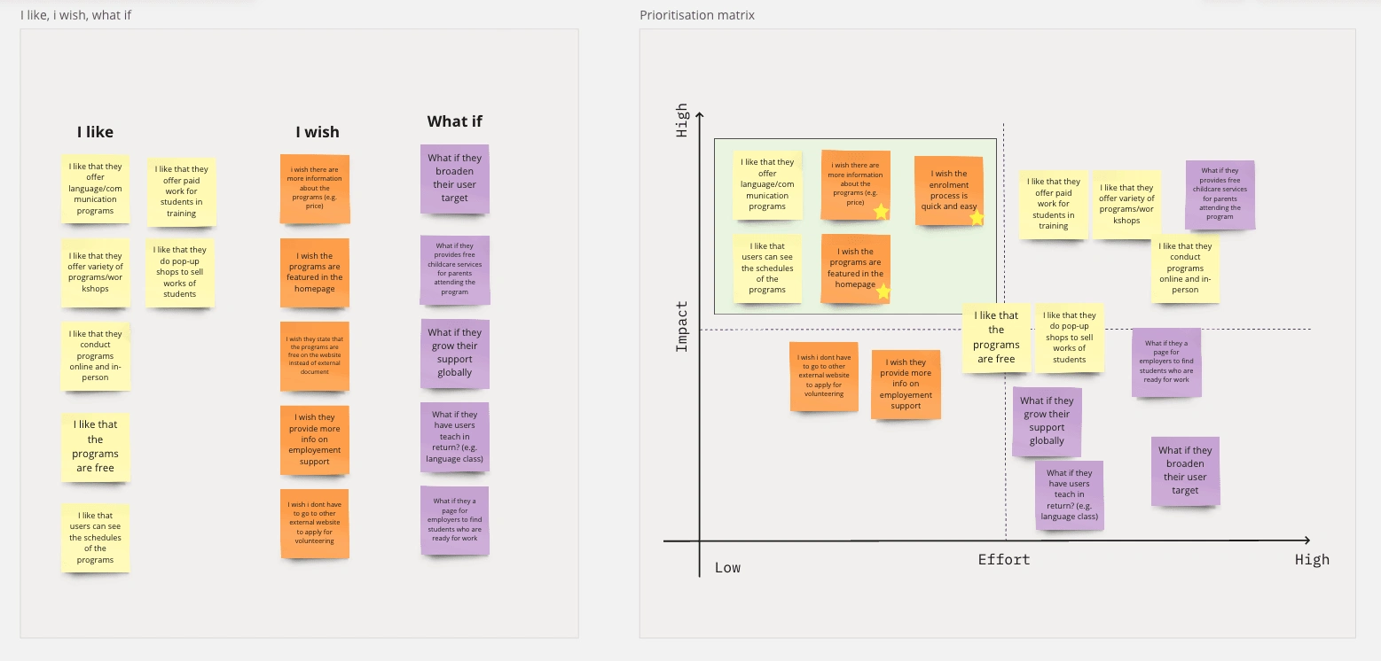
Left photo: I Like, I Wish, What if insight
Right photo: Prioritisation matrix
Design Solution
Based on the identified features, we divided the task to each team member. I took on the challenge of redesigning the Program Page. From here, I will primarily focus on sharing the details of my work and the improvements made to the program page.
When I designed the page, I focused on the following:
What is the main goal of the user when they visit the program page?
How the user interacts the page?
How the content in the page address the needs of the user?
User Flow
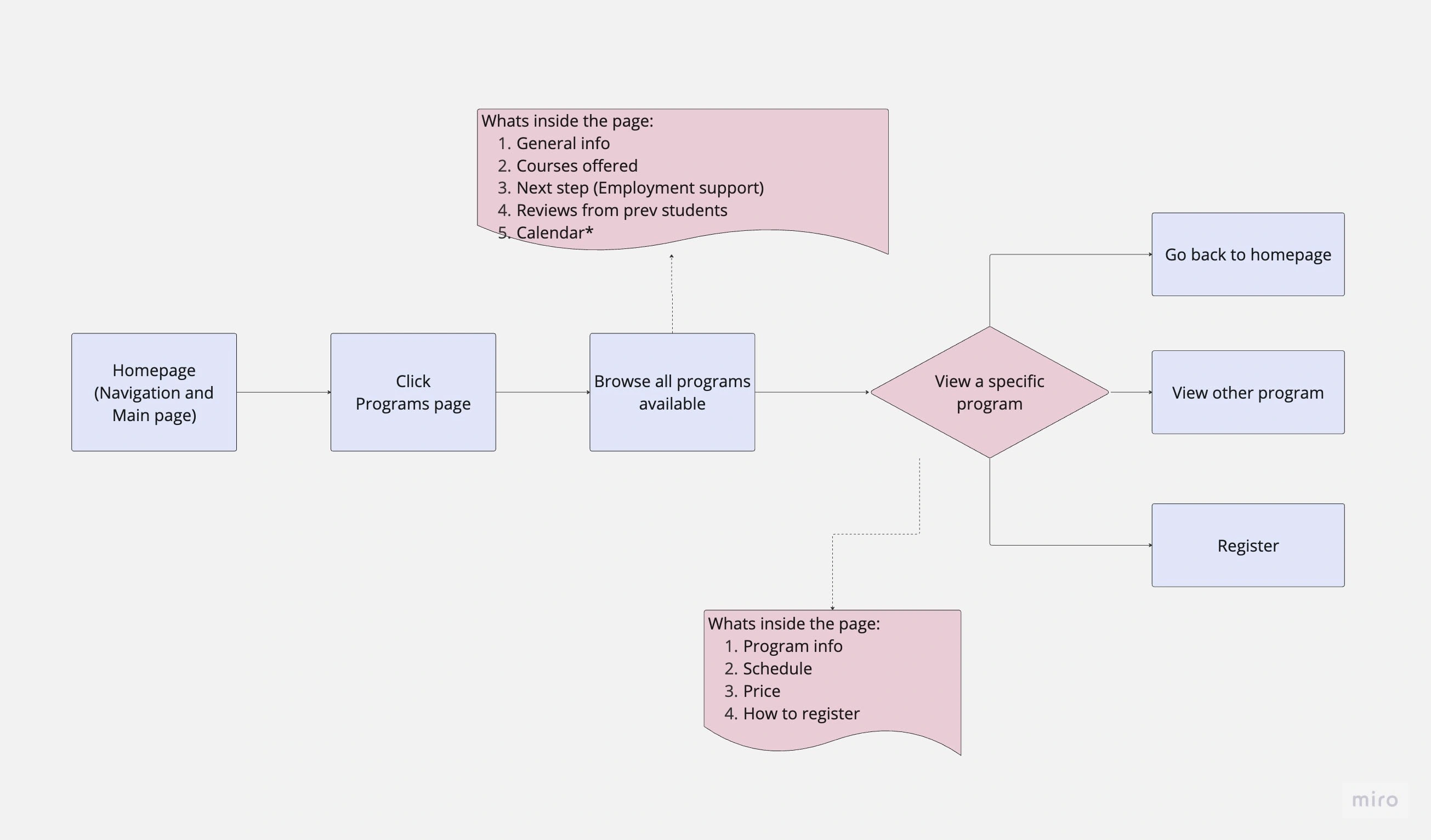
Our target users will visit the program page to seek job-oriented training programs suitable for them. They expect easily accessible information and clear instructions on how to participate in these programs. By utilising card sorting, I was able to determine content redundancy, information hierarchy, and optimal presentation methods to meet user requirements.
The user flow will showcase the user interaction of the page.
Prototyping
Now lets put it into action!
I created two (2) wireframe designs from Miro and conducted an A/B testing. I also created a separate page for the specific course.
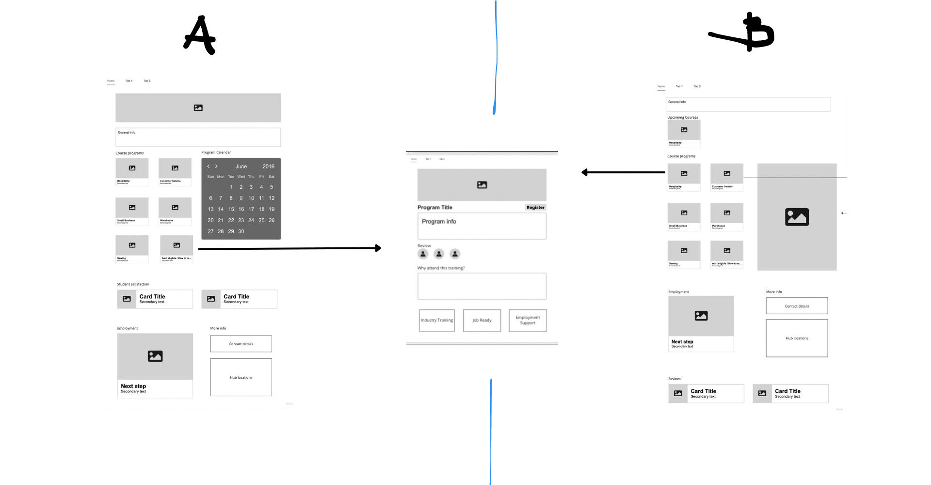
The A/B testing led me to incorporate elements from both the A and B layouts. I quickly implemented these design changes into a clickable prototype and conducted another round of user testing.
Redesign
You can see the comparison of the SisterWorks website and my proposed design.
Program page
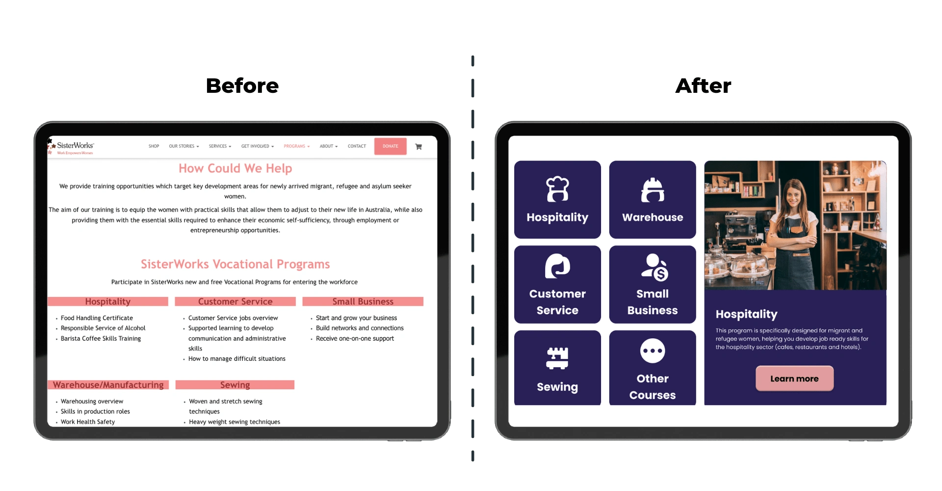
Comparing Program Courses
Design Solution 1: Replaced lengthy textual content with easily recognisable icons representing each program, accompanied by concise descriptions for enhanced user understanding upon selection.
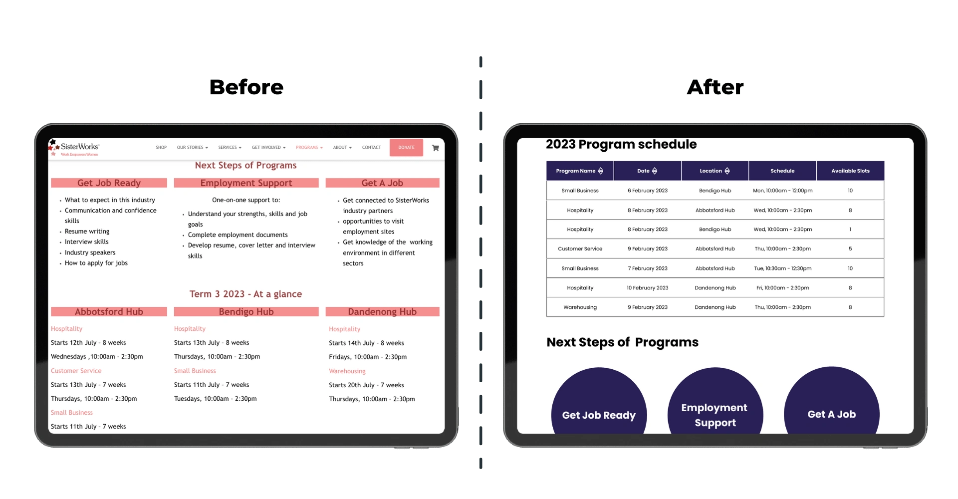
Comparing Program Schedule and Next Steps
Design Solution 2: Implemented a user-friendly table format for presenting program schedules, enabling easy filtering and sorting. Streamlined the Next Step section by removing redundant text and retaining key points.
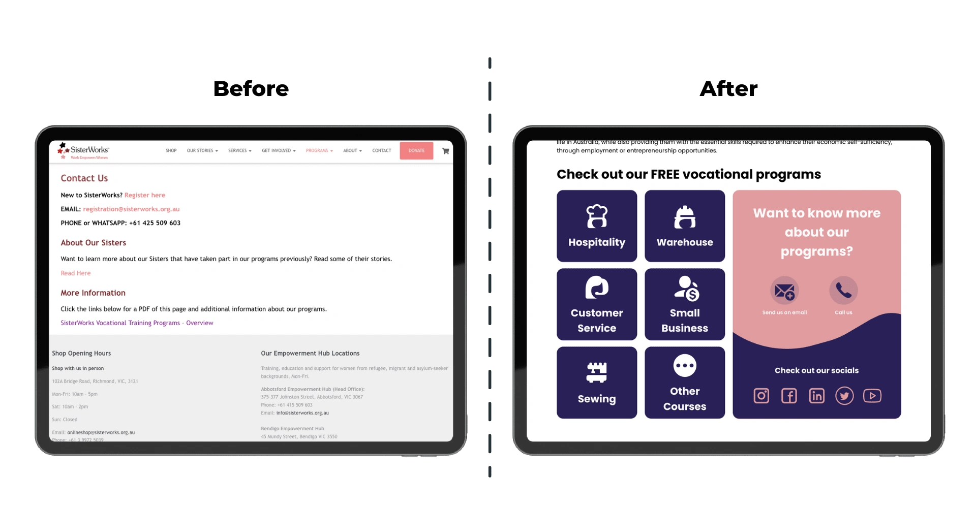
Comparing Contact Info
Design Solution 3: Enhanced usability by relocating contact information to the top of the page for easy access. Incorporated various social media links to provide users with additional resources and information about SisterWorks.
Specific Program Course (Hospitality Program)
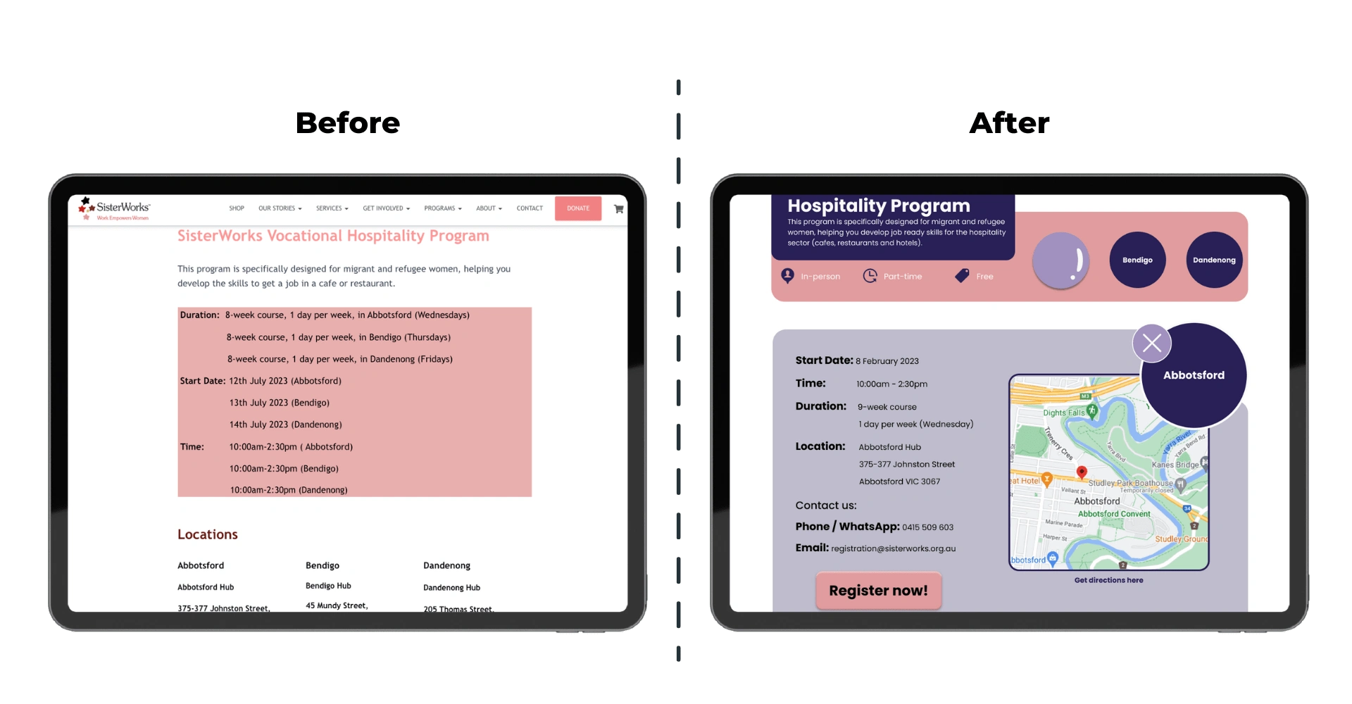
Comparing program details
Design Solution 4: Improved presentation of program details. Common and similar information are shown in the main page such as duration and price.
Design Solution 5: Implemented location buttons for convenient access to course details specific to each location, eliminating the need for external page redirection.
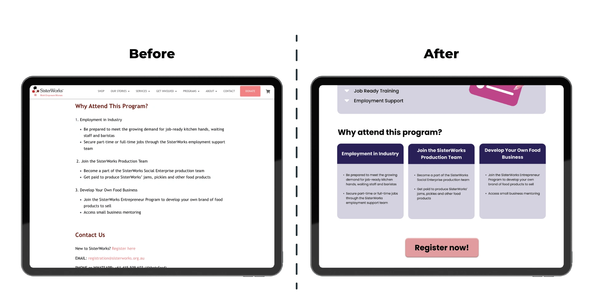
Comparing Why Attend this Program?
Design Solution 6: Used cards to enhance the readability and visibility of the 'Why Attend This Program' section, offering a user-friendly and visually appealing presentation.
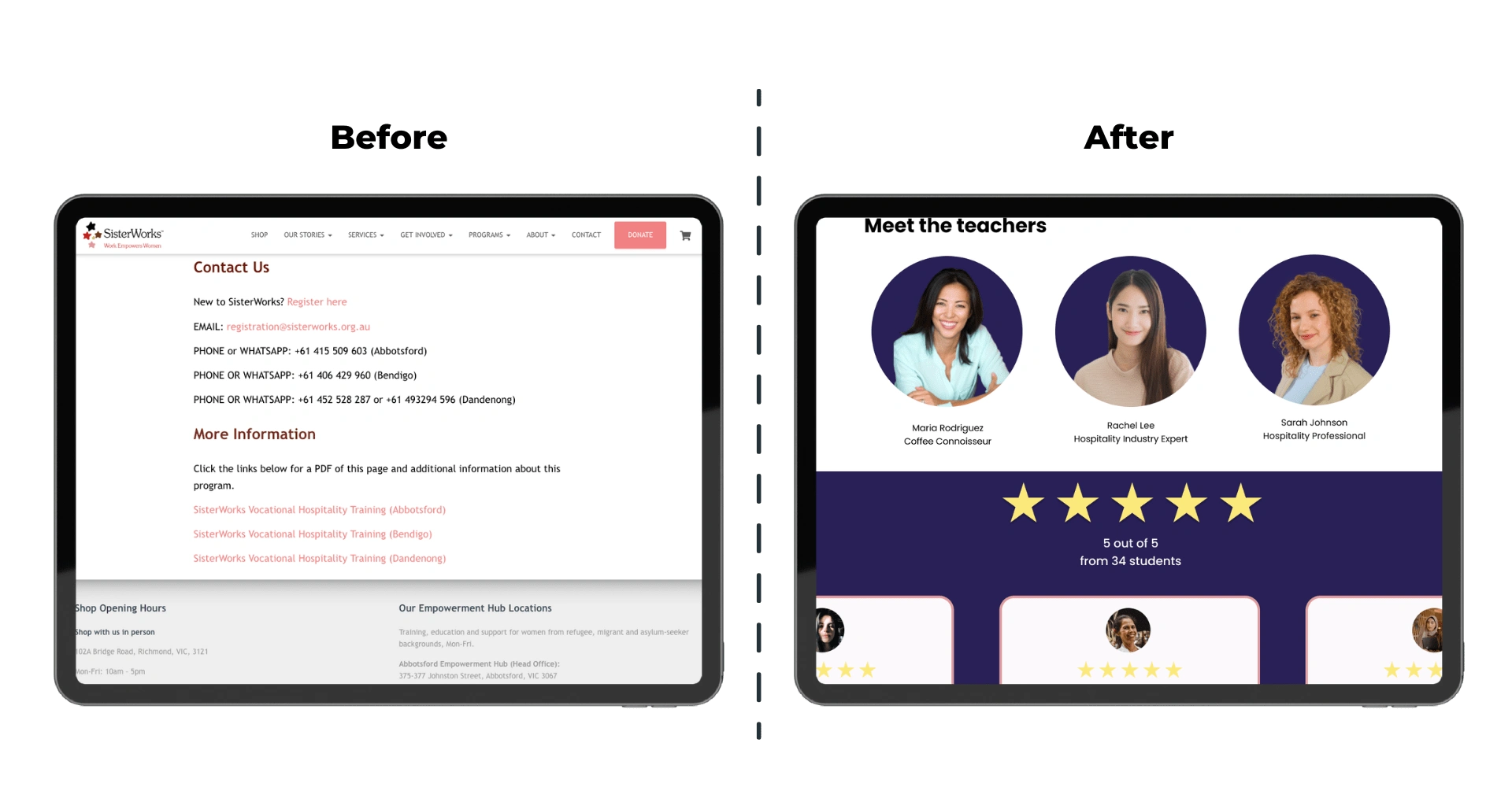
Other information in the page
Design Solution 7: Added Meet the Teachers' section and included reviews and ratings from previous students, enhancing transparency and providing valuable insights to potential participants.
Interactive Prototype
I also developed a mobile-responsive design to ensure optimal user experience across different devices. Feel free to explore the interactive prototype by clicking the link below.
Learning
I really enjoyed working with my group. I have learned the value of teamwork, knowing the power of delegating tasks and believing in each other.
Plan ahead. We decided on our colour palette, font style and common components as soon as possible and these made our design cohesive despite the limited time to communicate with each other.
Information architecture and doing heuristic evaluation is very helpful when redesigning a website.
Believe in the power of will and technology. I was literally in an Uber trying to catch my flight while presenting this project in class.
Like this project
Posted Jun 30, 2023
Redesigned NGO website for immigrant & refugee women. Enhanced UX/UI, prioritised user needs, and improved key pages for a seamless experience.

