my1416 Mobile Experience Redesign
Approve request to show earnings
View

Waleed Sabir
Verified


my1416 redesign
Overview
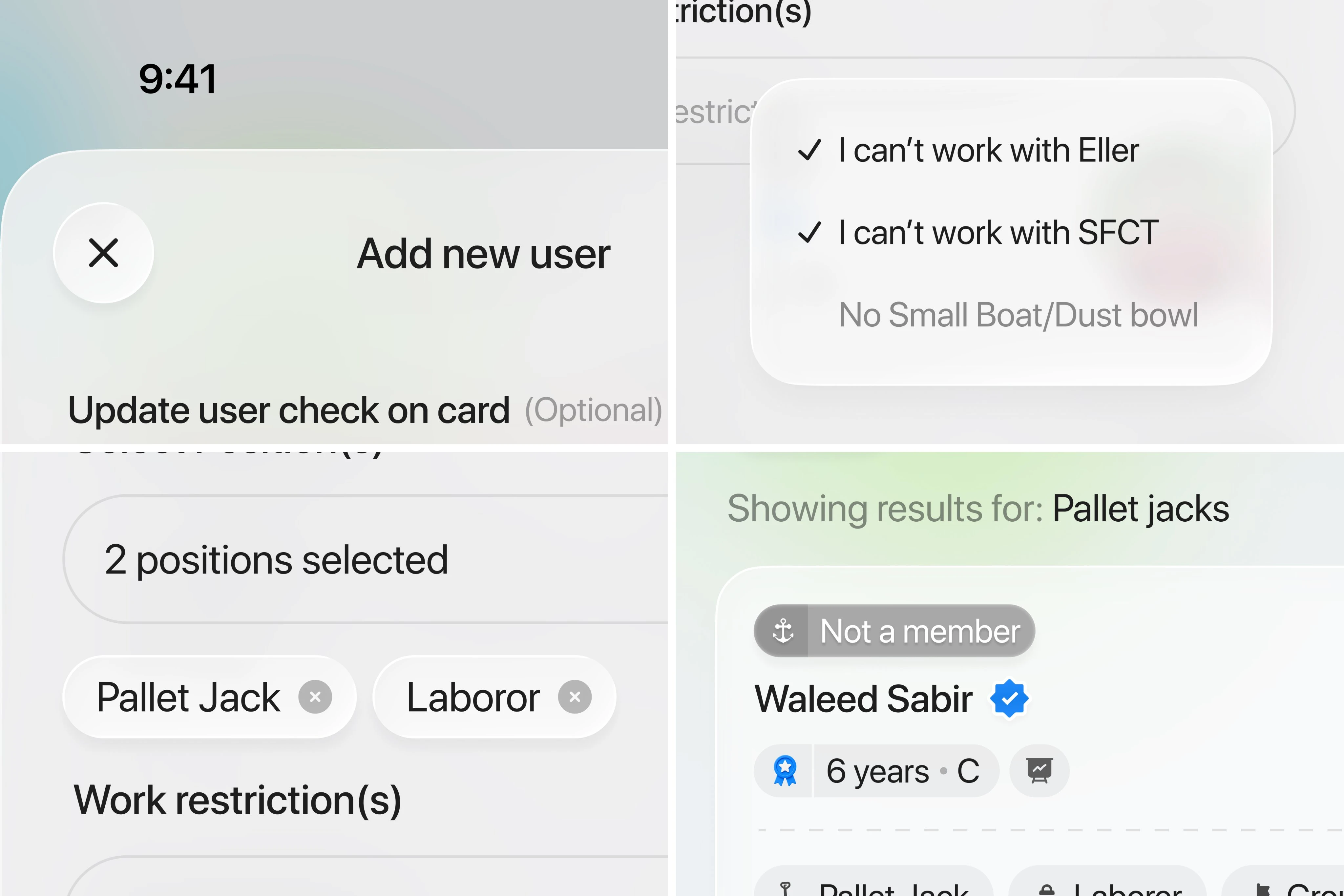
my1416 returned for its third redesign in five years, looking for a new visual direction that felt current without losing the familiarity of the product experience. I shaped a refreshed interface around a Liquid Glass-inspired aesthetic, with a focus on clarity, depth, and a more refined mobile experience.
The brief
The challenge was to introduce a distinct new visual language while keeping the experience easy to scan and navigate. The redesign needed to feel more polished at every touchpoint, from the page structure to the smaller interface details.
Design direction
I used Figma to explore a lighter, layered interface system informed by Liquid Glass. The work centered on:
Establishing a cleaner visual hierarchy for mobile screens
Introducing translucent surfaces, depth, and softer transitions
Refining spacing, typography, and component consistency
Keeping key actions visible and easy to reach
Outcome
The resulting concept gives my1416 a fresh, more expressive direction while maintaining a focused user journey. It creates a foundation for the product to evolve visually without making the experience feel unfamiliar.
Role: Mobile Designer, UI Designer, UX Designer
Tools: Figma, Claude
Like this project
Posted Aug 10, 2026
A third redesign for a returning client, reimagining my1416 with a fresh Liquid Glass direction and a more polished mobile experience.
Likes
0
Views
4