Bridox Website Redesign

Waleed Sabir
Verified


Overview
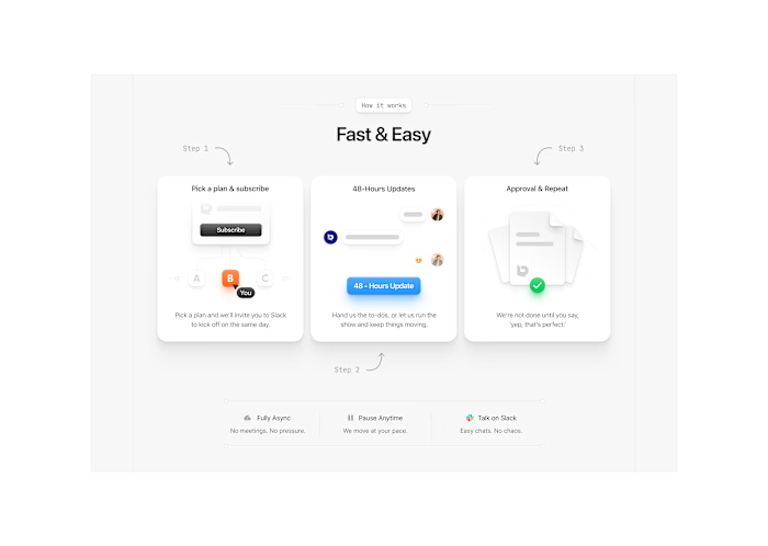
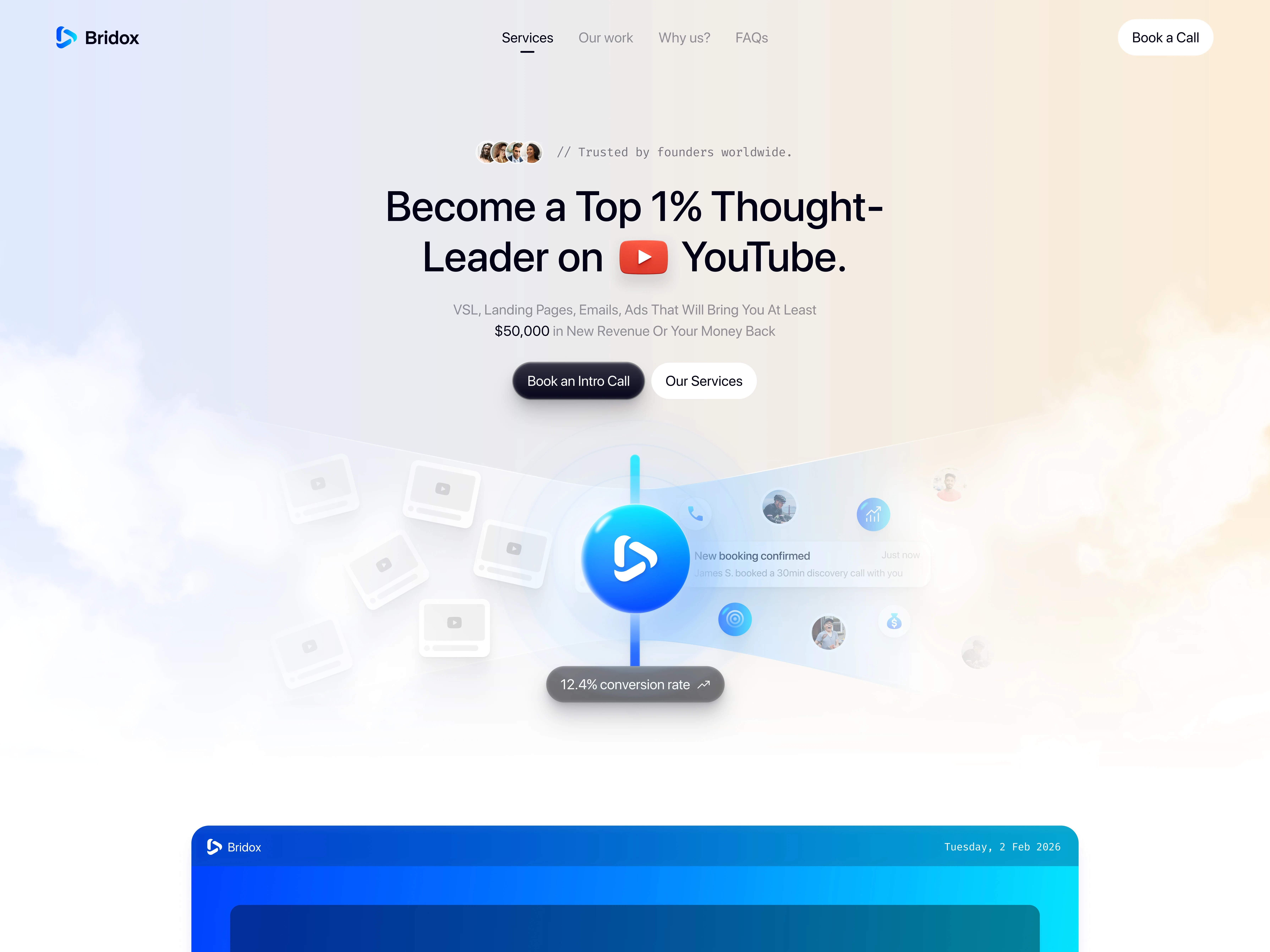
Bridox needed a website that felt clearer, more polished, and easier for visitors to navigate. I redesigned the experience with a sharper visual system and a stronger focus on guiding users toward key actions.
The challenge
The existing site needed a more cohesive structure and a cleaner presentation of Bridox’s offering. The goal was to reduce visual friction while making the brand feel more confident and modern.
My approach
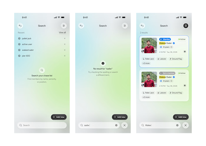
I reworked the site’s layout, hierarchy, and interface details in Figma. The redesign focused on:
Simplifying page structure and navigation
Creating a more consistent visual language
Improving readability and content hierarchy
Designing clearer calls to action throughout the experience
Outcome
The final direction gave Bridox a cleaner, more conversion-focused website concept that better supports its brand and makes the user journey easier to follow.
Role: UI Designer, UX Designer, Web Designer
Tools: Figma, Claude
Like this project
Posted Aug 10, 2026
A focused website redesign for Bridox, bringing clearer structure, a sharper visual system, and a more purposeful path to action.