Flowfit - Nutrition and Fitness App Development
Amelia Pettitt
Flowfit - Fitness app
Overview
Flowfit is a nutrition and fitness-tracking app built from the ground up over 8 months, a collaboration between a designer and a developer — my brother and me. The brief was simple: build something we'd actually use ourselves, and build it properly.
The result is a full-stack mobile application with AI integration, a curated workout database, and macro tracking that uses trusted mathematical equations rather than guesswork.
The Problem.
Most fitness apps make one of two mistakes. They either overwhelm users with data and complexity, or they oversimplify to the point of being useless after week one. Logging meals is tedious. Workout tracking feels disconnected from nutrition. And the AI features that exist are often gimmicks with no real accuracy behind them.
Flowfit was built to solve all three.
What we built.
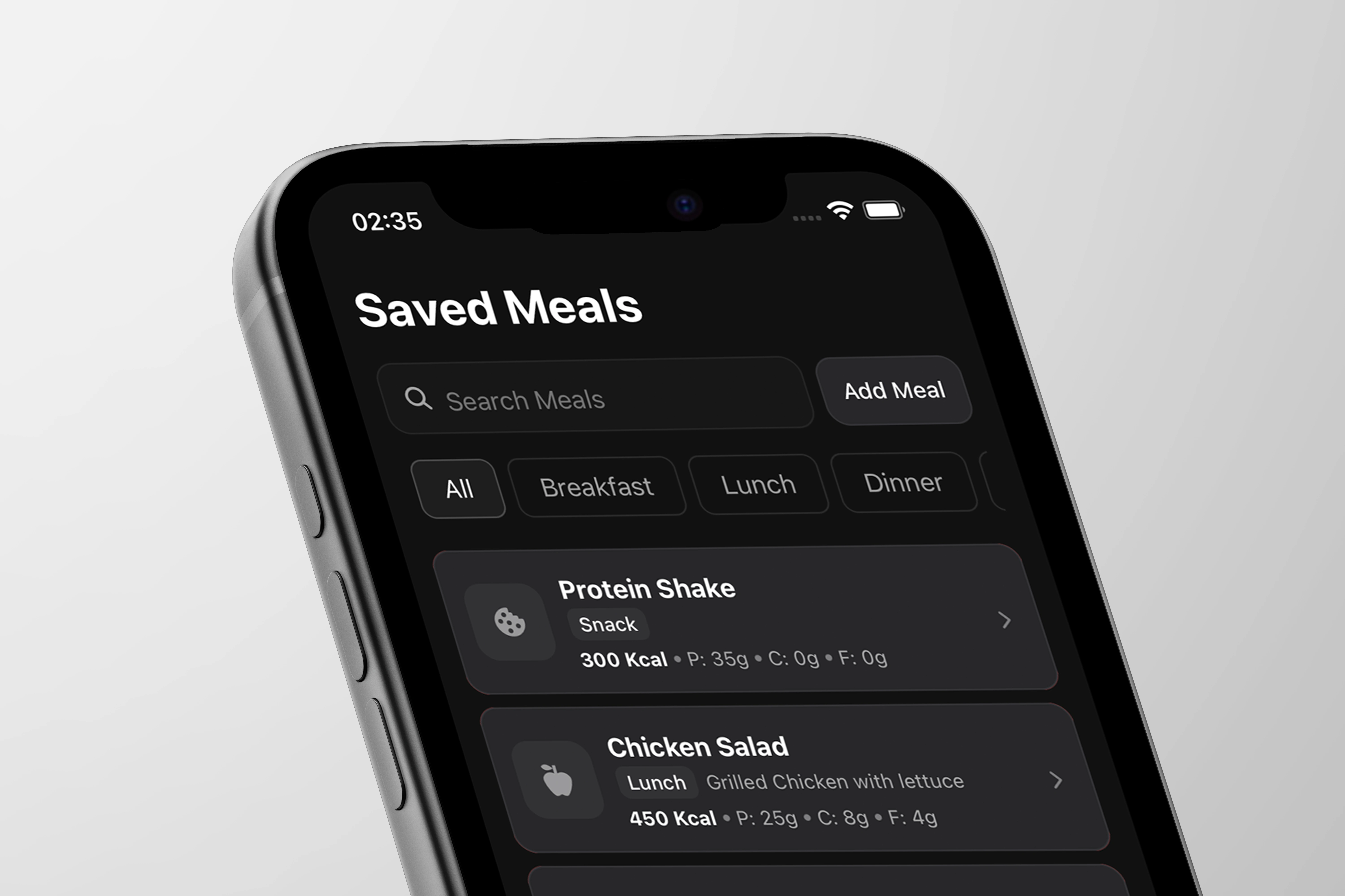
Macro & Meal Tracking
Users can log meals manually or use Flowfit's AI camera feature — point your phone at a meal and the app estimates macros from the image. Behind the scenes, macro calculations are based on established equations (Mifflin-St Jeor, Harris-Benedict) rather than rough approximations, so the numbers users are working to are actually trustworthy.
AI Integration
AI sits at the core of two key features: meal photo recognition for macro estimation, and intelligent recommendations built around the user's own data over time. The goal was AI that earns trust through accuracy, not AI as a selling point.
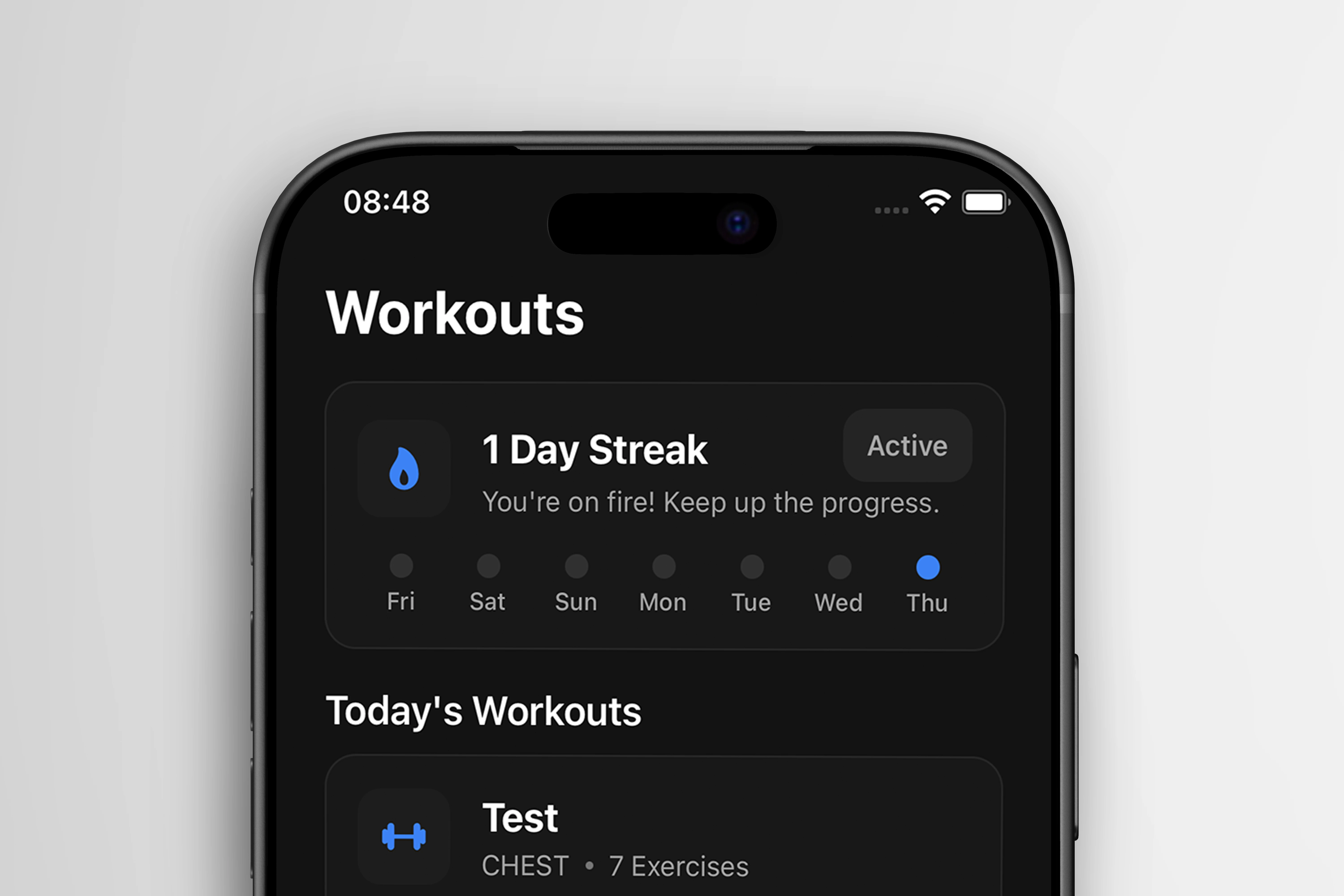
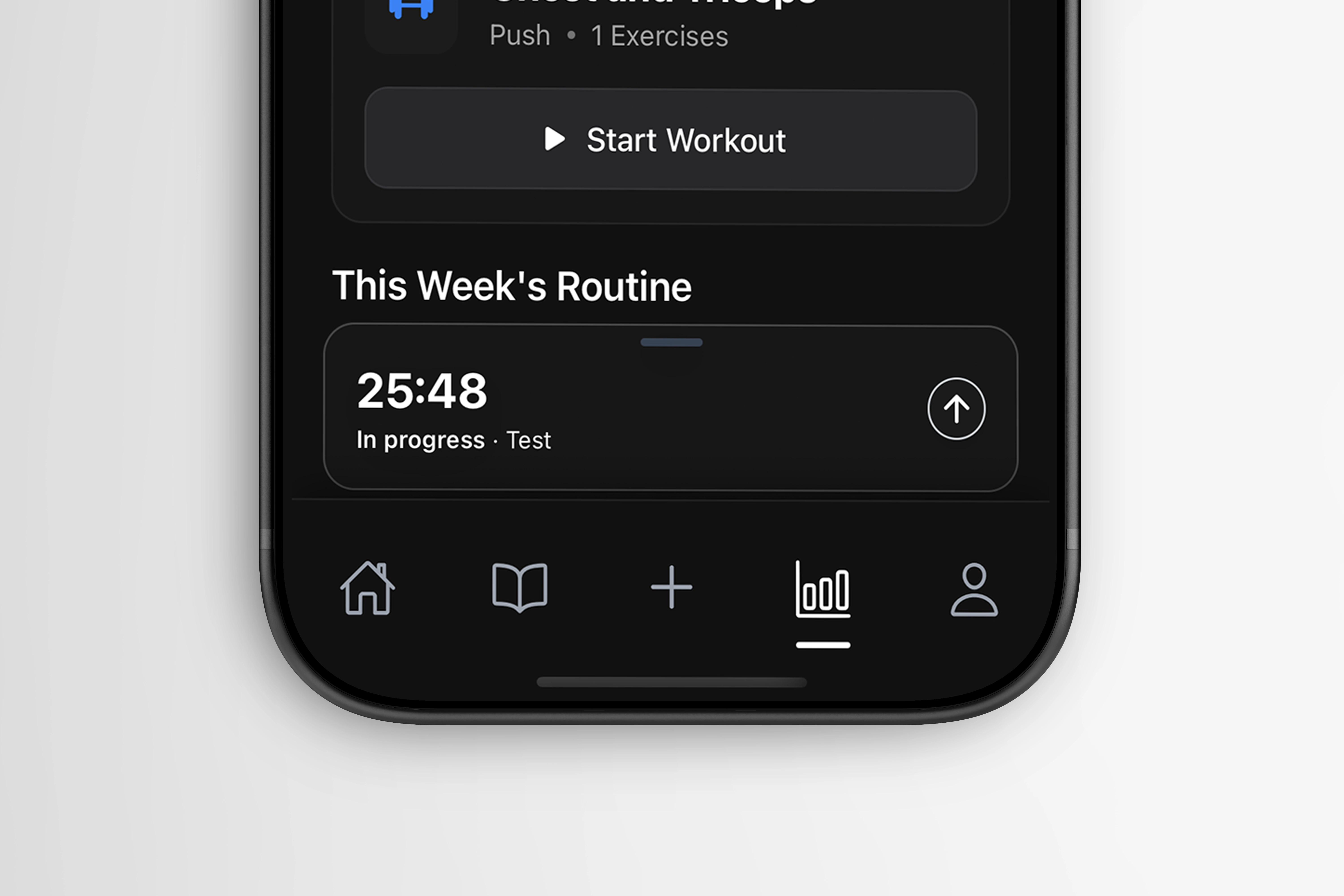
Workout Tracking
A built-in database of exercises that integrates directly into user programmes. Workouts aren't just logged — they're connected to the user's broader fitness picture alongside their nutrition data.
Analytics
A dedicated analytics layer gives users a clear view of their progress over time: macro trends, workout consistency, and goal tracking all in one place.
Onboarding
Full custom onboarding flow designed to capture the data needed for accurate macro calculation from day one, while keeping the experience approachable for users who aren't familiar with fitness tracking.
Design Approach
The UI was designed around one principle: reduce friction at every step. Logging food or a workout should take seconds. The dark interface, strong typographic hierarchy, and card-based layout were all decisions made to keep the most important information visible at a glance without requiring the user to dig for it.v
Every screen was designed and iterated in Figma before development, with close collaboration throughout to make sure the design intent survived the build intact.
Role: Lead Designer
Collaborator: Lead Developer (brother - Matt)
Timeline: 8 months
Tools: Figma, Visual Code Studio, React, Adobe Illustrator, Adobe Photoshop
Platform: iOS
Like this project
Posted Jun 2, 2026
Flowfit Fitness app — meal photo recognition, macro tracking, workout database, analytics & full onboarding. Designed in Figma, built in React.
Likes
2
Views
13
Timeline
Oct 1, 2025 - Apr 16, 2026