Swirl - Mobile App for Productivity & Focus Management
Himanshu Sharma
The Concept
Most productivity apps fail designers, developers, and creatives — the people who live and die by deep work. They're either too simple (basic to-do lists) or too bloated (project management tools that need a tutorial to use).
Focus is a concept app built for one type of user: someone juggling multiple projects who needs to track time, manage tasks, and understand their own productivity patterns — without switching between four different tools.
This case study documents the UI design decisions behind five core screens.
Design Direction
The visual language was built around two modes that reflect how the user actually works:
Light mode for clarity. The Home and Insights screens use a clean off-white system with generous white cards. When you're planning or reviewing, the interface should feel calm and organised — not demanding attention.
Dark mode for focus. The Focus Timer screen is pure dark — near-black background, a single glowing cyan arc. When you're in a session, nothing competes with the countdown. The UI disappears so the work doesn't.
This light/dark duality wasn't aesthetic preference — it was a deliberate UX decision: the interface should match the user's mental state at each stage of their workflow.
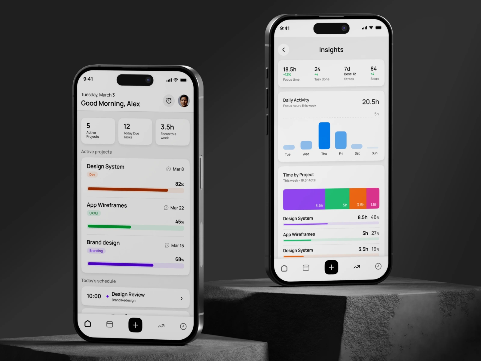
Home
The dashboard opens with a personalised greeting and date — a small touch that makes the app feel alive, not clinical. Three stat tiles (Active Projects, Due Tasks, Focus Hours) give an instant status read without requiring any navigation. Below, active projects surface with colour-coded progress bars and deadlines, followed by today's schedule. Everything a user needs for their morning review is above the fold.
Key decision: Progress bars use distinct, saturated colours per project (orange, green, purple) — not a generic blue system. At a glance, a user can identify their projects by colour before reading the label. This reduces cognitive load in a screen users visit multiple times a day.
Focus Timer
The centrepiece of the app. A full-screen dark canvas with a large circular arc timer showing remaining time. The active task and project label sit at the top — context always visible, never hidden behind a tap. Session progress is tracked with a secondary bar at the bottom.
Key decision: Two-button control (pause / stop) — nothing else. No settings, no distractions, no navigation. The only actions available are the ones that make sense during a session. The glowing cyan arc against deep navy gives the screen genuine visual drama without decorative noise.
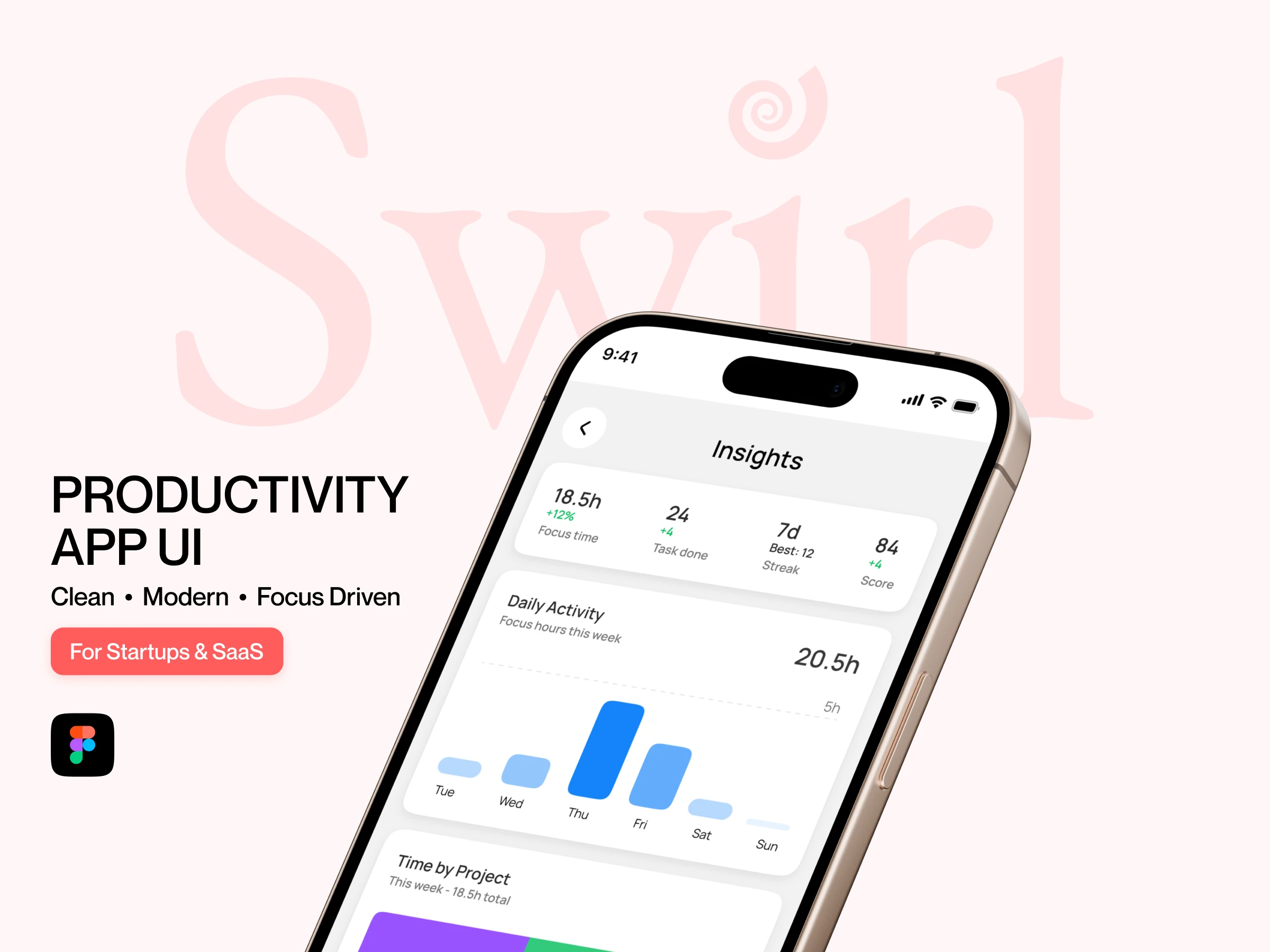
Insights
The analytics screen shows focus time, tasks completed, streak, and score in a four-stat summary card — scannable in under two seconds. A weekly bar chart visualises daily focus hours, and a segmented bar breaks time distribution across projects with percentage breakdowns.
Key decision: The project time breakdown uses the same colours as the home screen progress bars (purple, green, orange, pink). Colour consistency across screens creates a cohesive system — the user builds an internal map of their projects without reading labels every time.
Tasks (Project View)
Inside a project, tasks are listed with priority tags (High / Med / Low) and time estimates. Completed tasks show a filled blue checkbox and strikethrough — clear visual closure. The tab system (Tasks / Notes / Timeline) keeps the full project context one tap away without nesting.
Key decision: Priority is communicated through colour-coded pill tags, not icons or numbers. High = warm red-orange, Med = amber, Low = neutral grey. The hierarchy is immediately readable without a legend.
Notes
The Notes tab lives alongside Tasks in the same project context. Notes are grouped by date — Today, Yesterday, and older entries — making it easy to trace when a decision was made. Each note card is minimal: title and body text, no metadata clutter.
Key decision: Notes deliberately avoid markdown formatting, tags, or folders. The constraint was intentional — this isn't a second-brain app. It's a lightweight capture tool that lives inside the project, not alongside it.
What I Can Do for You
If you're building a SaaS product or mobile app and need UI design that goes beyond templates — a system that scales, communicates hierarchy, and actually reflects how your users think — that's the work I do.
Figma UI Design · Component Systems · Mobile & Web Interfaces
I'm currently available for new projects.
Like this project
Posted Mar 26, 2026
Built a user-centric app UI that improves usability, increases engagement, and provides clear productivity insights for better decision-making.
Likes
0
Views
0