Bupa Rebranding
Sandi Hidayat
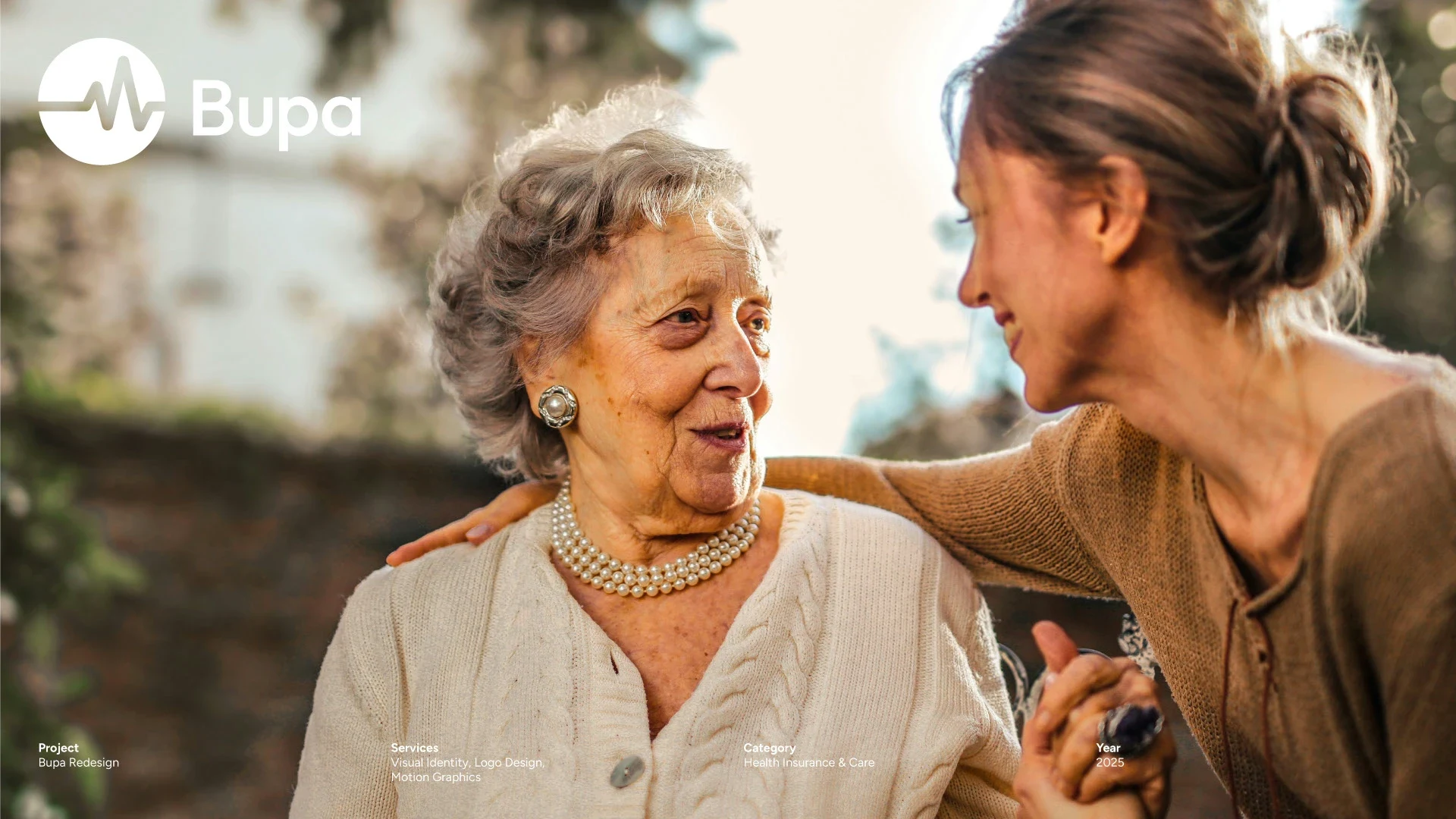
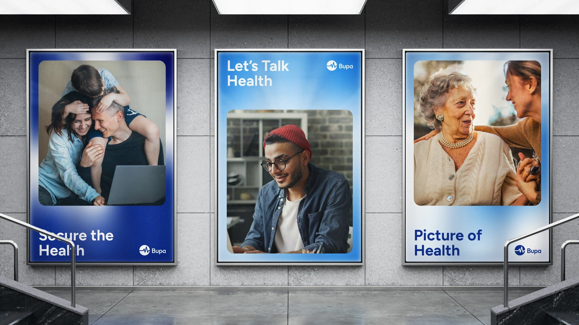
Let's Talk Health
Since 1947, Bupa has been serving and helping millions of people around the world. From early years through to retirement, Bupa provides the best healthcare experience. Bupa has renewed its vision to concern the environment, therefore a more adaptive visual language is needed.
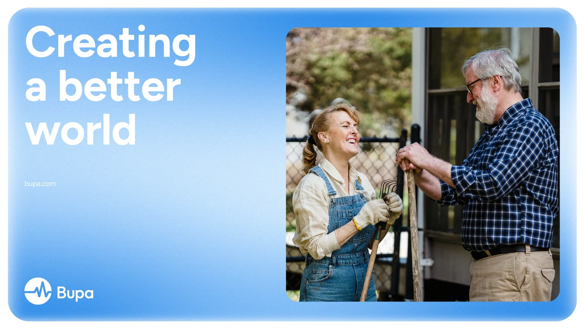
Under the tagline “Let's Talk Health,” this rebrand aims to create a bright and flexible visual identity that encourages spirit and confidence for a healthier, happier, and longer life.
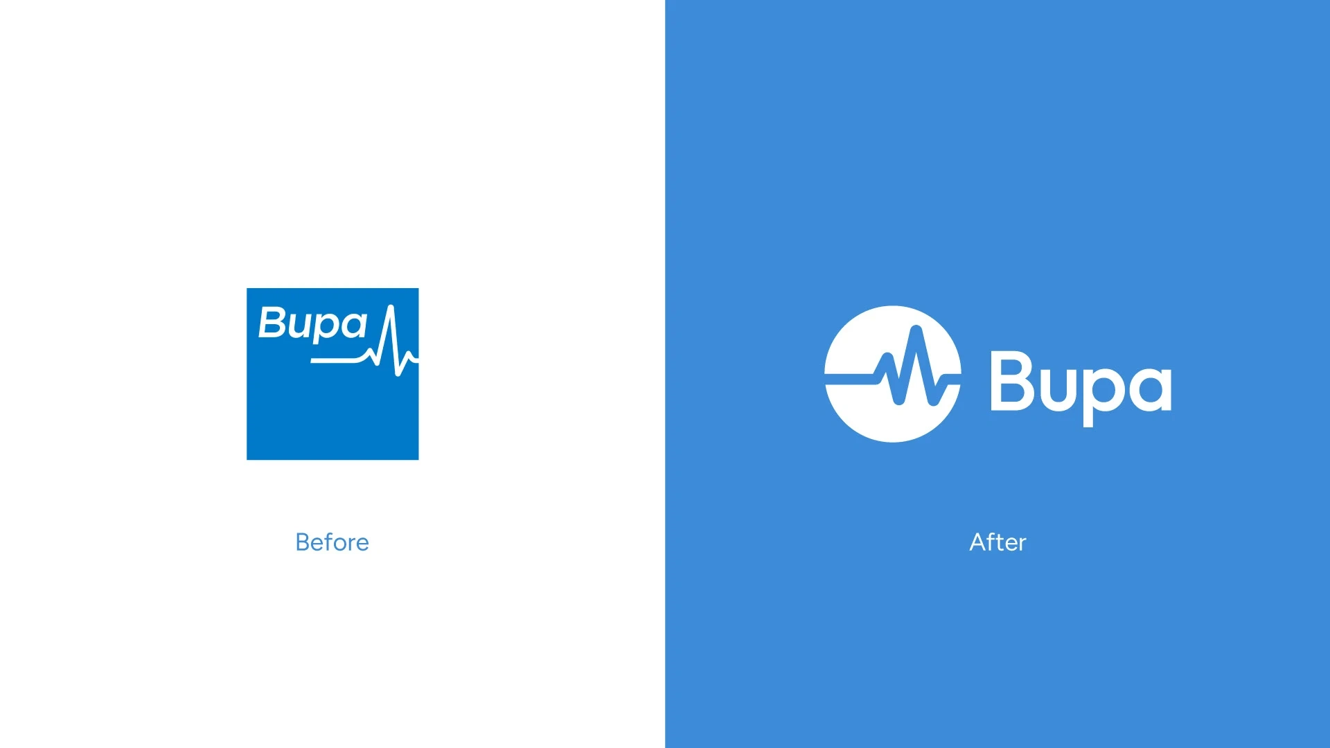
Logo Design Concept
Retaining the signature heartbeat line identity that has become its trademark, Bupa symbolises a trusted healthcare service. Packaged in a circle shape to represent its commitment to the environment, this combination creates a sophisticated, aesthetic and timeless brand image without losing its core business.
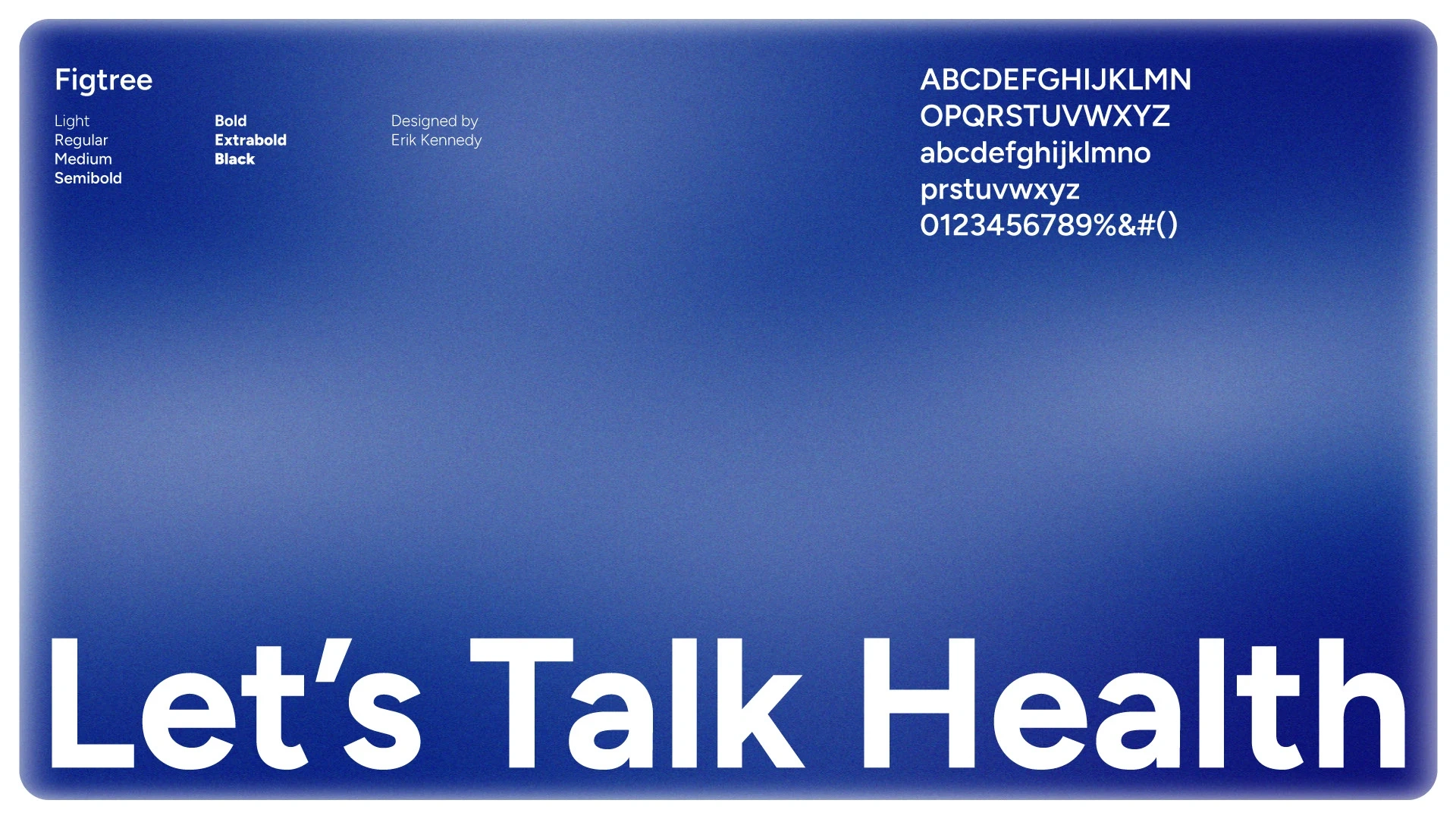
Colour and Typography
The color palette for Bupa was thoughtfully inspired by the trust of its customers. For a more premium service, dark blue was chosen for its bold impression. The color gradation evokes dynamism and innovation. For typography, Figtree was used as the communication font for its minimalist and secure attention.
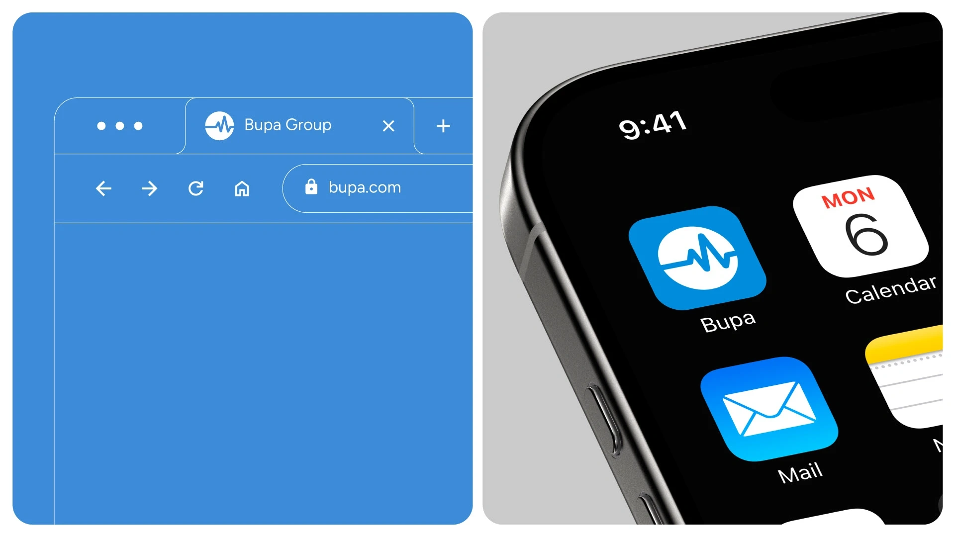
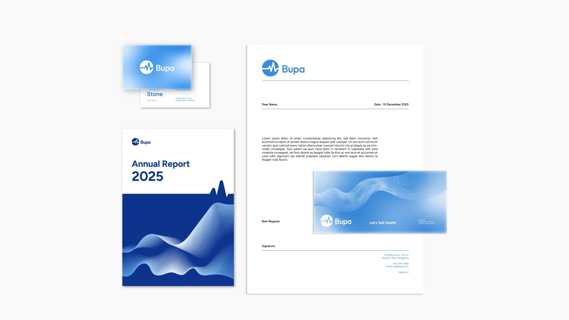
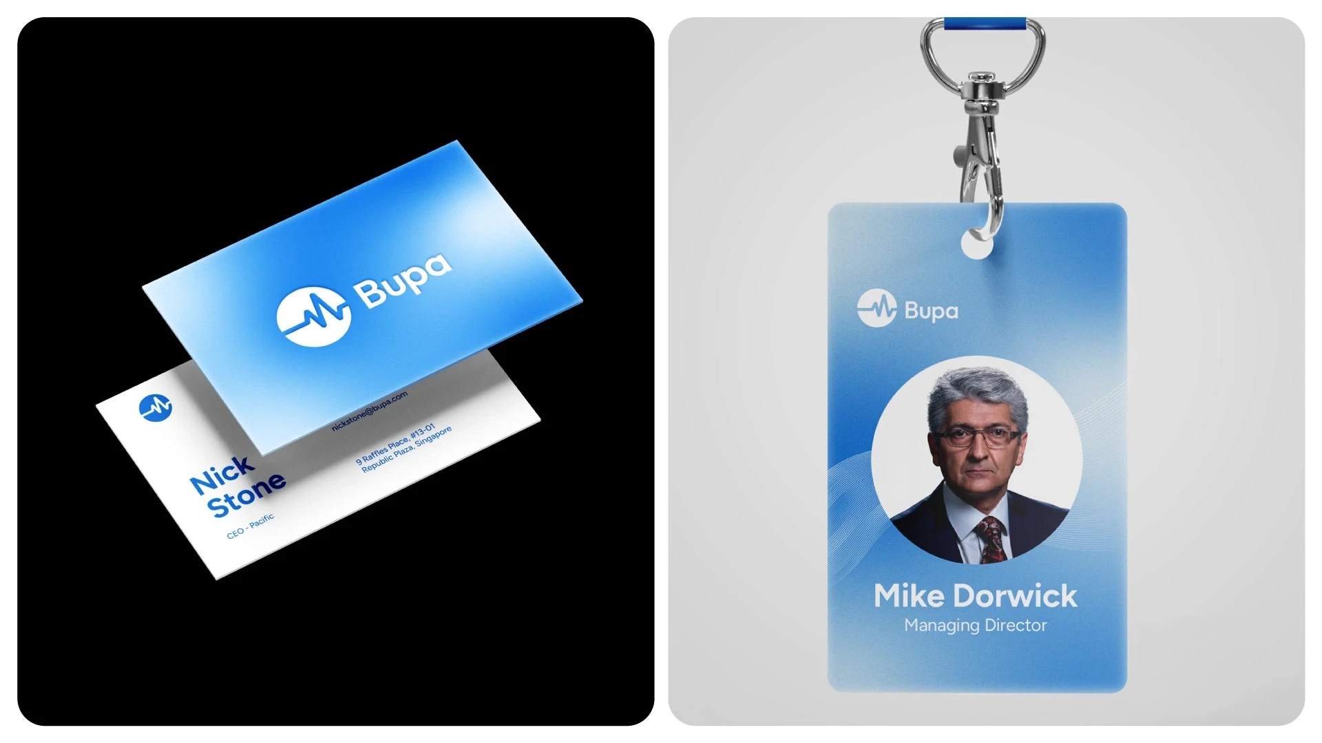
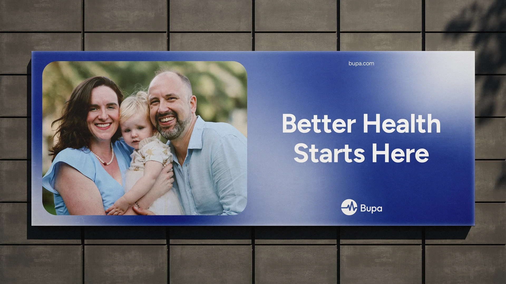
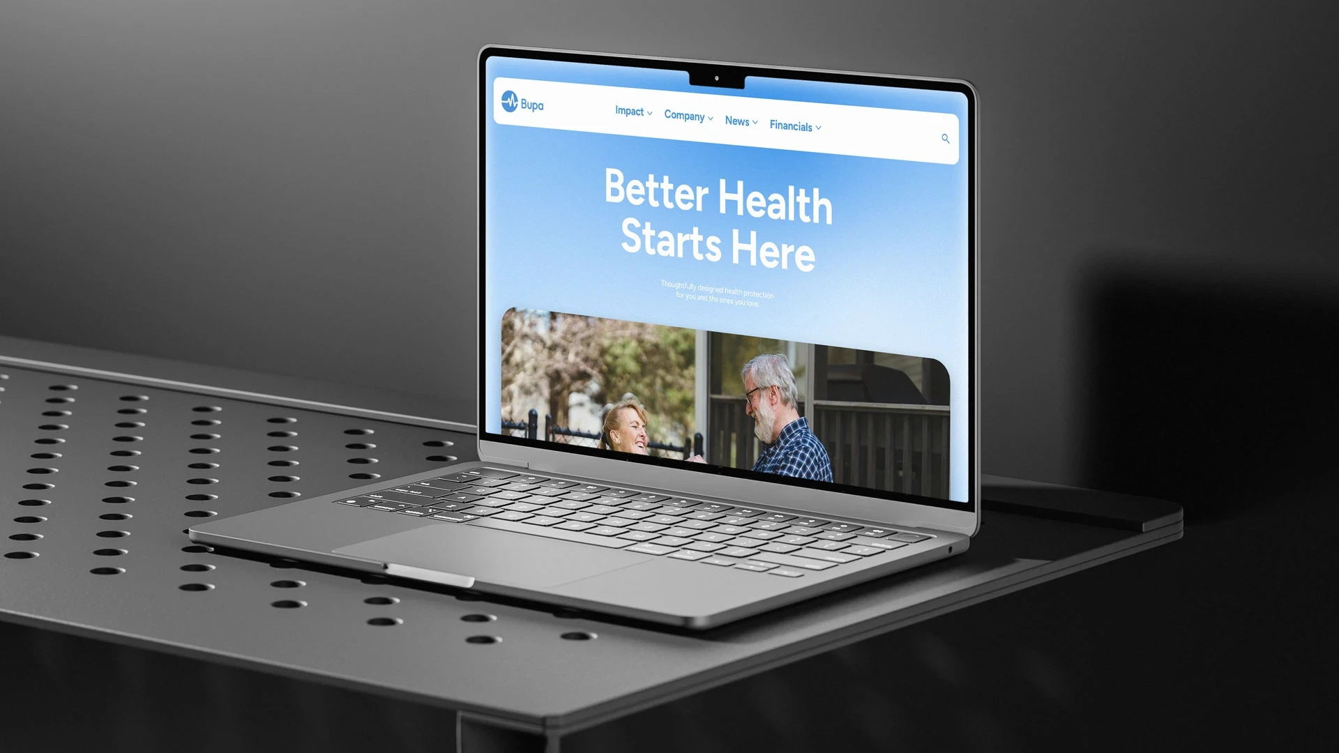
Brand Identity Concept
Communicating an inclusive and innovative international healthcare company, a bright, fluid, and dynamic brand identity system was developed, utilizing meaningful imagery from everyday life that is more relatable and connected to customers. Brand identity is delivered in an effective way to suit different media-specific characteristics.


Like this project
Posted Feb 13, 2026
Rebranding Bupa with a new visual identity under 'Let's Talk Health' tagline.
Likes
2
Views
5
Clients
Bupa