UrbanLife Apartments Visual Identity Framework
Berlian Nabila


UrbanLife Apartments – Art Direction Visual Framework
Project Context
UrbanLife Apartments: A progressive residential brand targeting young urban professionals, demanding a refined approach to digital brand storytelling. The objective was to define and deliver a cohesive visual identity for multi-platform digital campaigns.
Target Audience
Young urban professionals (20–35), aspirational, digitally engaged, seeking modern living with strong community values.
Creative Objective
To construct a sophisticated visual language that encapsulates UrbanLife’s ethos: contemporary elegance, interpersonal connectivity, and a tranquil metropolitan lifestyle.
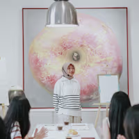
Curated Visual Selections & Rationale
Architectural Facade (High-rise Residence):
Represents verticality, modern structure, and the aspiration of metropolitan living. Serves as a core anchor for brand identity projecting sophistication and urban dynamism.
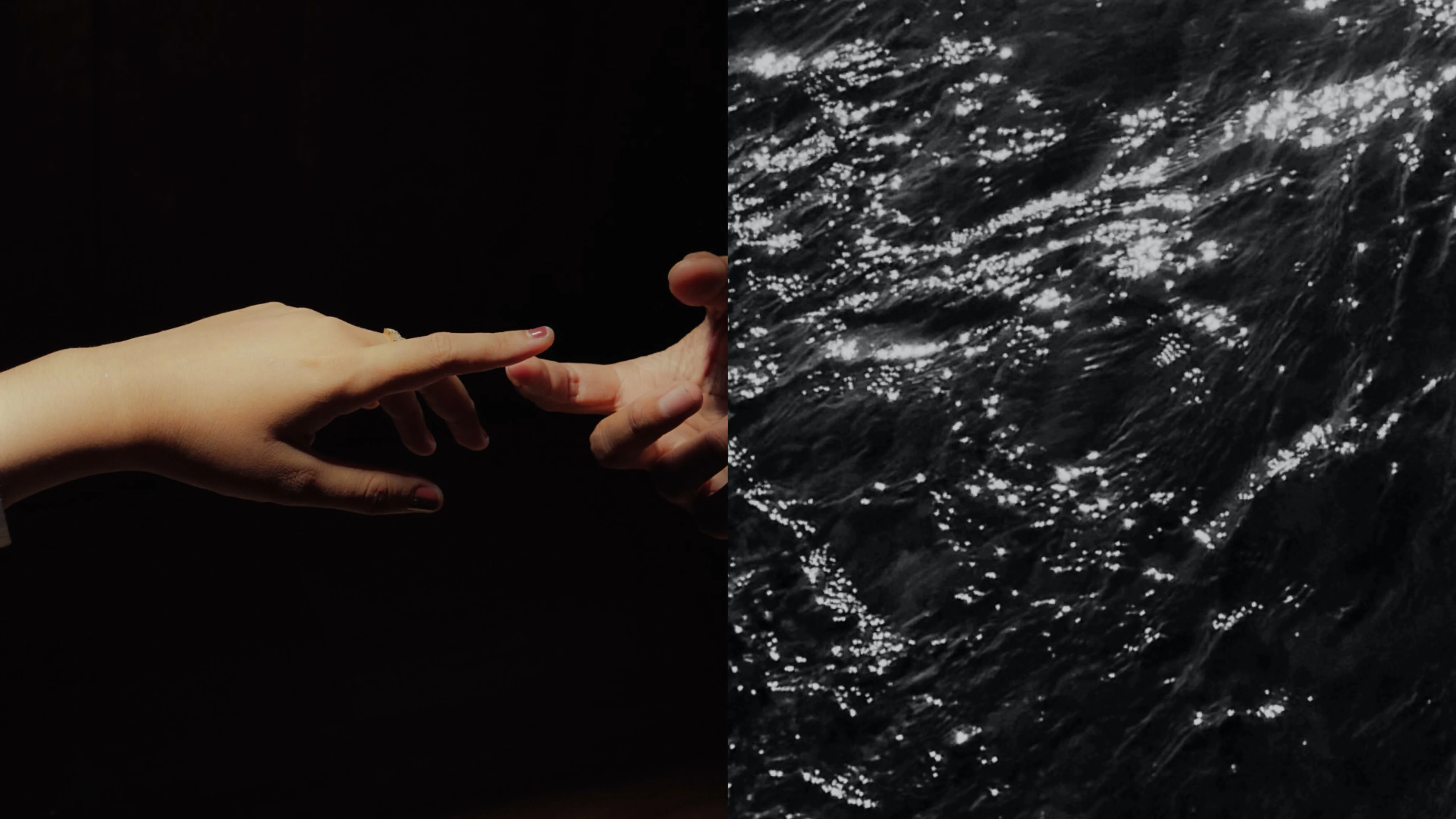
Human Gesture (Conveying Connection):
A stylized depiction of hands reaching, evoking intimacy and community This visual emphasizes UrbanLife’s commitment to fostering connections among residents.
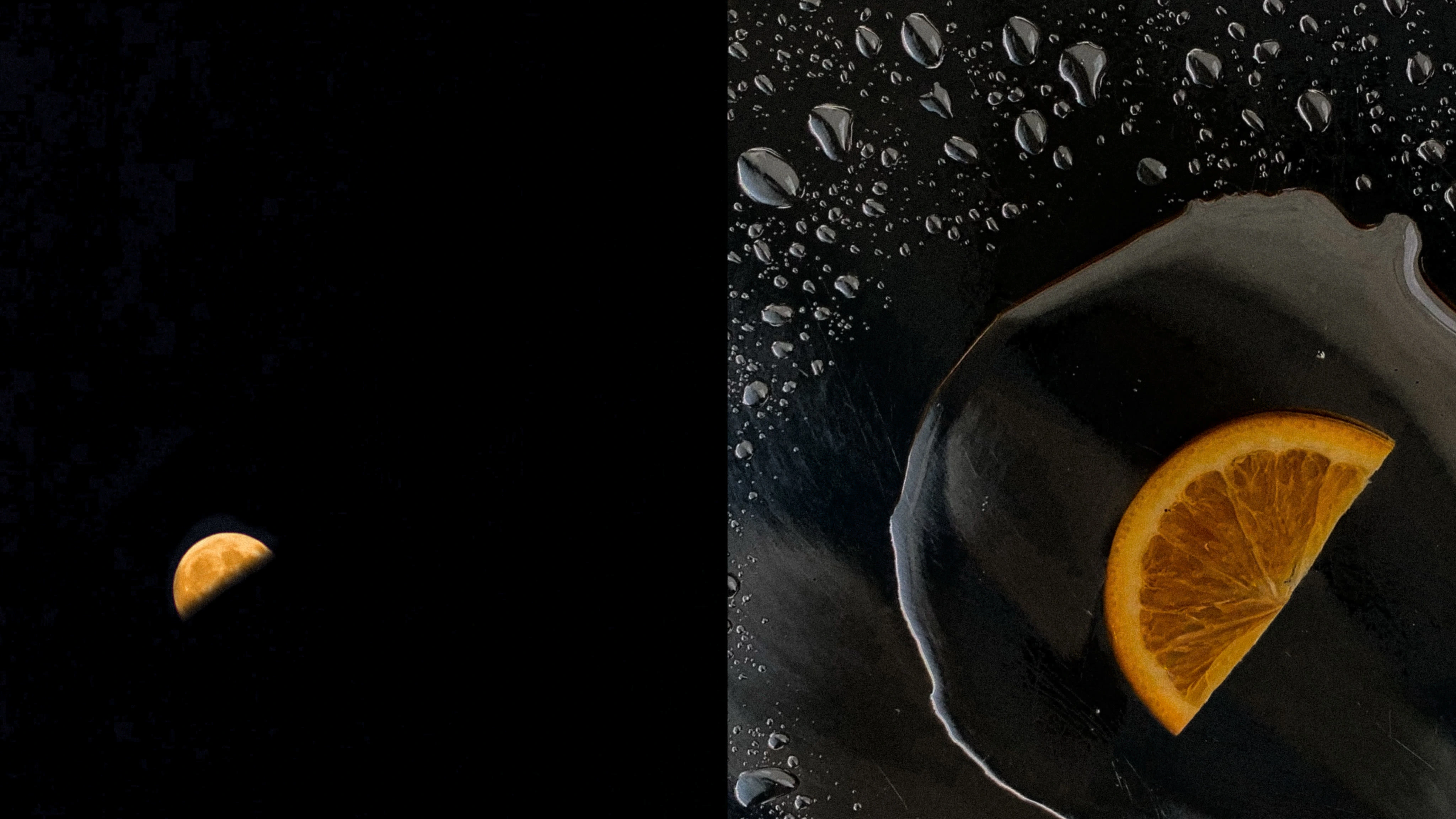
Celestial Accent (Crescent Element):
Introduces a motif of subtle aspiration and cyclical renewal. The abstract moon shape suggests calmness, rhythm of urban nights, and timeless appeal.
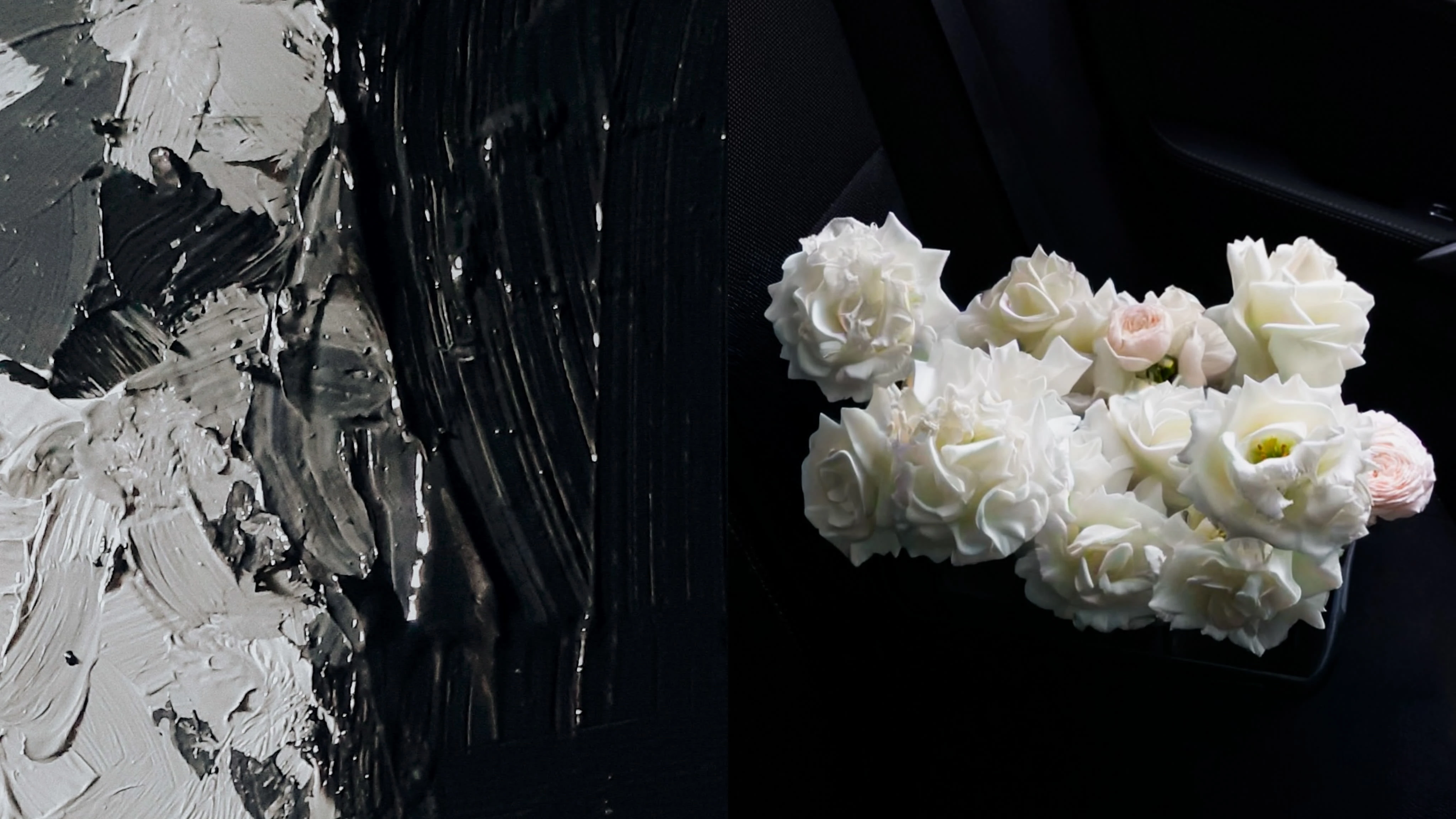
Botanical Detail (White Florals):
Adds a touch of purity and refined luxury. Florals are thoughtfully incorporated to soften the overall palette, infusing a sense of welcoming and exclusivity.
Textural Landscape (Liquid, Pigment, Surfaces):
Visuals featuring water reflections and painterly textures reinforce the concepts of serenity and artistic vibrancy, supporting the restorative aspect of the living environment.
Citrus Highlight (Orange Wedge):
A deliberate pop of saturated color, injected for vibrancy and contemporary freshness. This accent becomes a metaphor for new beginnings and urban energy.
Strategic Implementation
Each visual is accompanied by concise descriptors articulating its role within the brand framework. The selection is not arbitrary, every element contributes to an orchestrated storytelling experience, designed to maximize engagement and elevate perceived brand value.
Moodboard and style guide are distributed as a visual reference for creative teams, ensuring unified execution in social media content, digital assets, and promotional materials.
Deliverables
Visual identity moodboard
Captioned image descriptors, conveying strategic context and implementation guidelines
Recommendations for color palette, compositional standards, and photographic direction
Outcomes & Value Proposition
This framework empowers UrbanLife Apartments to broadcast a resonant brand narrative, amplifying audience connection and cultivating a differentiated, premium market position. The case study highlights advanced art direction competencies curation, contextual visual analysis, and multidisciplinary creative strategy.
Role: Art Director & Visual Strategist
Tools: Sony Alpha a6400, 35mm f/1.8 lens, manual styling, natural & artificial lighting, Adobe Lightroom
Like this project
Posted Nov 23, 2025
Developed a cohesive visual identity for UrbanLife Apartments' digital campaigns.