Nowsta Website Redesign and Visual Identity Update
Aida Oliva
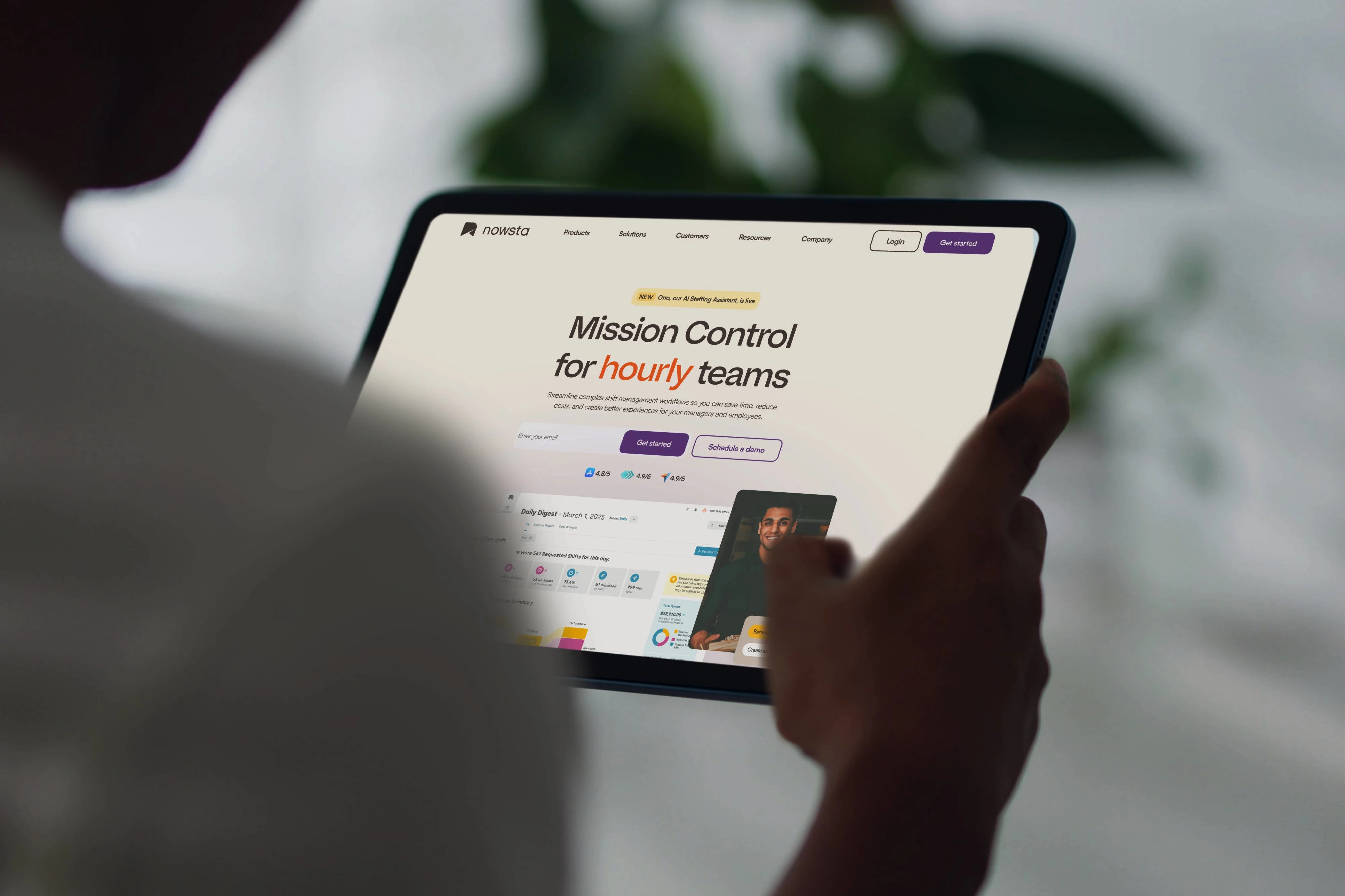
Nowsta offers an all-in-one operating system that helps managers request, schedule, and manage hourly, gig, and temporary teams.
The product had evolved into four core offerings, so the new website and visual language had to reflect that maturity of the brand’s human, trustworthy tone.
Industry: Saas
Client: Nowsta
Services and project scope:
Visual direction: Collaboration with Mother Sauce Studio on creative and rollout.
Updated visual identity
Website redesign & design system
Marketing collateral: new presentation decks and a product one-pager template tailored to multiple industries.
Objectives
Refresh the visual identity to feel innovative, accessible, and bold—while keeping a warm, human touch.
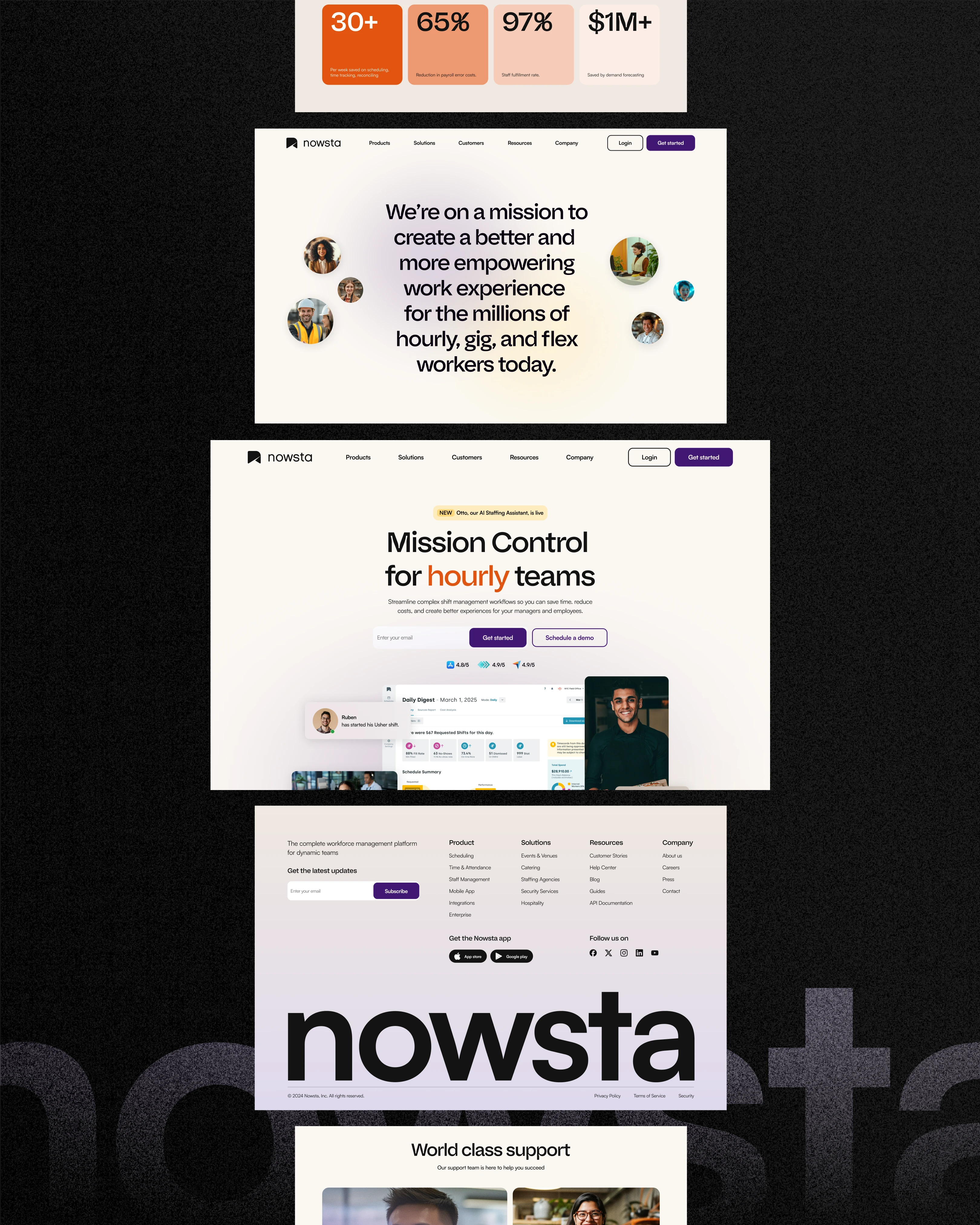
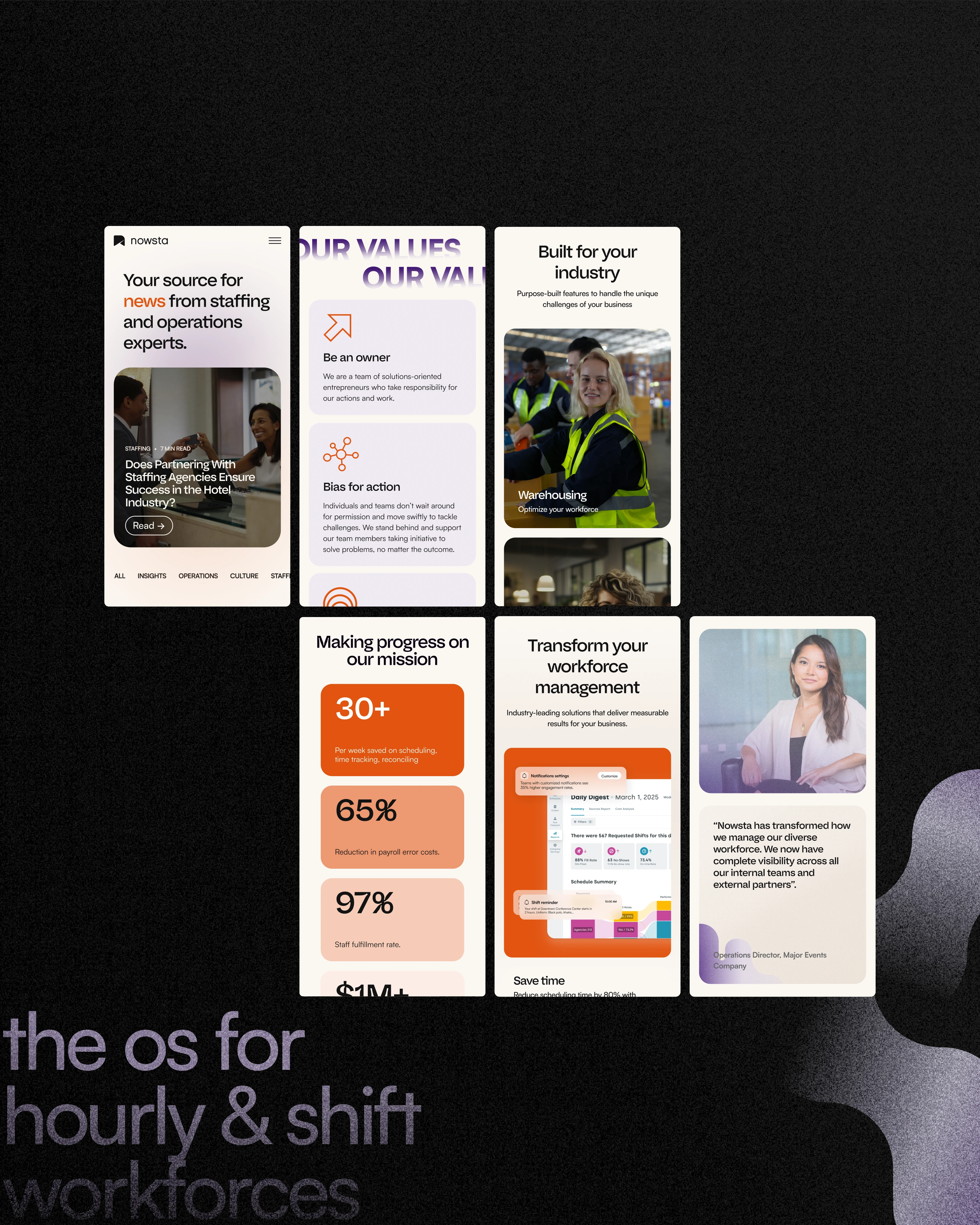
Clarify and connect the four key products with a clear story, benefits, and proof (data + testimonials).
Guide visitors to explore features and convert via Request a demo or Implementation consultation
Strategy
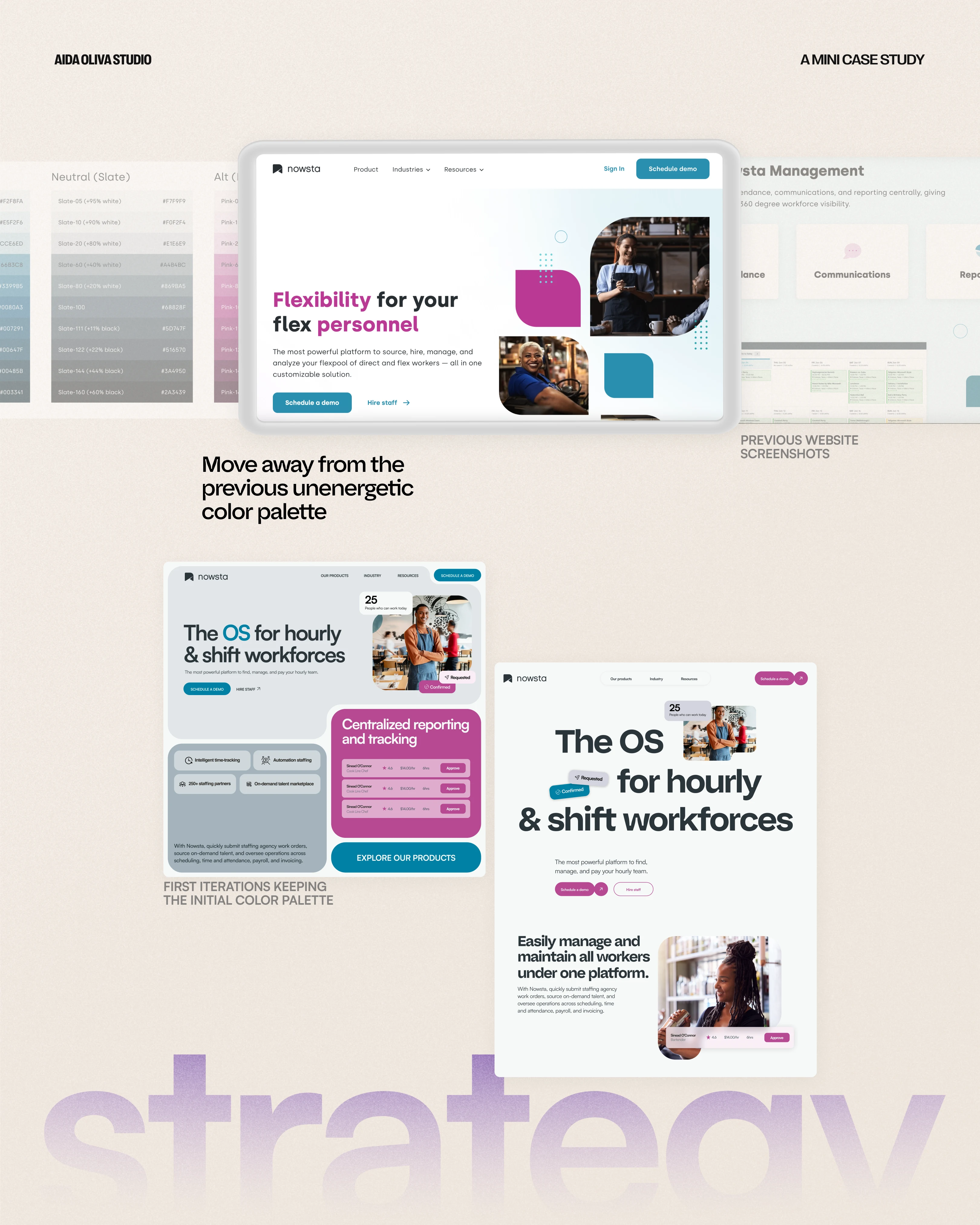
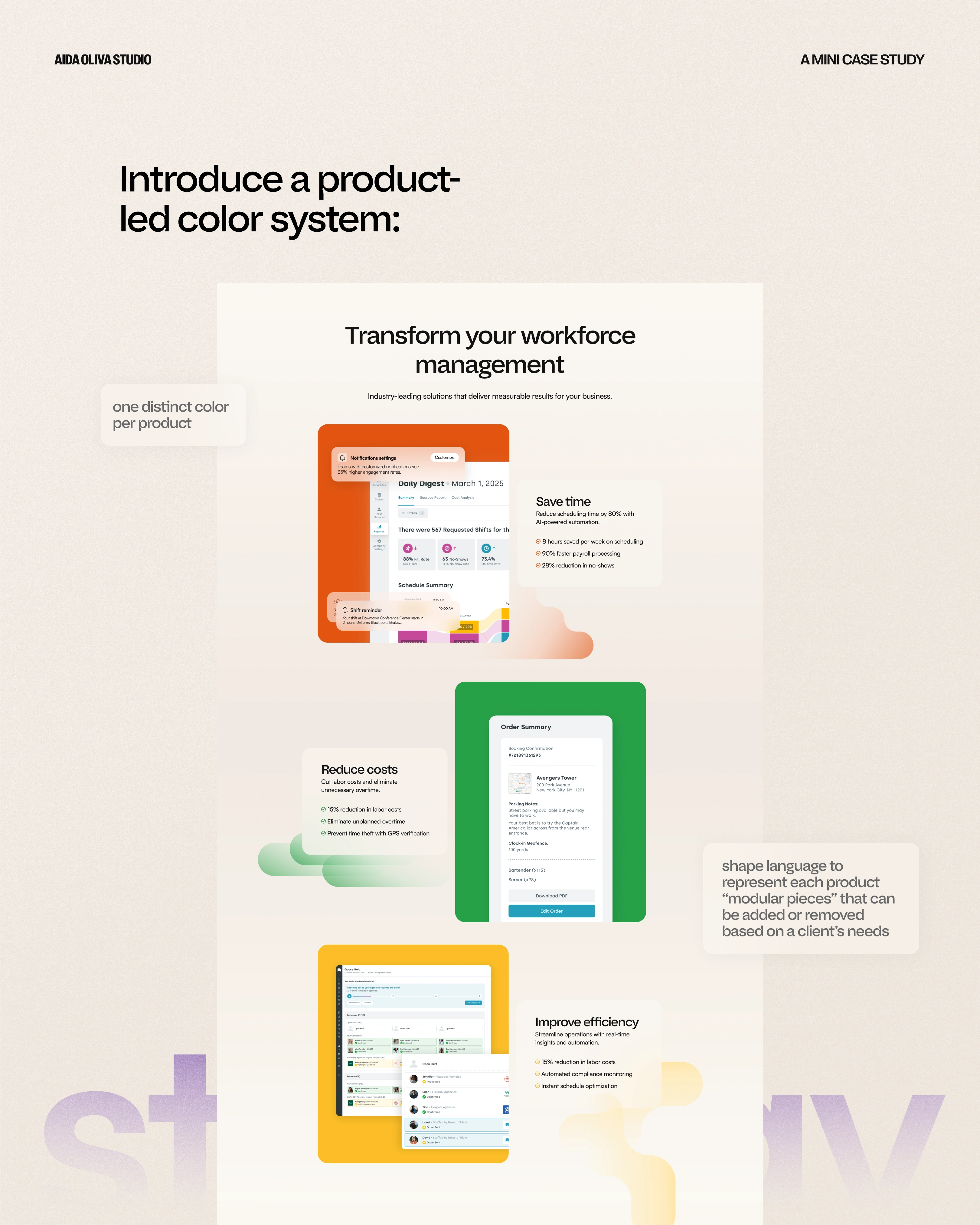
Move away from the previous low-energy palette and introduce a product-led color system: one distinct color per product, unified by a neutral base.
Use a shape language to represent each product—modular “pieces” that can be added/removed based on a client’s needs.
Balance human storytelling (people, outcomes, testimonials) with product credibility (UI details, metrics, workflows).
Design language
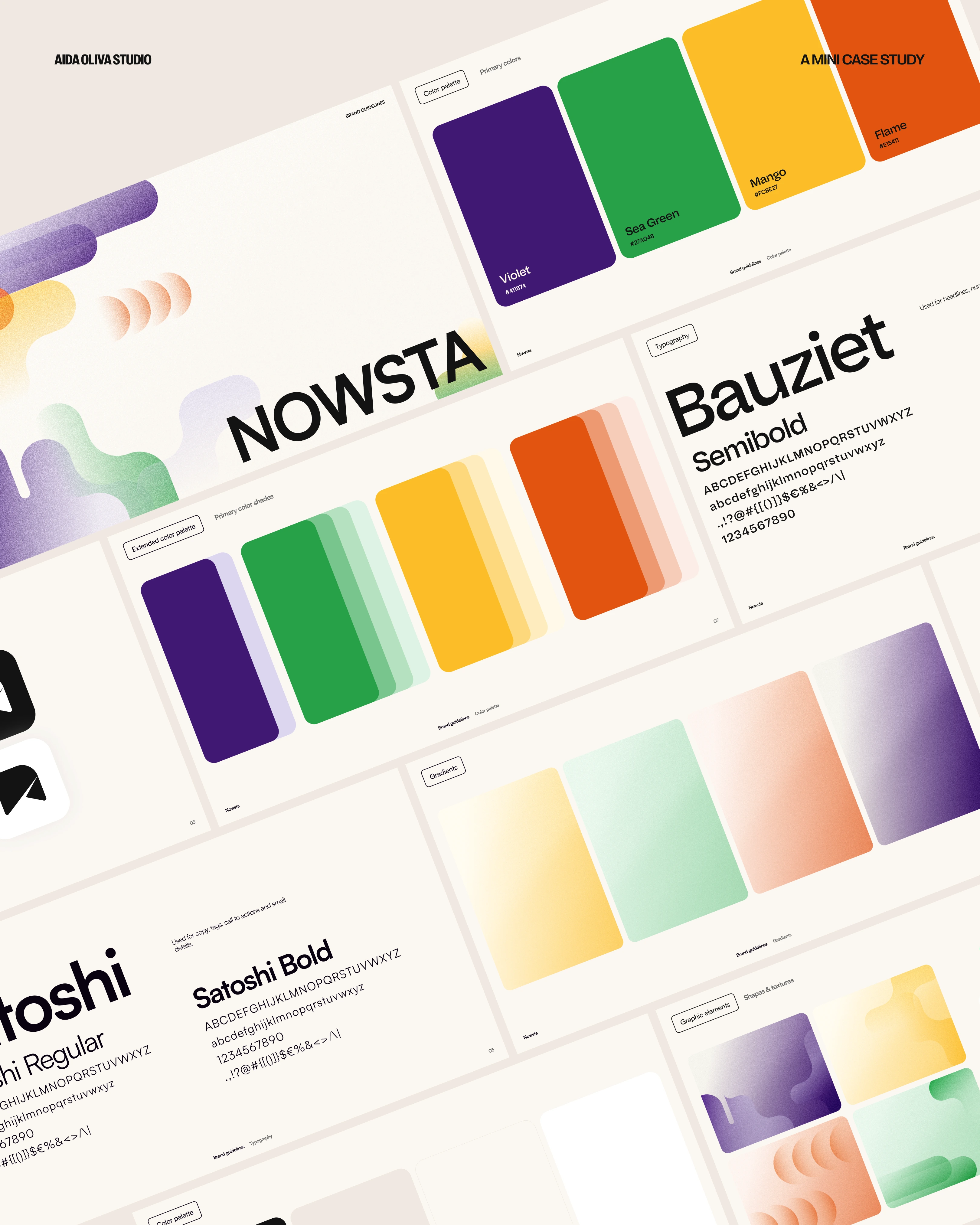
Color: Four primary hues (one per product) on a calm neutral foundation; related tints/gradients within each product stream.
Texture & depth: Soft ombré and fine grain for warmth and dimension.
Components: Card-based sections, rounded corners, clear hierarchy, generous spacing.
Product imagery: Full app/desktop screenshots with refined, minimal UI crops to highlight specific workflows.
Logo: Retained and updated to the new palette for cohesion.
Typography
Satoshi (sans-serif): UI, body copy, labels, CTAs—modern, legible, and versatile.
Bauziet (modern grotesk): Headlines—geometric forms with dynamic curves for a confident voice.
Impact
A cohesive brand story that ties four products into one clear ecosystem.
A warmer, more confident visual voice that feels both trustworthy and human.
Cleaner page architecture that better supports discovery and demo requests.
Like this project
Posted Oct 1, 2025
Redesigned Nowsta's website and visual identity to reflect the brand's innovative, accessible, and bold approach, while keeping a warm, human touch.