UW School of Medicine Service Learning Website
Overview
Goal:
Redesign the University of Washington School of Medicine's Service Learning website.
Duration:
4 months
Team:
4 UX designers
6 Software engineers
Problem brief
Service Learning is an important opportunity for medical students to gain hands-on experience through volunteering in settings that require medicine. The Service Learning site is what the students use to search for these opportunities. However, since the website was poorly designed and confusing to use, it was not doing its job. To solve this issue, we completely redesigned the website.
The initial product
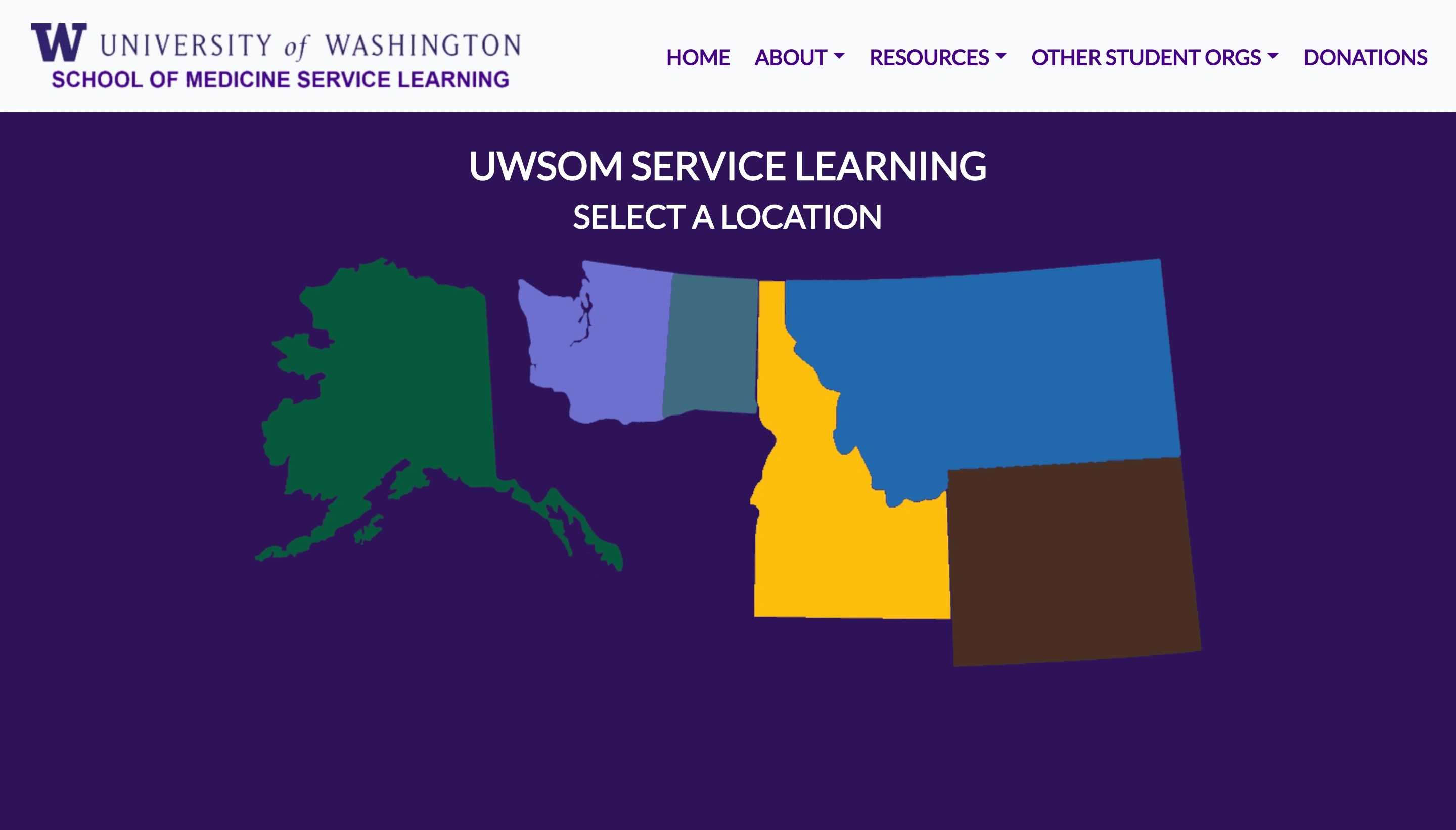
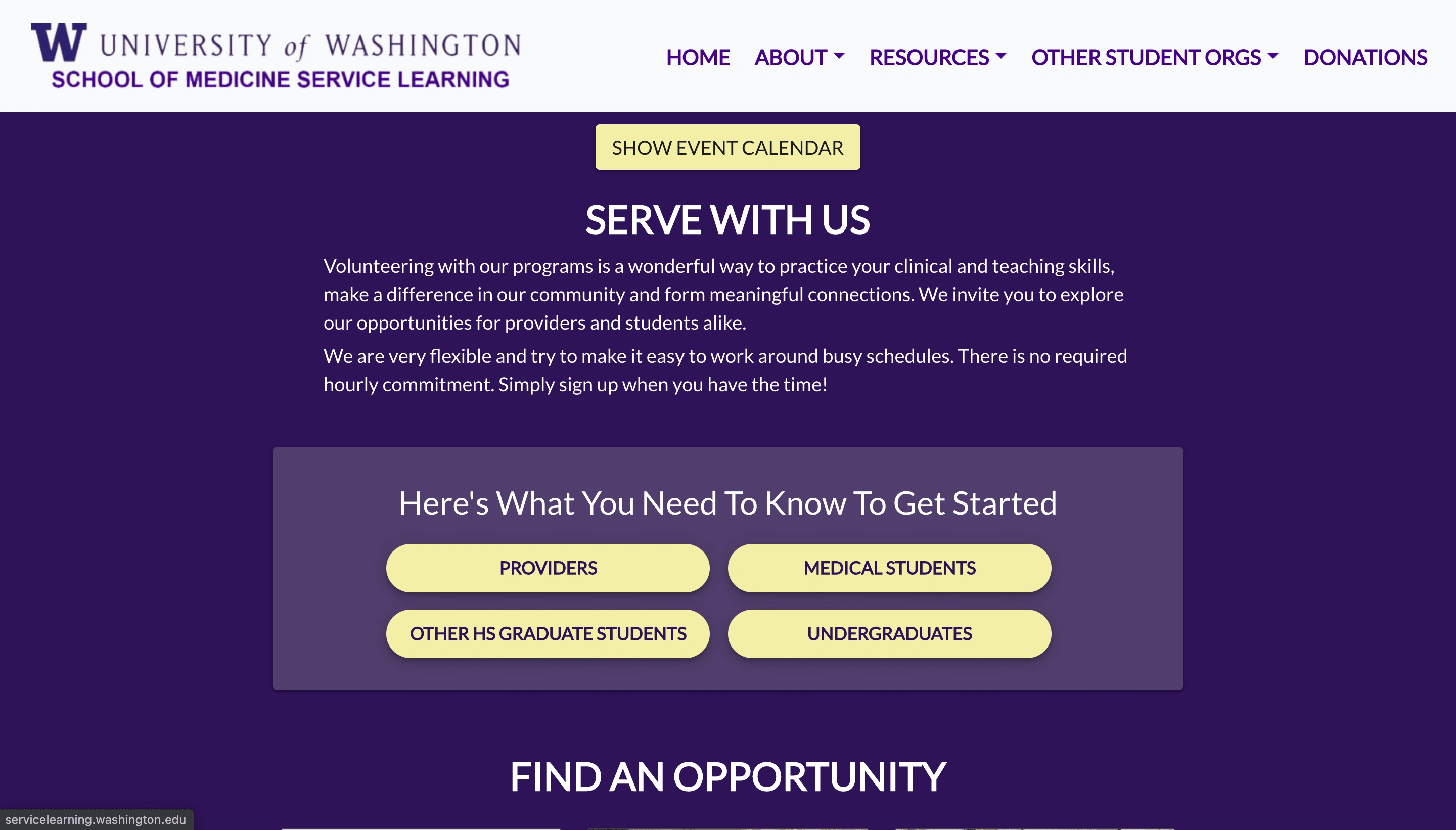
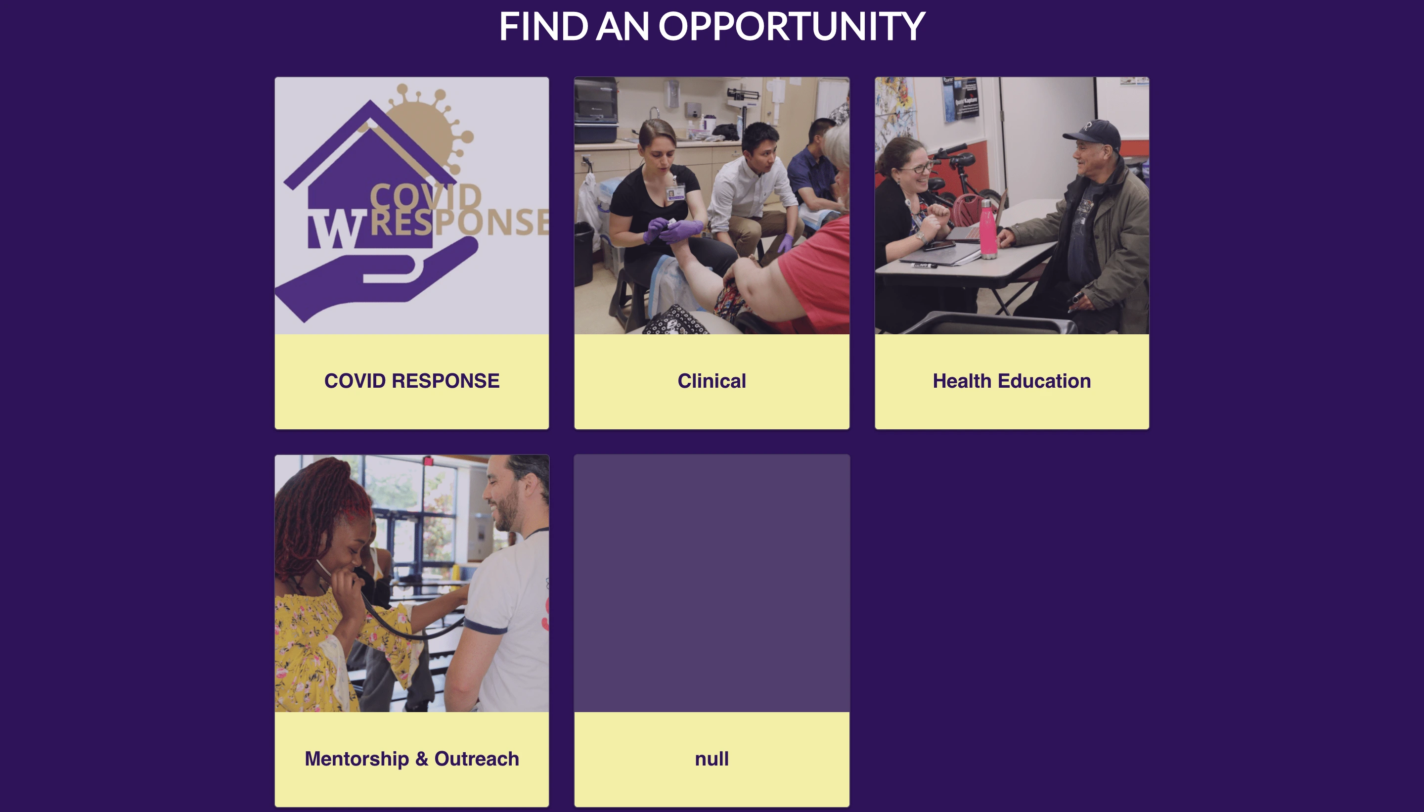
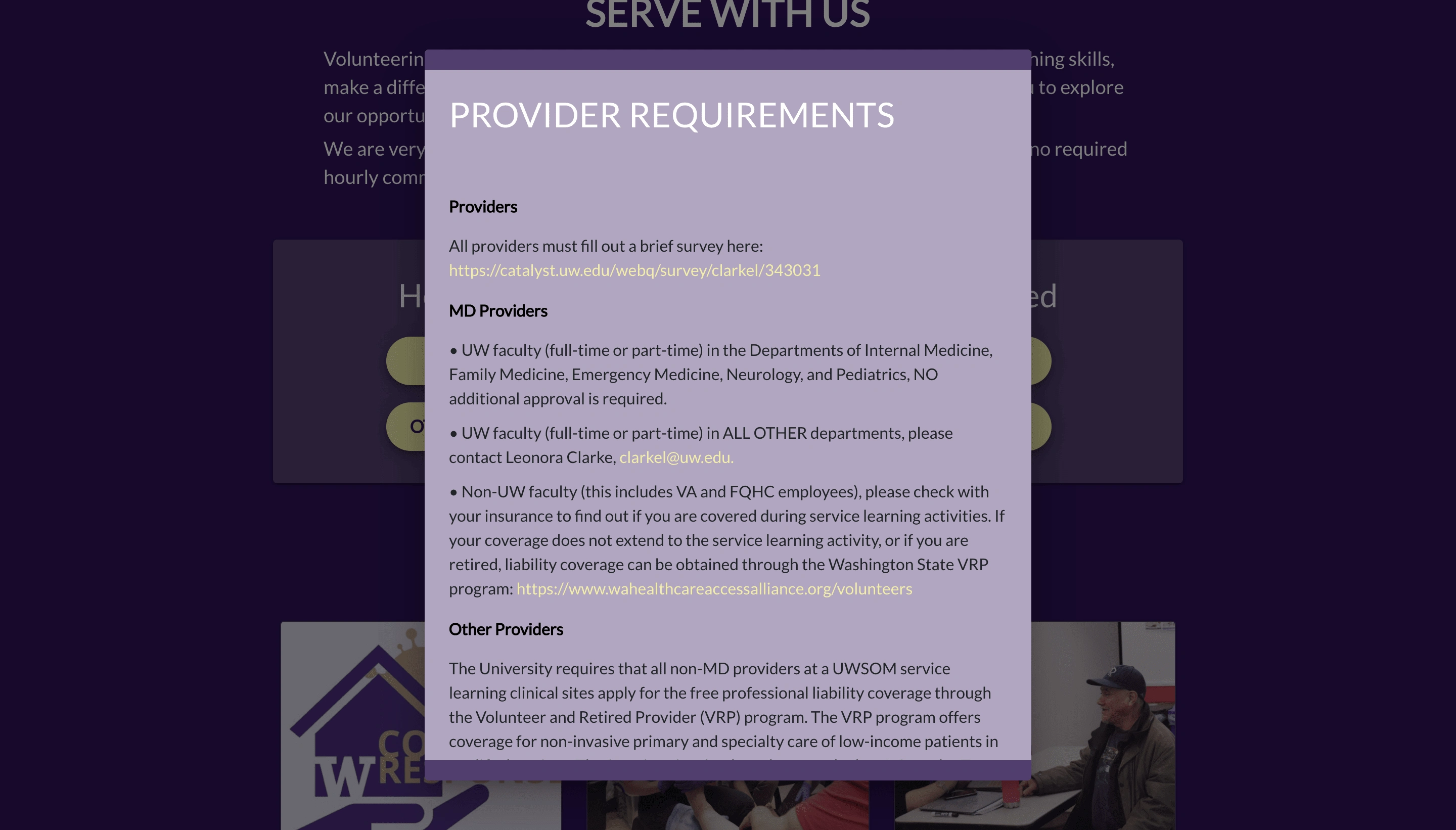
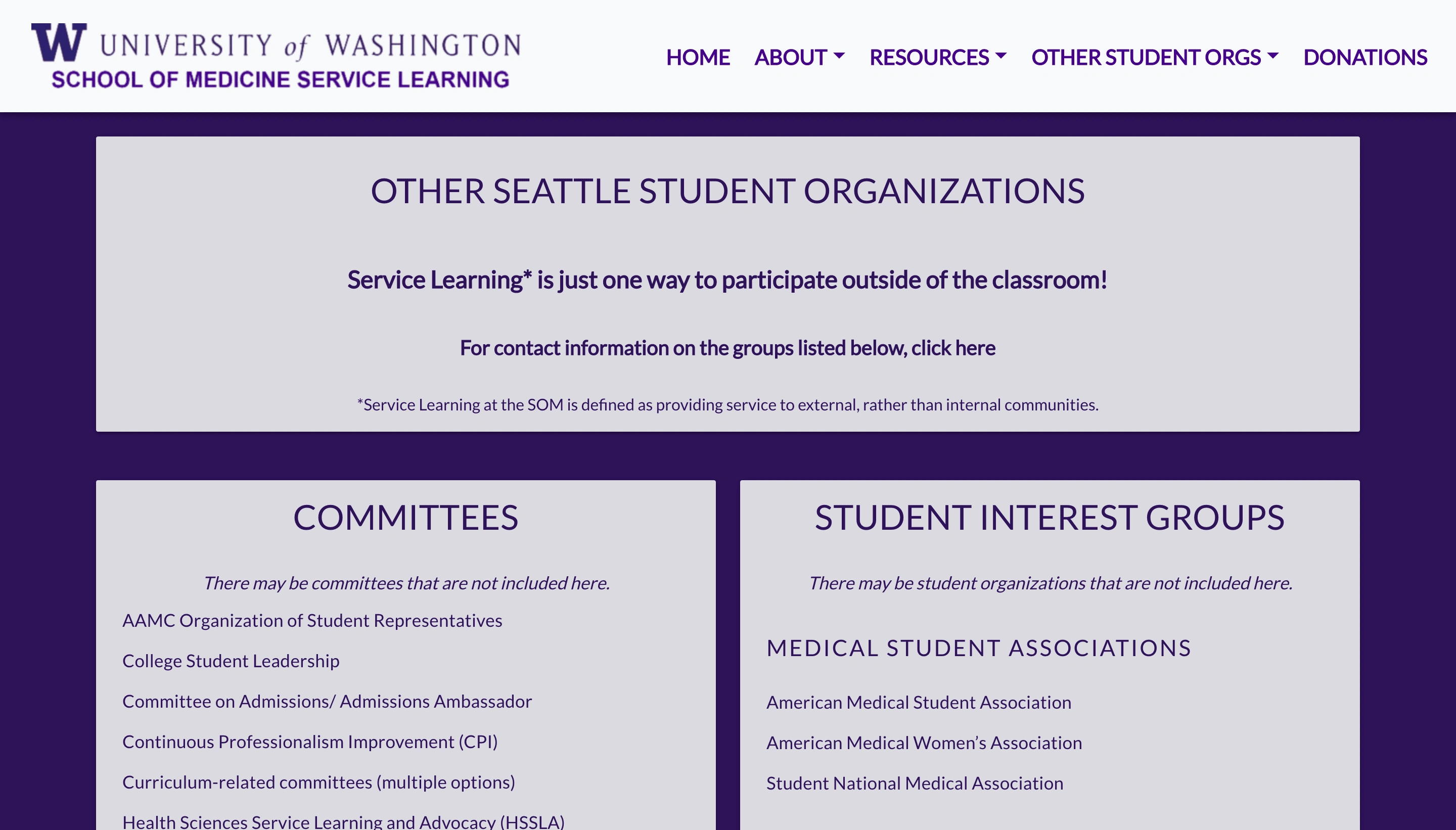
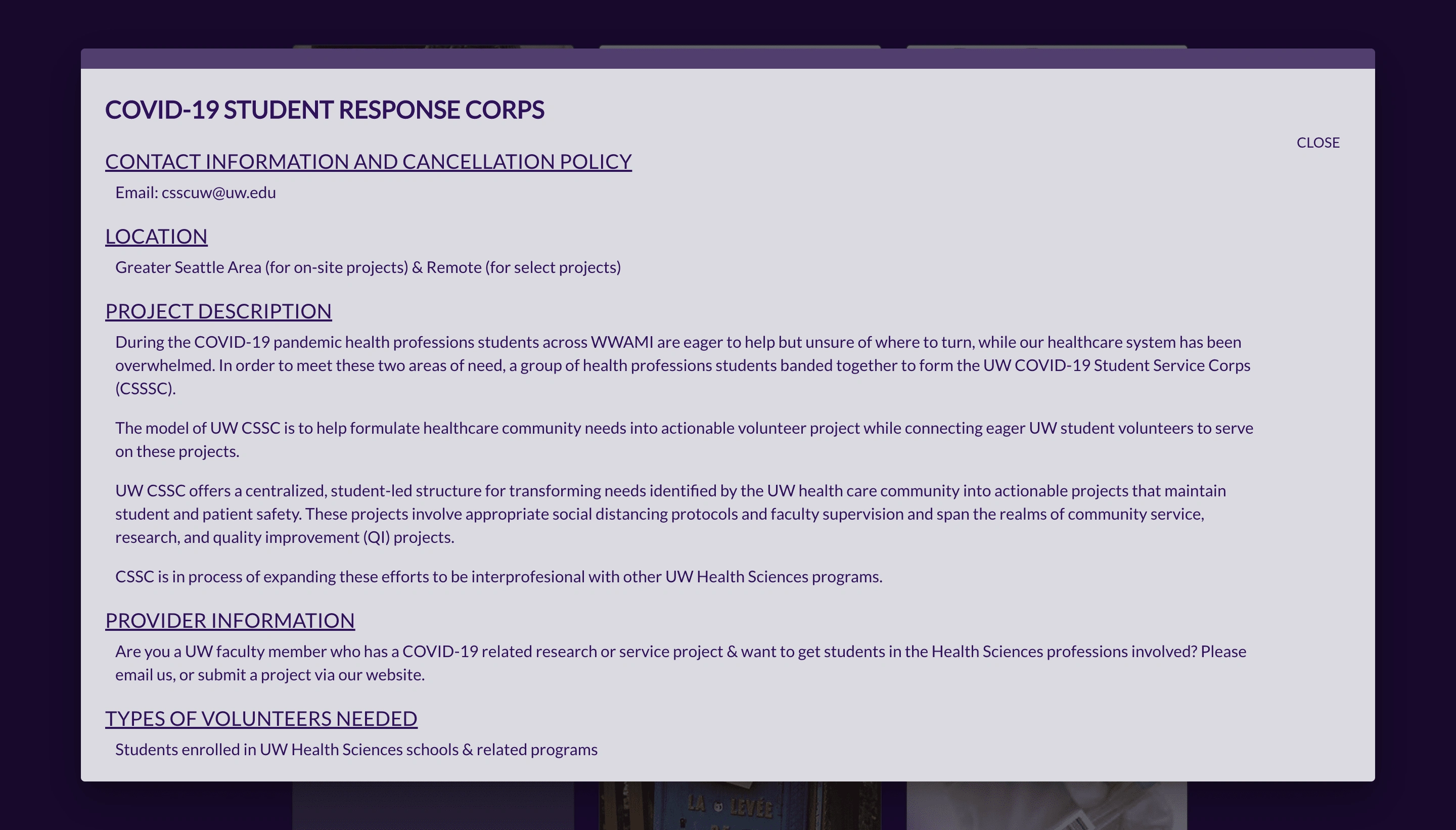
The initial website is shown below. As seen, while the purpose of the website is to inform of opportunities and show information clearly, it is not being done. There are many pages that are wordy and are very text-heavy. The initial website did not make use of buttons, and only put links on the site. Some of these links were not even hyperlinked and were very confusing to users. The overall UI, typography, colors, and aesthetics of the website were lacking as well.
Usability testings on initial product
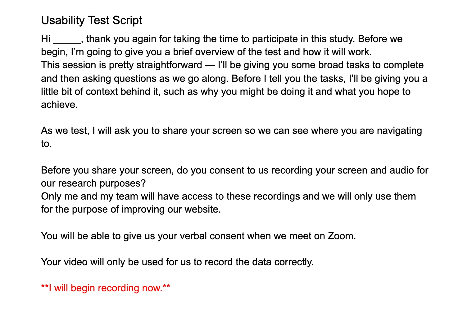
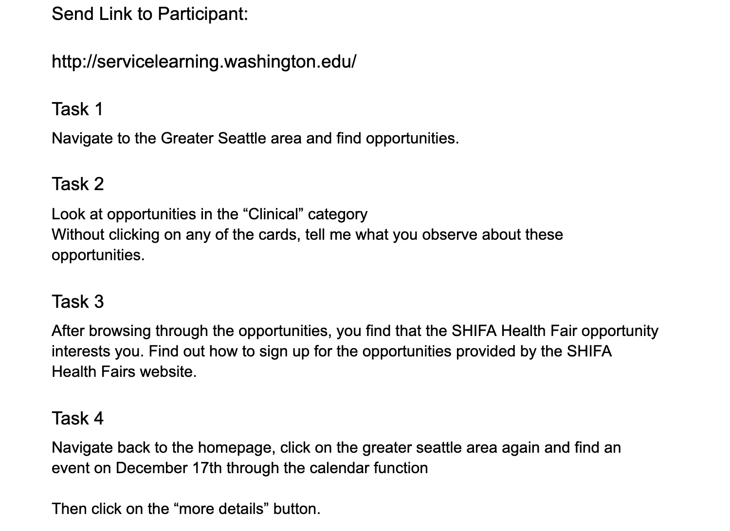
5 usability testings were conducted on the initial website. Due to Covid-19, the usability testings were conducted virtually through Zoom. We had 3 medical students, a pre-med undergraduate, and a provider test it out. A usability testing script was written as shown below and used for each interview.
Results
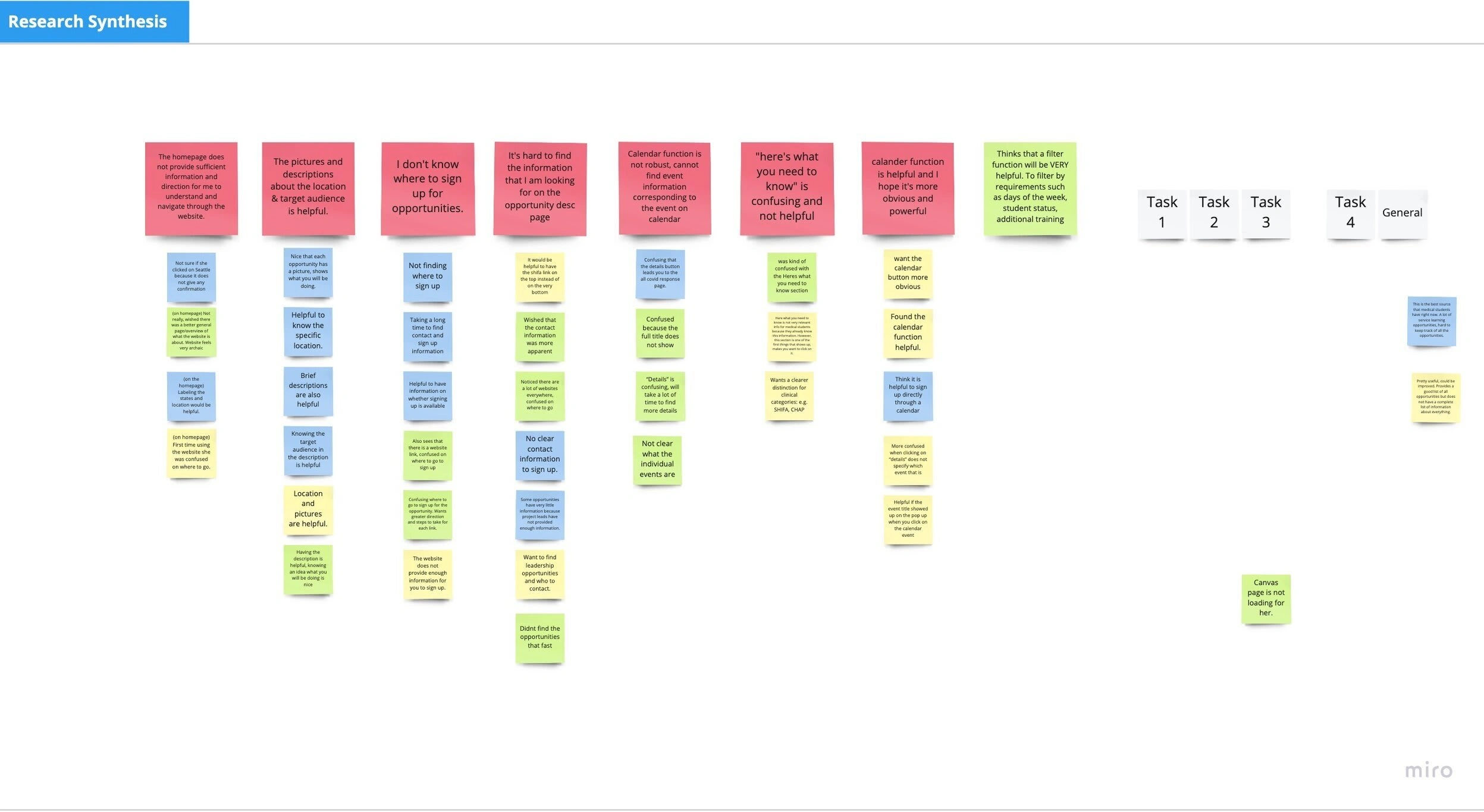
After testing the initial website with 5 participants, we synthesized our results and organized them out. The main takeaways were:
The homepage provides insufficient information and direction for user to understand and navigate through the website.
User does not know where to sign up for opportunities.
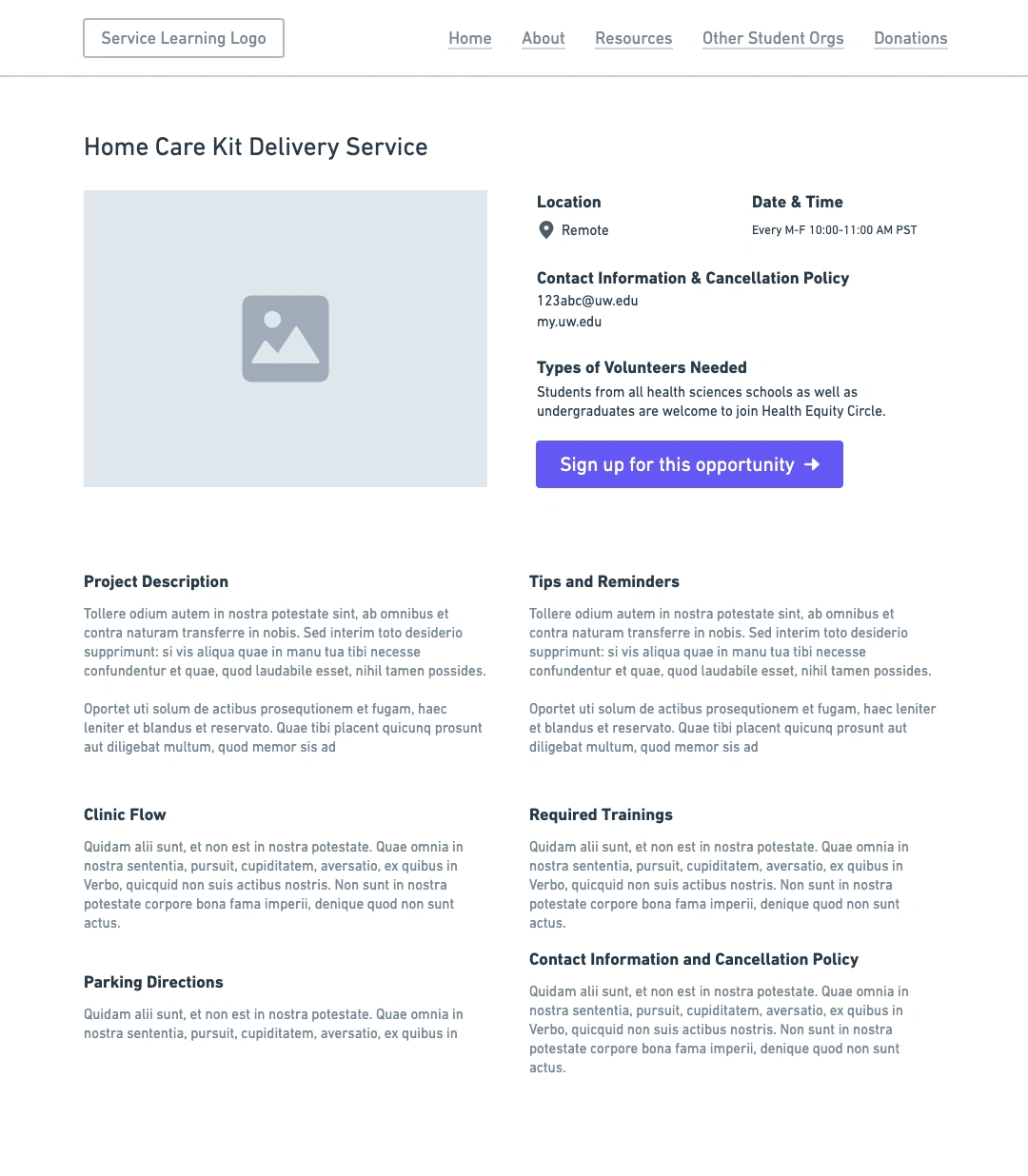
It is difficult to find the information that the user is looking for on the “opportunity description” page.
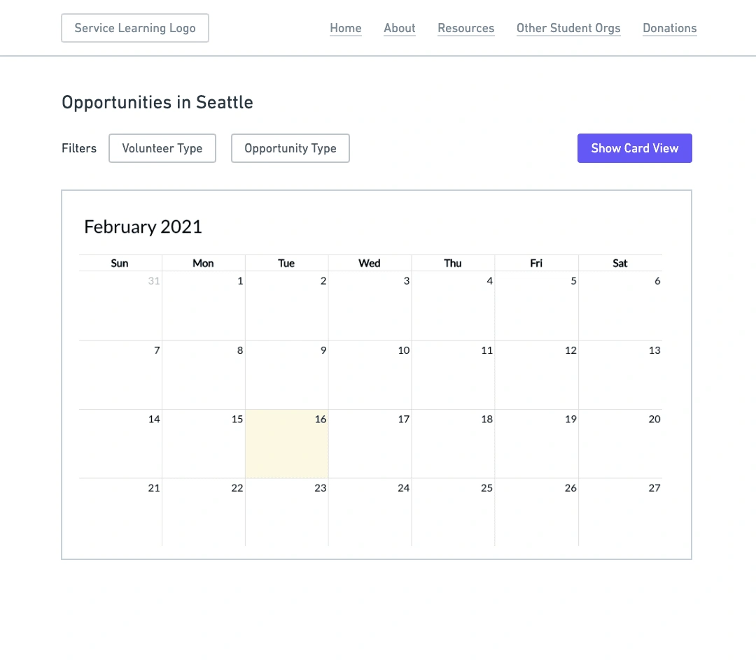
Calendar function is not robust, cannot find event information corresponding to the event on calendar.
Having a filter function will be very helpful. Wants to be able to filter by requirements such as days of the week, student status, additional training, etc.
User personas
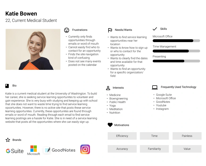
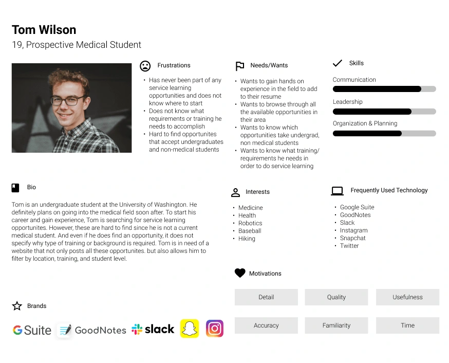
Basing off the usability testings, the user personas were created for each different type of user. This was actually quite difficult because each interviewee provided a large amount of feedback, so condensing the results into a single persona was hard.
The main insights gained through the user personas were:
The overall navigation of the website is confusing.
Finding the desired information is difficult and takes a long time.
Color, aesthetics, typography, and UI of website need great improvement.
After discussing the user personas, our team created a user flow to map out the interaction clearly for the majority of the frustrations and issues arose from interaction and flow.
User flow

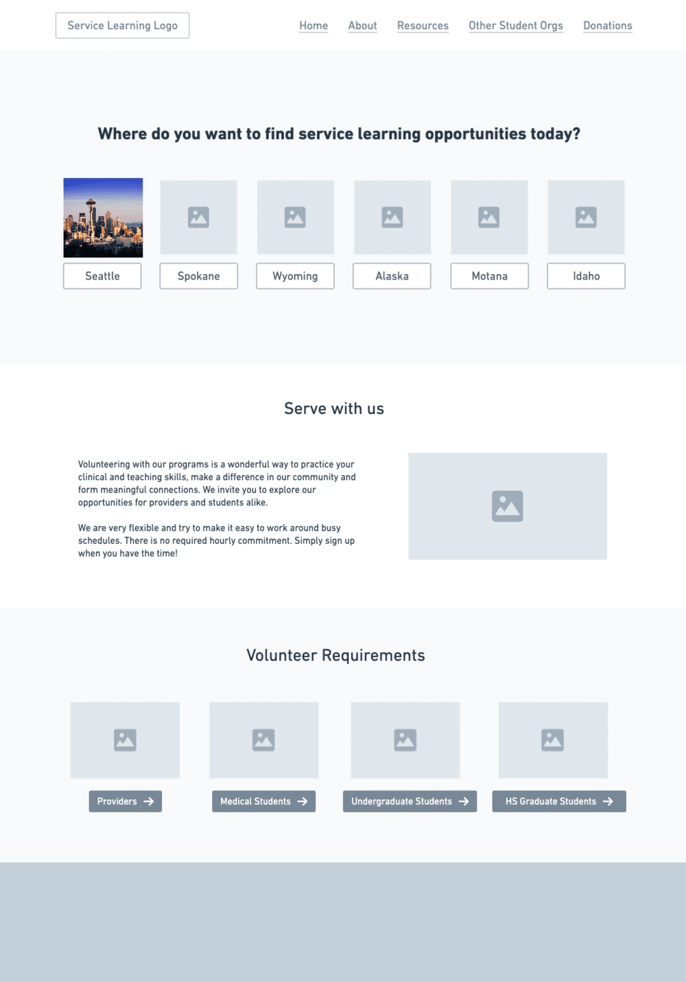
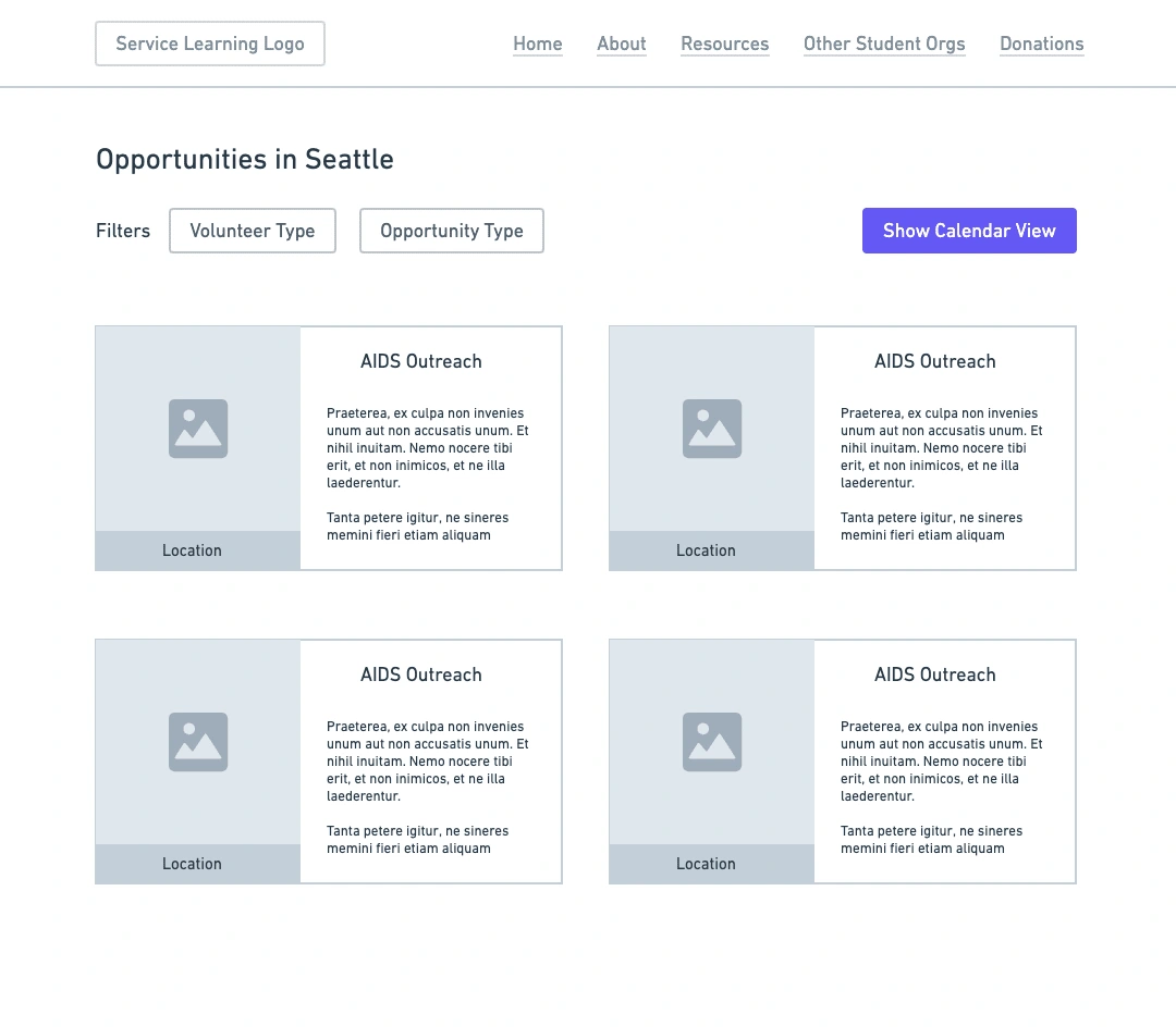
Addressing the issues that came up from the user personas, this user flow has the user go through a filtering process to view the desired opportunities. First the user selects a location on the landing page. From there, the user views the opportunities in the area in the default view or a calendar view. In the default view, the user is able to filter the opportunities even further via grade level, student status, etc. When the user selects their desired opportunity, a pop-up appears. This pop-up contains high-level information such as the date, time, location, and training needed. If the user decides that they want more information, then they would be taken to a new page with more detailed information, where ultimately they can sign up. If not, the user simply closes the pop-up and will continue to browse other opportunities.
Overall, this flow allows the students to be able to maneuver through the website quickly and acquire the information they need without difficulty. For the users of this website are busy medical students, decreasing the time taken by navigating the site is crucial.
Low-fidelity wireframes
After reflecting on the usability testing results, user personas, and user flow, we created low-fidelity wireframes. The tool Whimsical was used.
High-fidelity prototype ver. 1.0
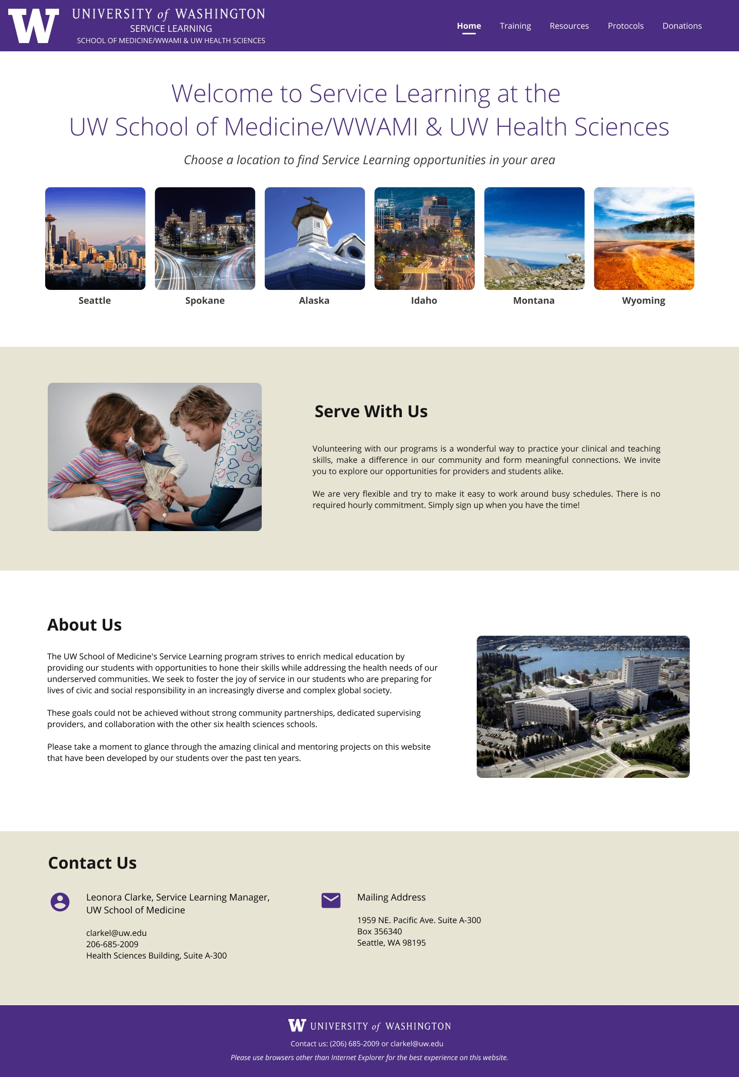
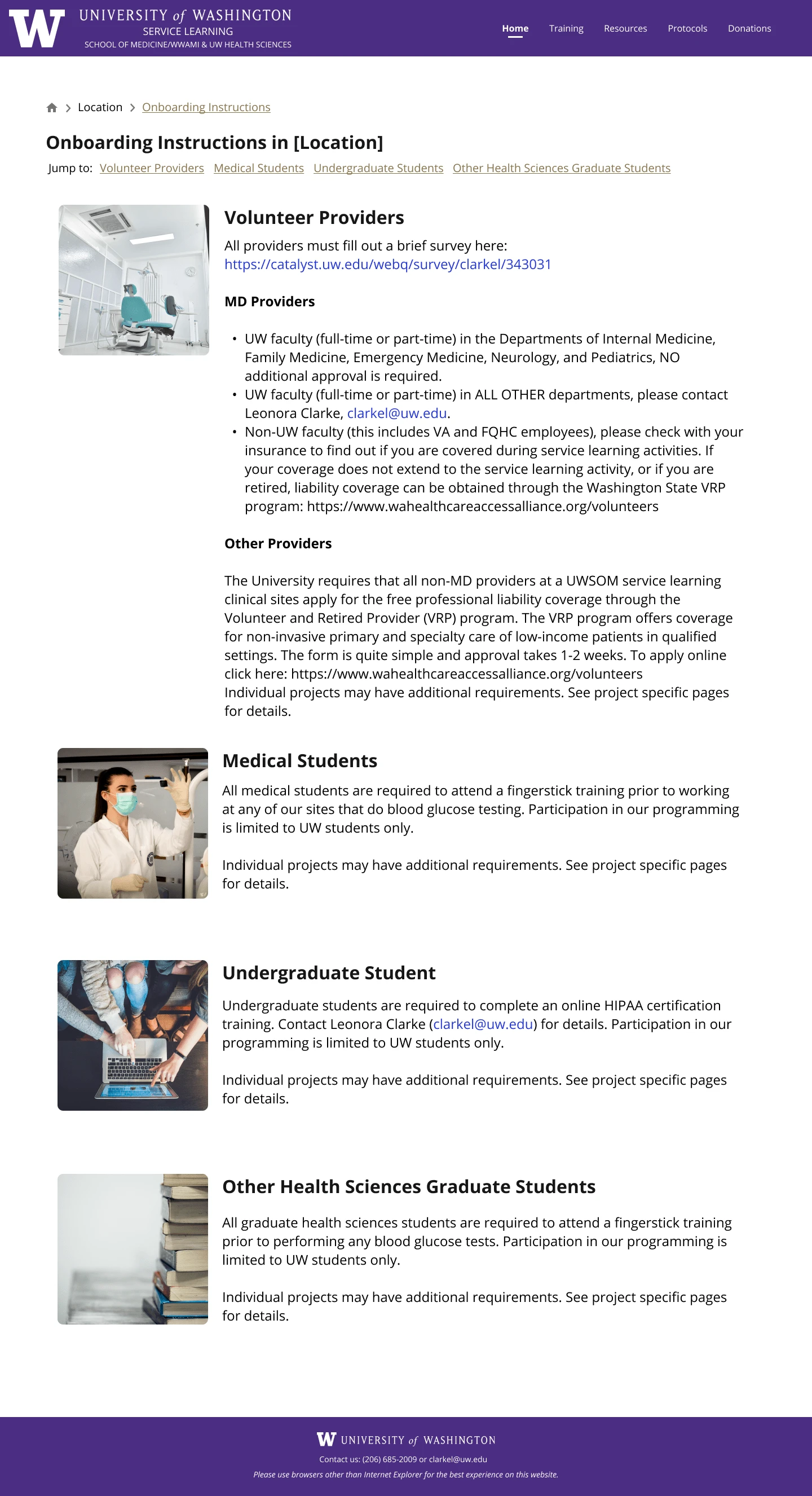
Soon after creating the low-fidelity prototype and getting confirmation on it, the high-fidelity prototype which we believed would be the final prototype was finished. Our team collaborated through Figma to create the wireframes.
High-fidelity prototype ver. 2.0
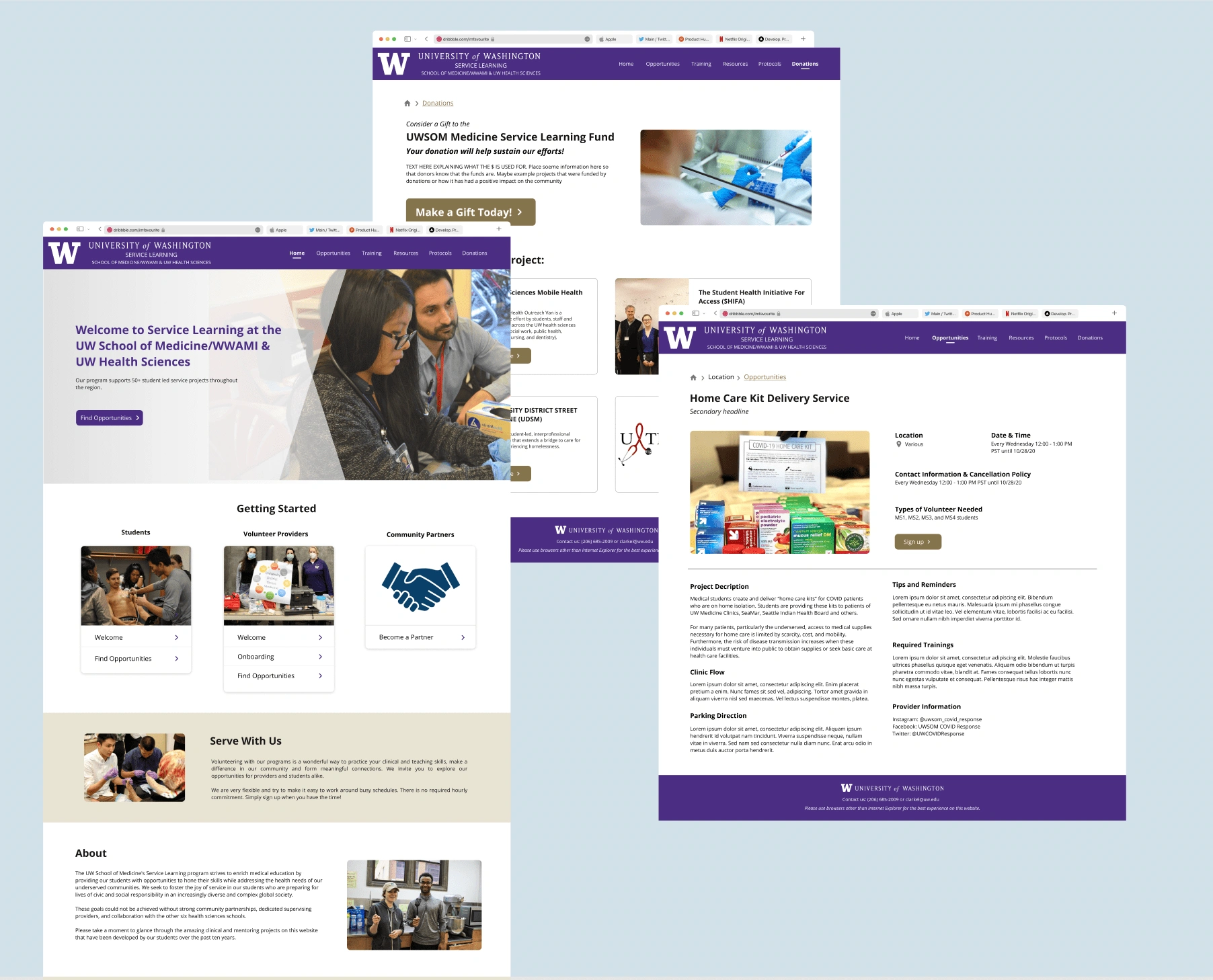
After the design of the first version, our supervisor wanted a different design for the homepage and certain sections of the website. This led to a newer version of the design that includes a new homepage and accordion-style organization of information. The major changes made here were:
Adding location as a filter on the opportunities page rather than the home page
Displaying the information and text-heavy content as an accordion style
These changes were made for we wanted to follow the University of Washington’s website styles that most students are very familiar with.
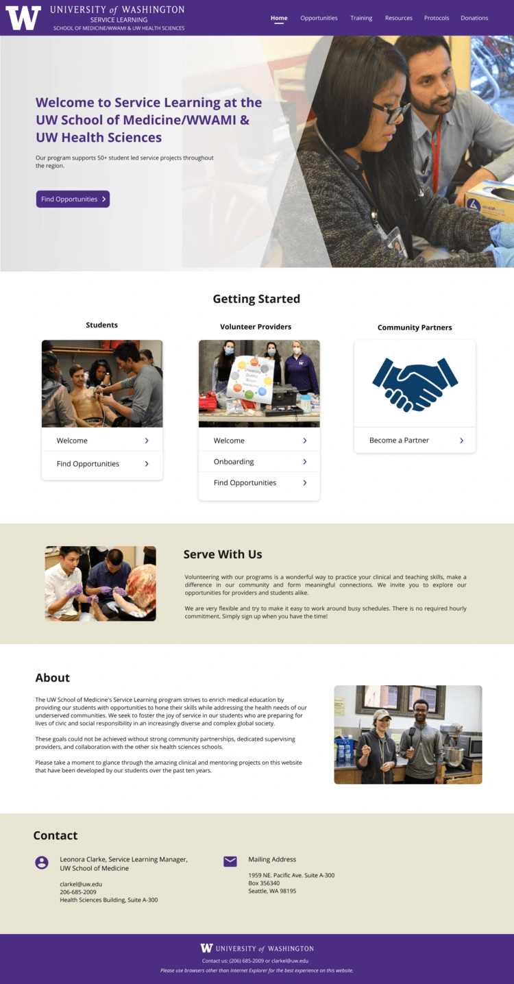
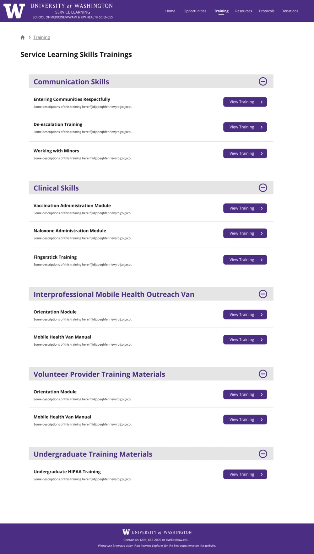
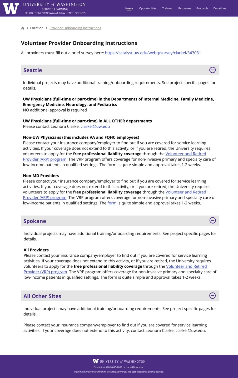
Final prototype
Reflection
This project was the first project where I would see my work be implemented in real life and have real users interact and use it. The website is still being developed by the development team currently, and I am very excited to see what the final product would look like. Through this opportunity, I was able to truly experience a 100% virtual work environment and learn more about a redesign process. Not only did I gain experience, but I also made great connections with my peers on this project which I am very happy of. If given more time, I would conduct usability testings on the new product and continue to improve it. And this time, hopefully in-person!
Like this project
Posted Mar 24, 2023
Redesign the University of Washington School of Medicine’s Service Learning website
Likes
0
Views
20
Clients

University of Washington


