FluidOS
Overview
Goal:
Design a new operating system (OS) for both the watch and the phone.
Duration:
10 weeks
Problem brief
Design a completely new OS for any device.
Device concept
Our team decided to design an OS for both the smart watch and the phone. However, we wanted to design for an innovative and futuristic device that is not out in the market yet. This led us to design an OS for a foldable watch that acts as both the watch and the phone.

The Fluid Watch (not a real product) is a wearable device that can be converted into a phone. It is both foldable and detachable.
Design Principles
Before moving into the design phase, our team decided to set design principles for the OS. This way, while different individuals are working together, the end product will reflect a unified design that is seamless.
The high-level descriptors of our design are:
Modern
Simple
Minimalist
Comfortable
Intuitive
The key principles are:
Flat Design
Simplicity of shapes and elements
Bold and highly readable typography
Clear and strict visual hierarchy
Avoiding textures, gradients and complex forms
Applying the principles of grids, geometric approach, and visual balance
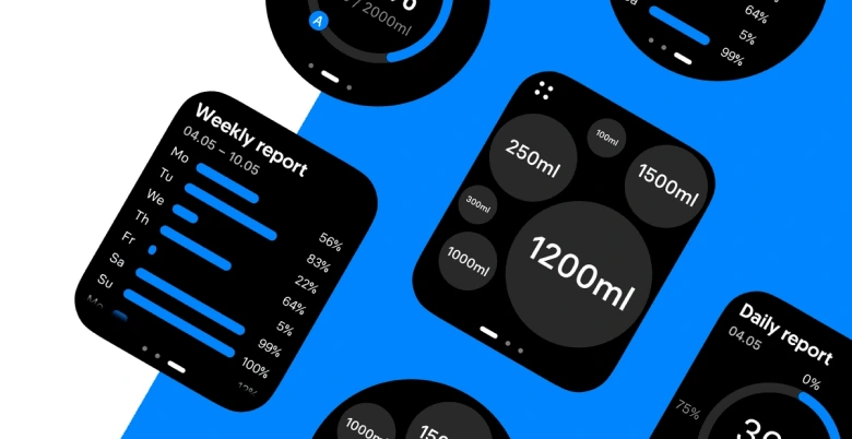
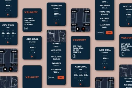
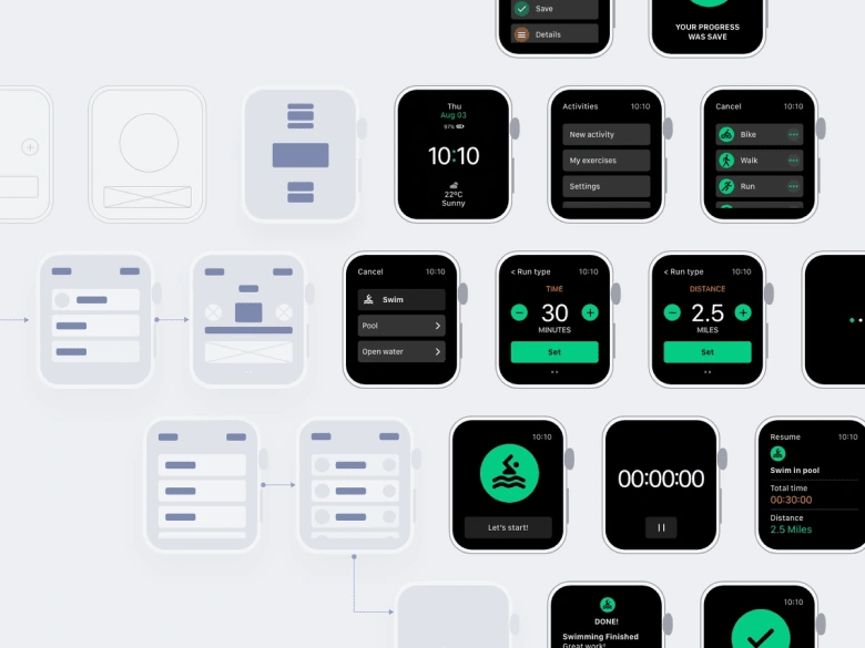
Visual direction and inspiration
Design language
The design language is the more specific design style our group will take on for the OS. It includes color, typography, and design patterns.
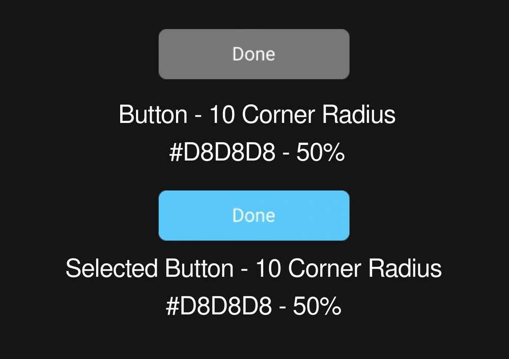
Buttons
We use 10 corner radius to make the button looks comfortable and consistent with our frame
Secondary color and 50% opacity to make the button looks more harmonious with background color
We use an accent color to make the selected button stand out.
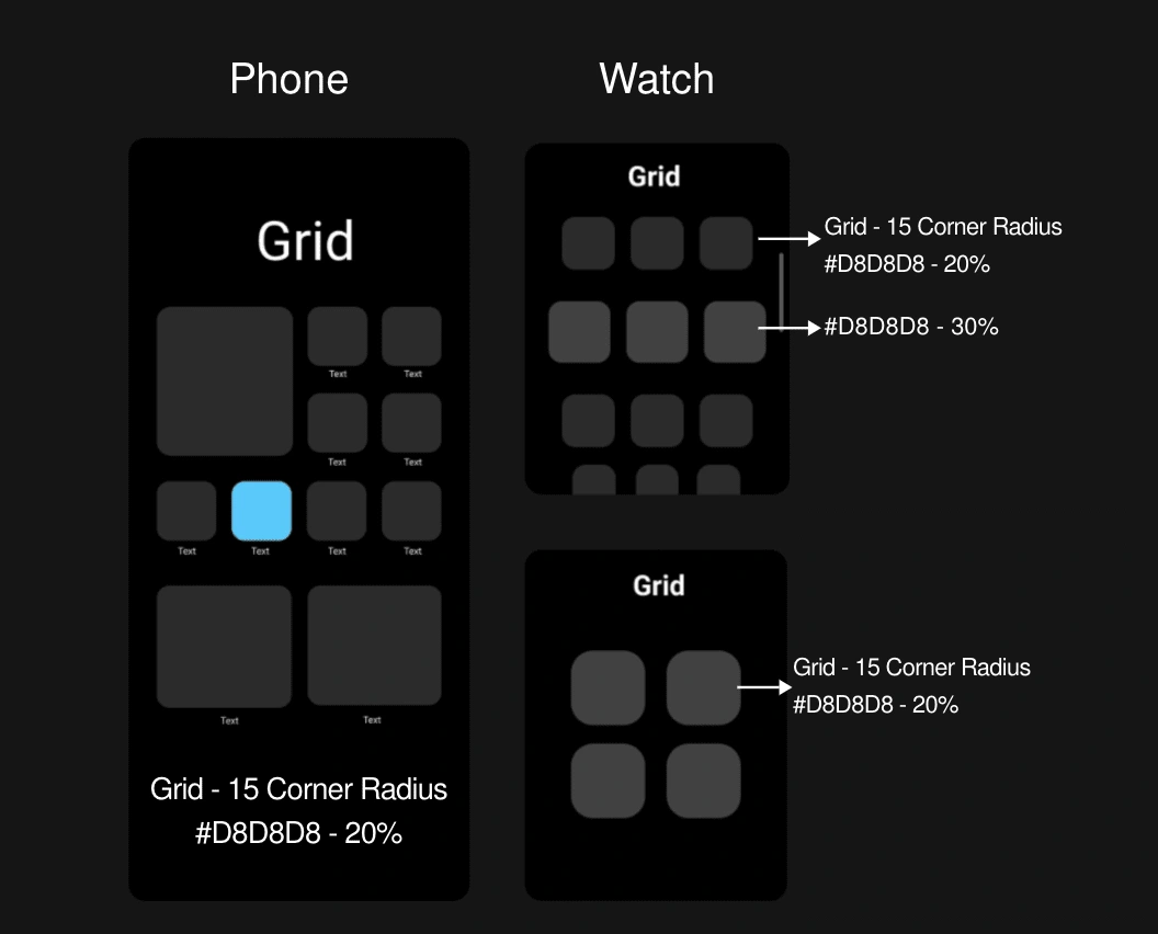
Grid
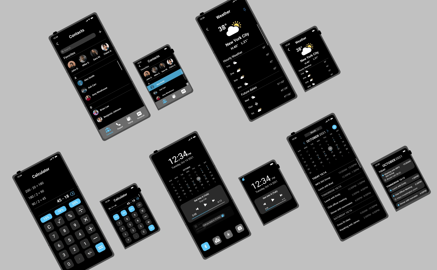
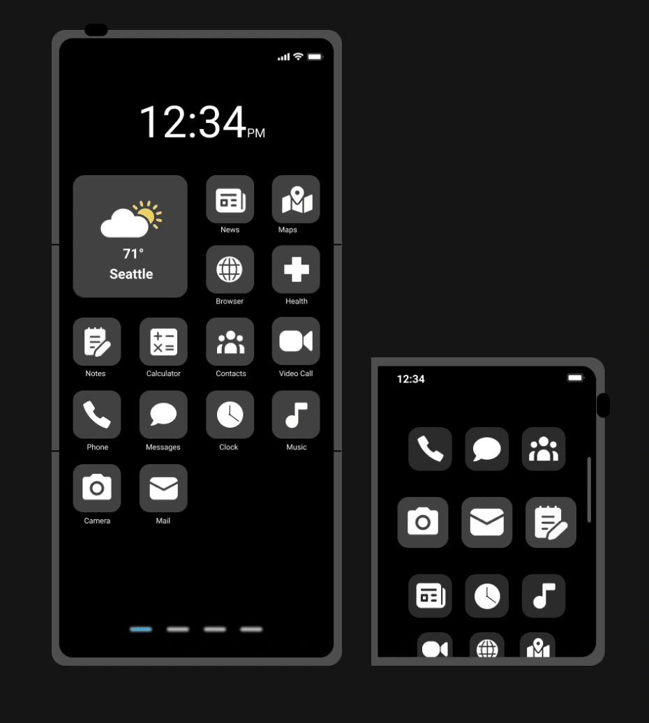
We give users 2 kinds of grid for phone mode so they can see information like weather in a larger grid.
There is a zoomed-in view for the watch grid element. This enlarges the middle row on the watch mode, allowing users to view their desired content easily.
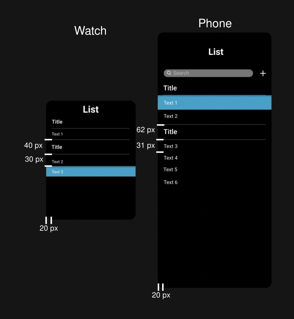
List
We use the list pattern for clear information alignment.
Accent color is used to show selected list.
The padding between each list element is as shown below.
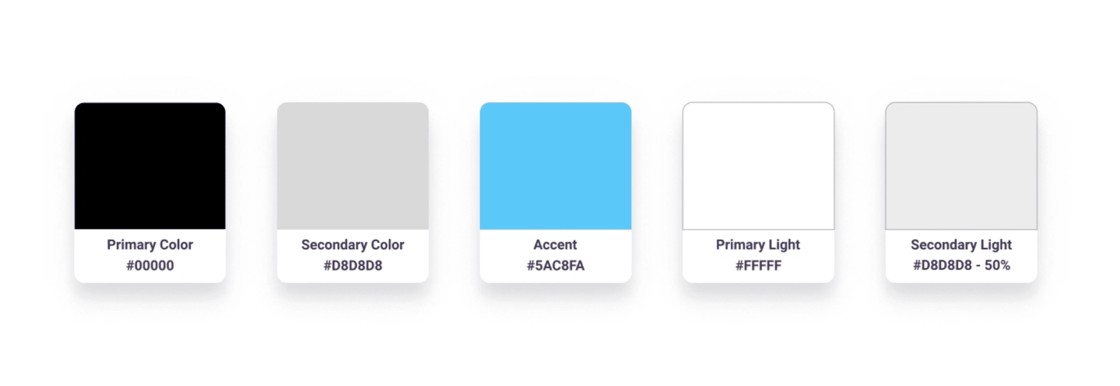
Color Palette
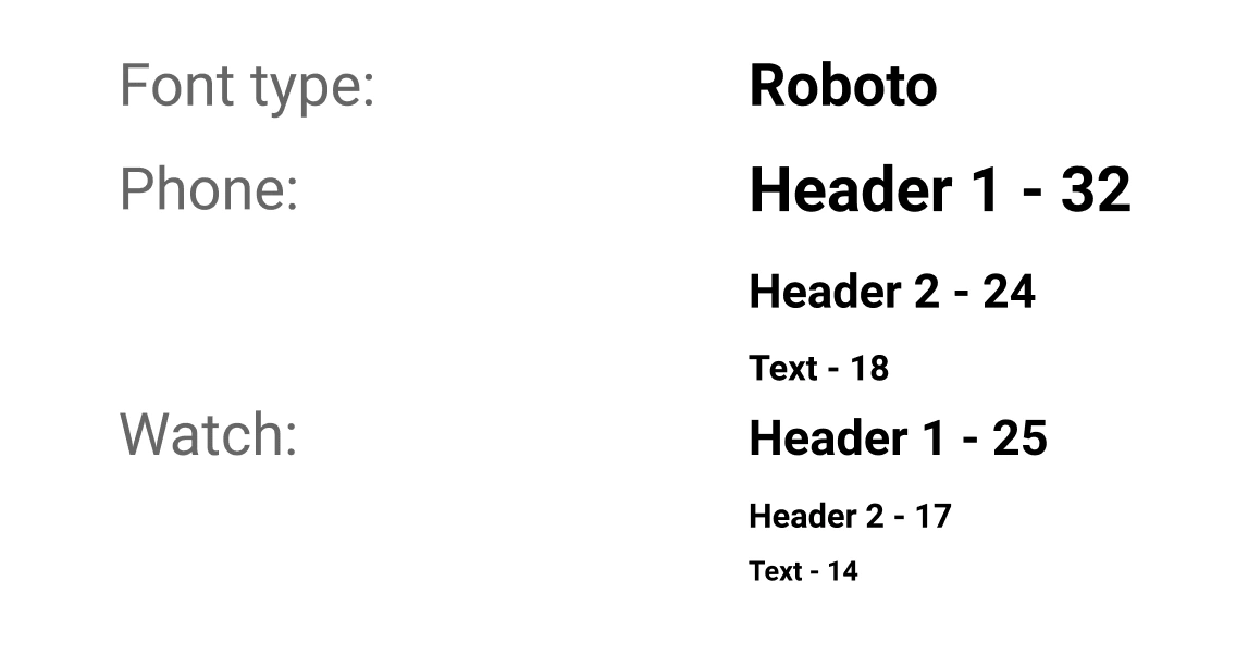
Typography
App prototypes
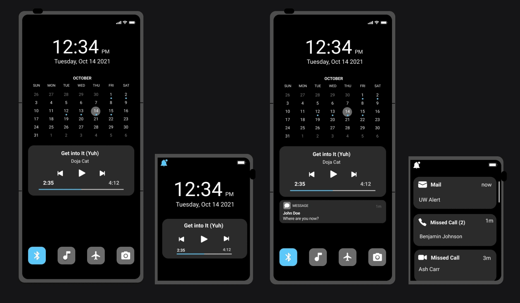
Lockscreen & notifications
Homescreen
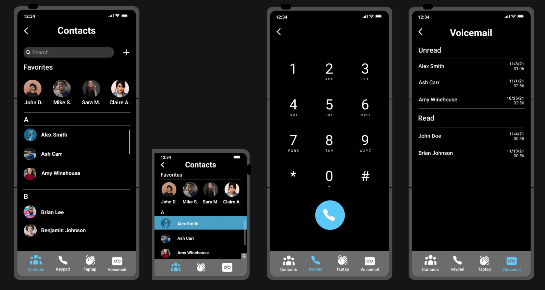
Dialer
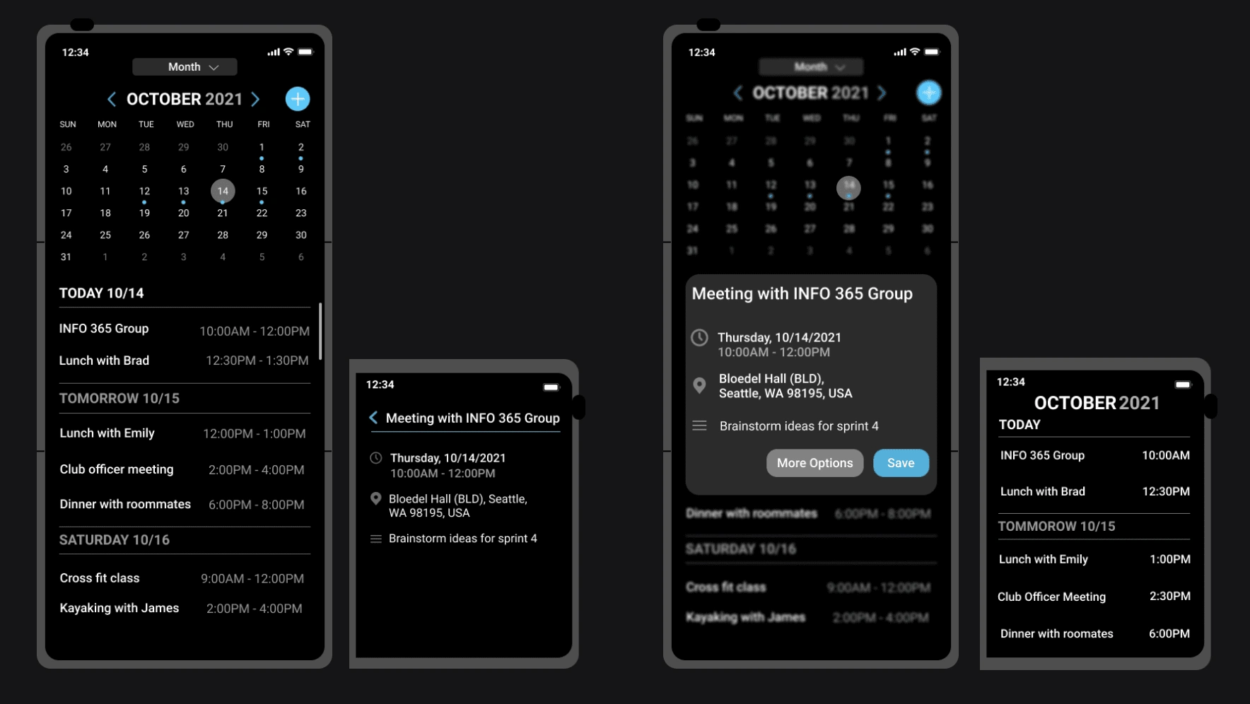
Calendar
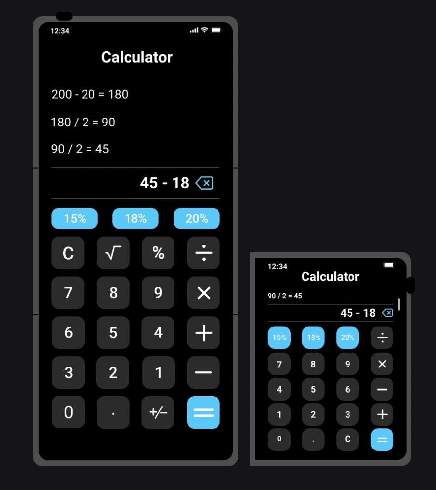
Calculator
Weather

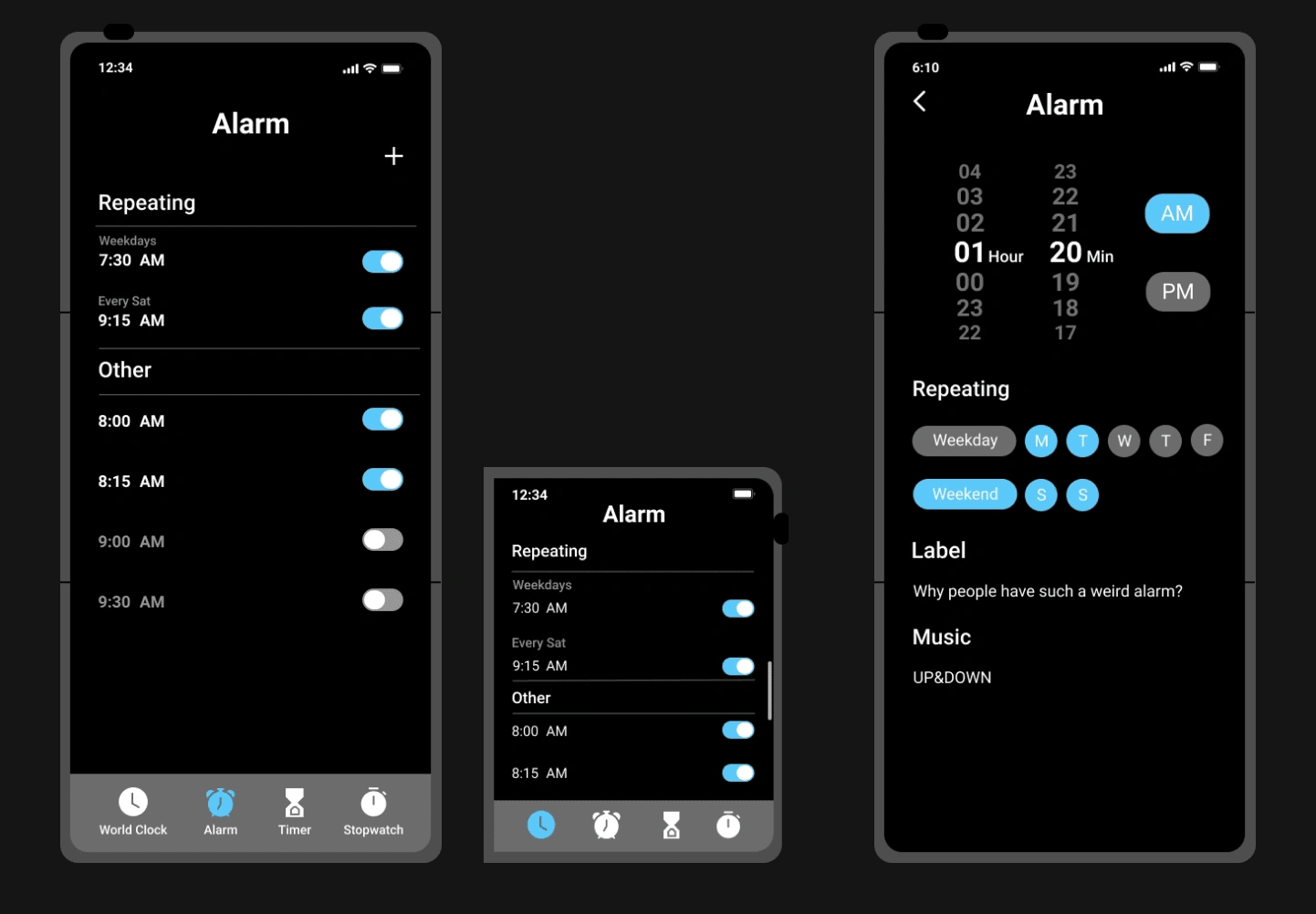
Alarm clock
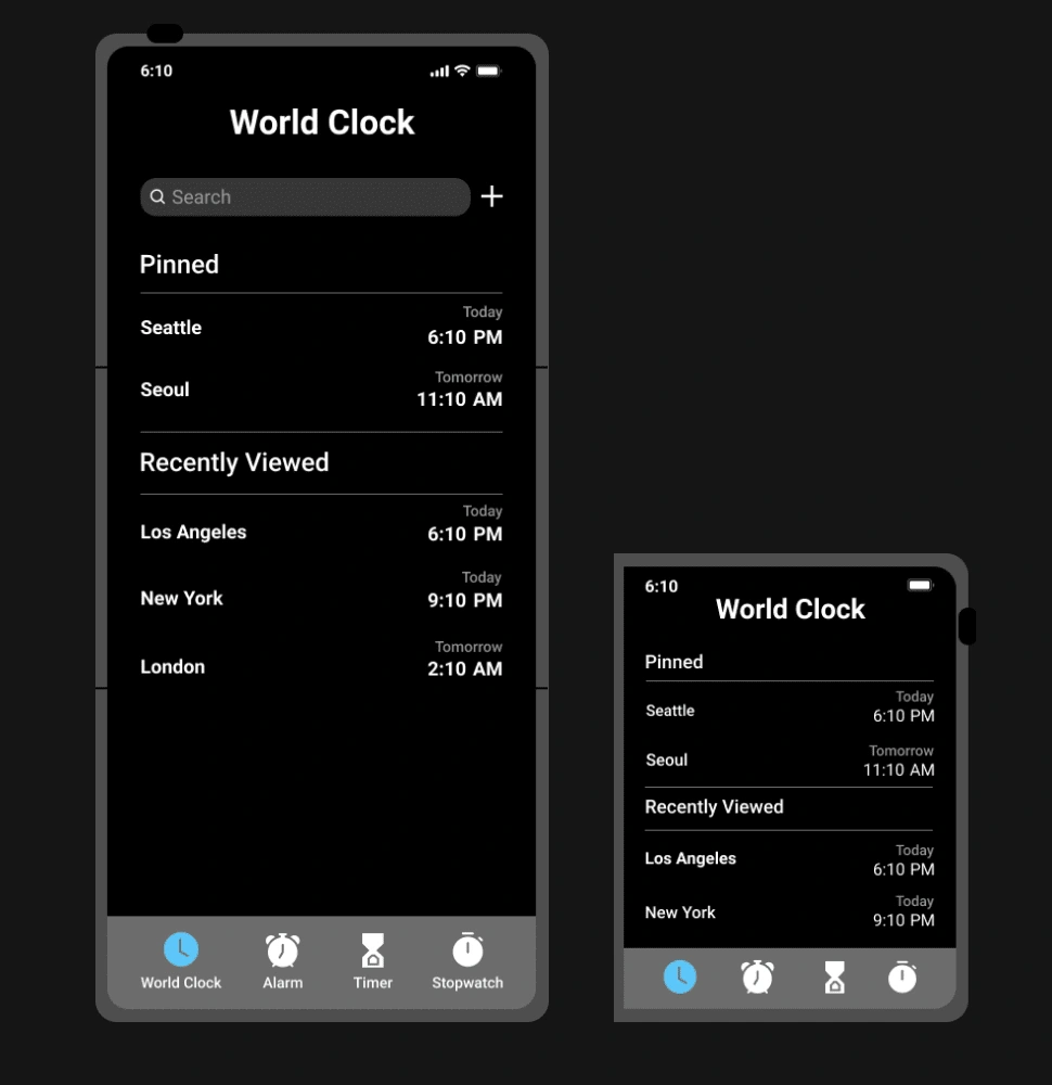
World clock
Like this project
Posted Mar 23, 2023
Design a new operating system (OS) for both the watch and the phone
Likes
0
Views
21
