Indeed Developer Portal
Overview
Project objective:
Define a developer documentation portal that holds comprehensive and feature-rich API documentation for third-party developers
Duration:
12 weeks
Timeline:

Initial Research
Research methodology
We conducted 5 UserTesting sessions with participants that met the following criteria:
Currently employed
Used third-party APIs within the last month
We focused on answering the following research questions:
What devices do developers use most frequently when accessing API documentation?
What information do developers need to work efficiently?
What key features of an API documentation portal are necessary vs. nice to have?
Initial research findings
When accessing API documentation, developers always use their computers
Approach design with a desktop-first approach
In order to work efficiently, a user experience that has clear navigation and architecture is necessary
Key features: clear error documentation, table of contents, search bar, code samples, and FAQ
Nice to have: Sandbox environment, help articles, split-screen layout
Competitive analysis
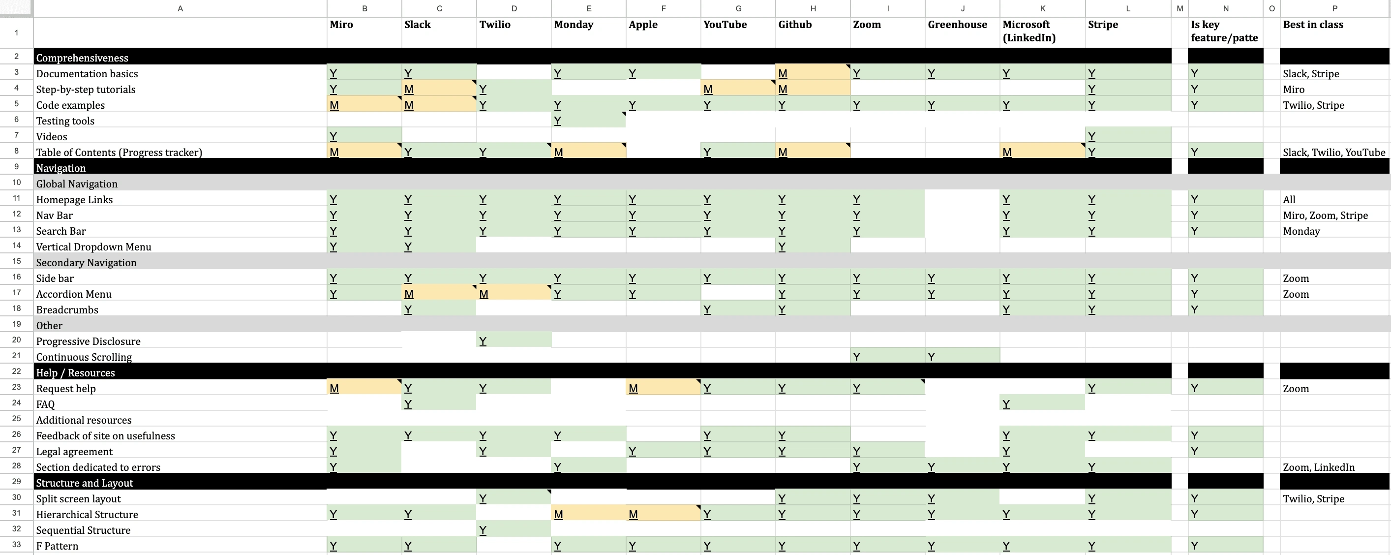
Conducted competitive analysis on 11 different platforms.
Results
The key features and design patterns that overlapped among these different platforms were extracted. After further analysis and discussions with product managers and other UX designers, 6 features were chosen to be implemented into the new design. This includes the table of contents, global navigation, secondary navigation, support, feedback, and legal.
Information architecture
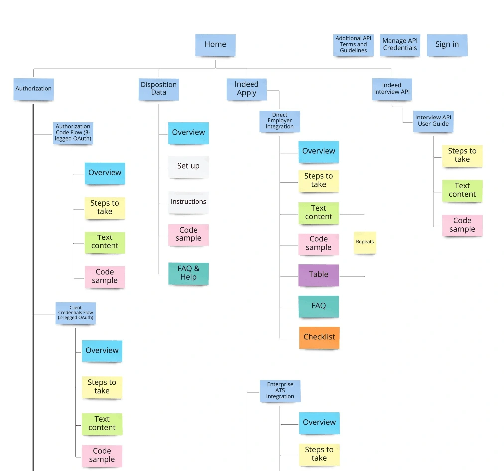
Low-fidelity proposal
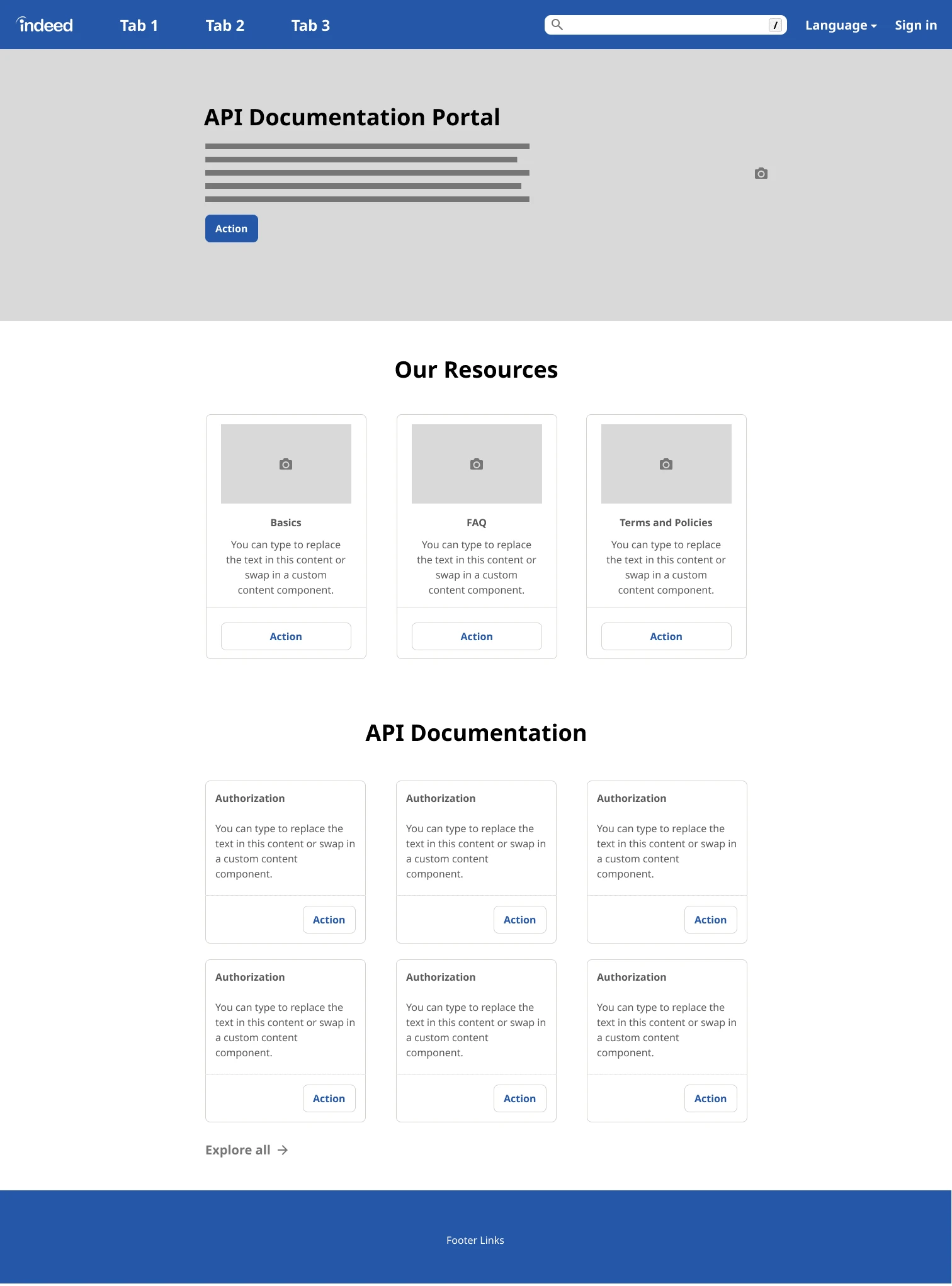
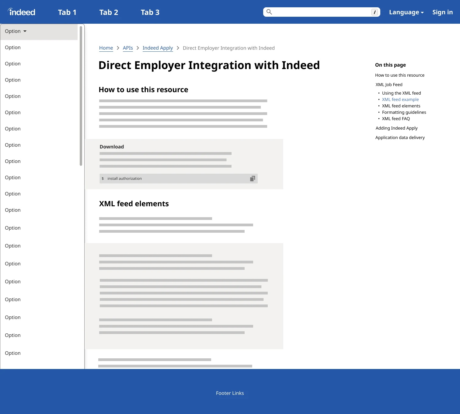
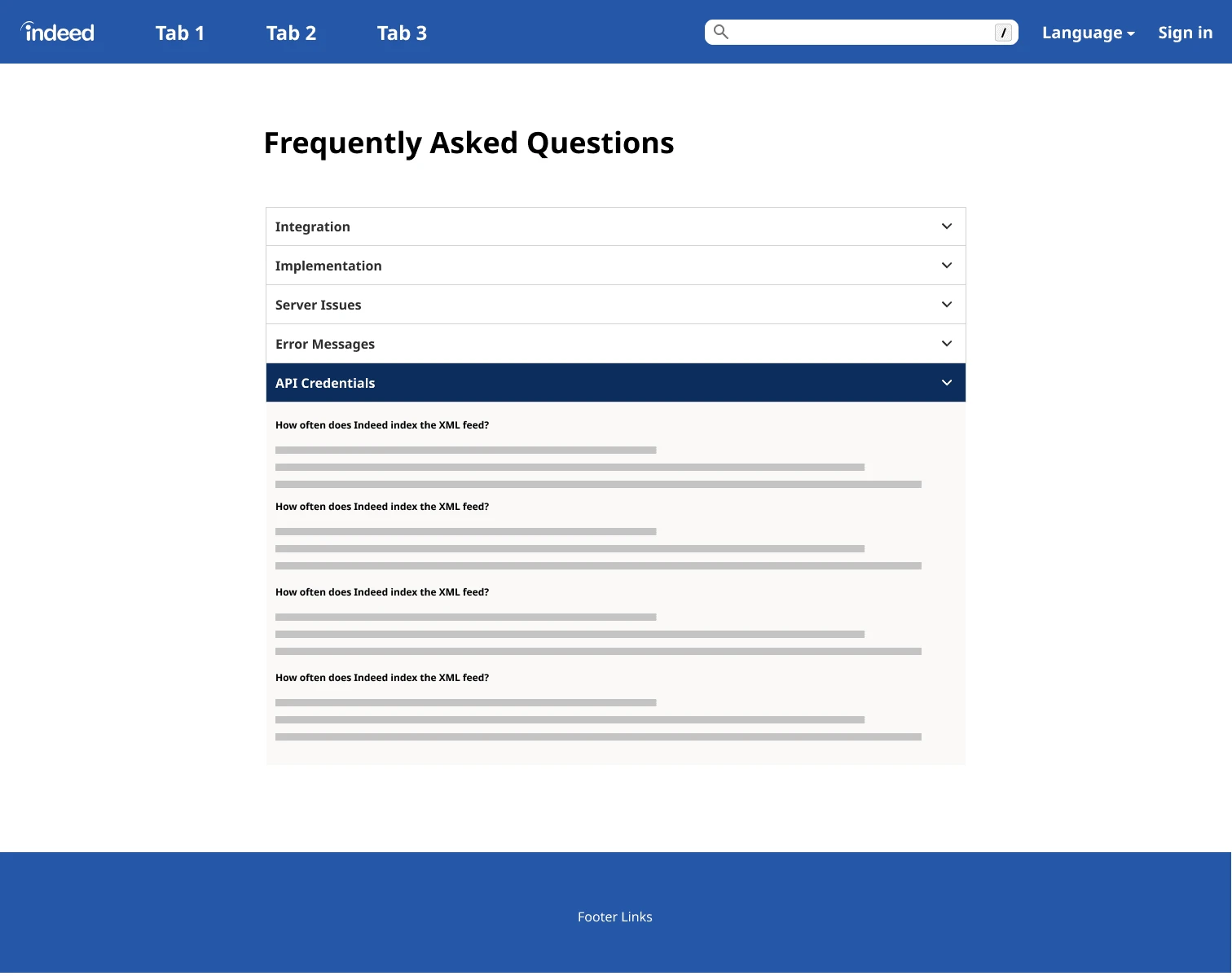
After defining the problem space, conducting initial research, and creating a competitive analysis, I combined all the insights I have gathered into lo-fi wireframes.
Home
Documentation
FAQ
Legal
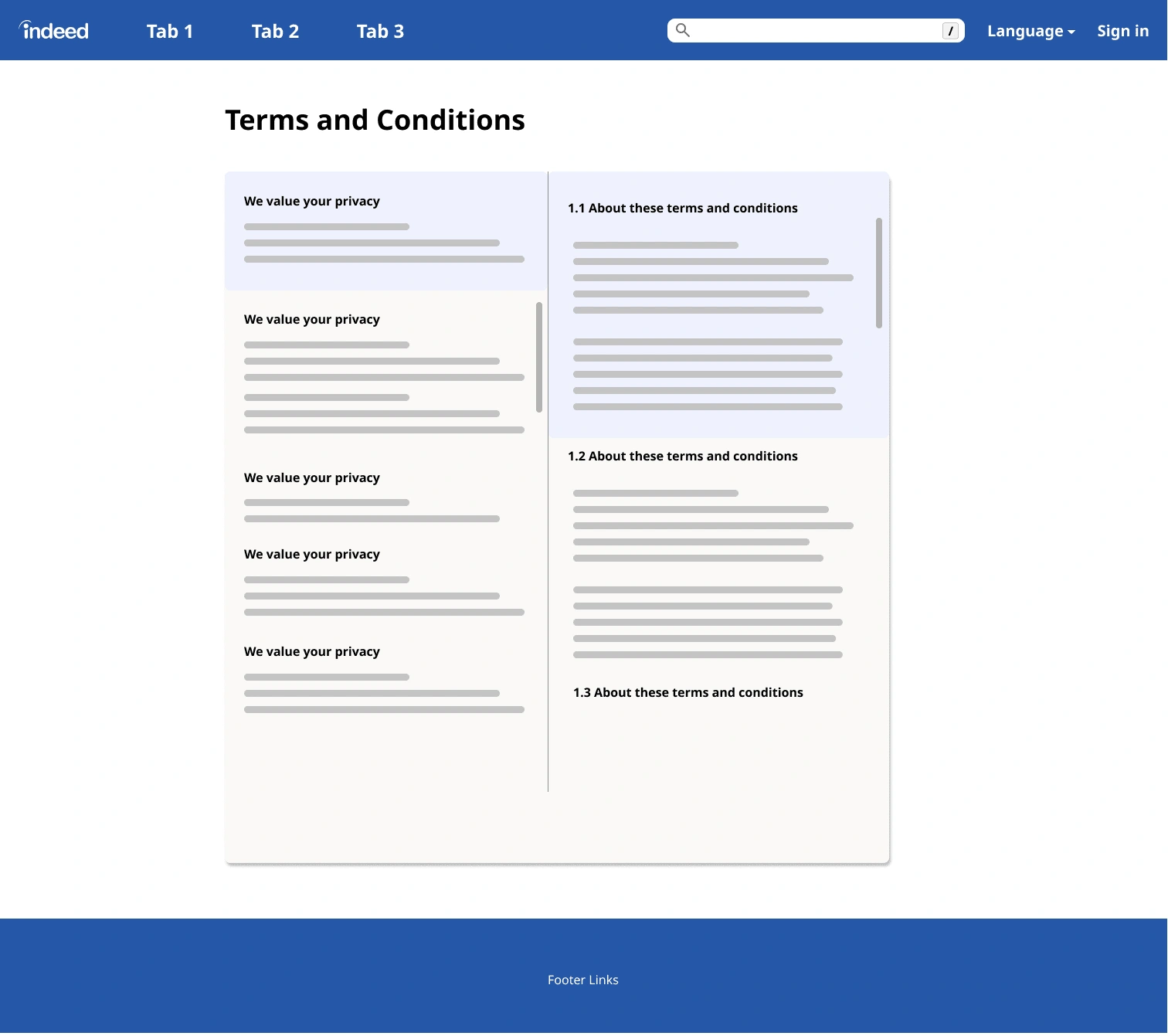
After creating the lo-fi wireframes, I received feedback from my team during the weekly design review sessions and worked on implementing different design recommendations given to me. During this time, I did a lot of exploring while also keeping very technical user in mind.
High-fidelity prototype
After going through rounds of design reviews and updates, I created the high-fidelity prototype in an aim to conduct usability testing on it.
Home
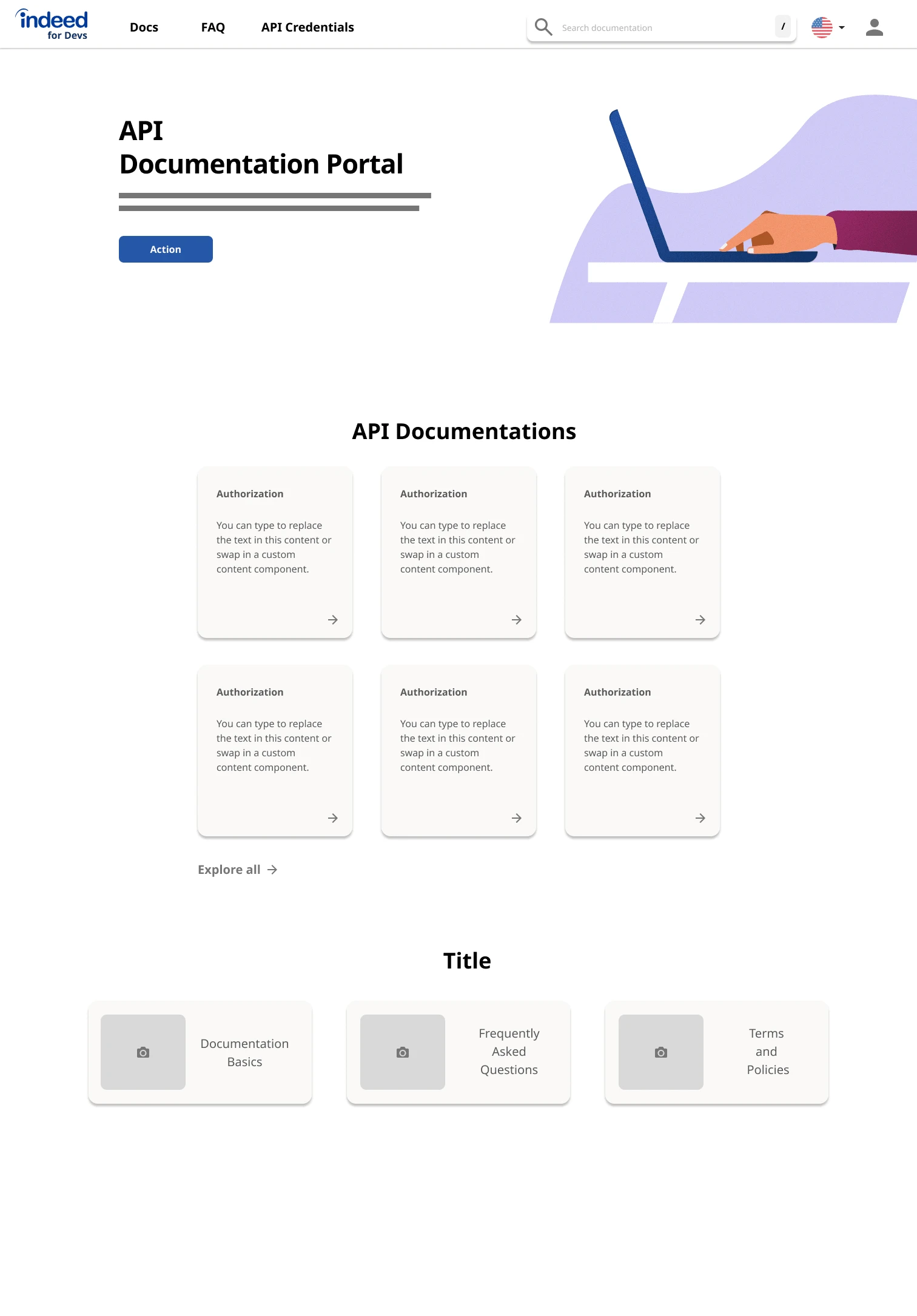
While the first home wireframe had a much more welcoming layout, the user base is software developers who want to access their information in the quickest manner possible. There was feedback that the first layout can be confusing for the users and take more time, so the second home design shown below, was introduced.
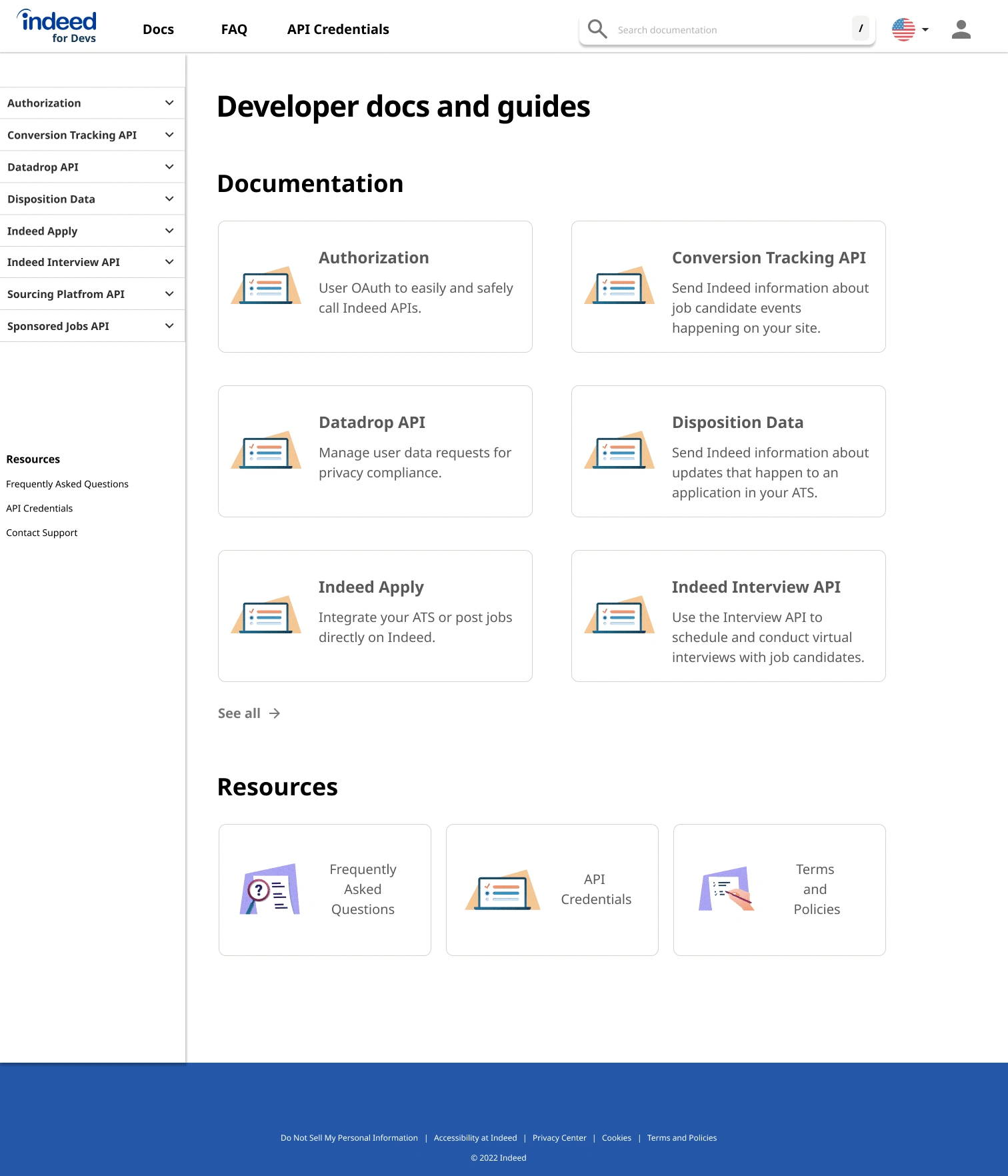
Documentation

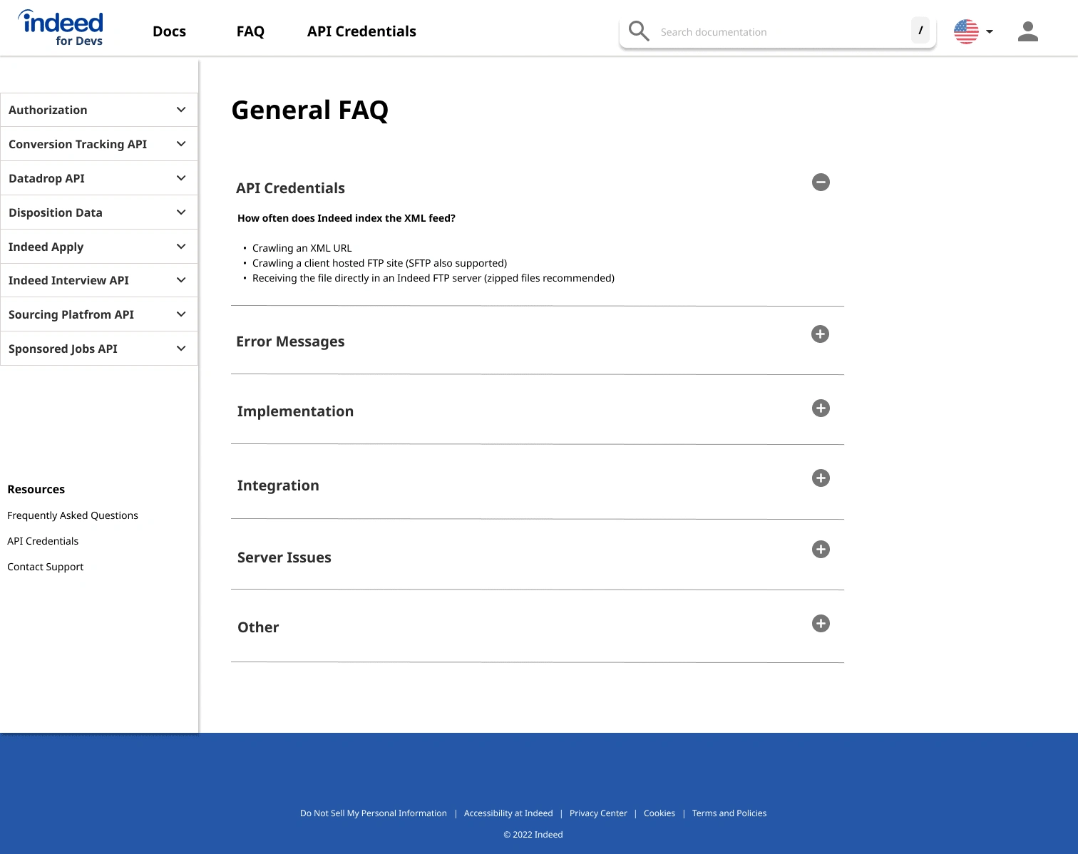
FAQ
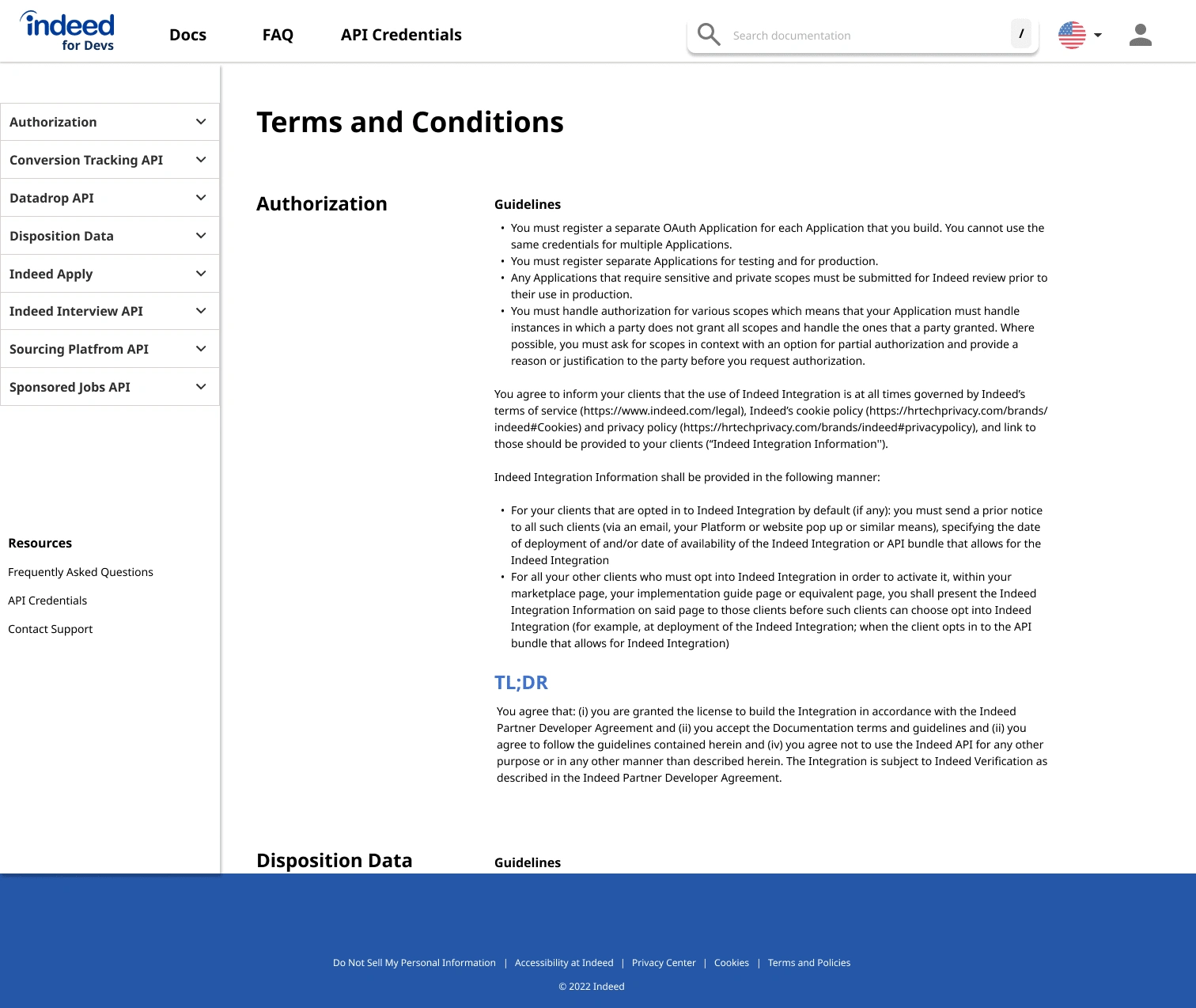
Legal
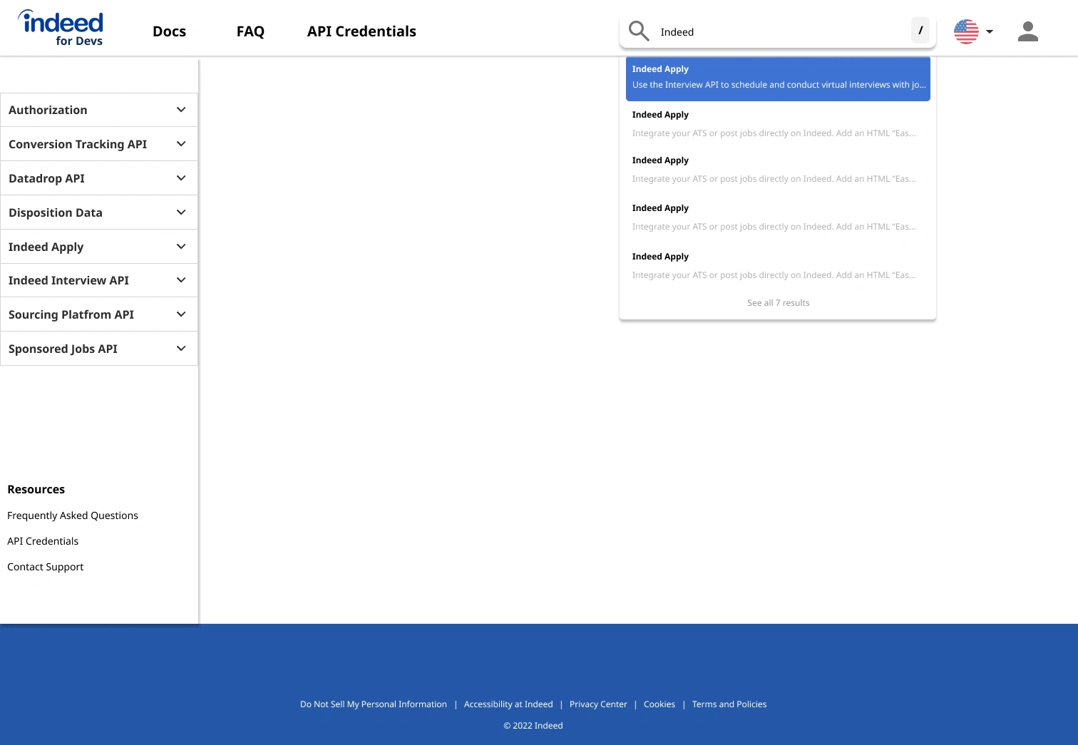
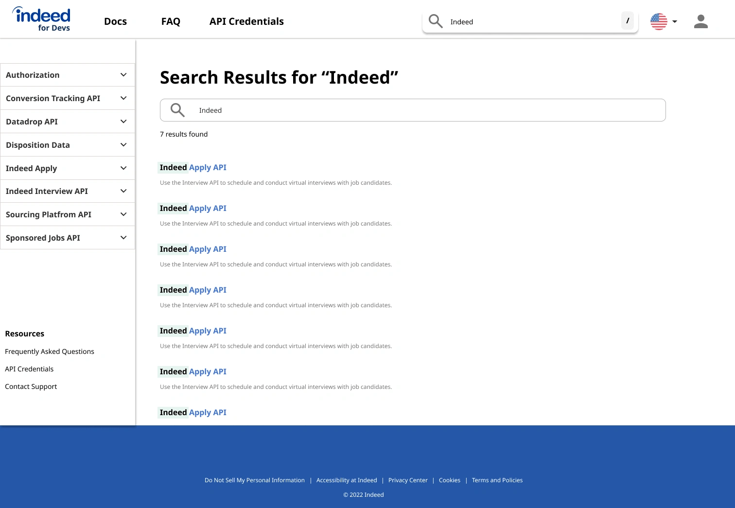
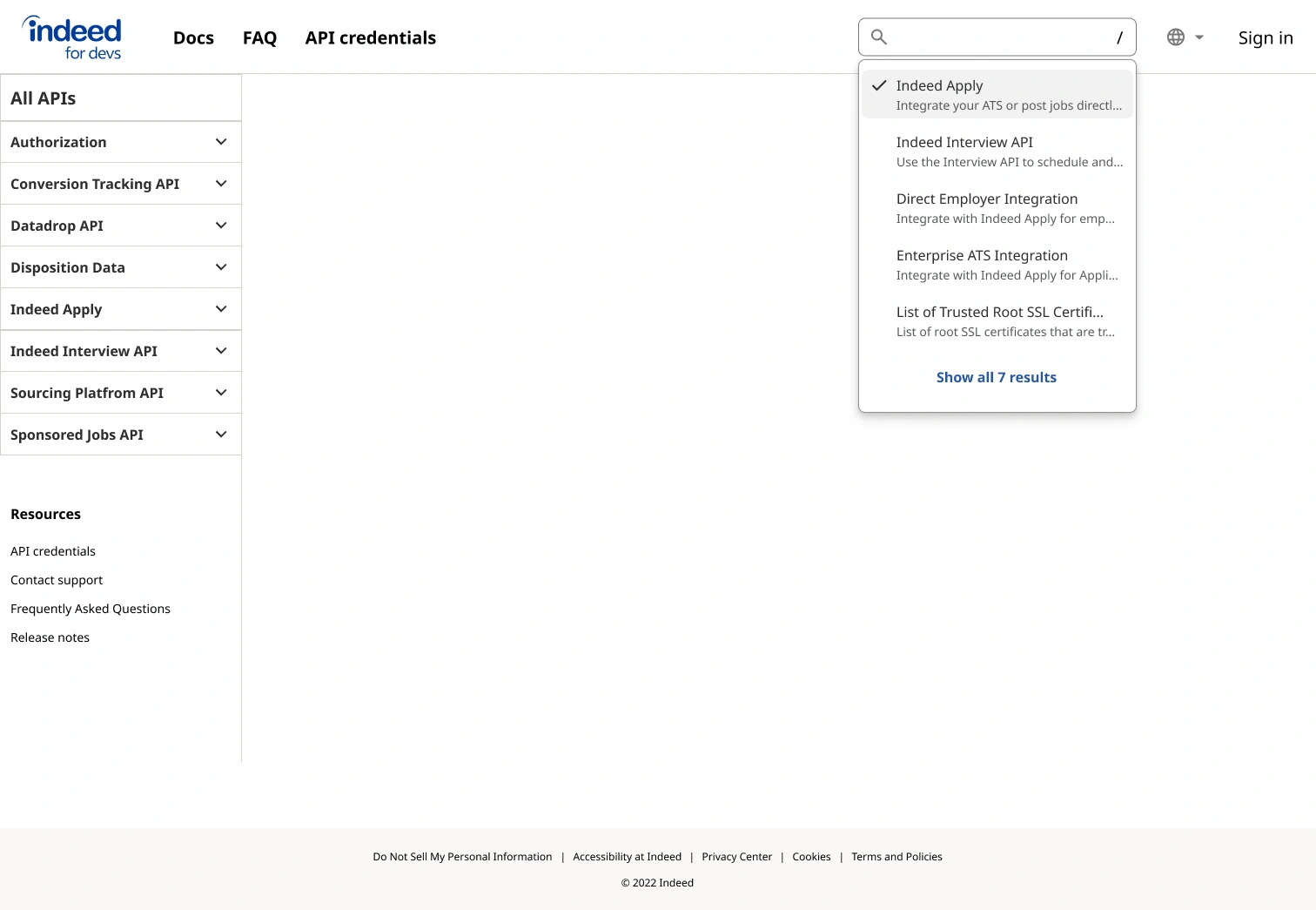
Search
Usability testing
We conducted 13 total sessions, both moderated and unmoderated.
Usability testing was conducted on the high-fidelity prototype to answer the following research questions:
Is the documentation provided in the current proposed designs helpful?
What additional documentation do developers need from a developer portal?
How quickly are developers able to find answers to their questions?
Are users able to easily find information within the developer portal?
We received overall very positive feedback on the prototype.
It's actually a little more meticulous than others that I have looked at in providing information. It does a good job in making me understand what I need and what I need to know and providing multiple ways to access that information. UserTesting participant Full stack developer
It's clean, it's easy to find the sections and navigate, so that's useful for me. Love the search section. Internal developer
Overall I like the design, it's very clean and easy to navigate External client Business Analyst
Research findings
Our Developer Portal will be serving more than just developers
Overall, the developer portal felt well organized and user centric
100% of participants gave overall positive feedback
Recommendations
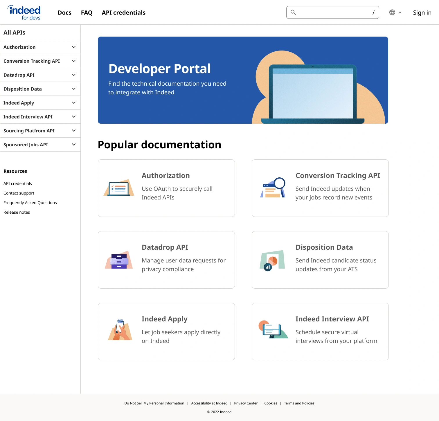
Increase clarity and familiarity in home screen to welcome the user and ensure that they know instantly they are on the home page
Include tabs showing different code languages to allow users to easily switch between languages and implement in the corresponding language
Reduce the points of navigation to minimize confusion and to speedily guide user to correct documentation
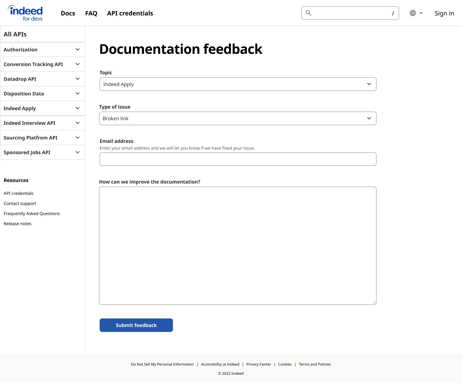
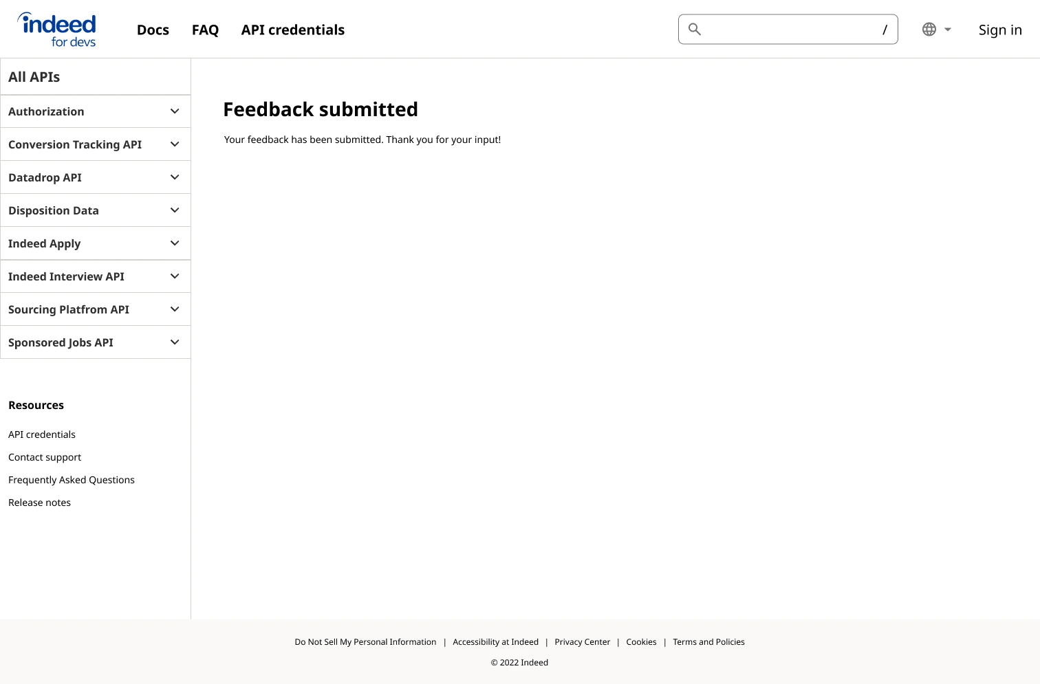
Allow user to leave reasons behind feedback to increase user satisfaction and decrease support tickets
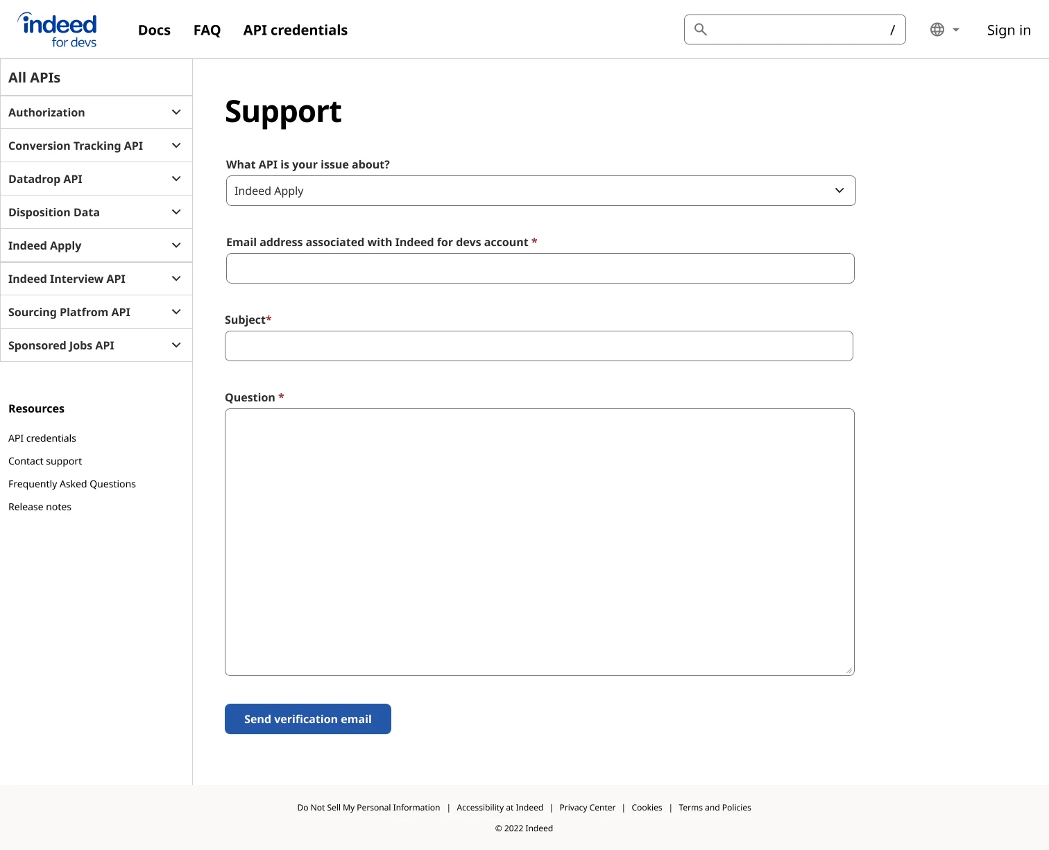
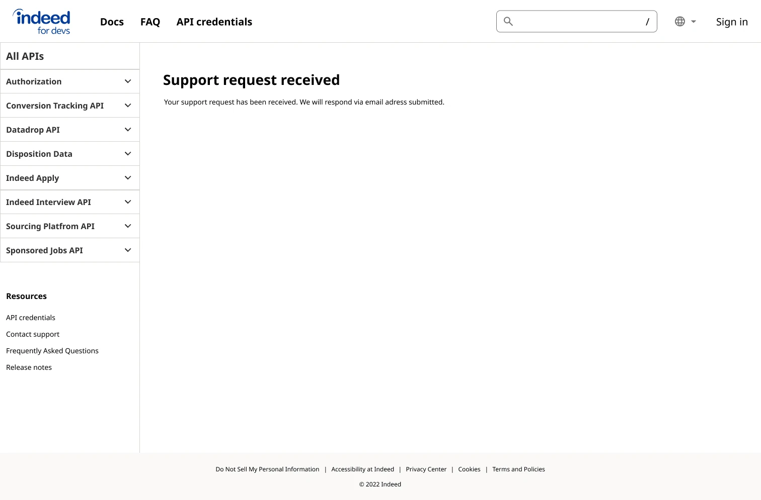
Contact support directly through a form on the browser to reduce confusion from multiple forms of communication
Final design
Home
Docs overview
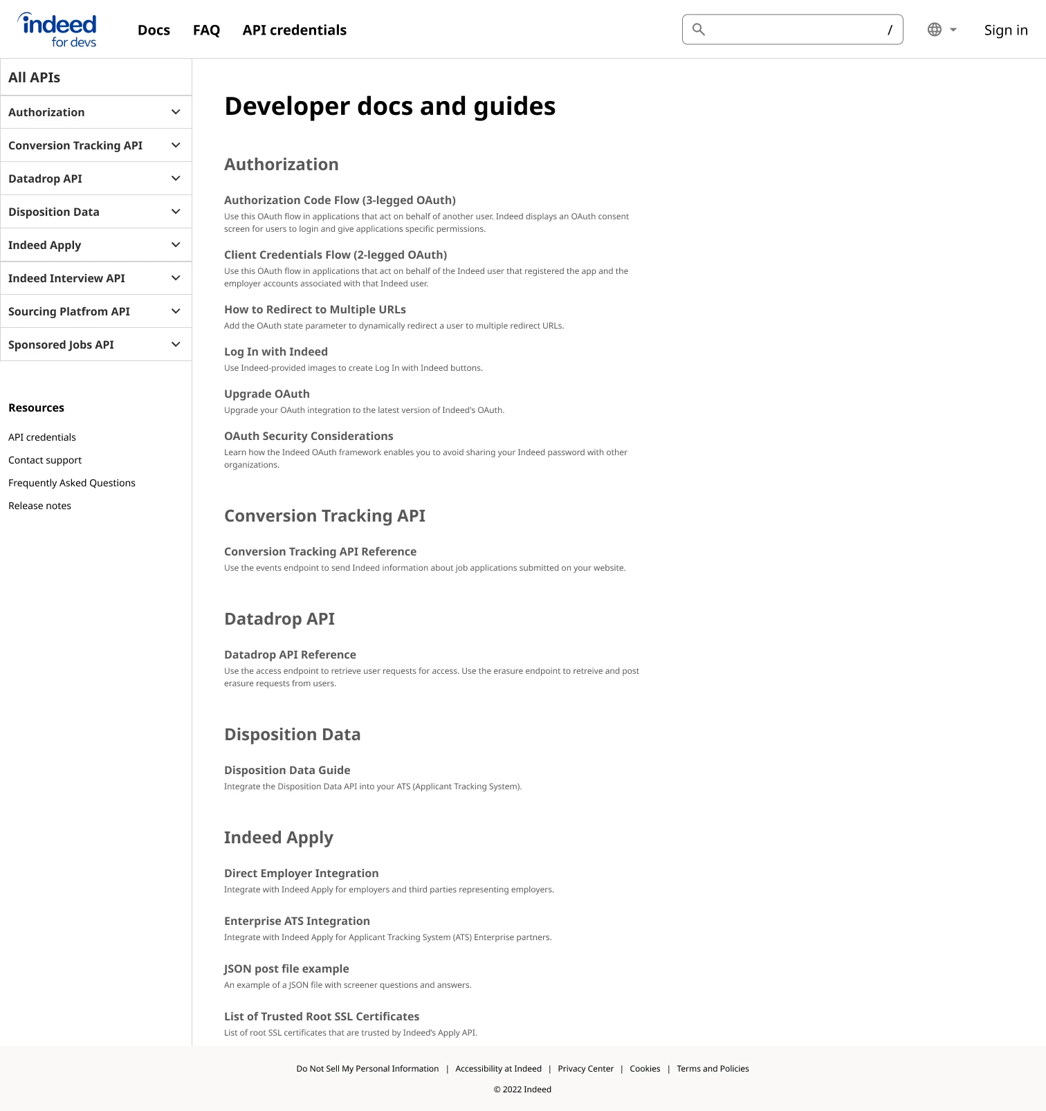
Documentation

Code component
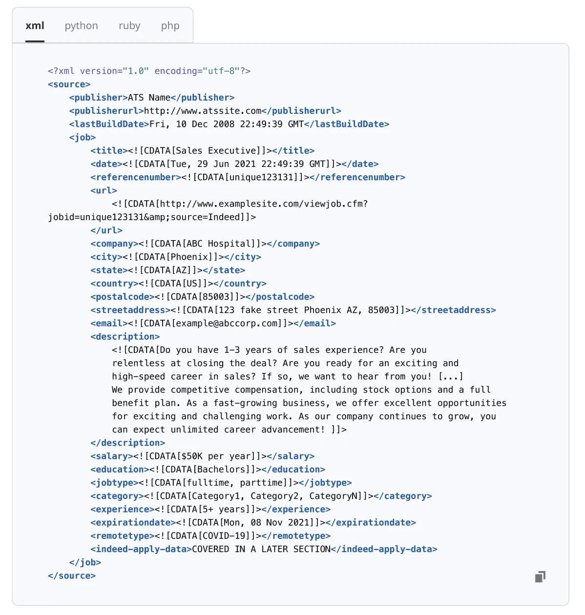
Expandable image
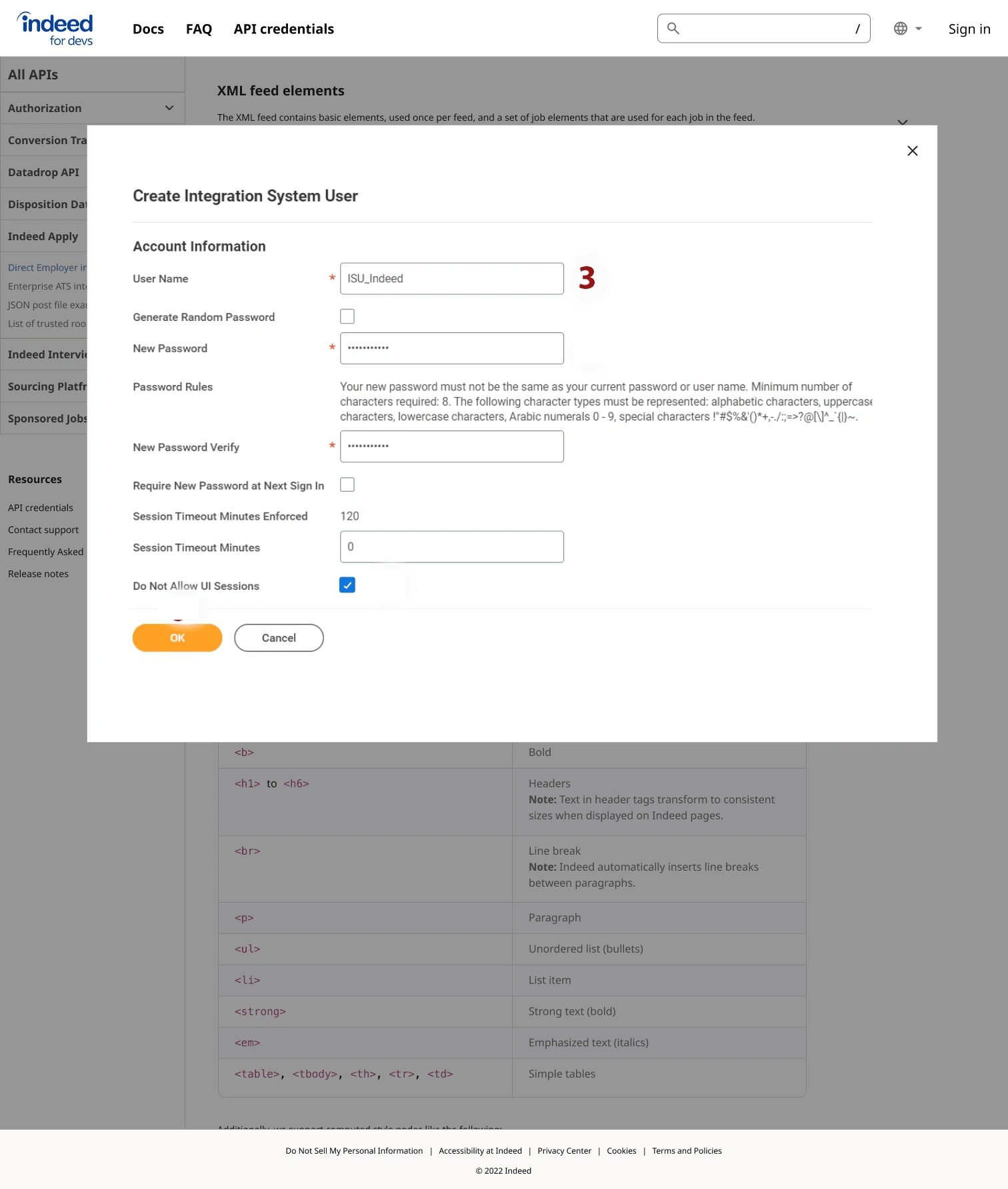
Feedback popover
Feedback
Support
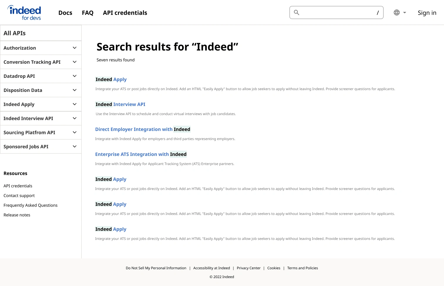
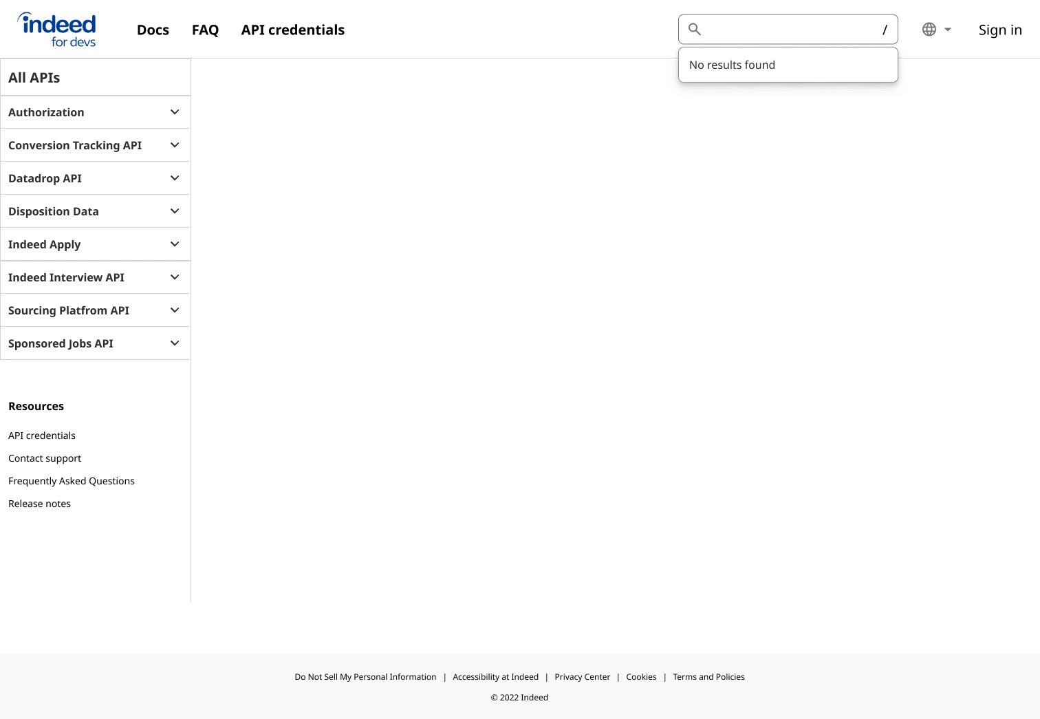
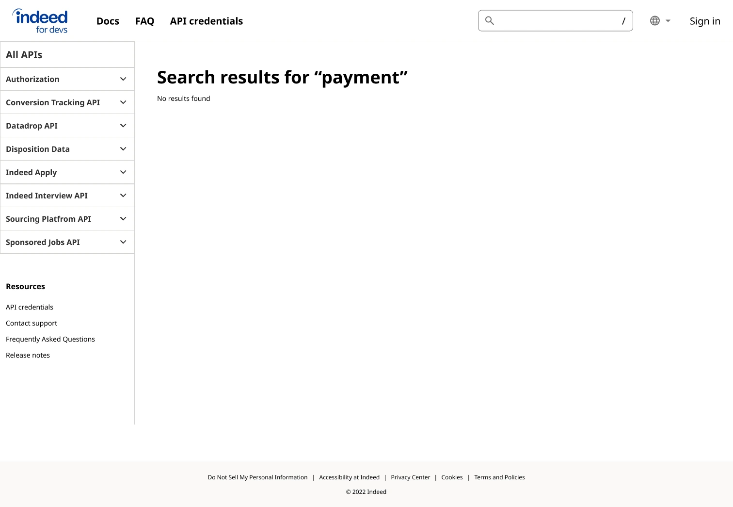
Search
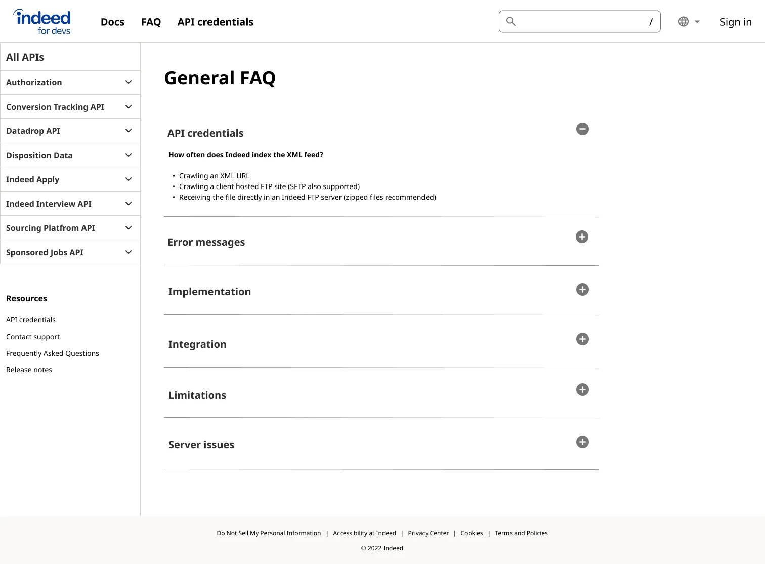
FAQ
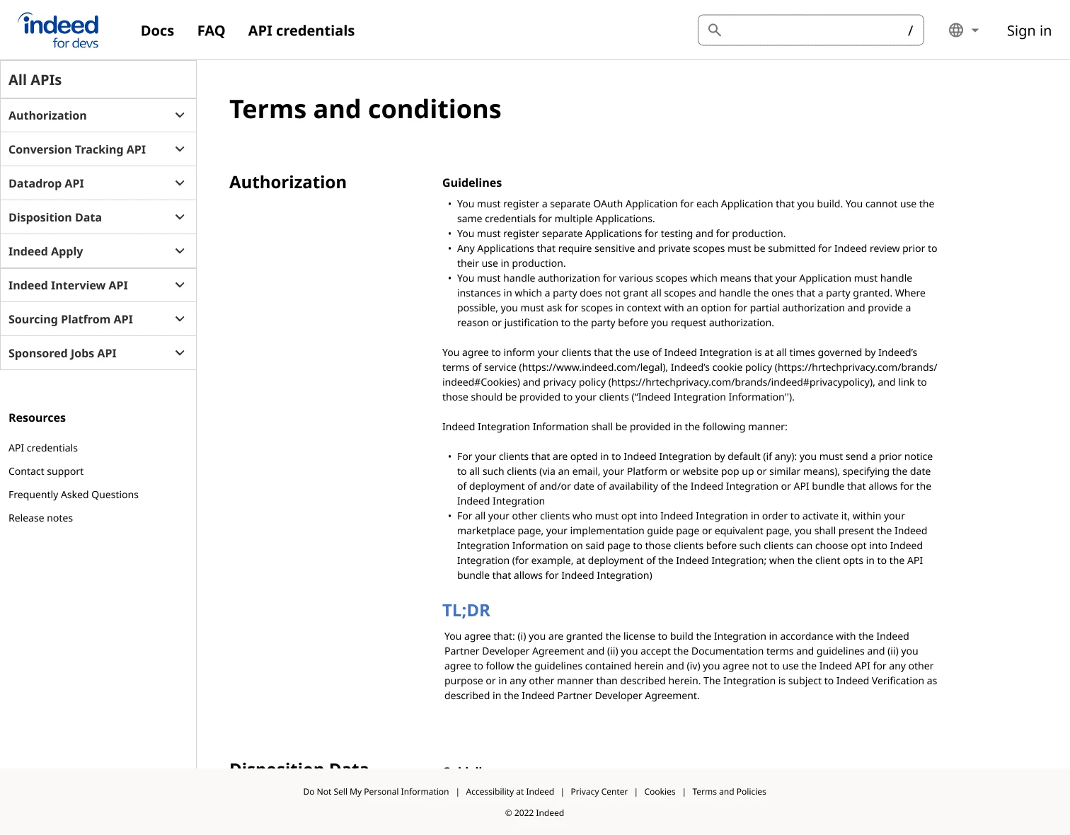
Legal
Next steps
Conduct usability testing on final design
Start scoping out implementation phases for next steps
Introduce a dark mode
Reflection
Overall, I learned so much during this internship. I was able to learn about the design process and the collaboration with other roles. It was really exciting to iterate my ideas and test them out with real users! I am so thankful for all the resources and support I received throughout the project and will forever remember it.
Like this project
Posted Mar 24, 2023
Define a developer documentation portal that holds comprehensive and feature-rich API documentation for third-party developers


