Redesign of TD Bank's Online Banking Enrollment
Jake Redmond
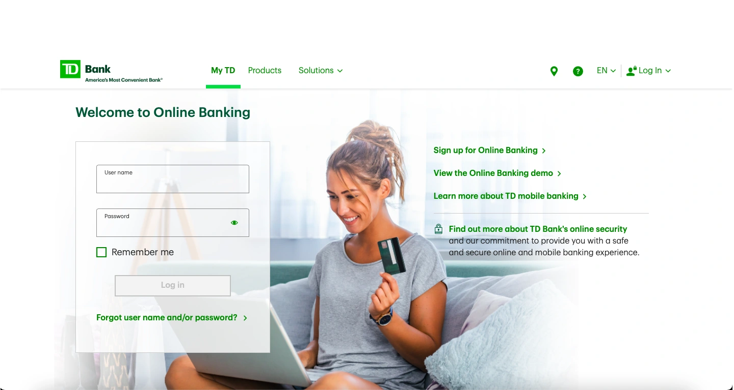
TD Bank, a Canadian multinational banking and financial services corporation, was looking to reimagine their Online Banking enrollment experience for customers. I was brought on to lead the redesign for the responsive web side of the project.
Enrollment in Online Banking for existing customers was underperforming. If the bank could hit the industry average, it had the opportunity to add ~700,000 new Online Banking customers. The existing experience had a significant drop-off in the enrollment process as customers hit roadblocks and exited the experience, contacted the call center, or visited a store to complete their enrollment.
While enrollment for new to bank customers was performing above the industry average, enrollment in Online Banking for existing customers was underperforming. If the bank could hit the industry average, it had the opportunity to add ~700,000 new Online Banking customers. The existing experience had a significant drop-off in the enrollment process as customers hit roadblocks and exited the experience, contacted the call center, or visited a store to complete their enrollment.
The success rate for both self-guided and assisted enrollment was between 4-9%, with increased call center volume and store visits.
“Opening an account was fine but unfortunately it goes sour when trying to enroll for online access.”
— TD Customer
“It would be easier if new customers could signup for online banking right away without having to put their debit card number in, seeing how we have not received a debit card yet; and we have to wait two weeks to receive it.”
“If you are willing to send a debit card out, at least have the decency to give me the opportunity to have an online banking account to manage it. I really like TD Bank, and would like to have it as my main bank. It’s sad no one seems to care if I need assistance to enroll into online baking.”
— TD Customer
In order to solve these customer complaints and bring TD’s Online Banking enrollment up to industry average, the entire enrollment flow was re-imagined. The project kicked off with a design sprint, bringing the Human-Centered Design team together with the line of business, change managers, legal partners, and the product team. At the end of the design sprint, the team ran a round of user interviews, testing a prototype they built, to gain user insight into the new process. Armed with this information, the project was then handed to the project teams to design the experience for each specific platform.
After the design sprint was complete, the project was handed over to my team to begin the design for our Responsive Web platform. Our first focus was to sort out the stepped process that came out of the design sprint, adapting it to fit our platform and standards. The new enrollment flow was brown down into 4 easy steps:
Account Lookup
Terms & Conditions
Security Verification
During the design sprint, the team decided to use only a user’s Social Security Number to lookup a users’ accounts. This greatly simplified the inputs for the user but also had mixed results during user testing.
The user tests revealed that users were hesitant to input their Social Security Number, although all shared they would expect the bank to ask for it.
To determine the correct combination of inputs to ask for, we decided that a second round of user testing was needed. We wanted to keep the flow as simple as possible and decided to test one version that just asked for a users’ Social Security Number vs. a version that asked for Last Name and Social Security Number.
Working with the User Research team, we set up an unmoderated user test to test the entire flow again. Within this test, we put an A/B test on the account lookup screen.
50% of users were curious if they could use other verification methods
Users stated they would like to see some help or alternative ID options
16.6% of users expected a confirmation from the bank confirming the correct information was found
20% of users shared they would like to see more information on how the bank is using their information and how their privacy is being protected
While users in both tests initially expressed concern or alarm that they were only asked for their Social Security Number, no one said it would prevent them from continuing with the flow since they would expect a bank would need their Social Security Number.
During the A/B test, users presented with the Last Name and Social Security Number version, expressed the same type of alarm. The research did not support that asking for more information alleviated users’ concern.
After account information is found, the user is presented with the Terms & Conditions required for Online Banking enrollment. In the previous flow, Terms & Conditions were presented contextually. While in theory this makes sense, in practice it meant that there were multiple points within the old flow were the user had to agree to Terms & Conditions.
After the user has accepted all Terms & Conditions, they are taken to step 3 of the enrollment process, Security Code Verification. Initially, this step caused the greatest concern for me as a designer. It was obvious that the design of these screens needed to match the rest of the enrollment flow. However, the development team had just completed a major overhaul of these same screens as a part of another project. My fear was that the development team would resist changes to these screens after just completing this previous project.
Once our initial designs for the enrollment flow were finished, I held design review sessions, first with the greater Human-Centered Design team and then with a group of Product Owners, to discuss the potential changes, discover any pitfalls, and come to a consensus on the best path forward. These sessions were essential for aligning the various teams and building goodwill with our project partners.
The final step of the process requires the user to input a username and password for their new account. This step was straight-forward but necessary for setting up the account correctly. There was a discussion during the design sprint to auto-fill the username field with the user’s email address on file to reduce the number of inputs. As we got further into the design process, there was concern that special characters in email addresses would not store correctly in the database. Additionally, we decided to give users control by selecting their username and password for themselves.
By the end of this project, we had designed a simple, easy to understand enrollment experience. Armed with this new flow, TD Bank is poised to reduce customer complaints and to bring its new Online Banking enrollments above industry average.
Breaking up the flow into manageable steps
Simplifying user inputs
Consolidating Terms & Conditions
Streamlining the OTP Security verification
— Alex Souza - Lead UX Designer, Amazon Web Services
Like this project
Posted Aug 10, 2025
Redesigned TD Bank's Online Banking enrollment to improve user experience and increase enrollments.