BikeScout Website Optimization
BikeScout sells bikes on their web experience. I was brought on to improve the conversion from browse to completion of checkout to increase revenue on the product’s web experience.
The Problem
The Product Manager has shared data that shows that 50% of users open on average 7 item pages and then abandon the site without moving any items into the cart. Additionally, 70% of users who place an item in the cart do not purchase. Data shows that users abandon the cart at the registration page. Right now, users must make an account to purchase. The Product Manager wants to design a guest checkout to solve for this. The guest checkout must capture email.
My Roles on the Project
Secondary Research
UX Strategy
Wireframing
UI Design
Prototyping
User Testing
Tools Used
Adobe XD
Miro
Google Suite
Secondary Research
Due to time constraints, secondary research was conducted to determine how other products had solved similar issues. This research had the following objectives:
Research Objectives
Discover what other companies have done to improve the conversion from browse to completion of checkout on a web experience.
Discover best practices for user checkout experiences.
Discover how others have designed a guest checkout that captures the user’s email.
Recommendations
From the research, four key insights emerged that could be applied to improve the user experience on Bike-Scout’s website experience.
Utilize product comparison tables to help users differentiate which bike is best based on relative features.
Make CTAs stand out in page hierarchy
Make the guest checkout the most salient feature of the checkout options, followed by options to sign in or create an account
Ensure delivery info and costs are visible throughout the entire checkout process to avoid surprises.
User Flows
After completing the research phase of the project, I began thinking about how these concepts might help me improve the experience of BikeScout’s website. In order to get a better handle on how the user might optimally move through the website, I used Miro to sketch out possible user flows for both the browsing and checkout experiences..
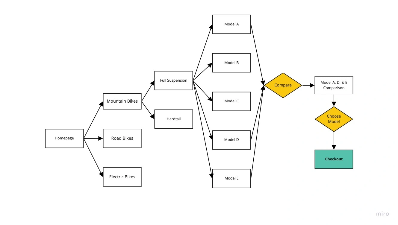
Browsing User Flow
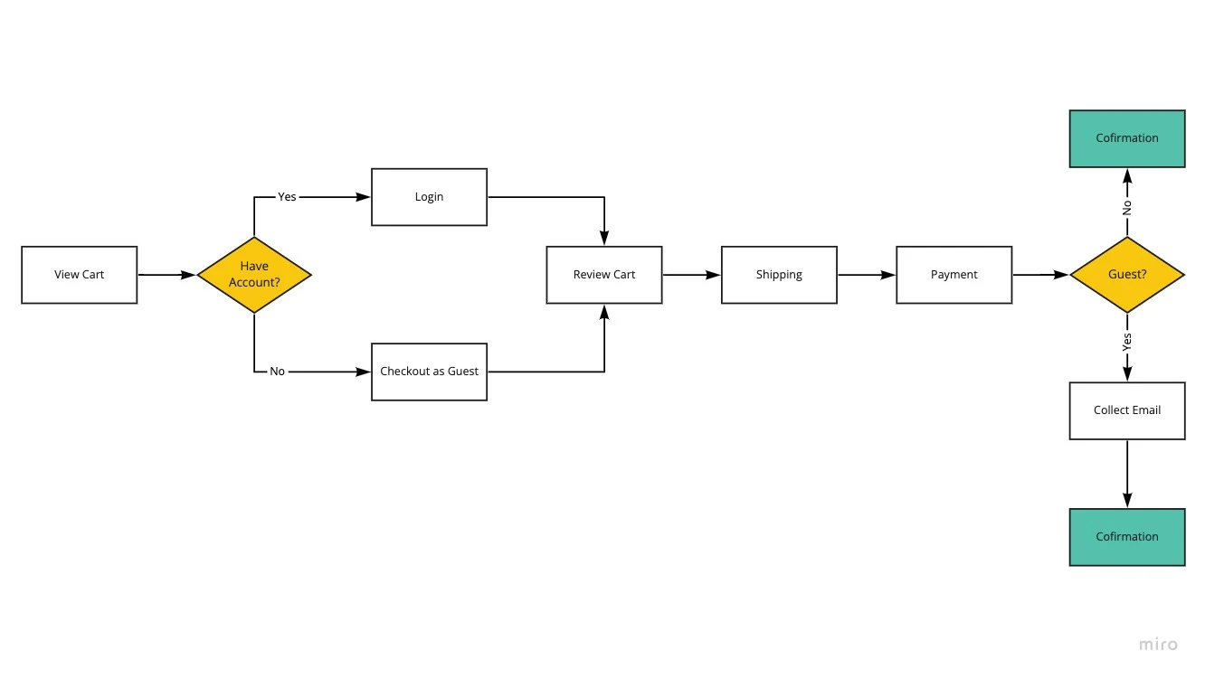
Checkout User Flow
Wireframes
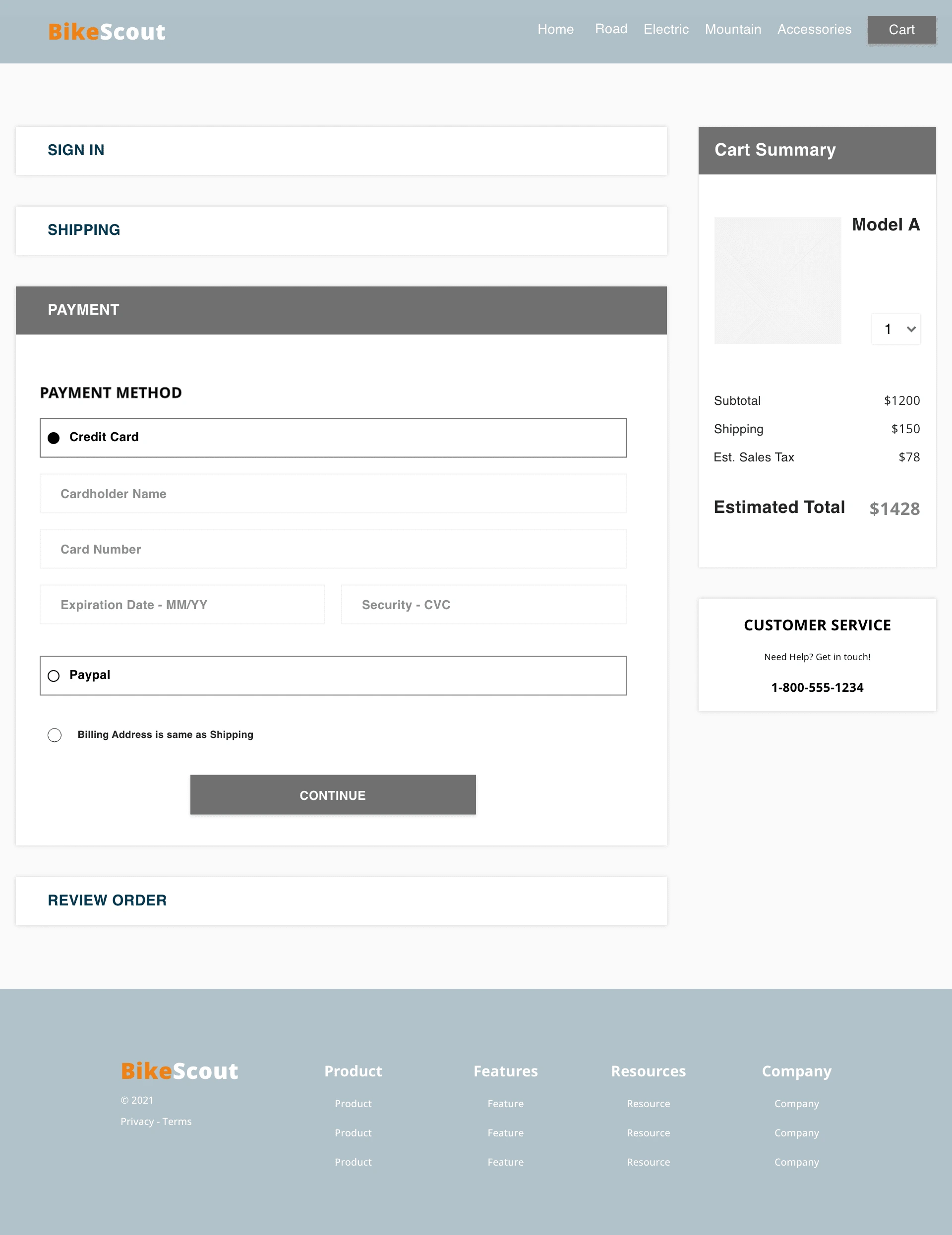
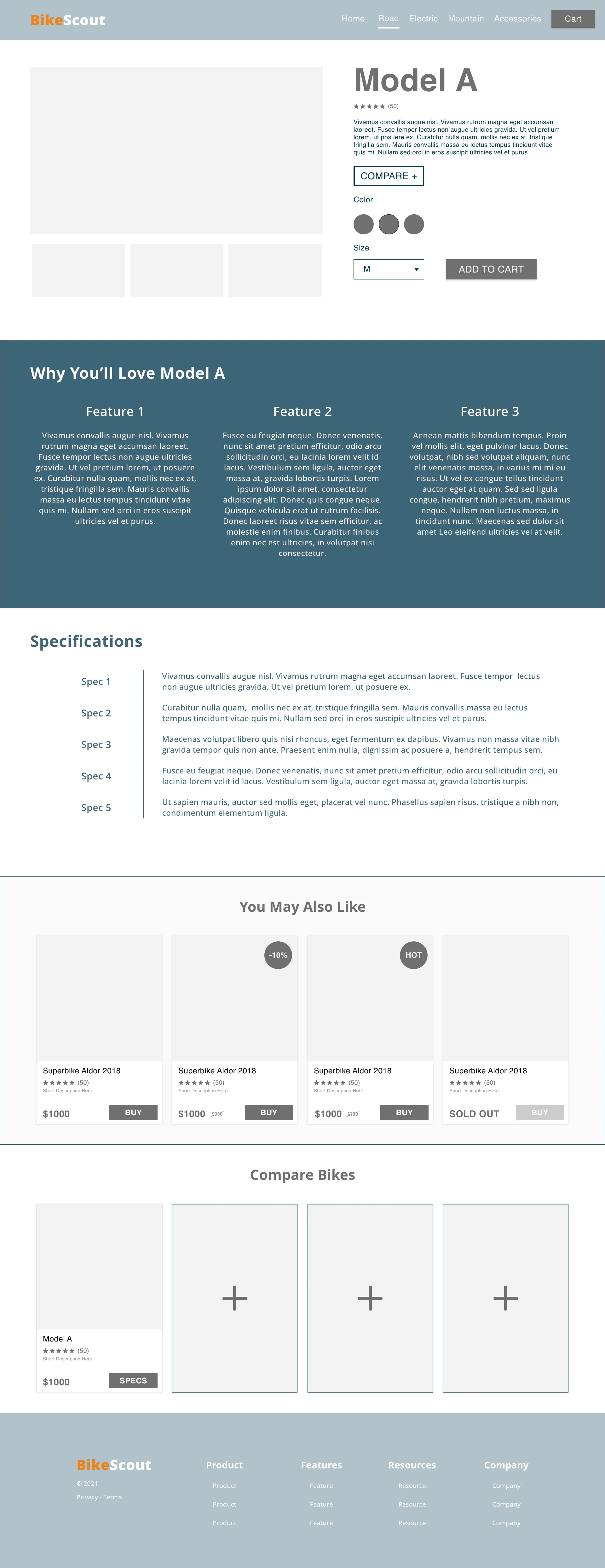
After sketching out user flows for these two experiences, I moved to wireframing a possible solution that could be validated with testing. Because of the limited scope of the project, I focused on two experiences within the larger website.
A product comparison tool that helps users determine which bike is best based on relative features.
A guest checkout experience that reduces the cart abandonment rate.
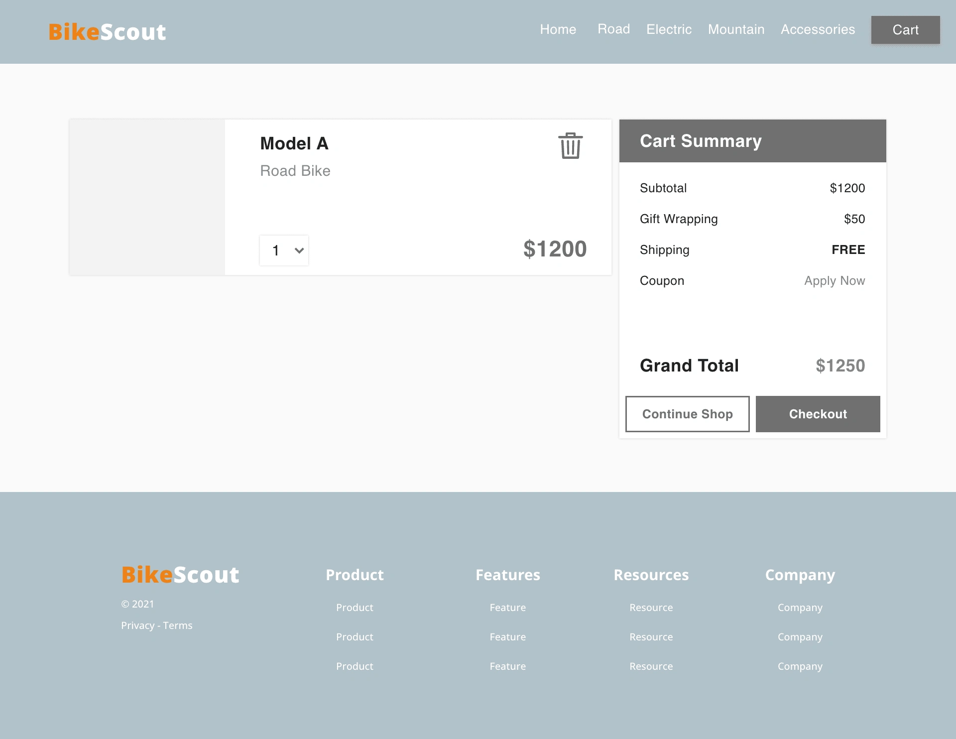
Validating the Initial Design
After creating wireframes of the proposed experiences, I set out to validate the ideas I had put forth. To do this I spoke with users who fit within BikeScout’s target market. From this testing, several issues were discovered. Below are two of the key issues discovered.
Issue #1
The product comparison tool should be more prominent on the product page.
Users wanted the compare tool to have a more prominent place on the product page. Some users had trouble finding the compare tool at the bottom of the page.
Recommendation
The comparison tool needs to be moved up the visual hierarchy of the product page. A sidebar or popup tool may be an effective way of conserving space and still preserving the information specific to the Model being presented.
Issue #2
The comparison tool is missing a Purchase CTA at the top of the page.
Currently the only CTA to purchase is at the bottom of all the information. This requires users to scroll to the bottom of the page to purchase.
Recommendation
Put a purchase CTA button before and after the presented information. Additionally, the link to the product page needs to be redesigned so it looks less like a purchase CTA. If not corrected, this could confuse users..
High Fidelity Design Mockups
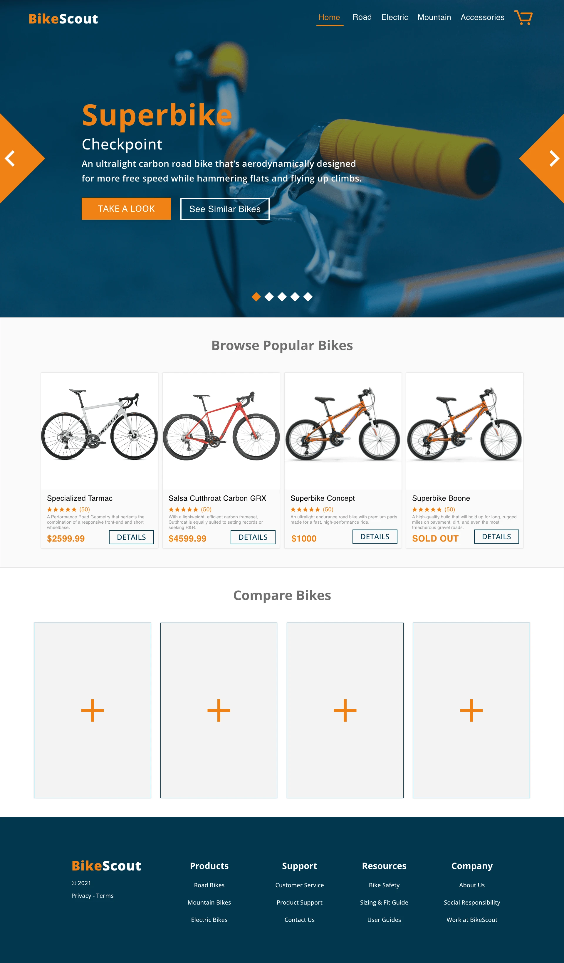
After completing the initial round of testing, I had a better idea of what the design still needed. As I began designing high fidelity mockups, I started considering how the design of the user interface might communicate the desired message to users. The design needed to convey BikeScout as an expert in the field who is always knowledgeable about the latest trends and best products related to biking. In addition to conveying the brand image, I also needed design features that compelled users to actions. The design needed bold features that elevate CTAs in order to increase the conversion rate of the site.
One of the big challenges of this design was the product comparison tool. I knew from research that this tool needed to:
Only allow users to compare 3-5 products at a time
Help users easily identify key differences
Only include attributes that users care about
Support scannability
The design of this tool took several iterations to get into a usable form. Only after the second round of testing did I feel like I had the insight to effectively design the tool. During the high fidelity mockup stage of the design, I focused on effectively presenting the information users were looking for in order to compare products.
The other key part of the website that needed to be carefully designed was the checkout experience. Research revealed that 70% of users who placed an item in the cart did not purchase. The data showed that users abandon the cart at the registration page. I was tasked with designing a guest checkout experience that still captured the users’ email address.
From secondary research, I knew that there were several key features that would improve the checkout experience. These included:
The guest checkout being the most salient feature of the checkout options
A streamlined process that removes intrusive or unnecessary steps
A stepper that shows users where they are in the checkout process
Providing the total price (including Shipping and Tax) throughout the entire checkout process
Easy payment options that don’t overwhelm users with too many options
Validating the Design
After completing the high fidelity mockups, I submitted the designs to another round of usability testing to ensure they were meeting user needs. This round of testing revealed several key insights that helped to improve the final design of the website.
Issue #1
It was not clear to users how to add products to the comparison tool.
Testing revealed that users were confused about how to add products into the comparison tool. There was a clear way to add a product from the product page however navigating to the product page to add each product was too tedious for users.
To address this issue, I auto-populated the comparison tool with products commonly compared with the product they were looking at. By doing work for the user and then allowing them to edit if necessary, the confusion on how to add products to the tool is reduced.
Issue #2
There was no visual indication that a product had been added to the comparison tool.
In testing, users were unsure if products were actually added to the comparison tool after clicking the “Compare” button on the product page.
To remedy this, I designed a popup that shows the products that had been added to the comparison queue.
Issue #3
There was no validation that checkout steps were correct.
In the accordion checkout, previous steps collapsed into a header. When reviewing information before ordering, users tried returning to headers to ensure information was correct.
To address this issue, I redesigned the checkout steps to collapse into a summary for quick review. Users are also given the option to edit the information without having to go back. I also numbered the checkout steps to make the progression clearer.
Click-through the Prototype above or view the prototype online
The Final Product
After completing the second round of testing and making changes based on those findings, I took time to review all designs, making sure that BikeScout was portrayed as an expert in the field who is always knowledgeable about the latest trends and best products related to biking.
The final product achieved the goals of the project, improving the user browsing experience and lowering the cart abandonment rate.
Next Steps
Changes that will improve the user experience include:
A/B Testing to determine the best place to capture email in guest checkout experience.
A/B Tests need to be run to determine whether to ask for email at the beginning or end of guest checkout experience. Research showed that most users abandoned the cart at the registration page due to being forced to make an account to purchase. The guest checkout feature reduces the information required from users, however the project scope stipulates that the users’ email address must still be captured.
In my final design I put the email input at the beginning of the checkout experience. I wanted to present users with all information at the beginning of the checkout experience so they were not surprised by information later in the process. Being surprised by information, whether it's an email input or additional costs, can lead to cart abandonment.
More testing is needed to see where users prefer to input their email address.
Work with development team to further prototype and test the comparison tool
Testing on the comparison tool was somewhat limited due to prototyping restraints. In order to run more developed tests, I would like to coordinate a more robust prototype with the development team in order to make the features work properly. Discussion with the Project Manager and Development lead will be essential to determine the best use of resources to make this happen.
Like this project
Posted Jul 24, 2024
This is your case study subtitle, rewrite these text-boxes & make them yours.
Likes
0
Views
11


